This is watchOS 4's marketing tagline, and it's an appropriate one. The fourth software iteration from Apple's watchOS team isn't bringing blockbuster changes to the Apple Watch, but it continues the trend of past watchOS releases in helping improve its users' lives — especially when it comes to health and fitness.
February 28, 2018: Apple Watch Series 3 will now track your skiing and snowboarding activity
While Apple Watch has always been good at tracking indoor and fairly warm-weather based outdoor activity, winter workouts haven't enjoyed anywhere near the same level of support. Until now.
According to Apple:

Starting today, skiers and snowboarders can use Apple Watch Series 3 to track their activities via new updates to apps available in the App Store. Watch users can now record runs, see vertical descent and other stats, and contribute active calorie measurements directly to the Apple Watch Activity app.
We haven't had a chance to test out the new ski and snowboard workouts, or the new integrations for app developers, but we aim to do so soon and we'll update this review with the results.
Black Diamond with Black Sport Loop, here we come!
Look and feel
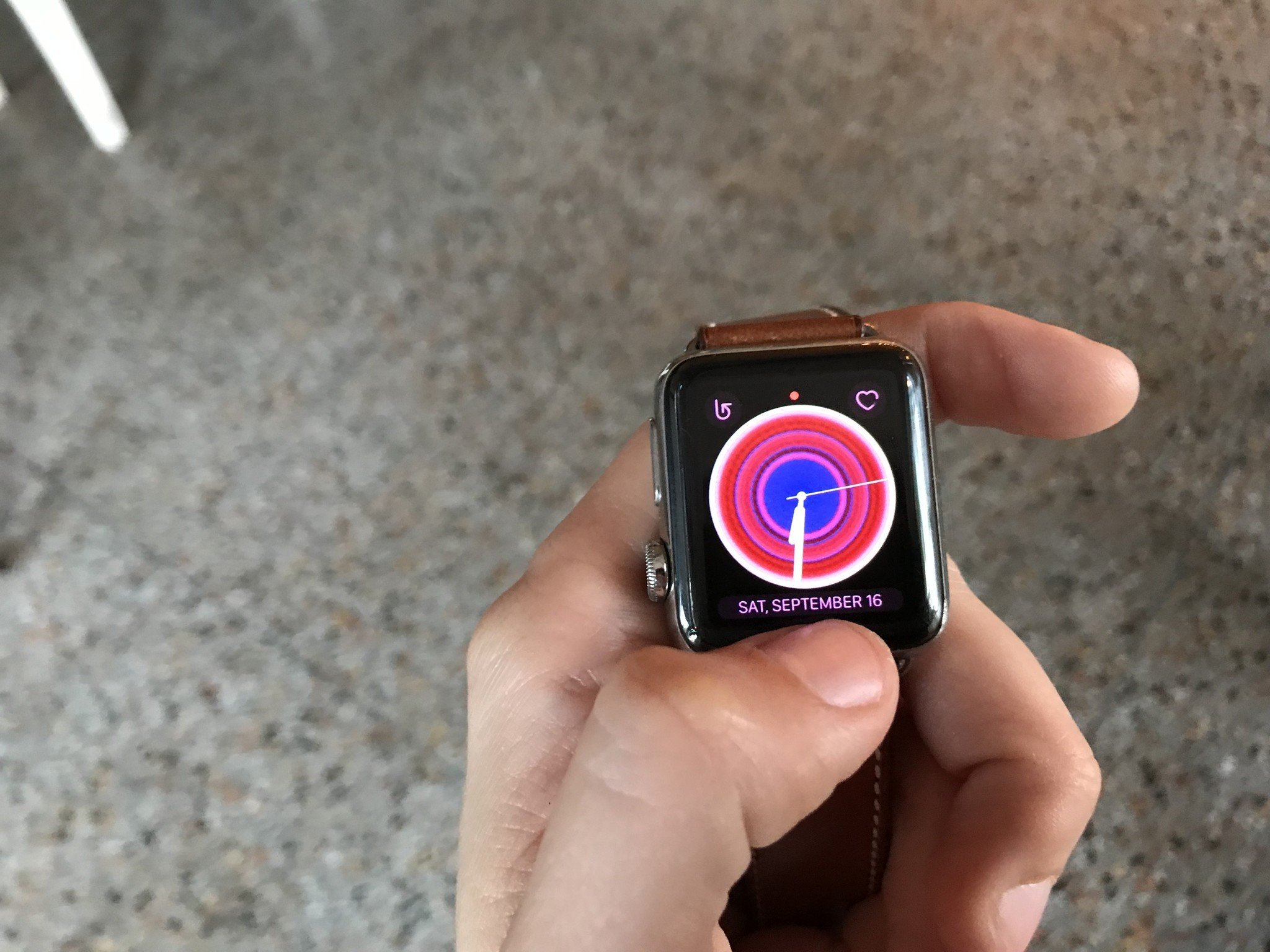
Like 2016's iOS 10 release, watchOS 4 is a child of two worlds: It's beginning to embrace the bold look favored by iOS 11, but the operating system isn't quite there yet. Many vestiges of watchOS versions past remain, including the app screen's grid view (though it's been even further deprecated with changes to the Dock and the List View option), older stock app designs, and a more limited Siri interface.
But you needn't look further than the Lock screen to see signs of forward movement in watchOS 4. The watch's PIN pad has been enlarged and emboldened, making numerical input more pleasant on even the 38mm watch size. Gone is pretty much every page-based horizontal interaction, with watchOS opting instead for a Digital Crown-controlled vertical view. (Real talk: We never needed horizontal swipes on the watch, anyway.) We're still stuck horizontally swiping between watch faces, but beyond that, the new Flashlight tool, and Workout views, it's card-based scrolling all the way down.
Redesign city
This is especially obvious in redesigns of the Music app and Workout app, the new News app, the Dock, and the new Siri watch face. Card-based interfaces allow for full-screen viewing of content, and vertical swipes or Digital Crown twists quickly let the user scroll through.
In general, I'm going to support any redesign that makes content easier to see and read on small screens, and iOS's bold and curved card language fits especially well on the curved square interface of the Apple Watch. My only complaint is that it's not universal: While apps like Maps, Music, News, Workout, and Heart Rate have the new look, there are still quite a few apps (Mail and Messages in particular) that are still favoring smaller lettering and thin rectangular tap targets in the main app view over bigger, easier-to-read cards.
That said, I suspect this is something we'll see improve as watchOS continues to grow — Apple's latest design language for iOS took over two releases to get implemented device-wide, and I won't be surprised if we don't get a fully revamped look until watchOS 5.
I read the news today
I was initially unconvinced that the News app on watchOS would be better than getting the occasional iPhone-based push notification from the app, but after a few months with watchOS 4, I find myself really enjoying it. The redesigned look of iPhone notifications helps a lot, as does the clean and streamlined interface of the News app itself. I may not always love the content that the News app pushes (though that's less a fault of the News app than our current news climate), but I'm glad to be informed.
Of course, you can't actually read a story on the Apple Watch — or have it read to you. Instead, you just get the headline and lede, with the option to save it to the News app on iPhone to read later. This is where lede writers do a good job: I don't think I've ever actually saved a story to read later because the notification gives me nearly everything I want to know.
Keep watching the clock, tick tock
It wouldn't be a watchOS release without a few new watch faces — though, unfortunately, we're still limited to Apple's "sweet" solution of mixing and matching pre-built faces and complications, rather than being able to fully customize our own.
I'm still hoping for a custom watch face store in watchOS 5, but in the meantime, I'll tip my cap to the new Kaleidoscope face: It gives you the option to remix one of 8 existing photos into three Kaleidoscope patterns (Facet, Radial, or Rosette) for your watch face, with up to three complications; you can also choose your own image for a kaleidoscope pattern all your own. Turning the Digital Crown on the face itself to invoke the remix is an oh-so-satisfying time-waster, reminiscent of grade-school kaleidoscope viewers.
iOS 11 also lets users turn any photo from their library into a watchOS 4 Photo or Kaleidoscope watch face. It's not as satisfying as a true watch face customization app, but it does greatly simplify the photo-picking process.
There are also four new Disney faces starring the cast of Toy Story, including Buzz Lightyear, Woody, Jessie, or the Toy Box. These are cute enough, but a two-complication limit makes them little more than a fun novelty option.
The watch's face customization screen remains largely the same from watchOS 3 (including the much-superior Watch Face Gallery for creating faces through the iPhone's Watch app), though there are a few revised complications available in watchOS 4. The Messages complication now shows your unread message count, the News complication offers a quick ticker, the Music app now shows an interactive peak meter along with the song title, while Heart Rate will display the watch's last heart reading.
Light up the Dock
The Dock has been reinvented yet again for watchOS 4: You still press the side button to access it, as with watchOS 3, but now Dock items are solely organized by Recents or Favorites — there's no intermingling. They also now display in the same card-based rolodex view as some of the system app redesigns.
The new Dock cards are easier to read and tap on than the page-based system; though it does take away some of the previous "glance" functionality present in watchOS 3, I prefer having to tap on the app: The horizontally-scrolling Dock's preview panes were too small to really grok information off on a 38mm watch face, anyway.
In addition to a series of either Favorite or Recent apps, there's an All Apps shortcut button at the end of the list allows you to dip into the app screen (one of the few remnants from the watchOS 1 design graveyard) if you absolutely have to. Here's hoping you do not — but should you have to, you can also make that app screen easier on the eyes with a Force Touch gesture, which allows you to switch your app view into alphabetical List mode. I switched to this mode pretty much immediately after moving to watchOS 4, and I haven't gone back: Here's hoping Apple eliminates the Grid view (née Carousel) entirely in watchOS 5.
The Apple Watch's Control Center pane hasn't gotten the same redesign as its iOS counterpart, in part because it already mostly exists as a series of floating bubble panes. That said, I wish there was some ability for Force Touch adjustments here, especially with the addition of the Series 3 GPS + Cellular watch option. The watch is more powerful than ever when roaming on its own, but you still can't manually pick and dictate passwords to a Wi-Fi hotspot, or clear an interstitial screen (like the ones present at Starbucks). It's a shame, and a feature that prohibits the watch from being able to truly exist outside of its paired iPhone.
Control Center does have two new features in watchOS 4: A small GPS indicator now displays in the top right corner of the pane when apps are actively using either the watch or the iPhone's GPS, and there's a new Flashlight button.
It works much like the iPhone's Retina Flash, lighting up the Apple Watch's screen with one of several flashlight styles: solid white, flashing white, or solid red (for easier-on-the-eyes light in dark locations). These panes won't light up a room, but it's a helpful little feature for trying to find a house key in darkness or reaching into a dusky space.
Hello, Dave
Siri's biggest improvement in watchOS 4 doesn't actually have to do with the traditional Siri voice interface at all: It's a new, text-based Siri "intelligent" watch face, which uses all of Siri's data detectors and other machine learning goodies to help you throughout your day.
The Siri watch face is an interesting proposal from a company that's focusing more than ever lately on smart, private machine learning. Does it make sense to have a watch face that knows what you want, when you want it, rather than trying to hand-customize your own data-filled watch face?
For reference, the Siri watch face supports the following data detectors:
- Alarms
- Breathe
- Calendar
- Home
- Maps
- News
- Now Playing
- Photos
- Reminders
- Stocks
- Stopwatch
- Timer
- Wallet
- Weather
- Workout
It also has room for a single complication (a Siri trigger by default), though the scroll itself doesn't currently incorporate third-party apps.
By twisting the Digital Crown downward, you can see the current day's weather, past events, and the most recent music you were listening to; otherwise, you're limited to your Up Next queue, which can include things like calendar appointments, the projected sunset time, any impending weather, recommend news stories, Photos memories, a Breathe reminder, and any projected exercise goals, among other things.
So will the Siri watch face make your Apple Watch experience better? I think it'll honestly depend on how you use your Apple Watch. The Siri watch face is great about tracking your calendar appointments and reminders — it's one of the better calendar trackers out there, and certainly the best calendar experience in watchOS 4. But after several months with it, I haven't been wowed. The lack of third-party cards hurts the face, to be sure, but also the lack of customization — I care little about my calendar appointments, but I'd love more easily-accessible Workout controls at times when the watch knows I usually work out, or maps when I leave the house.
More interesting is what it says about Apple's plans for Siri — and the Watch — going forward. Intelligent watch faces and complications are far from perfect in 2017, but it's clear that the company is very interested in making technology work as seamlessly for the end user as possible. The Siri watch face is just one part of that.
Dance to the music
Elsewhere, Apple has made Siri-style changes under the hood in watchOS 4 to make its notification system slightly more intelligent, especially when it comes to interacting with apps. For instance, the Music app will now automatically show up as your primary watch screen on wrist raise when you're listening to a song on your iPhone or Watch. And not just a song: This works for just about any audio you play, including videos, the Podcast app, Spotify, and even websites.
Healthy living
There are also quite a few bits of Siri smarts in Apple's health initiatives: Breathe and stand notifications now hook into the Watch's built-in sensors, allowing the Activity app to avoid pinging you with notifications if it thinks you're driving or otherwise unable to respond to activity prompts. Running a workout will also automatically suppress some of Apple's default notifications (think of it as a miniature Do Not Disturb), so you can keep from getting distracted by a text message mid-deadlift while still receiving third-party notifications (in case you're using external paired health accessories that might need to communicate with you).
Missing the connection
For all its under-the-hood improvements in watchOS 4, I'm still sorely missing offline dictation support and queued Siri queries if you end up asking a question while offline. (And despite rumors to the contrary, Siri doesn't yet support dictating notes in watchOS 4 — one of its major Siri limitations.)
I'm guessing this is largely a hardware limitation, however, not software: It's hard to offer a feature if your hardware's chipset can't support it, and given that watchOS 4 is available for S1, S1P, S2, and S3 chipped watches, offline dictation may be impossible to provide without destroying performance or battery life in older models. Maybe next year.
Sweat the details
Apple has revamped a number of features in its Health suite of apps for watchOS 4: Fitness is clearly a motivating factor for many Apple Watch purchases, and it's smart business to continue to improve in that arena. The biggest changes here are watchOS's new Workout app and improved Activity notifications, along with the Heart Rate app's new scatterplot graph and extra tracking categories so that you can get a quick glance at your heart rate throughout the day.
Save me
Here's a potentially huge feature in iOS 11 that intersects with watchOS 4: Apple now supports iCloud sync for your Health data on iPhone, which means any health data you sync from your Apple Watch to your iPhone gets encrypted and stored in iCloud at will. In plain terms, this mostly frees the Apple Watch from one of its most frustrating limitations: not being able to pair to a new iPhone without first restoring the entire iPhone backup.
Yes, if you start from scratch on a new iPhone you'll still lose custom watch faces, app lists, and your general Apple Watch preferences, but you'll no longer lose your heart rate or workout records, your Activity Rings, and past activity. It's a huge improvement for those of us who frequently need to switch iPhone models but don't want to lose out on tracking Apple Watch data, and I'm very happy to see the change.
Of course, you still need to sync the Apple Watch to an iPhone to get that Health data to iCloud — Apple doesn't yet support direct syncing between the watch and iCloud. (Yet. Another item to add to the watchOS 5 wishlist.)
Let's get moving
The Workout app now sports watchOS 4's vertical cards-based interface in displaying workouts, making them easier to read and to begin new workouts. Continuing in Apple's quest to track more exercise types, the app also offers a new HIIT (High Intensity Interval Training) exercise, and has improved Pool Swim tracking with sets and rests, pace for each set, and distance for stroke types.
The HIIT option uses the accelerometer and heart sensor in tandem to try and track exercises (like burpees) that the Other workout option didn't always catch accurately. It remains to be seen how accurate the HIIT workout option will be — I did a few brief tests and was pleased with the results, but it's not perfect.
But there's a reason why Apple takes its time in rolling out new exercise types. The company wants to get its health data correct the first time, and it likely isn't going to add an exercise type unless the results are within range of those from top-tier health measurement systems.
There are a few more perks in the Workout app in watchOS 4:
- You can switch exercise types on the fly during an active workout, letting you swap between running, HIIT, cycling, swimming, and more
- You can change your music's volume and tracks within the Workout app
- If you're working out at a gym with compatible (read: new and fancy) equipment, you'll be able to wirelessly pair your Apple Watch with the machine to sync up your fitness data and get credit for that awful treadmill run
As in watchOS 3, you can save Other workouts with custom exercise types, but in a new move, those Other categories are now saved with the proper icon and name. (Skating Sports now saves with a skateboarder icon, for example.)
Make me a life coach
Okay, so the Activity app's Siri-based coaching notifications aren't quite "life coach" material, but they definitely want to help you improve your day-to-day experience.
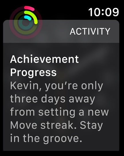
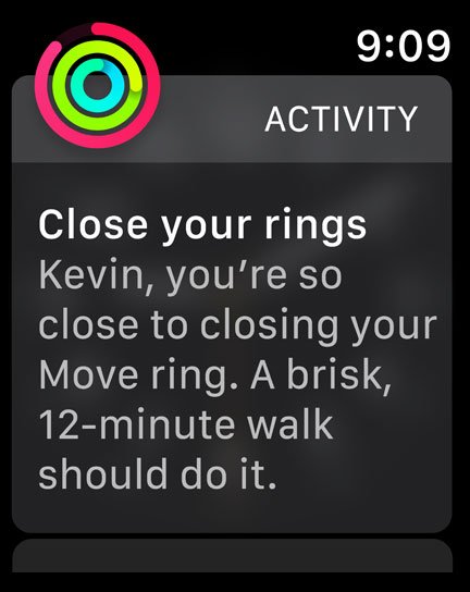
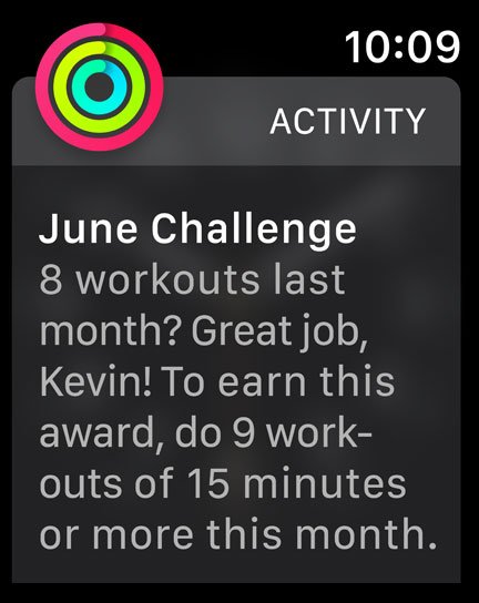
In watchOS 4, rather than receiving stock notifications about your exercise goals and streaks, the Activity app will attempt to customize notifications to encourage you personally. It uses the accelerometer and time-based data to predict when you're most receptive to things like Breathe notifications and taking walks, and celebrating the achievements you hit. I've largely enjoyed watchOS's end-of-day activity challenges, which give you a specific goal to get your achievements (i.e. "Take a 15-minute walk to hit your goal today"). And when you hit your goals and streaks, the Activity team has added neat little full-screen animations to make it more fun. It's a little touch, but a nice one. Oh, and you'll automatically have music play for your workout if you don't already have something playing on your headphones.
watchOS will also reportedly provide personalized monthly challenges depending on your activity level — so someone who crushes a 700cal Move goal every day will get a different challenge than someone still struggling to hit 200cal/daily — but I haven't seen any during the beta period.
More detailed tracking
In the vein of third-party apps like Cardiogram, Apple has added a bunch of functionality to the Heart Rate app and its tracking on Apple Watch, including:
- Overall faster readings
- An overview of your current heart rate, resting rate, walking average, and last recorded exercise
- A 24-hour scatterplot graph of your recent heart fluctuations along with your most recent reading
- Alerts if your heart rate peaks when your watch detects no major activity
These features should be available with the release of watchOS 4 for Series 1, 2, and 3 owners; I've heard conflicting reports on whether the original Apple Watch will get anything but the 24-hour scatterplot graph, but we're looking into it.
After Apple's September announcement of these features, I initially worried that this would fall into the area of "too much health information" for my awful hypochondriac self. Heart rate alerts are a good thing in a vacuum, but as someone who had a terrifying false alarm a few years back that had to do with high heart rates, I still get a little on edge with that kind of data, especially given the Apple Watch's occasional tendency to misread heart rates during extreme temperatures.
But that said, after a week with these features, I'm actually really enjoying them. Apple hasn't said this publicly, but I suspect that the company has done some tweaking to the way the heart rate sensor interprets data: Readings feel faster and significantly more accurate at rest with my Series 2 than they did in watchOS 3. It's just conjecture at this point, but I hope to do more significant tests in the coming weeks.
The resting heart rate average is an especially nice bit of information for aspiring athletes, as is Apple's new exercise-based Recovery metric: After you finish a workout, watchOS will display your heart rate average during that workout, along with how quickly your heart rate came down from maximum effort (also known as your recovery metrics). This data is incredibly valuable for accurate training, and I'm happy to see Apple putting the work in to make the watch better and better for fitness enthusiasts and newcomers alike.
I haven't seen a high heart rate alert yet in watchOS 4, but that may be in part due to the threshold I set (120BPM). You can adjust your own personal threshold from the Watch app on your iPhone to accurately reflect a good monitoring point for your own personal health. Apple has reportedly been working on a monitoring system like this for years, and it says something about the company's confidence in its Apple Watch heart rate sensors that it's being rolled out to all watches, not just the new Series 3.
Play it again, watch
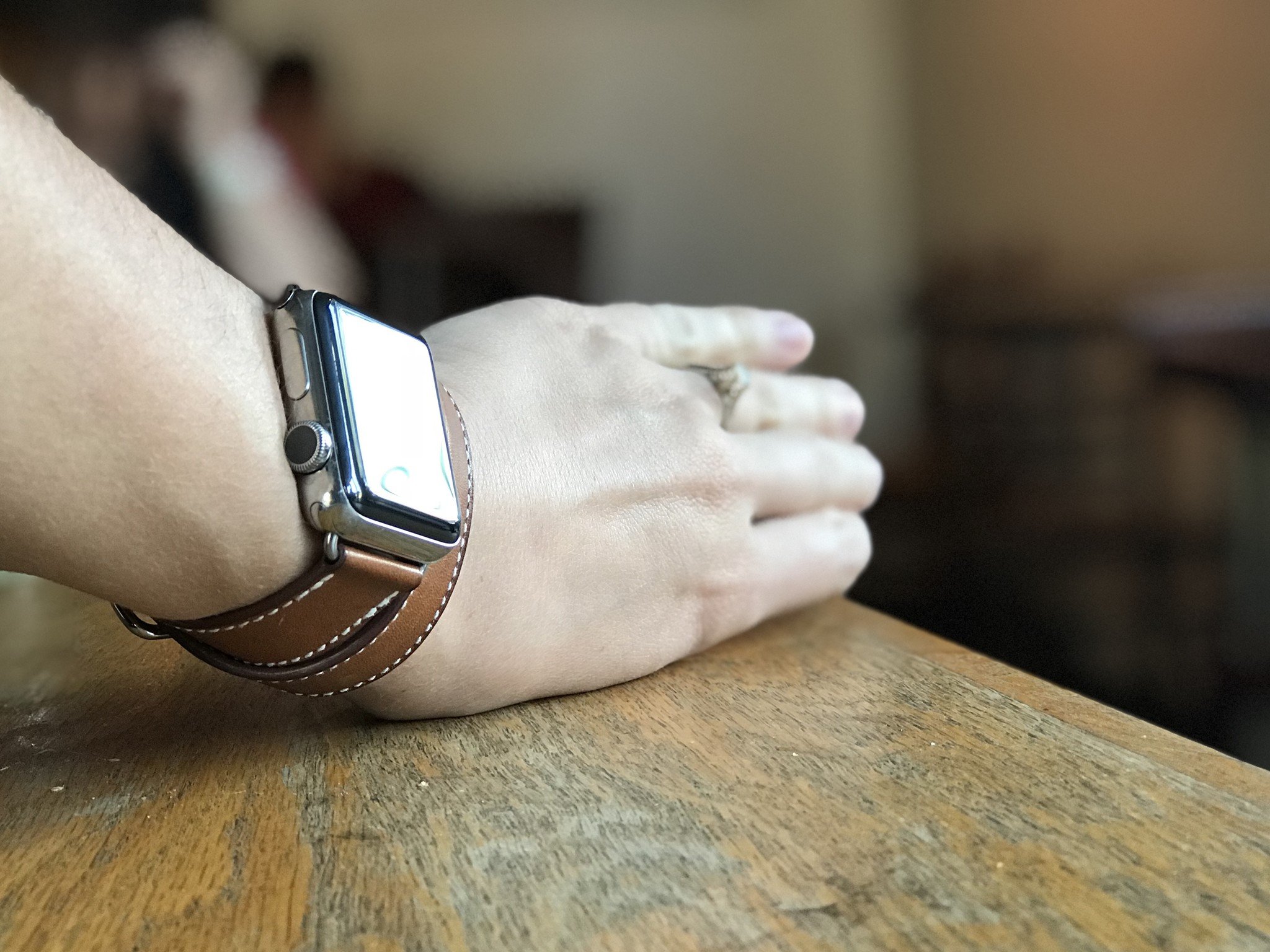
Though there isn't (yet) a native Podcasts app on the Apple Watch, we're still getting some audio improvements in watchOS 4, largely inside of the Music app.
You can now sync multiple playlists to your Apple Watch (up to 2GB on my 8GB Series 2; the 16GB Series 3 GPS + Cellular may have a larger option, but I haven't yet tested it). It's a large improvement over the single-playlist restriction of past operating systems; better yet, Apple will also automatically sync a few of your most-played playlists and albums while your watch charges — ensuring that you'll always have music at the ready should you need to groove on a run.
Like several of the other watchOS 4 apps, Music has been redesigned to incorporate the vertical card-based scroll design, displaying "Heavy Rotation" playlists as a few tappable full-screen cards before viewing your Library and other options as a text-based list. The Now Playing complication also more clearly indicates controls for Music, displaying a small level meter (and the song title, if choosing a larger complication).
As I mentioned above, there's also a bit of Siri-based smarts in Music and watchOS 4: When you're actively listening to music on your iPhone or Watch, the Music app will automatically display as the dominant app on wrist raise, much like the Maps or Workout apps do when getting directions or running. In my limited testing, this works almost flawlessly, and it's especially useful when you're out walking and want to skip a song or change your volume.
Cooler still, the Digital Crown's volume controls work for any device that's connected to your iPhone: Yes, that means that if you're driving and connected your iPhone to your stereo, you can adjust the volume of your car speakers from your Apple Watch. It also means you have a wrist-worn control system for any Bluetooth-paired speaker, too, which is great for parties and the like.
One downside to Apple's music changes: The Music app no longer lets you switch between your iPhone and Apple Watch libraries in the watch app — you only have access to your Apple Watch library. You can get around this limitation by asking Siri on your watch to play a specific song or shuffle a playlist, but it's still a frustrating change for those of us who used the Music app to find and play iPhone content.
If you build it, will they come?
So I've written over 2000 words on some of the features and improvements in watchOS 4, but I've yet to actually touch on the features I'm most excited to see in action — the ones you haven't heard about on Apple's user-facing website.
I'm talking about Apple's new developer APIs for third-party apps, and yes, I recognize how un-exciting that sentence sounds to the average human. "APIs! … Um, wait, what?"
So let's break it down in plain English.
Google Maps could get turn-by-turn navigation alerts and haptics
With watchOS 4, Apple is letting third-party apps build in turn-by-turn navigation alerts and haptics — also known as "those awesome Taptic alerts you get in the default Maps app." And not just straight maps apps, either: Transit and tour guide apps have the option of using these, too, so you can enjoy a walking tour of a city without gluing your eyes to your phone's map.
I've been waiting for this since the very first version of watchOS, but always assumed that Apple was going to keep this feature exclusive to its own Maps app. Not so!
Of course, for Google to take advantage, it has to build a new version of its Google Maps app, which it pulled from the Apple Watch earlier this year after a year of so-so functionality. As exciting as this feature could be for frequent travelers, it requires buy-in from Apple's many developers — and hopefully won't murder my 38mm watch battery when used.
You won't have to weirdly bend your wrist to show people stuff
This is a small nitpick, but one I'm glad Apple is fixing: Third-party apps (and first-party apps alike) can now take advantage of an auto-rotate feature for content like payments, language translation, photos, and more; when you flip your watch screen away from your body, apps that incorporate this feature will rotate content 180° to properly display right-side-up to the recipient.
Less iPhone, more Watch
We may not have offline Siri processing in watchOS 4, but we're edging ever closer to an iPhone-less Apple Watch with new developer features that let Apple's smartwatch talk directly to more aspects of an app.
In watchOS 4, apps can get permission for location directly on the Watch, and apps can connect directly to most Bluetooth devices (no cars, sadly) without using an iPhone as a passthrough. This allows hardware like glucose monitors and smart sports equipment to communicate faster and apps to update more quickly.

With watchOS 4, Apple is layering new improvements atop the framework of its predecessors. These features aren't game-changers: watchOS remains watchOS, nitpicks and all. But they will nevertheless sell watches. They'll delight customers. And, if developers take advantage of Apple's latest tools, they'll further improve their onboard app experience for all involved.watchOS 4 will be out later this afternoon alongside iOS 11 and tvOS 10 for all Apple Watch models. If you have an Apple Watch, it's worth the upgrade for the health features alone, but improvements to music and third-party apps should also be an upgrade consideration.
Serenity was formerly the Managing Editor at iMore, and now works for Apple. She's been talking, writing about, and tinkering with Apple products since she was old enough to double-click. In her spare time, she sketches, sings, and in her secret superhero life, plays roller derby. Follow her on Twitter @settern.
