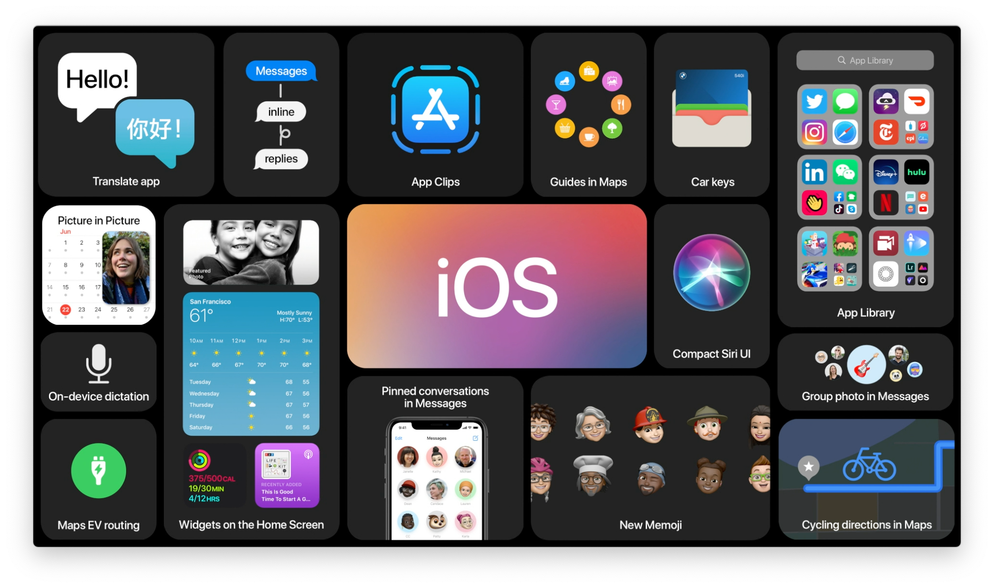
19 iPad Pro software improvements I want to see at WWDC 2016


I love my iPad Pro, and using it as my sole laptop over the last six months has been an exhilarating look at working on the go sans Mac. But it's not without challenges and workarounds. For the iPad Pro to truly take the next step into the laptop computing world, we need more.
Earlier this year, I polled Twitter and iMore readers, asking for their top picks in regards to iPad Pro software improvements. Here are the top twenty improvements we're hoping to see Apple implement as part of iOS 10 when it's previewed later this month.
Multitasking
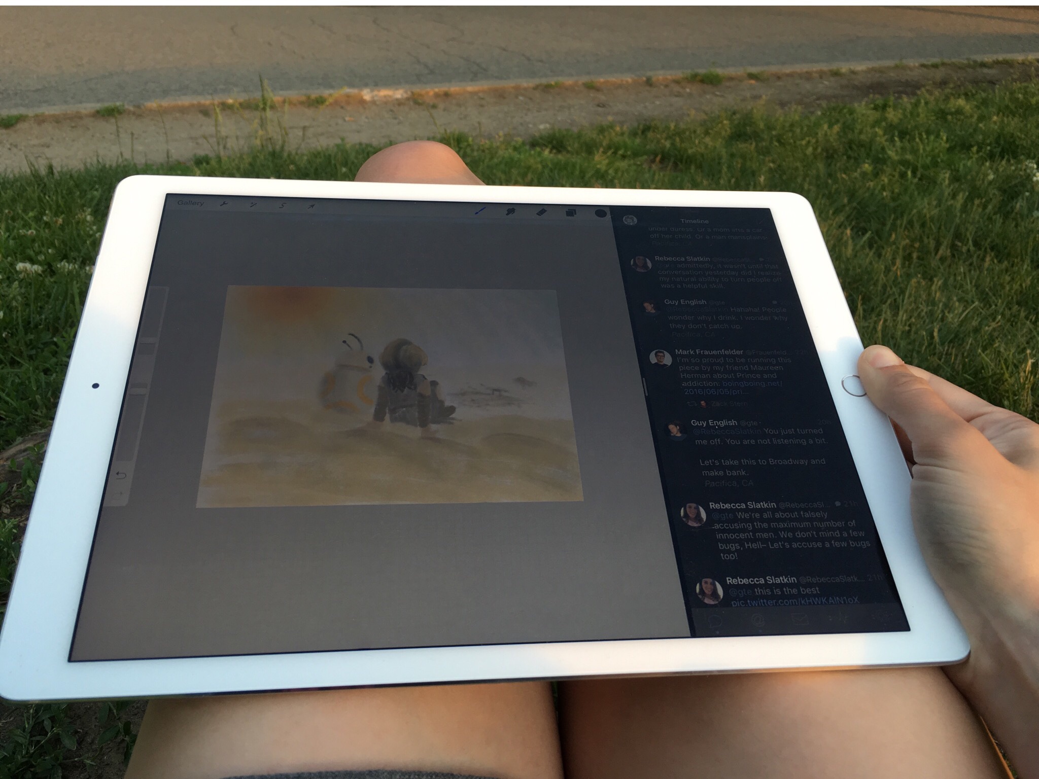
Slide Over and Split View were great first strides into the world of iPad multitasking, but with iOS 10, it's time to take working in multiple apps to the next level. Splitting the screen in half makes perfect sense for the iPad, and I'm not calling for an iOS future cluttered with windows; as-is, however, Split View is clunky and in need of a turbocharge.
1. Rethink the Split View Controller
There are a few different fixes to make multitasking truly a stand-out part of iOS 10, but the biggest piece of that puzzle is fixing the Split View picker itself. Scrolling through a lengthy list of every app you've ever opened that's Split View compatible was a good hotfix. For iOS 10, I'm hoping for an app picker that's organized, searchable, and even might reflect my home screen. And for even better navigation, let's add a Split View launcher to each app window, rather than Command-Tab (if a hardware keyboard is installed) relegated to switching the left pane, while the right pane uses the default swipe-down screen.
My secret end-game hope is for a more Mission Control-style view of my iPad.
Though I don't expect it to show up as soon as iOS 10, my secret end-game hope is for a more Mission Control-style view of my iPad: Multiple "screens", each of which can hold multiple full apps or two apps in Split View. Instead of switching from app to app with a four-finger swipe, you could switch from Split View to Split View.
2. Multiple versions of the same app in Split View
Sometimes you just want to look at multiple documents in Notes, compare several PDFs or emails, or have two browser windows open at once. There are some apps that attempt to provide this functionality, but you're ultimately using two different programs — not the most user-friendly experience. If iOS 10 let you add multiple instances of each app to Split View, it could open up a lot more flexibility where the user was concerned.
3. Drag and drop between Split View
A no-brainer addition: If I have Photos and Mail open, for example, let me drag a photo from the Photos app to a new Mail message. I get why this wasn't an iOS 9 addition — when you're moving data from one sandboxed application to another, you want to be sure you're not compromising security or providing a messy gesture interaction — but it seems an absolute must-have for advancing the iPad experience in iOS 10.
Master your iPhone in minutes
iMore offers spot-on advice and guidance from our team of experts, with decades of Apple device experience to lean on. Learn more with iMore!
4. Universal Split View support for system apps
As of iOS 9, you can't use Split View in the Music app, Settings, or the App Store, among others. This is as crazy as some of Apple's apps not being sandboxed on OS X: If it's technology the company wants third-party apps to embrace, all Apple's system apps need to do it. (And it's just confusing to the average user to tell them that only some of their apps can use multitasking.)
Files

From the beginning, iOS has strived to take the file system out of the computing experience, hiding your files inside their respective apps and removing any idea of a Desktop or Finder. But even without those traditional computing methods, users need to work with files, and they need those files to talk to multiple programs. It's just the way of the world. As such, here are a few thoughts on how Apple could let users do more with files without necessarily porting over the Finder.
5. A better iCloud Drive
When Apple introduced the (optionally-hidden) iCloud Drive app that let you see all your iCloud-stored documents, power users rejoiced... only to realize that the app was, in fact, fairly limited in its capacities.
While you can store files, create folders, and open documents in other programs, moving and renaming files is a clunky experience, and only PDFs and images open up in anything resembling OS X's (and iOS Mail's) Quick Look — everything else gets automatically punted to the app it originally belonged to.
Not only could iCloud Drive improve its appearance and organizational options, but features like batch renaming, zipping/unzipping options, offline access, and sharing Drive files could make the app a lot more compelling — and move people away from using apps like Dropbox.
6. Better cross-app file transfer
File transfers are a big part of the iCloud Drive problem: it's currently tricky and weird to move or open files from some programs to others, and certain file formats still aren't usable on the iPad Pro.
File transfers are a big part of the iCloud Drive problem: it's tricky and weird to move or open files between programs.
Mail is the biggest offender when it comes to file movement: Unlike its desktop cousin, Mail has no real way to download multiple attachments, and if those attachments are PDFs or images, they often load inline, confusing users on how to download them or otherwise move them into another program. For example, my mother recently got an iPad Pro for marking up sheet music; she frequently receives emails with 10-12 separate scans of a PDF page. Currently, there's no real way for her to batch download all those PDF pages into PDF Expert or another PDF-combiner; she has to manually tap each one, then tap the share button. It's tedious, and it'd be an easy fix.
7. Upload or share multiple files at once
When iCloud Drive was introduced, Safari also gained the option to upload directly from iCloud — or another cloud-based location, like Dropbox. Unfortunately, most of these screens only allow you to add one file at a time, even when the website form you're uploading to supports multiple file import. (The one exception is importing images directly from your Photos library, but if you do so, you'll be uploading those JPGs and PNGs as "image.jpg"; there's no way to name them before upload.)
Fixing this would go a long way toward improving my online web workflow — and I suspect the workflow of many other folks as well.
8. Support RAW files and PSDs
This is a big one for photographers and designers alike. You can technically import RAW files and PSDs into iCloud Drive or Dropbox, but good luck actually editing in Raw or importing a Photoshop document in any app available on the store today. This isn't due to lack of processing power: If my iPad Pro can edit dual-stream 4K video or create a 40-layer document in Procreate, there's no reason why it shouldn't be able to import a similar document. But right now, there's a limitation on what apps can and can't open; in iOS 10, that needs to disappear, stat.
9. Recognize USB storage
Apple's powered USB adapter provides all the power you need for an external drive; now it's just time for the software to support it.
Another huge boon for those with limited internal storage space or photographers and videographers: Let iOS recognize externally-mounted file systems, perhaps through the iCloud Drive app, and let us add content to them. SD cards can be imported from, and you can recognize some storage options with third-party apps, but those apps are often junky and slow-moving. Apple's powered USB adapter provides all the power you might need for an external drive; now it's just time for the software to support it.
The System
iOS is approaching its tenth iteration, and what better time for an overhaul and rethink than a milestone? When it comes to iPad Pro, the iOS home screen feels hopelessly outdated, and certain system limitations prevent the tablet from really taking hold in certain markets. iOS 10 could change all that.
10. Redesign the home screen
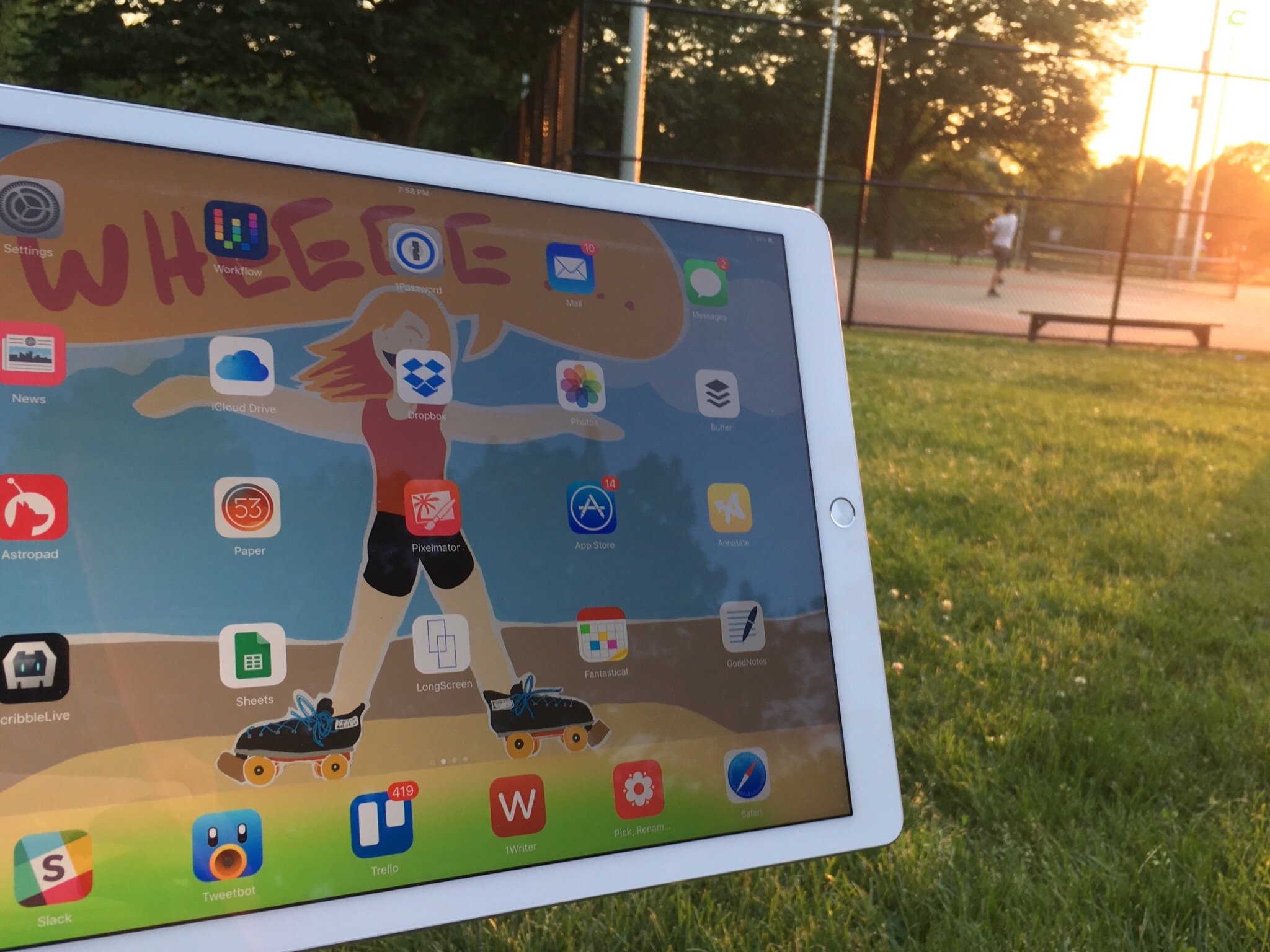
The app grid makes a lot of sense for the iPhone, but on a 12.9-inch screen it looks more like wasted space than actual organization.
I'm pretty sure I've been asking for this since the very first iPad — and its overly-spaced grid of app icons — appeared, but I'm feeling good about this change actually happening in iOS 10. What better time to rethink how apps are displayed on the iPad? The grid makes a lot of sense for the iPhone, but on a 12.9-inch screen it looks more like wasted space than actual app organization. (And, in all honesty, I currently use the Spotlight search bar to launch apps about 95 percent of the time on my iPad Pro, rather than tapping on icons.)
11. Multiple user accounts
While the iPad Pro in our home is solely my device, there are many families and groups who operate otherwise: Anyone with kids knows the pain of endless folders of iPad games, or adults who have to sign in and out of their respective accounts to use iCloud. But I suspect that multi-user support is, at last, coming — in large part due to the education market.
After many pleas for a multi-user option, Apple debuted the feature in iOS 9.2's education package; school administrators with iPads for classrooms can configure them to support multiple children and their data and apps — all without taking up precious storage space on the device.
I'm hoping that this was Apple's initial test run into making multi-user a reality for all iPads, not just education-configured models: The company had to do most of the heavy lifting when conceiving multi-user for education, and now has months of in-classroom usage data to help refine it for the average user.
12. Multi-stream audio for playback and recording
Though it appears halfway into this article, this feature is one of my personal top three for iOS 10 — in part because it's a must-have for podcasters, musicians, or anyone looking to record audio. Right now, the iPad can only pass audio into one app at a time: If you're using Skype, for instance, you can't hop over to GarageBand and record your mic locally.
There are apps like Audiobus that attempt to solve this problem with special code in each app, which allows them to talk to each other; unfortunately, developers on each side of the app need to implement that code before it works — in other words, no Skype audio in GarageBand.
If Apple truly wants to position the iPad as the creative professional's device, giving creative pros the tools they need would be a big step in the right direction.
13. On-device coding
Getting audio right is a big step; letting developers work on the iPad Pro opens up another big sector where the tablet is lacking: coding. Save for a few smart HTML/CSS editors like Coda, writing any sort of code and committing it to a central database is next to impossible on the iPad — and you're completely out of luck if you want to try writing a program for the iPad on the iPad.
If you want users to build apps for your platform, they should be able to build apps on that platform.
When it comes to bringing something like Xcode on the iPad, I firmly believe the answer is not "if", but "when": It's a huge undertaking — and requires a definitive rethink on how users manipulate their code and interface — but at the end of the day, if you want users to build apps for your platform, they should be able to build apps on that platform. I'm not expecting a full version of Xcode for iPad when iOS 10 debuts, but something like Playgrounds for iPad would be an incredible way of opening the door to coding and compiling on a tablet computer.
14. Improve text selection
Largely, iOS has kept to the same sort of text selection shortcuts throughout its entire life: The tap to select and edit-handle-maneuvering was novel when it debuted, but on an iPad Pro, it can get tricky — especially when in certain apps that want to grab entire paragraphs rather than single words or lines.
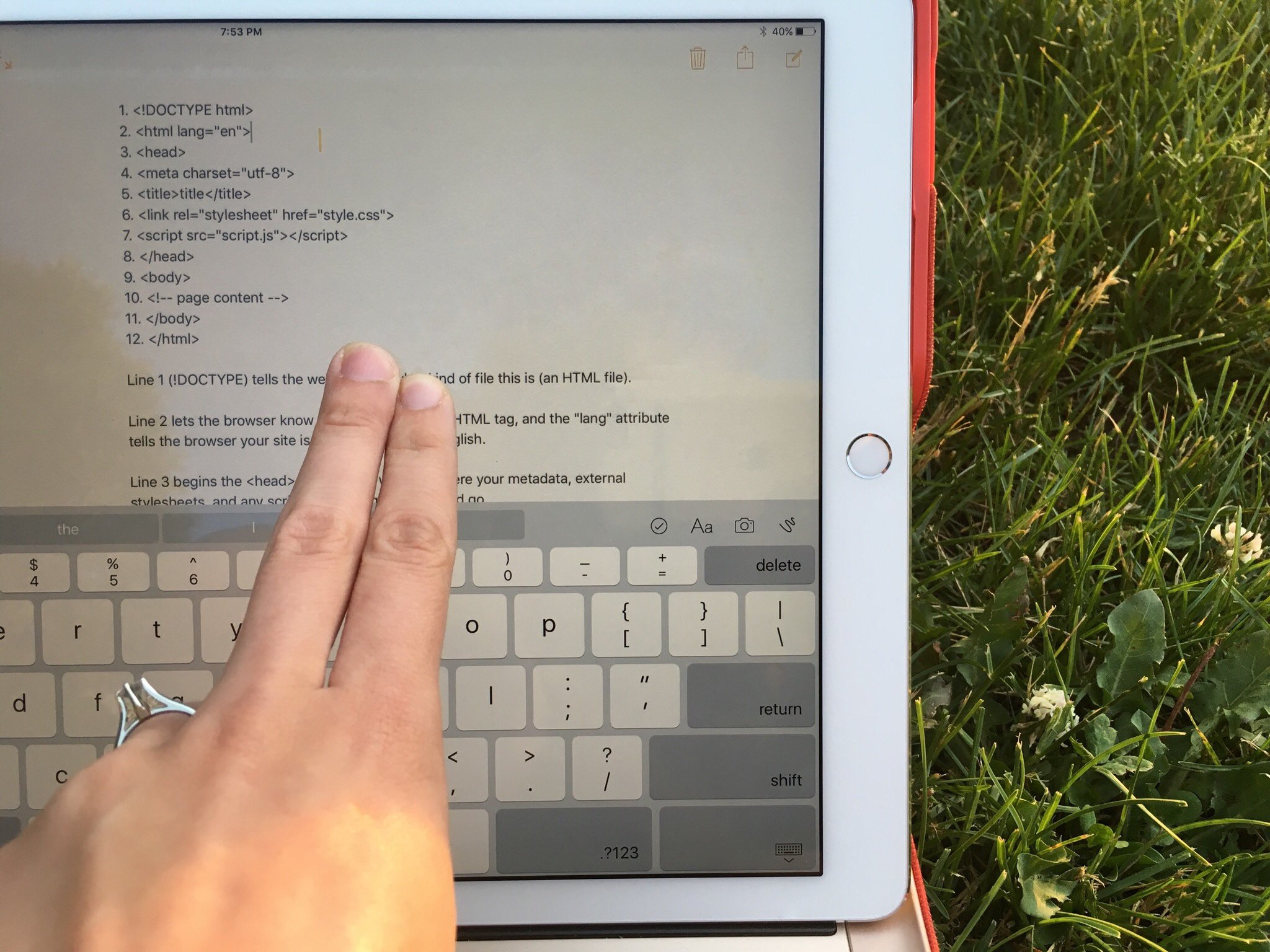
The iPad's software keyboard does offer two-finger-tap-and-drag to move the cursor and select, but after doing so, you don't get the same pop-over as you would if tapping and holding on a word; that kills a lot of gains from the precision, since users can't paste data (URLs, for instance) after moving the cursor appropriately. Adding that pop-over after two-finger iPad interactions would solve most of my text-selection woes, but I'd love to see Apple at least entertain a text selection rethink.
Apps

There are absolutely great system and third-party apps for the iPad Pro, but iOS 10 could make both a great deal better. The next big version of iOS gives Apple a huge opportunity to rethink some features in its own apps and vastly improve the third-party ecosystem with incentives and a strong framework for aspiring professional software developers.
15. Support the app ecosystem
If Apple wants professional iPad apps, then developers need to be able to charge pro-level prices and not get punished for it.
The market for excellent, professional iPad Pro apps is a difficult one, and it's one many folks smarter than me have spent thousands of words discussing. App Store economics make it difficult to charge a high price for semi-pro or pro apps, and Apple currently seems uninterested in helping change that. But if the company wants the iPad Pro to flourish, it needs to rethink that attitude.
Hardware is not the limiting factor to great iPad apps — it's all about good developer support. Apple has eschewed the idea of free trials and shareware on iOS in the past, but a redesign of the App Store in iOS 10 might open the door to such things for professional apps. $1 or in-app-purchase games are all well and good on the iPhone, but a professional photography editing program or audio editor can't rely on in-app purchases or yearly subscriptions paying for its development costs. If Apple wants pro software on the iPad, then developers need to be able to charge pro-level prices and not get punished for it.
16. Make the Music app not suck
Right now, the Music app looks like a wide-screen version of its iPhone cousin — all that extra space is filled up with white background, save for a column-view of your personal music, and even that isn't particularly attractive. The Mini-player in full screen is perhaps the biggest example of this insanity: The album art takes up two-thirds of the screen, with tiny touch targets for play, pause, shuffle, and Up Next. Music is also one of Apple's stock apps that doesn't yet support Split View.
The Music app needs to be more functional and less a blown-up clone of its small-screened cousin.
All that needs to change in iOS 10. The app needs to be more functional and less a blown-up clone of its small-screened cousin, and Split View is a necessity. I almost wonder if it would make sense for the Music app to create a pop-over similar to iOS 9's picture-in-picture option: Tap a button to let the Music mini-player hang out as an overlay on any of your apps or Home screen. Maybe pop-over mini apps should be an option for all developers...
17. Let us create Smart Mailboxes and Playlists
When iOS first debuted, it made sense to avoid the advanced-user trickery of the Mac OS's smart searches — the operating system was built for a smartphone, and Mail rules or smart photo searches seemed like unnecessary complications.
As time progressed, Apple added under-the-hood smart mailboxes like the Attachments folder, but the company still hasn't offered customizable smart mailboxes, music playlists, or photo searches. That should end in iOS 10, especially on the iPad Pro: We're losing out on a lot of valuable data by not being able to build our own smart options, especially when those options are niche and may never fall into public favor. (If Apple had introduced smart photo albums back in iOS 7, for instance, it could have avoided years of journalists clamoring for a stock Screenshots folder.)
18. Options for local downloads
I understand why smart caching exists on iOS, especially for lower-capacity devices. But even so, I'd love the ability to mark certain files, photos, videos, music, or mail messages as "always-downloaded" — protecting them from getting cache cleared off the device And being forced to rely on the iCloud-stored version.
There are many reasons to want locally-stored files — going somewhere without Internet access, for instance — and while I appreciate Apple's desire to make things simpler for most users and ensure they don't eat up their storage space, it's also infuriating to those of us who need certain files readily available, Internet connection or no.
19. Turn Markup into its own app
It seems weird to have features like Markup live only inside Mail.
I've been begging for a version of Preview on iOS for at least four years, and I'm doubling down on it for iOS 10: With features like Markup and more users than ever interested in viewing PDFs and marking up documents, it seems weird to have those features live only inside Mail. Instead, a system-wide Quick Look — powered by a new Preview app — would make the process more seamless and give power users a native app to work from. Preview on iPad Pro could also solve a lot of Mail's problems with properly displaying attachments and unzipping files.
Miscellaneous fixes
Like Apple's "tiny things you missed in this version of iOS" slide, I've got plenty of other nitpicks: Mail's terrible multi-folder search, permanently preventing websites from loading the mobile version of a page on the iPad Pro, updates to Pages and Numbers, and (in my dreams) mobile versions of Logic and Final Cut to pave the way for pro apps on the platform. But there are only so many engineers working on iOS 10 in Cupertino and only so many hours in the day and days in the year.
What are your biggest hopes for the next version of iOS and the iPad Pro? Let us know in the comments!
Serenity was formerly the Managing Editor at iMore, and now works for Apple. She's been talking, writing about, and tinkering with Apple products since she was old enough to double-click. In her spare time, she sketches, sings, and in her secret superhero life, plays roller derby. Follow her on Twitter @settern.
