Could last Friday have been any more massive for Apple? Following on the heels of slew of preparatory updates including OS X 10.5.4 and iTunes 7.7, the transition from .Mac to Mobile Me, and -- oh, yeah -- the highly anticipated launch of the iPhone 3G hardware (see Dieter's review), Apple also dropped a little something called the 2.0 firmware. Available pre-baked in the new iPhone 3G, Apple didn't spare the love for owners of the original iPhone 2G who receive it as well as a FREE downloadable upgrade, as do owners of the iPod Touch (minus the phone, camera, SMS, and GPS functionality, and the FREE part -- $10 please).
The 2.0 firmware was first demonstrated back at the Apple iPhone SDK Roadmap event in March 2008 and immediately went through a very long, very public beta process where almost anyone could sign up and download it. In spite of the NDA (Non-Disclosure Agreement), during the 8 different betas released to developers, many new features that weren't originally demonstrated still leaked out all of the interwebs. But did all of them?
Read on to find out!
What Hasn't Changed
Before we dive in to all the new hotness, let's just get some housekeeping out of the way. Some apps remain pretty much unchanged (at least to our eyes!) from the 1.4 firmware that immediately preceded this release. This includes:
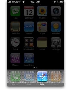
- Home. 3G label replaced E(DGE) for the new hardware, and dock icons look to get a tad more translucent when they zoom out or back in, but otherwise its the same Springboard as before.
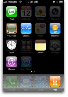
- Text. SMS messages tweaked to allow following or bookmarking of texted linls, but still no SMS forwarding. Still no MMS.
- YouTube. It's your vidz, what else did you need? Oh... inline Flash...
- Stocks. Same old widgety goodness from the last gen.
- Weather. See stocks. No HTC Touch Diamond-style animated goodness here.
- Clock. What do you want, it's timeless!
- Notes. Still no sync. Still no integration with the other PIM (Personal Information Management) apps. Still no landscape keyboard. Stevie, please!
- iTunes. Icon tweak aside, you can still buy songs over WiFi, and that's still it. No media and nothing long-form.
- iPod. Gets some small tweaks like video rotation (you can watch portrait or landscape now), and video podcasts are gone from the audio section, so no more listening-only option (?!). But how about metadata? A2DP Stereo Bluetooth support ?
Sure, constraints on time and resources, not to mention battery life trade-offs mean we can't have everything and all at once, so let's see just what Apple did choose to update this time around...
Calendar
The most visible for every user in Calendar is color! No longer doomed to dull blue, the new Calendar 2.0 will retain your color settings when you sync from Outlook or iCal, and what's more -- will use transparency effects to visualize overlapping effects. Very sweet.
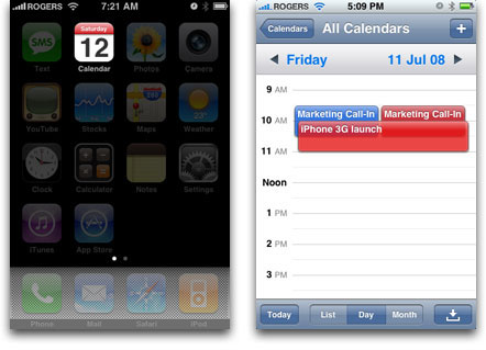
The biggest change overall, however, is integration with over-the-air, wireless syncing via "push". For more details on these, see our already-posted reviews for both Microsoft Exchange ActiveSync and Apple MobileMe "Exchange for the rest of us" service.
Camera
The Camera 2.0 software has also been tweaked to improve image quality but the big news is that it is now location aware, which means it will geo-tag your photos.
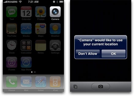
For more on how CoreLocation services work, including how to grant and reset permissions, check out the sections on Maps and Settings (below).
If Flickr popularity is any indicator, a lot of people will welcome these updates.
On the minus side, there's still no ability to tweak basic camera settings, however, and no Mobile iPhoto-like post-processing options have been added. Apple may figure users will do this once they sync back to their computer, but if you want to take a shot and quickly email it upload it, the ability to do basic corrections on the iPhone itself would be more than handy.
Photos
Photos is mostly unchanged from 1.4. The only difference is that now, in addition to photographs taken with the iPhone's built camera, the Camera Roll also store screenshots.
How do you take a screen-shot? Press the Home Button and Sleep/Wake button (on the top) at the same time.
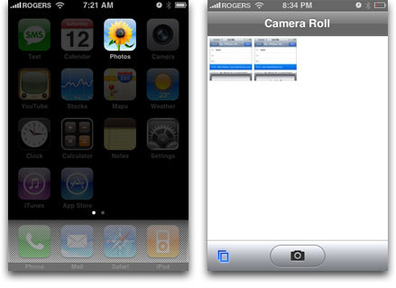
For the iPod Touch, since it lacks a camera and hence a Camera Roll, screen caps are stored under Saved Photos.
An almost invisible addition if you don't know about it, it's still much appreciated (especially by reviewers, no doubt!)
Still no ability to tweak photos, Mobile iPhoto-like, but as a viewer -- and a way to stun crowds with accelerometer spinning, finger-pinch zooming -- it's still a killer app.
Maps
Maps 2.0 gets a minor face lift, using the more literally page curl icon to activate -- what else -- the page curling to reveal the extra options added during the late 1.x era.
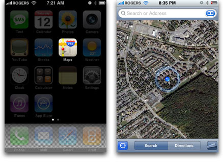
For iPhone 3G owners, however, Maps also adds the much more precise location functionality provided by the new aGPS functionality. Rather than just the large blue circle (sometimes encompassing entire city blocks) that Google cell tower mapping and Skyhook's WiFi Router mapping provided previously, aGPS now gives a small blue dot within yards/meters, if not right at your exact current location. (Complete with eye-candy fading ripple effect).
Leveraging the cell and WiFi location services to handle some heavy lifting, the aGPS is remarkably snappy.
Moving? No problem, the blue dot will follow you.
From staying on route to keeping track of where you parked (via the pin drop), this functionality is huge, especially for people who have no inborn sense of direction... (present!)
Note: Like all location aware apps (including Camera and even 3rd party App Store apps like Twitteriffic), Maps will ask your permission to use your current location the first few times you launch it. Keep agreeing and it will stop bothering you. If you later have privacy concerns, you can revoke your permission in the Settings and force it to ask you again next time (see below). In the age-old battle between convenience and security (where the former often -- and unfortunately -- trumps the latter), this is an interesting and acceptable solution.
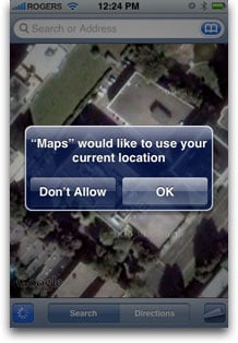
Incredible new functionality, though it is lacking in turn-by-turn
Calculator
Apple's Vice President of Design, Jonathan Ive, loves him his mid-1900s Braun, and few places is that more obvious than the iPhone's Calculator app. While the basic app itself remains unchanged from 1.x in its default, portrait mode, if you switch to landscape, Calculator 2.0 now switches with you, expanding to become a full-on scientific calculator.
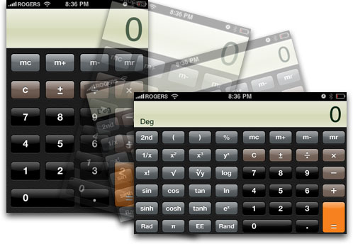
While I have pretty much allowed myself to atrophy into a near math-lexic state, this had been a long requested feature and is a very welcome addition.
What would also have been a very welcome addition? The ability to backspace to precisely correct input errors. The ability to nuke the entire current display with the "C"-Clear button may be more in keeping with the 50 year old physical calculator from which the iPhone calculator was derived -- and thus default behavior for those raised on said calc -- it's just not how modern computer input should work. Bad user experience.
Settings
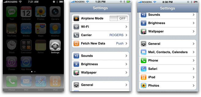
While Settings is not the sexiest app in the bunch, it underpins pretty much everything else and has received quite a few updates in 2.0. Fire and foremost is a new "Fetch New Data" section, while "Mail" has been renamed the MobileMe- and ActiveSync-enabled "Mail, Contacts, Calendars".
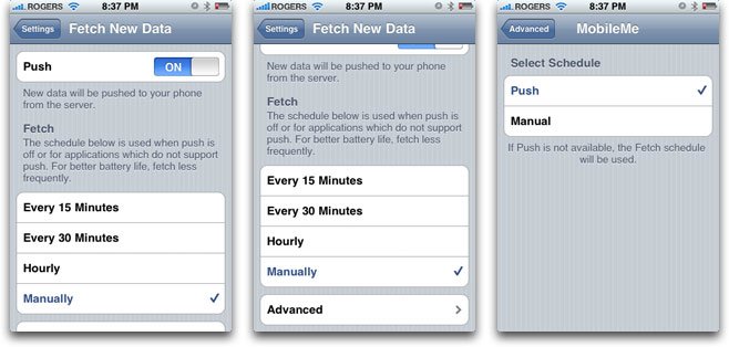
The Fetch New Data panel lets you globally toggle "Push" data syncing (for MobileMe and ActiveSync), schedule fetch/pull requests (e.g. for POP or IMAP email checking), and an Advanced panel to select Push or Manual (with the same type of scheduling set up in Fetch) for MobileMe.
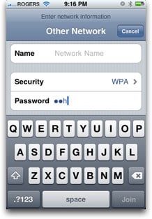
Although a system-wide change, one thing is obvious in Settings that's fantastic news for anyone that uses strong, even pseudo-random passwords (no, not cut, copy, and paste, don't be silly!). Apple has changed the way password fields work, now leaving the last character you typed visible for a few seconds so you can minimize the chance of typos. Not perfect, but lightyears ahead of the old system which pretty much made everyone and their IT department shorter and simplify passwords, again trading security convenience. Good Job!
General Settings adds a new On/Off toggle for Location Services, to globally allow your iPhone to use the Google cell, Skyhook WiFi, and for iPhone 3G, aGPS technologies to keep track of where you are -- or not.
A new section called Restrictions allows you to selectively disable (via a 4-digit Pin number), iPod content flagged as "explicit" (though sadly only for violence and adult subject matter, not explicitly poor taste or writing/production...), and potentially inappropriate Safari web pages and YouTube videos, as well as access to spend money on the iTunes WiFi Music and App Stores.
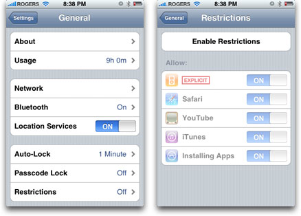
Good stuff there for parents, even if no toggles will prove perfect and parents will still need to monitor their young hax0rs lest they find a way around them.
The Keyboard and International sections have been beefed up in anticipation of Apple's 70+ region eventual iPhone 3G rollout (and since the iPod Touch has already been available for almost a year in most areas, about time too!)
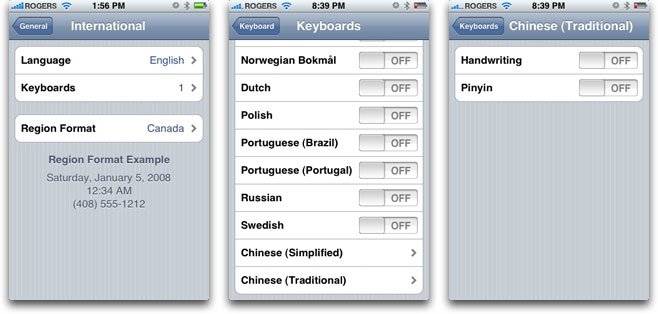
Yummy. Having done a couple of years of Mandarin, while I haven't had the chance to try out the Chinese handwriting recognition yet, I'm eager to and will definitely report back in a future post.
Last in the General Settings, Reset has been updated to let you change your mind about previously allowing or disallowing location services (for the Camera, Maps, and some App Store Apps), and to go along with the new emphasis on enterprise features, Apple's enabled Secure Erase, and warns it will take 2 hours just to prove it's serious.
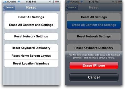
Given previous reports that AT&T refurb iPhones contained the data from previous users, this is an important addition to a device that can easily contain all your personal and business data. Hopefully -- for Steve Gibson's sake! -- Secure Erase uses several passes of pseudo-random data writes, and not something patterned like zero-ing out, which can still be subtracted to reveal the underlying data -- if you have the tech and the will to go to the trouble, of course!
For Mail, Contacts, Calendars, in the Mail, the only new addition is the ability to add Microsoft Exchange ActiveSync and Apple MobileMe accounts (see our previous walkthroughs for more). Contacts and Calendars give similar options, allowing you to choose which account you want as default, how you want your information sorted and synced, and other bread-and-butter style management features. Newly added is the ability to Import SIM Contacts, which may be useful for people upgrading from GSM feature phones and who stores a lot of data on their SIM chips. For ActiveSync Calendar users, you can toggle New Invitation Alerts On/Off.
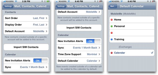
The last major change to settings is that now App Store apps, like AOL's AIM, can add their own panels to Settings. Not all do, with others choosing to keep their own local settings within the apps. Daring Fireball, Ignore the Code, and others have commented on the relative merits and implications for Apple's Mobile HIG (Human Interface Guidelines) for both approaches. I'd just add that Mac apps can have their own Preferences, or can add panels to the global Settings app. Perhaps the iPhone environment could likewise label local options as Preferences to avoid user confusion with the Mobile Settings app proper.
App Store
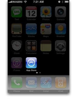
The only new icon on the first page of the 2.0 home screen, App Store is potentially the killer feature of 2.0, and one of the biggest ripples in the mobile market thus far. Check out our previous coverage in Brian's How To review.
The core concept really is game changing, but even as some accuse Apple of being too controlling (and they are to the extent they will not allow certain classes of apps, nor the discussion of the SDK in public), they obviously weren't controlling enough to keep out the silly, duplicative, buggy, ugly, and sleazy dev dwarves. But we'll post more on that later.
Bottom-line for me? The cream of the crop put to shame any previous mobile development ecosystems. It really might be the next major computing platform...
Phone (and Contacts!)
Phone's changes are primarily in the Contacts section, and as special bonus, Apple snuck the iPod Touch's dedicated Contacts app into the 2.0 firmware for iPhone users as well (though the hid it on the second screen). What's the point? Well, first its nice to have if you just want to access your Contacts in fewer taps. Second, unlike the Phone app's contacts, Nate Bird points out that the Contact apps allows for you to add contacts while speaking on the phone. Nice bit of extra functionality there!
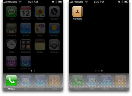
Rounding out the contacts goodness is the long awaited ability to search your contacts. If you're at the top, you'll see the search box ready to go. If you've already scrolled down, just tap the magnifying glass icon above the letter A on the alphabet running down the right side, and you'll be whisked back up to it.
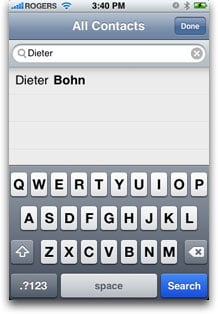
Drawbacks? It's... not exactly zippy to bring it. We're talking EDGE speed here, not 3G for the interface. But that problem plagues more than just contact search, so I'll save it for the end.
For the rest of the enhanced contact functionality, see our previous reviews for Microsoft Exchange ActiveSync and Apple MobileMe.
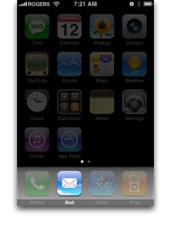
At the risk of being repetitive, the major new feature in MobileMail 2.0 is the "push" integration of add Microsoft Exchange ActiveSync and Apple MobileMe (see our previous reviews for the details).
Management gets a boost with multi-move and multi-delete functionality. Unlike 1.x, where you had to individually select and approve each message for deletion, in 2.0 you can select as many as you see and wipe them out all at once. Great for nuking "push"-spam according to Dieter!
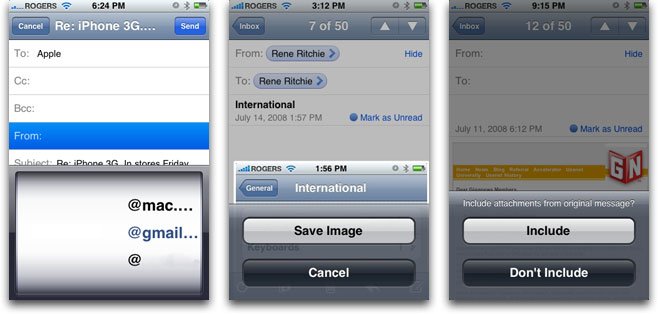
Smaller, but also very nice new additions include, if you've setup multiple accounts, the ability to see which account your sending from, and change it on the fly if you want to.
Receive a picture in an email? Now with 2.0 you can hold your finger down on it for a second, and Mail will ask if you want to save the image. If you do, it will be filed in the Camera Roll, same as screen captures. (Or the Saved Images if you're using the iPod Touch).
I also noticed (though haven't been able to verify yet if this is new to 2.0) that when forwarding an email, I was prompted as to whether or not I wanted to include the attachments. If this isn't new, d'oh! Where've I been? If it is, equally sweet.
Safari
Update: Safari did get much, much faster, especially in Javascript execution! Still, I'm waiting for a full MobileSafari update that brings in some of the new WebKit technology, like the lightning-quick SquirrelFish javascript engine, which should go a long way to speeding up and stabilizing some of the more script-intensive sites. HTML 5, CSS animation, audio and video tags, SQLite local storage, and all the rest as well...
Maybe in 2.4?
Right now we get the same image-saving ability built into Mail (see above), and according to Daring Fireball, a horizontal keyboard that's roughly 30 pixels shorter, consuming less of the vital real estate than it's 1.x counterpart. Personally, I didn't notice. Confession: I don't use it much. I'm fine with the vertical keyboard. Call me a mutant if you must, but I really like the keyboard. (But then, I never liked, and hated using, Treo and Blackberry hard keyboards, so maybe even more pariah than mutant, eh?)
For those who do prefer the landscape keyboard, Apple still hasn't seen fit to enable it system-wide, like in Mail, Notes, or any other app in which it might prove beneficial.
3.0?
Sigh.
Conclusion
Overall, iPhone Firmware 2.0 is a stunning achievement that really puts the iPhone on par with the Apple II and Mac as one of the great revolutions in modern technology. It takes it beyond simple Phone + iPod, or even smartphone, and makes it the leading contender for the next great shift in computing.
That said, it's still far from perfect, and more to the here and now, suffers from stability issues and overall sluggishness problems that make me think Apple was cramming until the very last minute to finish the 2.0 release. That some users have reportedly fixed their problems (including overly-yellow screens, App Store app crashes, etc.) by hooking up to iTunes and restoring to a 2.0 firmware 2 build numbers later than the one that shipped makes this seem even more likely. (And no doubt, Apple is already prepping a 2.0.1 or even 2.1 update to polish things up -- hey, it happened with the original iPhone!).
If I had to give it a score right now, it would still be a 10, with the understanding that when it came to the 2.0 release, the bar was reset to 11 early on.
If you're an iPhone 3G owner, you already have it. If you're an original iPhone 2G owner, it's a free -- and therefore no-brainer -- upgrade (now that Apple's servers are working again!). If you rock an iPod Touch, and are worried about the $10 "non-subscription accounting mandated" charge, I would still recommend it. It's almost the exact same price as Super Monkey Ball, which many of you will want to download immediately there after...
So there it is, my iPhone 2.0 review. Did I miss anything? Have you discovered any more hidden gems buried anywhere? Let us know!

Rene Ritchie is one of the most respected Apple analysts in the business, reaching a combined audience of over 40 million readers a month. His YouTube channel, Vector, has over 90 thousand subscribers and 14 million views and his podcasts, including Debug, have been downloaded over 20 million times. He also regularly co-hosts MacBreak Weekly for the TWiT network and co-hosted CES Live! and Talk Mobile. Based in Montreal, Rene is a former director of product marketing, web developer, and graphic designer. He's authored several books and appeared on numerous television and radio segments to discuss Apple and the technology industry. When not working, he likes to cook, grapple, and spend time with his friends and family.
