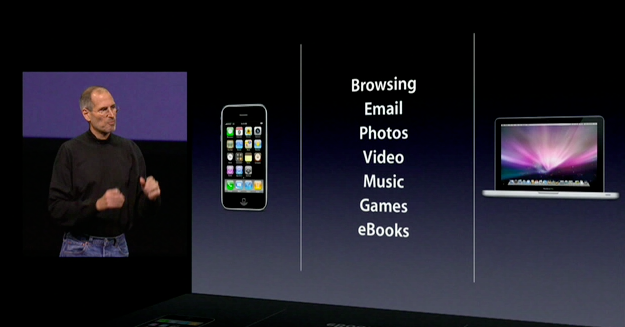
iPad is Apple's attempt to define something between the smartphone and laptop, to give the masses silky-smooth software and multitouch glass all wrapped up in unibody aluminum and complete ecosystem control -- to make mainstream the computing appliance starting at just $499. To do this, to justify the iPad's existence, to make us buy a device too big for our pocket and too small for our server room, Steve Jobs said it had to do several things better than either of the categories so well established before: browsing, email, photos, video, music, games, and eBooks.
Given the companies and products that have tried and failed before it, that's audacious even for Apple. Especially for a first generation attempt. How close did they get? Did they get close at all?
Dieter goes hands-on with the iPad hardware and Rene dissects the iPad software after the break!
iPad Hardware Review
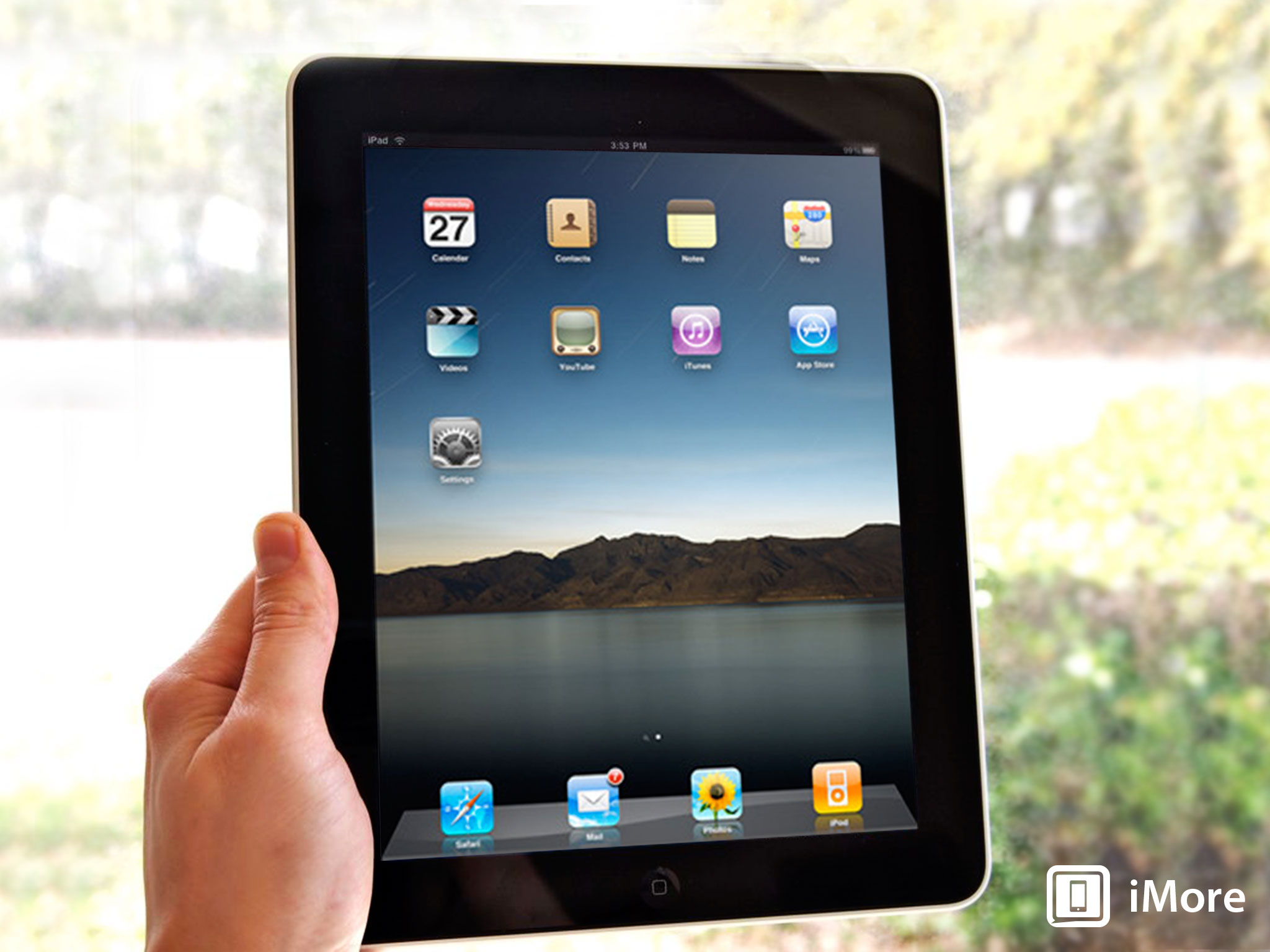
The iPad is 9.56 x 7.47 x 0.5 inches of polished glass and cool aluminum, everything the iPhone and iPod touch are taken to grand scale. Perhaps more than any previous device, however, the iPad's specs aren't what's interesting or even as important here. It's the experience.
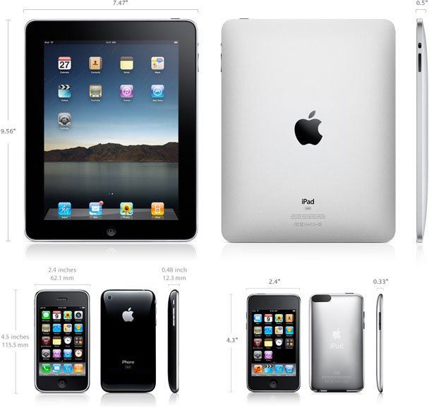
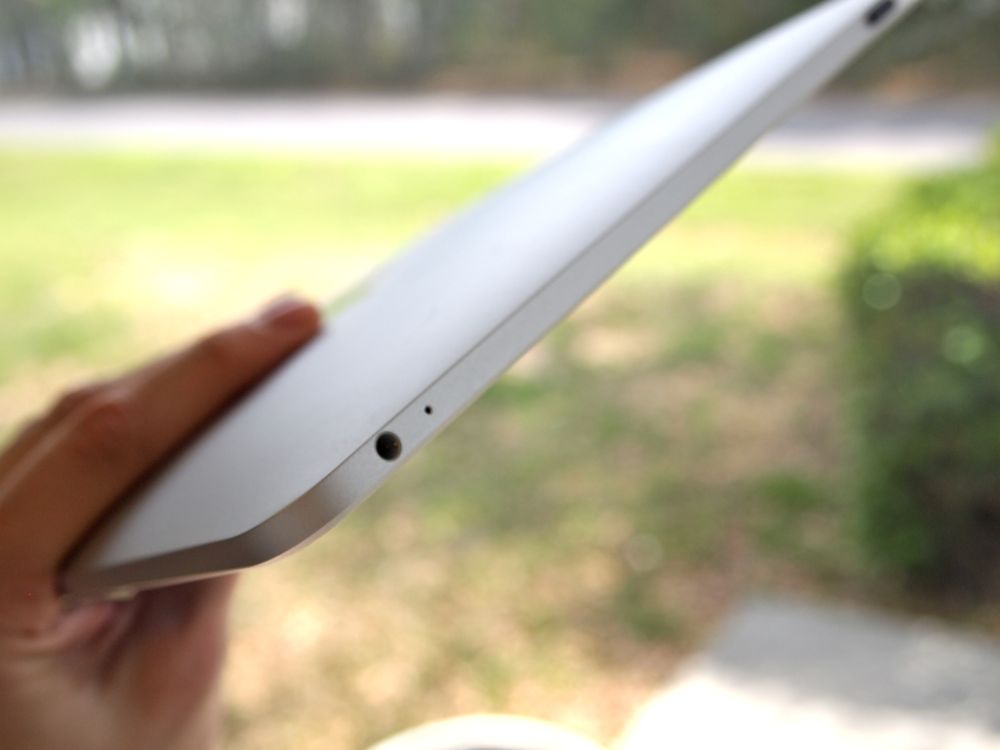
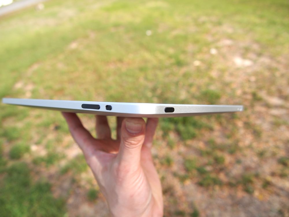
You've seen the photos and watched the videos, but holding the iPad in your hand for the first time really is a different experience. Of course it's solid and well-constructed, the large glass panel and aluminum back mean that there is no flex at all. The buttons are well-familiar by now - home, power, volume, and a switch that locks the iPad into landscape or portrait. They're all nice and clicky and as solid as the aluminum casing.
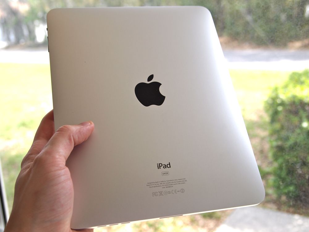
Speaking of that aluminum casing, it blocks WiFi signals pretty effectively. To get around that, Apple placed the WiFi antenna behind the plastic Apple logo. While all reports indicate it's a good antenna, I do find that I'm getting slightly worse reception on the iPad than I do on other devices. Apparently the 3G model will have a plastic strip on the rear panel so there's more room for the antennae to breath. It's too soon for me to say for sure, but I think it might help on the WiFi-only version as well.
I'm not sure why Apple went with a black logo on the back instead of a white one, but I like it. The fact that I'm reduced to talking about the color of the Apple logo should say something: Apple's designed this thing like they did the iPhone, by removing as many physical elements as possible so the device can become invisible and you can focus on the screen. Ignore the complaints about the bezel around the 9.7" screen - it's fine and doesn't seem as large in person as it does in photos.
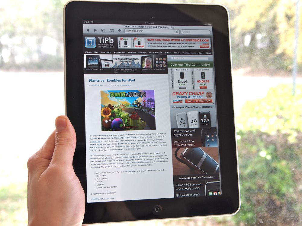
The screen is great - 1024x768 with 132 pixels per inch equates to just the right size, I think. Any higher resolution and not only would those iPhone apps look odd, but likely there'd be a lot of squinting going on. The screen also features 'In-plane switching' (IPS), which means that you can view the thing from pretty much any angle. Fingerprints and reflection: both definitely there and a nuisance, but with the bright screen on you don't notice them too much. The glass is 'oleophobic,' so fingerprints are easy to wipe off.
I'm forever grateful that Apple switched the silent switch to the rotation lock - the accelerometer on the iPad is very sensitive. On balance, I think Apple did the right thing by having the screen rotate so quickly and easily. There's nothing more frustrating than repeatedly tilting a device to rotate the screen. It's a testament to the fast processor and to the way that OS is built that you never have to wait or try hard to rotate the screen. Dang, though, the iPad sure does flip the screen around quite a bit.
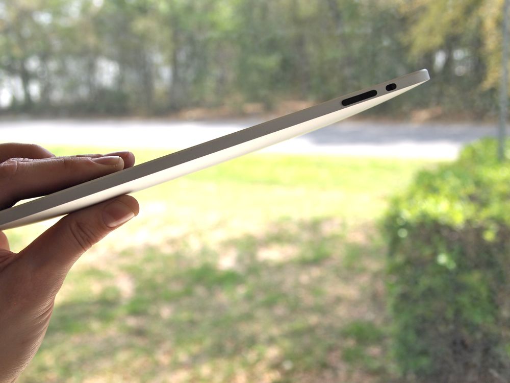
Put me in the camp that isn't disappointed that the iPad isn't widescreen. For web browsing, a 16:9 screen would get annoying really fast. Also, honestly, you spend a lot of time switching between portrait and landscape and if we had a long, narrow device the change in page rendering would get old mighty quick.
At 1.5 pounds, I initially was worried that the iPad would be too heavy for me - or at least too heavy to justify a spot inside my gear bag. After using it for a few days and toting it around, my basic feeling is that I wouldn't complain if the thing shed a half a pound or so. It's heavier than you might expect and holding it up in one hand gets tiring pretty fast. You'll find yourself leaning back and setting it on raised knee (Henceforth: the iPad Position), setting it flat on a table and looking down on it, or perhaps using Apple's folio case to prop it up. Either we will all get beefy forearms and wrists or we'll be choosing furniture that's more conducive to raising your legs up. iFixit's iPad teardown actually reveals quite a bit of empty space inside, my guess is Apple spent quite a long time balancing weight and battery life.
On that balance, Apple clearly went for longer battery life and I fully applaud them for it. In my first few days of testing, I can say that the iPad definitely achieved Apple's 10 hours of use. Cranking the screen brightness up to 100% will cut down on that, though - I had it set high for several video reviews and noticed the difference. The bottom line is that you don't need to fret too much about battery life.
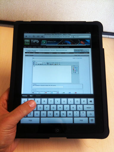
I expected typing on the iPad to be completely abysmal, but I'm happy to report that it's better than I expected. The portrait mode keyboard is strictly hunt-and-peck, but I do wonder if I might get faster with prolonged use. I've spent so long one-handed typing that apparently my right hand has key placement ingrained in more than just my thumb - I can truck along fairly quickly. In landscape mode I find I can type faster than I expected too - much faster than I have ever been able to on my Dell Mini 9 netbook. The trick for touch typists it to pretend you no longer have pinky fingers. Apple's second-to-none autocorrect helps out here as well.
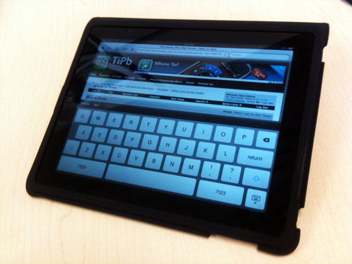
The speaker is loud, but even though it's a little gimmicky on a device of this size I do wish there were two speakers for stereo. The headphone jack works, sound is crisp and loud. You can hold down the volume-down button to immediately silence all sounds.
The experience of using a touch screen this large is surprisingly intimate. With an iPhone (or any smartphone), the ergonomics of having something small in one hand means that you're tapping with one finger or two, often (literally) at arm's length - the touchscreen is small and at the 'end' of your fingers. With the iPad, you need to use larger gestures, your hand floats above the screen instead of the tips of your fingers. The ergonomics require you to either recline and set it in your lap or lean over it on a table. If the television is a 'lean back' interface and the computer is a 'sit forward' interface, the iPad is an 'embrace' interface. You haven't had a relationship with an object like this since your childhood teddy bear: you tote it around with you everywhere, you sit cuddled up with it, you take it to bed with you.
iPad Software
When you boot up the iPad for the first time you see the familiar silver Apple logo. Then the Home Screen flies in and you realize it's not a big iPhone -- it's an iPhone gone IMAX. It's familiar the way IMAX is familiar to anyone who's seen a movie, but it's so much more expansive, it so fills your field of vision that you get a small rush that doesn't go away until several home button presses later.
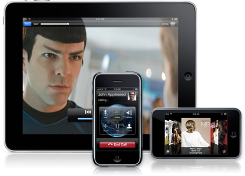
Looking at it, the graphics are crisp and clean. Even though the pixel-per-inch ratio is less than the iPhone, it's sharp enough to look like a photo and that's another feeling that doesn't quickly fade. Touching it, the sheer speed of the user interface is impressive. While the iPhone 3GS and Nexus One are fast, the iPad simply flies. From swiping between Home Screens to typing on the virtual keyboard to the transitions and transformations of the built-in apps, there's no hint of disconnect, much less lag.
That look, that feel, combine to make the iPad the most intimate digital interaction experience we've ever had. When Steve Jobs said you had to use it to understand it was a rare moment of understatement from Apple's master orator. It's better than we thought it would be, and we're an enthusiast site.
That's not to say it's perfect, however. Far from it. But we'll get to our pet peeves in a moment. We started off with the overwhelming presence of the iPad for a reason -- it's more than the sum of its software. It may not be magical or revolution in specs or bits, but it feels like it is when you use it. Even when it frustrates, and it does frustrate at times, that feeling, that connection to the iPad itself remains. That's the part Apple nailed.
One to the specifics now, and specifically whether or not Apple nailed browsing, email, photos, video, music, games, and eBooks to make the iPad more than just a feeling.
We're going to note up front that the iPad runs what Apple confusingly calls iPhone OS 3.2. That's because it's based on the mobile version of OS X that Apple originally debuted with the 2007 iPhone, but has since been used to power the iPod touch and now the iPad as well. Moreover, and even more confusingly, iPhone OS 3.2 currently only runs on the iPad. Make of that what you will, but it means if you're new to an iPhone OS device, our iPhone 3.1 and iPhone 3.0 software walkthroughs contain a lot of material that applies equally well to the iPad. We've also done an iPhone 3.2 for iPad preview, linked here for completists sake.
UPDATE 1: At WWDC 2010 Apple renamed their mobile operating system iOS.
UPDATE 2: Apple has released iOS 4.2 for iPad.
UPDATE 3: Apple has released iOS 4.3 for iPad.
UPDATE 4: Apple has released iOS 5 for iPad.
Interlude: iPad iPhone OS 3.2
1. Browsing
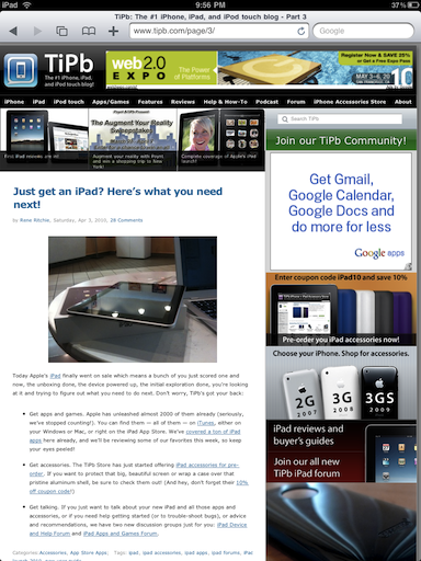
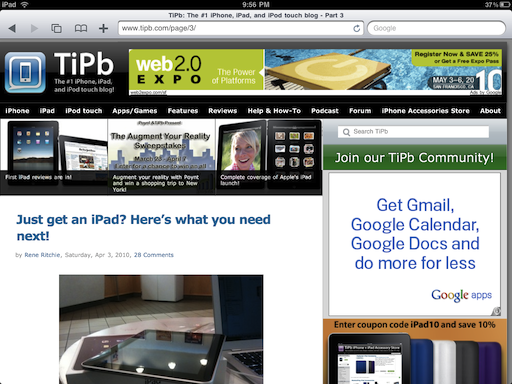
When you browse on an iPad in a very real sense the device falls away and all that's left is you and the web. The iPhone taught us how to multitouch our way around, how to swipe and flick and pinch and tap without the intermediation of mouse or trackpad. The iPad takes that to a whole new level. Simply by virtue of its size and resolution you see much more of the page, and the use of popovers (think drop-down meets pop-up) rather than iPhone-style full-screen menus makes for a calmer, more settled experience that perfectly fits the concept behind a tablet device.
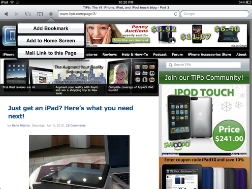
Controls have moved from the iPhone's bottom menu to the iPad's top menu (a global change better suited for a wider, two-handed device) but remain pretty much the same: back, forward, pages, bookmarks, and add.
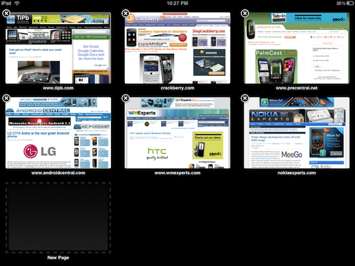
If you're not familiar with the iPhone or iPod touch, pages is the metaphor Apple uses instead of tabs to keep multiple web sites "open" at the same time. Due to RAM constraints, only a few actually remain in-memory, so if you haven't used on in a while, they'll have to reload when you go back to them. That's not a big deal on an always-connected iPhone or iPad 3G but something to remember for iPad Wi-Fi (since it might try to reload when you're off-network).
Unlike the iPhone and iPod touch, which scroll pages sideways, the iPad puts them into a 3x3 grid view, and instead of an add-page button, one of the grid squares tells you to tap it to add a new page. It works the same.
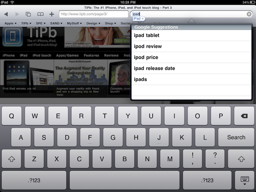
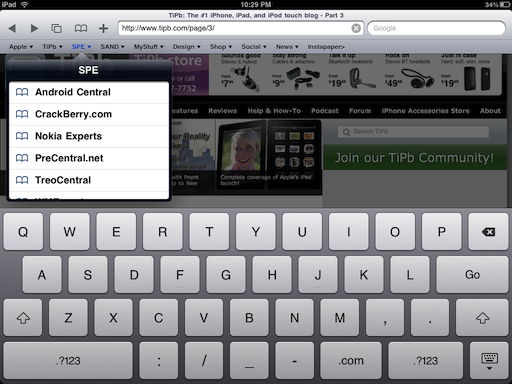
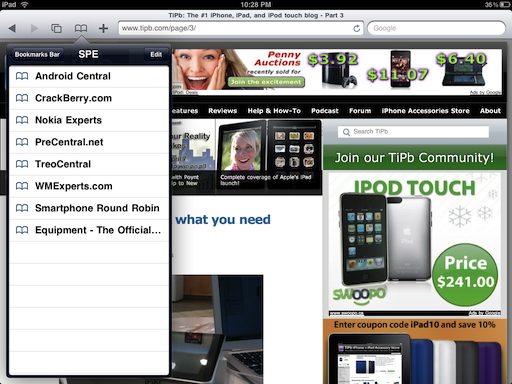
In a nice if not obvious touch, tapping on the URL or Search field reveals a bookmark bar identical to desktop Safari. Any links you put in the bookmarks bar folder are instantly accessible there, with popovers in place of the drop-downs. Pro-tip: this is a great place for your Facebook, Instapaper, or other favorite bookmarklets (especially the find-in-page bookmarklet since even iPad Safari still lacks basic find-in-page functionality).
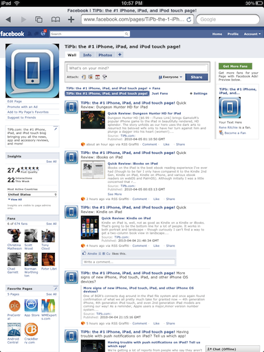
iPad Safari declares itself differently from iPhone or Mac/Windows Safari, so unless a website specifically decides to make the iPad site use the iPhone-optimized version, you'll get the "real" version. The good news is that HTML5, CSS, and Javascript -- aka standards-based -- websites work wonderfully in our experience. We were able to edit pages in popular CMS (content management solutions), tread through Google's new iPad-optimized Gmail, and pull up even the most over-stuffed of Facebook pages. Pro-tip: use two fingers to scroll inside a textbox or iFrame.
About the only thing that stopped us cold was Google Docs which, while we could view them, refused our best tapping efforts to scroll through or edit them. Oh yes -- and Flash, Silverlight, Java, ActiveX, or any other web plugins. Apple doesn't allow plugins of any kind. Knowing this, an increasing number of websites detect the iPad and serve up HTML5 instead. That's no replacement for the power of most plugins, of course, but it does mean your YouTube and CBS.com, your Vimeo and Ted, your Brightcove-powered (think New York Times, Time Magazine) and yes, even many porn sites, will play their video right in the web page just like you're used to (and many will let you double-tap for full screen video as well).
There's also no file system, which means no downloads. You can tap and hold to save pictures and view any document format supported by iPhone OS (PDF, Microsoft Office, Apple iWork, QuickTime audio and video) but you can't save ZIP or RAR files, download apps, or do many of the other file-oriented activities you can do on a Windows PC or Mac.
While we're on the subject of file systems, it would be nice to see Apple add access to the picture-picker (Photo database) in Safari, the way they and 3rd parties do in other apps. The simple task of uploading a photo to your favorite website is currently impossible within Safari for iPad (or iPhone). Working some Apple-intercept magic and making the picture-picker pop-up for websites that expected Windows Explorer or Finder would be sublime (making a unified document repository and letting it do likewise would be transcendent).
That may be why Apple used the word "browsing". iPad Safari lacks the always everywhere convenience of iPhone and the sheer power of desktop Safari, but even with those limitations, for sitting back and browsing the web -- for enjoying the consumption of it -- the breath and tactility of the experience really is better.
2. Email
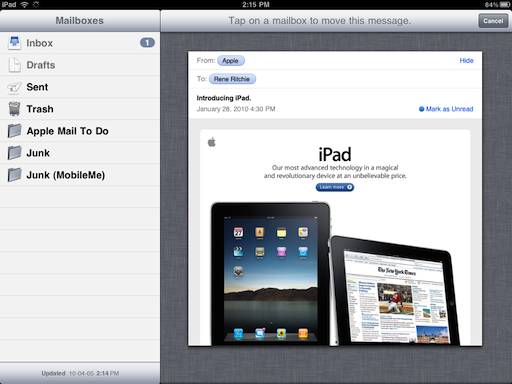
Mail on the iPhone involves a lot of tapping into and out of accounts, boxes, and messages. The limited screen real-estate causes most of that while Apple's lack of support for a universal inbox doesn't help (though Steve Jobs recently said that feature was coming). HTML email support is great and data detectors make acting on contact information quite easy. Mail on Mac (which is in no way more popular than Outlook but is the desktop client Apple itself makes) is infinitely more robust with said universal inbox as well as client-side rules/filters (including anti-spam), smart mailboxes (saved searches), event-based data detectors, full body search, and a multi-pane view.
In other words, Mail on Mac is far better than Mail on the iPhone. Steve Jobs wisely didn't position the iPad against the Mac or MacBook, however, but against a Netbook. The problem there is Outlook, Thunderbird, and other dedicated clients just as good, if not better (or simply better suited to the individual in question) than Mac Mail.
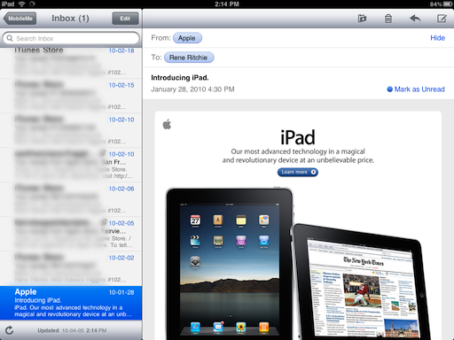
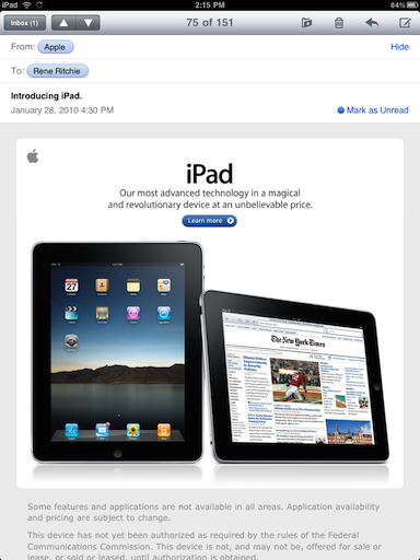
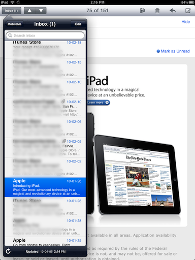
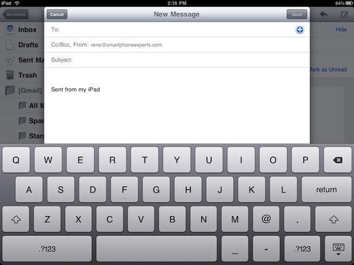
So while the very same factors that make the iPad a pleasure to use for browsing the web -- the larger screen size, the use of popovers (and in this case sidebars) rather than screen switches to handle menus, the overall speed of the device, not to mention the visual flourishes such as email stacks, make iPad much better than iPhone for handling mail, its dedicated Mail app just can't compare with a full computer client.
If your server doesn't have good spam filtering, the lack of client-side filtering on the iPad means you're left to manually manage tons of junk mail in your inbox, and that gets old fast. Lack of IMAP-IDLE support means no push email outside of Apple's own MobileMe or the single, built-in ActiveSync slot (that you could use for either Exchange or GoogleSync, but not both). Where the iPad often proved its value on the edge between portability and power, in the many cases where email is a power task the Mail app just isn't there yet.
(An argument could be made that the casual user targeted by the iPad doesn't need power email management features, but every user on the 'net these days benefits from power features like spam filtration whether they're even aware of them or not).
Perhaps poetically, the one place where the iPad matches and can even exceed netbooks for the casual email user is web mail in general, and Gmail in specific. Google announced experimental support for Gmail for iPad right before launch and given the excellent browsing experience it should come as no surprise that web mail is similarly outstanding on iPad. Best of all, Gmail's server side spam filters are excellent, and their quirky but powerful features like labels, stars, etc. work the way they're supposed to. (Exchange Outlook Web Access/OWA is also perfectly usable, but until Microsoft makes all the features available outside their own Internet Explorer browser, the use case isn't as compelling.)
3. Photos
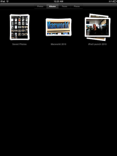
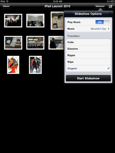
There's a button right on the lock screen that turns the iPad into an (optionally) animated picture frame. That alone answers the "better" question. It's a simple addition but a profound one given the mainstream audience Apple has in mind. Photos look so good on that big, bright screen, in fact, the slideshow feature alone -- which you can launch inside the app on a per-folder basis with more animation options and music pulled from your iPod app library -- will no doubt sell a lot of iPads.
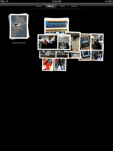
Another great addition is the ability to spread or pinch photo stacks to "peek" inside. If its the one you want, keep spreading and you get a grid view of all the photos. If not (or once you're done with the grid view), pinch it back down. On the full-screen, single photo view, you also get a horizontal line of thumbnails along the bottom that you can tap through to quickly get to the photo you want.
Photos was the first killer demo app on the original iPhone. Unlike that iPhone, however, iPad has some 3000 (and still sky-rocketing as of this writing) App Store apps available at launch and so it likely won't enjoy the same unique status here and now. It also lacks the convenience of the iPhone's photo-album-in-your-pocket, and the editing and managing power of Mac OS X's iPhoto.
It does make use of iPhoto '09's Faces and Places feature if you happen to sync over from a Mac. Those use facial recognition and GPS features to organize your pictures into groups of people (all your photos of mom, for example), and locations (all your photos of the Vancouver Olympics). Faces get a Polaroid-style presentation while Places are represented by pins on a Google-supplied map (yes, despite the rumored tensions, Google is still present on the iPad).
For Windows PC users, you're limited to Photos (all pictures) and Albums, but Apple continues to fail in providing good syncing sources outside their own platform. Steve Jobs saying there were no plans to support Picasa is a good indication they won't be addressing that deficiency any time soon.
While in an ideal world, we'd have those basic photo retouching features iPhoto provides -- rotation, red-eye removal, color, level, and other global adjustments, etc. -- even the basic ability to manage photos on-device would be beyond welcome at this point. You can't move a picture between folders, create new folders, even delete anything (besides screen shots) on the iPad itself. Mail provides those functions, why can't Photos?
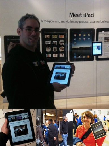
Still, the ability to hand the iPad around the sofa and show off your vacation photos, to pass it around the table and share your latest portfolio, to hand it to your nonagenarian grandmother and introduce her to her brand new great-grandchild -- for experiencing the photos you love with the people you love, it remains killer.



4. Videos
On of the first complaints that echoed through geekdom following the iPad's introduction was that it bucked the modern trend towards 16:9 HD displays that even Apple has embraced for the latest generation of iMacs. No doubt Apple had 16:9 aspect ration iPads in the labs and quickly realized what we quickly realized when using the device -- 16:9 would be a mistake. Sure, modern HDTV is 16:9 but that's about it. Movies are typically wider, so they would need to be letterboxed anyway. And while 16:9 is a good width for a dedicated movie viewer, 9:16 is a horrible width for the web browser and photo viewer we just discussed, and the music, games, and eBooks facets we'll get to in a moment. So Apple wisely went with 4:3 which, yes, is the aspect of old SDTV but also just happens to be the aspect of something we mentioned previously -- IMAX and its nice to have those extra pixels when you need them.
If there's anything we're learning from this review is that hardware and specs matter only so far as they enable usability and experience where the iPad is concerned. In a dark room with a black bezel, letterboxing a 16:9 HDTV show or wider aspect movie is more than good enough -- as with browsing the device disappears and it's just you and the content that remain.
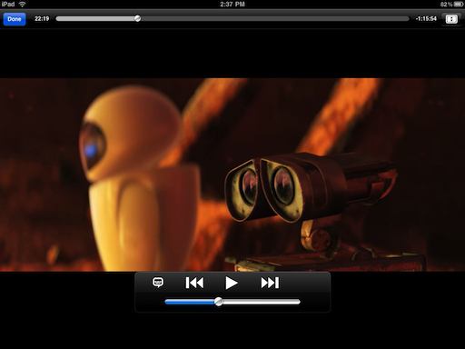
If letterboxing is really a distraction Apple, like with the iPhone and iPod touch and their 3:2 ratio, allows you to double tap to zoom in and fill the screen. Cinematographers and cinemaphiles alike will no doubt cringe at the mere thought -- it's one step below even old-style pan-and-scan. We flirted with it ourselves a few times but ultimately the width won out.
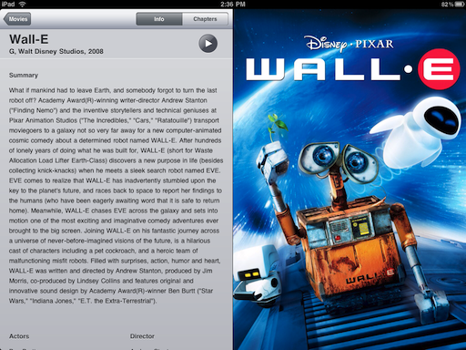
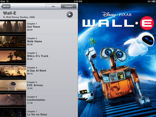
Controls are also similar to the iPhone; you can adjust volume and scrub through the movie at speeds that vary depending on how far you drag your finger down from the slider. Presentation is all new; for movies content is arranged in a grid view of poster art and tapping one brings up an intermediary description page with summary and cast and crew info, and a toggle to switch to a chapter list. That's a slower pace than the iPhone's tap-to-play, and extra step, and we'd prefer it if Apple would have kept the instant play behavior and made the metadata an option we could tap while the movie was playing. Also, that data only appears if you've bought your content from iTunes or gone through the process of adding it to your home movies (or ripped DVDs). If not you get just the facts: length, pixel dimensions, file size, release date (unknown), and codecs.
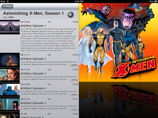
For TV shows and video podcasts you get the grid view and tapping through gives you a list of episodes with truncated descriptions you can tap to expand. Mercifully, tapping the episode simply plays it.
We could complain about the lack of container and codec support, with no AVI, MKV, or WMV, and no XviD or DivX but we're not going to. If you know what those formats are primarily used for, you know how to transcode them. If you don't, you'll just enjoy the high quality and hardware-accelerated, battery-life-saving benefits of MP4 H.264. (Though iPad does add support for limited AVI in order for the USB camera input accessory to import home movies).
The one area where it does fail is lack of support for iTunes Extras (the digital version of DVD extras). We synced over Wall-E with iTunes Extras only to find those extras extraordinarily missing. Hopefully that will be fixed in a software update and quickly; their absence is bewildering.
It's not better than a big screen HTDV or digital projector in the living room, of course, or the high-powered Windows box that can play everything you throw at it, but then Apple wisely didn't position it to compete with those.
When it's just you and your significant other lounging back on the love seat, when you're bored on a transatlantic flight in the increasingly cramped economy class, when the kids in the backseat can be entertained during a 10 hour family trip the experience is excellent and certainly better than a smartphone and a netbook.

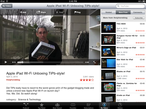
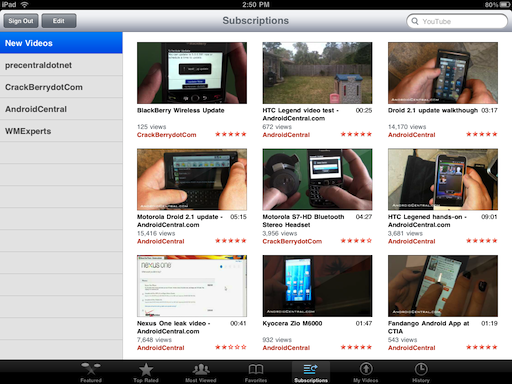
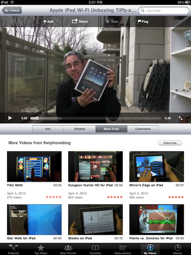
We're going to mention YouTube before we leave video since it provides the built-in streaming counterpart to the on-device Video app proper. With YouTube on iPad we have a resounding win. It looks fantastic and it works... just how you'd expect (which is sometimes not the case on mobile devices). You can log into your YouTube account, see you videos the videos from your subscribed channels. You can comment and rate videos (not your own!). You can see featured and popular videos and search for pretty much anything and everything (that doesn't violate someone else's license or show any naughty bits). Here the combination of big form-factor with portable device really shines, as you're not only given full screen videos but inline videos as well, surrounded by a wealth of meta data and links for further exploration and discovery.
Now, if you have the iPad Wi-Fi you will be limited to watching in areas where you have a network connection handy. If you have an iPad 3G and a data plan (and service in your area), there's almost no limit.
We've looked at Netflix specifically, and compared Netflix with ABC Player and Videos apps for iPad as well.
The built in YouTube app, however, makes an outstanding case for "better" streaming video experience all on its own.
5. Music
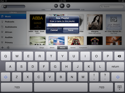
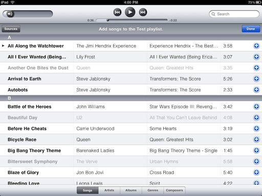
The iPad iPod app is unfortunately not inelegant in name alone and is perhaps the one app caught most between smartphone and netbook. It's better for managing music than the iPhone or iPod by simple virtue of its larger screen, but it's nowhere near as good for that as even rickety, kludgy iTunes for Windows running on a rickety, kludgy netbook. You can make and edit playlists on-device, which is great, but there doesn't seem to be a way to create smart playlists which is where a large part of iTunes' power lies. (You can create Genius playlists, however).
Conversely, the original tag line that rocketed the iPod to success -- "1000 songs in your pocket" -- shows why the iPad isn't better than the iPhone or iPod touch. For music, convenience wins out. It doesn't require a big screen, it requires big sound and earphones in a iPad are pretty much the same as earphones in an iPod or iPhone only the device itself is harder to carry around with you while you listen.
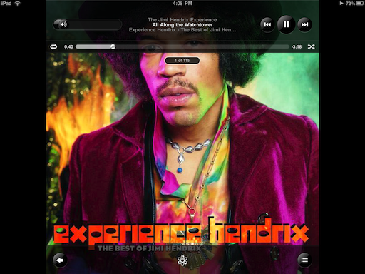
Sure, in an idealized world that exists only in the anachronistic dreams of myopic record label executives, we're buying whole albums and sitting back against our beds, iPad in hand, pouring over album art and liner notes. The problem with that is even Steve Jobs couldn't really sell it as iTunes LP, and iTunes LP (like iTunes Extras) doesn't seem to be supported on the very device where it makes the most sense.
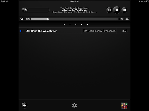
The iPod app itself is also the least attractive juxtaposition of Mac and iPhone to be found on the iPad. It's mashup of iTunes player and iPhone iPod app works fine to browse but the giant album view and reversible album art/album contents just don't seem to work as well or enjoy as much UI polish as the other re-written apps.
Unless we missed them, not including desktop iTunes' visualizations or even Apple TV's album art animations seems like a blown opportunity here.
If all you want to do is start up some music to listen to in the background while you surf the web or use another app, iPod is okay. It's fine. But we're thinking Apple of all companies can do more. Otherwise, for a device where time and time again glorious visual and tactile experience transcends hardware and software, this is the one item from Steve Jobs' list that least makes the case for "better".
6. Games (and Apps)
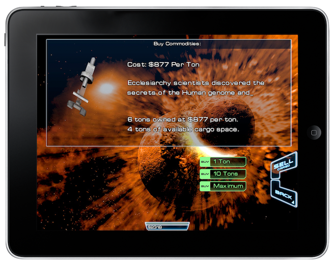
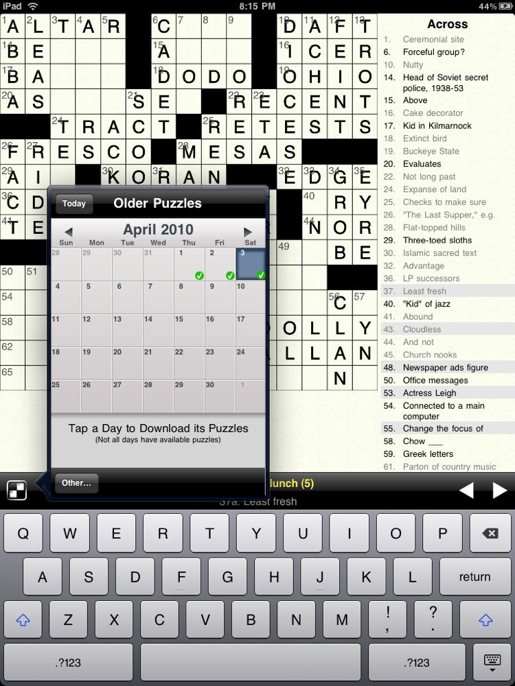
The iPad can run three interrelated types of games (and apps in general), all downloadable via the on-device App Store app (which only functions in the US at the time of this writing but should be "fixed" in time for the late April international roll-out) or via sync from iTunes on the desktop. The first type are iPhone apps, run boxed a 1:1 or "pixel doubled" at 2:1 ration to simulate a full screen (see our discussion of the pros and cons of running iPhone apps on iPad). The second type are Universal Binaries that include both iPhone/iPod touch and iPad interfaces all in one app. (With both of hose types you pay only once for the app but can run it on all three devices). The third are iPad-specifc apps that are purchases separately from the iPad section of the App Store. (Which means, unless they're free, you're paying for them separately as well -- even if you already own the iPhone version).
iPad apps are currently priced far higher than iPhone apps, with games running $4.99 to $14.99 compared to $0.99 to $9.99. In general, prices seem to be falling somewhere in between iPhone and Windows PC/Mac software. They may fall later, as iPhone apps did, but at this point re-buying "HD" or "for iPad" versions of your favorite games could be expensive. If Apple sees fit to offer a mechanism for upgrade pricing, it could allow developers to provide cheaper upgrade paths. We'll keep our fingers crossed.
In terms of the gaming experience on an iPad, the same IMAX-factor takes effect. It's like the iPhone but fills your field of vision. Everything is bigger yet more detailed, bolder yet more nuanced. For the same types of games you enjoy on the iPhone, Nintendo Wii, Xbox Arcade or Sony PS3 Online Store (i.e. not the types of games that fill a DVD much less Blu-Ray or demand a 50" screen and 5.0 sound system) its great. Certainly better than an iPhone and a netbook (though we must confess we've never heard of great gaming on netbooks anyway).
Well over 3000 apps strong and growing rapidly -- with a typically large number those being games -- we're covering the most notable of them in their own iPad App review section.




7. eBooks
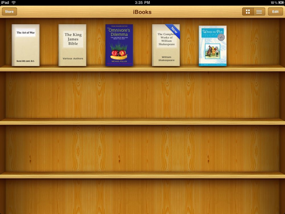
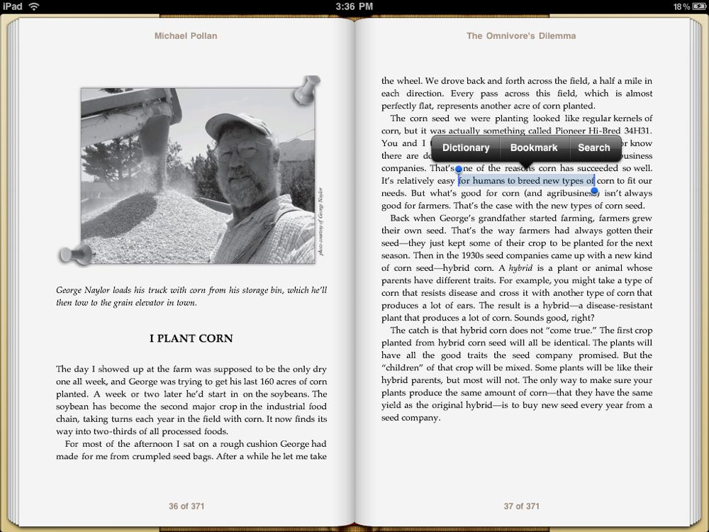
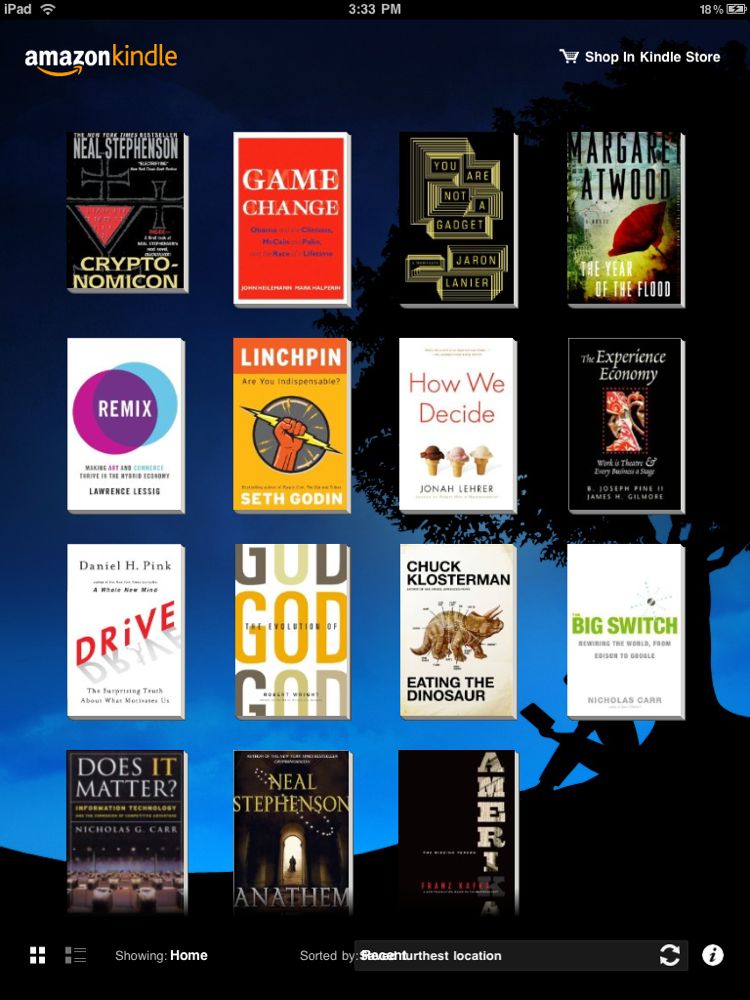
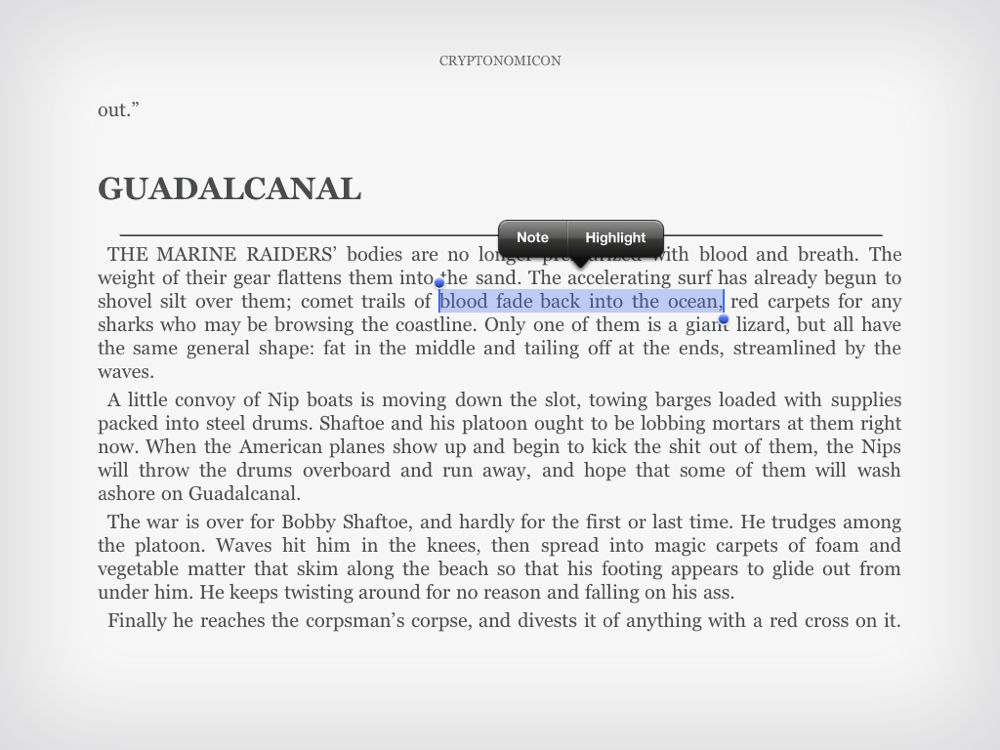
Apple didn't include iBooks as a pre-installed app for the iPad but instead put it in the App Store and packaged it with the new iBookstore. That might be a way to firewall it off so as to appear more open to competition like Amazon's Kindle app and Barnes and Noble's Reader app, or it could just be because licensing issues will most likely keep it US only for now. Either way, since it's not built in, we've provided a separate review for iBooks and for Kindle for iPad.
The bottom line, however, is that having access to iBooks, Kindle, and Reader makes for a huge assortment of content and account options. And the size of the iPad once again makes for a better experience than the iPhone or iPod touch, and the lack of anything but a screen makes for a far more intimate one when it comes to consuming content.
This is what you can take on the train during your morning commute, what you can take to bed before you sleep, and what we more than anything else would love to see Saturday Night Live skit-up Steve Jobs sitting down to read from on the set of Masterpiece Theater.
>
Miscellany
There's an assortment of other apps Apple didn't specifically include in their list of iPad targets but did build-in to the device: Calendar, Contacts, Notes, Maps, iTunes Store, App Store, and Settings. For the most part they follow the same faux-reality UI motifs, and succeed well because of it. Calendar looks like an agenda you can leaf through, Contacts like an address book filled with pages, and Maps simply looks fantastic at this resolution (and even more intrusive when you see your house in Street View!)
We'll look at them some more in an addenda to follow. And if you notice we left out some built-in iPhone apps like Stocks, Weather, Voice Memos, Clock, Calculator, and Compass, well that's because Apple left them off the iPad. We've compiled a list of alternatives from the iPad App Store, however, should you want to fill those gaps.
Accessibility
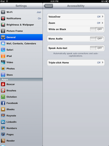
It's worth once again noting the efforts Apple is making towards accessibility with their consumer electronics. As with the iPhone 3GS, VoiceOver will read the interface and text out loud (including eBooks and auto-corrections), subtitles are displayed in Video when available, the UI can be reversed to white-on-black or zoomed in, and audio can be made mono.
Conclusion
The iPad is neither absolute failure nor second-coming. It is nothing more or less than Apple's attempt to once again make the computer more personal. What began with the original Apple and Mac and became the Apple II and iMac, takes another step forward into the future with the introduction of the iPad. That the iPad can deservedly be mentioned alongside those previous paradigm shifts, that it does for multitouch computer appliances what was done before for command-lines and graphical user interfaces -- and smartphones with the iPhone -- is a tremendous accomplishment. But it's the first generation of this shift, the Apple or Mac, not the Apple II or iMac, and that means it's certainly not for everyone, not yet. But it holds the potential to be just that -- the computing device of the future, and for most people.
If you owned or wanted to own an original Apple or Mac, you'll want to be there at the beginning again for iPad. If you're heavily invested in the Apple ecosystem and have a passion for the future of technology, you'll likely also want an iPad. Otherwise you'll need to think about it a lot more first. Think about where you use a computer and how you use it. The iPad makes a for credible threat to the cheapy netbook but it's no threat at all to the full-on laptop. If you're still not sure, check out our iPad buyers guide where we discuss which model, and which generation (if any) might best suit your needs. Go to an Apple Store if you can and try it. Figure out if those things the iPad does best are the things you most want to do.
If you're still not sure then wait. Apple has just announced their iPhone 4.0 Sneak Preview Event for Thursday April, 8. It's fairly certain a version of that new OS will be made available for the iPad this summer and will add new features -- multitasking being the most rumored.
And current iPad owners will get that update for free.

Rene Ritchie is one of the most respected Apple analysts in the business, reaching a combined audience of over 40 million readers a month. His YouTube channel, Vector, has over 90 thousand subscribers and 14 million views and his podcasts, including Debug, have been downloaded over 20 million times. He also regularly co-hosts MacBreak Weekly for the TWiT network and co-hosted CES Live! and Talk Mobile. Based in Montreal, Rene is a former director of product marketing, web developer, and graphic designer. He's authored several books and appeared on numerous television and radio segments to discuss Apple and the technology industry. When not working, he likes to cook, grapple, and spend time with his friends and family.
