Complete review of Apple's iOS 4.2 sofware update for iPad
iOS 4.2 is the grand unification update, the software that brings iPhone, iPod touch, and for the first time, iPad all onto the same version number and at the same time. Yes, it's the one firmware to rule them all.
Announced during Apple's 2010 special music event, for iPad's that have been running iOS 3.2 since launch back in April, the change is nothing short of a revelation. Multitasking, folders, and unified inbox from iOS 4.0 join Game Center and TV show rentals from iOS 4.1, and add in AirPlay video sharing and AirPrint wireless printing fresh to iOS 4.2.
Huge.
And we're going to take you through it, after the break!
(Note, if you're interested in iPhone or iPod touch, we've got a complete iOS 4.2 for iPhone walkthrough as well!)
What hasn't changed
Almost everything has changed this time. Likely because there's no weather or clock apps to ignore. Still, there doesn't seem to be anything new in Contacts yet, but we'll keep our eyes peeled.
Huge update, we told you.
Hardware changes
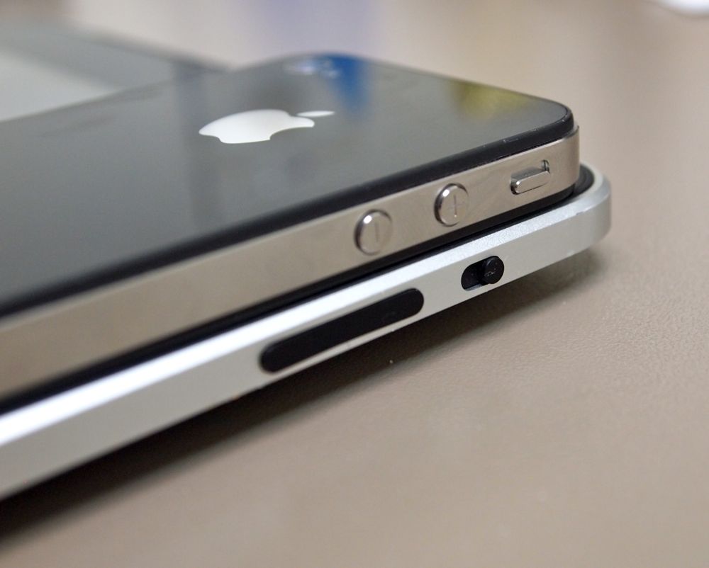
No, that's not a typo. As you're read below, Apple has added a software orientation lock to iOS 4.2 for iPad, similar to how it works on iPhone. That means the previous, hardware-based orientation lock is no longer needed, so they've made that a mute switch like on iPhone. Yes, they really changed a hardware button. Yes, it will make iPhone owners less confused but it will mess with existing iPad owners.
Either way, be advised.
System-wide enhancements
Many of the system-wide enhancements that came with iOS 4.2 for iPhone were already present in IOS 3.2 for iPad -- spellcheck, text replacement, etc. And unfortunately, there's still no sign of VoiceControl, which both iPhone and iPod touch have. There is, however...
AirPlay

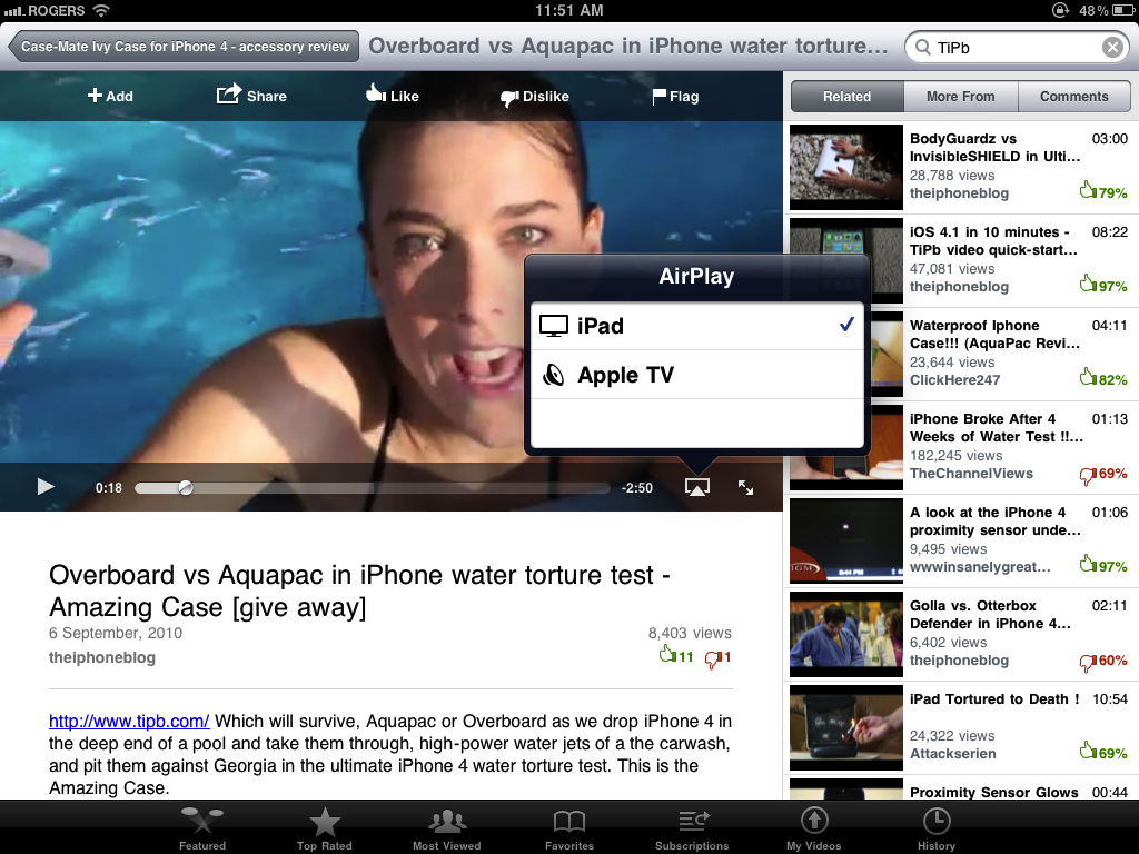
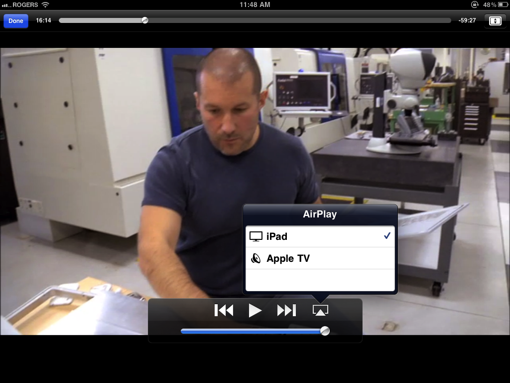
AirPlay is an evolution of Apple's AirTunes system that used to let you stream music between iTunes on Windows or Mac and Apple TV or Airport Express connected speakers. AirPlay takes that to the next level, letting you stream video and pictures as well as music from iPad (or iPhone or iPod touch) and the new 2010 Apple TV. Built-in apps like iPod, Video, and YouTube can stream, but unfortunately it looks like all other apps, including Apple's own Safari and all App Store apps are currently limited to audio-only. Whether this is intentional or Apple simply ran out of time and didn't finish making public APIs for video is unknown but hopefully this will be expanded upon in a future update.
You can tell AirPlay is an option when its icon appears to the right of the volume slider. It looks like a TV-style box with a triangle being inserted up into it. (Yeah, seriously). AirPlay compatible apps, when AirPlay compatible devices are present, will show the AirPlay icon as a button. Tap it and you get a list of devices you can stream to. Tap one and your video will switch from iPhone to TV. And since it's called AirPlay and not AirView, here's hoping Apple also expands the functionality in the future to project game video onto the big TV screen, leaving iPhone and iPod touch as a full on multitouch game controller. Hey, we can dream…
AirPrint

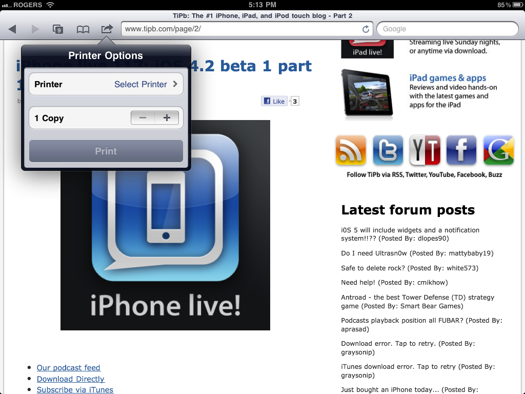
AirPrint is Apple's wireless printing service. By the time it ships, it should be able to send pages to almost any printer on the same Wi-Fi network, or to certain printers directly (HP ePrint have already been announced). Needless to say, this answers one huge piece of previously missing functionality. (The one it doesn't answer, and still isn't answered, is easier file transfer and sync).
AVRCP Audio/Video Remote Control Protocol for stereo Bluetooth

Yes, you can finally -- finally -- control volume, skip tracks, and do pretty much anything your stereo Bluetooth headset allows. Unfortunately, at least in my tests, volume changes on the headset don't show up on the iPhone's volume slider -- but they do work in both iTunes Store streaming and iPod apps.
Home Screen

SpringBoard, the app that runs the home screen and overall interface in iOS, finally gets the iOS 4 crown jewels of multitasking and folders, but there are a few small changes to go through first.
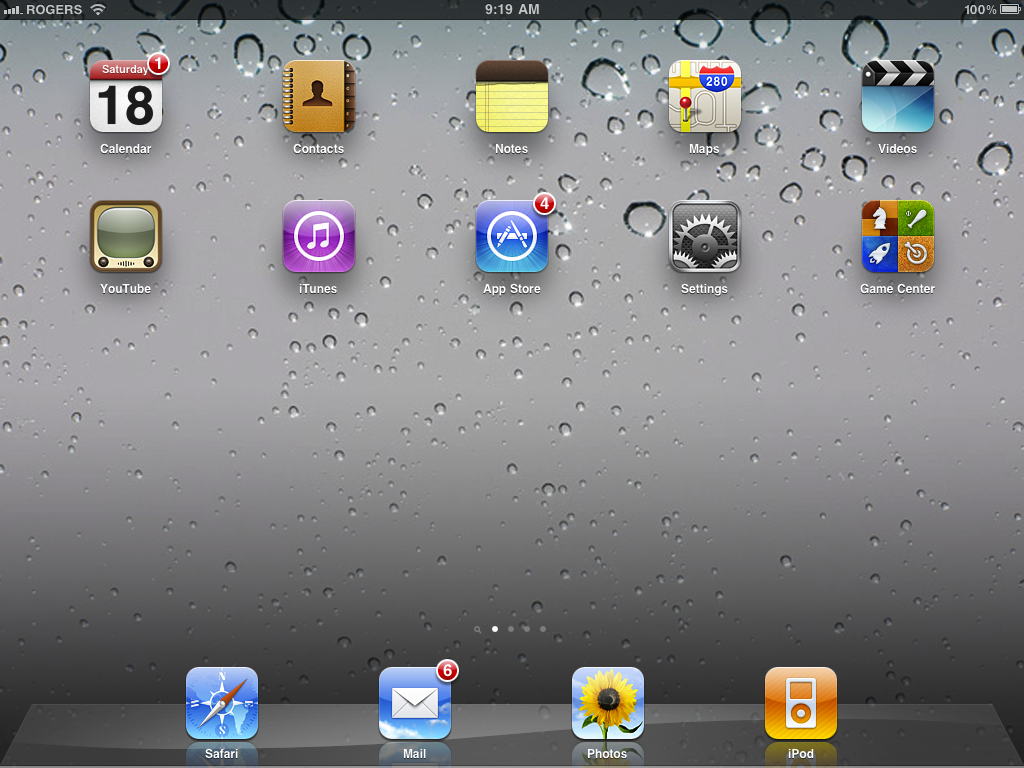
The little northeast pointing arrow that indicates a location-based service is running, be it Wi-Fi mapping or aGPS, now shows up in the status bar along the top, just like iOS 4 on iPhone.

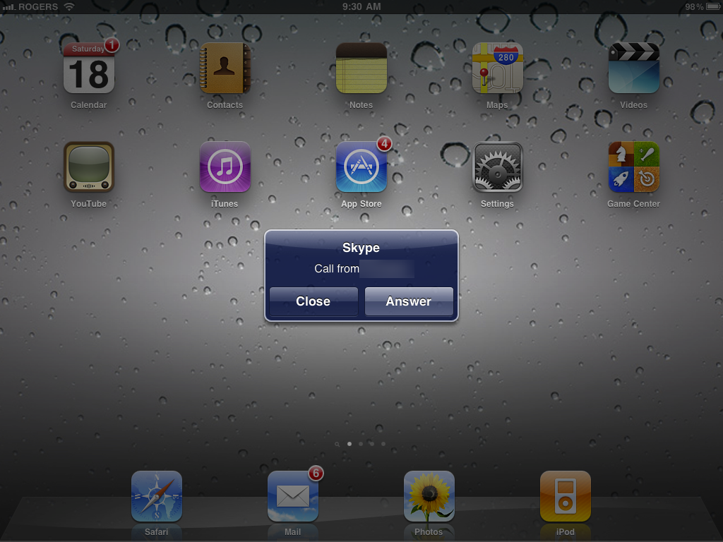
The red bar that shows background VoIP is here, long and thin though it may be. (And yes, tapping it does indeed take you right back to your VoIP/Skype call).

Spotlight
There's more control inside Settings for Spotlight, but nothing in the search interface itself that we can find yet. If Apple were to create a true universal search, including for settings, app content, etc. like webOS 2.0 or BlackBerry OS 6, that would terrific.
Multitasking

While Apple's built-in apps (like iPod, Mail, etc.) have had background multitasking since iOS 1.0 for iPhone and iOS 3.2 for iPad, with iOS 4.2 it finally comes to 3rd party App Store apps.
As to how it works, instead of a traditional "leave full apps running in the background" approach, Apple instead chose to implement a more restricted but, they felt, better performing and power friendly solution involving 7 specific background API (application programming interfaces.)
Local notifications
In addition to the existing push notification service from Apple's servers, which provide sound, badges, and alert popups for everything from IM to VoIP calls, to game challenges, iOS 4.2 adds local notifications so something like an alarm-clock app could register an alert that would sit in the iPhone in the background until the proper time, then activate. That takes the online server out of the equation which is good for tasks that don't need additional information from the cloud, and so don't have to activate the radios.
Task completion
There's another API for task completion so that, for example, if you're uploading a picture to Flickr and leave the app, it can register a thread to keep uploading the picture in the background while you do something else. That means the entire app doesn't have to keep running, freeing up memory and lightening battery load, and even the thread will terminate when the upload is done.
Fast app switching and saved state
Fast app switching deals with the perceptive speed that multitasking offers. With iOS 3.2 if you left an App Store app it would shut down completely. If you went back -- regardless if it was a second or a week or later -- it would usually restart not from where you left off but from the beginning. A few developers tried to add persistence on their own, saving your place when you came back as best as previous OS versions allowed, but most didn't -- especially games. Also, if you closed one app and went to another, you could theoretically be stuck swiping back or forth between 11 home screen pages. And with a 9.5-inch screen, that could be a lot of swiping!
Saved state is now built into iOS 4.2 for iPad. If you switch out, Apps have their currents state recorded to memory and if/when you go back, the app checks the memory save and resumes from that state.
To enable fast app switching, Apple's created a new UI metaphor. Now, when you double tap the home button, the screen turns translucent and slides up, allowing you to peek at the apps running "in the background". (Technically frozen with state saved and threads registered with the background API).
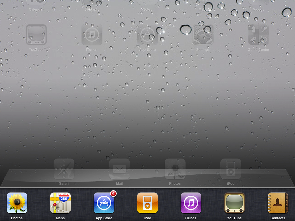
Apps in the fast switcher UI are sorted in order of last usage. That means, if you're moving between a set of commonly used apps, they're most likely right next to each other and not screens and screens away. These two elements combine together to make launching apps perceptively much faster, even though the apps don't have to be running in the background consuming resources just for that convenience.
Positionally the fast app switcher replaces the space traditionally reserved for the Dock, so while it's a tad confusing the concept of apps at the bottom of the screen being more permanent and easily accessible remains. Behaviorally, while they look like a secret Dock, they function like the Home Screen itself in that you can swipe from right to left to scroll through a several 4-icon sets of multitasking apps.
Given iPad has only 256MB of RAM, we assume Apple will discretely kill off the least-used app in the stack when things get tight or a certain amount of time passes. That means, yes, sometimes you will come back to that game and have it start over rather than resuming, but resources on mobile devices -- they be constrained.
(Here's also hoping iPad 2 gets 512MB of RAM like iPhone 4 did.)
iOS 4.2 helps users visualize what's going on when switching apps by introducing a new, carousel-like animation. It's a bit different than the carousel style used in iPhone and iPod touch, more like panels swinging around, but it works well. The new animation occurs when you switch between two apps either via the new, double-click-Home to trigger to launch the multitasking UI, or when one app calls another app (i.e. when you're in Contacts and you tap to send a contact an SMS).
Launching or leaving an app retains the same, zoom-based effect as always.
Interlude: Task Killing
At the iOS 4 event, Steve Jobs likened task managers (in the multitasking, not to-do sense) to styluses -- if you need them there's something wrong. Initially this created confusion in iOS 4 when it was noted, if you hold your finger down on multitasking apps, they'd jiggle and bring up a delete icon that, if tapped, removed them. So um, yeah.
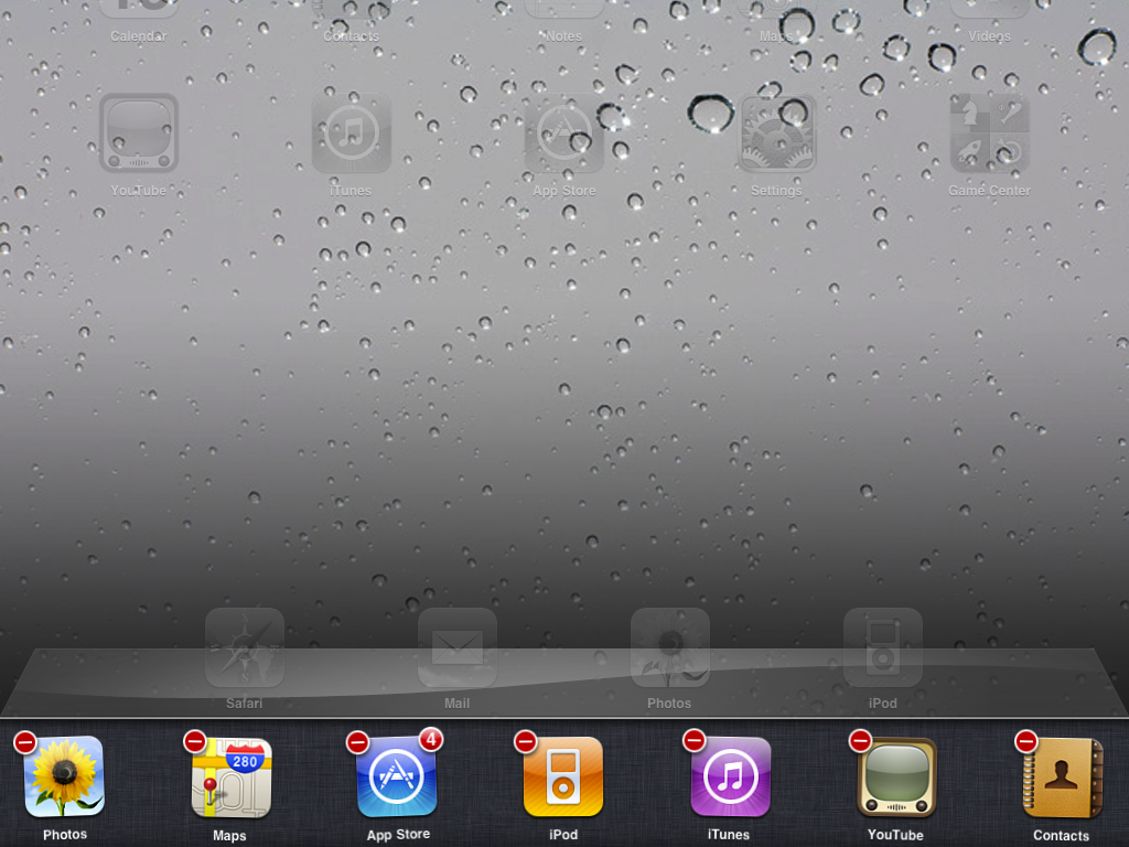
It appears like there's a couple things going on. First, with built-in Apple apps, like Mail, if you "delete" it from the fast app switcher, the service will re-spawn immediately so you will still receive Mail (it doesn't kill the background thread that checks, sounds/vibrates, and updates the badge). However, the respawn will sometimes fix issues of mail not loading properly, for example.
For App Store apps, if you "delete" them it flushes their saved state and forces them to reset and reload when next you launch them, i.e. they won't resume from the previously saved state and their threads seem to be restarted.
And yes, you can still hold down the Sleep/Wake button until the red Shut Down slider appears, then hold down the Home button until you return to the home screen, and that will flush the RAM and give you a general reset.
Widgets
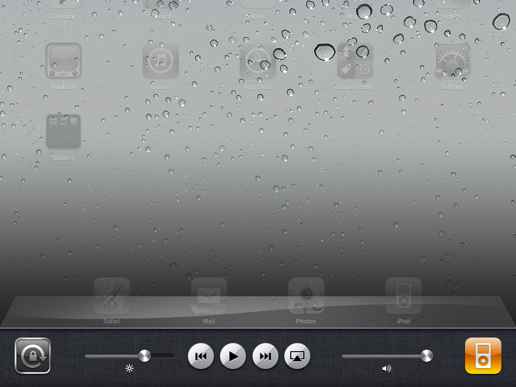
Just like to the left of the main home screen is a special Spotlight screen, to the left of the fast app switcher is a special widget dock containing a software version of the iPad's previous hardware orientation lock control.
That's right. The hardware orientation lock button has been reassigned as a mute switch, to match the iPhone, and now orientation lock is software based. Unlike the iPhone, however, you can lock in both portrait and landscape mode.
More over, there are three circular music controls to skip back/rewind, play/pause, or skip ahead/fast forward whatever audio is currently queued up (including streaming music). Whichever app is currently playing the music, be it iPod, iTunes or Safari (streaming podcasts, for example), or an App Store app (like Pandora or Slacker) is shown at the right so you can jump back to it and access further controls.
iPad 4.2 also gets something more than iPhone -- it gets all the widgets in one dock, and it gets a brightness slider thrown in to boot. The extra screen real estate pays off with instant access to crank things down for reading or up for watching movies.
The presentation may not be as visually slick as Palm webOS' Card view (which looks like iPhone Safari's Page view) or Mac OS X Expose mode, but it keeps tens of millions of existing iPad users grounded in the interface they're familiar with and that's what Apple is prioritizing.
Background music, location, and VoIP
Speaking of streaming music, perhaps most famously, Apple is allowing apps to register three specific types of threads for persistent backgrounding (they can just keep running until you close them). Again, this isn't the whole app running, just one thread from the app, so the idea is it won't slow down performance, use up memory, or drain battery to the same degree. These API are for streaming music, location, and VoIP (voice over IP).
This means you can listen to Pandora, Slacker, etc. while surfing the web. Navigon, TeleNav,TomTom, etc. can keep using the GPS and alert you to directions while you're on the phone, and to further save resources, non-critical location apps like FourSquare, Gowalla, Loopt, etc. can be alerted when you change cell towers. Fring, Skype, Line2, etc. can answer calls and receive messages when you're not in the app, making them more equal telephony citizens.
What's still missing are background API for timeline updates, so that IM, Twitter, RSS, etc. could update like Mail does and have new messages ready and waiting when you return to the app. Also, there's no API to let internet sessions like SSH, RDP/VNC remain active when you exit an app making it more onerous for network administrators and others to manage remote machines. Hopefully these can be added in future revisions.
Folders

There are umpteen hundreds of thousands of apps in the App Store, tens of thousands specifically for iPad, and more and more every day. With iOS 3.2 on iPad we had 11 pages for 180 apps viewable, but you could install many more and use Spotlight as a way of finding and launching them. And Organizing them efficiently? Forget about it.
Enter Folders. A Folder is simply a grouped icon that holds up to 20 other icons inside it. (And for those keeping count at home, the new math means a whopping 3600 apps can be kept available at once. Super hudder).
The way it works is you tap a Folder icon and once again the Home Screen fades and splits open, this time below the Folder. Inside the split are all the apps contained in the group.
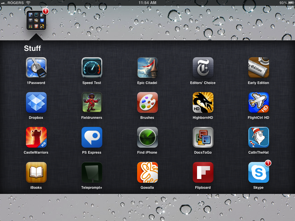
To create a Folder, you begin by tapping and holding an icon to put it in jiggly mode, just like you did before to delete or move it. Then, drag it over and drop it on top of another icon to create a Folder. (This works better when icons aren't at the right edge of the screen, as the "get out of the way" behavior sometimes supersedes the Folder behavior, causing the icon to wrap to the next line before you can drop on top of it.) Once created, iOS reads the apps' category data and tries to name the folder for you, but you can easily edit it and change it to anything you want.
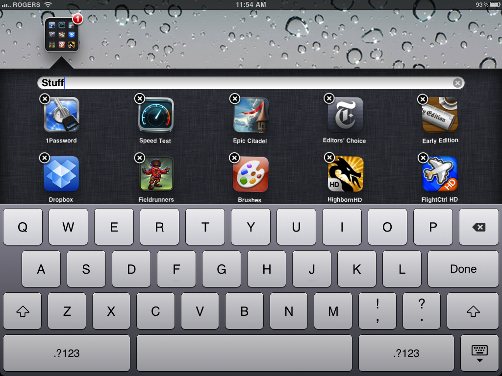
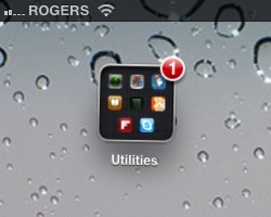
As you add apps to a folder, tiny representations of the apps icon appear inside the folder icon in a 3x3 grid. Since iOS 4.2 on iPad supports more app than the iPhone version, 20 instead o 12, as you add more than 9 apps, the grid of tiny icons scrolls up to show the new apps being added. Since 20 isn't divisible by 3, when you hit 19 or 20 that row contains only 2 icons. Once you leave jiggly mode, the folder icon scrolls back down to show only the first 9 icons again. So, if you need visual reminded for certain apps being in certain folders, make sure you add them first so they'll be visible.
To remove apps from a Folder, put them in jiggly mode inside the Folder and drag them out (or just delete them if you don't want the app anymore at all). You can also move them around within the Folder to customize their order.
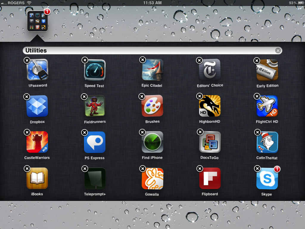
Folders can be put in jiggly mode and moved as well, but not deleted (they can only be deleted by removing all the apps from within them, and which point they self-destruct for you). You can even move them to the Dock, which means you could have 120 apps readily available at any time for quick launching.
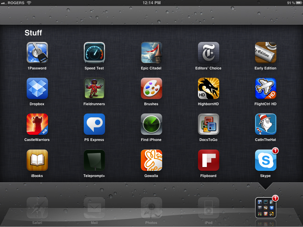
You can also manage them from iTunes 10's app interface if a mouse and keyboard helps you speed up the process. (Oh, the irony.)
And while you still can't delete Apple's built-in apps, you can take the ones you're not using and hide them away inside a folder so they waste as little Home Screen space as possible.
Again, not as visually exciting perhaps as Mac OS X's Stacks, but it keeps current iPhone users in a familiar interface while adding much-needed functionality.
Calendar

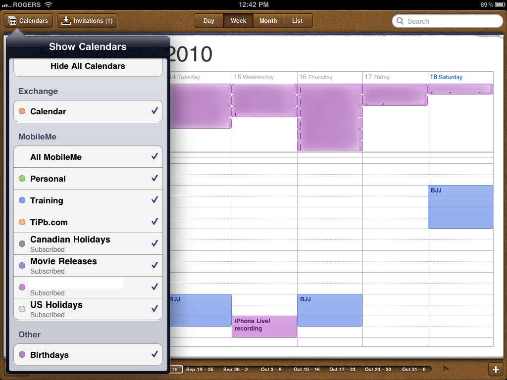
Calendar app appears to be functionally identical to iOS 3.2 but for the color scheme. The shades are all pastel now, just like iPhone on iOS 4.1. Full on Miami Vice light purples and greens and peaches and tones only Prismacolor has names for. No idea what this change was about.
Notes

Notes finally -- finally lets you change fonts. That's right, if Marker Felt was never your thing, you can now jump into Settings and switch it to Chalkboard (essentially Marker Felt with a shave and a haircut), and Helvetica, used by the rest of the interface.

Curiously -- and frustratingly -- there doesn't seem to be AirPrint support for Notes.
Maps

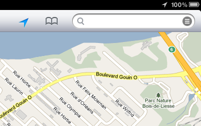
A minor tweak, but the current location/current direction button changes from the previous crosshairs to a north-east pointer to match the new location services icon used in the title bar, much like the iPhone's did under iOS 4.0.
Video

Video, the app that unlike the iPhone but like the iPod touch houses all movie, TV, and video podcasts on iPad, enjoys AirPlay integration so all of the preceding should be able to easily stream to the 2010 Apple TV (and perhaps 3rd party AirPlay devices one day, if any offer video support).
YouTube

YouTube only gets a minor update this time, which is kind of disappointing given how great YouTube has been making YouTube.com work for iOS devices. In any event, if you've ever wished you could give a YouTube video the old thumbs up or thumbs down right on your iPad, the you're in luck.

And, of course, the AirPlay is right there, giving us hope any HTML 5 video will be instantly transportable to the TV.
iTunes Store

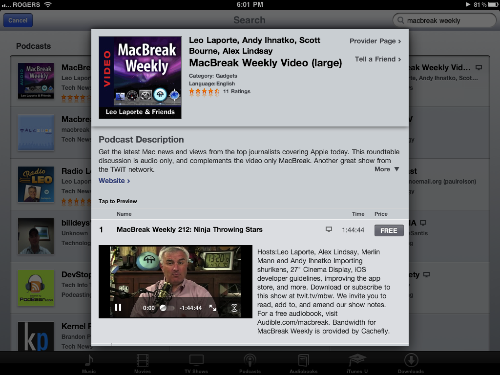
iTunes store gets AirPlay too in case you want to stream a video podcast and shoot it over to your 2010 Apple TV. Speaking of streaming, thanks to iOS 4.2 background audio, streaming on iPad is now as rock solid as it's been on iPhone since 4.0.
Most of the time you can scrub and it re-buffers and keeps playing flawlessly. You can stop it and come back hours or even days later -- even after using the iTunes app to search for other things or the iPod app to play different audio -- and it still knows where you left off and starts playing again instantly without missing a beat. I almost never download podcasts anymore. That's how good the streaming is now (especially if you're mobile with an iPad 3G).
Ping

Ping isn't exclusive to iOS 4.1 -- it's already available to iOS 4.0.x users -- but Apple is touting it as a new feature and it's being launched at roughly the same time, so it makes some amount of sense to fold it in here for easy reference.
A social music network, Ping debuted with iTunes 10 but only became accessible on iPad with iTunes 10.1 and iOS 4.2. You get to it via the double talk bubbles tab, bottom middle. If you haven't yet synced your iPad with iTunes 10.1, you'll get a Ping splash screen telling you to do so. Why it can't just ask for your login like Twitter or Facebook and even Apple's own Game Center is beyond me. Cut the tether already.
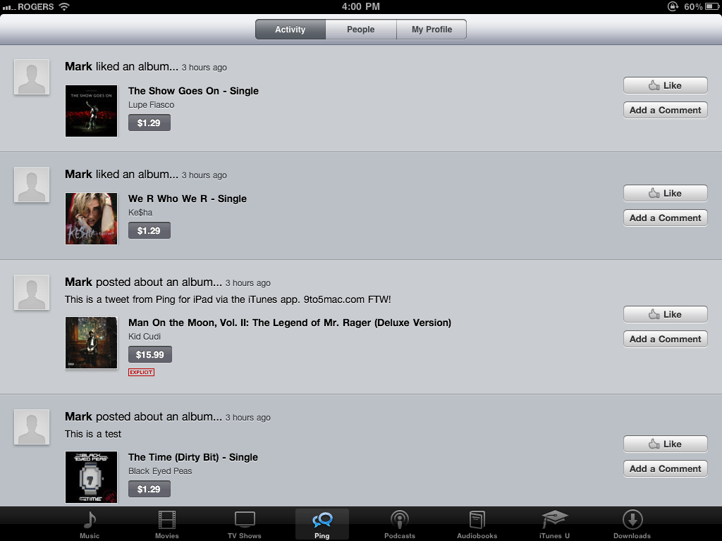
Once you've signed on, the Ping tab will come up with the Activities view. Activities show what's going on with the people you've followed -- status, pictures, and videos from recording artists like Lady GaGa, and comments, likes, and shared music from friends. It gives you the ability to like or comment on any of those things and, of course, instant access to preview and purchase the music being liked or commented on in iTunes. That also means there's currently no way to share or discuss music that's not in iTunes, specifically in your local country's iTunes store, which can be frustration for Beatles fans in the US, and fans of far, far more artists internationally.
Actions are fairly simple. To like or add a comment to an activity, tap the appropriate button. To preview or purchase a song that was posted, tap anywhere on the song widget, from album art to title. To be taken to the song's album, double tap on the title.
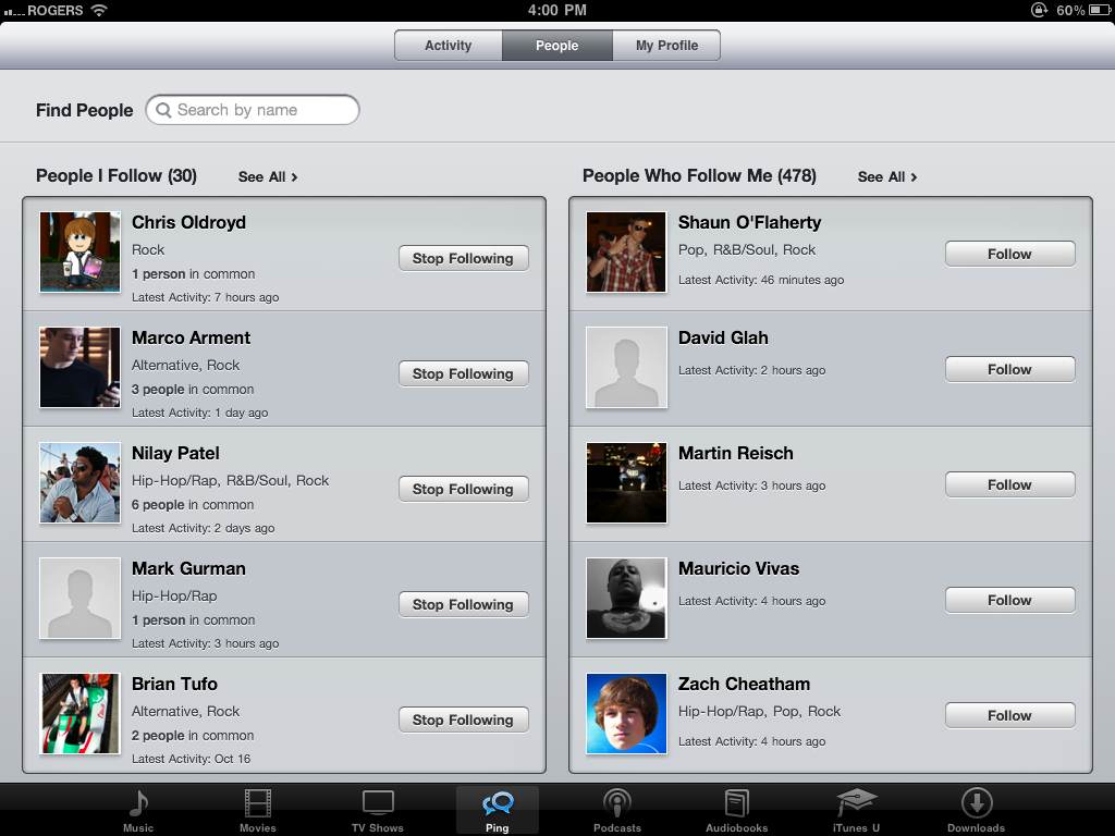
The People tab gives you a list of people you follow and people who follow you, as well as a featured button for a list of recording artists.
Tapping on a person gives you profile page with recent activity and an easy follow/stop following toggle. You can also switch to an info view that contains a short bio and buttons to see the person follows and who follows them. Similar to Twitter, people can either let anyone follow them or decide to approve followers on a person to person basis.
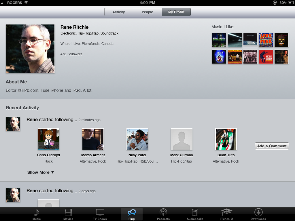
The My Profile view, as the name suggests, shows you your own recent activity and, at the bottom, has a button for My Info that shows you your own profile. You can't (yet?) edit this info on iOS, however, and will need to go back to iTunes 10 on Mac/Windows for that.
I'm not sure if it's the blank loading screen, but iTunes Store has never felt like the snappiest app on iOS and including Ping inside it likewise makes it feel less snappy than Twitter or Facebook. It also doesn't seem to save state of, or cache, the tabs - perhaps because they're web pages being re-loaded each time - which makes the experience of moving between apps seem sluggish. There's also no refresh feature, you need to switch between tabs to check for new data, and sit through more reload screens...
At least Apple finally added social integration, albeit by way of Twitter and not Facebook as they'd originally tried. Most of that seems to live inside the desktop iTunes, where you can link your Twitter account, find people you follow on Twitter, and friend them on Ping as well. What you like on Ping then gets tweeted to your Twitter account. That could be to your liking or incredibly not.
TV show rentals
The other addition is TV show rentals. They're only available in the US and from ABC (whose parent company, Disney, counts Steve Jobs as its biggest share holder), and FOX (whose owner, Rupert Murdoch, sees mobile devices as a way to save old media), and cost $0.99 per episode. You have 30 days to start watching and 48hrs. to finish once you start.

Ping

Ping hasn't show up in iOS 4.2, but since the UI is web-based Apple can update it at any time, so it's almost certainly will be coming to the iPad with this release. We'll update when it shows up. It will be interesting to see what Apples does to balance the rather awkward iTunes Windows/Mac UI with the fairly standard iOS on iPhone UI.
App Store - iAds

App Store, like iTunes Store is mostly just a thin app container around constantly updated web content, but Apple has snuck something new in this time, if not for users than at least for developers. And yeah, we're talking about iAds...
iAd

Okay, so iAd really shouldn't be considered a feature, at least not for users, but it will be a feature of iOS 4.2 for developers, and it will go in apps, so we're mentioning it here.
iAd will provide developers with an easy-as-Xcode way to place advertising in their apps, both paid and free. Apple is setting a high bar for their ads, however. No simple Google-style text, annoying punch-the-monkey, or jarring transition out of the app and into the browser, they claim to want great looking, highly interactive, emotionally compelling content that will connect with rather than alienate users. Served every 3 minutes...
Settings

Settings is a boring app that often contains a great number of terrific surprises when it comes to Apple iOS updates. iOS 4.2 for iPad is no exception.
Brightness & Wallpaper
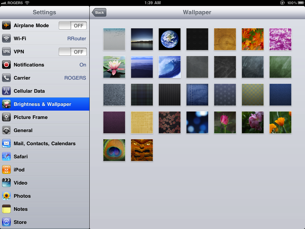
iPad gets all the wallpapers that iPhone got with iOS 4, some of them re-rendered to look even sharper on the big 9.7-inch screen.
General: Location Services
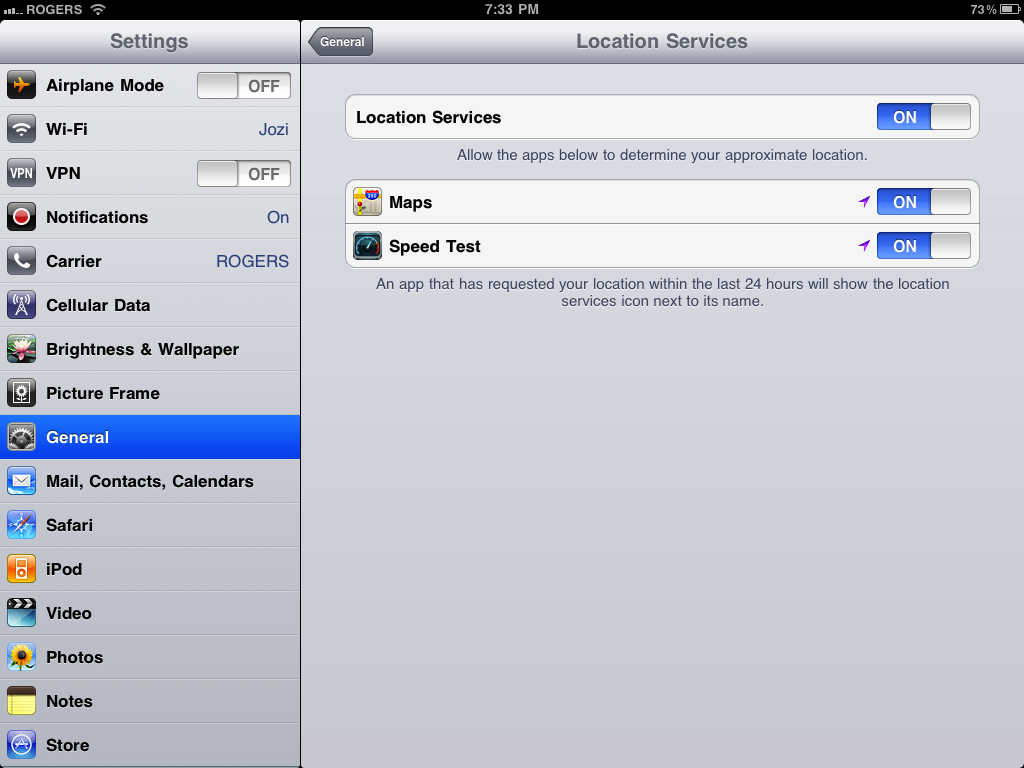
Since Apple is, post Google-breakup, awfully serious about user privacy, Location Services get a new Settings tab that lets you turn them off completely, but also turn them off in each app separately if you like.
General: Passcode lock
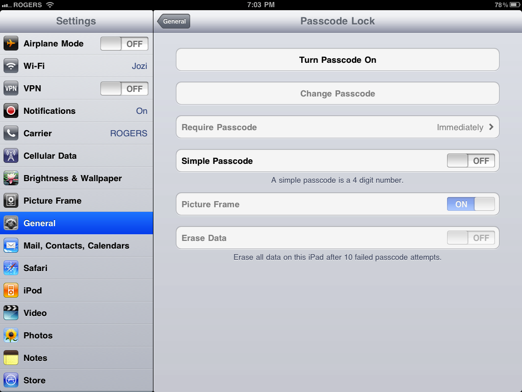
iOS 4.2 brings alphanumeric passcodes to iPad by default (no more configuration file required). Turn it on and you can have a nice, strong, even gnarly pseudorandom string... if you can remember it.
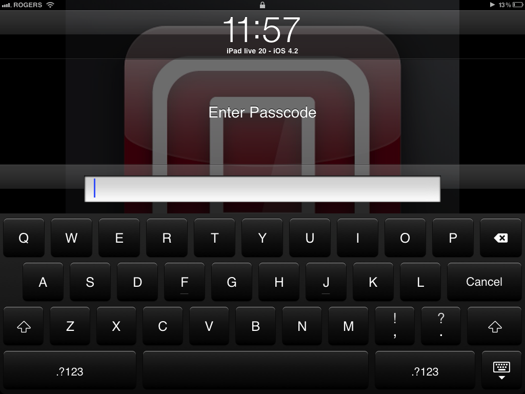
And yes, you get the Vader-black keyboard standard if you flip that switch.
General: Restrictions
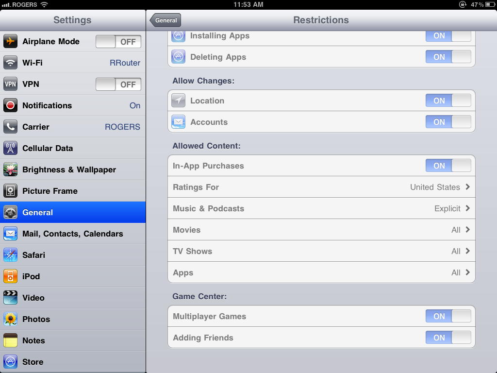
To the list of things you can lock down and lock out, iOS 4.2 adds Deleting Apps, no doubt to the cheers of parents with young children everywhere. You can also prevent changes to location services (so your kids can't stop you tracking them, unless they're hax0rs) and email accounts.
If you don't want them playing multiplayer Game Center games, you can stamp that out as well. You can even turn off friend requests.
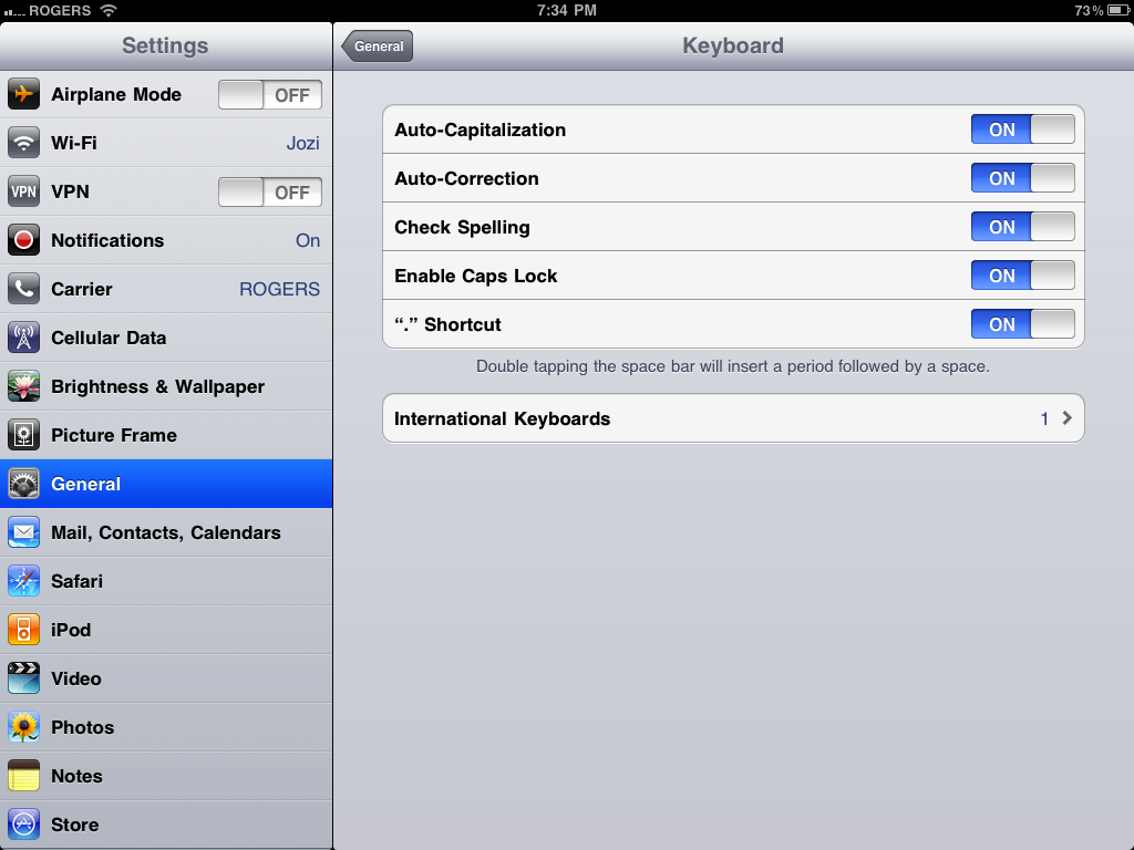
General: Keyboard
iOS 4 spell check causing more problems for you than it's fixing? No problem, you can now turn it off.
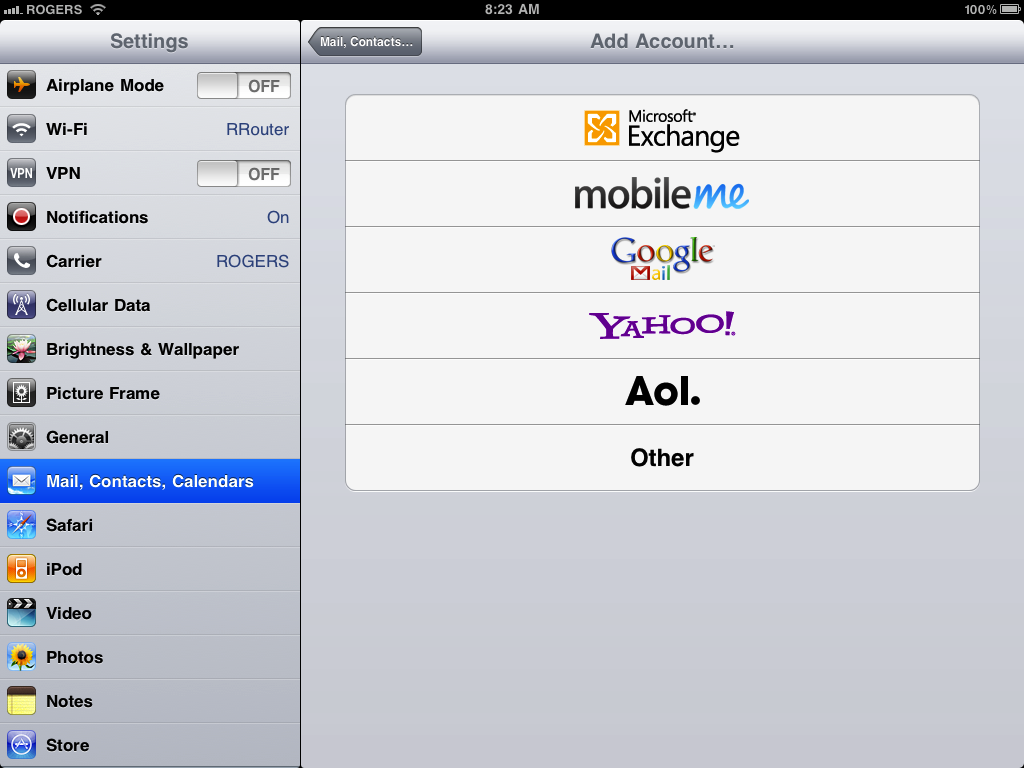
Mail, Contacts, Calendars
Gmail is dead, long live Google Mail.
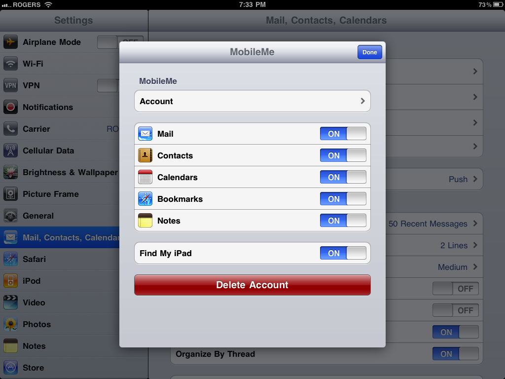
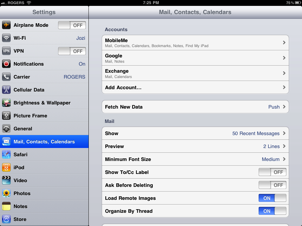
Inside MobileMe, Google Mail, or other IMAP accounts, you can choose whether or not to enable sync. Again, there's no support for Exchange ActiveSync accounts yet (including Gmail via GoogleSync).
Because mail now supports threaded email messages, Settings now gives you the option to turn that feature on or off.
Notes
Notes now has its own Settings tab because, as mentioned previously, you can now change the font in Notes, and here's where you do it.
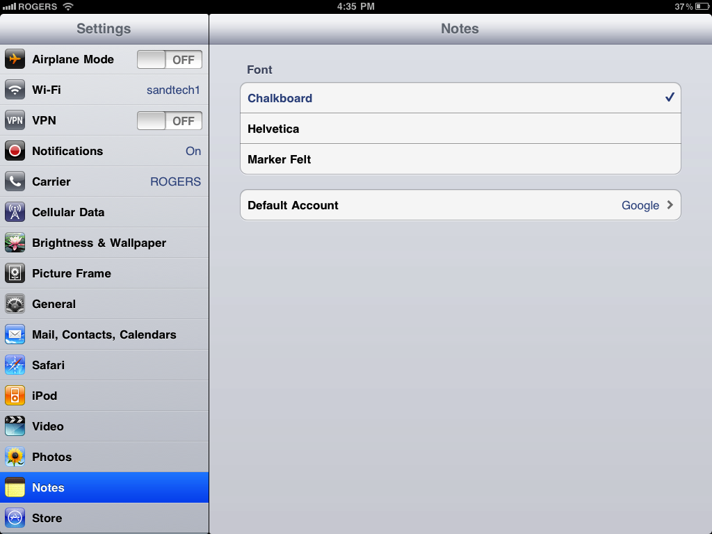
You can also choose the default account for Notes sync if you have more than one IMAP mail account set up.
Game Center

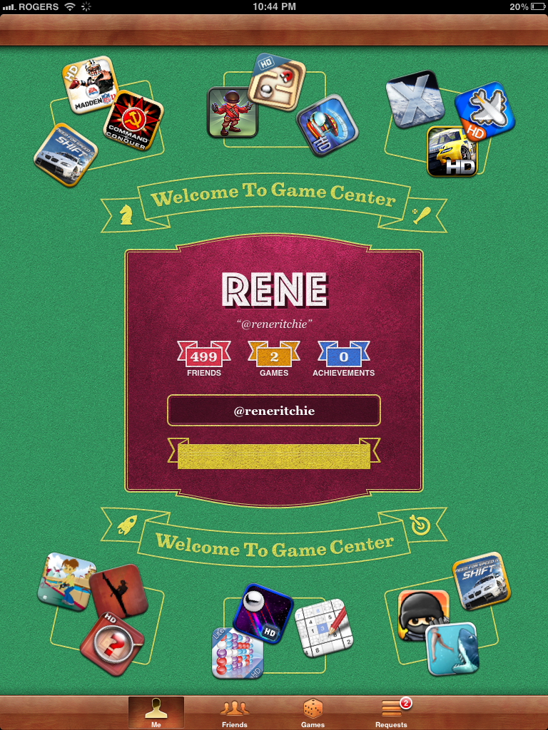
Game Center, Apple's social gaming network went live with iOS 4.1 for iPhone and iPod touch and comes to the iPad with iOS 4.2. As of this writing, Apple has a Game Center section set up in the App Store to help you find games that support it. To start off, you can create or login to an account, update your status, and add friends.
And yes, on iPad Game Center takes advantage of the full screen. You get a double column-view instead of single like on iPhone, and that means your lists (like friends) will on the left and the detail view (like stats) will be on the right.
Also, the sign in/welcome screen currently shows a number of app icons "dealt" card-like across Game Center's game table style UI. Tapping them does indeed take you to the App Store to get the game.
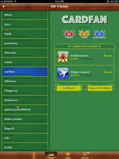
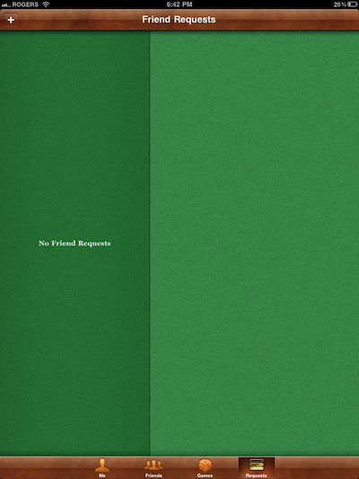
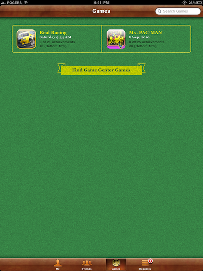
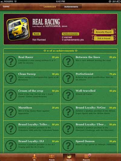
You can also see a list of your games that support Game Center. Tapping on one gives you general info and the ability to hit Play and go straight to the game. Tapping on Leaderboards lets you see top scores for Today, This Week, and All Time.

Achievements shows everything you can earn for playing the game.
Safari

iOS 4.2 finally gives iPhone, iPod touch, and iPad the ability to find text on a Safari web page. This is similar to Windows or Mac, where you just hit CTL-F or CMD-F, type your text, and off you go. On iPad Safari you use the regular old search field (still confusingly labeled Google by default) and start typing the text you want to find.
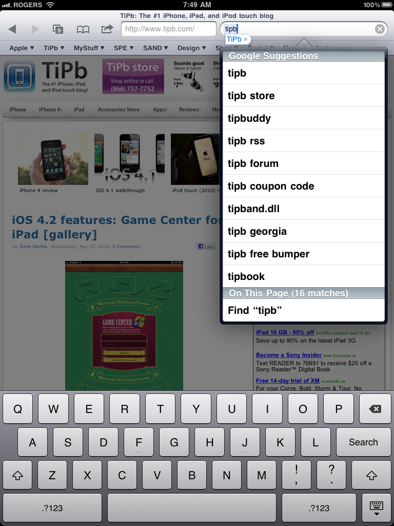
Where previously you only got suggested search terms, now you get an additional section at the bottom to find the word on the page. Tap it and the first match on the page is highlighted in yellow and a set of buttons slide up on the bottom for "Next" and "Done", as well as a counter for how many matches of the word there are on the page, and which one is currently highlighted (e.g., 7/16). Hit next until you find the one you want, hit done when you're finished. If you want to change the find term, the search box is repositioned alongside the controls to make it convenient.
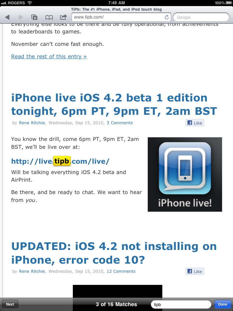
No more tedious manual scanning, no more javascript bookmarklet workaround. Just happy surfing.
The previous + icon, for adding bookmarks and Web Clips is gone, replaced by the Action button found in other apps. Hitting the action button gives you all the same options as before, but now also includes AirPrint.

AirPlay will show up inline for videos where compatible but is currently limited to audio only.
Behind the scenes, Apple has added support for the accelerometer and gyroscope and generally improved HTML 5 support. (That means the potential for more, better web apps in the future.)

iOS 4.2 for iPad Mail gets a unified inbox just like iPhone has had since iOS 4.0. For those with multiple email accounts whose previous iPad experience involved tapping into and out of those boxes many, many times a day this is a hugely welcome addition.
Unlike iPhone, the split column view of iPad lets you see your inbox choices on the left in landscape mode and in popover in portrait so it can be even faster to move around. The list includes all Inboxes, a specific account's inbox (which is considered fast inbox switching), or into the complete folder and sub-folder system of a given account (how Mail has worked in iOS 3.2).
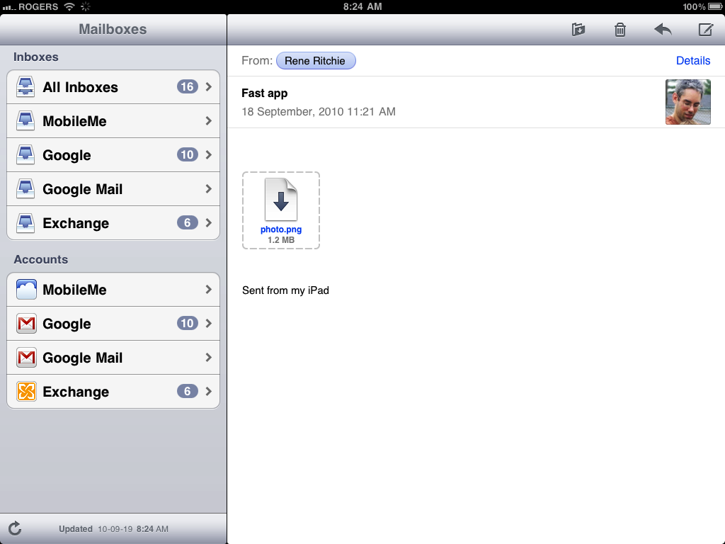
Once inside, All Inboxes is visually indistinguishable from an account-specific inbox, it simply contains all of their messages.
What is distinguishable are the carets (technically greater-than symbols) to the right of certain messages that indicate a message is part of a thread. A number, typically 2 or 3, accompanies the caret to indicate how many replies are in the thread.
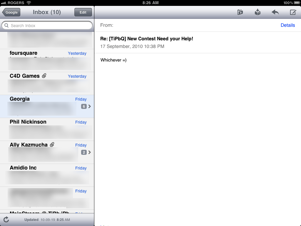
Tapping on a message that's part of a thread gives a second list of all messages in the thread. Tapping on one of them shows you the message in the main column.
A thread view contains a small vertical bar at the top with the subject of the thread and time of the most recent reply. A button to the top left of the message contains the name of the inbox you came from so you can back out again, leave the thread completely, and see all your messages.
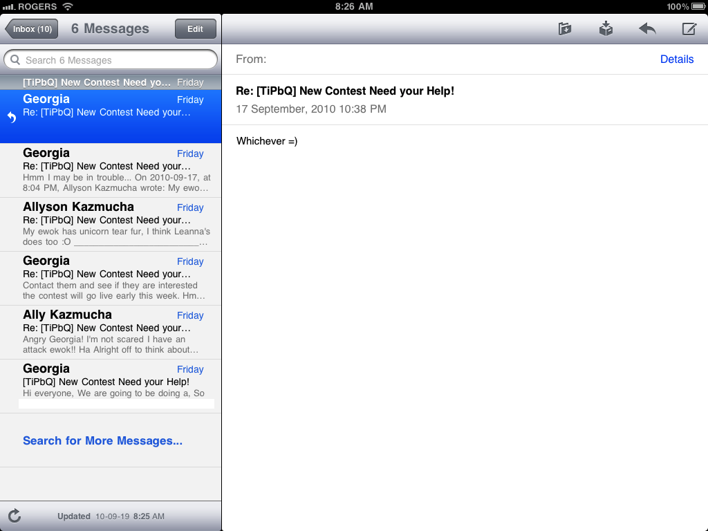
So yes, the tap, tap, tap of inbox navigation persists, albeit shifted from moving into and out of inboxes to moving into and out of threaded messages.
Great news for heavy ActiveSync users, iOS 4 supports multiple accounts. So, for example, you can now have your work Exchange server and home Google account both set up to push through ActiveSync (which is what Google Sync users behind the scenes) at the same time.
Also for Gmail users, the Delete button has now been properly renamed as Archive (since Google really doesn't want you deleting anything if they can possibly help it), and the trashcan replaced with a storage box icon.
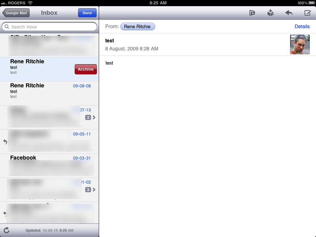
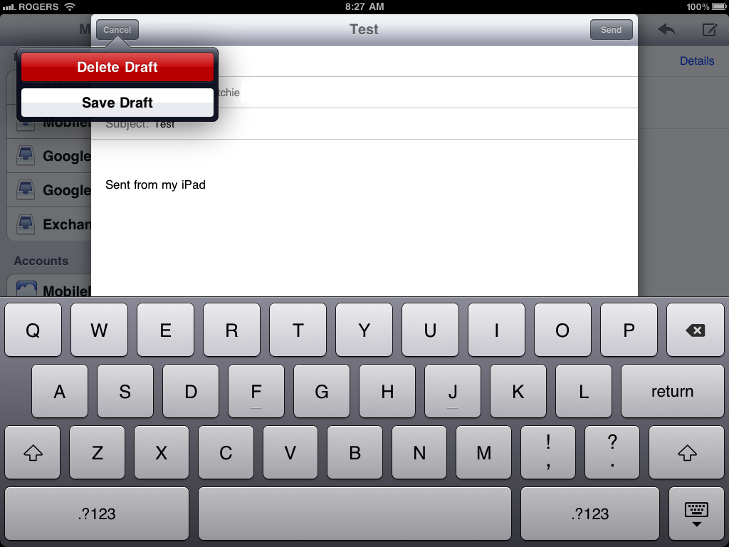
Lastly, in iOS 3.2, when you wanted to abandon an email, you would hit Cancel and get options to Save (store the email in Drafts), Don't Save (trash the email), and Cancel (go back to writing the email). The naming of these options was likely too confusing so in iOS 4.x they've been replaced with a big red Delete Draft button (to trash the email) and Save Draft.
Photos

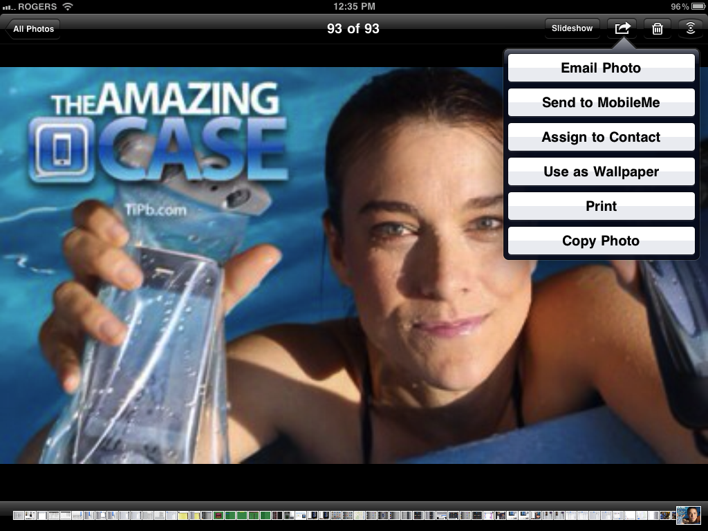
Photos get a bump in the functionality department, primarily through the Action button getting AirPrint. Just tap, choose a compatible printer, and your photos go wirelessly from iPad digital to hardcopy ink or laser.
Photos also get AirPlay and you can swipe through them and watch them change on Apple TV. Unfortunately AirPlay for video isn't supported.
iPod

iPod on iOS 3.2 for iPad was fairly well rounded already, so the bump up to 4.2 seems fairly minor at this point. You get AirPlay, so you can send music to Air Port express speakers, or video to the 2010 Apple TV.
Availability
iOS 4.2 is a free update currently in Gold Master (GM) for final testing, and unless anything major comes up, it should be released this week.
Conclusion
iOS 4.2 on iPad is a revelation. It's the way iPad is meant to be. That's not to say it's perfect or has every feature on every geek's wish list -- it certainly doesn't -- but it has enough new functionality to make iPad much more valuable.
Like with iOS 4 on iPhone, multitasking and folders extend the existing UI in a way that gives power users what they need, but keeps casual users either grounded in familiar metaphor, and feature-phone types blissfully unaware it's even there.
AirPrint addresses an important bit of functionality for home and business alike, and AirPlay has the potential to turn the TV video scene upside down.
Sure, non-obtrusive notifications, and glanceable, lock-screen widgets -- and hey, AirEasyFileTransfer -- would be grand, but iOS 5 beta is only 4 months or so away...
For now, we'll just thank Apple's iOS team again -- this is one hell of an update. If you notice anything we've missed, send us an email or drop a note in the comments and we'll add them to the next update.

Rene Ritchie is one of the most respected Apple analysts in the business, reaching a combined audience of over 40 million readers a month. His YouTube channel, Vector, has over 90 thousand subscribers and 14 million views and his podcasts, including Debug, have been downloaded over 20 million times. He also regularly co-hosts MacBreak Weekly for the TWiT network and co-hosted CES Live! and Talk Mobile. Based in Montreal, Rene is a former director of product marketing, web developer, and graphic designer. He's authored several books and appeared on numerous television and radio segments to discuss Apple and the technology industry. When not working, he likes to cook, grapple, and spend time with his friends and family.
