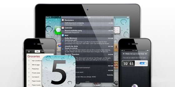
Complete review of Apple's iOS 5 software update for iPhone, iPod touch, and iPad
iOS 5 is perhaps Apple's most audacious update since iOS 2, which introduced nothing less than the App Store and MobileMe. The features are almost an embarrassment of riches, including unobtrusive Notifications, the carrier-consternating iMessage, Twitter integration, a location aware Reminders app, and an entirely new UI paradigm in the artificially intelligent Siri voice control system for iPhone 4S.
And for the first time what's happening on the outside is just as compelling -- iCloud. Apple called it "cutting the cord", severing the post-PC from the PC, and the iPhone, iPod touch, and iPad from their subservience to Mac and Windows.
But is it truly transformation or just another bold yet ultimately evolutionary step forward? Let's find out.
Updates
- iOS 5.1 for iPhone and iPad update
Previously on iOS
iOS 5 adds new features to almost every existing app on the iPhone, iPod touch, and iPad, and introduces new apps as well. Still, iOS 5 is built on the foundation of what came before, so for previously introduced functionality, please see our previous walkthroughs.
- iOS 4.3 for iPhone, iPad walkthrough
- iOS 4.2 for iPhone | iOS 4.2 for iPad
- iOS 4.1 for iPhone
- iOS 4 for iPhone
- iOS 3.2 for iPad
- iOS 3.1 for iPhone
- iOS 3.0 for iPhone
- iPhone 2.2 for iPhone
- iPhone 2.1 for iPhone
- iPhone 2.0 for iPhone
iOS 5

iOS 5 includes new system-wide features like Siri for iPhone 4S, PC free, Notification Center, AirPlay Mirroring, and Twitter integration, new apps like Reminders and Newsstand, and tons of new features for existing apps like iMessage, photo editing, Reader and Reading List, and much, much more.
Apple's video above gives a good overview and I'm going to go over everything on an app-by-app, feature-by-feature basis below. But like I said at the beginning, this year iOS is only half the story...
iCloud

iCloud replaces MobileMe and iWork.com, and groups together functionality previously included in the iTunes, iBooks, and App Stores. It also does setup, backup, and restore, and a host of other things.
Unlike MobileMe, Apple has carefully avoided calling iCloud a sync service. Instead, they say it wirelessly stores your content on the server and then pushes it back down to all your devices. This probably better frames the relationship between cloud and devices. There's no single master copy of "truth" on the server, but coequal copies on every device, and on iCloud.com (which Apple notes is ad free. Zing). And just like with iOS, there's no end-user exposed file system. Your data no longer exists in folders like it did on iDisk. It exists in apps.
Storage capacity
Everyone gets 5GB of iCloud storage for free, and iTunes, iBooks, and App Store purchases aren't counted against that, nor are Photo Stream images. Mail, documents, accounts, settings, app data, Camera Roll, etc. do count, however. In case they count far more than your free 5GB allow, you can purchase more storage.
- 10GB for $20/year
- 20GB for $40/year
- 50GB for $100/year
Documents in the Cloud

When apps like Apple's own iWork suite, Numbers, Pages, and Keynote save copies of your files, those documents are stored on iCloud and pushed out to all your iOS, Mac, and Windows PC devices. Apple has made the same functionality available to 3rd party developers as well, so it's likely many if not most apps that can create and edit files will soon tie into Documents in the Cloud.
(Hopefully games will as well. Starting Angry Birds on iPhone and having to start over to play on iPad or Mac needs to be a thing of the past.)
It's not a Dropbox killer, or a name-your-favorite-sync-service-with-APIs killer of any kind. I can keep my home directory in Dropbox and use it like I use a filesystem, with the advantages of versioning and sync. iCloud doesn't -- and doesn't want -- to do any of that.
However, some apps that previously used Dropbox merely to sync documents may add iCloud as well or instead because it's built in, and I'm fine with that. It frees Dropbox up to be my file system.
Find my Friends

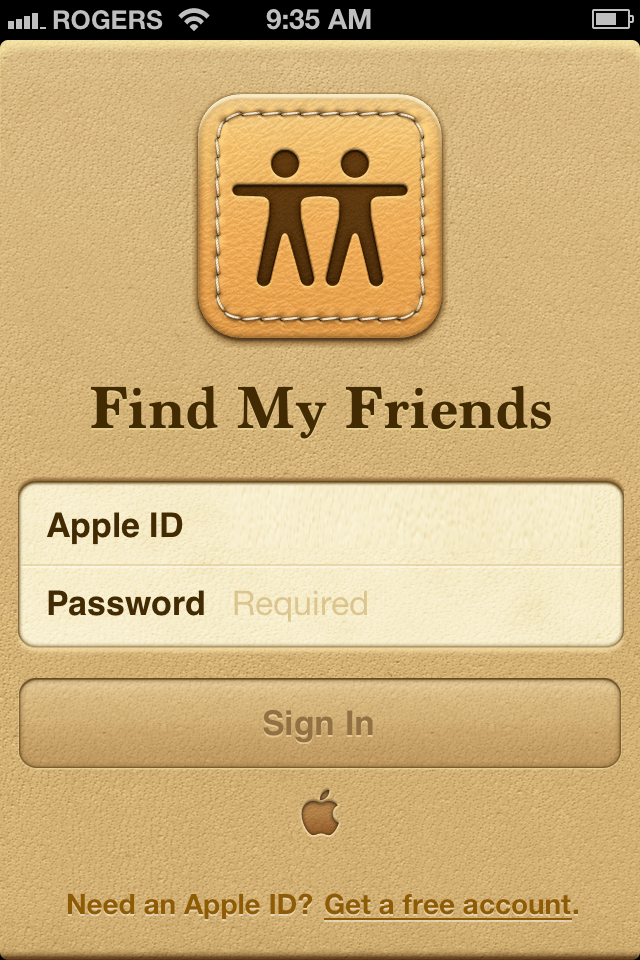
Find my iPhone has been folded into iCloud, and joining it is Find my Friends, a Google Latitude-like social location sharing service that takes pains to point out its better privacy and security. Like Find my iPhone, Find my Friends isn't built into iOS, but is available for free in the App Store [Link].
When you install it you'll be asked to allow it to use Location. It's pretty much useless without it. From the All tab you can see All your Friends and a list of specific friends and their current distance from you. Tap a friend to see their Info. Since it's integrated with Contacts, if you already have their details you'll see it here. If not, you'll be able to add them. Tap through to see their location on an embedded Map. You can even curl up the page to get the basic Map-style options. Tap All Your Friends and see the world light up.
If you don't have any friends yet, you'll be given the opportunity to invite some. Tap the Edit button on the top left to remove friends.
<
p align="center">
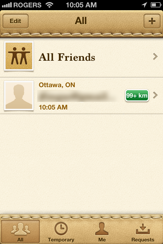
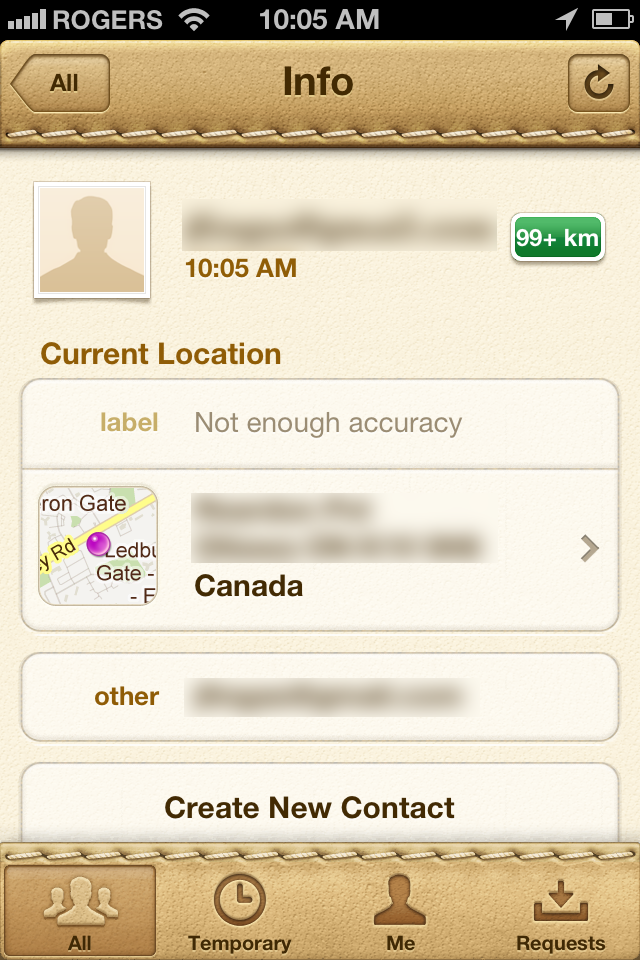
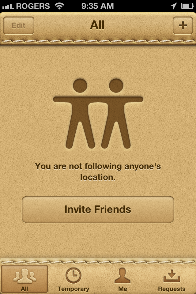

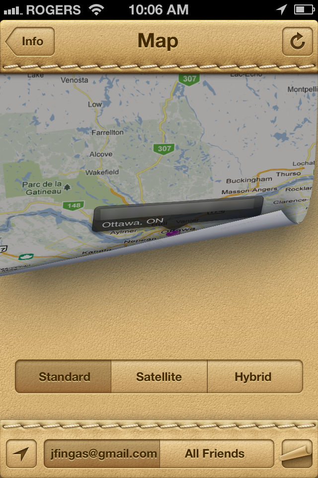
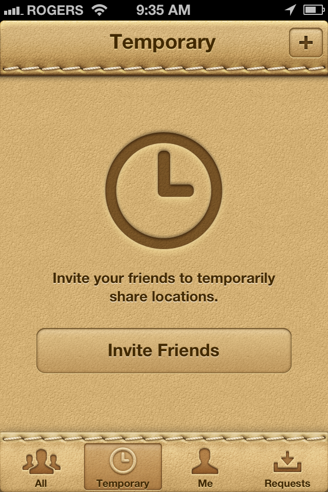
Under the Temporary tab you get a separate set of more constrained friends. These friends can have location sharing enabled for an hour, a day, a week -- whatever you decide. For example, your spouse or children might have permanent location sharing. A group of friends trying to find each other at a cafe might only have a couple hours of sharing.
The Me tab lets you see your own profile. Tap on your current location to see it on a map. Toggle Hide from Followers to go off grid for a while. You can also see a list of your followers and tap through to their Info.
Tap Account to sign in or out, choose from which Apple ID to send notifications, toggle Friend Request on or off, and tap through to get help.
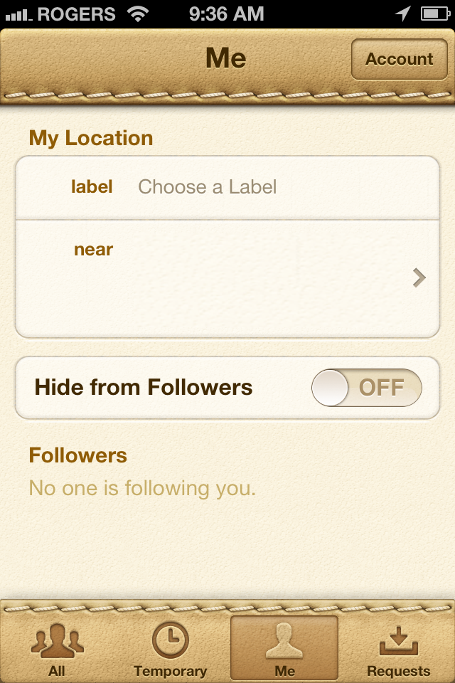
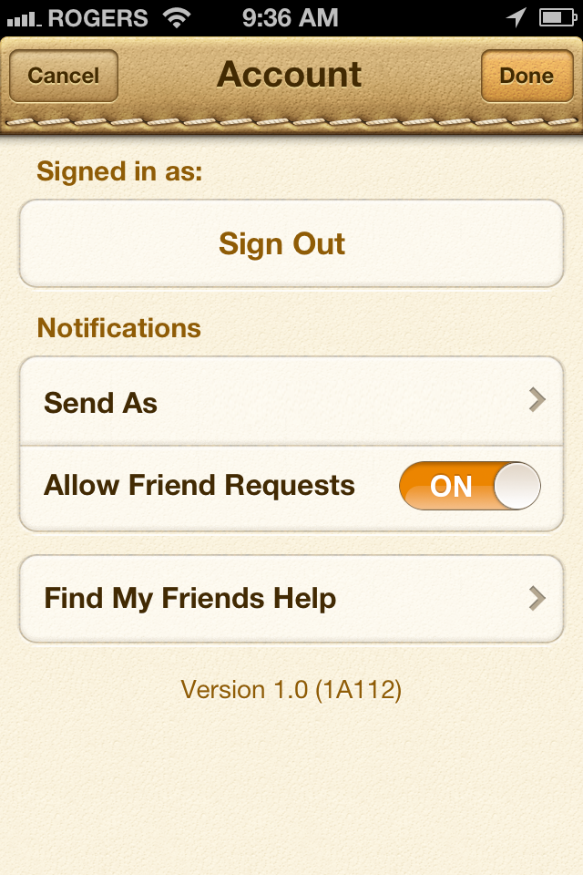
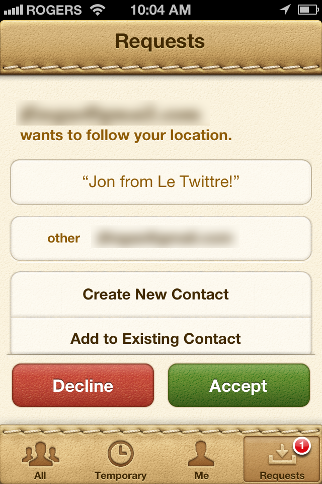
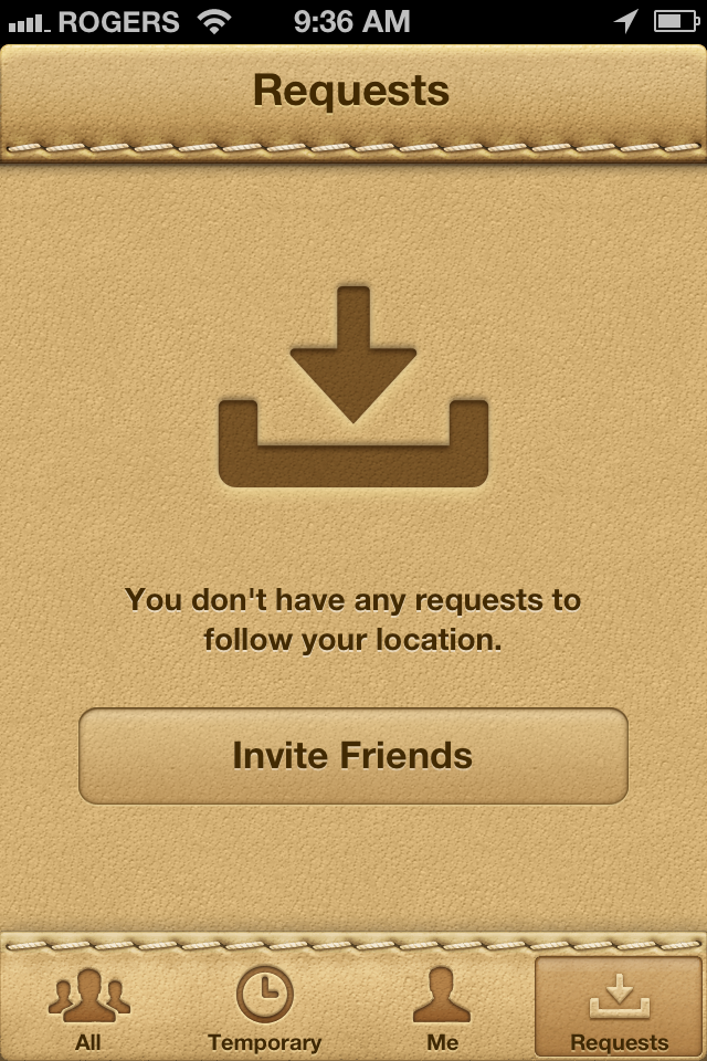
The Requests tab lists friends who have invited you. Accepting shares your location with them. Inviting them back shares their location with you.
PC Free

Perhaps the single most profound change in iOS 5 is Apple's cutting of the iTunes cord. Never again will a Mac or Windows PC be required to activate, setup, or update a new iPhone, iPod touch, or iPad (though you can still choose to do so if you wish.) From now on, you can activate, setup, and update directly on your device over the internet.
Other aspects of PC Free are more subtle but just as welcome, such as the ability to create photo albums and mail folders on-device. We'll cover those in the appropriate app sections; here's the big stuff.
Device Setup
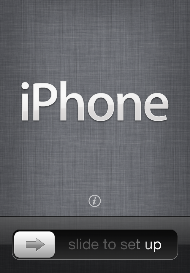
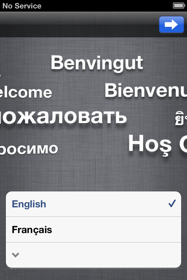
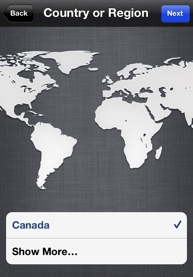
When you turn on your new device, you'll now be presented with a screen that says iPhone, iPad touch, or iPad (depending on which device you're setting up). Just swipe to unlock and you're welcomed and invited to choose your preferred language. The most common language options will be immediately available but you can tap the down arrow to see others. Hit the Next button to pick. Apple will also provide you a default Country or Region based on where you bought your device, but you can tap Show More to expand the choices.
Interestingly, neither here nor in any later step are default choices pre-checked for you. You can't simply keep hitting Next to speed through. You have to look at the choices and tap one to check it before the Next button will even activate. Apple is forcing you to pay more attention than is often required on the web or in apps.
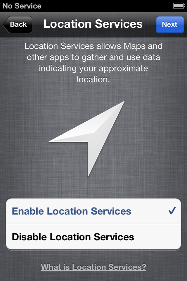
Next you're given a choice to globally enable or disable Location Services. Location Services use GPS, cell-tower triangulation, and Wi-Fi router mapping to determine the approximate location of your device. This feature is used for turn-by-turn navigation (like TomTom), check-in games (like FourSquare), social networks (like Facebook), geo-tagging (like in the Camera app), and utilities (like Siri and Find my iPhone), etc. Unless you have a particular need to globally disable it, you probably want to turn on the Location Services feature at this point. You can change your mind or selectively disable or enable these services later on in the Settings app (e.g., turn off your Camera app's geo-tagging, but leave on TomTom's turn-by-turn navigation).
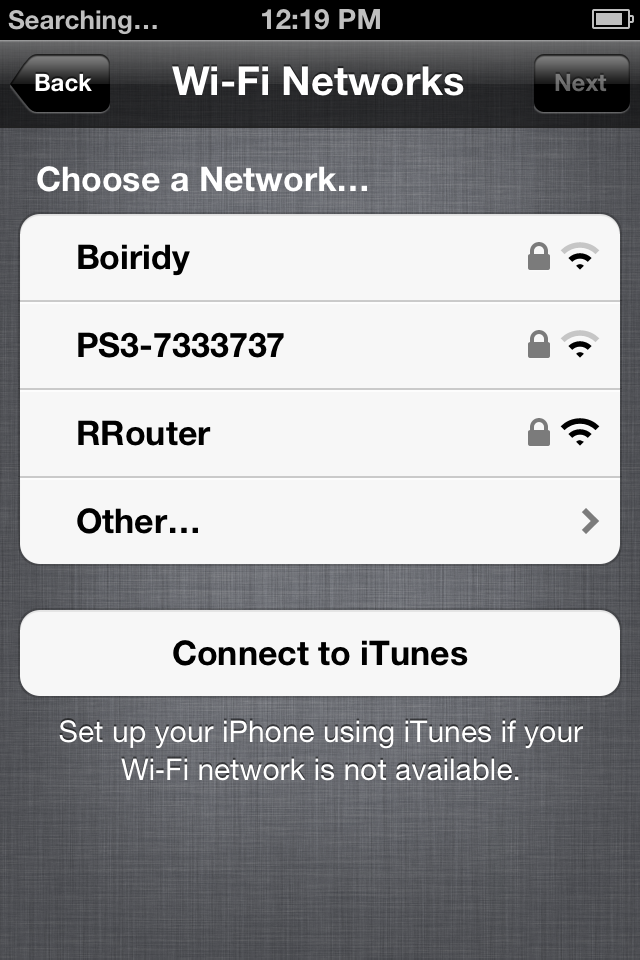
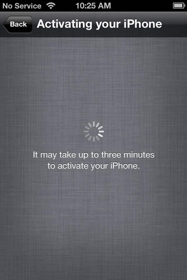
You'll need to connect to a Wi-Fi network to continue iCloud setup (if none is available, you'll have to switch to iTunes setup instead.) Your iPhone, iPad, or iPod touch will then connect to Apple's servers to activate (the cord was cut from iTunes, not from Apple).
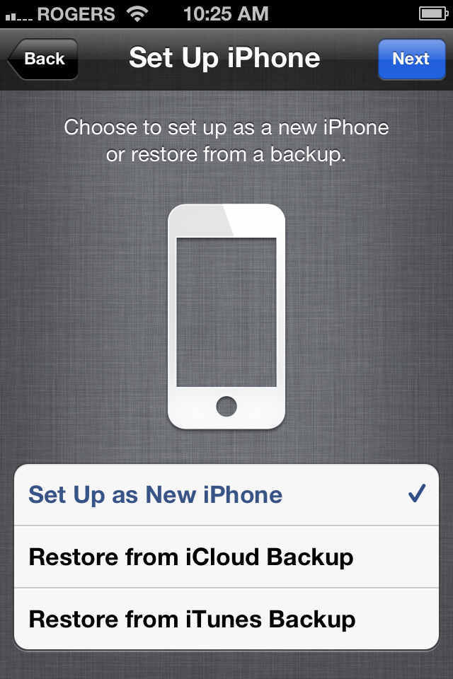
You have the choice to
- Setup as a new iPhone, iPod touch, or iPad
- Restore from an iCloud Backup
- Restore from an iTunes Backup
Set up as New
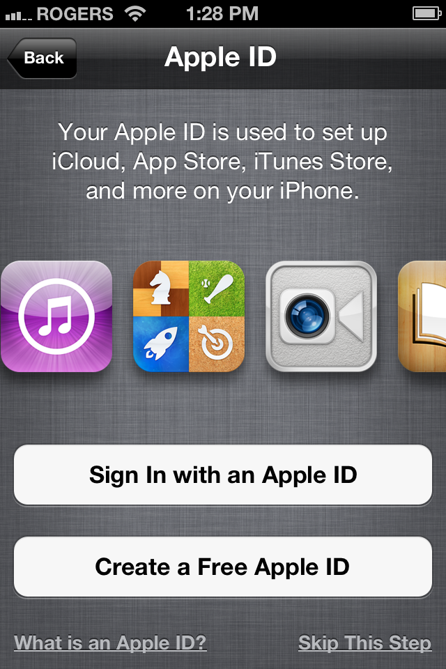
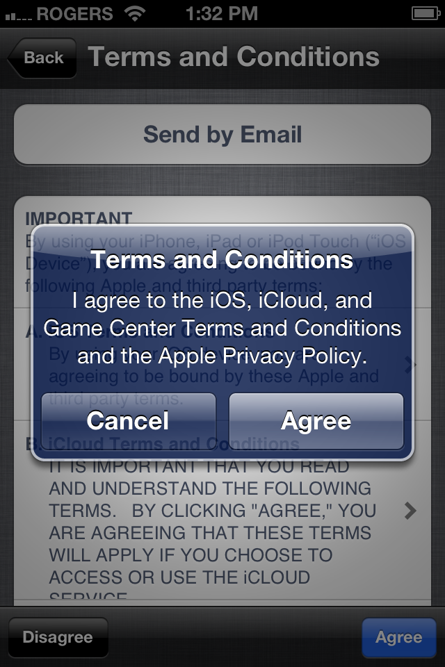
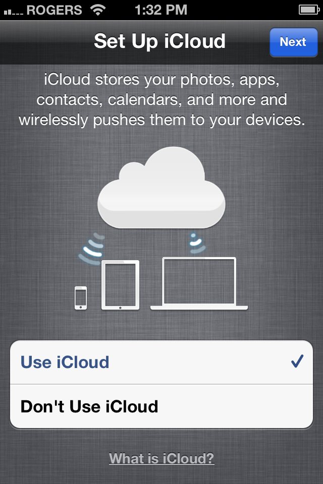
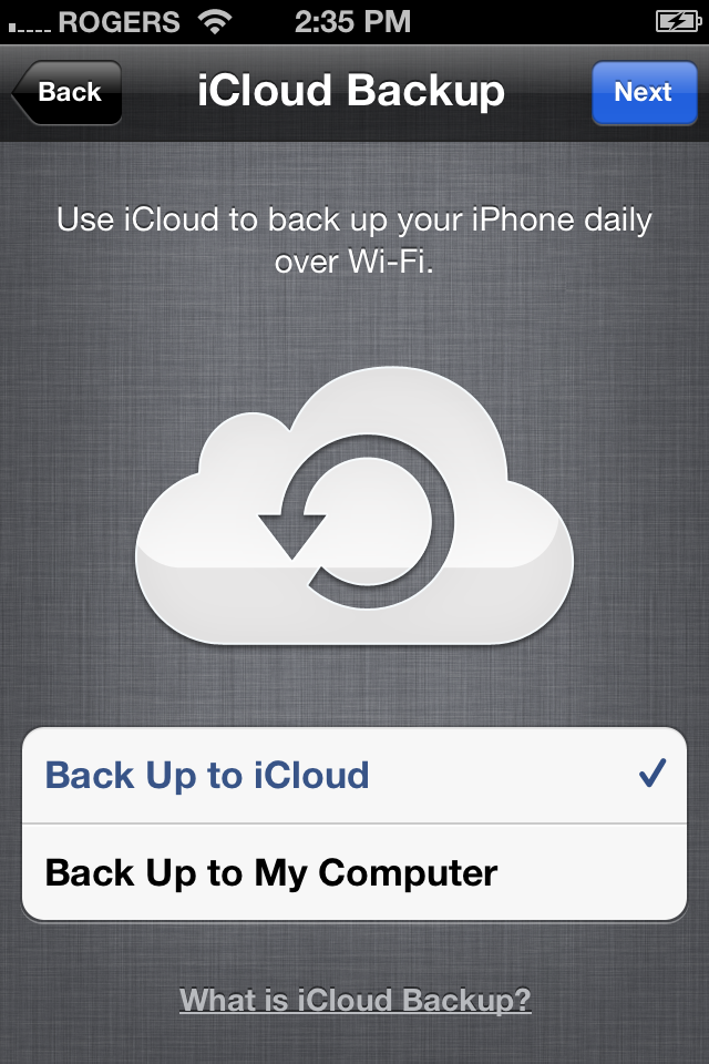
To set up your iPhone, iPad, or iPod touch as a new device, sign in with your Apple ID (or tap through to create one). If you have multiple Apple IDs, for example a MobileMe ID, an iTunes ID, an ID associated with FaceTime or something else, you'll have to choose which one you want to use. If you change your mind, you can login with a different ID later (and you can also login to different apps, like iTunes and iMessage, with separate IDs later). Agree to Apple's Terms and Conditions and Apple will setup your ID and ask if you want to use iCloud or not. If you do -- and most people should because it's 1) free for the base level service, and 2) highly functional -- you'll be asked to enable iCloud Backup -- and again, most people should. (It will create daily backups when you're connected to Wi-Fi.)
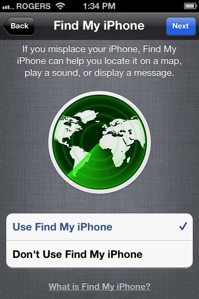
Decide whether or not you want to enable Find my iPhone to help trace lost or stolen devices, and then choose if you want to share diagnostic information with Apple to help them improve the iOS experience.
And you're done.
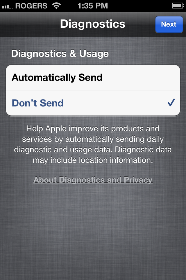
Restore from iCloud Backup

You can also choose to restore based on a previous iCloud Backup. You'll be asked to sign in with your Apple ID. Make sure it's the same Apple/iCloud ID that you used to make your previous backups. Agree to the Terms and Conditions and you'll be given a list of recent backups to choose from, including those of all iOS devices backed up to iCloud.
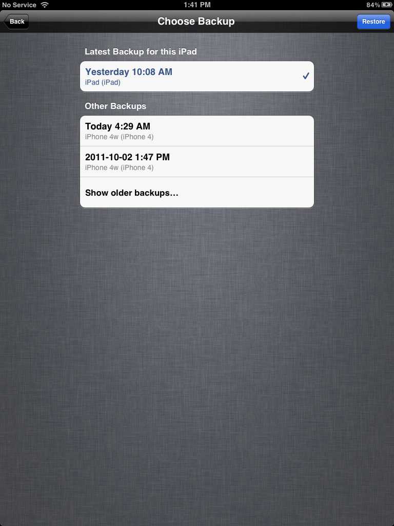
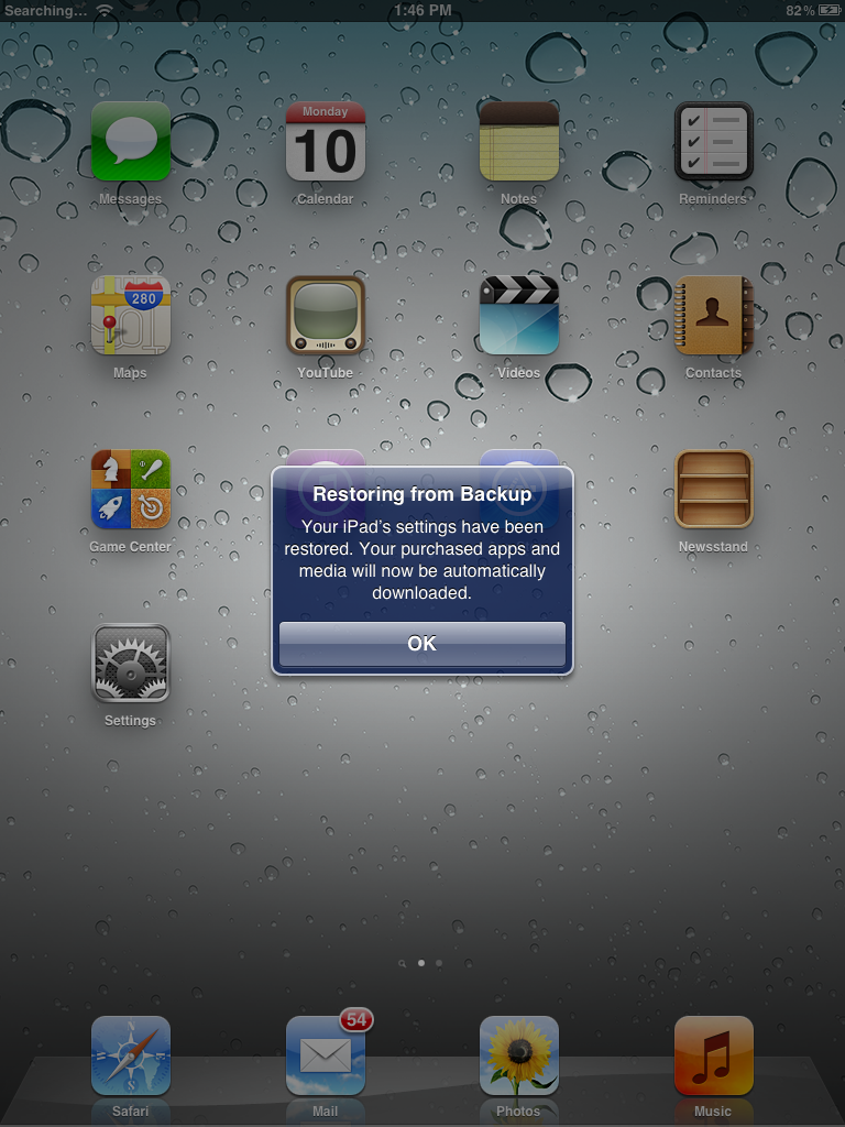
Pick your backup and iCloud will begin the restore. Then your iPhone, iPod touch, or iPad will restart, all your settings nicely back where you left them, and iTunes will begin to re-download all the apps you had installed when the backup was made. If you live in countries where iTunes in the Cloud is available, iTunes will also re-download all the iTunes music, TV shows, and iBooks that were previously on your device. (You need to stay on Wi-Fi for large files to re-download.)
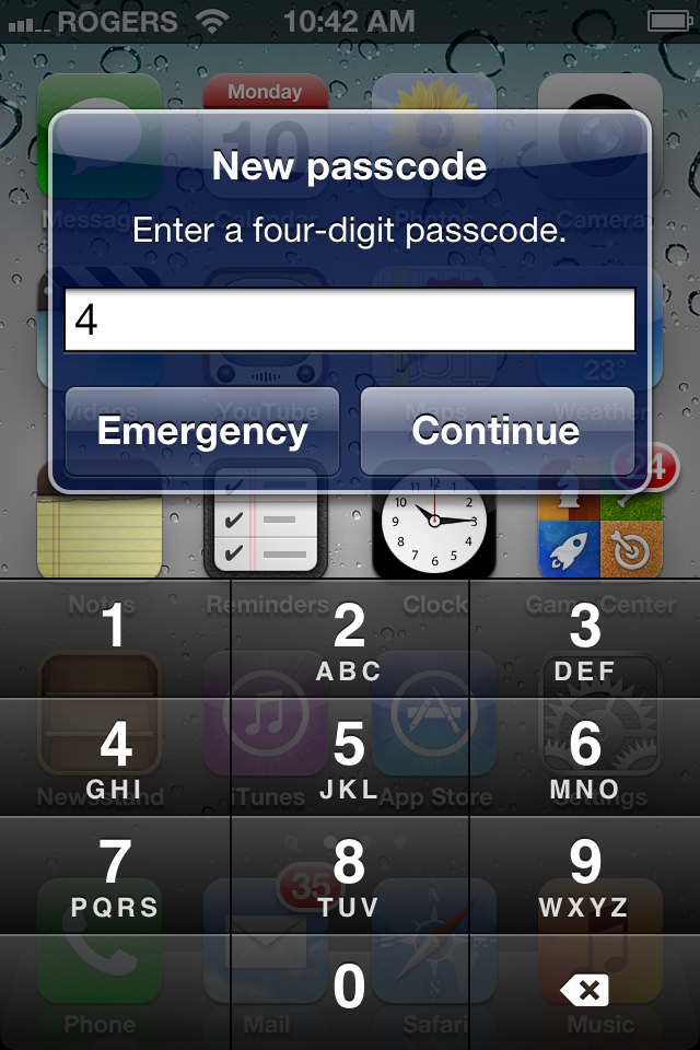
For security reasons, iOS may also prompt you to set a Passcode Lock, and not wait for you to go find it in Settings on your own.
Software Update
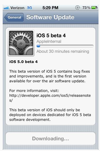
Gone are the days when, after Apple released a software update, you had to rush back to your iTunes-equipped Windows or Mac PC, download a 500MB+ firmware file, backup your data, install the new OS version, and restore you data back to your device. You can now do all that, better and faster, right on your iPhone, iPod touch, and iPad.
When a Software Update is available, you'll get a notification popup. The Settings app will also get badged, just like Mail. To get your update, go to Settings, tap on General, tap on Software Updates, and if it isn't there waiting for you, tap on Check for Updates. When you see the update, tap Install.
The firmware will download and then your iPhone, iPod touch, or iPad will restart and update.
Apple is now doing bit-differential, or delta file updates. That means only the bits that have changed need to be downloaded, not the entire firmware anymore. The update also happens in place, so you don't need to backup and restore your data. Much more efficient and hence much faster.
![Daily Tip: How to do an iOS OTA update [developers]](https://cdn.mos.cms.futurecdn.net/zoaBAqnr6FyNzoE2Aw73MK.png)
Wi-Fi sync

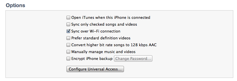
If you do still want to sync with your home iTunes library but don't want to have to tether to your Windows or Mac PC over USB, you now have the option to sync over Wi-Fi as well. Wi-Fi sync needs to be enabled in the Settings app, and you need to sync with iTunes over USB at least once to set it up, and you need to be plugged into power throughout, but if none of that dissuades you, Zune-like Wi-Fi sync is finally yours.
Non-modal USB sync
If you do choose to keep syncing with iTunes over USB, or you sync occasionally over USB to move over large files, like movies, you can now continue to use your iPhone, iPod touch, or iPad while syncing. (Previously unlocking your device would cancel the sync.)
Multitasking Gestures (iPad 2 only)

Back in iOS 4.3 Apple introduced Multitasking Gestures as a beta feature for developers to test. In iOS 5 they're back and they're for everyone. They include 4 or 5 finger multitouch navigation gestures that complement rather than replace the Home Button functions. They do, however, reduce the amount of times you need to single or double click Home, which could reduce concerns of hardware wear and tear post iOS 4 multitasking.
The new gestures can be done with 4 or 5 fingers and resemble multitouch trackpad gestures available on Mac OS X since the introduction of the original MacBook Air in 2008 and expanded upon in the recent Mac OS X 10.7 Lion. They currently include
- Pinch all fingers in to exit an app and return to the Home Screen (identical to single-clicking the Home Button).
- Swipe up from the bottom bezel to reveal the multitasking Fast App Switcher Dock (identical to double-clicking the Home Button).
- Swipe sideways from left to right or right to left to move between recently open apps (similar to double-clicking the Home Button to reveal the Fast App Switcher and tapping on an app icon immediately to right).
The sideways swipe is interesting in that it allows you to go left or right whereas the Fast App Switcher reorders the recent app icons so you always go backwards in "time" to the right. It seems perceptively faster for a single app-back movement since there's no carousel animation, yet you can only swipe back one app at a time whereas you can tap on any of 4 immediately available app icons in the Fast App Switcher and jump back 4 additional apps at a time.
Either way, once you get used to them they make moving around apps on an iPad 2 a breeze.
Siri (iPhone 4S only)

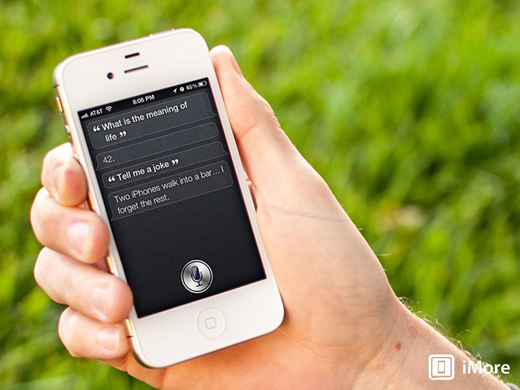
Siri is a natural language interface for iOS that combines powerful voice recognition (rumored to be powered by industry leader Nuance) and synthesized speech with a context-aware, artificially intelligent query and response engine designed to become your "virtual assistant". It replaces the previous Voice Control feature introduced with iOS 3 on the iPhone 3GS and is initiated the same way -- a long press and hold of the Home Button.
Siri launches as a beta and supports English (U.S., UK, and Australian), French, German. Apple urges users to talk to Siri the way they would another person, and to ask similar types of questions. Here's some of what Siri can do:
- Set up Reminders, Calendar appointments, and Clock alarms and timers.
- Send Texts, iMessages, and Emails
- Play Music
- Search for location based information like restaurant and business listings, and search for directions to locations
- Search Yelp (in the U.S.), Wolfram Alpha, and Google for information.
- Ask about Weather and Stocks
- Read your SMS/iMessage messages.
- Take dictation in any app.
- Silly questions. (Apple has actually programmed in funny responses to many of these.)
You can set relationships, so Siri knows who your spouse, parents, children, colleagues, etc. are, and even set a nickname for yourself so Siri knows what to call you.
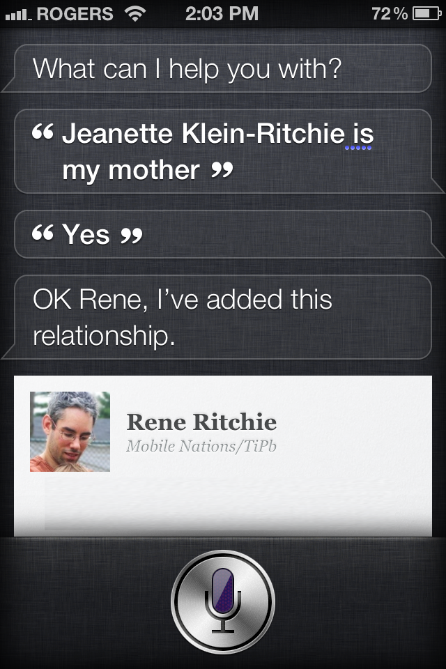
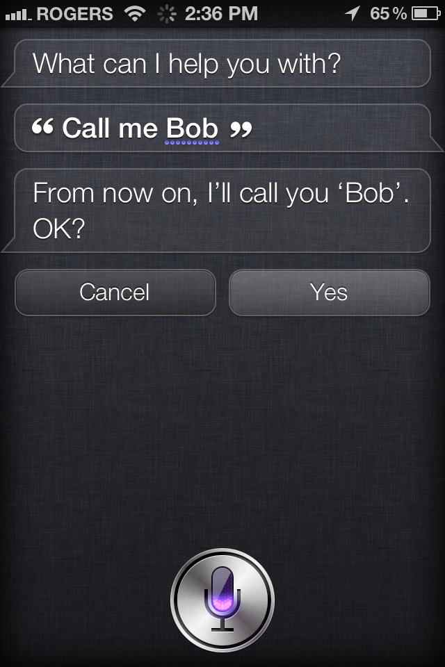
More impressively, it can combine these functions together into interactions. Siri can read a message requesting a dinner date, search for a restaurant, get directions, send back a confirmation message, and add an appointment for the dinner, all as part of an interactive confirmation. Here are some examples of real-world things you can say to Siri.
- "Siri, remind me to call my mom at work when leave home." Siri will start a Reminder, set the departure location as your home address, determine which of your contacts is defined as your mother, and popup an alert to with your mom's work phone number ready to dial when you leave.
- "Siri, tell my boss I'll be there soon." Siri will get the contact that's defined as your boss, find the mobile phone number, and send her an SMS/iMessage with the content reading "I'll be there soon."
- "Siri, read my messages." Siri will read any new SMS or iMessages that have come in.
- "Siri, wake me up in 30 minutes." Siri will set a Clock timer that will go off In 30 minutes. (Hopefully when your nap is over.)
- "Siri, where can I get Italian for lunch?" Siri will search for nearby restaurants and show them to you on a map. In the U.S. it can also order them by Yelp ranking.
- "Siri, do I need a raincoat today?" Siri will check the weather, see If it's likely to rain, and let you know if you need to worry about Ig wet.
- "Siri, who starred In the movie Serenity?" Siri will search Wolfram Alpha and give you a cast list from the movie.
- "Siri, what's your favorite color?" Siri will give you one of several replies, likely that your language lacks the dimensions to properly describe the right shade of green.
- "Siri, tell me a joke." Siri might just start the one about the two iPhones that walked into a bar…
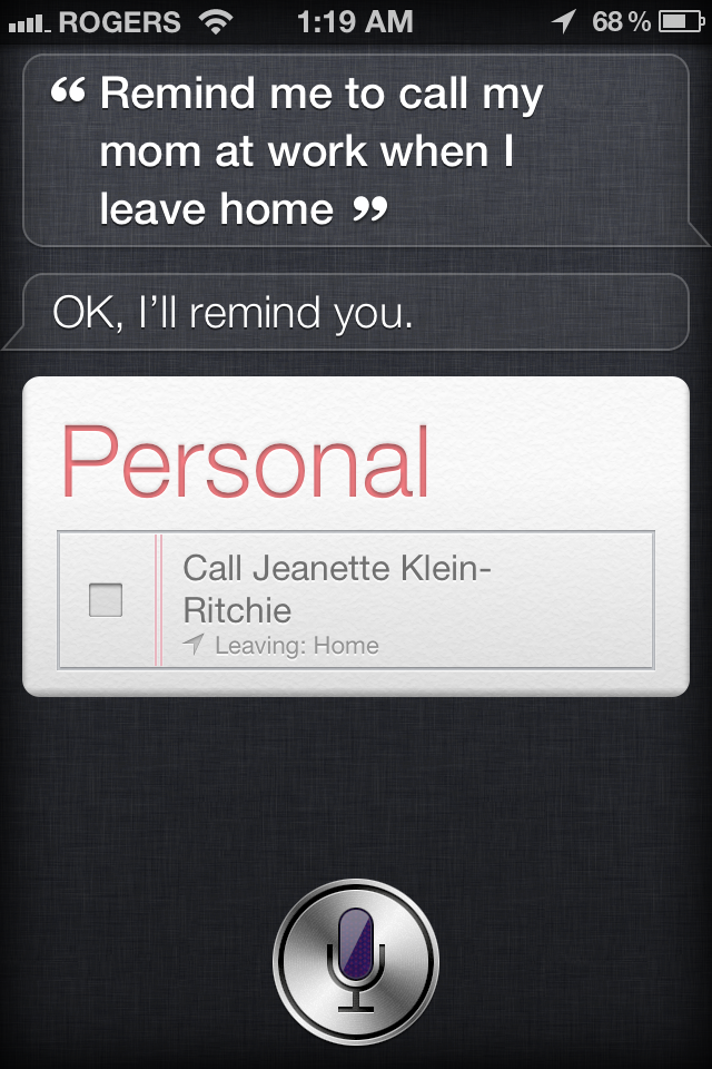
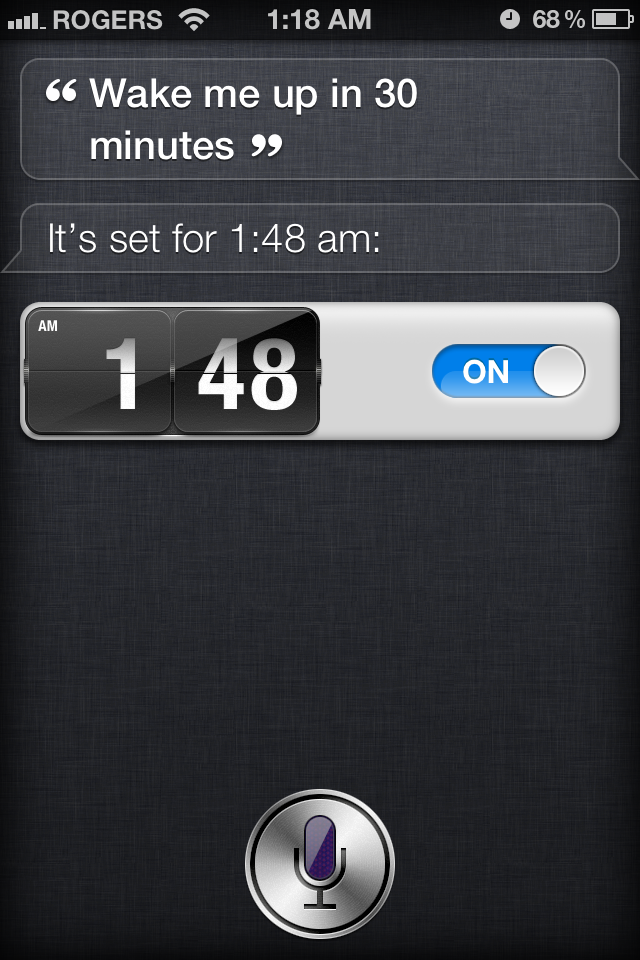
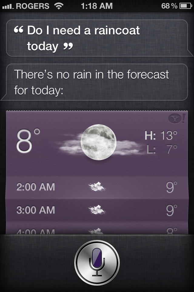
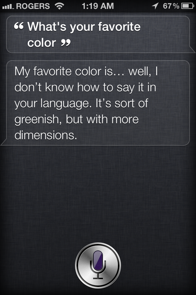
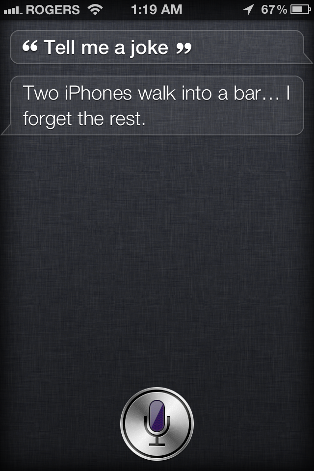
Siri will listen to and parse these and other questions, launch applications like Mail or Messages, search internet services like Yelp and Wolfram Alpha, and check the Weather or Stocks. It will then synthesize and speak a response, and if you ask a follow up question, it will remember the context and understand the next query and issue the follow up response accordingly.
Equally interesting is what it portents for Apple. Just like the App Store began the intermediation and exclusion of Google by offering users a better experience interacting with data in apps than via a web search, Siri continues it by theoretically making it easier and more enjoyable to engage in query/response with Siri than with Google. In typical fashion, Apple isn't building a search engine to compete with Google, they're building something to obsolete the current conception of search engines. And they're not doing it by becoming a walled garden -- there's no profit in that. They're doing it by becoming a walled gate with a multi-directional toll system.
Customer Insight is a hot industry topic for a reason -- if done well it lets you increase revenue per user, turn users into products you can sell to advertisers, and even turn suppliers into customers of their own data, and complementary and competing companies' data.
At least in theory. It remains to be seen how reliable and resilient it will prove when millions of new iPhone 4S users start pounding on it. Whether it's the best new feature in iOS 5 and the future of user input, or just the best new feature no one will use for input remains to be seen.
Note: Apple says additional language and feature support will be coming to Siri in the future.
Dictation
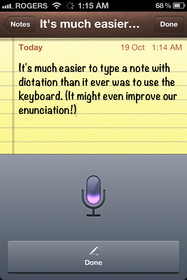
In addition to Siri's query/response engine, it also includes speech-to-text functionality. This manifests as a microphone key to the left of the space bar that, when tapped, brings up an speech input interface. Talk, tap Done, and Apple will parse what you said on their servers and return text to built in apps like Mail or Messages, or any App Store app that supports keyboard entry, including Facebook, Keynote, etc.
Siri also understands symbols, punctuation and other special characters, like period and question mark, "open parenthesis" and "close square bracket", and "new line" and "new paragraph", provided you use their proper name.
Notifications

iOS 5 brings non-interruptive, less intrusive notification alerts to iPhone, iPad, and iPod touch. Similar to how Android's notification tray works, or the basic functionality of the LockInfo Jailbreak app, it's perhaps not quite as elegant as webOS' system but it's a huge leap forward from iOS' previous implementation.
Notifications are presented in one of three different ways:
- Lock Screen Info
- Notification Center
- Notification Banners
All of the implementations show an icon of the app issuing the alert to the left and a brief except of the alert content to the right, but work in slightly different ways.
Lock Screen Info
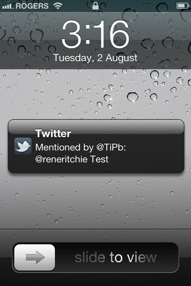
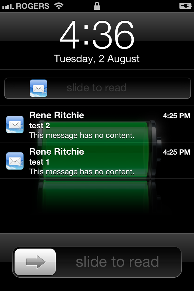
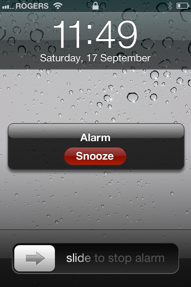
Lock Screen Info is the most complex of the three. When an alert comes in, your iPhone, iPad, or iPod touch wakes briefly from sleep to show you the notification.
- If it's a single notification, you get a single popup.
- If it's multiple notifications, you get a stacked list view.
- If it's a single notification but there have been previous unread notifications, you get a single popup but can view the complete list by swiping down from the time/date bar (a small gripper icon indicates when this is possible.)
- If it's a notification along with a secondary action, for example Snooze for an alarm notification, a secondary button will also appear for that action.
Touching and dragging the icon unlocks the device and sends you to the app to view the information. Unlocking the device clears all past notifications from Lock Screen info.
Notification Center
When your iPhone, iPod touch, or iPad is unlocked, Notification Center can be revealed by swiping downwards from the status bar. It can be dismissed by swiping back up from the small gripper icon at the button of the screen.
Notification Center proper brings widgets of a sort to iPhone and iPod touch, though currently only Apple's own Weather and Stocks app are enabled. Weather shows the current local or default temperature, hi and low, and precipitation, if any. Stocks shows a horizontally scrolling ticker of recent quotes and the delta changes since the previous close. Tapping on either one takes you to the full app.
Just like iPad has no Weather or Stocks apps, it has no widgets in Notification Center.
Beneath the widgets is the notification list. Each list is headed by the corresponding app icon and name to the left, and a far-too-tiny X icon to the right. Tapping the X icon clears all notifications for that app. Tapping anywhere on the alert will take you to the app to view the information. You can control which apps and how many notifications per app are displayed in Settings.
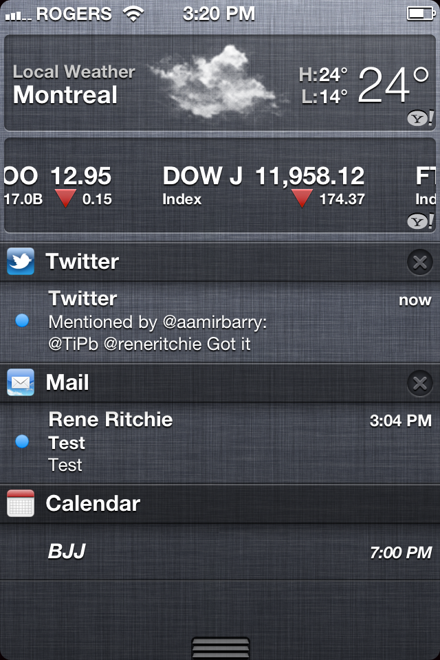
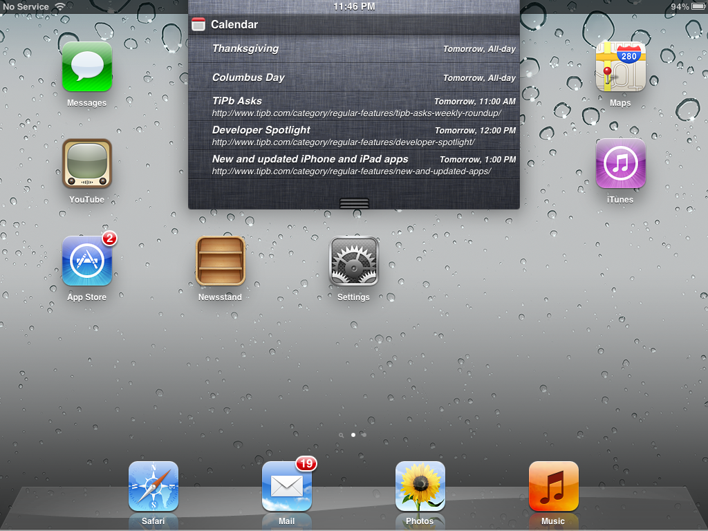
This is lightyears beyond where iOS notifications were before. Balancing the desire of power users for powerful notifications with the desire of casual users to avoid constant interruption is tricky. Notifications does a good job of it and it raises intriguing possibilities for the future. Developer access to the widget system, media controls in Notification Center as opposed to the Fast App Switcher, radio controls for fast Wi-Fi and Bluetooth enabling/disabling like SBSettings perhaps? Apple values simplicity, but they're not afraid of hiding layers of sophistication beneath it.
Notification Banners
Notification Banners appear appear briefly at the top of the screen whenever your device is unlocked, and are animated with a roll down, roll back up effect. Tapping a Notification Banner sends you to the app that issued the alert and shows you the information. While far less obtrusive than the old-style popup notifications, the Banners can still obscure information and cover buttons, and when they roll-down unexpectedly can cause you to accidentally tap them rather then the top bar or button you'd begun to tap. Hopefully, as Apple matures the notification system and developers update their apps to support iOS 5, this issue will diminish.
If they're really getting in your way, you can either touch, pull slightly, and flick them away, or swipe from right to left to dismiss them more quickly.
Note: Some apps will still default to old style popups to really get your attention, like Clock alarms and Calendar appointment alerts. You can manually assign your preference on an app-by-app basis in Settings.
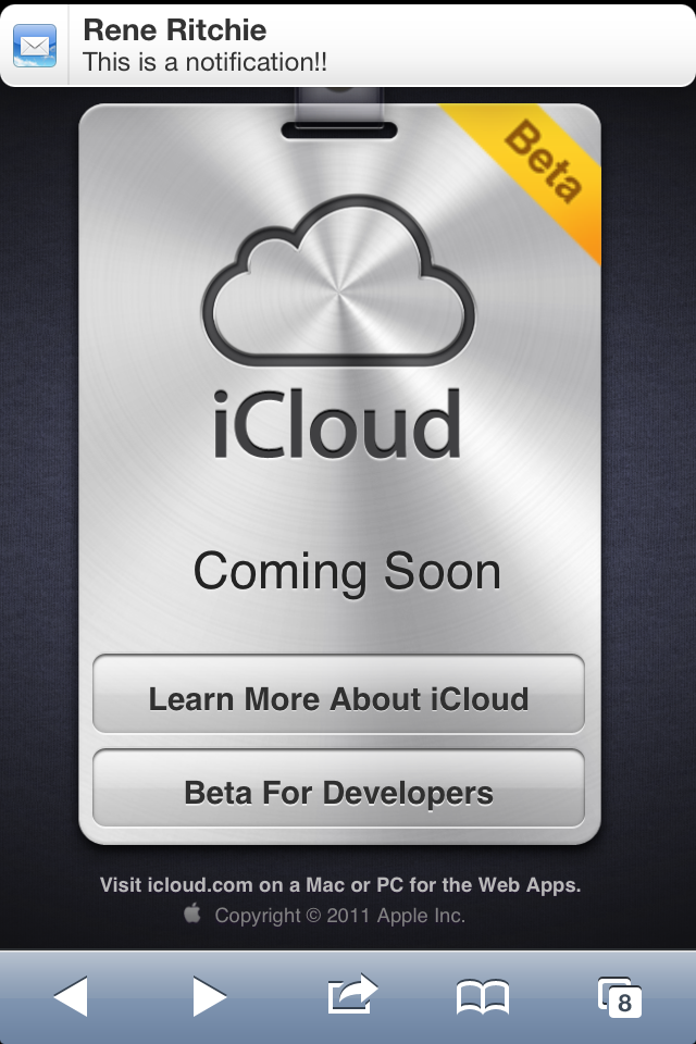
Again, far better than what came before, yet there's room for more to come. For example, the ability to tap and instantly reply to Messages without having to leave the current app -- like BiteSMS?
Notification Accessibility

iOS 5 also adds new accessibility features that allow the camera's LED flash to be used to signal notifications. Vibration patterns, including custom vibration patterns, can also be assigned and created to better identify incoming notifications, such as phone calls. These features are accessible in the Settings app.
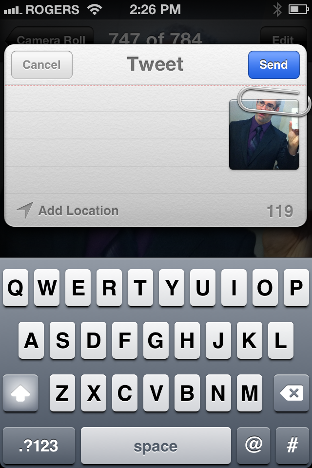
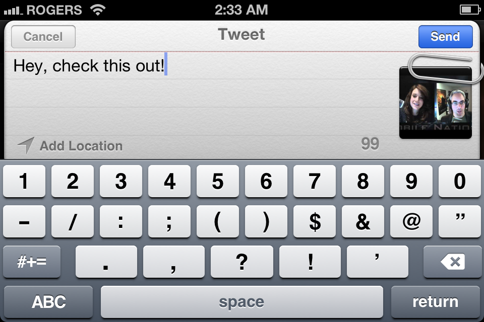
Twitter, the 140-character social network, has been integrated into iOS 5 at the system level. This means that everywhere you could previous Share content via Mail or Messages, you can also now choose to Share by way of a Tweet. Rather than handing you off to the official Twitter app, however, just like Mail and Messages are embedded views, so are the new tweet sheets. Just fill them out, choose if you want to add your location, and tweet away.
AirPlay Mirroring (iPad 2 and iPhone 4S only)

AirPlay was introduced with iOS 4.2 and allowed any video using Apple's standard media control to beam image and sound over a local Wi-Fi network to an Apple TV for viewing on the big screen. It was... limited in its initial release but iOS 4.3 brought increased support for Apple's Photo app and added support for 3rd party apps, and in general made it a solid, enjoyable feature. (Especially with on-the-fly transcoders like Air Video)

With iOS 5, Apple brings AirPlay Mirroring to iPad 2 and iPhone 4S. AirPlay mirroring lets iOS share it's screen, any screen of any app, to the Apple TV over Wi-Fi.
iPhone 4S and iOS 5 brings AirPlay mirroring to the iPhone. Because Apple decided against adding a dual core Apple A5 chipset to the 2011 iPod touch, that's now the only device left out in the cold when it comes to mirroring.
While on the surface AirPlay mirroring might not seem like a major feature, it allows the personal, intimate experiences of everything from gaming to FaceTime to become social, group activities, and allows videos and presentations to be shared by the whole family or entire meeting.
A keynote presentation projected in the boardroom, or a group of friends playing a big screen boardgames are just some of the obvious uses. As companies like Firemint continue to push the envelope with concepts like multiple-device-to-Apple-TV Party Play -- where iPhone 4S and iPad become controllers for group gaming, an a serious threat to traditional consoles in the casual space.
To activate AirPlay Mirroring, start the app you want to mirror, double tap the Home Button to bring up the Fast App Switcher, swipe across the media controls, tap the Air Play button, and select Apple TV as the source.

Dictionary
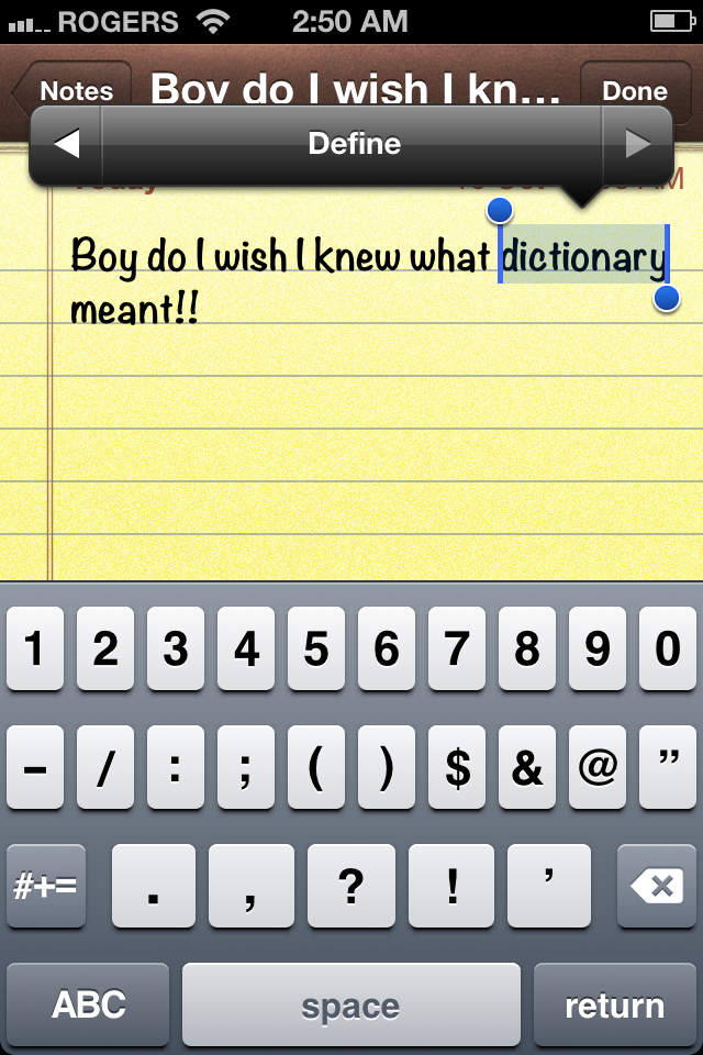
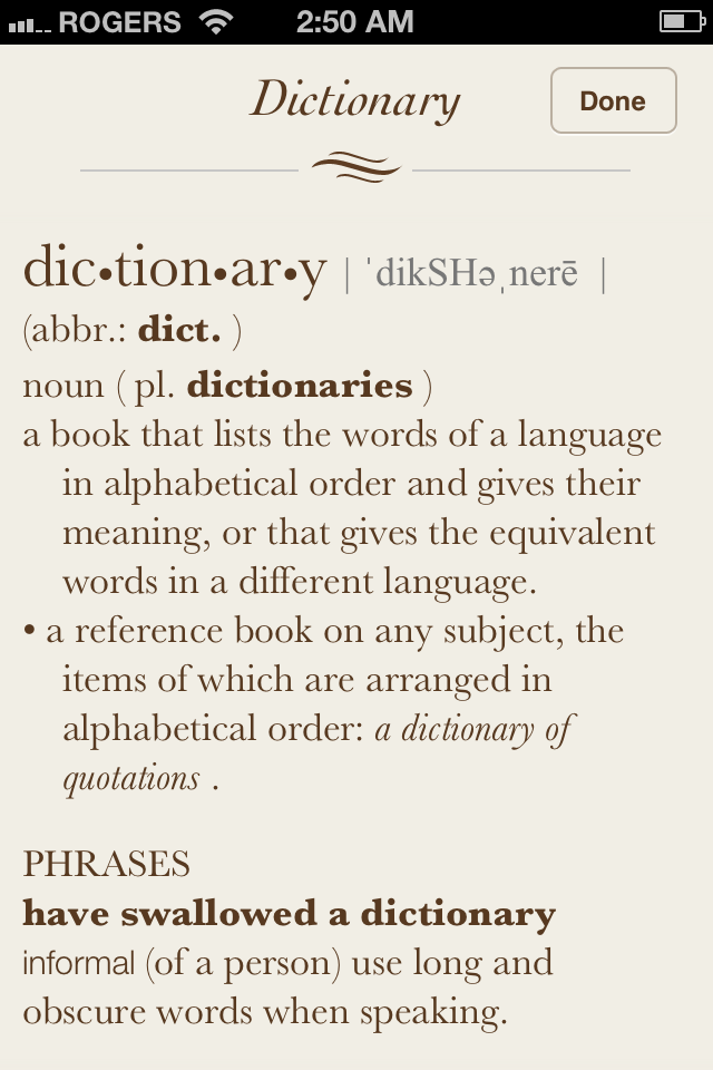
Previously embedded only in Apple's iBooks, with iOS 5 the entire system has access to a built in dictionary. Unfortunately, I'm lead to believe developers don't have access to it yet for App Store apps, but hopefully that will change in the future.
Keyboard (iPad only)
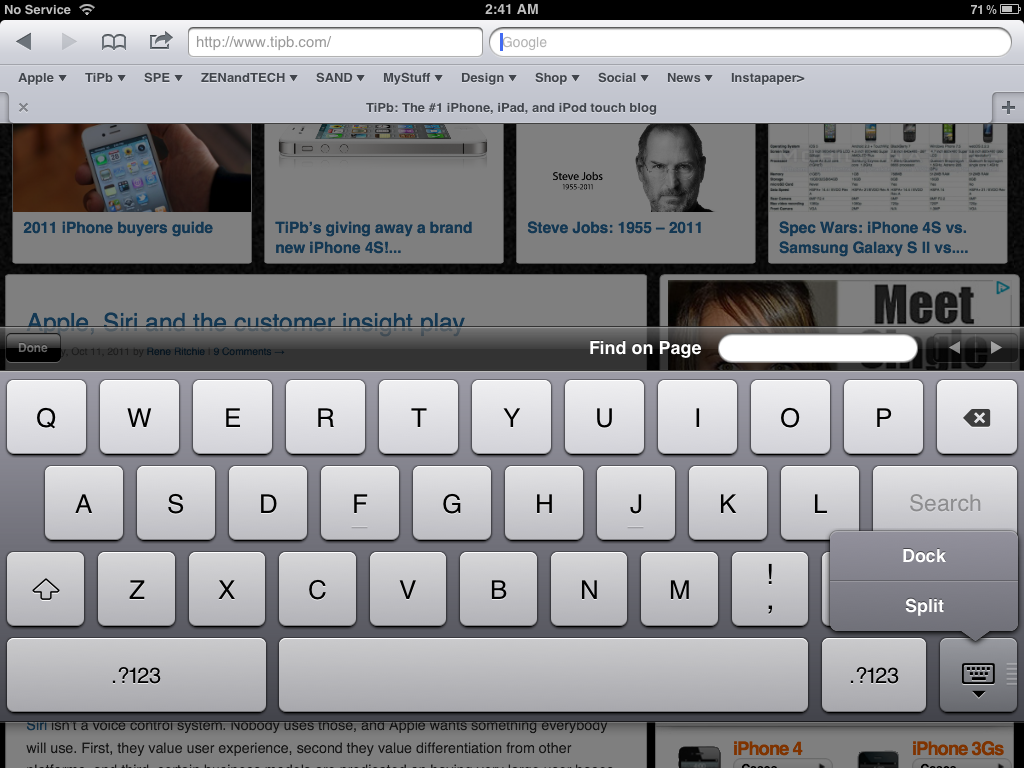
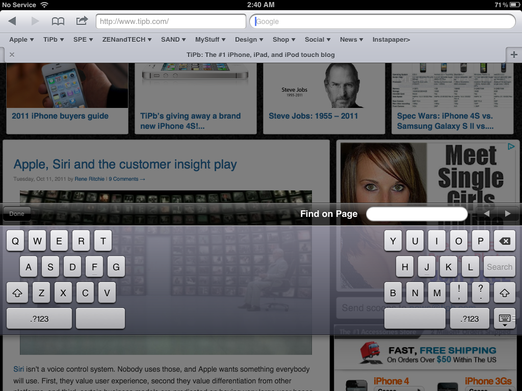
With iOS 5, iPad gains the ability to not only undock the keyboard and slide it up and down, but to split it apart into two half-keyboards for easier thumb-typing. Just touch and hold the Keyboard button at the bottom right of the keyboard to popup the dock/undock and split/merge menu, or just touch it at both sides and pull it apart or put it back together again. (Yes, it's very cathartic.)
Home Screen

Compared to iOS 4's Fast App Switcher and Folders, iOS 5 changes either transcend just the Home Screen (Notification Center's Lock Screen info) or blur the boundaries between Home Screen and app (Newstand). Still, there are a few additions that can probably be safely categorized under Home Screen.
Multiple app installs
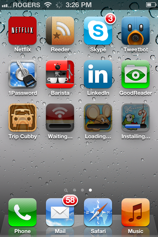
Instead of Apps being installed one by one, multiple apps can now be downloaded and installed simultaneously.
Assistive Touch

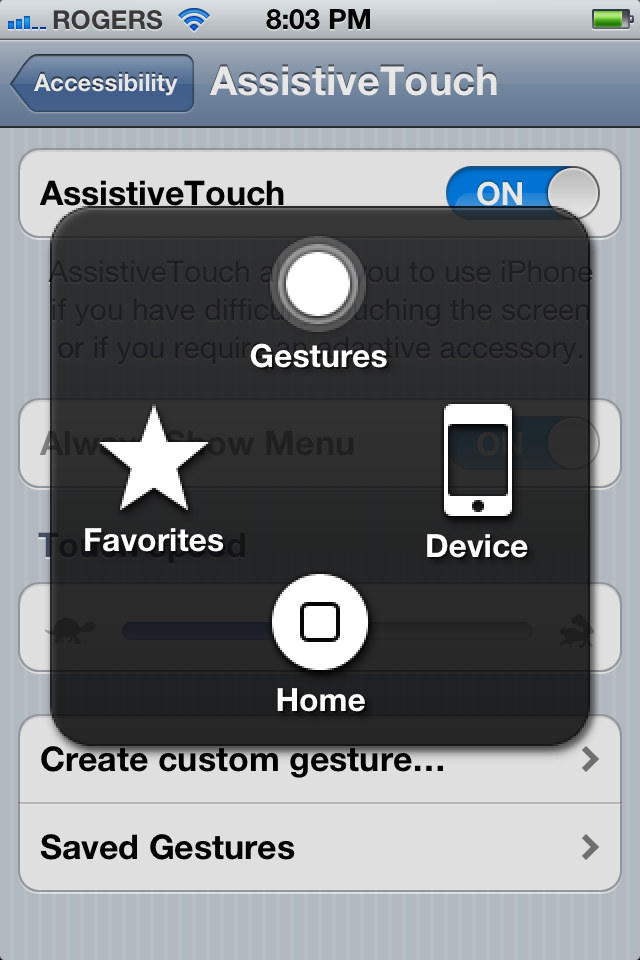
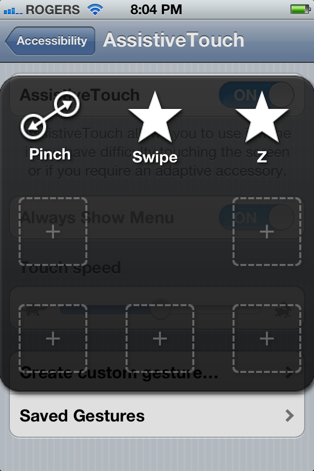
iOS' already industry leading accessibility has been augmented with a gesture based control panel called AssistiveTouch that can reproduce all the functionality of the existing hardware buttons, and much more.
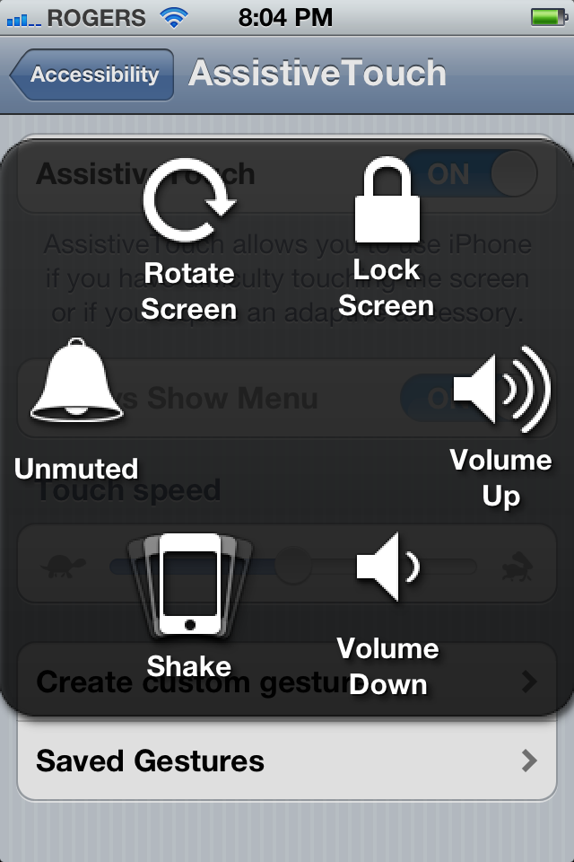
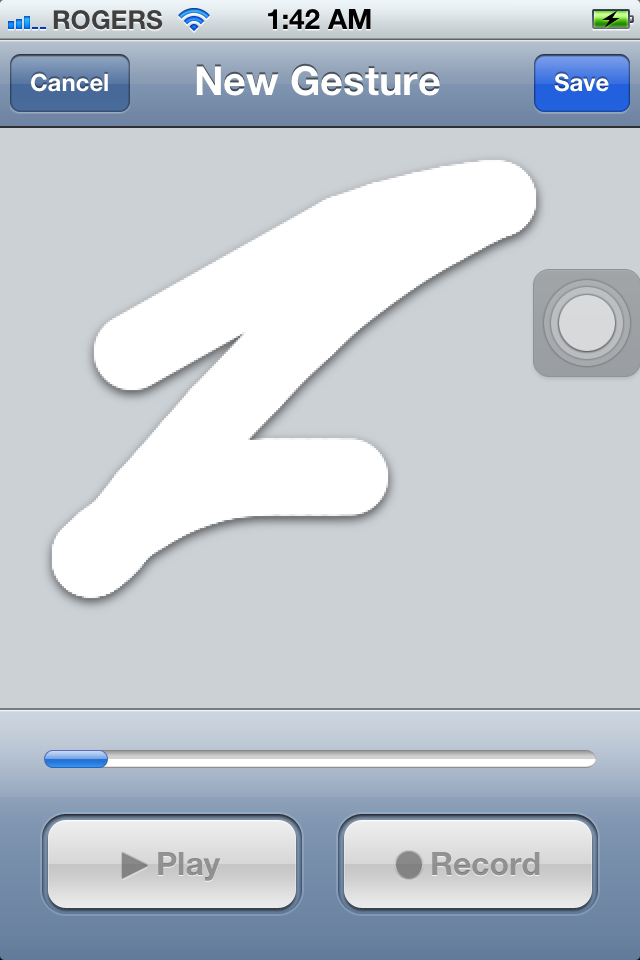
Once turned on in Settings, the control panel can be activated by tapping the overlay on screen. It pops up with a menu containing Gestures, Favorites, Devices, and Home. Gestures has a sub menu for 2, 3, 4, and 5 finger gestures, and once you choose a quantity, blue circles in the appropriate amount appear on screen. Favorites contains defaults like Pinch and Swipe, and any custom gestures you've created. Device replicates the hardware features such as Rotate Screen, Lock Screen, Mute/Unmute, Volume Up/Volume Up, and Shake.
While some may think this heralds Apple ditching hardware buttons, remember, you would still need a way to reset your device if it locks up, to turn off the ringer or change volume if it's in your pocket or purse, and to keep iOS accessible for children and people form whom the Home Button is easy and complex UI and gestures are a barrier to entry.
Still, this could turn out to be a very interesting addition to iOS 5, especially for advanced users who want to have a software-based interface. Most importantly, it shows that Apple -- who is already incredibly far ahead of the competition when it comes to accessibility -- is not slowing down.
Messages

The biggest change to Messages is one that's as almost invisible as it is profound. Messages began as SMS, an in the beginning only offered text message functionality. In iOS 3 internationally and iOS 4 in the US, Apple renamed is Messages and added MMS functionality. Now, in iOS 5, Apple has replicated the carriers' traditional cash cow by providing a method to send text and multimedia via iMessages -- securely encrypted -- over the Wi-Fi and cellular data networks.
Messages neatly handles both traditional SMS/MMS messages and iMessages, with iMessages integrated so seamlessly that only the color and faded text -- green for traditional SMS/MMS and blue for iMessages betray which is in use at any given time.
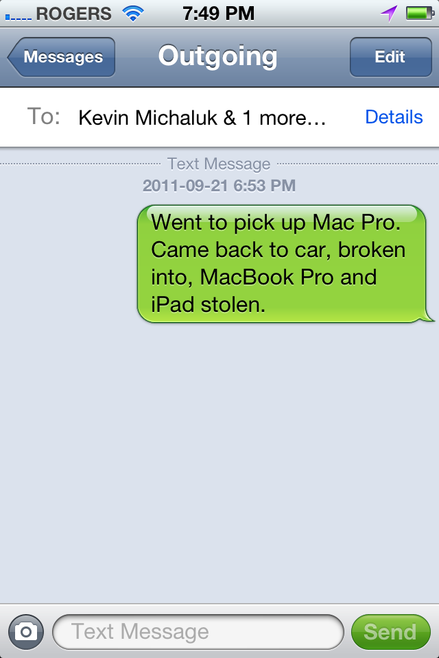

There is one large limitation to iMessages, however, and for some users it might be a deal-breaker -- it only works between iOS devices. That hasn't stopped BlackBerry's BBM from become a platform-locking success, but BBM has been around much longer and offers far, far more functionality.
That's not to say it doesn't have some BBM-like functionality. You can see delivery status and, if enabled in Settings, read receipts as well. You can see, via ellipses, when someone is in the midst of responding. Also, for users with limited text plans, especially expensive international text plans, and lots of friends on iOS, iMessage will be welcome.
Like FaceTime before it, iMessages uses an Apple ID-registered email address as a method of identification. This also means, like FaceTime before it, iMessages is available to iPad and iPod touch users. Yes, they get the iOS Messages app for the first time. Due to the data-centric rather than telephony-centric method of transmission, they can now send and receive iMessages from other iOS users when and where they never could -- and still can't -- SMS or MMS.
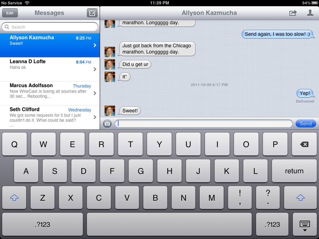
The interface conventions are a little different. iPhone has a single pane view, for example, so hitting the edit button in the contact list view lets you delete whole conversations and in the conversation view allows you to delete or forward individual messages (bubbles). On iPad, both contact list and conversations are visible at the same time so the edit button handles conversations and individual message managements is switched over, strangely, to the action button. (You can also pop up and edit contact info via the contact button, topmost right.)
However, it does mean users with more than one iOS device registered on the same iMessages Apple ID, they can start a conversation on their iPhone while out and about and continue it on their iPad when home on the couch.
In a nice touch, you can now swipe down to dismiss the keyboard and read your messages full screen.
Calendar

With iOS 5, the Calendar app gets a couple of new features that users have asking for for a while now, including new views, more consistent iOS-style navigation, and more direct touch-based interactions.
Week and Year view
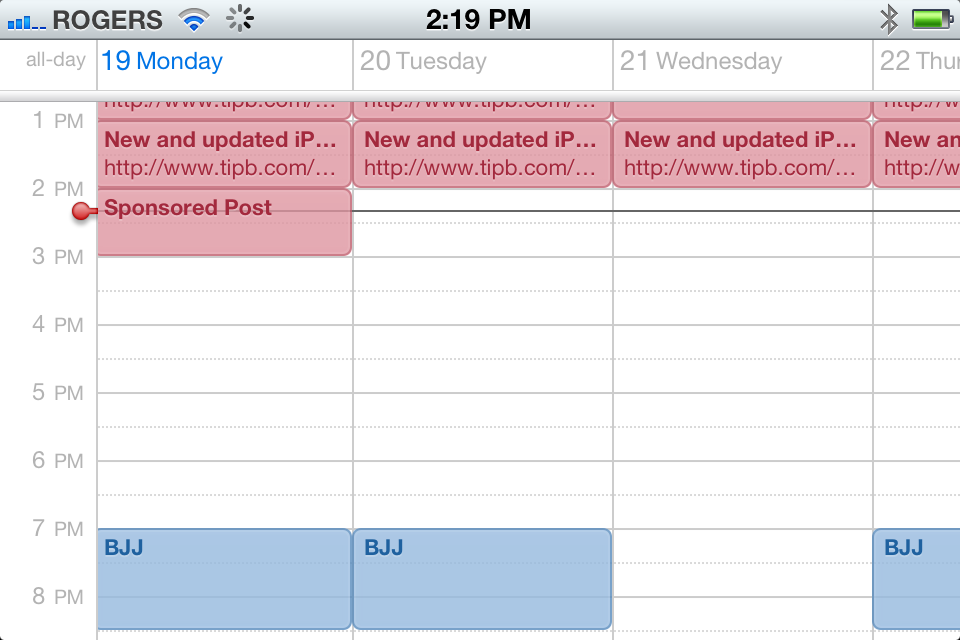
First, when in list, day, or month view on iPhone or iPod touch, turning to landscape orientation now gives you a week view.
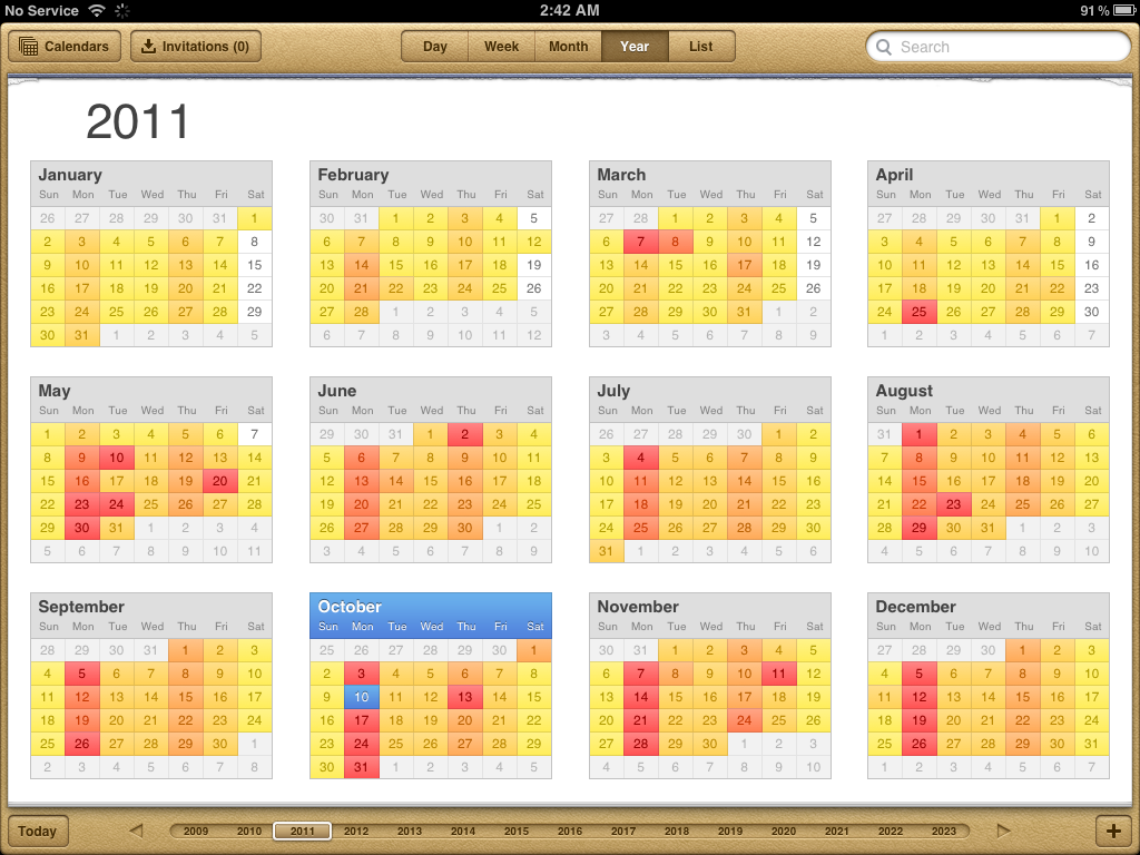
On iPad, you now get a full Year view, complete with a color-coded heat map showing how busy your days are, from empty white days to blisteringly busy red days at opposite ends of the spectrum.
Touch-based event creation and editing
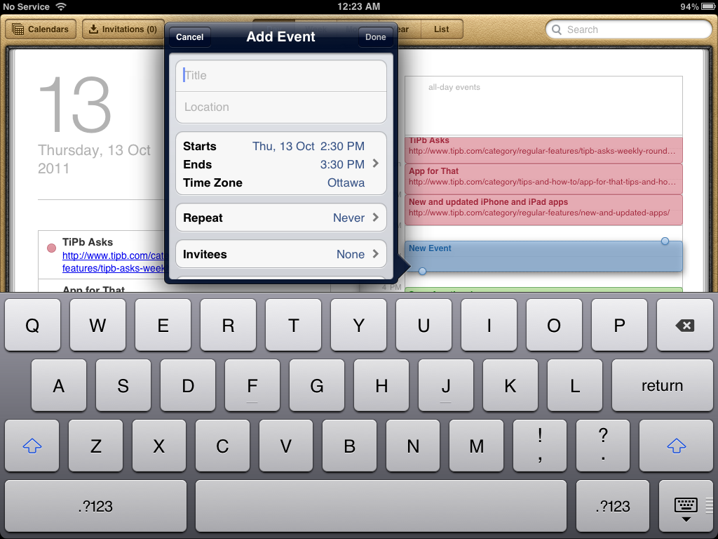
You can now also create a new event simply by touching and holding your finger down on the time (day view), or day (month view), or day and time (week view) you want to create it for, or in the all-day area (day or week view) for an all-day event. You can also touch and hold existing events to "float" them and drag them to new time time periods, or resize change (change start or end time to lengthen or shorten) using handles that appear at the top right and bottom left. The + button and edit buttons are still there and you can still use them, and you still have to fill out or change all the other information, but intuitively it's always felt like something we should have been able to done so it's nice to finally be able to do it.
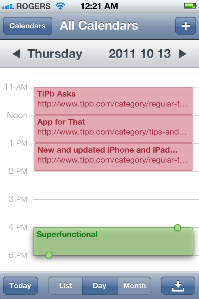
Speaking of which, you can now swipe forward or backward to the next or previous day as well. Score one for perceived consistency.
iCloud also offers the ability to share calendars with family, friends, and associates.
Photos

Photos gets a ton of new functionality in iOS 5, partially to help iOS become "PC-Free". Instead of having to rely on iPhoto on your Mac, or image software on Windows, you can now do basic photo editing and album management right on your iPhone, iPod touch, and iPad.
Album management
While not specifically called out as part of Apple's iOS 5 "cutting the (iTunes) cord" initiative, the ability to create and manage photo albums directly on-device for iPhone, iPad, and iPod touch helps achieve just that. No longer are you stuck with what you sync over via USB.
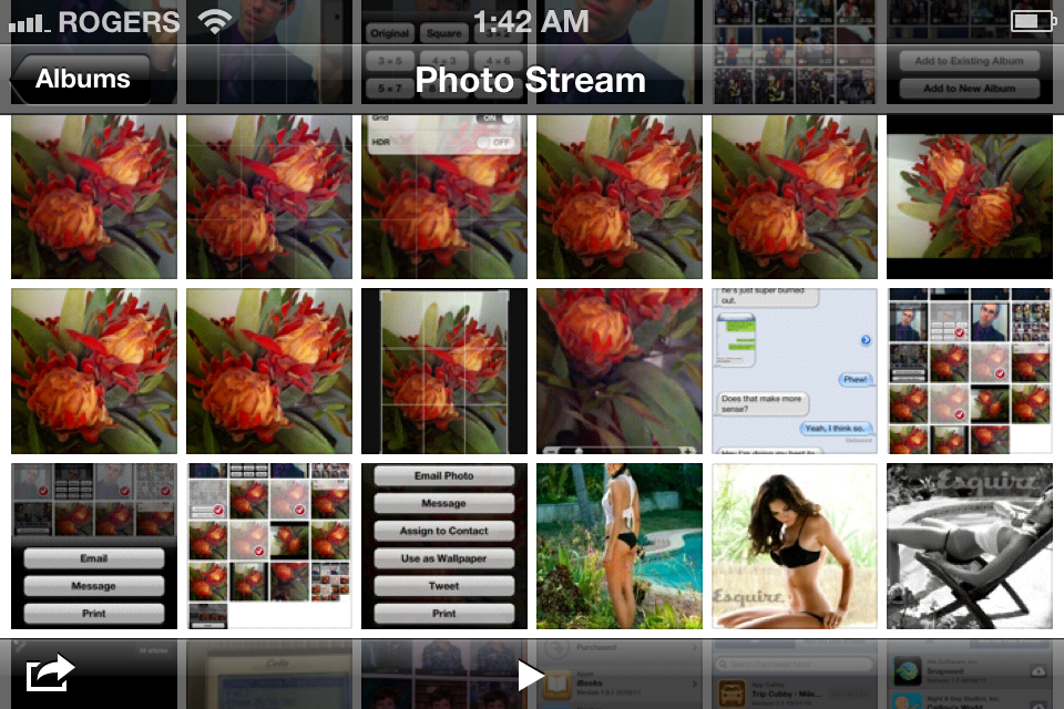
Now, by tapping the edit and then album buttons, you can add a new album. By multi-selecting photos and tapping Add To, you can move them between albums and from Camera Roll and Photo Stream (for iCloud) to albums.
Only Photo Stream pictures appear to be synced stored and pushed to all your devices, however, not the folder structure. That's a little disappointing. It would be great if whatever folder system you set up on your iPhone — family, friends, dogs, hawaii trip, etc. — would automagically be replicated on your iPad or iPod touch, but… baby steps.
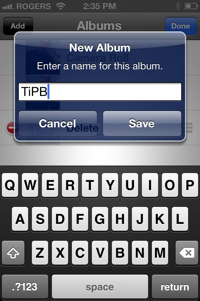
Photo editing
Apple has also moved the powerful CoreImage framework from OS X to their mobile operating system, allowing the Photos app for iPhone, iPod touch, and iPad to do some basic image editing work. Now, by tapping on the edit button at the top right, you get access to several iPhoto-like tools:
- Rotate, to turn your image in 90 degree increments
- Auto-enhance, which waves a magic wand and tries to balance your image
- Red-eye removal, so you can just say goodbye to flash-induced evil possession
- Crop, which lets you cut away the parts of an image you don't want, and includes all the standard presets.
As is the case with most built-in functions, it provides the basic set of tools but is by no means a feature complete photo editing app. Still, it's free, its bundled, and very many it will be good enough.

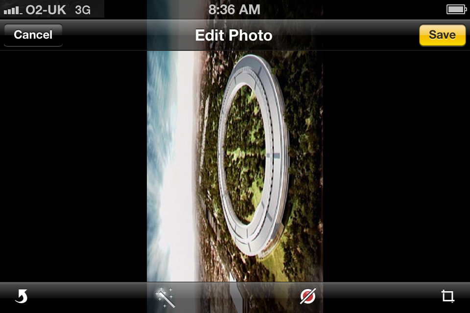


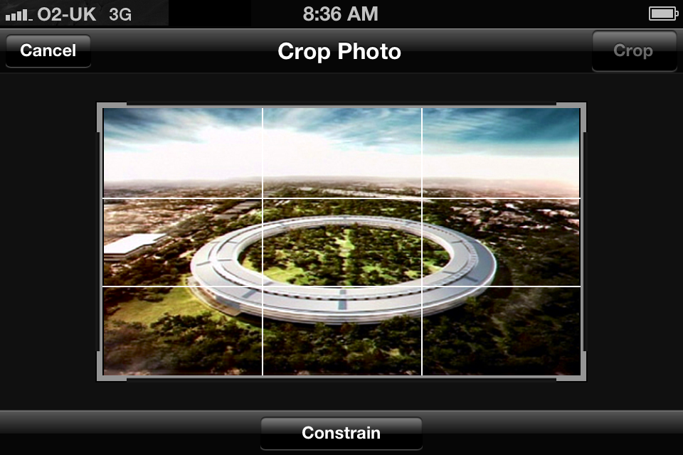
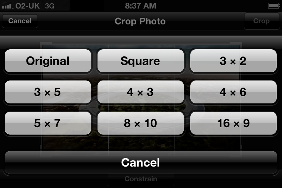
Photo Sharing
MMS has been replaced with Messages, and gone is MobileMe Gallery, but new to iOS 5 is the ability to tweet a picture (not video) to Twitter.

Photo Stream
Photo Stream is part of iCloud and keeps the most recent photos from your Camera Roll, up to 1000 of them and for up to 1 month, in a special album that's stored up to Apple's servers and pushed down to your other iOS 5 devices. It can also stream photos to an Apple TV 2 without keeping any local copies, and will store all your photos, without limit of number and time, in iPhoto or Aperture on Mac, and on a Windows PC.
Think of it as a photo only (no video) duplicate of all the Camera Rolls of all your iOS devices -- including photos you've saved to the Camera Roll from email and the web -- all in one place.
Unlike Camera Roll, however, you can't delete photos from Photo Stream. That means if you take any risqué photos, or save anything risqué from email or the web, that's it. It's in your photo stream until 1000 other photos force it off, a month passes, or you disable photo stream.
Camera

Camera's updates don't just include the ones it inherits from Photos by way of Camera Roll integration -- it gets a lot of very convenient feature additions all its own.
First from the live Camera preview screen, you can now not only get to the Camera Roll and review your photos and videos by tapping the thumbnail button on the bottom right, but by swiping back as well. (No, you can't get to the live Camera preview screen by swiping forward from Camera Roll in the Photos app.) You can either swipe back to the live Camera preview or tap the redesigned, and much brighter blue Camera button.
Faster picture taking
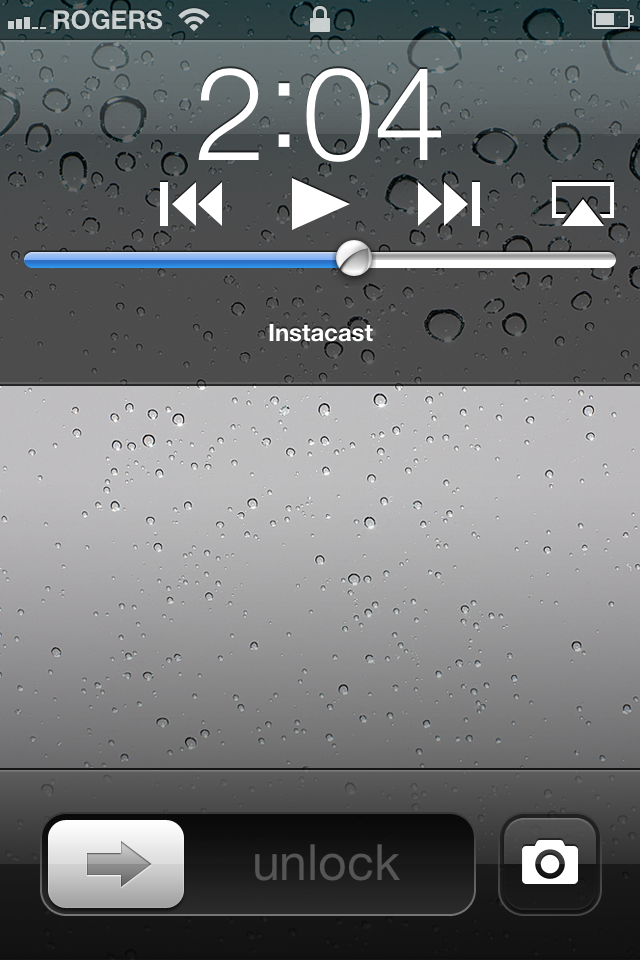
Double clicking the Home button from the Lock Screen doesn't just bring up audio controls any more -- it also brings up a Camera button. Tap the Camera button and you're rocketed straight to the camera app, Passcode Lock or no Passcode Lock. (Though if you click the Home button from there, you're intercepted by the Passcode lock.)
The Grid
HDR (high dynamic Range) has been moved into an Options button that takes it's place top center on the screen. When HDR is on, you now get a small text label above the Camera icon informing you it's on. That's a nice touch since HDR photos take a much longer amount of time to save and can lead to cursing if you're in a rush and take one accidentally.
Also under Options you now have the ability to turn on a 3x3 Grid overlay to help compose your shots.
Pinch to Zoom
The Zoom Slider isn't immediately apparent any more but you can now spread and pinch your fingers to zoom in and out, just as you do photos in the Photos app, and once you start zooming the old slider reappears.


Hardware shutter button
Taking pictures and starting/stopping video recording has also become a lot easier in iOS 5, as you can now use the volume up button as a hardware shutter/recording button. If you plug in headphones, you can even use the volume up button on the headphones as a remote shutter/recording button.
Focus and Exposure Lock
While you could previously tap the screen to set auto focus and auto exposure, you can now tap and hold to lock both focus and exposure. Small text reading AE/AF Lock with appear above the Camera icon when enabled, and you can then move the shot around without it recalibrating. Tap the screen again to unlock.
Face recognition and image stabilization
iPhone 4S also gets both face recognition to improve focus and exposure for portrait shots, as well as video stabilization to help alleviate excessive shaking in your monstrous 1080p recordings.
Videos

The great sundering of the iPhone's traditional iPod app begins with Videos. That's right, while iPod touch and iPad have always had a separate Videos app, iOS 5 marks the first time iPhone has seen the same split between audio and visual content.
On iPad 2 and iPhone 4S, thanks to the powerful A5 processor, Apple has also enabled 1080p playback. (Though give the 1024x768 iPad 2 screen resolution, and the 960x640 iPhone 4S resolution, it's a bit of a waste -- though an eventual Retina display iPad at 2048x1536 or an Apple TV that could AirPlay 1080p could one day make it worthwhile.)
YouTube

YouTube gets little by way of updates this time around, but if you're a frequent Twitter user you'll be glad to know integration into iOS 5 means you can now tweet out links to your favorite videos.
Stocks (iPhone and iPod touch only)

Stocks now get "real-time" updates. Also, the Stocks you add in the app are also the Stocks that appear in the new Notification Center Stock widget. Add or remove a stock here and it will be added to or removed from a widget.
Maps

While Apple has purchased map-related companies like Placebase and Poly9, there's no obvious indication they've deployed them in Maps to anywhere near the extent they've deployed Siri. What they have done is continue to use the Google Maps backend and improve existing features and make them even more useful.
Alternate Routes
Maps can not only give you directions now, but they can provide you with alternate routes to your destination. The default route will be labeled Route 1 and highlighted, but if traffic or personal preferences make it less than desirable, you can tap an alternate route, for example Route 2, it will become highlighted, and the directions will switch to that route.


AirPrint
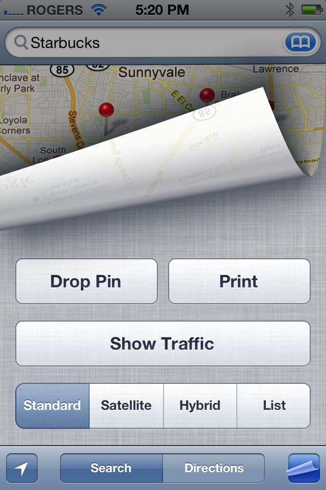
The Page Curl button now reveals the additional option to AirPrint your current map.
Weather (iPhone and iPod touch only)

For starters, Weather now hooks into the Notification Center widget system. Whichever place is your default in the Weather app is the one that will be shown in the weather widget. So, change the default location in the Weather app and you change the widget.
Local Weather
Rather than choosing your home town as the default location for Weather, and manually changing it if and when you travel, you can simply enable Location Services in Weather and your iPhone or iPod will detect and display the weather for where you are at any given time.
Note: I live in Montreal, but Local Weather keeps putting me in Ottawa. So, work on the trust but verify principle -- you may need to manually adjust if it Location Services gets it not quite right.
Hourly Forecasts
If daily forecasts weren't enough for you, if just know it would rain or snow but not when wasn't enough for you, iOS 5 weather adds hourly forecasts for the current day. Just swipe down and the rest of the week will fall away and hour-by-hour predictions will be revealed in their place.

Reminders
Reminders is the Apple task and todo app 5 years in the making. As with most built-in apps, the functionality is bare-bones -- it won't be replacing high end task managers any time soon -- but well executed. Interestingly, you need to have either iCloud and/or Exchange sync setup to use Reminders (or it sort of curls up and won't do anything.) Once you've enabled sync in Settings, iCloud will create a Reminders list and Exchange will create a Task list and you're in business.
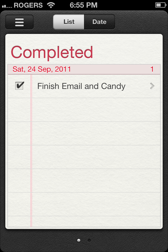
The default view is your default list and you can swipe forward to see other lists, or back to get to the special Completed list. To mark a Reminder as completed, tap the box immediately to its left and a check will appear. To unmark it, quickly tap the box again. Completed Reminders will disappear from the regular lists and move to the Completed List. To move it back, tap the box to uncheck it.
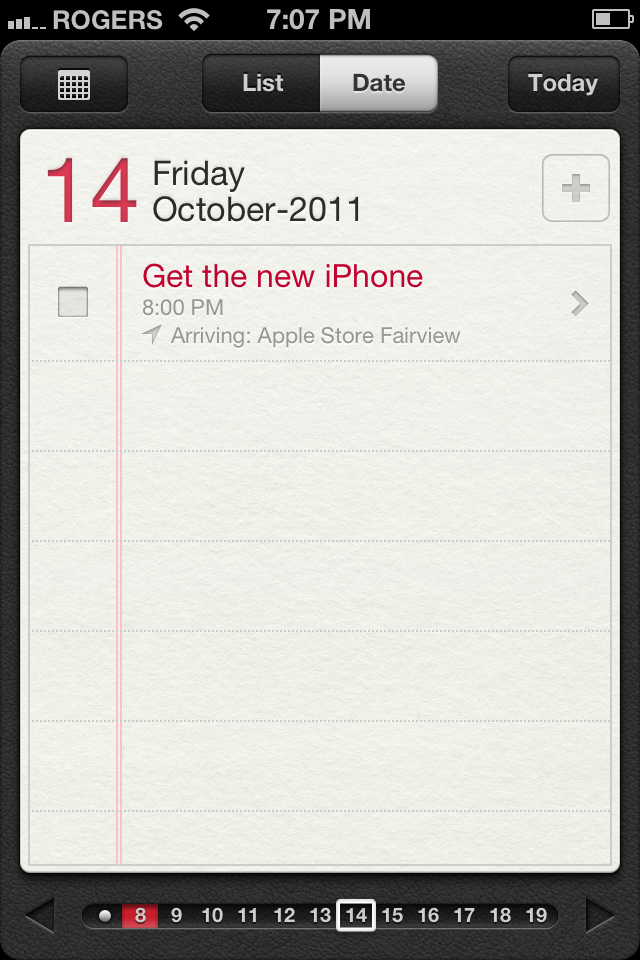
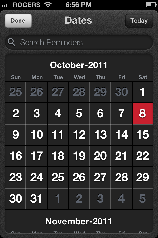
Tap the Date button and you're taken to a Day view where you can view all your reminders for that date. You can swipe backwards and forwards to the previous or next day or use the iPad-style thumbnail scroller at the bottom of the page. Tap the Today button at the top right to return to -- you guessed it -- today. If you'd rather see a month at a time, tap the Month button at the top left. Days with Reminders are colored red. Instead of swiping horizontally between months, you can scroll vertically.
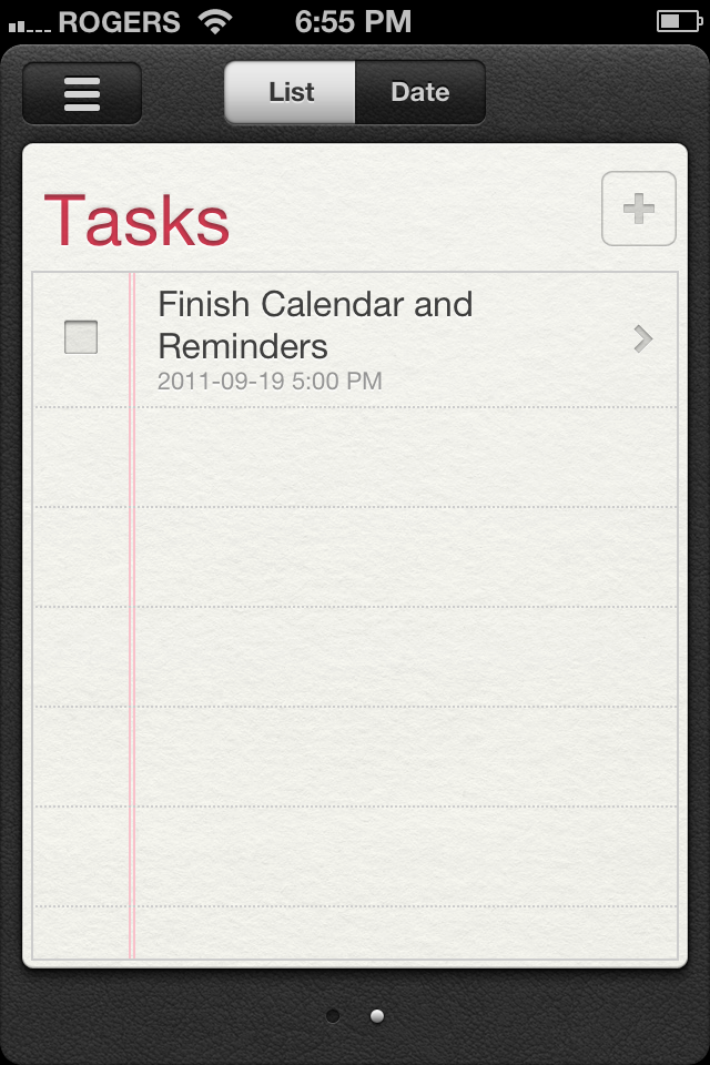
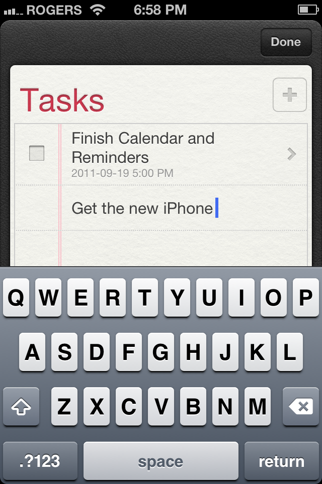
To create a new Reminder, either tap the + button on the right, or tap the next empty spot on the lined paper in List or Date view. Type a name for the reminder to create it. Unlike Calendar, which immediately pops up a page for you to enter additional information, you need to tap Done at the top right, wait for the Reminder to be created, then tap it to get to the Details page.
From the Details page you can edit the name of the Reminder, and set the Remind Me method. It defaults to the current day and time, but you can set the On Day to any future date (or turn it off), and you can also set At Location to create a geo-fence around a specified location that can be told to alert either When I Leave or When I arrive. You can either choose your Current Location, your default Work or Home locations, or Choose Address from your Contacts. (Unfortunately, you can't use an embedded Map to search for an address -- you have to have it in your Contacts first.)
A Reminder can have either a time or a location assigned to it, or both. Reminders will alert you when the time arrives or the location is triggered, whichever comes first. So you could use it to remind you to call home at 5pm, and/or to call home when you leave your office.
Note: only iCloud associated Lists can use location reminders. Exchange associated Tasks don't have that functionality.
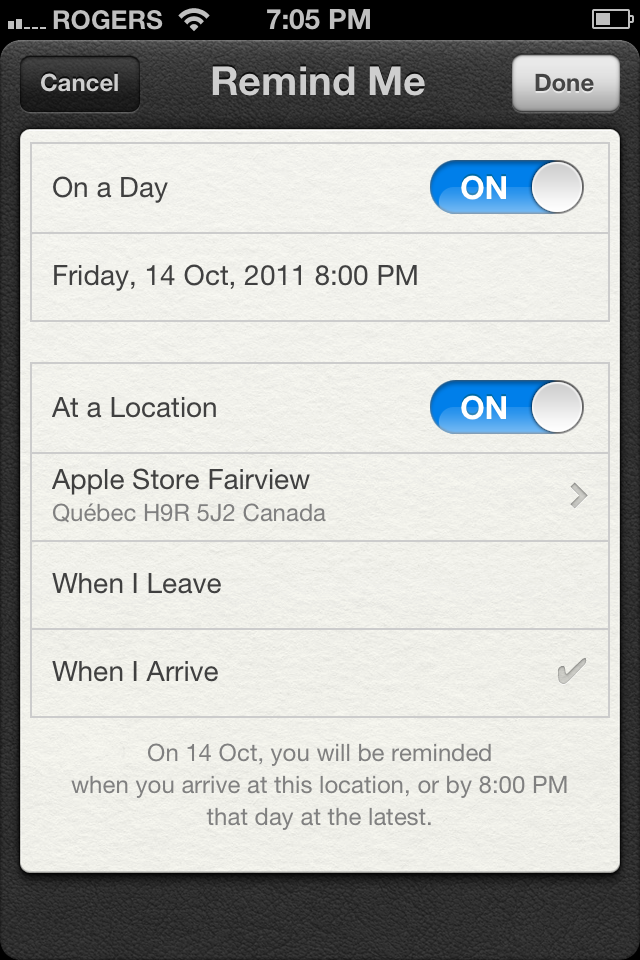
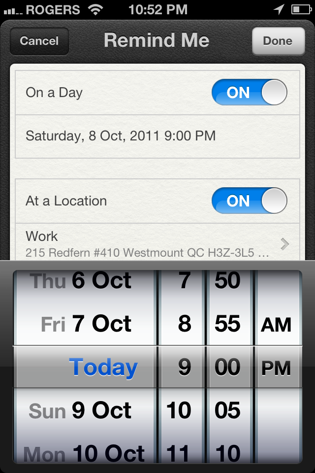
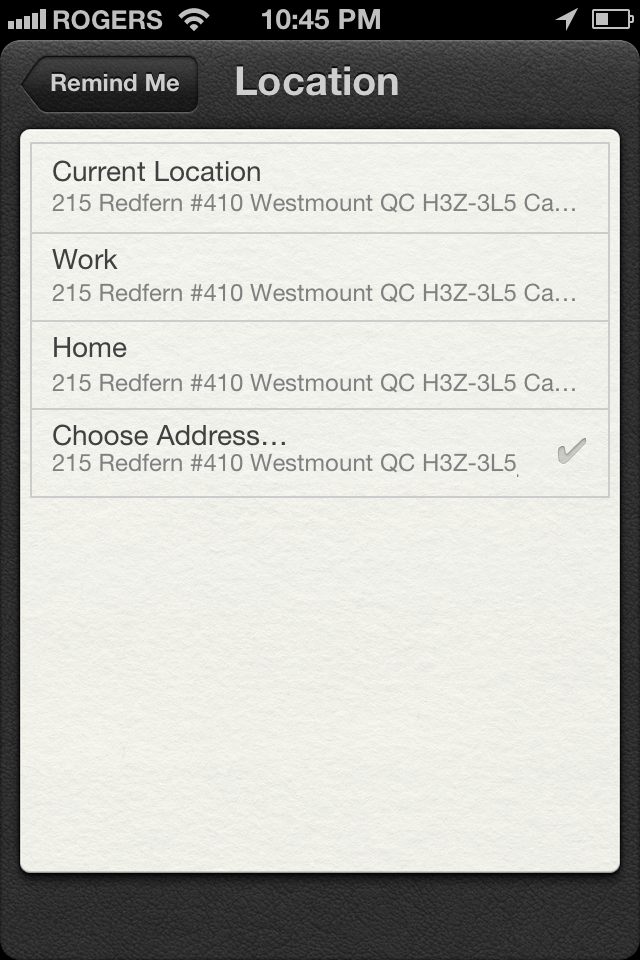
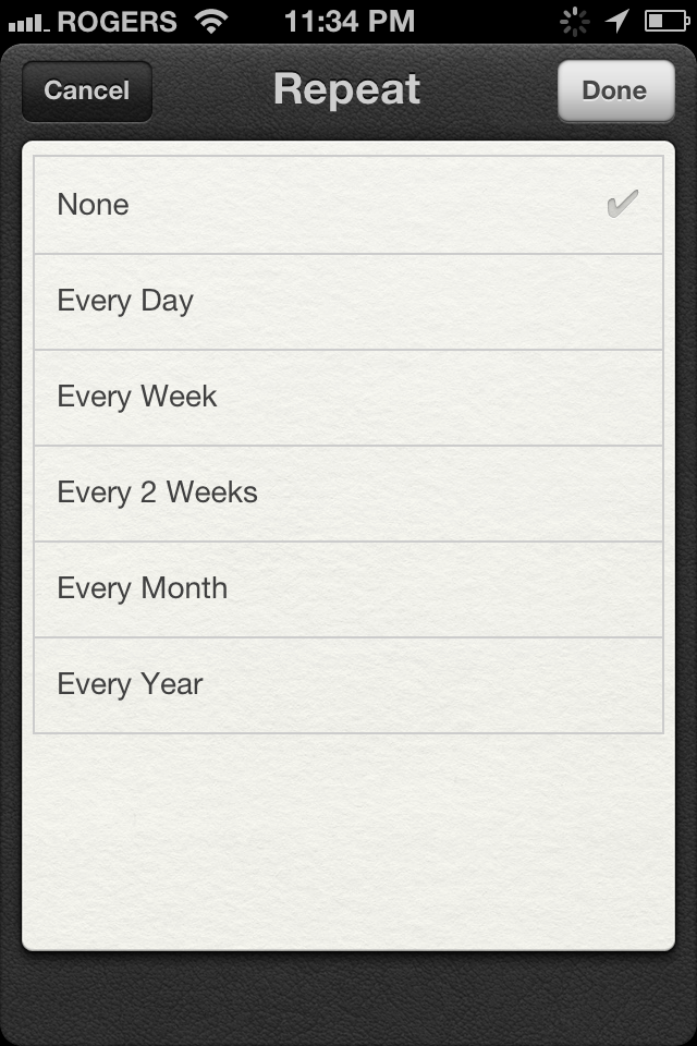
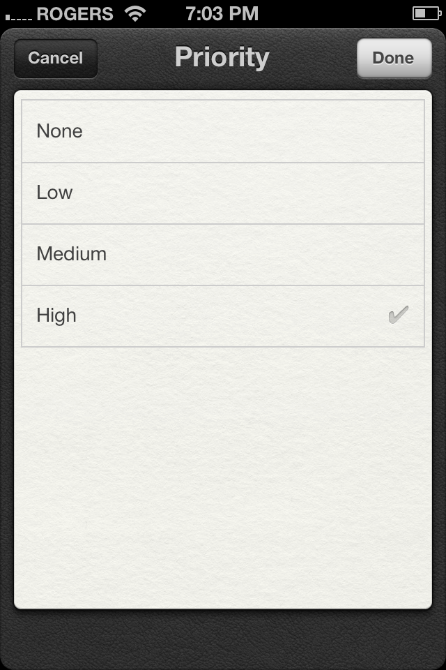
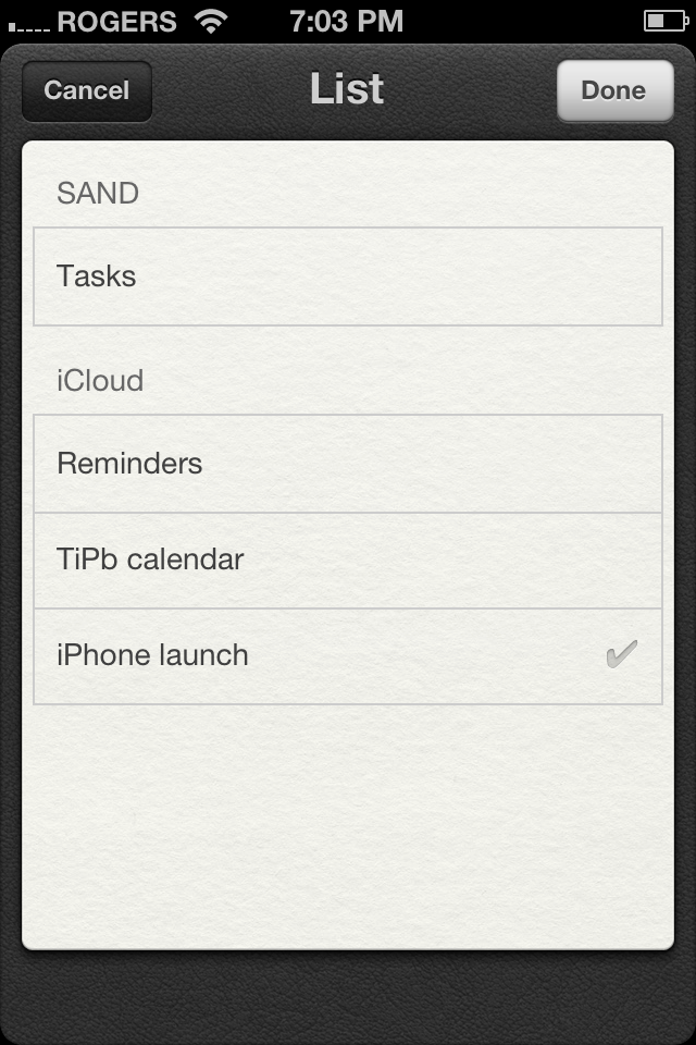
You can also set the Repeat frequency, if applicable, and by tapping Show More, you can change the Priority, change the List the Reminder is filed under, and add any Notes you might need. To delete a Reminder, tap the Delete button at the bottom.
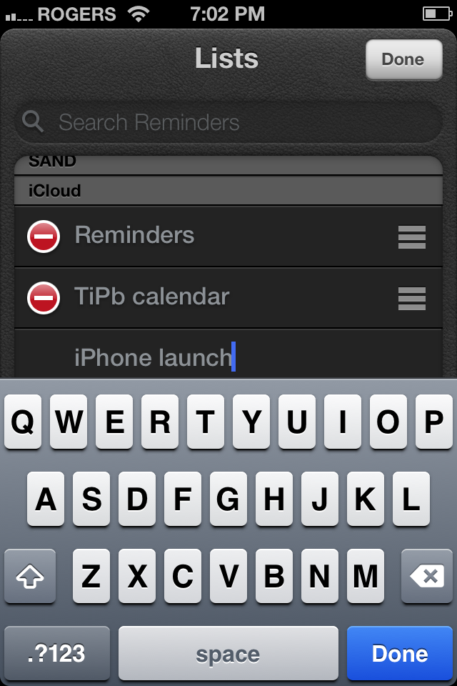
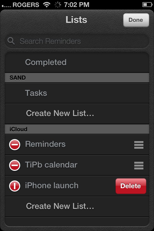
If you want to create new lists to help keep things organized (like a packing list, shopping list, project list, etc.) just tap the Lists button at the top left, then edit at the top right, the Create New List... beneath the account you want to add it too (if you have both iCloud and Exchange sync setup.)
You can also delete lists from this page by tapping the red circle icon, then the red delete button. You can re-order lists by grabbing the gripper icon to their right and dragging up or down. You can also search for reminders in any list here, which is good functionality but it feels like a strange place to put it. Creating a unified master page that collects all your reminders from all your lists, and allows search, feels like it would be a more useful and consistent way of handling it.
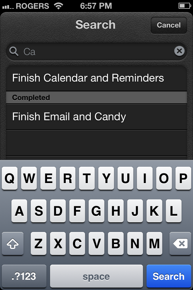
Clock (iPhone and iPod touch only)

Now you can pause the countdown timer.
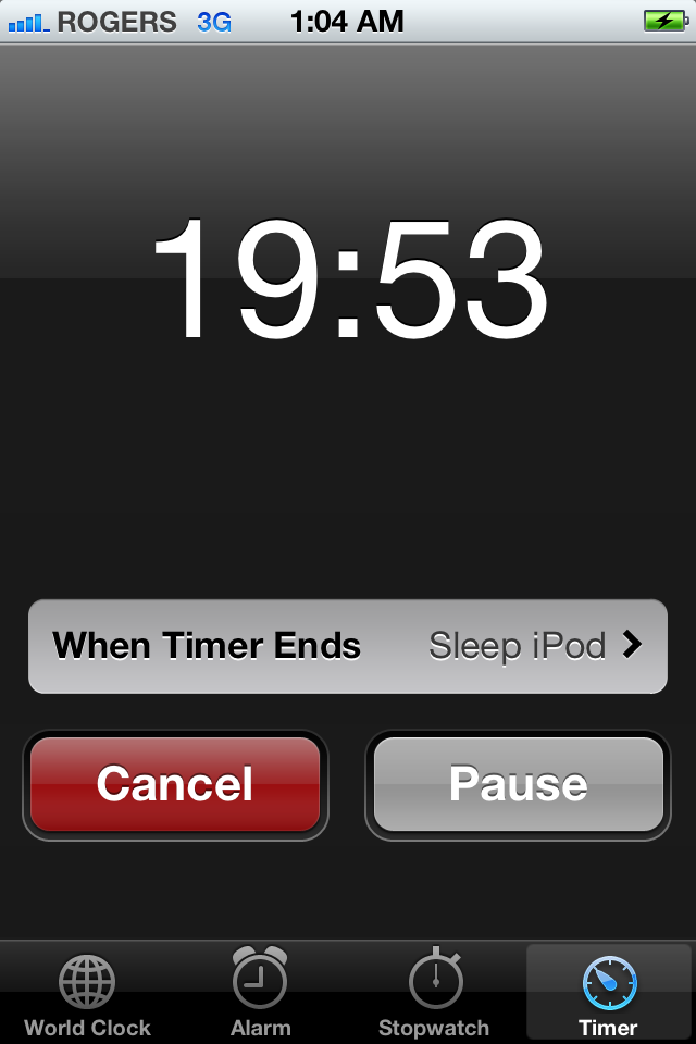
Game Center

Game Center, Apple's answer to Xbox Live!, gets updates this time around where Ping, Apple's social music network, does not. Like several other iOS 5 updates, they round out the feature set and better integrate the app with Apple's store system.
Profile Privates and Pics
First up, you can now choose to keep your profile private, in which case your real name won't be shared with Game Center friends. You can also add a picture or avatar to your profile, so you're visually recognizable.
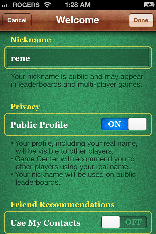

Friend Recommendations and Points Sorting
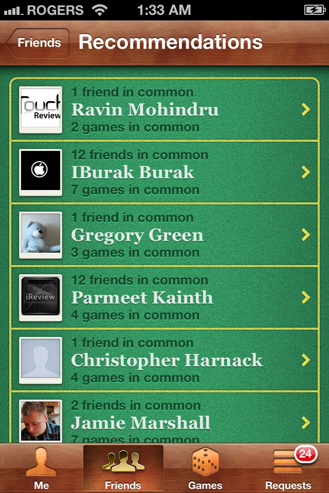
You get to see other people's profile pics on the Friends page, along with a fanned out deck of friend recommendations, and the ability to sort friends by their achievement point total.
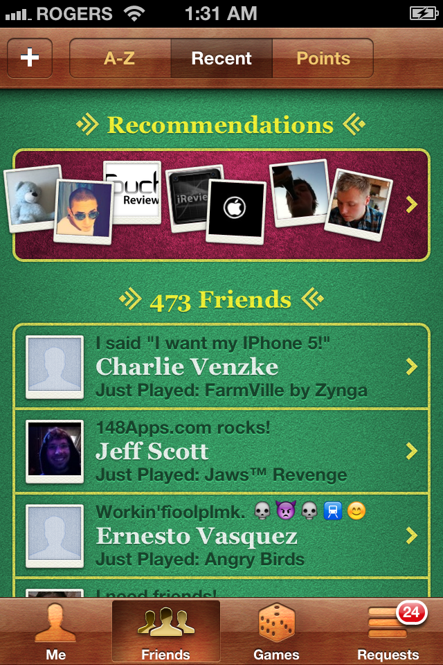

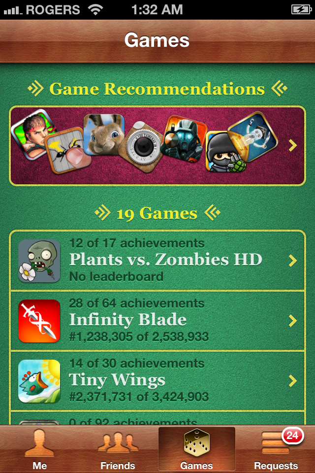
Game Recommendations and Purchase
Games are likewise recommended, and you can buy them right inside Game Center via an embedded version of the App Store. It included no non-game apps, and no search, so it's limited but still convenient.
<
p align="center">


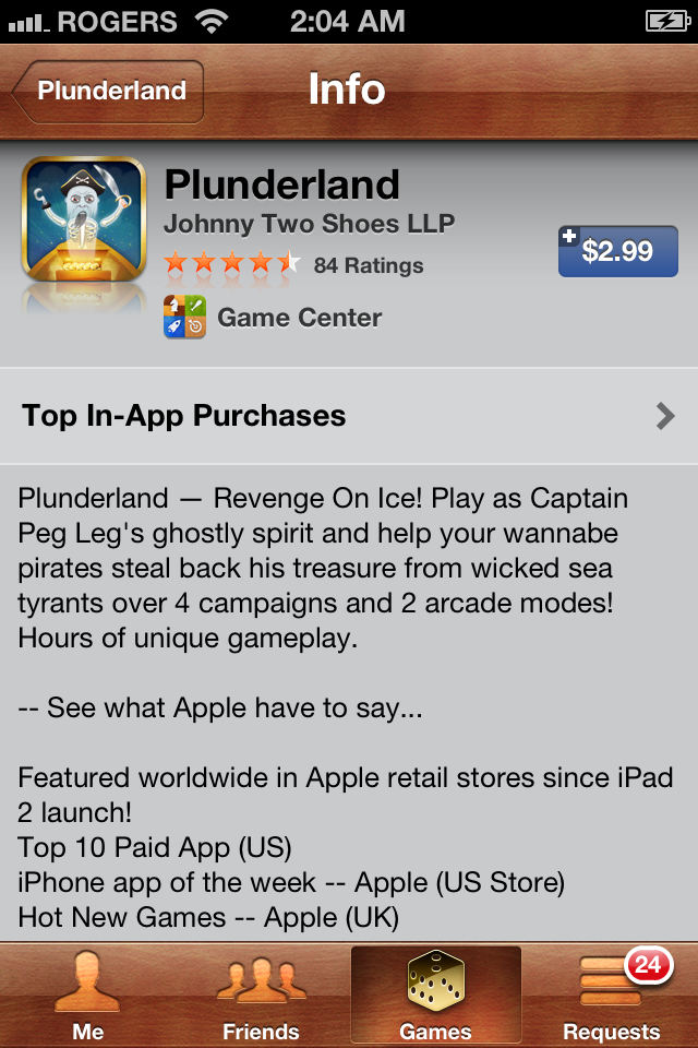
Which begs the question -- will Apple continue this type of integration, similar to what they do in iBooks, and instead of a button in Music to take you to the iTunes Store, just embed the audio portion of the store in Music?
Newsstand

Newsstand is new to iOS 5 but isn't a new app per se. It's more like a permanent Folder than contains all your subscription magazine and newspaper apps. Tap the Newsstand icon and, just like for Folders, Newsstand opens up to reveal the apps inside. Instead of a dark linen background, however, you're greeted with iBooks-like wooden shelves. And instead of the usual app icon, you're shown the cover art or front page of the latest issue. Tapping a Newsstand magazine or newspaper app launches it the same as tapping any iPhone, iPod touch, or iPad app.
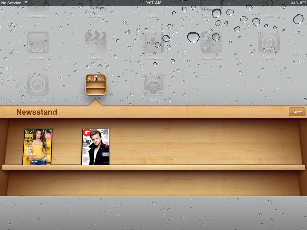
A Store button at the top right takes you to a special section of the App Store where you can subscribe to your favorite magazines and newspapers, from Elle to The Economist, the New Yorker to the New York Times, Cosmo to Car and Driver.
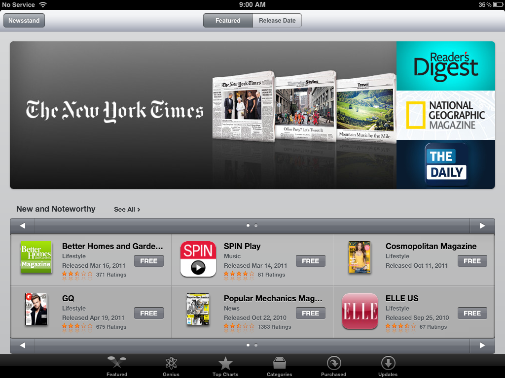
Note: Individual apps have to be updated to support Newsstand. If they haven't been updated yet, they'll download to your Home Screen as they did before Newsstand. Sadly, the Newsstand Store doesn't indicate which apps have or haven't updated up front, you need to tap through an examine the release notes for each one.
iTunes Store

iTunes Store has been integrated with iCloud to provide functionality that was previously exclusive to apps and games in the App Store. However, most of this new functionality is currently only available in the US -- Apple is at the mercy of the record labels and Hollywood studios -- but will hopefully expand in the future.
Music and TV re-downloads
iTunes -- in the US -- now offers the ability to re-download previously purchased iTunes music and TV shows without being charged again for the privilege. This isn't exclusive to iOS 5 mind you. As of a few months ago, re-downloads have been available in iOS 4.3 as well. (iTunes is a native wrapper around web views, so Apple can update it outside of the firmware.) However, this is as good a place as any to go over it.
Just tap the Purchased tab on the bottom of the screen and then choose which type of media you want to re-download. You can either view All your previous purchases or just the ones Not On This iPhone/iPod/iPad. You'll be given an alphabetical list of songs, topped by options for All Songs and Recent Purchases. All Songs can be further filtered by Most Recent, Song Name, and Artist Name. Tap the iCloud Download icon to start re-downloading.
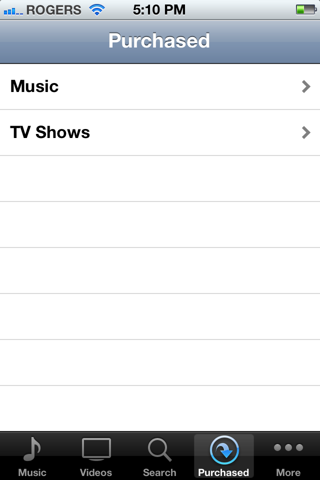
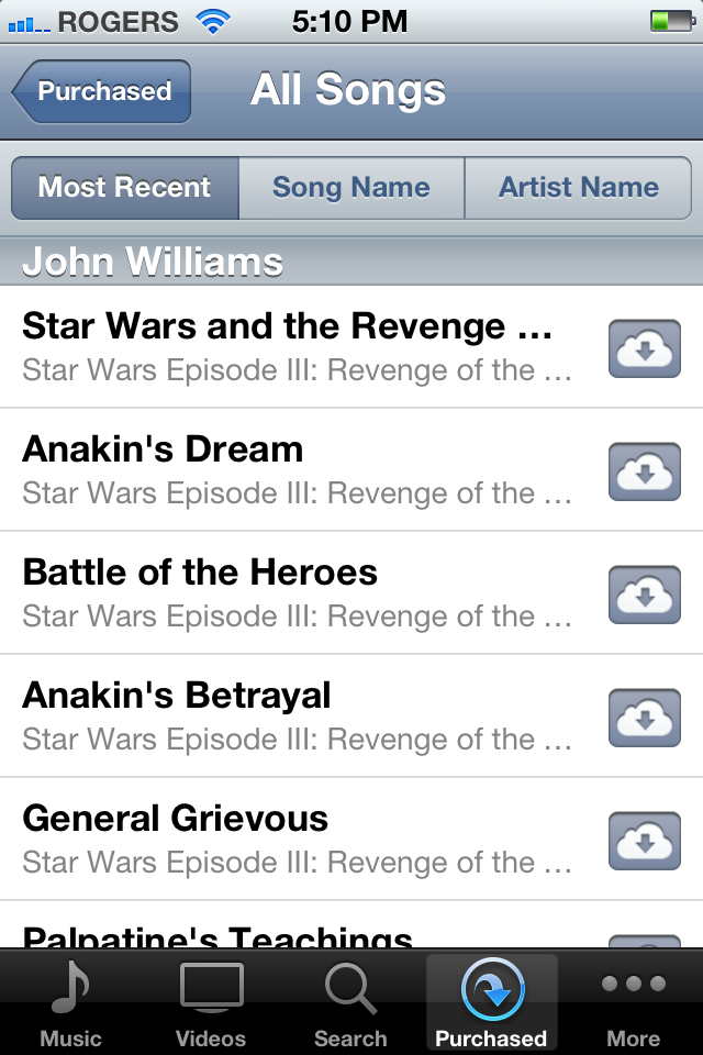
Tapping the More tab and then Downloads will let you keep track of what's being pulled from iCloud, and tapping the Purchased button at the top right will send you to the Music or Videos app where you can also track the downloads and start listening/watching.
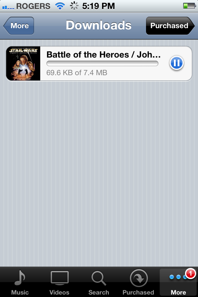
Note: To prevent piracy, you can't simply log into one iTunes account after another and re-download all the music from each account. Once your iPhone, iPad, or iPod touch is associated with an iTunes account, it can't be changed for 90 days.
iTunes Match
iTunes Match is a supplementary iCloud service available for $25 a year. It's a music locker service that scans your desktop iTunes library and, if they're part of the 20 million strong iTunes catalog, immediately makes any songs you already have in your possession available to you in 256-bit AAC format. If they're not in the iTunes catalog -- if they're your favorite fringe Anime soundtracks, for example -- they'll be uploaded to Apple's servers in the existing format and quality.
Note: iTunes Match is currently in beta and listed as "coming soon".
Tone Store
Apple introduced the iTunes Ringtone store way back in 2008 alongside the first iPod touch. With iOS 5 Tones are no long restricted to phone calls and can be purchased in iTunes and assigned in the Settings app to a wide range of alerts, including Messages, Emails, etc. Same store, same prices, more places to use them.
App Store

App Store also gets integrated with iCloud, though in this case it's mostly new management, same great service. Like iTunes, the updates here aren't unique to iOS 5 -- Apple has rolled them out to iOS 4.3 users already -- but for convenience's sake, here's where we're going to cover them.
App Re-downloads
You could always re-download previously purchased apps at no additional charge from the App Store, but now Apple has created a better, clearer interface for doing it. Just tap on the Updates tab and you'll see a top-of-page option for Purchased apps. Tap it and you'll get a list of All your previously purchased apps in reverse chronological order. You can also tap the Not On This iPhone/iPad/iPod button to filter out app you already have installed. Tap the iCloud Download icon to start installing them.
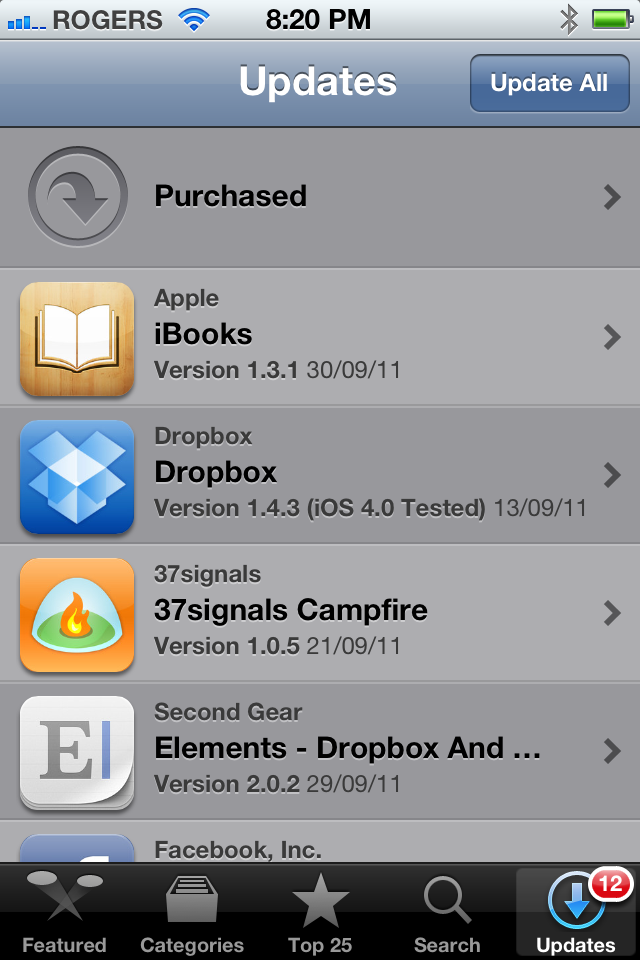
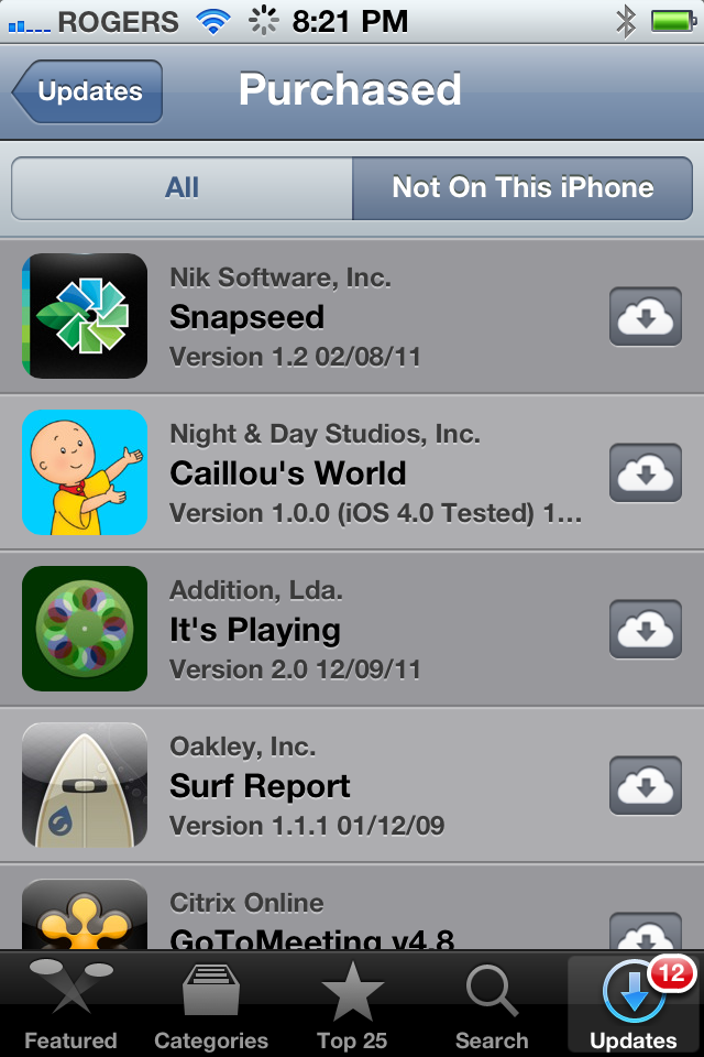
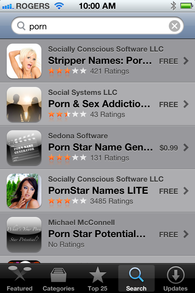
Note: If you share an iTunes account with your significant other or kids, iTunes will now rat out any risqué purchases you might have previously been able to keep hidden...
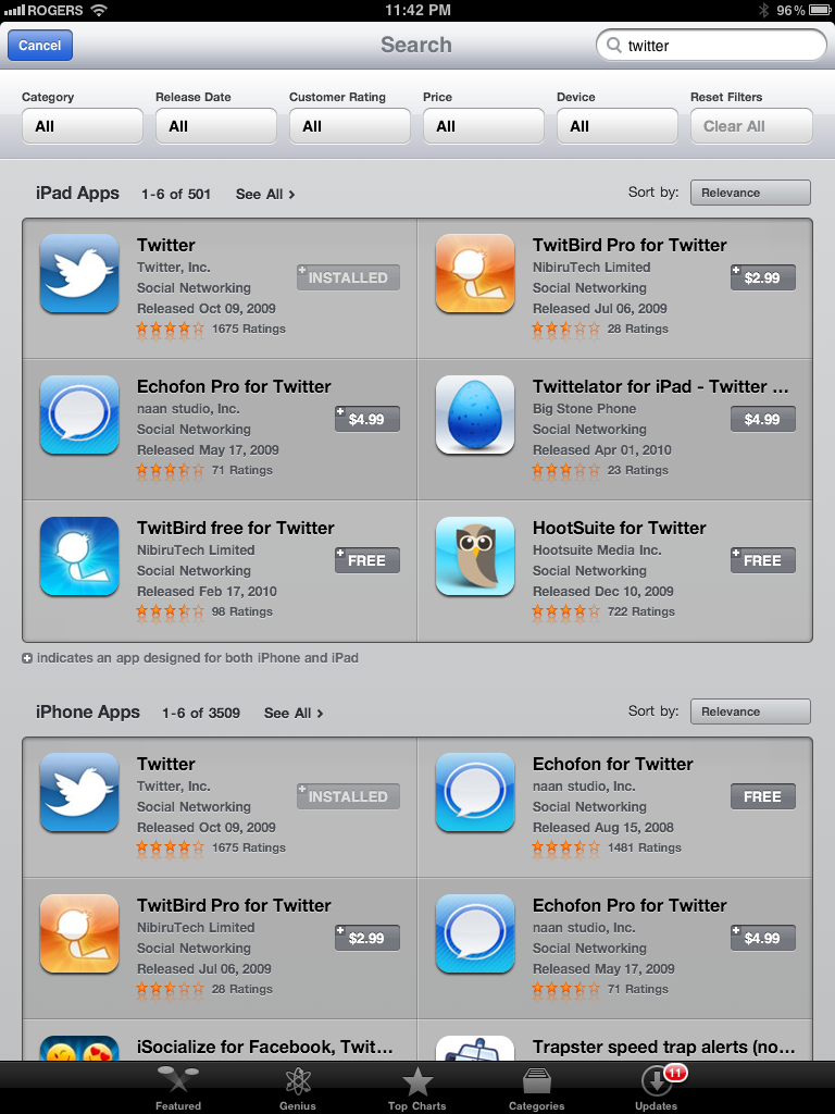
In the other App Store sections, there's no more guessing as to whether or not you've already purchased an app. If you have, the price tag button is replaced with an Install button.
Settings

As is almost always the case, the greatest number of changes in iOS 5 appear in the Settings app -- it's where all the options for all the new system features, apps, and app features are to be found. Also, for the first time Settings gets notifications of its own. Any time a Software Update is pending, Settings will send you a popup and place a badge on its app icon.
Notifications
Notifications now houses all the options for Lock Screen Info, Notification Center, and in-app Notifications. Up top you can choose to Sort Apps Manually or By Time. Below that are two lists, In Notification Center for apps that are currently enabled to send you notifications, and Not in Notification Center for apps you've disabled.
The Edit button gives you little gripper icons on the right hand side to let you re-order apps within either list.
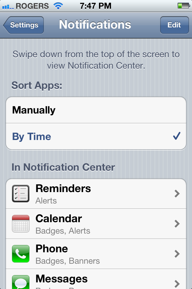
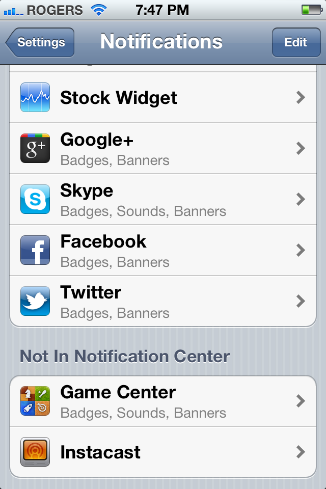
Tap an app and you're taken to the individual Notification settings. For each app, you can toggle Notification Center on or off, choose to Show 1, 5, or 10 recent items, pick an alert style from None to Banners (new style) to Alerts (old style popups), and decide if you want to Badge the App Icon (the little red numbers on the top right), allow sounds (including vibration). You can also choose if you want to be able to see the alert in View in Lock Screen.
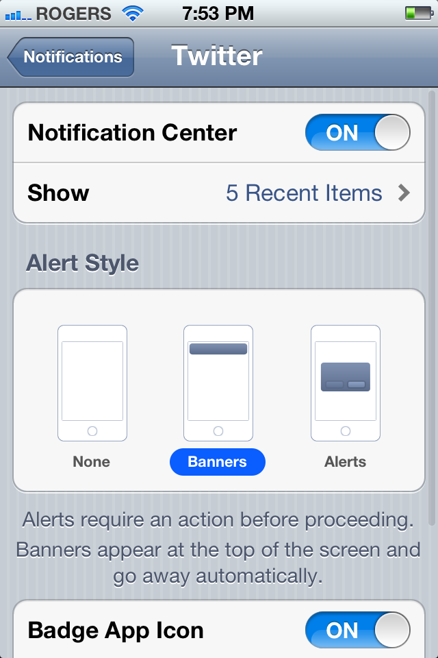
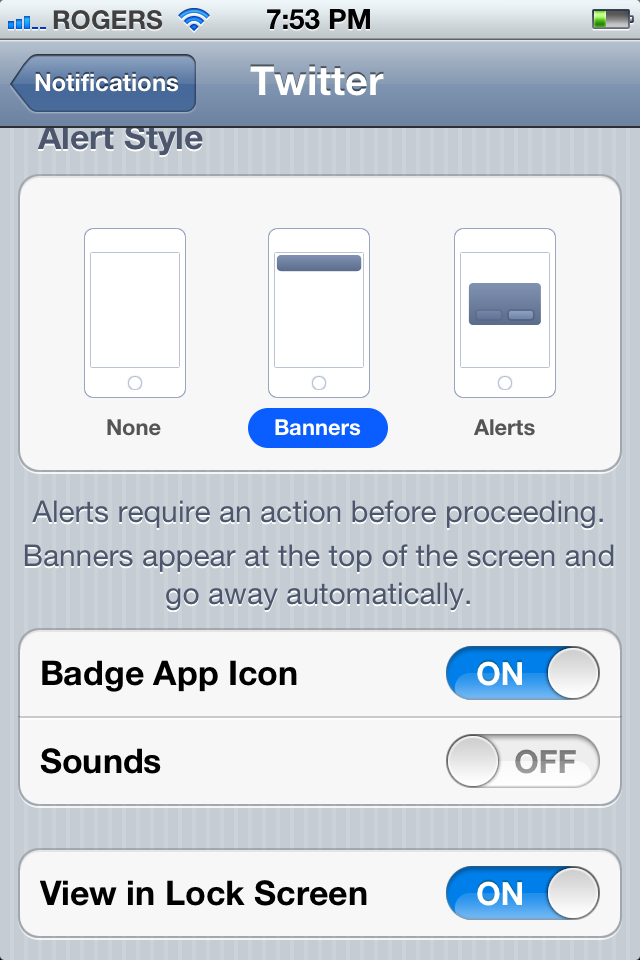
Note: Not all apps provide for the same options. For example, some apps have no sound alerts, so there's no option to enable or disable them.
Location Services
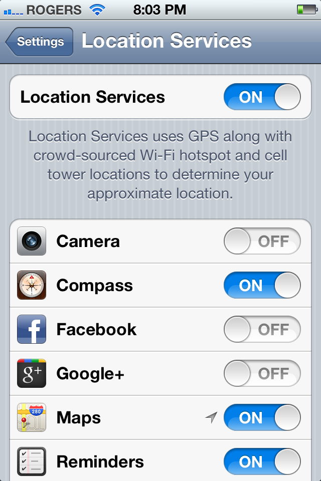
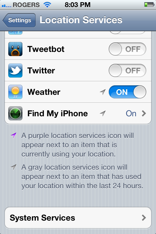
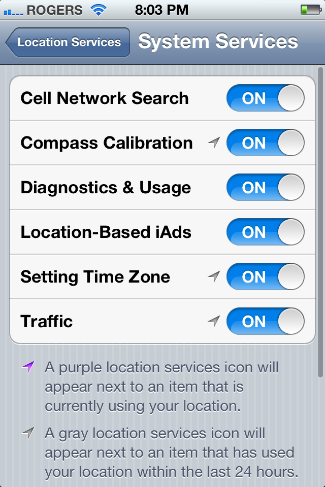
Apple continues their emphasis on privacy by making Location Services far more granular. Not only can you globally disable them during initial setup, and toggle them all on or off in Settings, you can enable or disable each app on an individual basis, whether they're built-in like Camera or Maps or App Store like Facebook or TomTom. You can also tap through to System Services and enable or disable Cell Network Search, Compass Collaboration, Diagnostics & Usage, Location-Based iAds, Setting Time Zone, and Traffic.
Moreover a purple arrow icon to the left of the on/off toggle tells you if any app or service is currently using location, and a gray arrow icon tells you if any app or service has used your location within the last 24hrs.
Sounds
Sounds also get far more granular, and more encompassing controls. In addition to Ringtones (iPhone only) and Text Tones (new to iPod touch and iPad), you can set tone for New Voicemail, New Mail, Sent Mail, Tweet, Calendar Alerts, and Reminder Alerts.
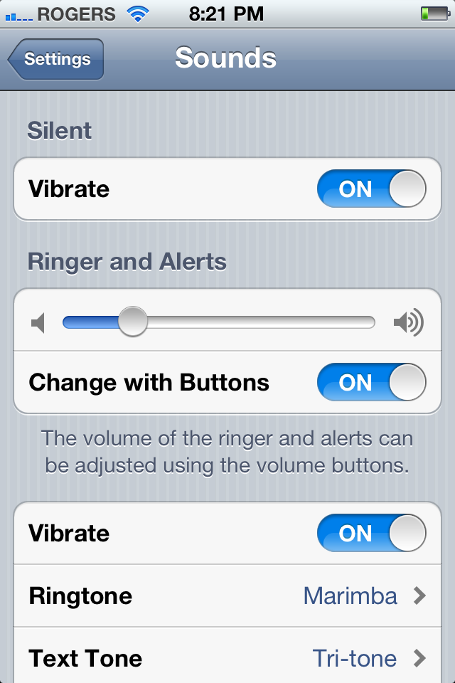
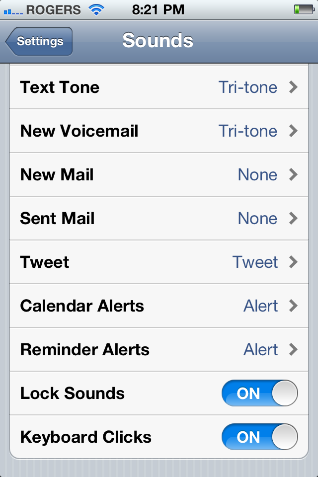
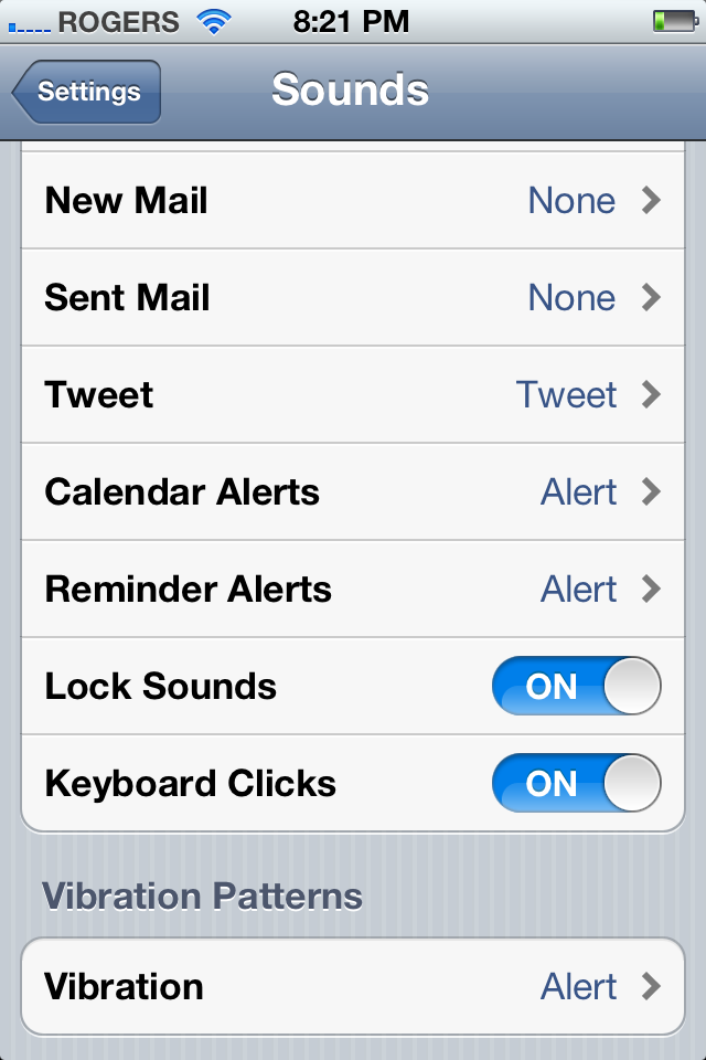
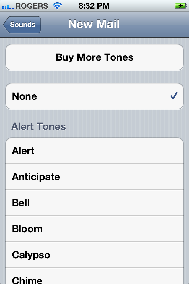
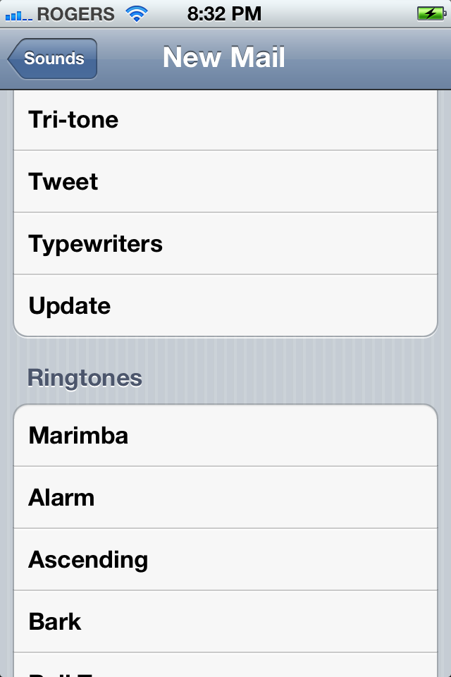
If you want to change one, tap it. At the very top of the tone page you have a handy button to take you right to the iTunes Tone Store (not just for Ringtones any more). You can then choose from None (no sound), or from a list of Alerts (previously Text Tones) and Ringtones.
Alerts now includes a Tweet Tone for the new Twitter integration. And yes, most Alerts are still inappropriate for the job for which they were intended -- let's hope they get shorter and snappier in the future.
While it may seem like a bit of an overlap to have alert sound on/off settings under Notifications and a None option in Sounds, it does increase discoverability for users.
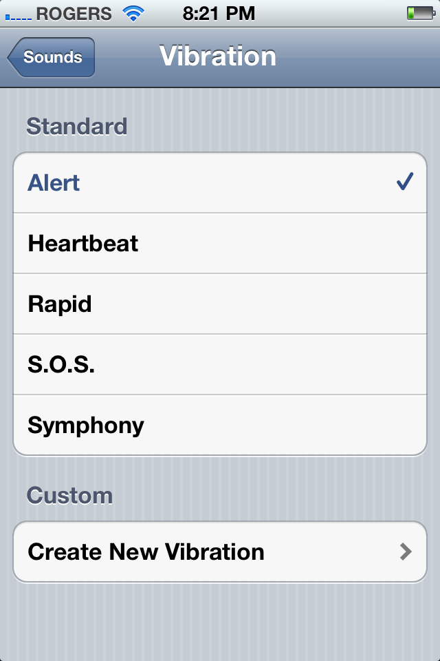
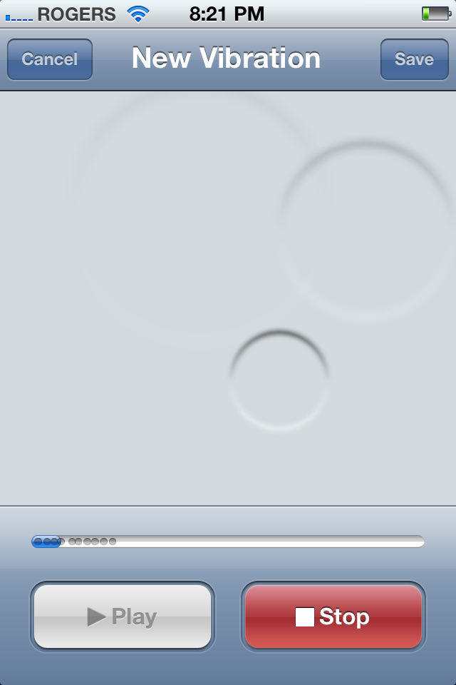
Also, as part of Apple's outstanding Accessibility features, you can now set Vibration Patterns in addition to the standard Alert, including Heartbeat, Rapid, S.O.S., and Sympathy, and you can even create a Custom Vibration via the Create New Vibration tab.
Just tap the screen to create a pattern, stop it and play it back to make sure it's too your liking, and then hit Save. This way, if you can't hear individualized alerts, you can feel them.
General: About
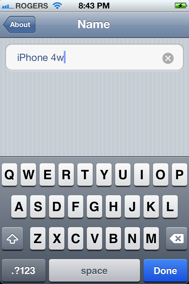
In the About section, there's now a field for your iPhone, iPod touch, or iPad Name. Tap it and you can change it on-device.
General: Software Update
Since iOS 5 has take iPhone, iPod touch, and iPad PC Free, instead of updating your firmware by connecting to iTunes on Mac or Windows, you can just tap Software Update and it will do it on-device. If there isn't an update ready and waiting for you, Settings will check for it. When an update is available, tap Install and it will begin to download. Settings will restart your device and apply the update.

![Daily Tip: How to do an iOS OTA update [developers]](https://cdn.mos.cms.futurecdn.net/zoaBAqnr6FyNzoE2Aw73MK.png)
General: Usage
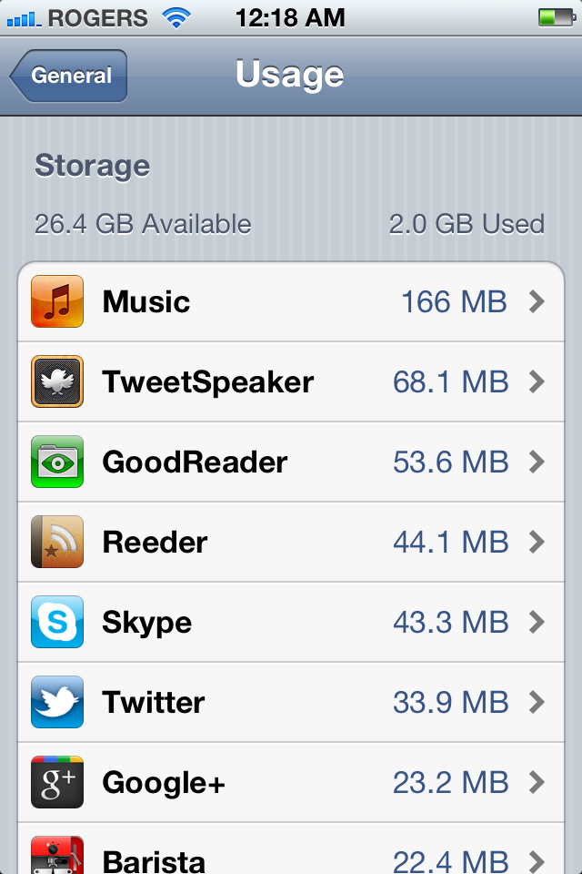
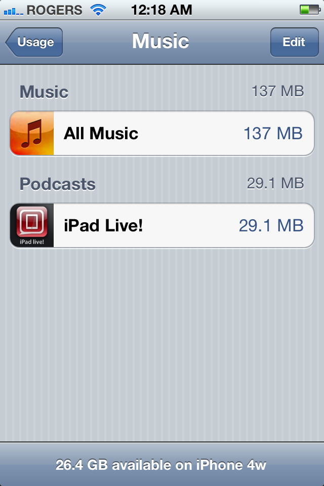
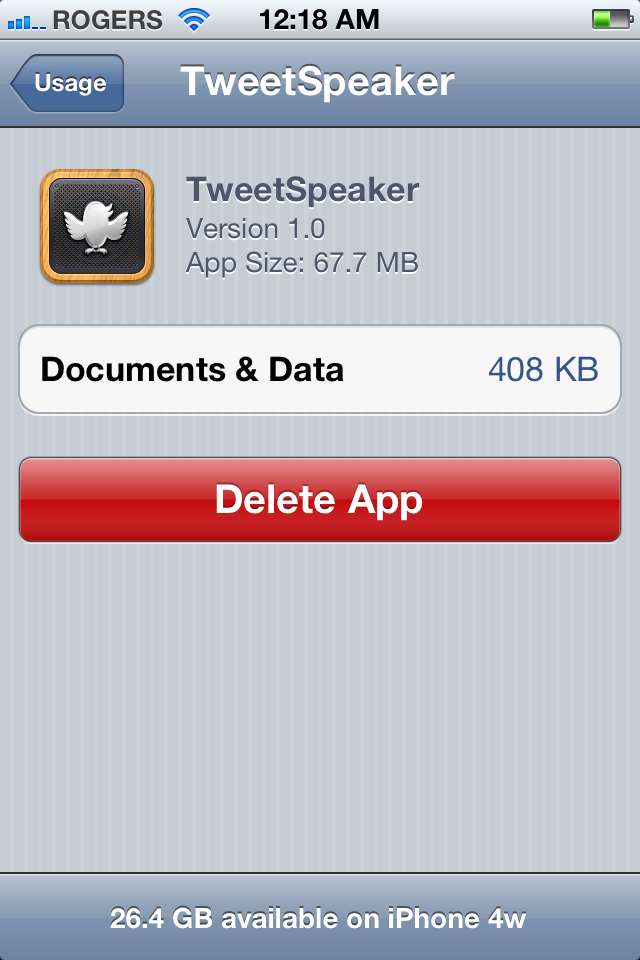
Usage gets a big makeover, and far more granular and interactive controls. First, Storage is broken down on an app by app basis. You can see how much memory each app is using, and if you tap through, you can see what it's using it for, and even delete it if it's an App Store app. (If you don't see all your apps, just tap Show all Apps.)
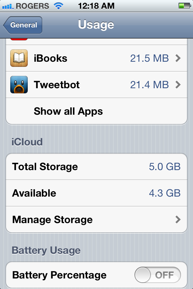
iCloud shows off it's stats here to, and lets you tap through, you can Manage Storage just like you can from the top level iCloud Settings area proper (see below).
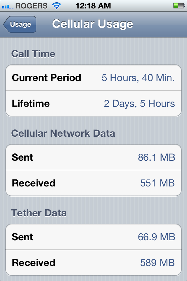
Cellular Data now requires you tap through to see Call Time, Cellular Network Data, and Tether Data (if your plan allows tethering.)
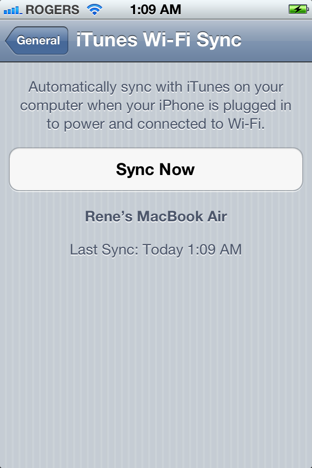
General: iTunes Wi-Fi Sync
Once you've enabled iTunes Wi-Fi Sync, here's where you can check and see your last sync day and time, and manually tell your iPhone, iPod touch, or iPad to Sync Now.
General: Spotlight Search
You can now enable or disable Spotlight Search for Reminders.
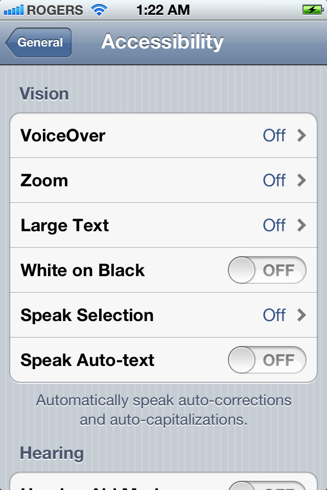
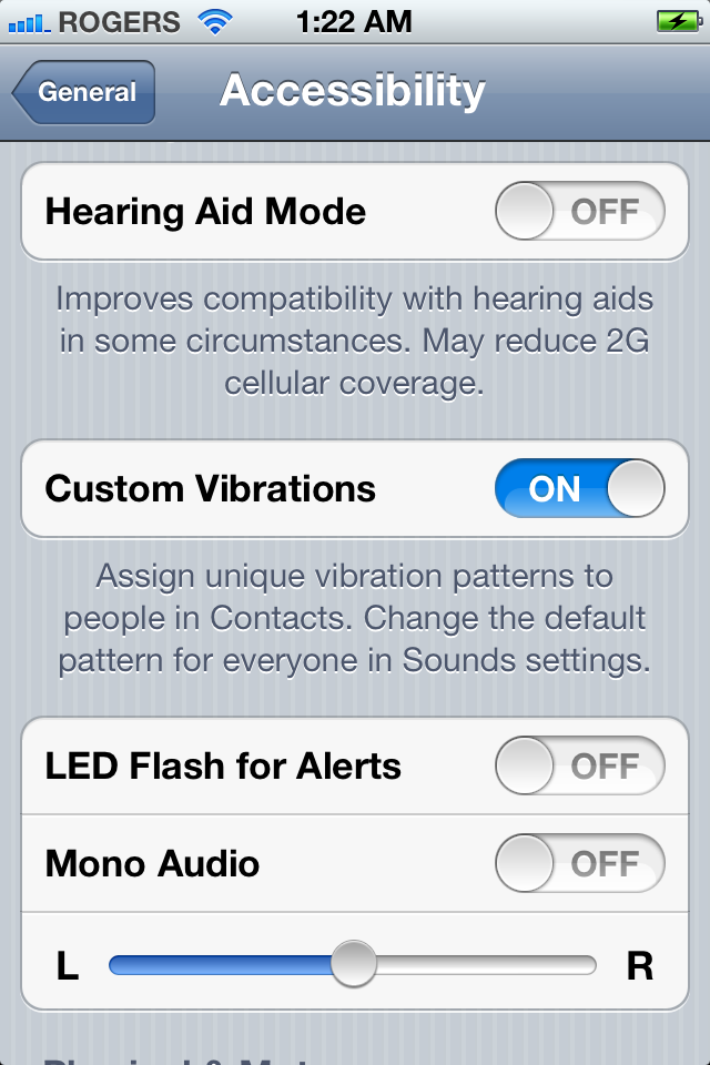
General: Accessibility
Here's where Apple hides all the really impressive Accessibility features. Along with previous options, you can now toggle on Hearing Aid mode, turn on or off Custom Vibrations, have the LED flash go off to signal notification alerts, set Mono Audio left or right, set Assistive Touch, and set Triple-click Home.
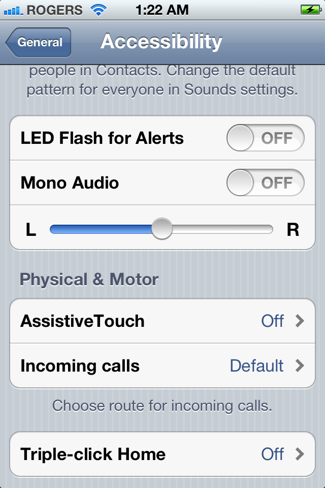
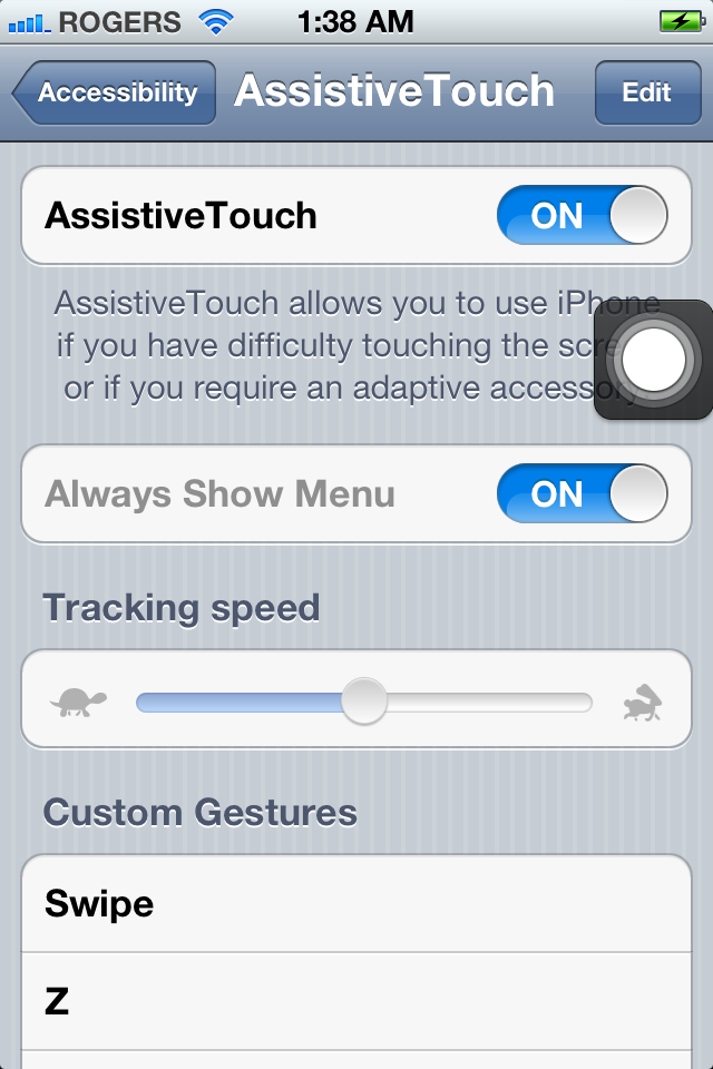
If you tap through to Assistive Touch, you can toggle it on or off, toggle Always Show Menu on or off, set the tracking speed, tap through to Create New Gestuers, or delete Custom Gestures via the Edit button at the top right.
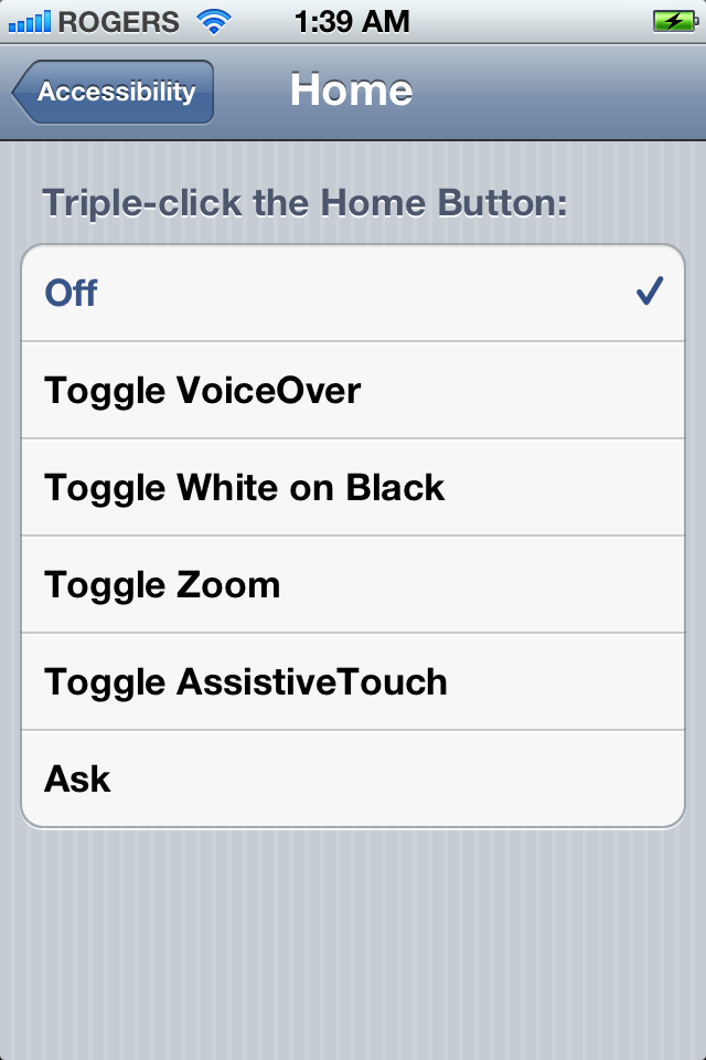
Triple-click Home can now be set to toggle AssistiveTouch.
iCloud
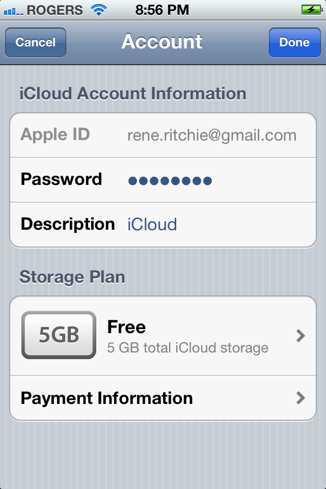
iCloud shows you your current Account and lets you tap through to see the associated Apple ID, your current Storage Plan, and your Payment Information. You can buy more Storage right from this page if you want to.
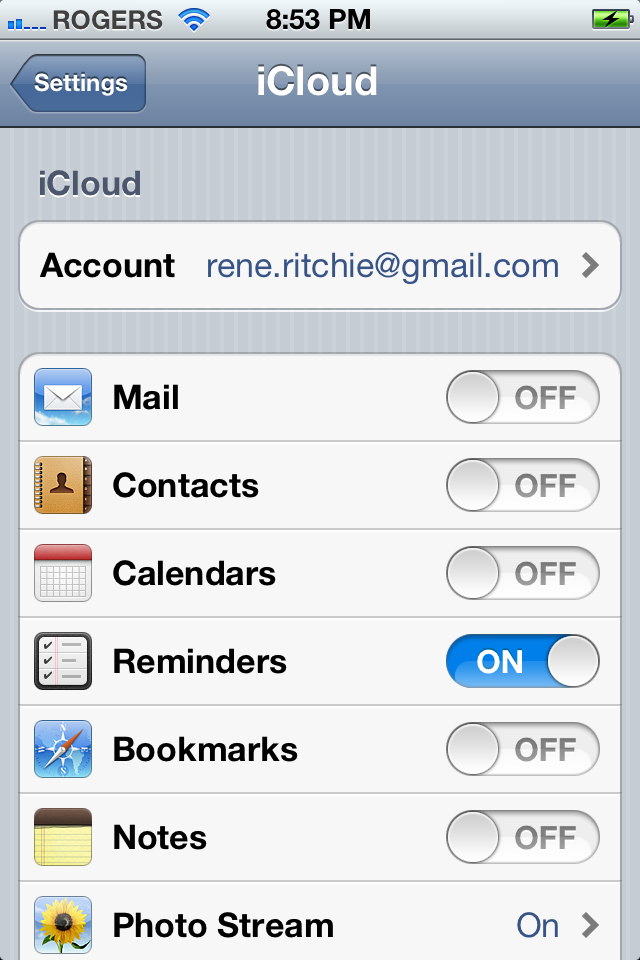
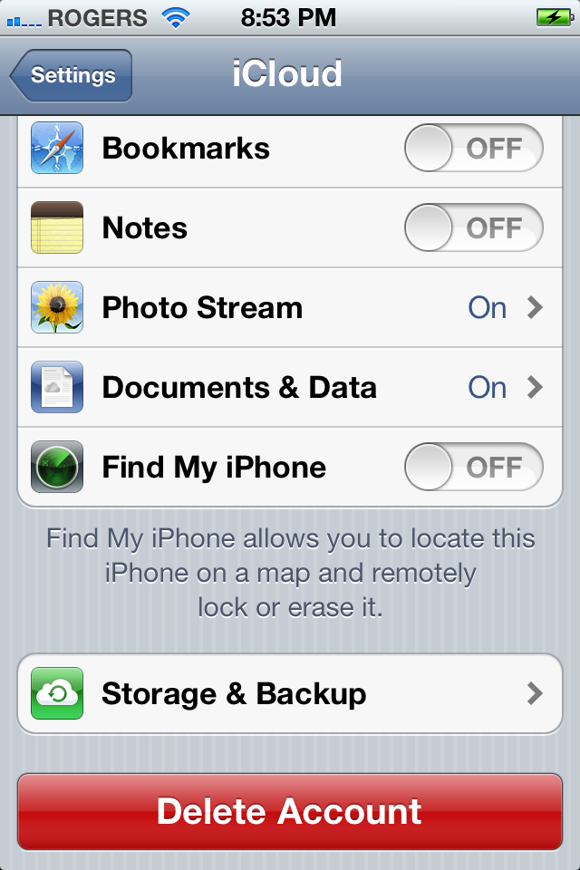
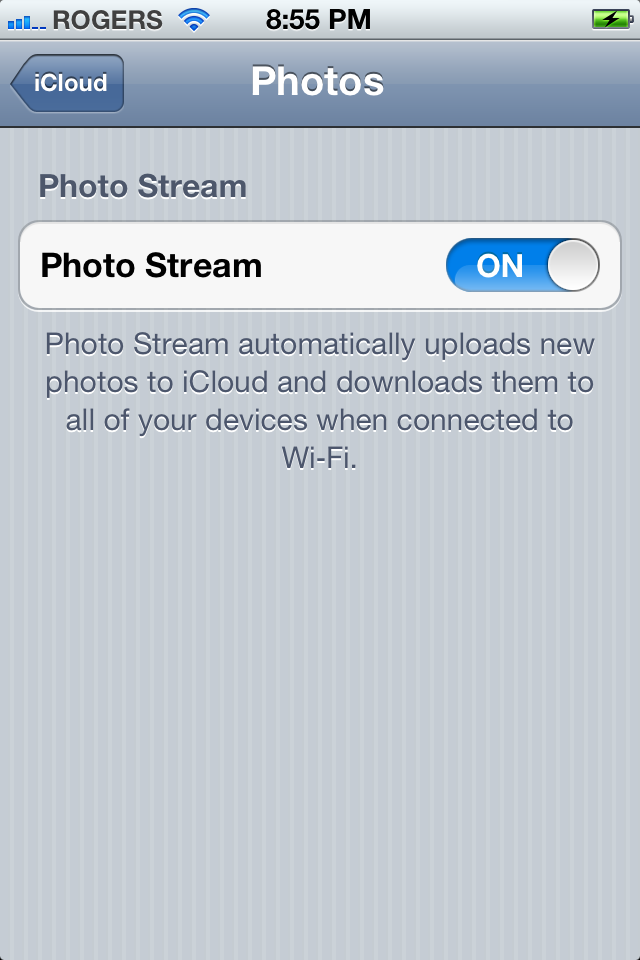
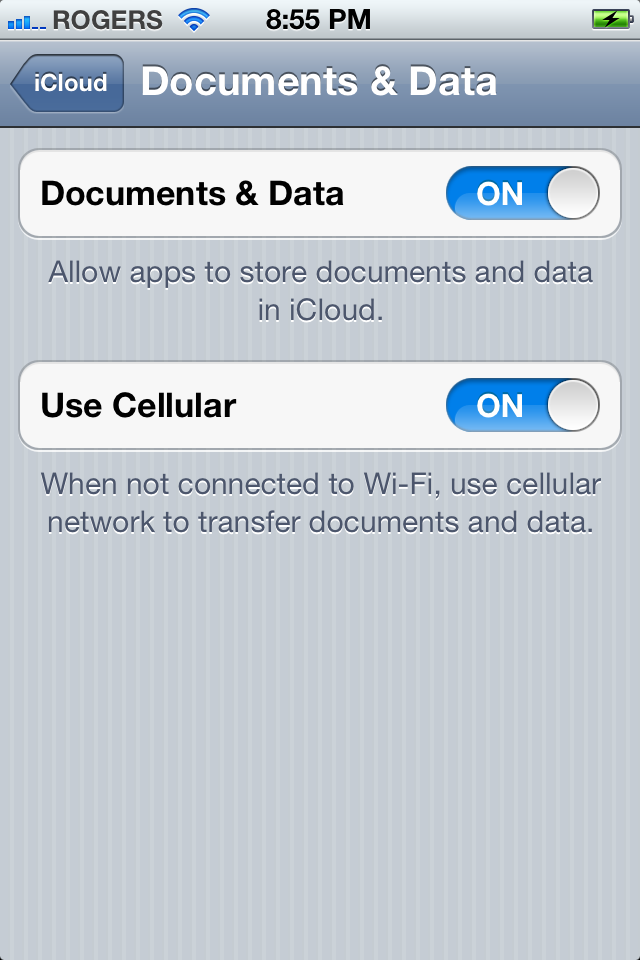
Mail, Contacts, Calendars, Reminders, Bookmarks, Notes, and Find my iPhone can be toggle on or off, as can Photo Stream but oddly you need to tap through to a separate page to do this. (Perhaps more options are coming in the future?) You also have to tap through to a separate page to toggle Documents & Data, but have the additional option to toggle Use Cellular on or off as well. (If you turn it off, you can save on data but will need to be on Wi-Fi to store/push your documents.)
Storage & Backup shows how much total storage you have available (every iCloud user starts off with 5GB for free), and how much you have available out of that total. You can Manage Storage, Buy More Storage (using your iTunes account), toggle iCloud backup on and off, and even start a Back Up Now (if you're on Wi-Fi).
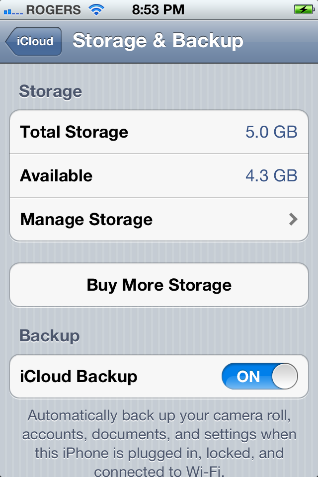
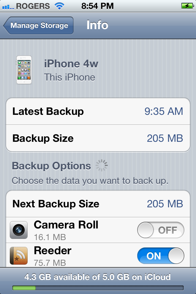
Tap through to Manage Storage and you get a list of all your currently backed up iOS devices, along with the size of their individual backups. (You can Buy More Storage here as well). Tap a device name and you're taken to its info page which shows the device name, device type, the time of the Latest Backup, the Backup Size, and the Backup Options.
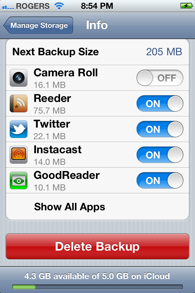
Backup Options predict the Next Backup Size and then lets you see the current size of each individual app's backup and toggle its backup state on or off. (If you don't see all your apps listed, tap the Show All Apps tab at the bottom.) You can also tap the big red Delete Backup button to remove that device's backup from iCloud.
Mail, Contacts, Calendars
All your accounts are listed here and tapping on one lets you toggle individual aspects on or off and set additional options.
If you have an iCloud account, tapping it here gives you the same options as tapping iCloud in its own settings tap. Again, more places means more discoverability.
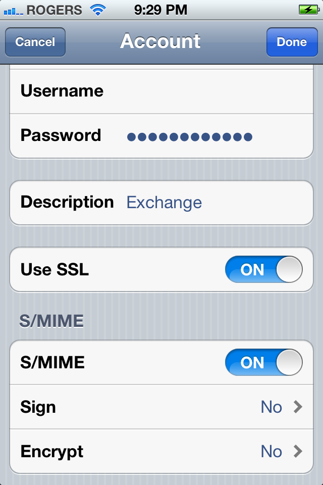
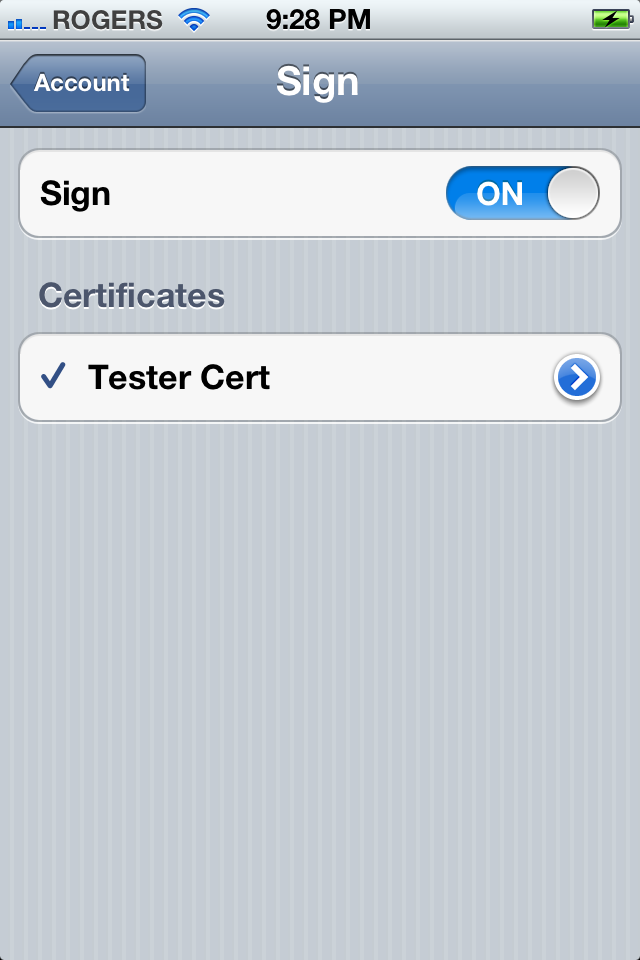
If you tap into another account, like MobileMe or Exchange, and keep tapping into Advanced settings as deeply as you can, you'll find and be able to toggle on S/MIME support, turn Sign and/or Encrypt on, and pick a Certificate.
There have been a bunch of other small changes as well. For example, showing 25 mail messages is now gone and 1000 has been added.
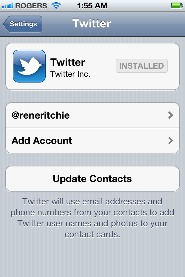
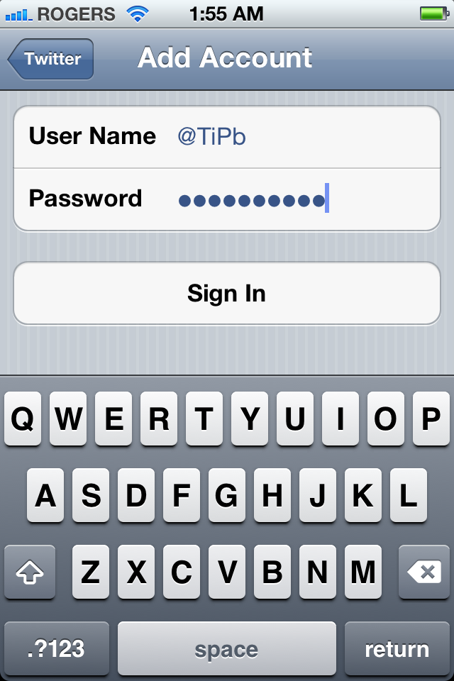
Settings for Twitter include a handy button to grab the official Twitter app from the App Store, if it's not already installed. You can tap Add Account to get started, and you can add multiple accounts without a problem. You can even Create New Account if you don't have one (or enough) already.
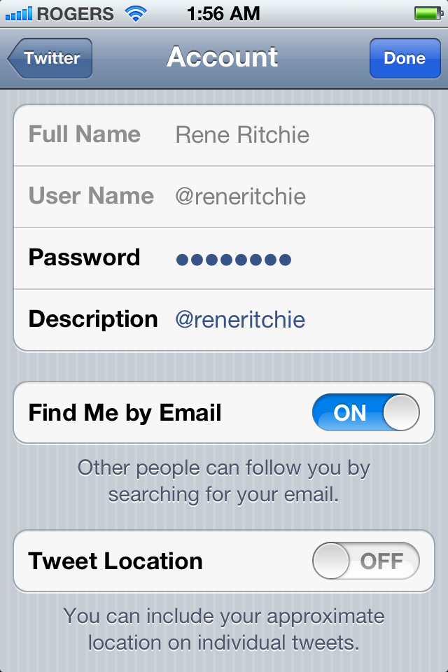
For each account you can individually enable or disable Find Me by Email and Tweet Location. And you can use Twitter to update the info in your Contacts.
FaceTime
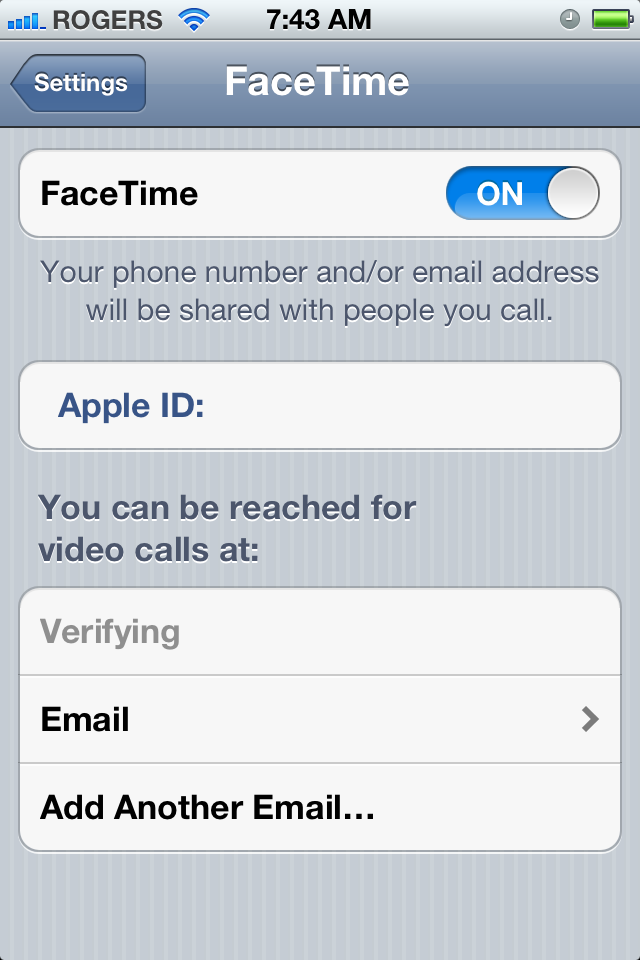
FaceTime was originally introduced in iOS 4 for iPhone using phone numbers as unique identifies. Later iPod touch and then iPad got FaceTime using Apple IDs as the identifier. Now in iOS 5, things go full circle and iPhone can use both phone numbers and Apple IDs for FaceTime.
Safari
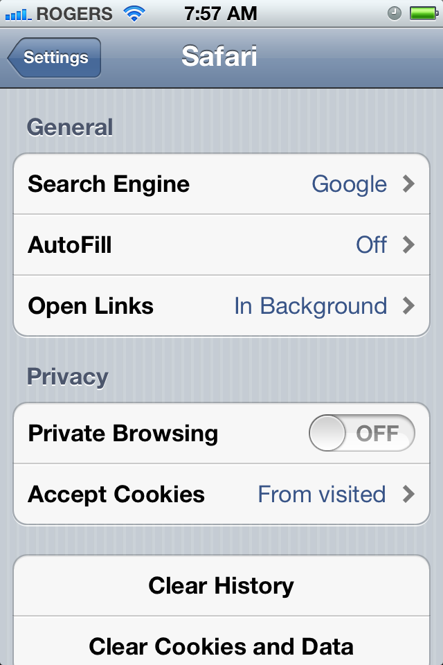
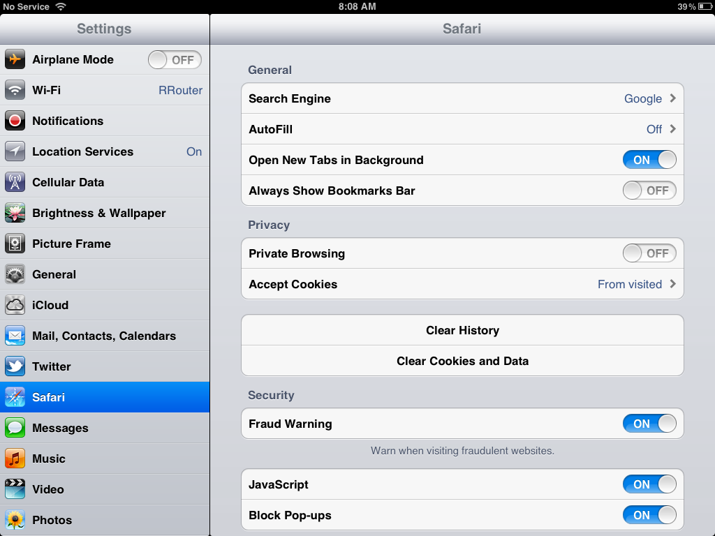
You can now choose to have Safari open links In New Page (iPhone and iPod touch) or In New Tap (iPad), or In Background so you can stay on the same page/tab and go look at the new one only when you're ready. On iPhone and iPod touch you have to tap through and check your preference. On iPad, just a toggle.
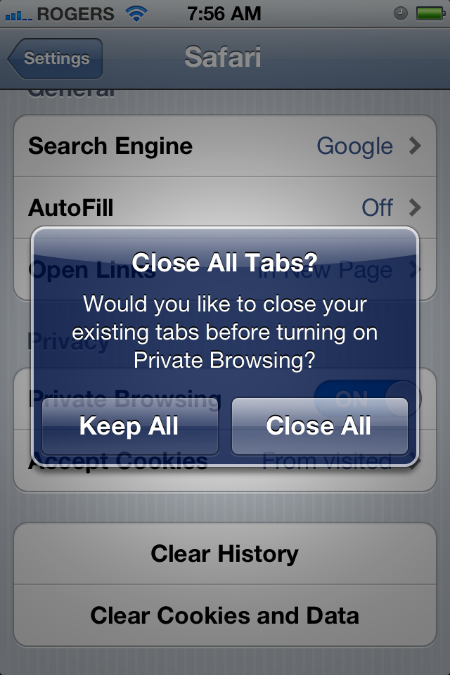
Desktop Safari stalwart Private Browsing makes the jump to mobile as well. When you toggle it on or off, you'll be asked if you want to close all existing pages or tabs or leave them open. Since the point of Private Browsing is to turn off all cookies, caching, and tracking information so you can surf discreetly, closing existing pages and tabs is probably a good idea.
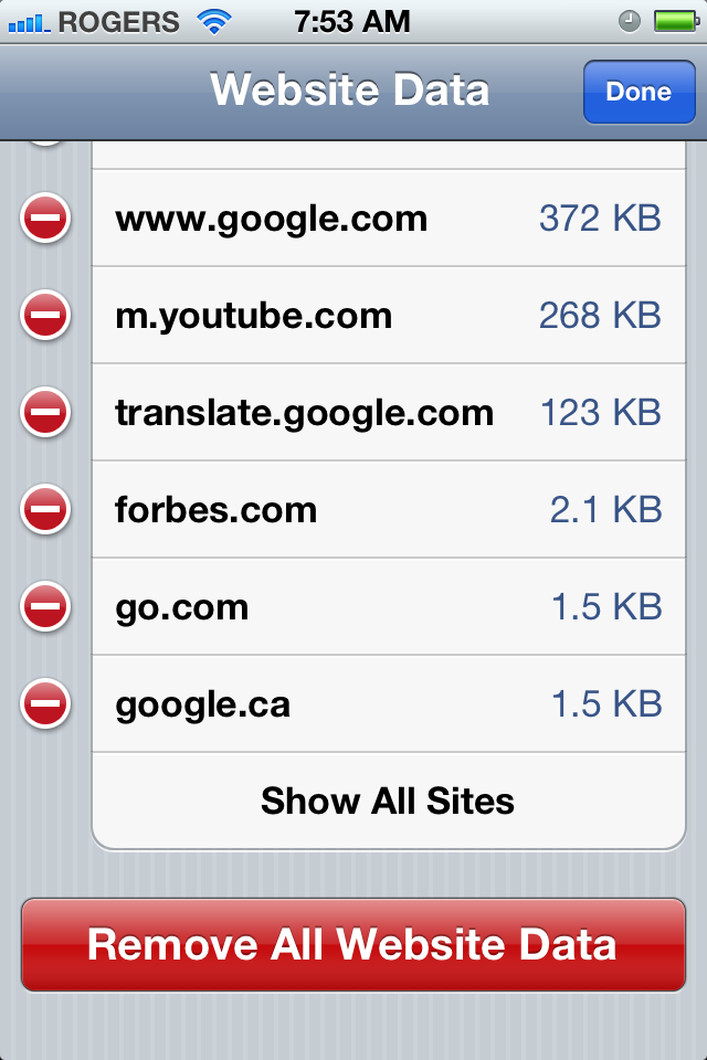
If you tap through the Advanced Tab, and into Website Data, you now get a list of websites that use HTML5 local storage to keep information stored on your iPhone, iPod touch, or iPad (for example, Gmail.com so you can still access some recent mail when off of the network.) Not only can you see which sites have data on your device here, you can tap Edit to delete that data on a site-by-site basis or scroll to the bottom and tap Remove All Website Data to nuke every bit of it all at once whenever the mood strikes you.
Messages
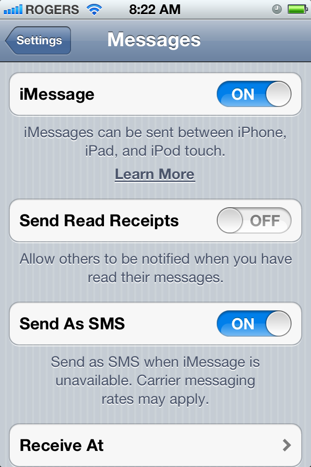
With the addition of iMessage, the Message Settings now let you toggle the service on or off, and present the option to Send Read Receipts, so like BlackBerry Messenger (BBM) you can let people know not only that you've received their iMessage, but seen it as well.
On the iPhone, because it also ties into your carrier's SMS/MMS service, you can choose to enable or disable Send as SMS for when iMessage is unavailable (say one of your writers has taken up with an Android phone for a week...) If you have both a decent text and data plan, leaving this on ensures smooth, uninterrupted messaging. If you've greatly reduced texts in lieu of iMessage, leaving this off means you don't risk hefty a la carte SMS charges.
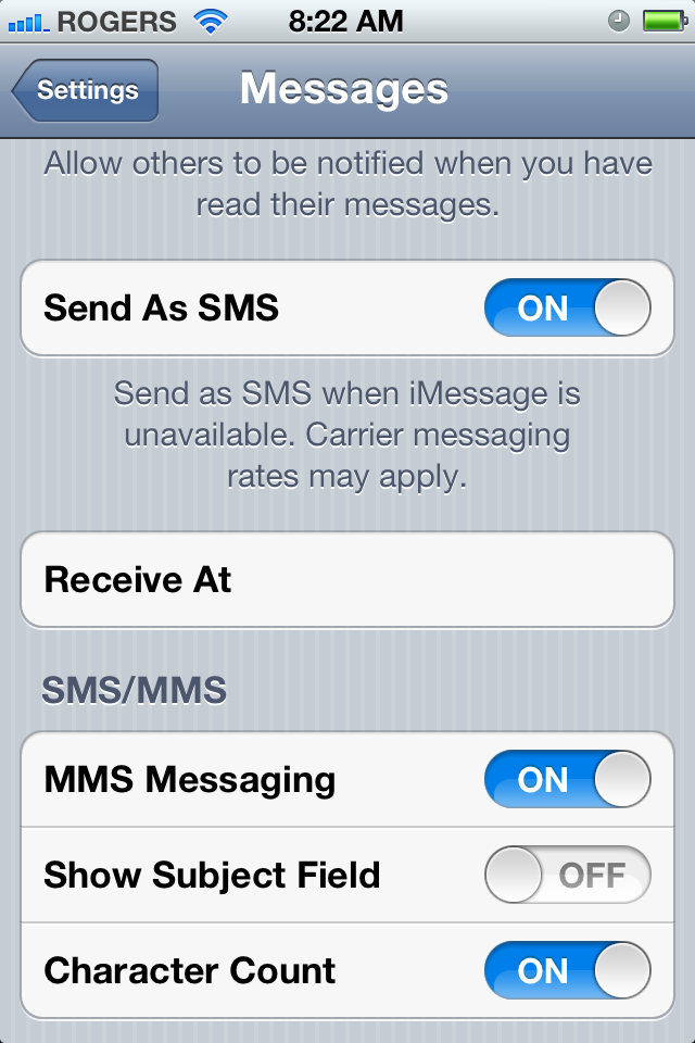
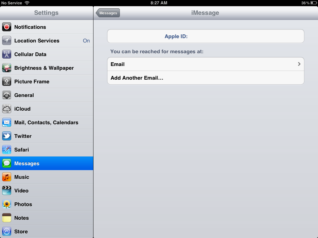
You can also choose which Apple ID email address you want to use for iMessage (much like you can for FaceTime), and add additional email addresses if, for example, you want friends and family to reach you through a different channel than colleagues at work. (Or if you've just collected too many Apple IDs, lost track of who has which one, and don't want to miss anyone who might iMessage you on a whim.)
Photos
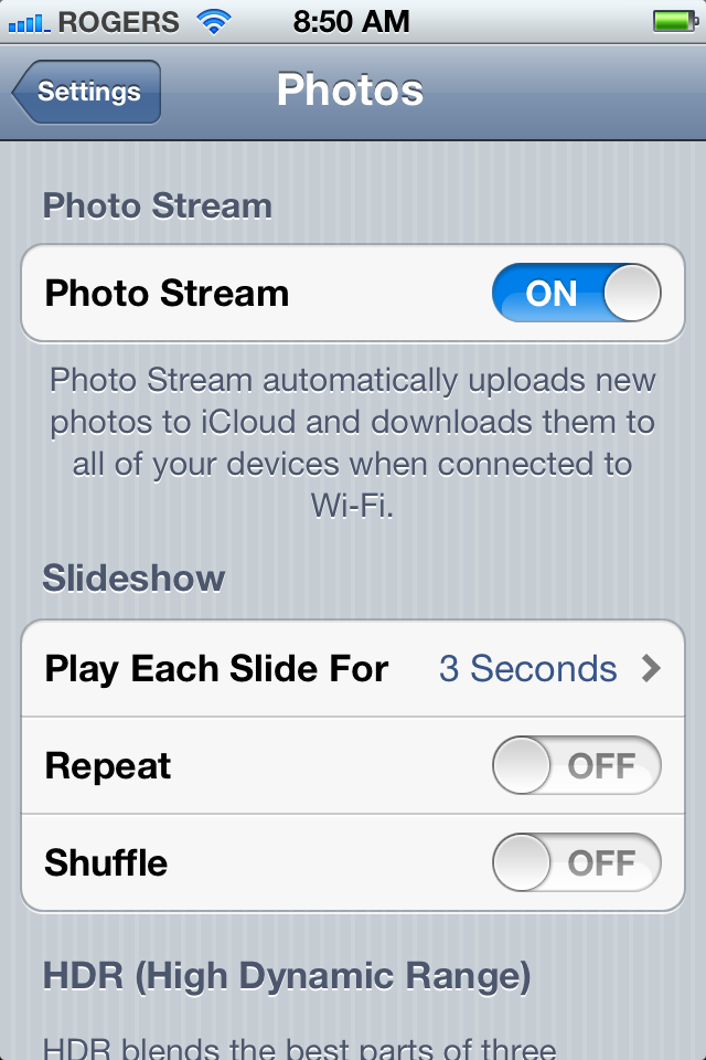
In Photos Settings, like in iCloud Settings, you can toggle Photo Stream on or off.
Store
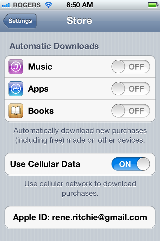
If iTunes in the Cloud is available in your local iTunes Store, you can not only re-download Music and iBooks just like Apps, but you can now set your iPhone, iPod touch, or iPad to automatically download any Music and iBooks, and Apps that you've downloaded on any other device or on iTunes desktop on your Mac or Windows PC. For example, if you buy All Along the Watchtower on your Mac, it'll start downloading to your desktop library but also start downloading on your iPhone and iPad. The same holds true for apps provided they're universal. So, if you buy Angry Birds HD on your iPad, it'll download to your desktop iTunes library, but not your iPhone (because you can't play iPad games on your iPhone). Likewise, buying an iOS version of an app or game doesn't cause your Mac to start downloading the Mac App Store version.
If you have several family members with widely different tastes all on the same iTunes account, auto downloading can get messy. If you're the only person on the account but you have a bunch of iTunes enabled computers and iOS devices, it can be miraculous.
On iPhone and iPad 3G, you can also choose to enable Use Cellular Data to automatically download purchases when away from Wi-Fi. If you have limited data, keep this off.
Phone

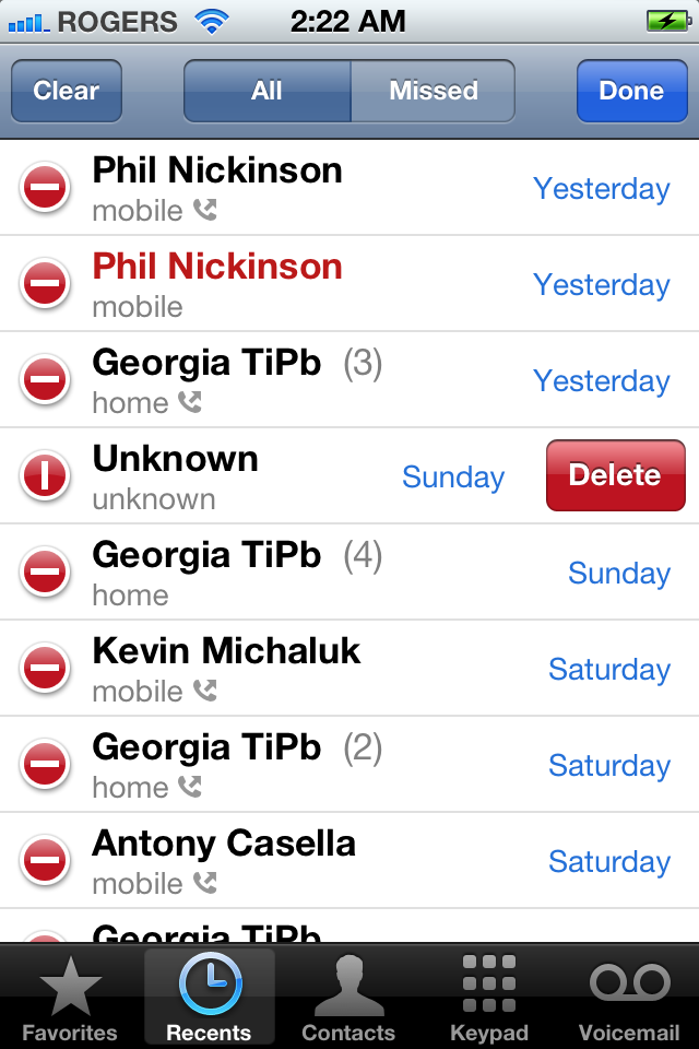
Phone has a number of new options in Settings, but in the app itself the major new feature is granular deletion of Recent Calls. You now get an Edit button at the top right and tapping it lets you go through and select and confirm individual calls for deletion.

Mail gets a bevy of new features in iOS 5 that bring it closer on par to a full desktop email client without losing the ease of use that characterizes Apple's multitouch apps. Everything, from formatting to function gets an update, and the built in dictionary comes along for the ride.
Dragability
Have an email address in the To: field and think it really would be better off in the CC: field? Gone are the days of moving by way of deleting and retyping. Now just touch the address, it floats up, and you can drag it to just exactly where you want it.

Rich Text
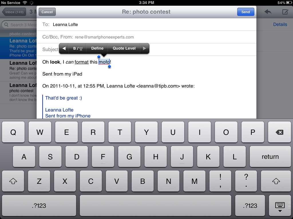
Touch and hold to select as you would for copy and paste, and the popup menu now let's you tap an arrow to get to formatting commands. Bold, italic, and underline are all options, along with decreasing or increasing the quote level.
Marking and Flagging
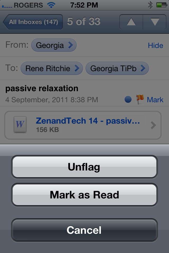
You can now Flag or Unflag messages to make important email stand out. It's been included alongside Mark as Read or Unread.
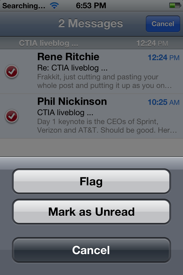
Speaking of Marking, you can now Mark multiple messages as Read or Unread using the same Edit controls that previously allowed you to Move or Delete them.
Warning signs
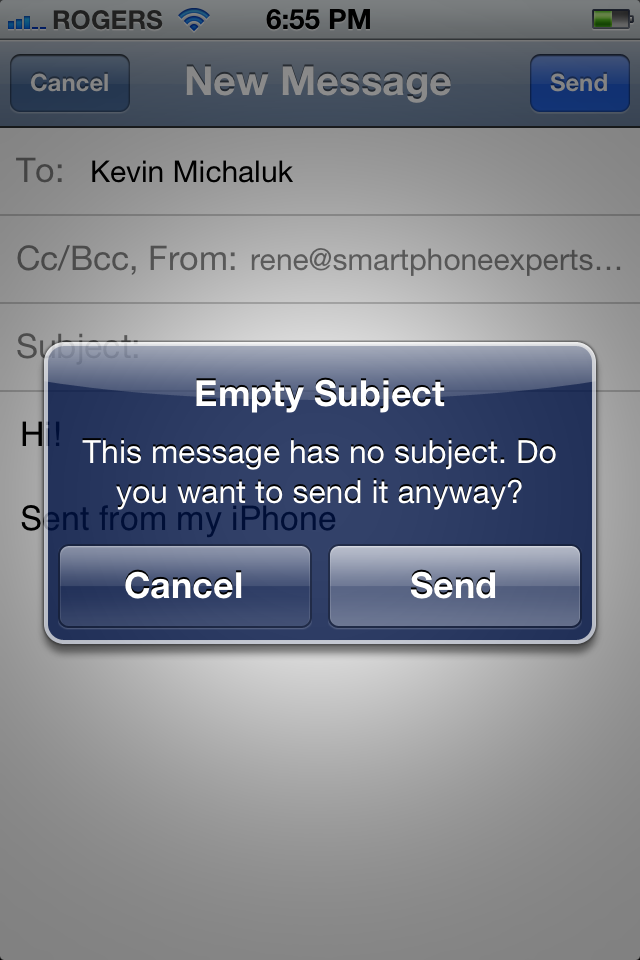
If you try to send an email and the Subject is left blank, iOS 5 will popup a warning.
Folder Management
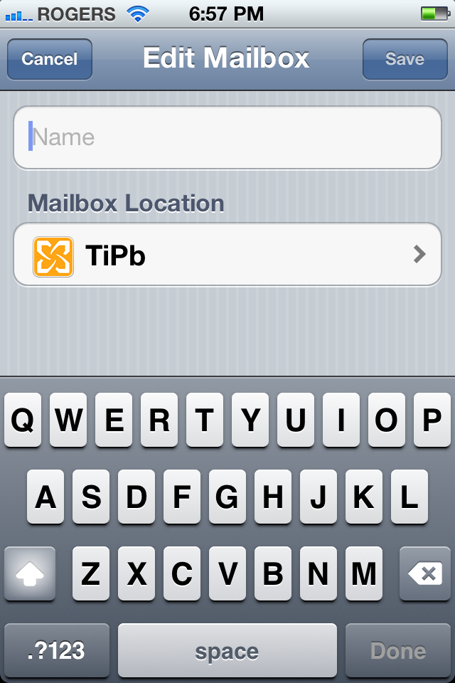
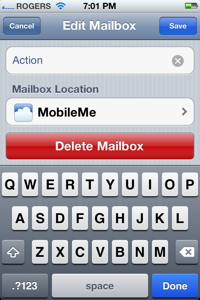
You can now add mailbox folders directly on your iPhone, iPod touch, or iPad. Just go to the account you want to add a mailbox folder to, tap Edit up top, then New Mailbox at the bottom, and enter the name you want to use. If you want to make it a subfolder, just tap the account name and you'll get a list of parent folders.
You can also tap the Edit button, choose a folder, and then change the name, change the parent folder, or even tap the Delete button to remove it from existence.
Safari

Several of Safari's new features seem designed to allow users to consumer web articles faster, easier, and more elegantly than was previous possible on mobile devices. But at the same time, Safari for iPad behaves more than ever like a desktop browser.
Reader and Reading List
Safari Reader uses, in part, the open source version of Readability to re-render web articles text on a white background with big, legible text, and free from ads and other distractions that typically clutter up the 'net. Just tap the Reader button at the top right of the address bar and Reader will slide in and take right over. To make it go away, tap the (now purple) Reader button again.
For hard-to-read sites, or those that have double-underline popup punch-the-monkeyed their souls to the monetization devils, Reader comes in really handy.
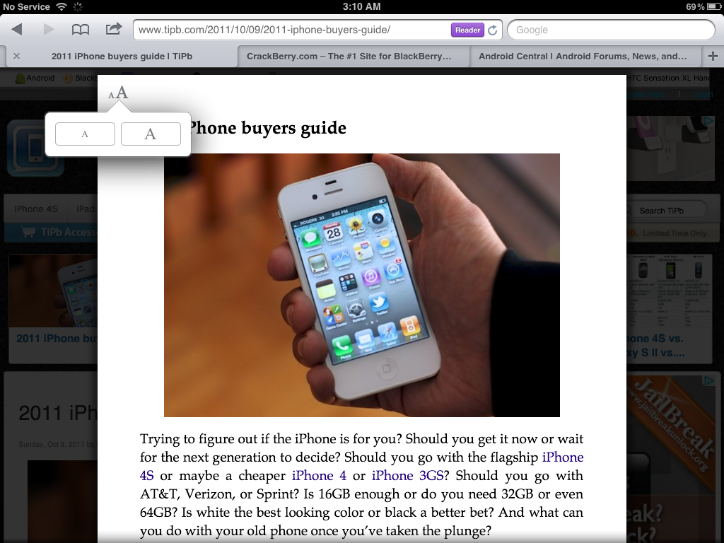
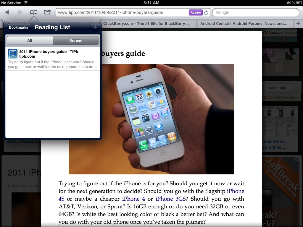
Reading List is a special type of bookmark that lets you quickly save a web article to read later. The combination of being easy to add and easy to find, and iCloud-powered sync across iOS and Mac OS X Safari browsers, makes it useful as far as it goes.
To save a page, tap the Action button and then tap Add to Reading List. To retrieve a page, tap the Bookmarks button and from the top level, tap the Eyeglasses icon or the Reading List label at the top.
But even taken together, while nice to have as built in features, they're not a serious replacement for Instapaper.
Pop-over pulled
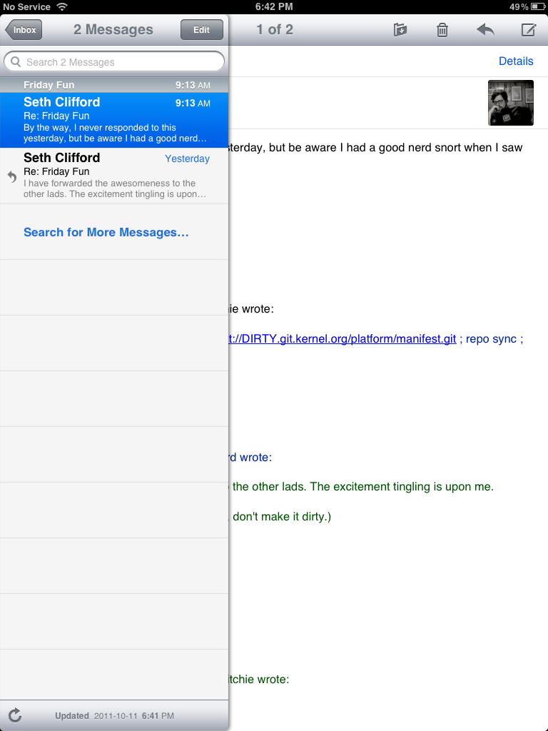
The less than ideal pop-over previously used to show the Mail list in iPad has been replaced with a slide-on, slide-off panel. It looks better but is a little harder to put away at time.
Nitro
The Nitro JavaScript engine, brought to Safari in iOS 4.3, has also been pushed out to Web.app, the service that allows web apps to be bookmarked to the Home Screen. That means all web pages now enjoy the 2x software speed boost Nitro previously only provided Safari, and Apple continues to provide the most powerful HTML 5 support in mobile.
Tabbed browsing (iPad only)
While iPhone and iPod touch retains their customary Pages system to manage moving between multiple active web pages, iPad gets the full desktop treatment courtesy of tabs. And they work just as you would expect. Tap the big + button on the right to add a new tab and the tiny X icon on the tabs far left edge to close it.
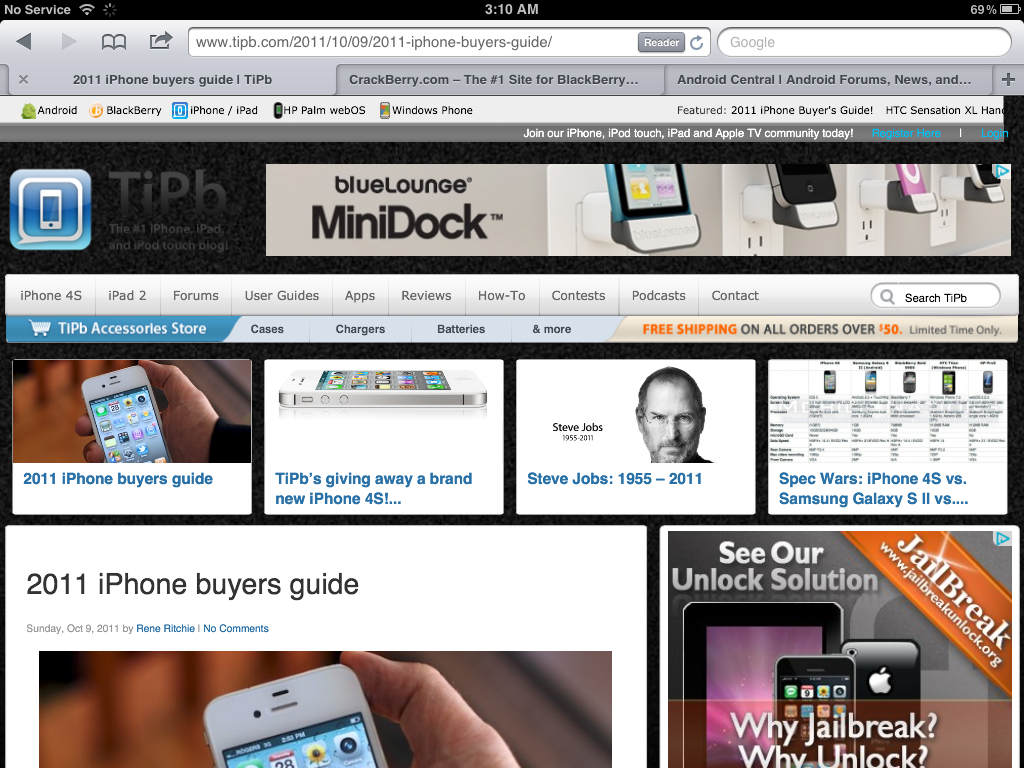
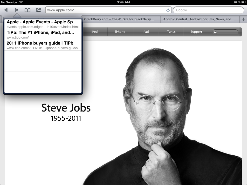
Also like desktop Safari, touching and holding the Forward or Back button will now open a History popover.
Music

While iPod touch always had a separate Music app, iPad had a separate music app named iPod, and iPhone combined both video and music into a single iPod app. No longer. Whether Apple is winding down iPod as a brand -- they didn't update any of the iPod line of devices this year -- or simply creating consistency across iOS devices, the iPod app is dead. Long live the Music app.
New interface, new iTunes Store integration
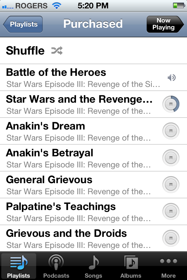
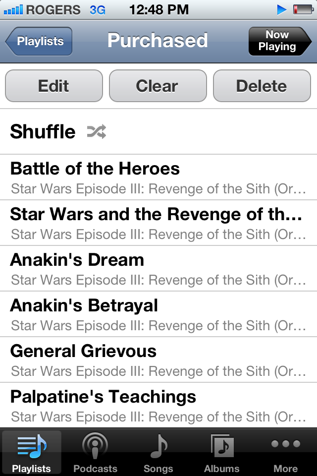
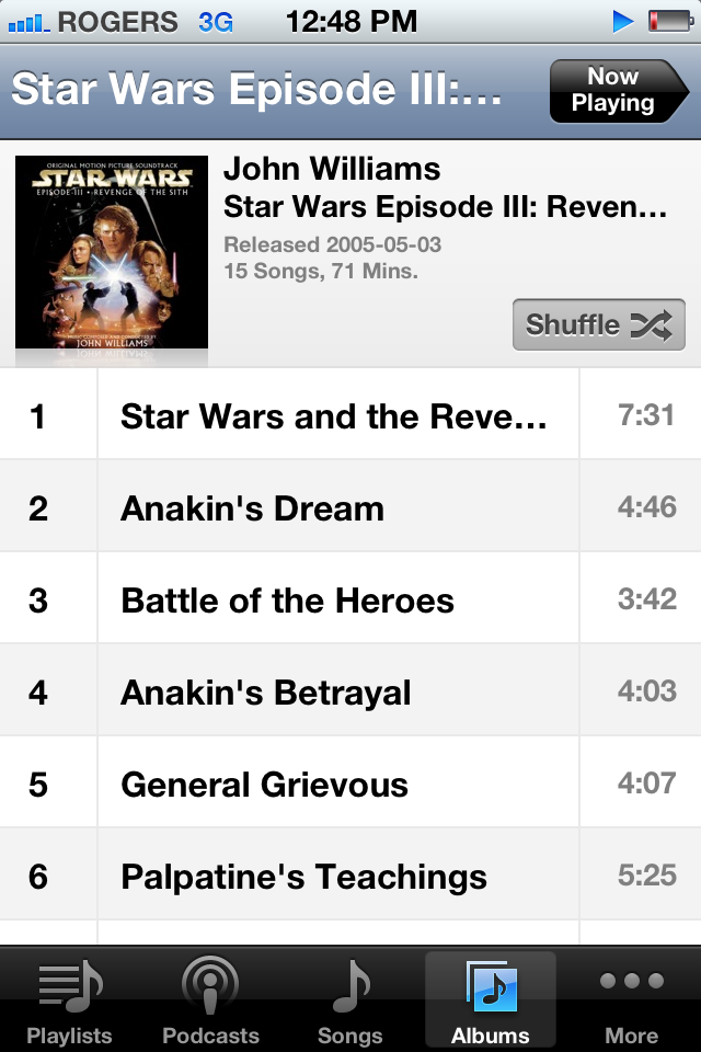
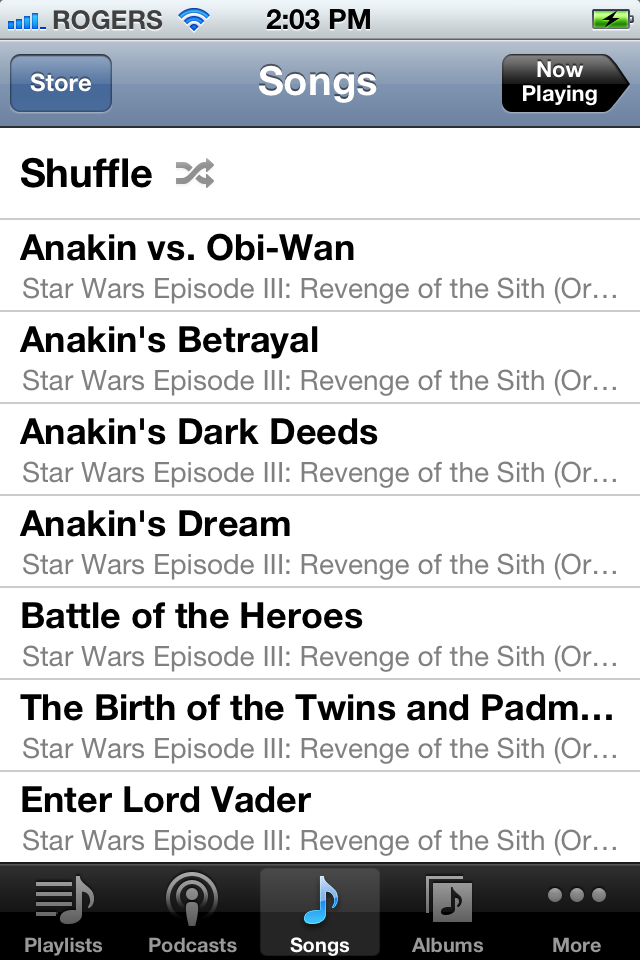
Music gets a face lift in general, with a new look to most of its views. The most impressive of which is the inclusion the download indicators for songs either freshly purchased or in the process of re-downloading thanks to iTunes in the Cloud. There's also a new Store button at the top right so you can quickly get to the iTunes Store to buy or download more content.
Pop up names
In previous versions of iOS, long names were cut off. That meant, for example, if you wanted to find one of a dozen or more chapters in an audio book, it was a guessing game. (Tap. No, not 9-16. Tap. No, not 20-22. Where's 25, frakdammit!) Now you just tap and hold and the full information pops up, making it easy to pick the right one. It works for most fields, track name, artist name, album name, etc. Again, a small addition but a helpful one.

Contacts

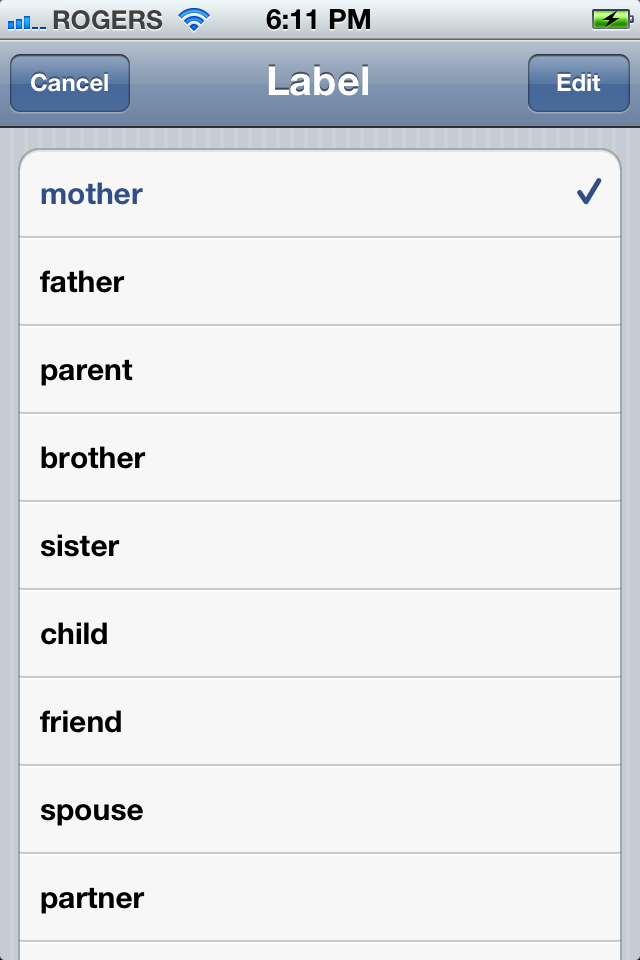
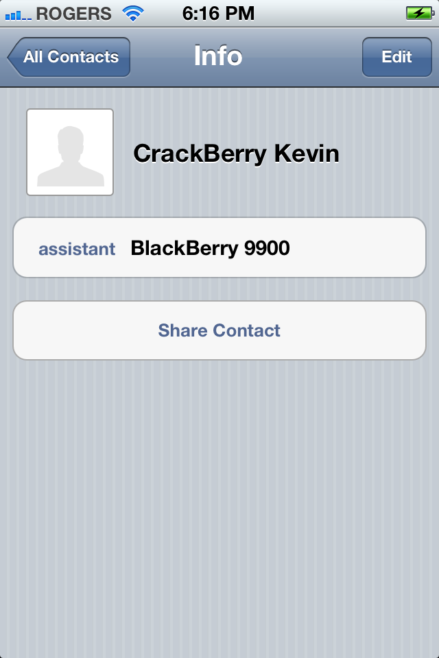
Contacts gets a relatively minor addition in iOS 5 -- pun intended. You can now add a new field called Related People, and set it to mother, father, parent, brother, sister, child, friend, spouse, partner, assistant, manager, or other. You can then type in a name or choose from an another existing Contact.
Pricing and Availability
iOS 5 will be available as a free update for all supported devices on Wednesday, October 12, 2011. Although not all features are supported on all devices -- or all generations of all devices -- iOS 5 can be installed on the following:
- iPhone 4S (2011)
- iPhone 4 (2010 and 2011)
- iPhone 3GS (2009, 2010, and 2011)
- iPod touch 4 (2010 and 2011)
- iPod touch 3 (2009)
- iPad 2 (2011)
- iPad (2010)
Should you upgrade?
Yes, absolutely and immediately with 2 caveats. First, if you're on older hardware like iPhone 3GS and you're reading this just as iOS 5 becomes available, you might want to wait a few days and make sure there aren't any reports of excessive sluggishness or other issues. Second, if you're Jailbroken and rely on certain features, and don't like tethered Jailbreaks, you might want to wait until a nicely packaged iOS 5 Jailbreak for your device is released (iPad 2 and iPhone 4S might take a while.)
Otherwise this is a fantastic update with incredible new functionality -- and it's free. What are you waiting for? It will make you feel like you have a while new device.
Conclusion
Almost everything about iOS 5 feels broader and better, and not only more functional, but more personal and more tactile as well. Apple has added more granular levels of control to things like Location Services and Data Storage, so you can keep private what you want to keep private and delete what you want to delete. They've also added more direct touch manipulation to the UI with Multitasking Gestures on iPad 2 apps like Calendar and Mail, so the interactions are viscerally intuitive. At the same time they've the social, sharing aspects of iOS with services like AirPlay and apps like Find My Friends. It's a clever balance. So is the interface, which Apple has kept as accessible for novice users as it was in iOS 1 in 2007, and yet added ever greater layers of complexity for power users, including Fast App Switcher in 2010 and Notifications in 2011. For my sister, an iPhone or iPad can just make calls, play music, watch videos, and take photos. For me they can increasingly do almost anything.
And then there's Siri. I've already written about what it might mean for Apple in the customer insight space. What it means for users is perhaps even more profound. It's a whole new interface for computing and the next step in Apple's relentless attempt to make technology ever more mainstream. From CLI on Apple II to GUI on Mac to multitouch on iPhone to Siri on iPhone 4S, Apple continues to tear down barriers of entry and reset expectations not about what we can do with devices, but about what they can do for us.
There are still things to complain about if you come from other platforms and miss specific features or have specific needs. Faster access to radio toggles. Quick message previews and responses. A Theme Store in case the 5-year old UI is starting to look a little less than fresh. A Files app that handles documents the way Photos handles images and videos. But with each version the list in undeniably growing shorter.
Still, it's hard not to think about Steve Jobs at this point, and his standing beneath that giant slide showing the crossroads of technology and liberal arts, and see iOS 5 in the context of that vision. The man who was inspired by calligraphy to make elegant digital typography and lick-able interfaces has begun to obsolete them with voice. But that was his way and it remains Apple's way. Future thinking and fearlessly so.
Some rough edges remain, and there will be an iOS 5.1 and iOS 6 after it, but iOS 5 is still beautiful and we can use it to make our devices and our lives better.

Rene Ritchie is one of the most respected Apple analysts in the business, reaching a combined audience of over 40 million readers a month. His YouTube channel, Vector, has over 90 thousand subscribers and 14 million views and his podcasts, including Debug, have been downloaded over 20 million times. He also regularly co-hosts MacBreak Weekly for the TWiT network and co-hosted CES Live! and Talk Mobile. Based in Montreal, Rene is a former director of product marketing, web developer, and graphic designer. He's authored several books and appeared on numerous television and radio segments to discuss Apple and the technology industry. When not working, he likes to cook, grapple, and spend time with his friends and family.
