"Clear is a task list app for those who don't like task list apps -- a new, gesture-based approach that's manages to be simple without being simplistic."
Clear seeks to apply new sensibilities to one of the oldest stalwarts of personal information management, the to do app. Clear does so by eschewing the user interface "chrome" of a typical iPhone app -- lots of buttons and columns, and endless amounts of tiny text to tap through -- for large lists that you swipe and push around. It also sheds a lot of features found in more expensive, more complicated "getting things done" apps, and instead focuses just on creating and managing lists. No more, no less.
It took Apple 5 generations of iOS to introduce their own, built-in task-management app, Reminders, which means the App Store has been trying to fill that particular void for years. In typical Apple fashion, Reminders offers only basic functionality compared to the full blown "getting things done" apps on the market, but it also manages to be remarkably cumbersome to actually use as an app. (Siri's voice controls rescue it for simple tasks.)
That leaves a gap below the high-end, feature filled task managers, for something elegant and easy to use, and it's one Clear seems intent on filling.
The key to Clear's approach is a big, bold design centered around a completely gesture-based interface.The challenge with any gesture-based interfaces like Clear's is one of discoverability. Humans are good at "see button, read label, tap button" but not so good at "see nothing, poke around, figure out a pinch collapses the lists". The first is almost instant, and the mental overhead all but unnoticeable anymore. The second is hit and miss, and can be frustrating or fruitless.
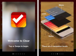
Clear mitigates a lot of the problems with gesture discovery by walking the user through them right when the app launches for the first time. It's an admission, much like a modern touch-controlled video game, that therein lies complexity, but it's also hopeful that once the first few moments of awkwardness pass, instinct takes over.
That it will quickly become like finger painting with productivity.
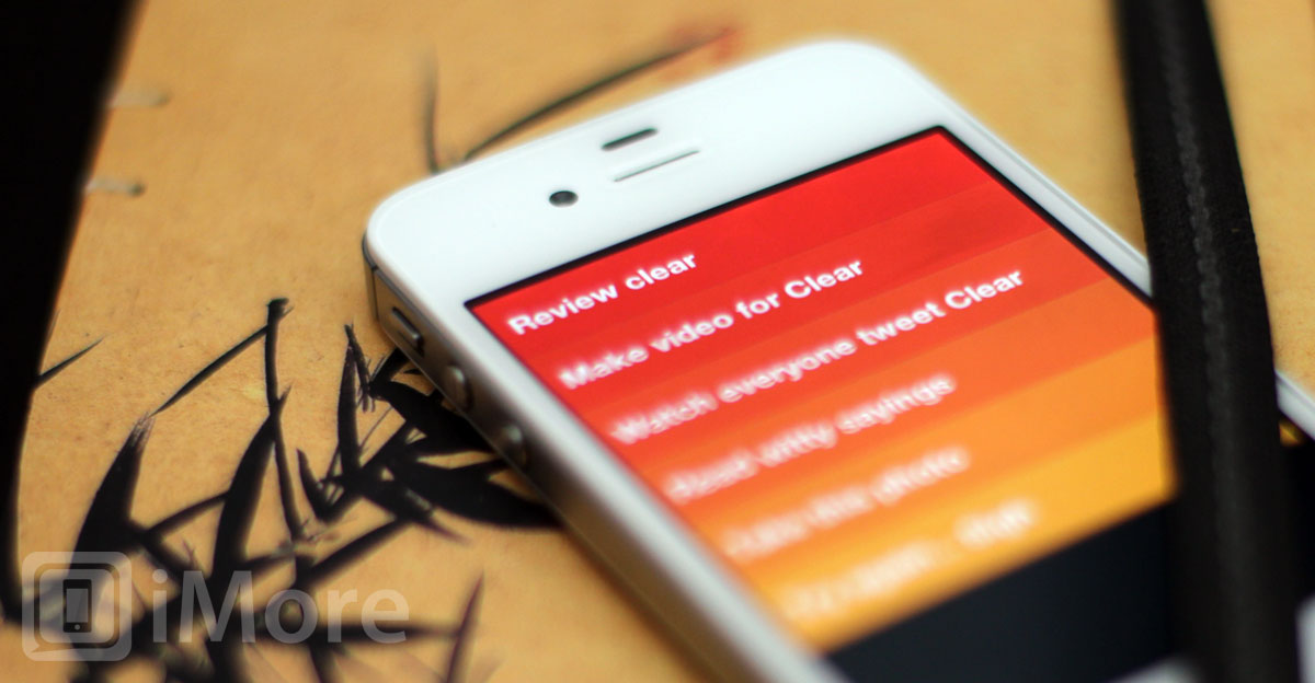
There are three layered views in Clear: Items at the bottom, lists in the middle, and the menu on top. You start at the bottom, in items. By default they're heat mapped with red at the top -- defcon 1 -- fading through orange and yellow towards the bottom. (If that scheme is too hot for you, you can change the theme in settings.)
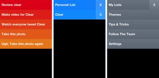
Screenshots alone won't properly convey gestures, so if you haven't already, watch the video above before continuing on. Done? Okay. To move up to lists, you can either touch the screen and pull down -- past item creation, we'll come back to that in a moment -- until the items fall off the bottom of the screen and the lists take center stage. To move to the menu, you can do the same.
Another, funner way to do it is to touch two fingers to the screen and pinch them together vertically, like you're trying to fold the items together. Items fold into lists, lists fold into the menu.
To go back to a previous, lower layer, like to go from the menu back to the lists, just touch the screen and push up. Sadly, you can't pinch your way back out (that creates new items or new lists, between the others, or does nothing in the menu.)
To create a new item or list below the others, just tap the screen below the items or list. To create a new item or list above the others, just touch and pull down, though not too far or you'll switch to lists or the menu, as described above.
Once a new item or list is created, you get to label it, but the label can only take up that one, single, large-type line. I like that. It forces you to be concise and disciplined in your thinking.
To move an item or list, tap and hold it, and slide it to its new location. To mark an item as completed, swipe right. It'll turn gray and drop to the bottom. Swipe right on it again to un-mark it as complete (you'll have to manually move it back to its former position).
To delete an item or list, swipe left. It'll vanish. I haven't found a way to undelete them yet, so be careful.
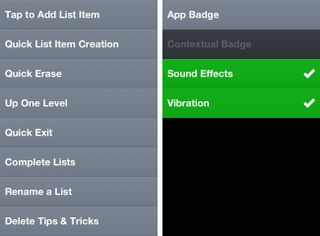
There are many more quick, gesture based controls. The menu has a whole section on them, including ways to rapidly create many new items in a row. Which is interesting. There are levels of usability that appear. But there are also levels of complexity and collision. For example, in iOS 5 Notification Center is activated by swiping downward from the top of the screen. If you're not careful in Clear, you can partially activate it -- make the little gripper handle appear - quite frequently. (Having just the gripper handle appear is smart, however, it prevents Notification Center from being triggered by a single, perhaps unintentional downward swipe, requiring a more precise, purposeful grab and pull to reveal it.)
Once you learn to pull down lower to avoid Notification Center and create a new top-level item, you still have to be somewhat exacting. Pull too much and you switch to list view (or if you're in list view, to the menu view). Likewise if you're trying to switch to list view, pull too little and you've created a new item and have to cancel out and start over.
Since you can also get to lists by pinching vertically (or to the menu if you're already in lists), it can be a safer navigation choice to rely on. Likewise, being able to swipe through the layers in both directions, but being able to pinch through them in only one direction takes a little getting used to.
There's both a price to be paid and compromises to be made for gesture-based user interfaces. Clear balances both well and tops it off with several, delightful touches.
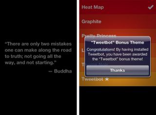
Empty lists are ghosted with famous quotes from the likes of Bruce Lee, William Shakespeare, Buddha, and others. Themes let you change color schemes from the default, aggressive red to more soothing green or unobtrusive gray, and if you have other apps installed, Clear will detect it and "reward" you with bonus themes (no stitched-leather popup for Find my Friends, though, I'm happy to report). There are also very distinctive sounds that accompany a lot of the actions. They're amusing at first, but you can easily silence them in settings if their charm or utility fades for you over time. (Likewise vibration.)
Once mastered -- and it doesn't take exceptionally long -- you can move very quickly through Clear. It doesn't have the power (or price tag) of something like OmniFocus or the features of Appigo Todo or the ability to quickly add tasks via Siri like the built-in iOS 5 Reminders app.
There are no dates or alarms, no location alerts or calendar integration, and no push notifications (though you can have Clear badge the app icon.)
There's also no iPad or Mac or Windows version, and no way to sync between devices, services, or platforms, which may be a deal-breaker for those who already have systems in place.
But then Clear doesn't seem intended for power users anyway. It's intended for everyone else; those for whom existing apps are far too much or far too difficult.
With Clear, once you get into the flow, you can fly through simple to dos, and triage your tasks, like nobody's business.
And hey, if you're joining us for fitness month, Clear is the perfect way to quickly, cleanly enter and check off your daily fitness goals. Whether it's going for those weekly walks or runs, or keeping that healthy shopping list handy, Clear can make sure you always know what's next.
The good
- Simple, highly focused design
- Well thought out gesture-based interface
- Fast, fun controls
The bad
- Not as feature-rich as typical GTD-style task apps
- Gestures take longer to discover and can collide at times
- No iPad or PC versions, no way to sync cross-device/platform
The bottom line
Clear is a task list app for those who don't like task list apps -- a new, gesture-based approach that's manages to be simple without being simplistic. It takes an almost Windows Phone Metro-style approach. It's not a task app for those who want power features or a more traditional interface. But for anyone new to to dos, who wants something fresh and fun, who just has a few lists of a few items and finds Reminders far too much of a chore, Clear might be the perfect place to start.
$0.99 (on sale) - Download now

Rene Ritchie is one of the most respected Apple analysts in the business, reaching a combined audience of over 40 million readers a month. His YouTube channel, Vector, has over 90 thousand subscribers and 14 million views and his podcasts, including Debug, have been downloaded over 20 million times. He also regularly co-hosts MacBreak Weekly for the TWiT network and co-hosted CES Live! and Talk Mobile. Based in Montreal, Rene is a former director of product marketing, web developer, and graphic designer. He's authored several books and appeared on numerous television and radio segments to discuss Apple and the technology industry. When not working, he likes to cook, grapple, and spend time with his friends and family.
