Updating interfaces for iPad 3: Why your favorite app might take a while to go Retina

Depending on how an app was designed and developed, updating for an iPad 3 Retina display could take days or weeks
Flash forward — After lining up for hours, or sitting at home all day waiting for a courier to arrive, you finally have your hands on an iPad 3 with its amazing Retina display. A display with over 3.1 million pixels. All of them difficult to distinguish, because they're so damn tiny. Text is crisp. Photos look are amazing. This thing is gorgeous.
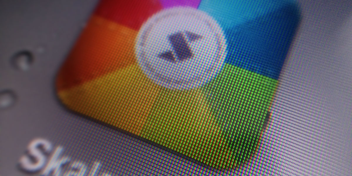
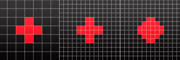
You launch your favourite app and notice things aren't as amazing as they were a few seconds ago. The app in question doesn't contain Retina image assets -- the pictures that make up the user interface elements are at the iPad 2's screen resolution, so things look as blocky as they did on your previous iPad. What's going on?
Custom UI vs standard UI

When creating an iOS app, developers can choose to use Apple's supplied UI (user interface) elements, they can create their own, or they can use a mixture of the two.
If they choose to only use Apple's in-built elements, then the onus is on Apple to ensure everything is designed to take advantage of the iPhone 4, iPhone 4S and iPad 3's Retina displays. No additional work needs to be done by the developer. Apps like this will look great on the iPad 3 on day one.
For designs using entirely custom elements, every single part of the user interface needs two images created — one for the previous, non-Retina size, and another at the new, double resolution Retina size (these contain "@2x" at the end of the filename). A simple app may only contain tens of images, but most of the prettier iOS apps also contain a large amount of individual images to construct their overall design. Some of the apps I've worked on have well over 300 images, so by the time we've finished creating the Retina assets, that's doubled to over 600 images.
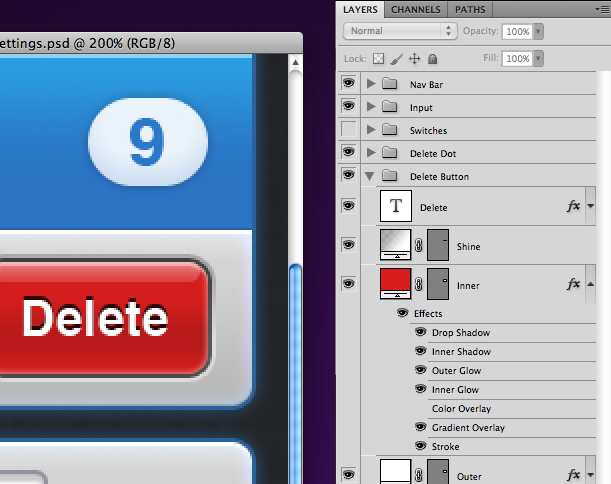
Depending on the designer and developer involved, each image may take up to a few minutes to create. Multiply that by the images required and it can often be a daunting, awkward, repetitive task. This also assumes the artwork was created using vector layers and layer styles in Photoshop (or a similar, freely scalable method). If it hasn't, there's a good chance everything will need to be rebuilt from scratch, using vector layers and layer styles, turning a few solid days' worth of work into something that might span weeks.
Thankfully, the transition from iPhone 3GS to iPhone 4 has taught a lot of iOS designers to work in ways that make creating two sets of images easier. If you're a designer looking to learn ways to improve your workflow when building non-Retina and Retina images, I've written articles on Designing for Retina and automated exporting.
Master your iPhone in minutes
iMore offers spot-on advice and guidance from our team of experts, with decades of Apple device experience to lean on. Learn more with iMore!
Preparation is the key
Some developers have made the assumption that a Retina iPad was on the horizon, and have already included Retina images in their apps. However, I suspect the vast majority haven't, even if they have the images on hand — being double the width and height also means the images are bigger in file size, which may push the total app size over the 20MB 3G download limit (apps bigger than 20MB can't be downloaded over 3G networks).
Why doesn't iOS just use vectors for everything?

If the issue is that pixel based images look blocky when they're scaled, why aren't vector based image formats, like SVG and PDF, used for iOS? Sometimes SVGs and PDFs are used in iOS development, but only rarely -- they're not the method Apple recommends. Vector formats tend to be far more resource hungry, especially for photorealistic icons, due to the amount of layers that have to be drawn independently to create the final visual. Mobile devices just don't have the grunt or memory to draw everything on the fly.
That's ok though -- think of the bitmap images used in iOS apps as pre-rendered vectors. The tools developers use to create the initial design should be easily scalable, but the final assets used in the app should be bitmaps, because they offer better performance (everyone loves silky smooth scrolling).
Patience
Good developers will know what's required of them, but may not want to start the arduous task ahead until the iPad 3 is announced (keep in mind that until Apple announces, we don't really know anything for sure). So please be a little patient if your favourite app doesn't take full advantage of the iPad 3's Retina display on launch day.
Marc Edwards is the founder Bjango and co-host of the mobile design podcast, Iterate.
Founder and designer at Bjango. Co-host of Iterate. Currently building Skala.

