iPhoto is a fantastic photo editing tool, in some ways better than it is on the Mac, but suffers from an inexplicable lack of useful sync.
Apple has brought iPhoto to iOS. Announced alongside the new iPad, but available as a universal app for the iPhone as well, iPhoto completes Apple's mobile iLife suite and once again challenges the misconception that multitouch is better geared for content consumption than creation. iPhoto took the longest to arrive on iOS, despite being the most popular of the iLife apps. So... was it worth the wait?
Photo Editing
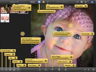
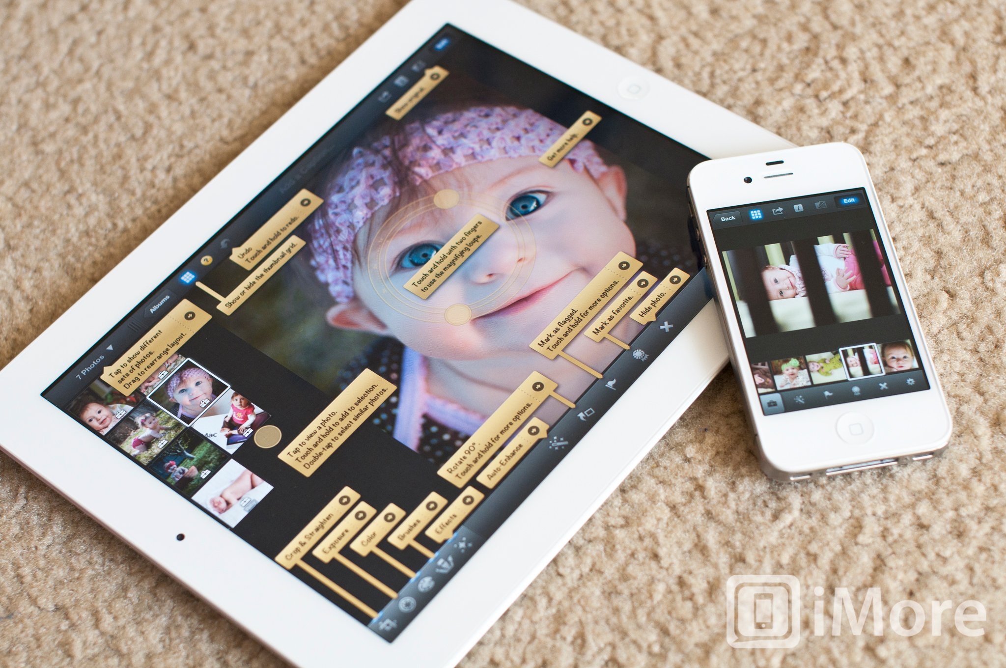
I'm am very impressed with the editing power of iPhoto. It's better then iPhoto for the Mac, that's for sure. It's jam packed with options, so it's nice that Apple included an info button that pops up a bunch of helpful notes about what each button does and what each filter or brush is named. (Not as nice as if they'd made the user interface more intuitive, but nicer than having to poke around and get frustrated.) If you tap the arrow on one of these tabs, a help screen will pop up with more info on the specific feature.
Color adjustments

The basic editing tools include cropping, auto enhance, and exposure. Included in the color adjustments tab is options to adjust saturation, white balance, and skin tones as well as smarter adjustments for blue skies and greenery. Be careful with these two, though. If you don't have greenery or blue skies in your photo, it produces horrific results.
This is the perfect time to mention that iPhoto does not support layers or masking, so you cannot exclude a portion of your photo from an effect or adjustment taking place. There is an option to preserve skin tones when making color adjustments, but it's mediocre at best.
To make color adjustments, you can move sliders provided at the bottom of the editing screen, or you can just drag your finger directly on the parts of the photo that correspond wit the color type. For example, holding your finger on the sky will pop up the Blue Skies tool and sliding your finger left or right will adjust the slider. Doing the same thing anywhere on your photo, but vertically, will adjust the saturation.
You can also adjust white balance with the typical presets that come with most apps and cameras: sun, cloudy, flash, shade, incandescent, and fluorescent. There is also a Face Balance tool that lets you choose a person's face and iPhoto will automatically choose a good white balance for the skin tone. Lastly, you can make select a white point on your photo with the custom white balance tool.
Brushes
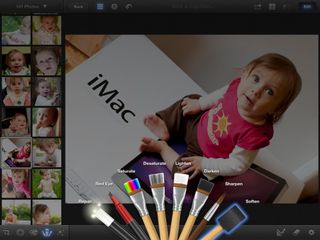
The best editing feature of iPhoto is the brushes. There are 8 of them: Repair, Red Eye, Saturate, Desaturate, Lighten, Darken, Sharpen, and Soften. The Repair brush will removes things like blemishes, dust marks, and scratches. The other Brushes are self explanatory.
To use a brush, you simply use your finger to "paint" the areas of your photo you the affect applied to. My biggest complaint is that iPhoto doesn't use a circle to show where you're touching -- the only visual cue is to see the results of the brush. But if you're making subtle changes, it's very hard to notice. However, the alternative that's available is the option to show your strokes. Turning this on displays all your strokes in red. When you're done applying the brush, just turn the strokes off to see the results.
My other gripe with brushes is that you cannot adjust the brush size - well, not directly anyway. The brush size is always the size of your fingertip, so to adjust it, you need to zoom in and out of the photo. This is just terrible. It's hard to be precise.
Now, I started out by saying that the brushes are the best editing feature of iPhoto, but have done nothing but complain about it. That's because, despite these two flaws, brushes are actually very powerful tools. The opacity of the brushes are fairly light, so you have control over how drastic you want the change to be -- just paint multiple strokes over one spot to create a thicker layer, so to speak. Showing your strokes is very helpful in this regard.
Effects
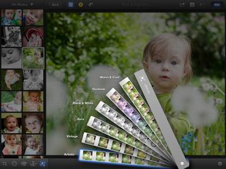
iPhoto has a set of filters that Apple calls Effects. The categories are Artistic, Vintage, Aura, Black & White, Duotone, and Warm & Cool. Honestly, there isn't really anything special about them in comparison to other apps, they're filters that change the look of your photos. End of story. Well, I guess the fact that you can adjust the vignetting intensity makes it a little bit more interesting?
Example of final edit

Here's the before and after comparison of a photo that I edited fairly quickly. I think it's a great example of a nice edit job that isn't overdone. I cropped and rotated, used the Face Balance tool, increased the Greenery slider, applied the repair, sharpen, and soften brushes, and added the Saturated Film filter from the Vintage category.
You can see a larger version here.
Sharing , Beaming, and syncing (or lack thereof)

You can share you photo from iPhoto directly to your Camera Roll, iTunes, email, Twitter, Flickr, Facebook, and an AirPrint compatible printer. There is also a new feature called Beam that lets you share photos from one device running iPhoto to another device on the same Wifi network also running iPhoto. It's really easy to use and a great way to share photos between devices. Unfortunately, it's also the easiest way to share photos between even your own devices.
I was really hoping that with the introduction of iPhoto on the iPhone and iPad that my iPhoto libraries would stay in sync between iPhone, iPad, and Mac, but this is not the case. It's not even the case within iOS. Each devices has their own library. Having photos and the non-destructive edits that go with them seamlessly sync between all devices would have been the single most useful feature a platform owner like Apple could implement. I expected more from the maker's of iCloud. Maybe in a future update.
Journals

iPhoto has this fun new way to display your photos called Journals. It's basically a collage of your photos with the ability of adding captions, blocks of text, notes, map, weather widgets to your collage. You can resize your photos and drag and drop them to place them exactly how you wish. Unfortunately, you cannot adjust the size of the widgets, so even if your sticky note only has one small phrase, it must still take up just as much space as four small photos.
Journals are pretty fun to play with and can be shared online through iCloud. This will give your Journal its own web address that can be shared with whoever you want. All your photos are also downloadable from your online journal - a "feature" that cannot be disabled.
I was very disappointed to learn that this was the only real way to share a Journal. I was really hoping for an export that would allow me to then share my Journal to my personal blog.
You can see an example of a journal that I shared through iCloud here.
The good
- Very powerful editing tools
- Journals are pretty cool
- Easy to use
- Integrated user manual is awesome
- Beam is a great and easy way to share to other iOS devices
The bad
- iPhoto libraries don't sync
- Brushes don't have visual indication of brush size
- Must zoom in and out of photo to adjust brush size, which isn't very precise
- No support for layers
- Can't adjust size of inserted widgets in a Journal
- Can only share Journals online through iCloud
The bottom line
iPhoto is a fantastic addition to the iLife family on iOS with very powerful editing tools. Sure, there are some things that could be changed to make it better, but at just $4.99, it's quite a steal. Minus the creation of books, cards, and calendars, it's better than iPhoto on the Mac.
$4.99 - Download Now
Former app and photography editor at iMore, Leanna has since moved on to other endeavors. Mother, wife, mathamagician, even though she no longer writes for iMore you can still follow her on Twitter @llofte.
