Flipboard vs Zite vs Pulse: iPad personalized magazine app shootout!
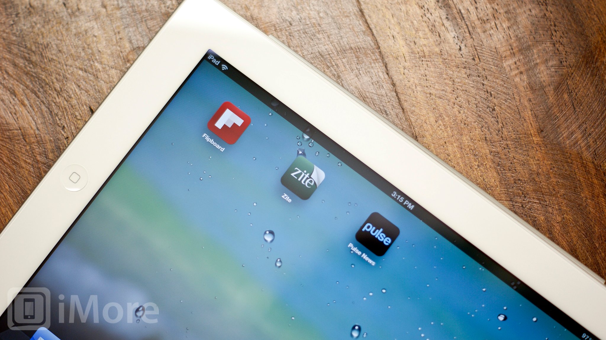
Thanks to its big, beautiful screen, the iPad is a great way to read traditional Newsstand-style magazines in a new, digital way. Because the iPad is online, however, and can be hooked into everything from RSS (Really Simple Syndication) to social networks like Facebook and Twitter, it can also be a lot more. It can be a dynamic, personalized magazine filled with things that are important to you, recommended by the people you trust most, or updated based on your previous likes or dislikes. Flipboard, Zite, and Pulse have all sought to make dynamic, personal, sometimes even social magazine apps for the iPad, and they've all gone about it in a different way. Which one is the absolute best? Lets take a look!
User Interface

Flipboard, Zite, and Pulse all have great interfaces that makes it easy for readers to navigate around and explore news and social sites.
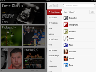
Flipboard is just fun. The cover page is full of big, bold squares and rectangles that highlight photos and images and give you categories to choose from. You navigate by literally flipping the boards to drill deeper into sections and stories. The layout inside the sections is crisp and clean and you can easily flip through until you find a story that catches your eye. Tap a story you like and you're zoomed into a full-screen view. If you want to move tiles around or don't want a specific section, hold down on a tile just like you would to move around app icons on your homescreen. You can then move them around and delete sections you aren't interesting in reading (you can always restore them later via settings if you'd like). Once you're done deleting and organizing, just tap any tile to exit edit mode.
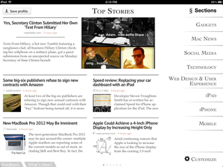
Zite uses lots of white space and it's Top Stories page looks like the table of contents of a contemporary, modern magazine. Sections are off to the side and rendered in big, beautiful type, and individual stories are shown in a spartan, stripped down, almost "read later" style.
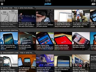
Pulse has the densest cover page of the three, and is set on black instead of white. Not only does it fit a lot of content onto one page, but you can swipe through any of the horizontal sections to see even more stories. Tap on one you like and a panel slides over to show you the story. You can swipe sideways inside the panel to move between stories, and because the cover page remains visible, keep swiping between the sections as well to keep browsing even more quickly.
All three are very well designed. However, the award has to go to Flipboard. Everything from the carefully crafted icon to the way pages flip and tiles fold down to view sections is beautiful and intelligently thought out. It's one of those apps that you want to use just because the interface is so enjoyable.
Content
Content is king for a reason. No matter how beautiful an app may be, if there's nothing in it, its value will be limited. When it comes to content, Flipboard, Zite, and Pulse all have their strengths and weaknesses.
Master your iPhone in minutes
iMore offers spot-on advice and guidance from our team of experts, with decades of Apple device experience to lean on. Learn more with iMore!
Flipboard integrates RSS, Facebook, Twitter, and Instagram as well. So if you're looking for an app that allows you to not only keep up with news but with friends and family, Flipboard offers an incredibly personalized experience.
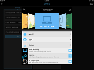
Pulse allows you to add individual RSS feeds on their own as well as browse for news. There is no Facebook and Twitter integration, though you can sign in with your Facebook account. Pulse will provide suggestions for feeds but nothing that's very customized.
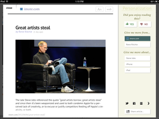
That's where Zite comes in swinging. While Flipboard and Pulse basically pull in the information you've already decided you want to look at, Zite aims to personalize and improve your reading experience over time. When you first launch Zite you can grant it access to your Twitter, Google Reader, Delicious, and Read it Later accounts as a starting point. From there it'll provide you news that it thinks you'll enjoy. If you find a story you don't care for, tap into it and give it a thumbs down. Zite will then stop showing you stories simliar to those. If you find a story, subject, or writer you enjoy following, give them a thumbs up and Zite will pull in more articles that are simliar or by the same author.
Flipboard's Facebook and Twitter integration means you get to see things your friends and the people you follow like. With Zite, you get to see things their continuously refined recommendation engine thinks you'll like. I've found tons of new sites, stories, and writers I enjoy thanks to Zite that I may never have found otherwise, and since I already use Facebook and Twitter in their own sites, I don't feel like I'm missing out by not having them in Zite.
That gives Zite the edge.
Social sharing
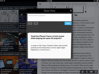
Zite, Pulse, and Flipboard all allow you to share stories to Facebook, Twitter, read later services, email, and many more. So there's really no clear winner in this category. Whichever one you decide to use, you'll be able to share things with anyone or any social circle you'd like. All three also support Instapaper and Read It Later.
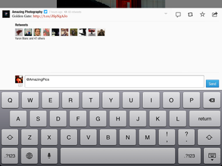
While Zite and Pulse only allow you to share stories to Facebook and Twitter, Flipboard actually allows you to pull in your Facebook and Twitter feeds. They'll filter in just like news. You can also see who is tweeting stories and you can comment on them as well as @ reply the creator if they're integrated into Twitter. So when it comes to social, all provide integration but Flipboard provides a more in-depth and personal experience.
When it comes to social networking, Flipboard gets the cake.
Cost
All three applications are free in the App Store so if you're debating between one or the other, there's really nothing to lose. Just download all three and stick with the one you find suits you the best.
Tie.
Conclusion
Flipboard is very well put together and integrates social networking in a way the other two don't. If you're heavily tied to Twitter, Facebook, and Instagram, this should be your go-to app. It's also got a unique layout that the others can't quite compete with just yet.
Pulse aims to pack a lot of information on the main screen by using tiles that slide horizontally and vertically. While quick access is important, so is what the app looks like. And to many users Pulse will be a bit too busy. If you're a power reader, you'll likely love Pulse. If not, it can be too much.
Zite has the simplest interface of the three and lets you really concentrate on reading. It may not be as fancy or fun, but for people who just want to read without distraction,
While Flipboard, Zite, and Pulse all make reading news on the iPad an amazing experience, how they handle content is an important part of what makes one better than the other. For this reason, Zite takes the win. It's not only personal to each user, but it grows more personal over time as you use it. The way it recommends new content is something none of the other apps provide. Bottom line, Zite is the best social magazine app currently available on iPad.
Zite - Free - Download Now
Pulse - Free - Download Now
Flipboard - Free - Download Now
Additional Resources:
iMore senior editor from 2011 to 2015.


