iOS 6: Is it time for Apple to revamp the Home screen?
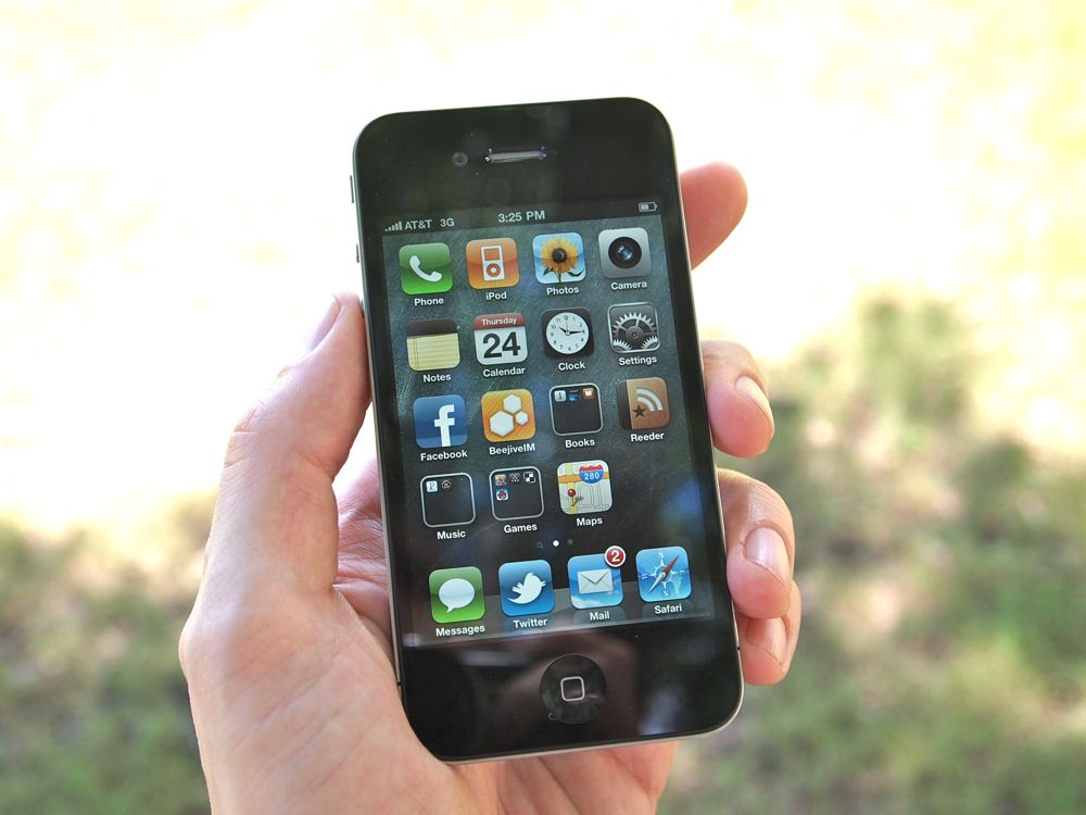
At Macworld 2007 Steve Jobs pulled the original iPhone from his pocket, held it up high above the stage, and showed off the app launcher-based Home screen... that's pretty much remained the same ever since.
That's not entirely true, of course. Apple quickly added the ability to create WebClip icons for websites, and to re-arrange and delete them. With iOS 2 (iPhone OS 2) they added native apps to that mix. They increased the number of Home pages. They added Spotlight. They added wallpaper. With iOS 4 they layered in the multitasking fast app switcher. They layered in folders. The iPad, and the iPad alone, got landscape Home screen support. With iOS 5 they layered in Notification Center and Siri.
Is it time for something more?
Familiarity is a feature
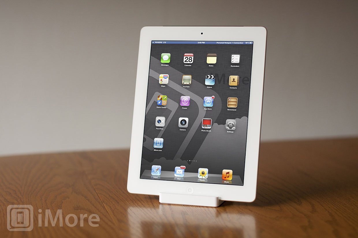
To a casual user -- someone who only makes calls, plays music, takes photographs, and runs the occasional app -- the iPhone today works almost exactly as it did back in 2007. Just like a casual Mac OS X user can ignore the Terminal, iOS users can happily ignore Spotlight, the fast app switcher, folders, Notification Center, and Siri, and still fully use and enjoy their iPhone. They can wait years between hardware upgrades (and sometimes, because of that, software upgrades) and still pick up the latest iPhone and use it exactly as they used the first iPhone.
That may not matter to gadget geeks who change their platform as often as they change their jackets, but to mainstream users, to those for whom technology has traditionally been intimidating and inaccessible, that familiarity is a huge feature.
It's why Apple made the iPad work almost identically to the iPhone and said as much -- hundreds of millions of people already know how to use it.
It's why Home screen interface and experience isn't fashion. If you're bored by the iOS UI or UX, consider how little computer UI and UX has changed much over the last few decades. For all its other advances, for all it's design tweaks, OS X still has icons and folders on a desktop, the same as the classic Mac OS had generations ago. For all of Windows 8's Metro skins and finger-friendliness, it will still ship on beige boxes with full mouse and pointer support at its core.
Master your iPhone in minutes
iMore offers spot-on advice and guidance from our team of experts, with decades of Apple device experience to lean on. Learn more with iMore!
That being said, mobile is moving at a blisteringly fast pace. While the iPhone and iOS were the startling new in 2007, they're now one of the oldest mobile experiences in the space. Interface and experience aren't fashion, but users are fashion conscious, and phones are subject to fashion trends.
Android has a huge marketshare. Windows Phone is getting a lot of attention, not just from AT&T but from designers. BlackBerry 10 may bring a new level of gesture-based interface to the table (if they can solve the discoverability issues).
These Home screen experiences not only look different to iOS and the traditional app launcher, but they function differently as well.
App launchers and information density
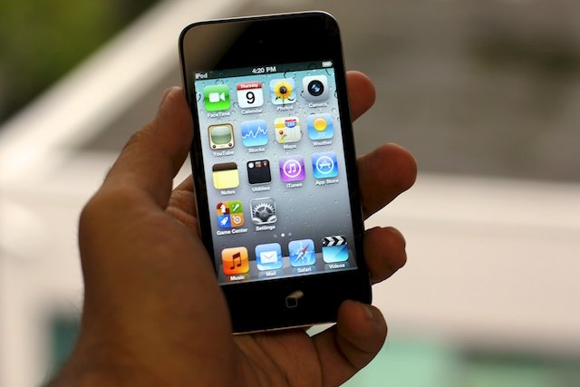
iPhone wasn't the first app launcher style Home screen. Not by a long shot. Long before smartphones, Palm Pilots were based entirely on the icon grid. When smartphones came along, the Treo retained the app launcher. Windows Mobile adopted it as well. Even today, you can find app launcher Home screens on webOS, BlackBerry OS, and Android. Some of them also add other layers, like Cards or widgets, but for the most part app launchers are never far away.
That's because they're familiar, as mentioned above. You see an iconic representation of something you want to do, you tap it, and it opens up. Because they're iconic (or supposed to be), and because human brains are great at pattern recognition, they scale well and can (usually) be picked out even among a large quantities of other icons.
What they lack is information density.
With very few exceptions, all an icon on an app launcher tells you is which app will launch when and if you tap it. They're static images and there's typically no information about the current state of the app, or any relevant data beyond the static image.
In the case of Apple's iOS, Calendar will show you the current date on its icon, and Apple created a badging system to overlay the number of outstanding alerts an app has pending. But that's it. With Notification Center, with a little extra effort, you can pull down snippets of those alerts, and see widgets for Weather and Stocks. However, the level of immediately available, glanceable data remains low.
Even if we consider the status bar, which shows carrier and Wi-Fi, time and battery, location and Bluetooth, none of it is actionable. It can't provide additional information or take you to it. (Although it has added persistent color bands for tethering, voice recording, VoIP or telephone calls, etc. and tapping those will take you to the associated app or Setting.)
Widgets and cards and tiles, oh my
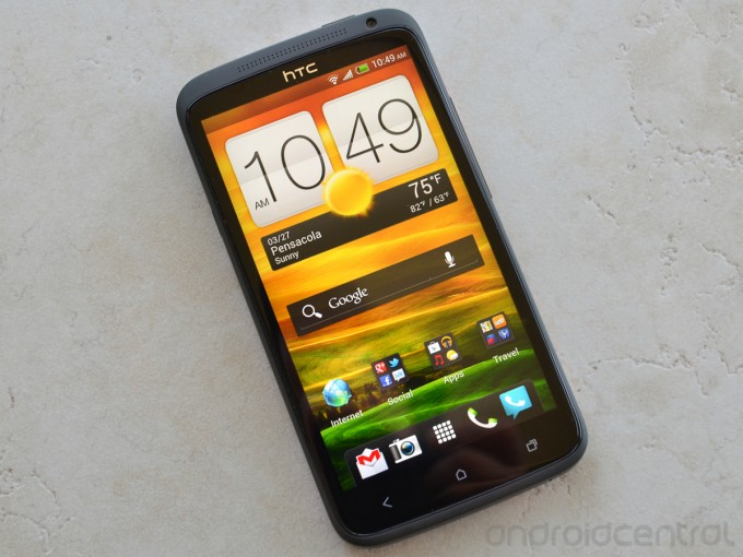
There's no consistent Android interface, but stock Google, Sense, TouchWiz, "Blur", and other manufacturer implementations typically offer some variety of widgeting system. With them, you can have social statues, search boxes, clocks, news feeds, and a huge amount of glanceable data available right on the Home screen. They typically take up more space, however, might use slightly more battery and bandwidth as they keep up-to-date, and add an element of chaos to the layout. However, the amount of time they can save makes for an excellent tradeoff. (If that type of data is important to you -- some users simply don't find a use for widgets on computers or smartphones.)
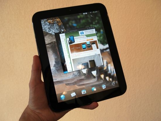
webOS takes a different approach, shrinking entire apps down into "Cards" that stay live-ish on the Home screen, and thanks to more recent updates, can be stacked together. Flipping through Cards doesn't give you an iconic view or a widget-ized extract, but a look at the entire app, in its current state, with its current data. BlackBerry's Tablet OS essentially aped this approach as well. The only drawback is that sometimes some apps aren't as identifiable by their actual screen as they are by their icon (long white list views just look like long white list views). So, it might take a moment to find the exact Card you want, but probably not longer than finding and launching an app.
Both Android and webOS have easily accessible app launchers as well. Both also typically provide more information in the status bar, including the ability to tap into icons to activate drop down menus or initiate other functions.
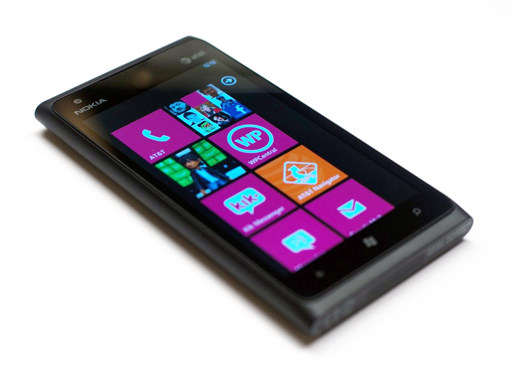
Windows Phone 7 took an even more radical approach. They threw away the Windows Mobile app launcher and replaced it with a tile-based Home screen. Squares or rectangles represent categories of functionality, and can show a small amount of live content -- a picture, an avatar, a number, an icon, etc. It's not always great, however, since at times they take up the space of a widget while not showing much more data than an icon. (They're not as informationally dense as they could be, at least not yet.) And because they update, they're not as visually persistent, which means they lose the advantage of pattern recognition.

BlackBerry 10, which will only be released later this year, seems to be taking a hybrid approach. In the little they've demonstrated so far, they've shown something akin to a set of four cards, one per corner. Sliding panels also allow access to notifications, messages, and more. (Somewhat like Twitter for iPad. There's likely a lot more to it as well, and we'll hopefully see it as time goes on.
Siri

Siri is and isn't a Home screen. It isn't the traditional implementation of a Home screen -- something you can sit in and navigate around. It demands immediate interaction. But Siri can be used to access data and apps without having to move through the traditional Home screen. Rather than unlock, look for an icon, and launch, with Siri hold down a Home button, wait for a double tone, and speak.
Siri can by no means replace the traditional iOS Home Screen, but it can and does sit in parallel to the traditional iOS Home screen, and can replace its use in a few very specific ways. Yet it's clear Apple put significant work into Siri, not just into the server-side voice and context parsing engine, but the interface as well. Siri got a lot of the widgets that the traditional iOS Home screen hasn't. Depending on what you ask, all manner of clock and alarm and to-do and information snippets pop up. All incredibly well thought out and incredibly well rendered.
Getting a Reminder into iOS using the traditional Home screen, icons, buttons, and gestures is a chore. Getting a Reminder into iOS with Siri is remarkably fast. (Granted, when Siri works.)
Siri is still in beta, it's still not fully baked, Apple hasn't implemented it on the iPod touch or iPad. So, while Siri is no doubt part of the future, how much of the future is still to be determined.
iOS 6 and the Home screen
There's not a lot of low-hanging fruit left in iOS. Over the years, Apple has slowly but steadily added in most of the features that most of the people thought were missing in the original iOS (iPhone OS) -- apps, copy and paste, multitasking, notifications. There's a lot of ways to improve the existing functionality, but not a lot of functionality that's still missing. So on what tent poles will Apple hang its iOS 6 keynote this year?
Sure, Apple's bought 3 map visualization companies (but no map tiles), so a new Maps App could be one. I'd still sincerely love a Files.app repository, now iCloud enabled. Georgia still wants her Theme Store, where users can choose between a small amount of Apple designed iOS skins. But over the years, as iOS has matured, the amount of features truly "missing" has reduced considerably.
That leaves improving existing functionality. And that brings us neatly back to the question asked in this article's title.
Is it time for Apple to revamp the iOS Home screen?
Do you want them too? Do you need them too? If so, how so? Is it as simple as adding a widget layer to the existing multitasking and notification layers? Is it increasing Siri to the point where the app launcher becomes secondary? Or does it require something completely new, something that makes Windows Phone Metro and webOS and the upcoming BlackBerry 10 look old and outdated?
If Apple does make a substantive change to the Home screen, what does that mean for the hundreds of millions of mainstream users who are used to, perhaps dependent upon, the way things work now?
Apple has always been fearless when it comes to driving the future. They obsolete hardware and software often faster than the market itself. Is it time for Apple to apply that fearlessness to the iOS Home screen?
Additional resources

Rene Ritchie is one of the most respected Apple analysts in the business, reaching a combined audience of over 40 million readers a month. His YouTube channel, Vector, has over 90 thousand subscribers and 14 million views and his podcasts, including Debug, have been downloaded over 20 million times. He also regularly co-hosts MacBreak Weekly for the TWiT network and co-hosted CES Live! and Talk Mobile. Based in Montreal, Rene is a former director of product marketing, web developer, and graphic designer. He's authored several books and appeared on numerous television and radio segments to discuss Apple and the technology industry. When not working, he likes to cook, grapple, and spend time with his friends and family.
