Twitpic is one of the most popular photos hosting services for Twitter and now they've released their very own iPhone app that lets you browse through the photos of all the people you follow on Twitter who have shared their photos with Twitpic, add comments, as well as add filters and effects to your own photos to share to Twitter and Twitpic.
Sounds a lot like Instagram, doesn't it? In fact, it's very similar, but I'm not ready to call it an "Instagram Killer" -- it falls short in too many ways.

There are three different types of feeds with Twitpic: your main timeline, the popular stream, and streams for individual users. All off them show rectangular thumbnails of the photos with a little icon that shows how many comments have been left on the photo. For the timeline an popular streams, you will, of course, also see which user posted the photo and their profile photo.

Tapping a photo will open it on a black background, and after a brief pause, the toolbars and caption will appear, and after another short pause, will disappear again. You can tap the screen to bring up the toolbars at anytime and tapping the comments icon will bring up all the comments for that photo and allow you to leave a comment of your own.
Unfortunately, comments on photos must have been made with the Twitpic app. I would've like to see all Twitter @replies to the tweet that included the photo be marked as comments in the Twitpic app. Since most people see Twitpic photos in Twitter, it makes perfect sense.
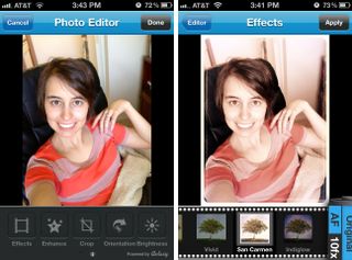
One thing that sets Twitpic apart from Instagram is that there are more editing options available. The "Add Effects" screen has tabs for effects, enhance, crop, orientation, and brightness. Crop, orientation, and brightness should be self-explanatory.
In the enhance screen, you can choose auto, night, backlit, or balance, and the effects tab has 10 different filters you can choose from. They're OK. Nothing amazing, but not terrible.
What is terrible, is the naming inconsistencies in the Twitpic editing screens. When you first take or choose the photo you want to upload, there is a button in the top right hand corner called "Add Effects", but this screen has five different tabs, one of which is called "Effects". When tapping on one of the tabs, the navigation arrow in the toolbar to take you back is called "Editor". But wait, I thought that was the "Add Effects" screen? Sure, I know what they mean, but it's the little details like this that make me think the app was thrown together.
The other thing that annoys me about Twitpic is the edits are destructive. Once you hit "Apply", there's no turning back. Returning back to that screen doesn't let you adjust your edits, just layer on new ones. The biggest problem with this is with effects. A lot of the effects apply some sort of special edging to your photo, which is fine, until you decide you want to crop your image. You'll either crop it completely away or, depending on how you crop, only crop it off a couple of the edges. The only way to fix it is to start over and make sure you save adding the effect for last -- even though it's the first tab. Yet another thing that makes me ask "was this app really put through proper testing?"
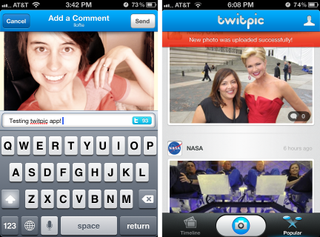
Once you have your photo edited to perfection, you can share it to Twitter with Twitpic and… that's it. Your photo isn't even saved to your Camera Roll! And what about the unique twitpic.com URL that is assigned to each photo? Nope, nowhere to get that either. What Twitpic was thinking, I have no idea. I guess they want to be greedy with your photos and not only not give you the means to share directly to another network, but not even let you share your photos separately to somewhere else like Facebook or Instagram.
The Good
- Browse through the Twitpic photos of who you're following on Twitter
- Upload photos to Twitpic and share to Twitter
- Edit photos with minor adjustments and add filters/effects
The Bad
- Inconsistent naming
- Destructible edits
- Can only share to Twitpic and Twitter
- Doesn't save to Camera Roll
The bottom line
Twitpic for iPhone had the potential to be a really neat app and a possible Instagram alternative, but it missed the mark on so many levels it's not even funny. The editing experience is terrible and the restriction to only sharing to Twitpic and Twitter and not even your Camera Roll is a deal breaker for me. If they wanted to be exclusive to Twitter, they could've at least pulled in the replies to the tweets with Twitpic links to the comments, but not even that's the case.
Sorry Twitpic, that's three strikes -- you're out.
At least it's free - Download Now
Former app and photography editor at iMore, Leanna has since moved on to other endeavors. Mother, wife, mathamagician, even though she no longer writes for iMore you can still follow her on Twitter @llofte.
