The 16:9 iPhone
iMore offers spot-on advice and guidance from our team of experts, with decades of Apple device experience to lean on. Learn more with iMore!
You are now subscribed
Your newsletter sign-up was successful
A few days ago rumors began to focus on the idea that Apple was moving to a 4-inch screen on the iPhone 5 (or whatever Apple ends up calling iPhone 5,1). I went through the mental exercise of mocking up, and breaking down, the various 4-inch iPhone options to try and figure out how Apple would get there.
Now, however, the rumors are coalesced around one specific option -- one I initially thought had fewer advantages, and was hence less likely -- a 16:9 aspect ratio, 1136 x 640 display.
So what would could Apple, a company that prides itself in saying "no" even more than saying "yes", consider switching their best selling product, the iPhone, to a 16:9 screen?
Article continues belowThe road to widescreen
Last iMore heard Apple hadn't settled on a new iPhone screen size. One of the versions they were testing had the same 3.5-inch screen, but they were considering going as large as 4 inches. There seems to be one or more prototypes with that screen size, including a 16:9 aspect ratio version. Since we also heard the next iPhone isn't shipping until October, there's still lots of time for them to decide. (Apple is the company that changed from plastic to glass screen in just a few weeks before the original iPhone launch, after all.)
Both The Wall Street Journal and Reuters have now reported a 4-inch iPhone. Previously a The Verge reader, who caught John Gruber of Daring Fireball attention, and later, iLounge heard something around 16:9 was a target aspect ratio. Yesterday Seth Weintraub of 9to5Mac broke news that the 4-inch, 16:9 prototype had a screen resolution of 1136 x 640. John Gruber once again paid attention to that ratio. Matthew Panzarino of The Next Web took the idea out for a spin, and asked the impertinent question I find myself asking all the time as well -- How would a 16:9 display help Apple sell more iPhones? Update: John Gruber has weighed in on this as well now.)
The three laws of Apple products
There are three laws by which Apple iOS products seem to be governed.
- Apple will only do things that grow profits now, or better position them to grow profits in the future.
- Apple will delight users with magical experiences, except where doing so would conflict with the first law.
- Apple will empower developers to make insanely great apps, as long as doing so doesn't conflict with the first and second laws.
Hobbies aside, Apple sells iOS devices by the tens or hundreds of millions. So far every iPhone has sold more than every iPhone before it, and that's a pattern Apple is going to want to continue. So far, the App Store has grown faster and larger than any software market before it, and that's also a pattern Apple is going to want to continue.
iMore offers spot-on advice and guidance from our team of experts, with decades of Apple device experience to lean on. Learn more with iMore!
But there's a second factor to consider.
Design matters
Apple's Senior Vice President of Industrial Design, Jony Ive, has espoused a very specific philosophy when it comes to product development. Back in March, Ive told The Evening Standard:
Most of our competitors are interested in doing something different, or want to appear new — I think those are completely the wrong goals. A product has to be genuinely better. This requires real discipline, and that's what drives us — a sincere, genuine appetite to do something that is better.
Under that mandate, Apple wouldn't switch from the current iPhone's 3:2 aspect ratio to a 16:9 aspect ratio just to have a different iPhone. They wouldn't change for change's sake, or for fashion's. They would only change to a 16:9 ratio if made for a better iPhone.
Ive also, just today, told The Telegraph:
We try to develop products that seem somehow inevitable. That leave you with the sense that that's the only possible solution that makes sense. Our products are tools and we don't want design to get in the way. We're trying to bring simplicity and clarity, we're trying to order the products.
So the change from 3:2 to 16:9 should be a natural progression of the iPhone itself. Likewise, it shouldn't make anything more complex, cluttered, or confusing.
It should make it even clearer.
Adding a dedicated OS space
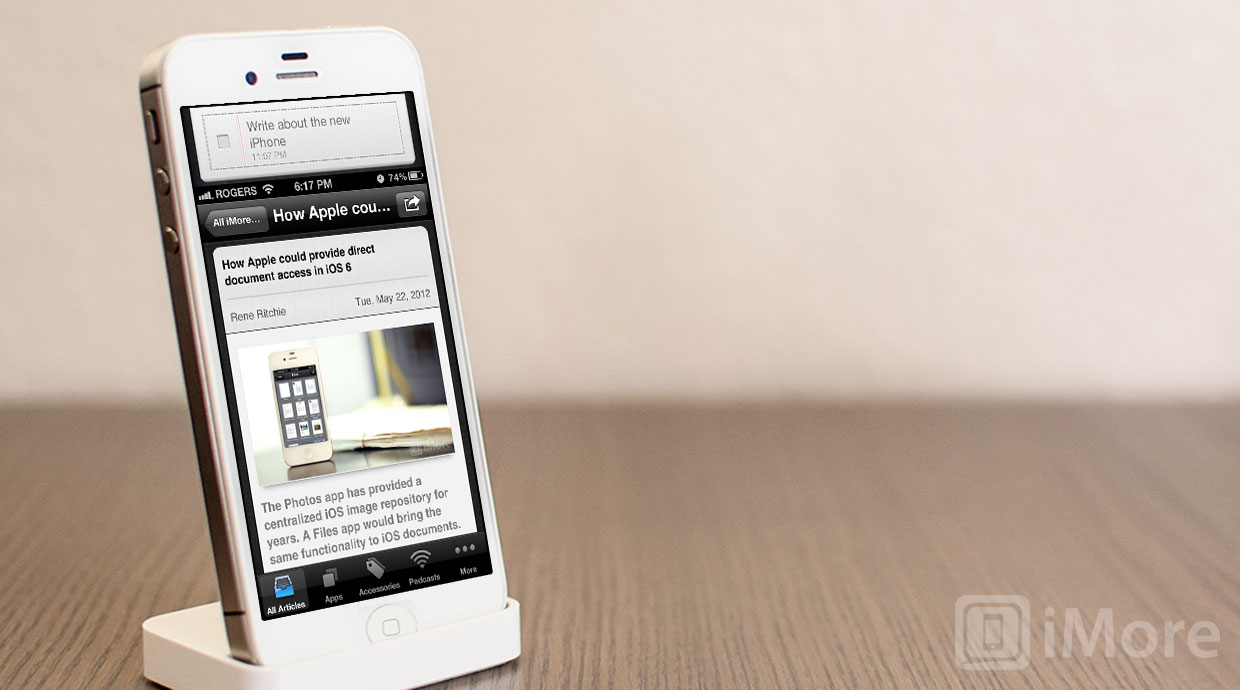
With all that in mind, the least likely option -- though the easiest for developers -- is for Apple to keep the app space the same on a 16:9 iPhone as it is on the current iPhone, and use the extra pixels exclusively for new and updated iOS features.
In other words, the main iPhone user space could still be 960 x 640, and an extra 176 pixels would be put on top of it, on the bottom, or split between top and bottom.
There are several things such a system space could be used for.
Static dock/fast app switcher
Right now the dock disappears when you go into apps, and the fast app switcher only comes up when you double-click the Home button. An even faster app switcher would always be there, recent apps only a tap away, controls and older apps only a swipe or two more.
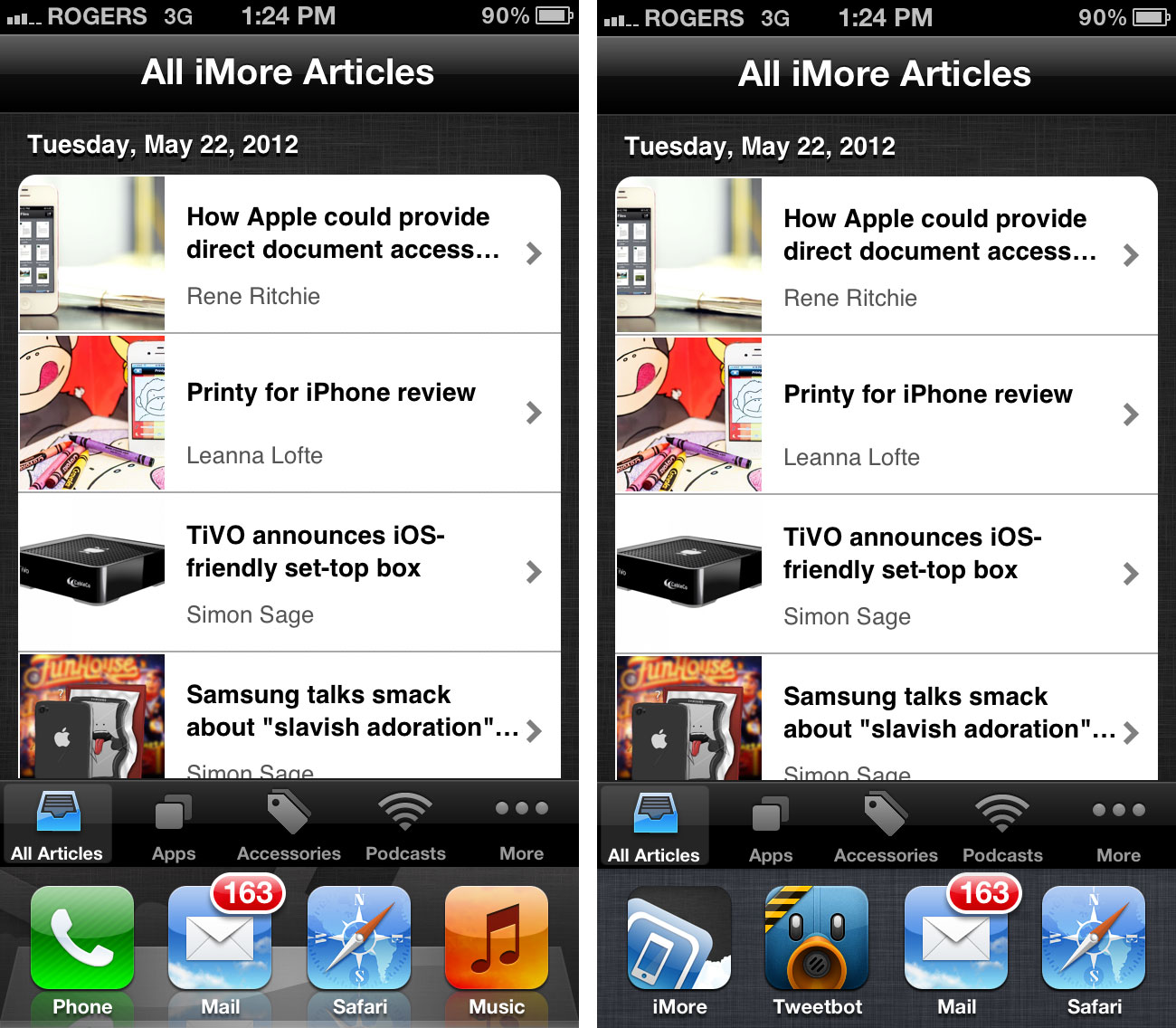
Of course, it risks accidental, app-switching hits, and it's utility in landscape mode is questionable.

Static widget space
Right now, widgets are hidden away in the fast app switcher, Notification Center, and Siri. While many people have expressed a desire for widgets on the Home screen, there's also an argument to be made that making app data available in other apps is even more valuable. (The current version of iOS is an app launcher, not a Home screen hangout for a reason.)
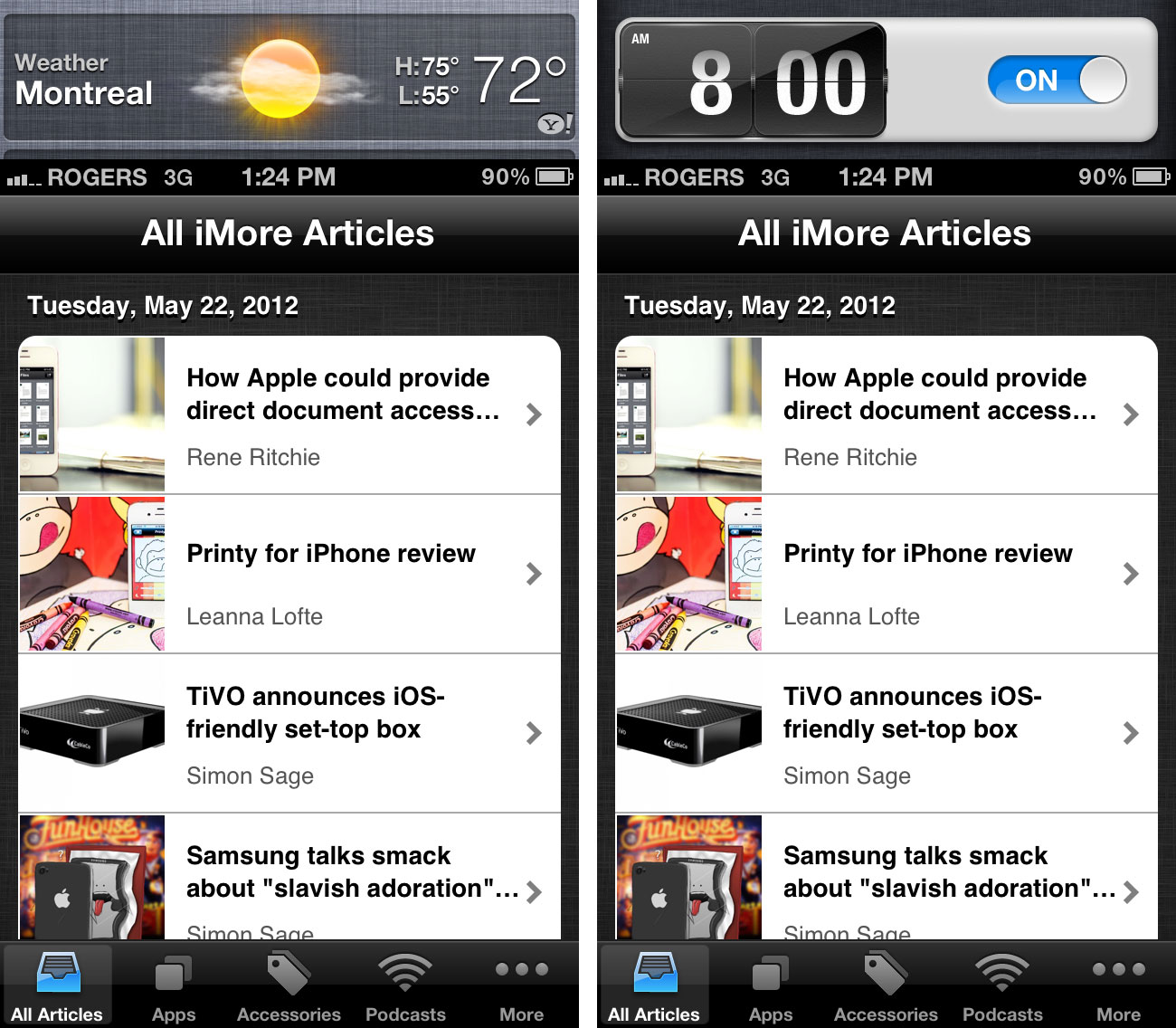
Again, however, landscape orientation wouldn't be as natural a fit, and would either require new UI, or the awkward sideways treatment fast app switching currently enjoys.

Static notification space
Right now, Notification Center banners fold down over and obstruct controls like back buttons, and provide no in-app functionality. With a dedicated notification space, not only could notifications keep clear of back buttons, they could have enough room for in-app actions like iMessage quick replies.
The temporarily nature of notifications make them less suitable for a static implementation, however. If there are no notifications, it's wasted space.
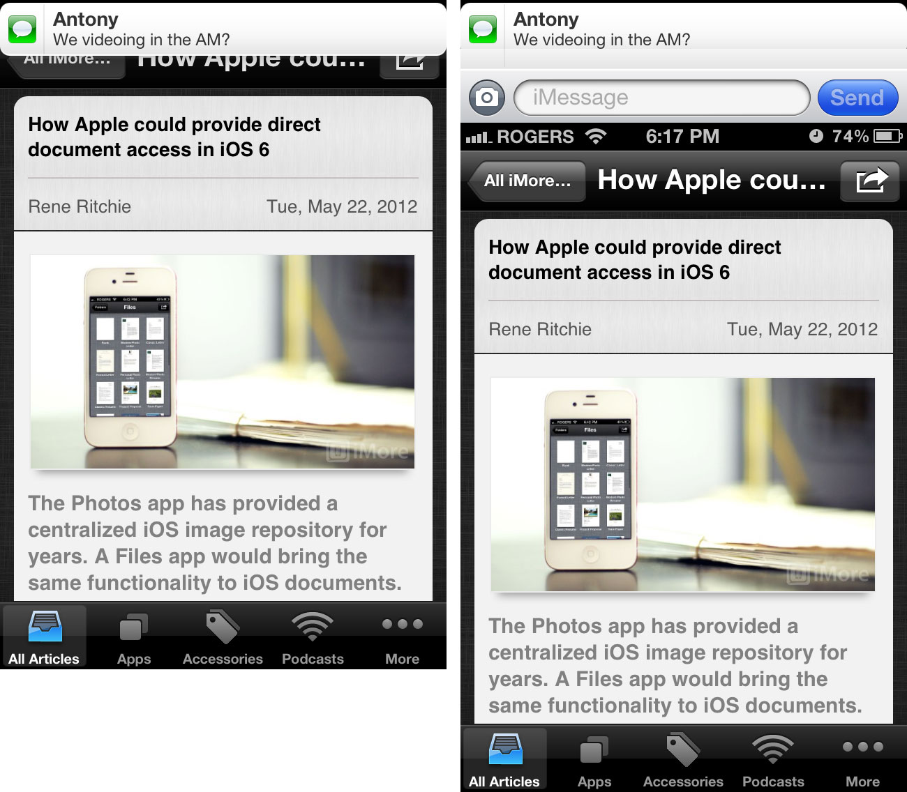
And I'm not even going to bother mocking up how awkward that would look in landscape. (But see above.)
Static gesture control space
Right now, system-wide gestures are completely absent from the iPhone, even though webOS has had them for years, the iPad has them, and [BlackBerry 10 is intent on using them as a major differentiator for pro users.
A larger capacitive area may mean there's room enough to explore more complex, if less discoverable gestures. That said, it's almost impossible to imagine Apple keeping a permanent dead pixel area around just for swipes up and down, backward and forward, etc.
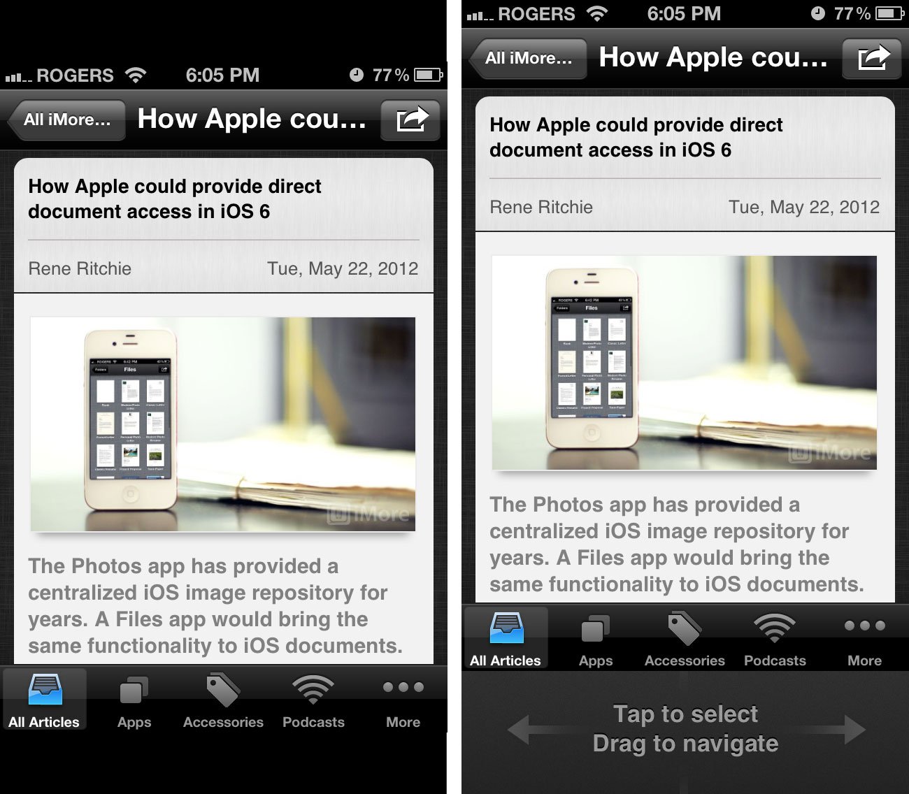
Static iAd space
Right now a new iPhone costs $199 to $399 even on contract, and companies like Amazon have already experimented with ad-subsidized price reductions on devices like the Kindle.
Tweetbot developer and all around instigator, Paul Haddad jokingly tweeted this idea, and I'm including it here just to make him regret it slightly.
Apple made fun of ads in Gmail, no way they violate iOS with an ad space, no matter what any patents might suggest.
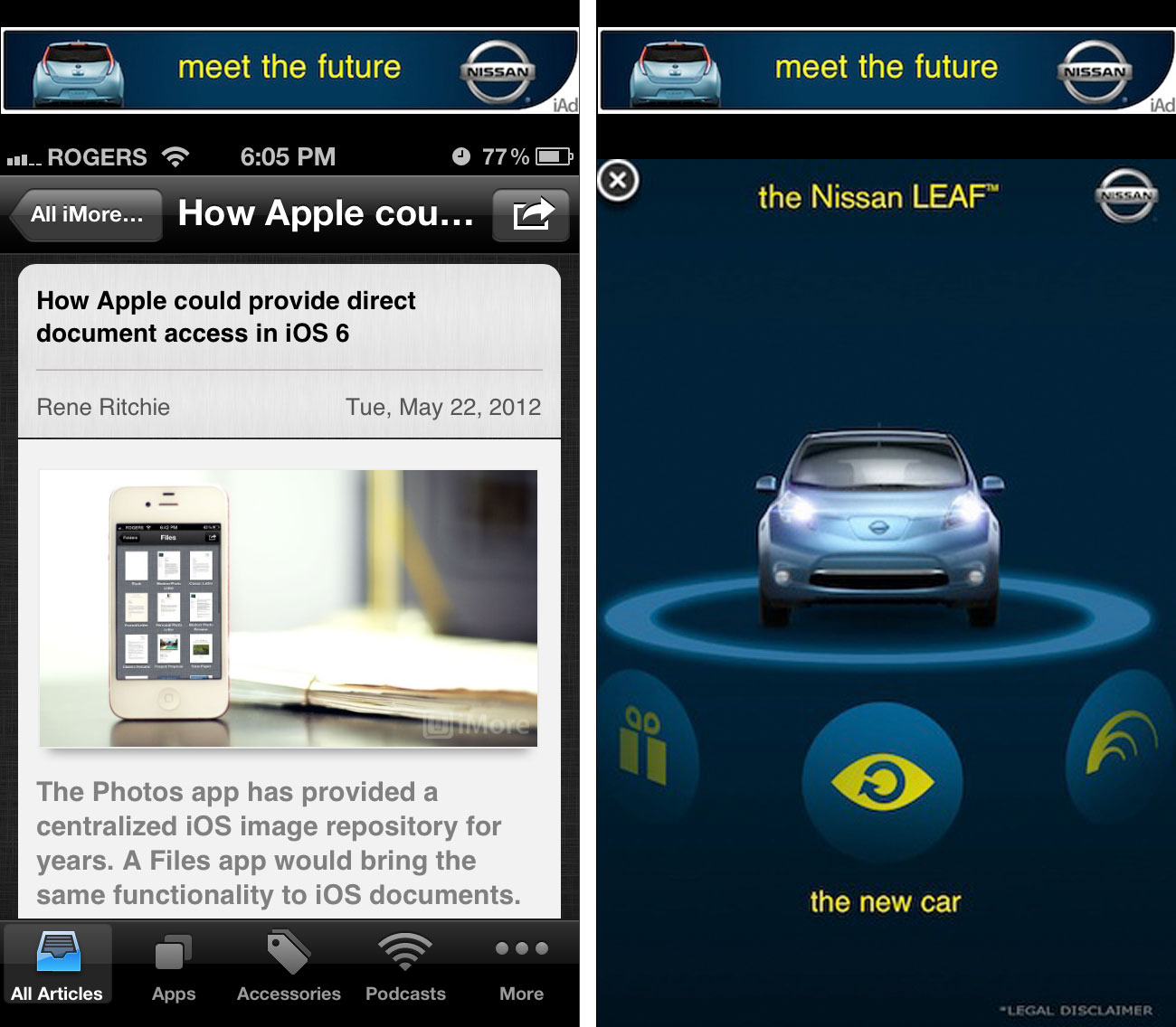
Static system space that can switch between some or all of the above
A combination of the above, but where widgets and notifications and gestures and all the rest co-exist in perfect harmony, in one Apple-only screen section.
And none of that is likely
Static system space on a small, mobile screen flies in the face of Apple's design philosophy. It would clutter the iPhone screen and ensure, likely much to Jony Ive's consternation, that no user could ever lose themselves in the content. The interface would always be there, staring at them, even when they didn't need it.
While more flexible than the hardware keyboards Steve Jobs mocked during the original iPhone launch, there are times when it won't be useful, and Apple is all about eliminating absolutely everything that's not essential all of time.
That brings us to...
Creating a bigger screen
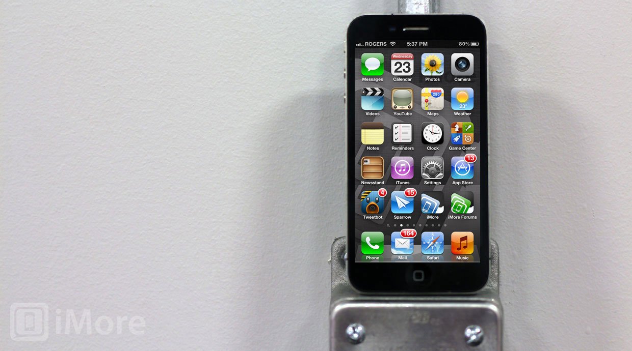
If we apply Occam's Razor, the simplest and most obvious way Apple could implement a 16:9 aspect ratio on close to a 4-inch display, is simply add the extra pixels, optimize the system software, and let developers have at it.
In my previous post, I saw some problems with this approach:
Since pixel size remains the same, text size would remain the same, control/button size would remain the same, and touch target size would remain the same. Apps that use the built-in interface elements would simply add an extra row of information -- an extra row of icons, an extra row to the table or item to the list. The display would be vertically larger, and more information could be displayed on it. But what about apps that don't use built-in UI elements?Safari would show more of a page's length, Mail would show an extra message, but games and anything with a highly customized, non-table based interface would have to be pillar-boxed. If developers made new versions that fill the extra space, those versions would be cut off on older iPhones. And if developers made 2 versions of the apps, it would mean more work for them and "fatter" binaries for users to download. (A universal app would go from having iPhone and iPad interface elements, to having old iPhone and new iPhone and iPad interfaces.)While many things are possible, this doesn't seem like a very Apple-esque solution. It would fragment the iPhone platform for developers in a way Apple has resisted so far, and offer incomplete user benefits (increasing pixel count in only one direction).More importantly, it would mean either significantly redesigning (or eliminating) the Home button, or lengthening the iPhone casing, or a bit of both. iMore has heard the Home button isn't going anywhere, and parts leaks have suggested it looks pretty much the same, so that leaves a longer iPhone and that... would be awkward. (Even if you remove part of the bezel to make room for it.)
Let's re-examine some of that.
Default apps
Apps that use Apple's built-in interface elements, especially table views, should enjoy some level of automagic compatibility on a longer screen. iOS simply shows more information -- another row, or partial row. These have been mocked up to death already, notably on The Verge and Overdrive. Here's an example of my own, if only to set context.
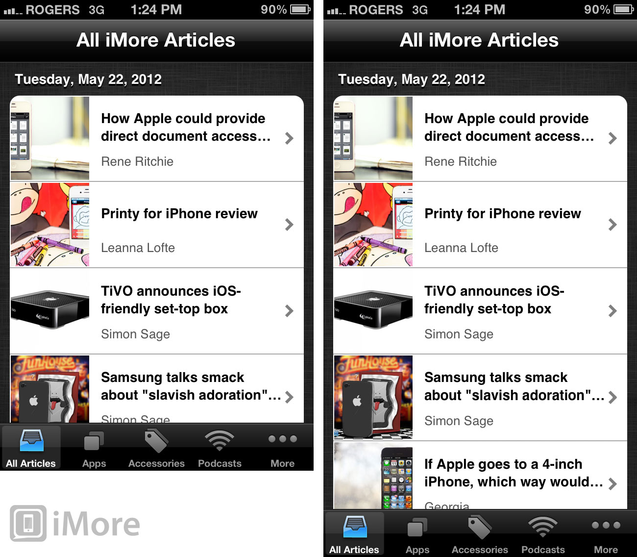
So far so good, right? Even if text and touch targets aren't bigger, more information is more. It's no accident, however, that most of the mockups have been in portrait orientation. Depending on text flow, landscape doesn't enjoy the same benefit, at least as iOS currently implements it.


The keyboard
The keyboard could be identical in portrait orientation due to the identical screen width, or Apple could take some of the extra vertical pixels and add another row of keys, either numbers on the default keyboard, or special purpose keys on custom keyboards (the way internet apps add @ or .com, for example).
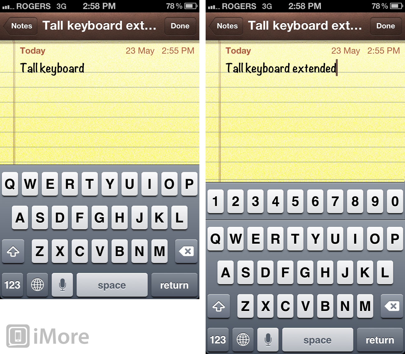
It would be more of a challenge in landscape orientation, however. Would Apple pillar box the Keyboard? Scale it to fit? Stretch it to fit? Split it, iPad-like, to fit?

Custom interface apps
Apps that don't use the built-in interface elements would be letter-boxed or pillar-boxed in the short term (or if abandoned, for as long as they remain in the App Store), and updated to fit the new screen ratio as soon as developers get around to it.

Web and web apps
The web and HTML5 web apps are largely seen as size and aspect ratio resilient. They'll flow content into and around the space they have, and simply show more or less of it, depending on the height or width of the display. In mobile, they'll typically size or re-size to fit as well. Some websites and web apps will need very little or no changes to fit the new ratio perfectly. Others, especially more static sites that made fixed-asset assumptions, may need more work.
In portrait orientation, this means we'll typically see the same size content but more of it. That's because the width hasn't changed but the height has increased, and the content will fill the extra space.
In landscape, on fixed-width sites, we'll see slightly larger content but less of it. That's because the width has increased but the height hasn't changed, and the content will scale up to fit the new width. Fluid-width sites will likely simply fill the new space, keeping the content the same but showing more of it. (Though the nature of line breaks mean less additional text content would fit in than it would in portrait mode.)

Videos and movies
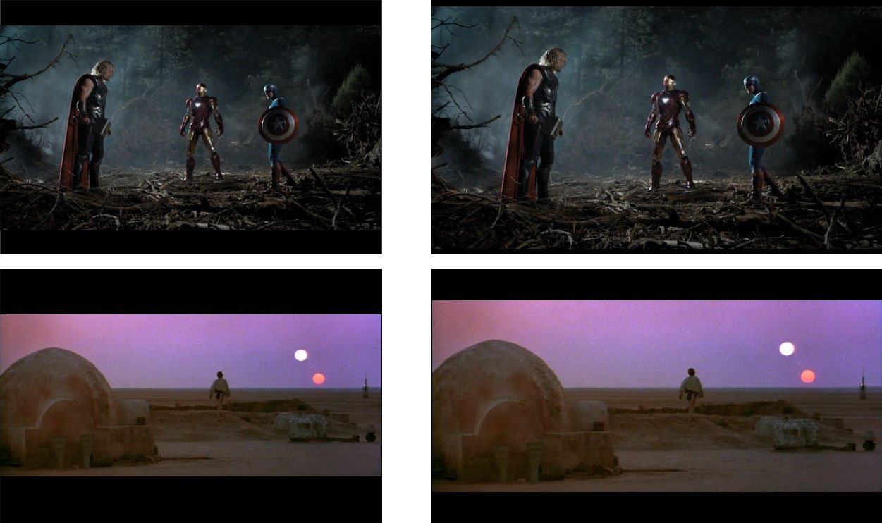
The current iPhone screen is 3:2. Most web video (i.e. YouTube) and most modern TV shows are 16:9. That means, where the current iPhone has to letterbox these types of videos, a 16:9 iPhone could show them full screen with no distracting black bars.
Movies are typically shot at close to 16:9 or wider. 16:9 is 1.77:1. Most modern movies are between 1.85:1 and 2.40:1. The Avengers is 1.85:1. Star Wars is 2.20:1. Wider movies would still require letterboxing, albeit with thinner lines.
That means most videos will be bigger, and look better, on a 16:9 iPhone.
Backwards compatibility
Supporting both legacy 3:2 iPhone screens -- everything from the original iPhone to the iPhone 4S -- and the new 16:9 ratio would be trickier. It seems unlikely that anyone would be happy with new, widescreen apps getting chopped off at the sides or top and bottom on old, standard screen devices.
Due to the way the App Store works, separate apps for old and new iPhones isn't a great solution either. Developers wouldn't be able to give new versions away for free to existing owners, and existing owners wouldn't want to pay full price again for what's essentially the same app at a different ratio.
That leaves the ugly but not unworkable option of multiple binaries or at least multiple assets to support older devices and the the new iPhone all at the same time. Depending on the app, there could be some efficiency achieved by sliding elements around to fill or conserve space, but worst case it's another big bump in file size. More apps hit the 50MB cellular download limit, and the lower-end iPhones can hold fewer apps.
And if an app is universal and already has an iPad interface, that would make for three versions (or at least two with more complexity) in one binary.
So why would Apple go to 16:9?

Given the need to sell more iPhones and make a better product, and given all the challenges listed above, why would Apple go ahead with 16:9? Why would they say "yes" to this screen ratio and not proudly "no"?
Content really is king
iOS devices have always been a screen surrounded by the least amount of other stuff necessary to make it work. The screen, more specifically the content it displays, is everything to Apple. There needs to be a bezel, there needs to be mics and speakers and the barest possible amount of buttons and ports. There needs to be a battery and electronics. But as much as that can be minimized, as much as the screen and the content it's showing can be thrust forward, the better.
Design is constant compromise
If Apple doesn't want to make the actual physical phone much bigger, if they can't make the side bezel any thinner, and if they want to make the screen bigger and the content it displays even more immersive, there's only one direction left for the display to grow.
Both the iPhone 4 and the iPad 2 designs took away visual cruft from the sides. Rounded bands were flattened, think frames were removed and buttons and ports hidden behind.
Now, maybe, Apple is ready to chip away at the front.
It's not an edge-to-edge screen, it's not a transparent display, but given the limits of current technology and the premise that Apple wants a bigger screen without having to make a bigger phone, it's the best compromise they can make.
And with less faceplate and more screen, it could be a more immersive, and a better product.
Predation over competition
There's a school of thought that, since Apple's iPhone outsells all larger screened Android phones combined on major U.S. carrier networks, Apple doesn't "need" to go to a larger screen for competitive reasons. However, that doesn't mean they won't go there for predatory reasons.
Just because people are buying more 3.5 inch iPhones than larger Android phones doesn't mean people prefer 3.5 inch screens. It means, as a total package, they prefer the iPhone. Some users no doubt compromise on a larger screen size just to get an iPhone. Others no doubt compromise on getting an iPhone because they really want or need a bigger screen.
Apple may just have run some numbers and determined that a 4-inch iPhone could outsell large screen Android devices by even more. With a similar casing size, no current users are likely to jump ship. With a larger screen, however, some who chose size over iOS might just make a different choice. Introducing a bigger screen could increase the iPhone's addressable market, and sell more phones.
Conclusion
While rumors continue to grow about the 4 inch, 16:9 iPhone, October is a long way off and Apple may yet decide a more conservative, less ambitious iPhone screen is the way to go.
If Apple does go with a 4 inch, 16:9 iPhone, they already know how they're going to do it and how they're going to handle any problems, pain, and other turbulence during the transition. Apple has rarely shown an aversion to those things. They'll relentlessly pursue the future and expect users, developers, and even their own team to keep up.
And it'll be for two reasons and two reasons alone.
To make a better product and sell more iPhones.
Additional resources
- iOS 6: Is it time for Apple to revamp the multitasking fast app switcher?
- The 4 inch iPhone
- How Apple could provide direct document access in iOS 6
- iOS 6 and the opposite of widgets
- Is it time for Apple to revamp the Home screen?
- The challenge of bringing Siri to the iPad
- iOS 6 and privacy: How Apple should draw inspiration from Android for better app

Rene Ritchie is one of the most respected Apple analysts in the business, reaching a combined audience of over 40 million readers a month. His YouTube channel, Vector, has over 90 thousand subscribers and 14 million views and his podcasts, including Debug, have been downloaded over 20 million times. He also regularly co-hosts MacBreak Weekly for the TWiT network and co-hosted CES Live! and Talk Mobile. Based in Montreal, Rene is a former director of product marketing, web developer, and graphic designer. He's authored several books and appeared on numerous television and radio segments to discuss Apple and the technology industry. When not working, he likes to cook, grapple, and spend time with his friends and family.
