iOS 6: Higher hanging fruit
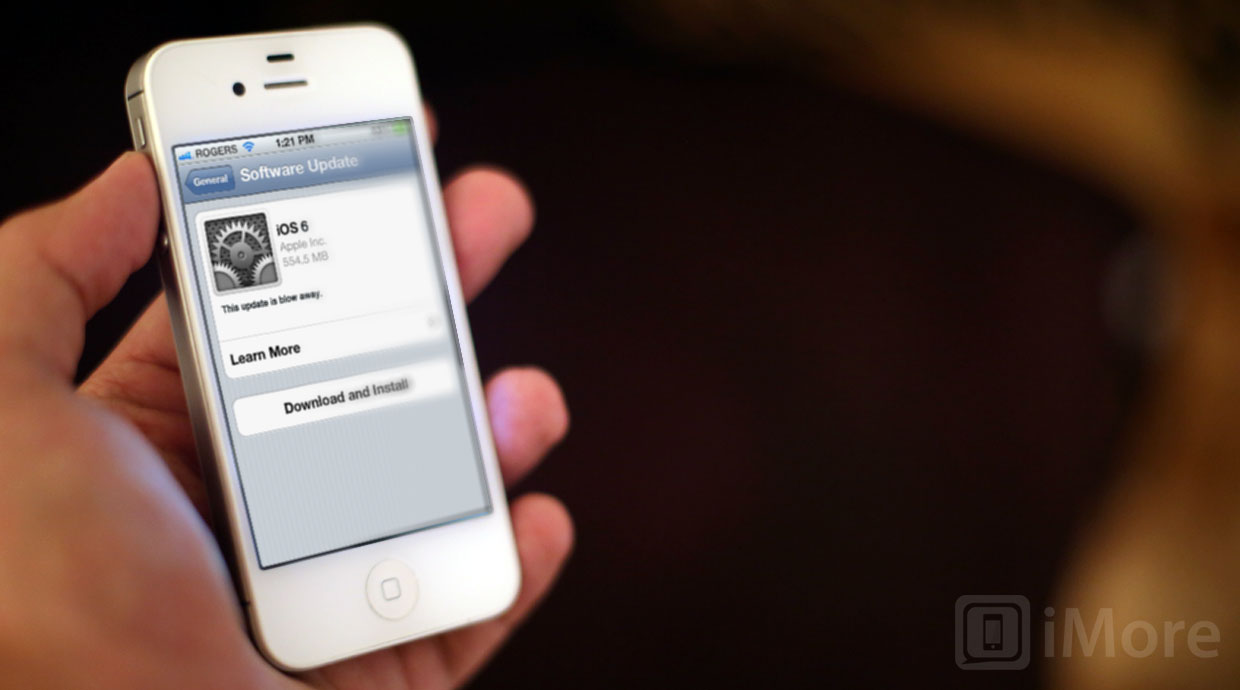
Features and functionality from Android, BlackBerry, webOS, Windows Phone and more, still ripe for iOS 6 inspiration
What will Apple bring to iPhone, iPod touch, and iPad with iOS 6? What will be the "tentpole" features to take Apple's mobile software into 2013? With WWDC 2012 coming in just over a week, and an iOS 6 beta widely expected to come with it, now's the perfect time to take a look and see what makes sense.
We've already seen some of what is likely coming in iOS 6, including a new version of the Maps app that replaces Google data with Apple data. It wouldn't surprise us in the least if it brings turn-by-turn navigation with it either, by way of Siri...
But what else could Apple bring with iOS 6?
Making smart choices
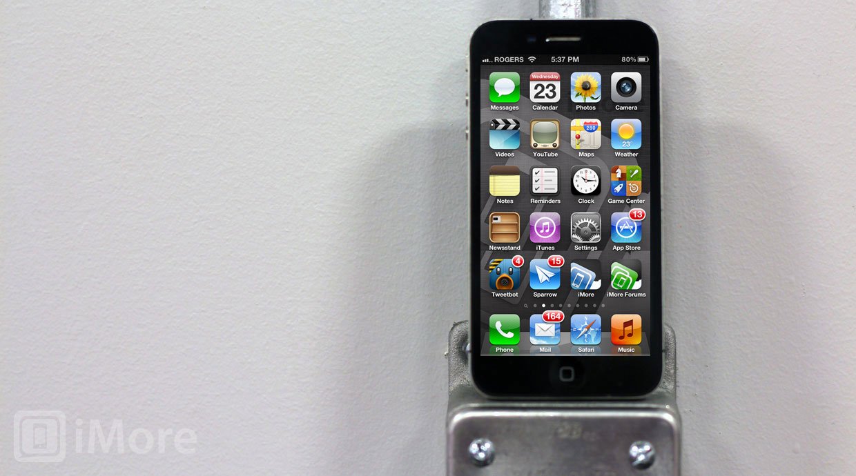
No company can do everything at once. Opportunity cost means that when you spend time developing feature A, you can't spend that same time also developing feature B. Even if you pull engineers from other projects, even if you work around the clock, there are limits to how much any company, even Apple, can do at one time. You have to choose. The key is choosing smartly.
When Apple launched the original iPhone in 2007, it didn't have many of the traditional features that established smartphone platforms had for years already. But it didn't matter. The revolution in user interface was enough that people simply didn't care (or were willing to carry two devices to make up for it.)
Obviously, prioritizing the multitouch interface was the right choice to make.
Apple then proceeded to add back those smartphone staples. Among other things, iOS 2 (then iPhone OS 2) got the App Store, iOS 3 got MMS (outside the U.S.), video, push notifications, and copy and paste, iOS 4 got folders, better email, and limited 3rd party multitasking, iOS 5 got better notifications, Siri voice control, and went PC free with iCloud.
Master your iPhone in minutes
iMore offers spot-on advice and guidance from our team of experts, with decades of Apple device experience to lean on. Learn more with iMore!
The rest of the industry didn't stand still, however. Android was released and is now at version 4.x, Ice Cream Sandwich, with more on the way. Palm rebooted with webOS, and while their business failed, their interface work was more than impressive. Microsoft rebooted with Windows Phone and let the world know that some people in Redmond did indeed have taste. And now RIM is poised to reboot with BlackBerry 10, and take gesture-based phone interfaces to the next level.
Interestingly, many of the newly rebooted operating systems lacked -- and some still lack -- all the features of their predecessors. And because they rebooted, Apple's iOS, once the new smartphone operating system on the block, is now one of the oldest.
That doesn't mean Apple can and should replicate each and every feature of their competitors. I'd argue many of the ones listed below shouldn't be copied, perhaps shouldn't even be re-imagined with an iOS twist. But they should be considered. Apple is famous for saying "no" more than they say "yes", but they're just as famous for the arduous design and prototyping process they go through to get there.
In fact, as we approach iOS 6, Apple might have already reached feature parity, and it might be hard to look at other platforms and see what else needs to be matched -- that there's no longer any low hanging fruit.
But what about the (slightly) higher hanging fruit?
What iOS could take from Android
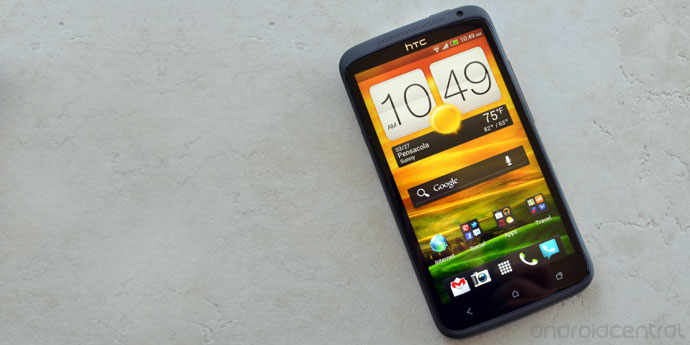
Android isn't a singular phenomena the way the iPhone is. There are multiple versions of Android currently on the market, and multiple manufacturer interfaces layered on top of them. Still, there are a few common threads in Android that iOS could draw inspiration from.
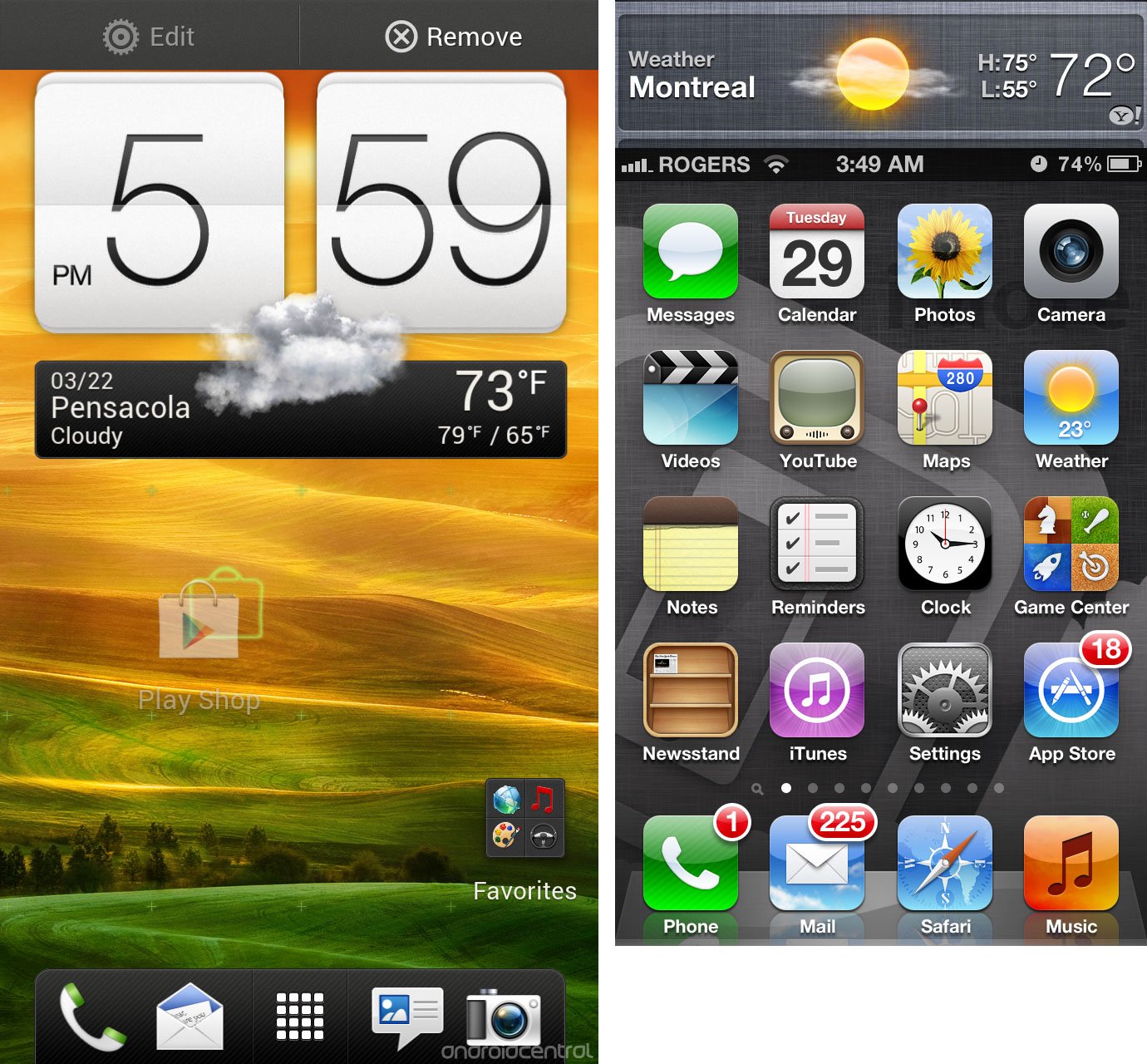
Better home screen information density
The current iOS Home screen system (Springboard) is an app launcher. With very few exceptions, an icon on an app launcher tells you only which app will launch when and if you tap it. They're static images and there's typically no information about the current state of the app, or any relevant data beyond the static image.
In the case of Apple's iOS, Calendar will show you the current date on its icon, and Apple created a badging system to overlay the number of outstanding alerts an app has pending. But that's it. With Notification Center, with a little extra effort, you can pull down snippets of those alerts, and see widgets for Weather and Stocks. However, the level of immediately available, glanceable data remains low.
While Apple has widgets in Notification Center and Siri, Android lets you pin them to Home screens as well.
The iOS Home screen isn't designed as a place to hang around, but as a launcher to get you quickly into apps. With widgets, however, you don't have to get into apps to get high level data, and sometimes that's more efficient. If rumors of a 16:9, 4-inch iPhone are to be believed, there could also be an extra 117 pixels on the Home screen to house a swipe-able widget space.
Here are some more examples and concepts for what Apple could do to with the Home screen, both in general and if they do go with a 4-in, 16:9 display.
Direct file access
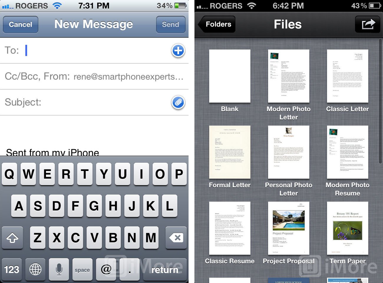
If I start writing an email in iOS, then decide I want to attach a document, I can't. It's not just difficult, it's impossible. Even if I trash the email, go to a document app, and share via email, I can only share what's in that app. I simply can't attach a Keynote, PDF, and image file to an email in iOS. I can only send out a bunch of emails, from a bunch of apps, with the document they support.
Likewise, If I have a text document in iOS, I have no way to directly access that text document. I have to go to an app and hope that I can access the document from that app. If I created a text document in Simple Note, I have to remember I created it in Simple Note because chances are I can't easily open it in Drafts, much less in Apple's Notes app. If I have a Document in the Cloud, it's the same problem only worse. I can't just see Documents in the Cloud. I have to keep a mental list of what I've created over time and their associations, which is a lot of overhead for something that's supposed to be simple.
A document picker, done almost exactly the same way iOS currently handles the image picker, and a Files.app with an interface in the same spirit as the Photos.app would go a long way to making iOS more convenient. Here are some examples:
More granular privacy settings
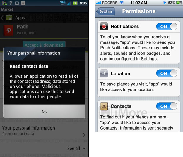
Right now if an app, any app, even a built-in Apple app, wants to know your location, it has to ask for permission. If it wants to send you Push Notifications, it has to ask for permission. If it wants to access Twitter integration, it has to ask for permission. If it wants access to any of your personal information, however, like Contacts, it doesn't have to ask at all.
Just like with Push Notifications back before iOS 5, however, the popup requester system doesn't scale. If you launch a new Twitter app for the first time, you get popup after popup, asking you to tap to approve Twitter account access, location, and Push Notification. Imagine when Contact access, Calendar access, and conceivably other information is added to the list. As the number of popups grow, the likelihood that a user will read and consider each one falls precipitously. They'll just start tapping through to get to their app.
Here's an attempt at a better solution beyond popups, and beyond Android's overkill, using a permissions sheet:
More personalization options
Android has a stock interface, but with manufacturer layers like Sense, TouchWhiz, and Blur, alternative keyboards like SwiftKey and Swype, and many other options, you can usually change the appearance of your phone.
Apple won't be making a Theme Store any time soon, but they could increase customization options in Settings, even if only for the Home screen and built-in apps (UIKit). Rather than Aqua and Graphite like OS X, they could even call upon iOS conventions...
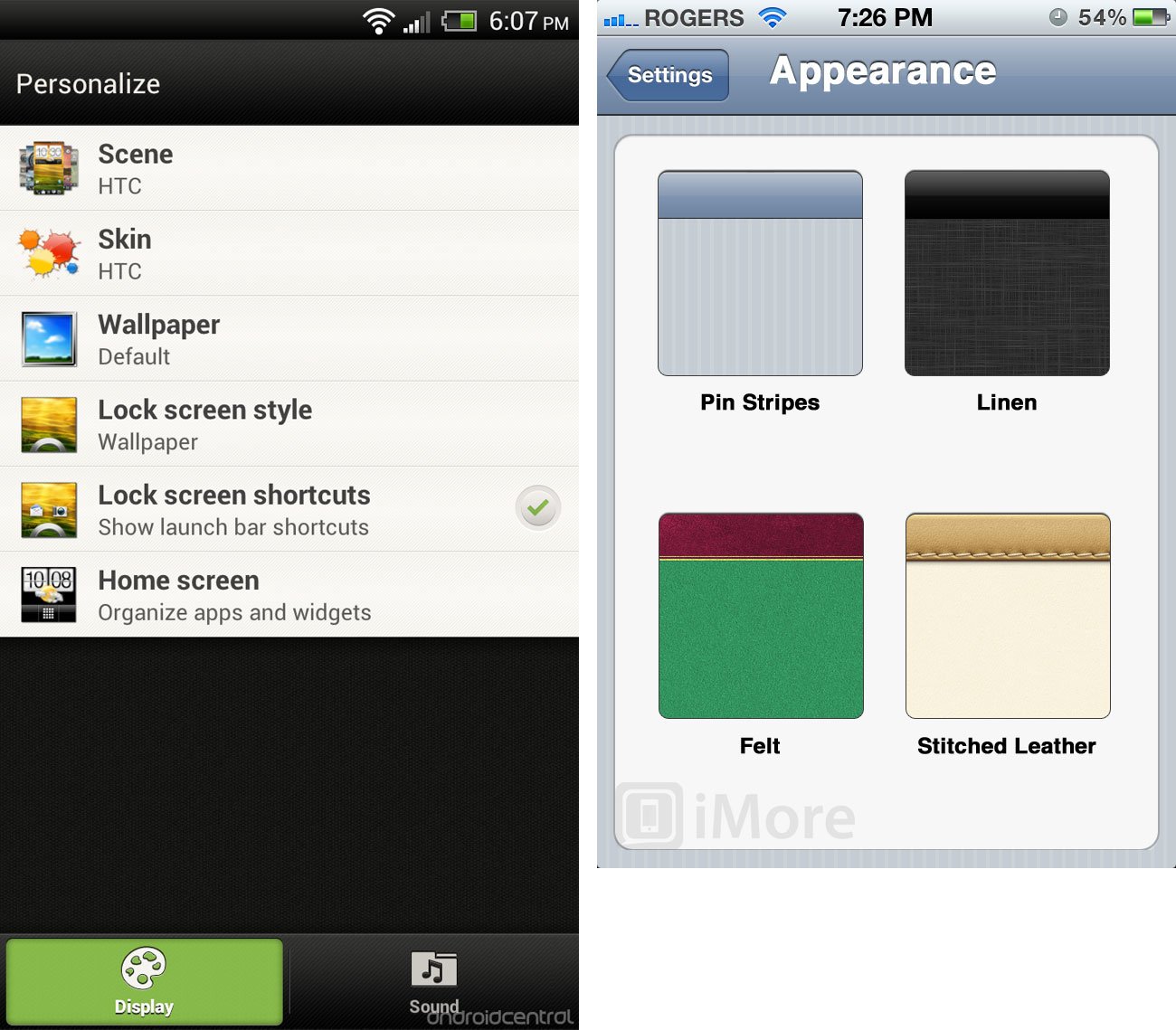
Here are some examples of the default iOS interface (UIKit) made-over in felt, leather, linen, wood, silver, and more.
What iOS could take from BlackBerry
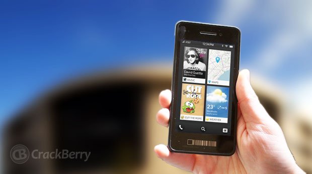
The traditional BlackBerry OS is a dinosaur soon to go the way of the dinosaurs, but there's still a few things iOS could learn from the old beast. Likewise, BlackBerry 10 won't be out until later this fall -- maybe around the same time as iPhone 5 and iOS 6 -- but what little we've seen of it shows potential.
More granular notification control
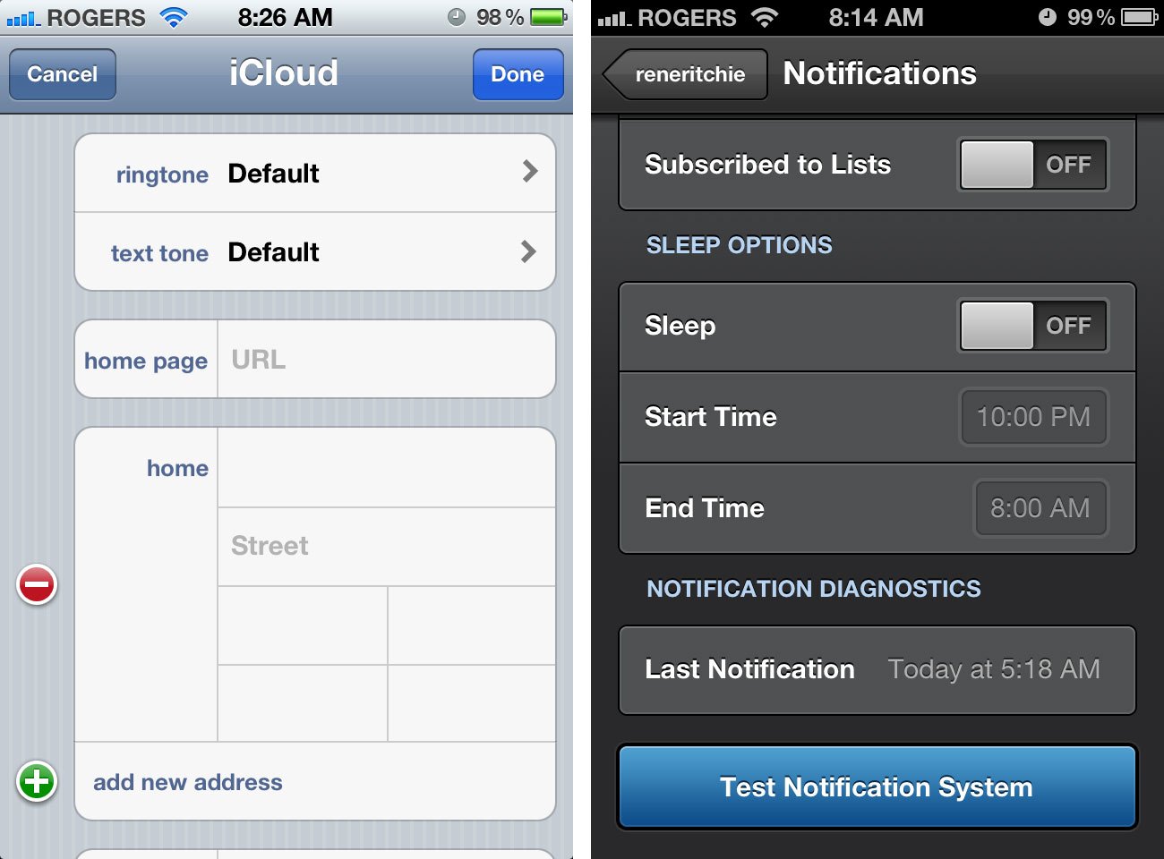
What if I want my iPhone to beep and buzz if my wife calls, but to go dead silent if it's my mother-in-law? What if I want different tones or vibration patterns for work and personal email, or for my boss's or partner's email? What if I want notifications to demand my attention during the day, but mute themselves and let me sleep at night? What if I want a work-centric set of options when I'm at the job site, but a I don't want work following me home? While iOS currently has per-app settings for notifications, it doesn't have anywhere near BlackBerry's level of granularity.
That leaves implementing more specific settings up to individual apps, like Tweetbot and it's sleep options. iOS could handle that, both globally (a Notifications on/off toggle), per Contact, and including time and location.
(And, in the name of all that's civilized, there should be a way to suppress notifications when on a call so we no longer feel the shock of an unexpected tone/vibe combo punch to the ear.)
Arguably this might all be better handled as part of a greater iOS time- and location-based profile system that includes additional elements like network settings, Home screen layouts, and more but functionality always needs to be balanced by simplicity. While more granular notification options sound more complex, examples already exist in iOS -- like per-Contact ringtones -- that could be built out.
Better gesture shortcuts
With BlackBerry 10, RIM is trying to solve the problem of maintaining one-handed ease-of-use on larger screen sizes. For example, reaching all the way to the top of the screen to pull down the Notification Center shade is just doable for most users on a 3.5 inch screen, but as screens blow past 4 inches and approach 5, it breaks down. Like on the iPad's 9.6 inch screen, it requires a second hand.
RIM is relying far more heavily on gestures as a way around this. Start swiping with your thumb from offscreen to on, and a transitional notification bar comes up letting you "peek" at your alerts. Keep swiping, and it takes you into the messaging center where you can handle them. Swipe the other way, and you're in the app switcher grid, and then the app launcher.
Gestures are typically much harder to discover than buttons, and suffer from the potential for collision between system and app, (e.g. trying to slash something in Fruit Ninja and ending up in Mail), and the limits of manual dexterity and accuracy on small screen sizes.
That's probably why Apple restricted gesture shortcuts to the iPad in iOS 5 (and to developers only in iOS 4). However, there should be a balance that can be reached where gestures allow more advanced, adept users to more quickly navigate and triage elements of the OS and apps, even if the gestures to do so remain gross and few.
What iOS could take from webOS
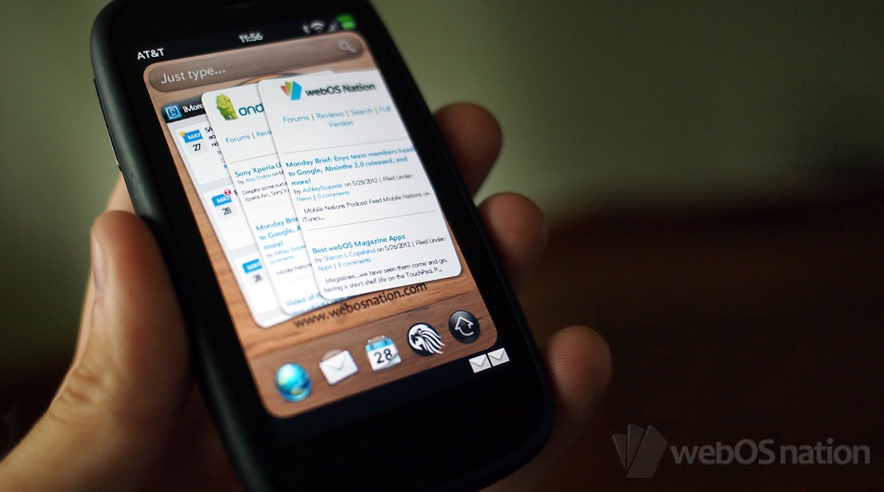
webOS debuted at CES 2009 and was shown off by former Apple executive, Jon Rubenstein. It was the most impressive mobile product introduction since the iPhone in 2007, in part because Palm seemed to specifically target things the iPhone wouldn't, or couldn't yet do. And to this day, webOS still does some of those things better than iOS.
Better fast app switching interface
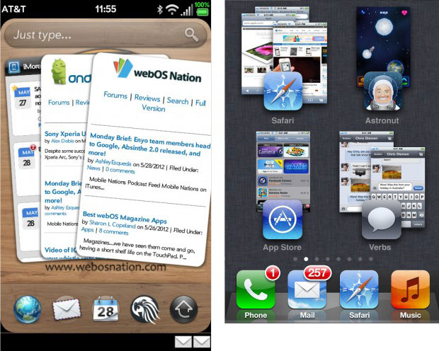
The current iOS fast app switcher does a good job listing open apps by putting them in a horizontally scrollable list, sorted in reverse chronological order. It does a great job making them easy to visually distinguish by using their icons. It does an okay job making them quick to switch between -- great if they're chronologically proximate, like jumping back and forth between two to four apps. (It's basically alt/cmd + tab for mobile, with some controls thrown in.) It also lets you kill apps.
webOS uses a metaphor called Cards, the early implementations of which showed one app or window (e.g. a website or email) in very similar fashion to iPhone Safari Pages. You could horizontally swipe between them but could also, very naturally, touch and flick a Card away to close an app or window. Palm later expanded the Cards visualization beyond what Apple did with Safari Pages by introducing Stacks in webOS 2.0.
It's a more approachable, more informational way of showing open apps and their state, and a more natural way of navigating and closing them. That's probably why Apple chose it for Safari Pages in iOS 1., and why almost every major OS uses some variation of it today. It's also probably why Apple supposedly experimented with a grid-based, Exposé version of it in iOS 4 before settling on the current, Dock-based model.
As the iPhone continues to evolve, and the mainstream market becomes more mobile-sophisticated, it could be worth re-assessing fast app switching on iOS.
Here's a more complete rundown of the history of fast app switching in mobile, and what some of those concepts might look like rendered in iOS.
Better account and social handling
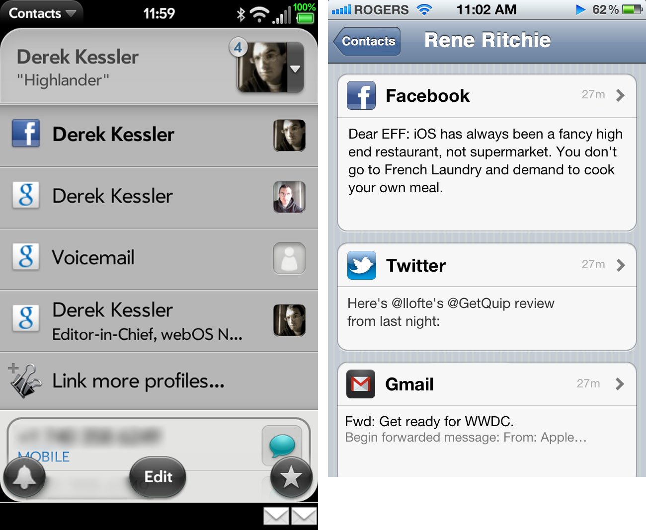
My iCloud, Gmail, and Exchange contacts currently sit in the Contacts tab of my Phone app and in the Contacts app proper. My Twitter contacts have been recently integrated with them, but my Facebook, LinkedIn, and other social contacts still live in their own apps, though they can impregnate themselves into my Contacts app resulting in varying levels of chaos and confusion. It's a mess.
webOS Synergy handles this much, much more elegantly. You enter you account info, much as you do for email and Twitter in iOS now, but also Facebook, LinkedIn, and other sources that plug in to the system. Then all of that information is kept in neat silos behind the scenes, but presented as a unified view in the interface. I don't have to care where any particular bit of data comes from -- Gmail, Facebook, whatever -- I just see it all in one place, and any time any of those sources update, I see the updates.
Taking it a step further, messaging could be unified as well. Rather than having to go from Messages to Twitter to Facebook to Mail to see what Leanna is saying, a unified view of recent public status updates and private messages could be presented.
If I said something, and a contact of mine wants to find it, it makes a lot more sense for them to go right to my card than than to jump to and scour through a half dozen separate apps.
More actionable notifications
webOS still handles the arrival of notification banners, and the subsequent stacking of them, in a more elegant manner than iOS. But there seems like much more that could be done.
Currently, in iOS, notifications aren't actionable within the notification system. I can't "quick view" a Tweet or a Facebook message, I have to go to the Twitter or Facebook app. I can't "quick reply" to them in-app, I have to go back to the associated apps to respond. That either causes me to ignore messages I may not really wish to ignore, or to wrench myself out of what I'm doing to go handle them immediately.
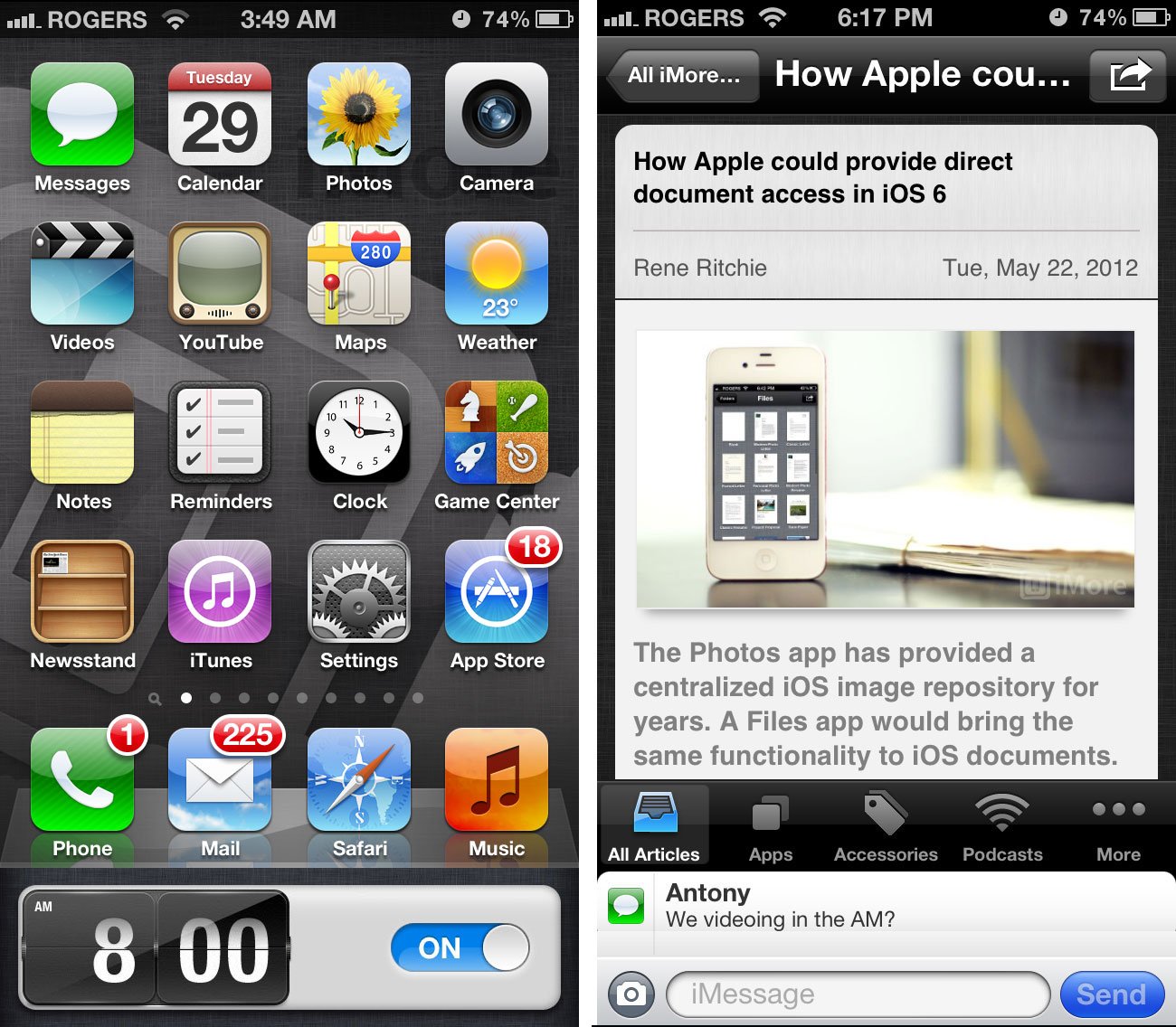
By contrast, jailbreak apps like BiteSMS let you quickly respond to a text no matter which app you're in. Your app (or game) pauses, a text entry box is overlayed, you enter your message, you hit send, and you're current app resumes. With apps like LockInfo, you see an email notification, and you can tap a button, and read it without even unlocking your device.
Those may seem like subtle differences -- a pause of state rather than change of state and back -- but in practice it's far more efficient. It reduces a lot of friction, and makes the experience far, far better.
Here's some more behind the idea:
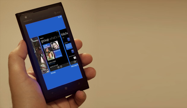
What iOS could take from Windows Phone
Better inter-app communication
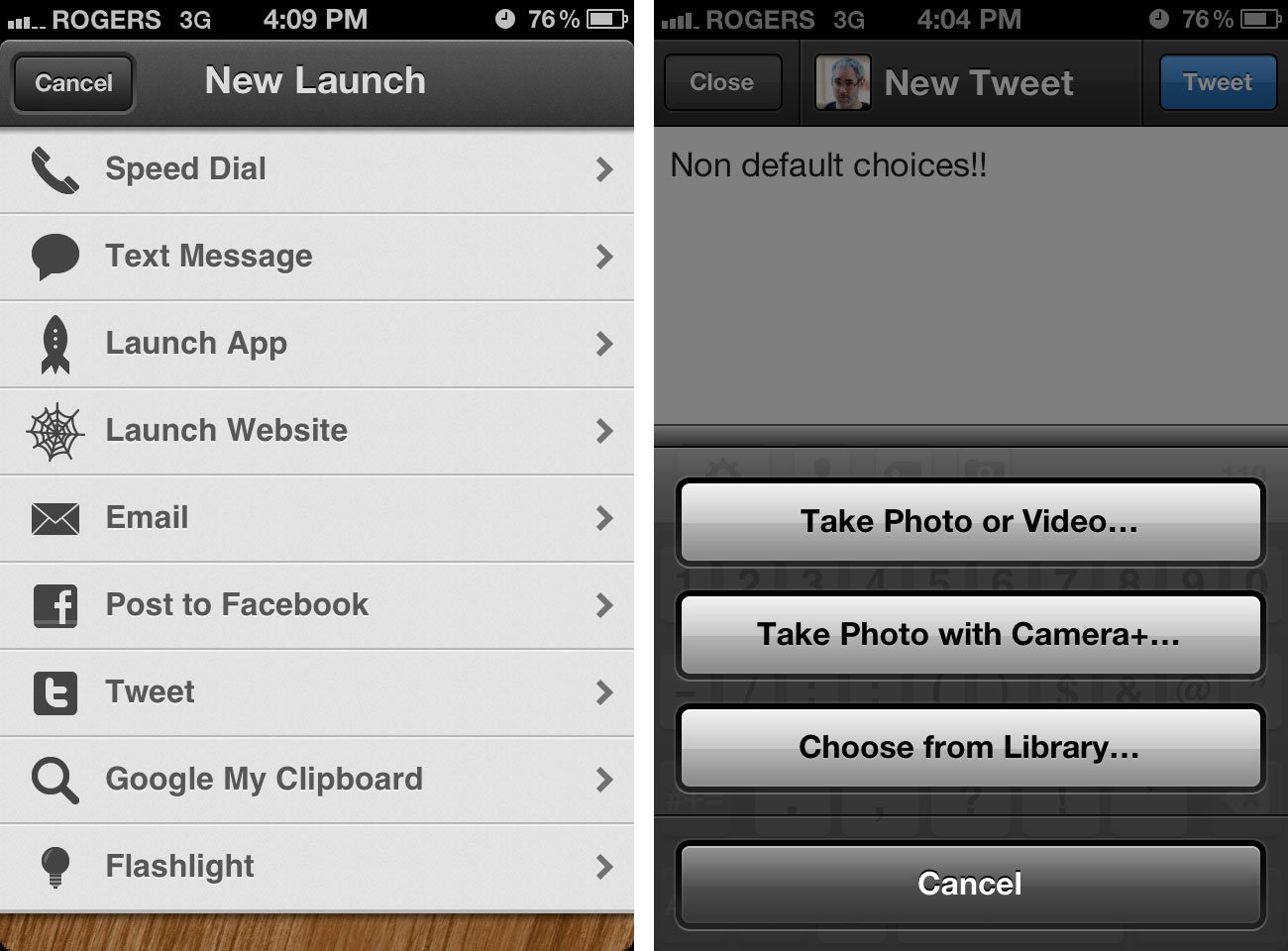
Currently the only way for iOS apps to exchange information is via the limited URL schemes protocol. Some amazing things can and have been done with it, perhaps none better than Launch Center and the upcoming Launch Center Pro. However, developers and users keep knocking their heads against that "limited" part.
Windows Phone 8 will employ something called "contracts", which will allow sandboxed apps to communicate with each other under certain, secure circumstances. For example, Instagram could present itself as a camera option, Sparrow as an email client, Elements as a text editor.
Then, other apps can hand off to those apps when they want or need to. We already see this done as a work around in iOS, for example, Tweetbot now gives you the option to take a photo with Camera+ instead of the built in Camera app, if you have Camera+ installed. The aforementioned Launch Center lets you tap a button to jump into an app and start an action, for example launch Tweetbot right into the new tweet sheet, or launch Safari right into a specific search.
It's tough to see Apple letting users set their own default apps, for example, set an alternate default browser to Safari. However, it's easier to see Apple creating a more robust system for inter-app communications than URL schemes.
Better gaming network
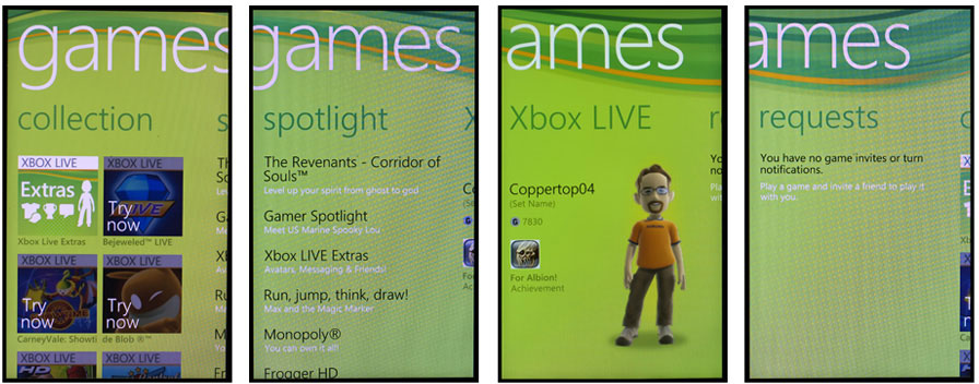
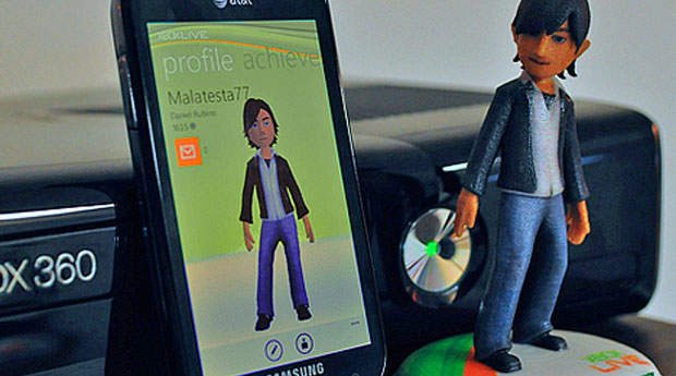
Microsoft is still kicking and screaming its way out of decades of disparate, non-interoperable systems, but they're starting to get it right. Xbox Live is an example of that. Sure, it costs a silly $50 a year for the far more useful Gold version, but it's otherwise well executed and is being pushed from TV to mobile with increasing efficiency.
Sure, Microsoft botched things badly by not calling their new mobile devices Xphones and having Halo-branded, Halo playing versions available at launch, but what they lack in smarts they make up for in tenacity.
Luckily for them, gaming is something Apple doesn't yet "get". But Apple's also showing signs that might change. Apple has already announced they're bringing Game Center to OS X Mountain Lion, for example.
But it needs to do more. Game Data sync, via iCloud, across devices is a start. If I'm playing Angry Birds on iPhone, I should be able to pick up my iPad and keep going, and then switch to Mac and keep on keeping on.
Cross-platform multiplayer will be a must-have soon as well. If I'm at the coffee shop gunning in N.O.V.A on my iPhone, I should be able to pwn Chad at home on his iMac, and Georgia at work on her iPad. (And, eventually, Simon on his Apple TV as well.) And hey, voice chat and beacons to let friends know what you're doing, and when, and to talk while doing it, would be nifty.
It's a lot of heavy lifting, but it's heavy stuff that needs to be lifted. (And yeah, I wouldn't say no to niftier avatars either.)
Better non-gaming network
Xbox live, wisely, wasn't called Xbox Gaming Live, because it's used for more than just gaming. All of Microsoft's living room ambitions are channeled through it, from Netfilx to social parties.
Even less than Apple gaming, Apple has repeatedly shown they don't understand social yet. Apple chose not to call their network Apple Live, but Game Center, for example. And they released Ping. But they do seem to know it's important. They're partnering with Twitter and might one day partner with Facebook. But Apple tends to like to own core technology.
iCloud is a good example and a good start towards a personal cloud. It needs an accompanying social cloud. Not just for sharing personal data like Calendars and Photo Streams with spouses and partners, but to share everything -- movie watching, music listening, app usage. Everything.
What iOS could take from jailbreak
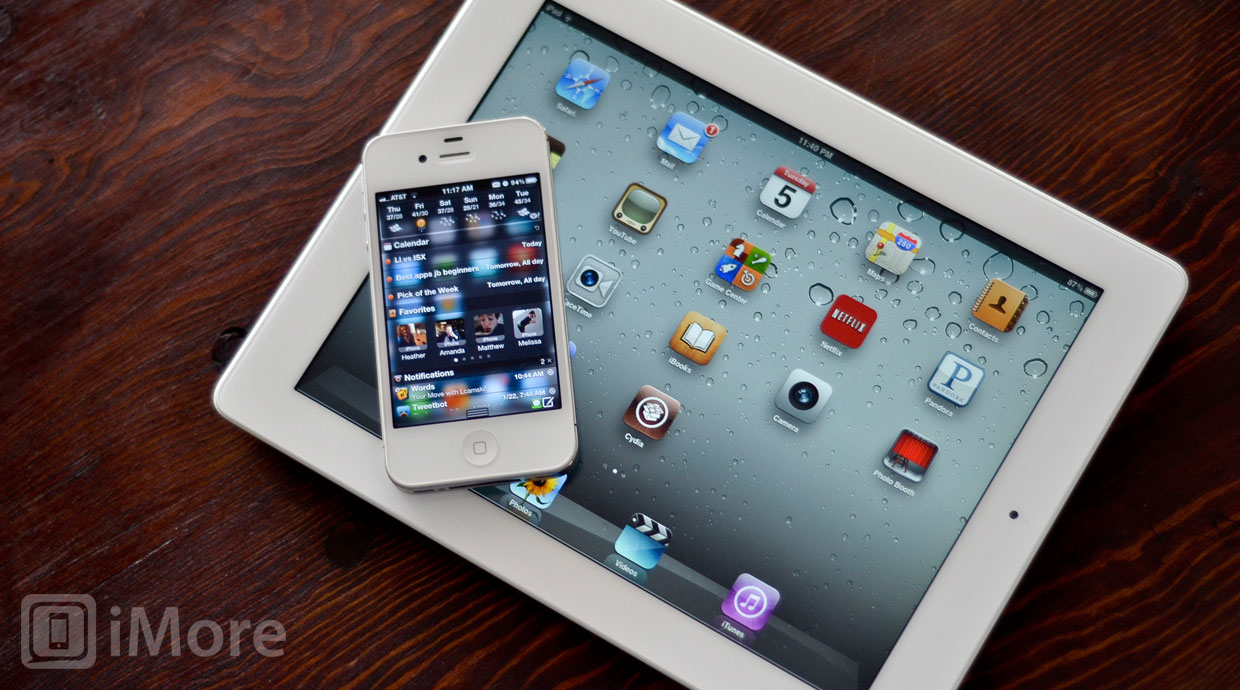
Instead of competing platforms, Apple can also draw inspiration from their own platform -- as it's been tweaked and modified by jailbreak developers. They've done it before, so there's no reason they can't do it again.
A lot of it is similar to what I've already listed above -- the jailbreak community has been picking the slightly higher hanging fruit for years and years. The way they've implemented it is often different, however, and often several different implementations exist. That makes it an incredibly fertile ground, and a free, pro-level beta pool for Apple when it comes to large scale testing deployments of new features and interfaces.
Here's more on what Apple could explore from the jailbreak community this time around:
What iOS could take from OS X
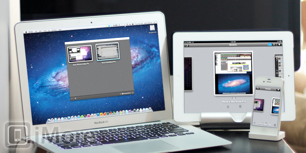
For a while now Apple has been working to take iOS "Back to the Mac" -- to take what worked best in iOS in general, and the iPad in specific back to the Mac. To make an Apple experience that's more consistent across their two platforms.
But how about a little quid pro quo? There are several aspects of OS X, including some of what's being implemented in Mountain Lion, that would be great to see in iOS.
More app loading options
The thing most power iPhone users have dreamed of since the original, no-third-party-apps iPhone launched in 2007 -- the thing that led to the jailbreak scene -- is the ability to side-load apps. The ability to run apps not approved by Apple. The ability to run app that come from outside the App Store.
With Gatekeeper in OS X Mountain Lion, users have a choice -- run only App Store apps, run App Store apps and non-App Store apps signed by identified developers, and run any app, no matter where it comes from. The App Store provides a lot of security -- it minimizes the chance for malware or other malicious software. It creates user trust. Non-App Store apps signed by identified developers is a good middle-ground, however. They don't need Apple approval but if any of them are found to be malicious, their certificate can be revoked.
Unfortunately, I don't think Apple would do this. It wouldn't really change the type of apps that are available -- for example, the system-level hacks of jailbreak -- and it would almost certainly lead to developers cutting Apple out of the 30% share of app sales Apple takes to maintain the App Store. Apple has shown they're not fond of end runs around the App Store for subscriptions, and they'd likely be even less so for paid apps.
More minor enhancements
- FaceTime conference calls. Like the iChat that Mountain Lion kills off, the big iPad screen -- especially a Retina display on a quad-core iPad 3! -- should allow for multi-person calling.
- Print to PDF. A built-in PDF printer option, perhaps added to AirPrint, that goes right to Documents in the Cloud, would be great for everything from Mail to Safari.
- Per-account mail signatures. No reason the current signature setting can't be moved down a step in the Settings hierarchy. Work and play can't always have the same signature.
- Top Sites for Safari. I could do without the forced curve effect, but quickly getting my most common sites as thumbnails is very convenient.
- Development options. Beyond Xcode, HTML5, and cross-compilers, support for other development options exists on OS X but not iOS.
- AirDrop. Quickly send files (from Files.app!) or photos from one iOS or OS X device to another over local Wi-Fi.
Here's more on what Apple could take from OS X and bring "Back to the iPhone and iPad":
- Back to the iPad: What Apple should take from OS X Mountain Lion and give to iOS 6
Conclusion
Operating systems are like art -- you add material then take away what you don't need. You add features and trim away bloat. While iOS may now be one of the older, more mature mobile operating systems, it's not perfect.
Just like OS X, Apple will keep adding features, then it will pause and re-soldify like it did with Snow Leopard, then focus anew like Lion and Mountain Lion.
The question is -- what will they do this time with iOS 6? Apple may or may not have plucked all the low hanging fruit in previous releases, but they haven't plucked all the fruit hanging just a slight bit higher. And they certainly haven't finished polishing it.
Additional resources
- iOS 6: A fresh coat of paint
- iOS 6: Is it time for Apple to revamp the multitasking fast app switcher?
- The 16:9 iPhone
- The 4 inch iPhone
- How Apple could provide direct document access in iOS 6
- iOS 6 and the opposite of widgets
- Is it time for Apple to revamp the Home screen?
- The challenge of bringing Siri to the iPad
- iOS 6 and privacy: How Apple should draw inspiration from Android for better app

Rene Ritchie is one of the most respected Apple analysts in the business, reaching a combined audience of over 40 million readers a month. His YouTube channel, Vector, has over 90 thousand subscribers and 14 million views and his podcasts, including Debug, have been downloaded over 20 million times. He also regularly co-hosts MacBreak Weekly for the TWiT network and co-hosted CES Live! and Talk Mobile. Based in Montreal, Rene is a former director of product marketing, web developer, and graphic designer. He's authored several books and appeared on numerous television and radio segments to discuss Apple and the technology industry. When not working, he likes to cook, grapple, and spend time with his friends and family.
