Adaptive UI in iOS 8: Explained
iMore offers spot-on advice and guidance from our team of experts, with decades of Apple device experience to lean on. Learn more with iMore!
You are now subscribed
Your newsletter sign-up was successful
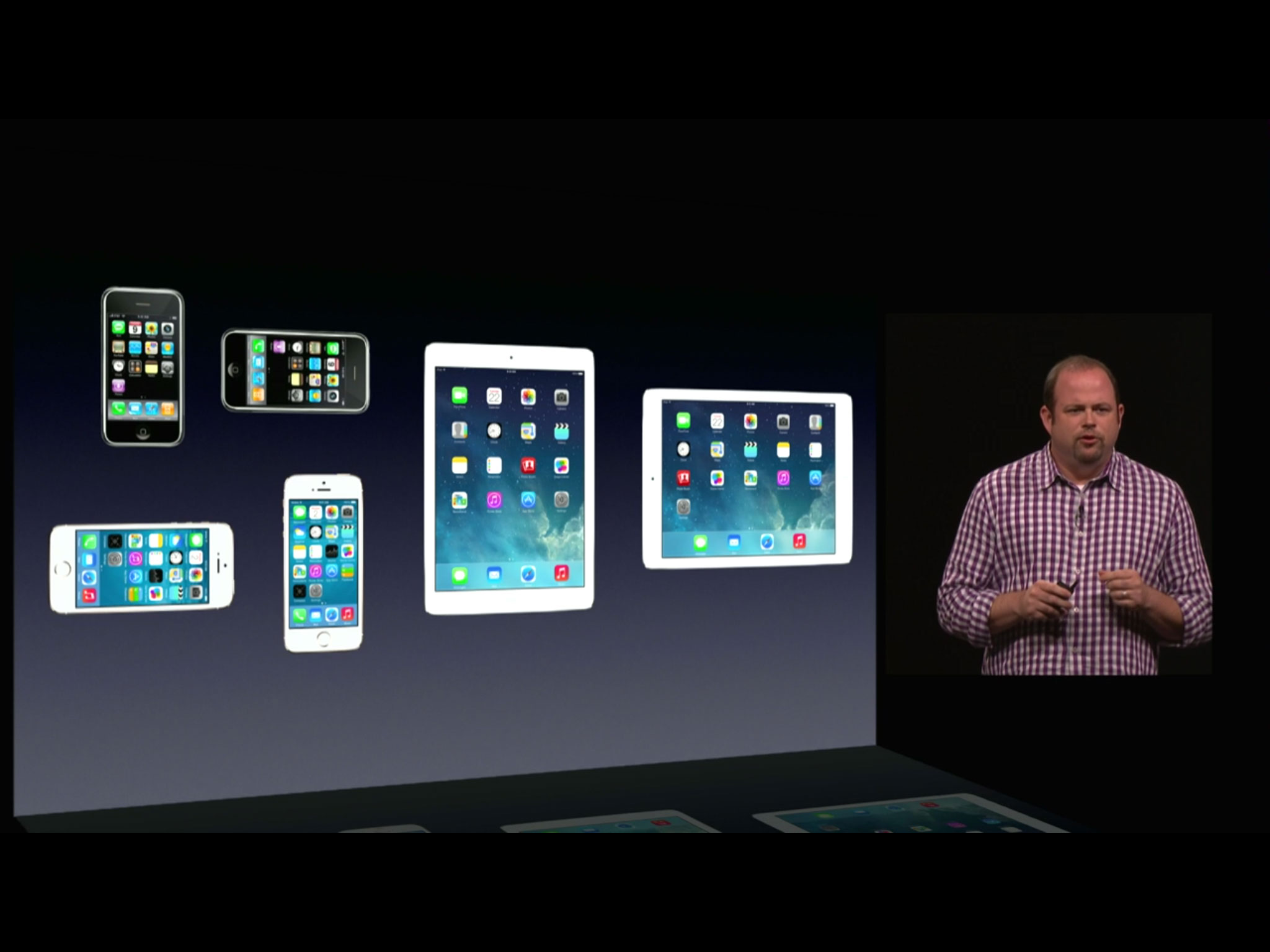
Gone are the early days of the App Store where there was just one iPhone for developers to target. Now there are original and widescreen iPhones, iPhone and iPads, in portrait or landscape, with standard and Retina displays. What are pixel-perfect developers and designers to do? According to Apple and iOS 8, use adaptive user interface (UI). Adaptive UI is meant to help rationalize a world with multiple devices, and let developers use a single storyboard in Interface builder to target different aspect ratios, screen sizes, orientations, and display densities. So, how does it work?
From pixel-perfect to constraint-based
When Apple made iOS (originally iPhone OS) they needed a way to rapidly develop interfaces for it. They decided not to bring AppKit over from OS X. It was something from the NeXT-era, of the past, and they needed something new. They also decided not to use WebKit, the rendering engine developed from Safari. It might one day be the future, but it wasn't yet performant enough for the present. So, they created UIKit as a framework for building standard interfaces.
With the launch of the iPhone 3G and the App Store in 2008, developers had only one screen to target, 480x320 points (@1x density), for the most part only one orientation, portrait, and only one "view" (think page of content) to display at a time.
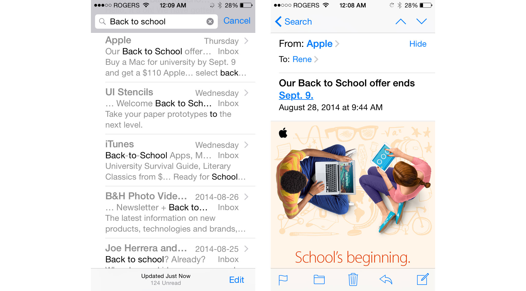
For example, the iPhone's Mail app had a list of messages that filled the screen, and if you tapped one, you got taken to the details of that specific message, which also filled the screen. You couldn't even rotate it because there was no consistent landscape support until iPhone OS 3.0.
Then, in 2010, Apple added the iPad and a new target, 1024x768 points (@1x density), both in portrait and landscape orientations. They also added "split views". If the iPhone views were like pages, the iPad split views were like pages with two separate columns.
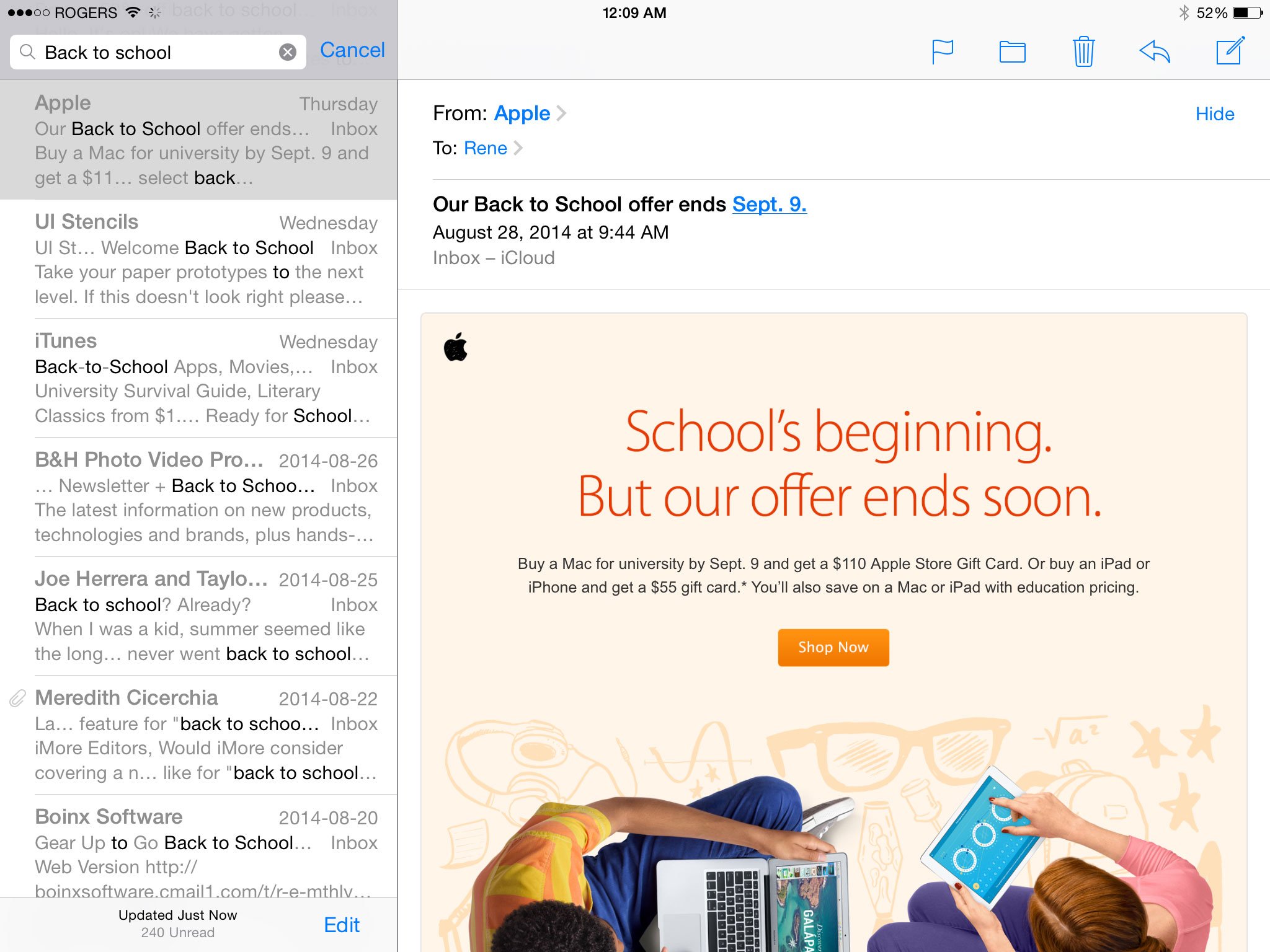
For example, the iPad's Mail app had a list of messages on the left and the details of the specific message on the right. Instead of changing screens, you could see both columns side-by-side at the same time.
To have an app that worked on both iPhone and iPad, developers had to make interfaces that addressed both "idioms", iPhone and iPad, and both orientations, portrait and landscape.
iMore offers spot-on advice and guidance from our team of experts, with decades of Apple device experience to lean on. Learn more with iMore!
Later that same year Apple also added the iPhone 4 and not only a new target, but a new Retina density, 480x320 points (@2x), which worked out to 960x640 pixels.

So, each point on non-retina was made up of 1 pixel, but each point on Retina was made up of 4 pixels. The smaller pixels meant the potential for much shaper, more detailed text and graphics.
Retina iPads followed in 2012, adding 1024x768 (@2x), which worked out to 2048x1536. Older apps still fit newer screens, they simply scaled up, resulting in a fuzzier look. Newer apps, by contrast, looked amazingly sharp.
All of this was still manageable. Developers had two point sizes in two orientations at two densities to target, which meant they could make two sets of pixel-perfect designs, one for iPhone and one for iPad, in two orientations, one for portrait and one for landscape, and two sets of graphics resources, one for standard and one for Retina.
Then, in 2012, Apple added the iPhone 5 and a new target with a twist, 568x320 points (@2x) in both portrait and landscape, which worked out to 1136x640 pixels.
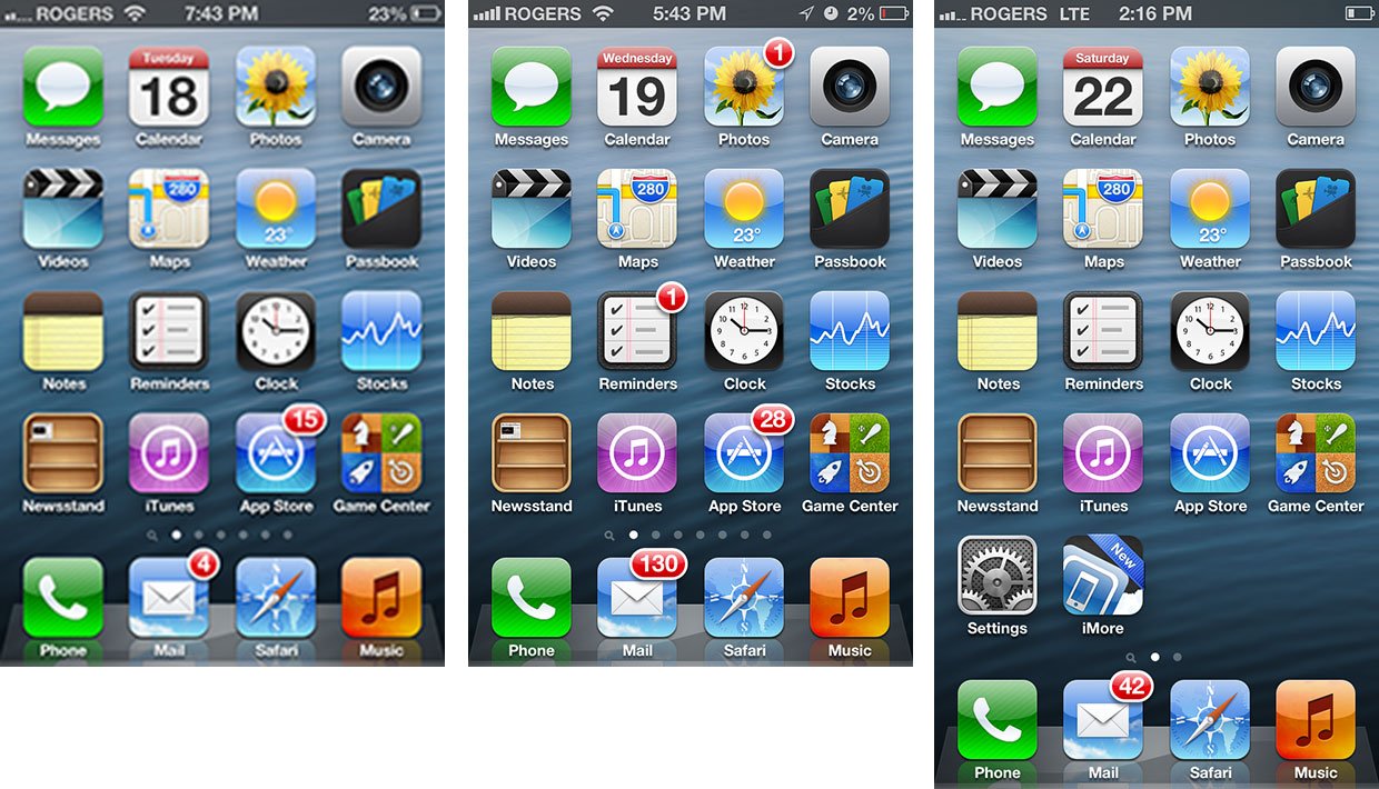
This time older apps stayed as sharp-looking as ever, but they were letterboxed (or pillarboxed) on the newer, wider (or taller) screen. (Just like standard TV shows are pillarboxed on HDTVs.)
To fill the taller screen, developers could expand things like standard lists to show an extra row, but custom interfaces had to be redesigned. Developers also now had two point sizes, two orientations, two densities, and two iPhone aspect ratios to target.
Mercifully, the iPhone 3GS was soon discontinued, which ended any pressing need to support 320x480 (@1x) iPhones. The iPad 2, however, and later the original iPad mini, lingered. So, 1024x768 (@1x) remained a thing.
What started off simply had become more complicated, and looked to be getting even more complicated soon. There needed to be a better way.
Back in 2012 Apple ported Auto Layout (the marketing name for a system of constraint-based layout) from OS X to iOS 6. If you imagine the "guides" in iWork, the ones that let you snap one item into position relative to another, then imagine that those guides would never disappear, and could be saved as persistant "constraints", then that gives you an idea of the basis for Auto Layout — defining relationships.
That could help developers make things simpler and more consistent, but it couldn't do it alone. There needed to be something more...
Size classes
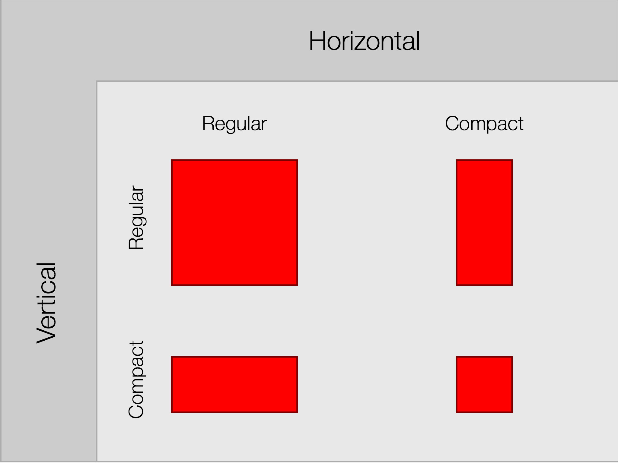
With iOS 8, Apple is introducing "size classes". Size classes have vertical and horizontal dimensions called "regular" and "compact". The iPad in both portrait and landscape defaults to the regular size class in both horizontal and vertical directions. The iPhone in portrait defaults to compact size class for horizontal and regular size class for vertical. The iPhone in landscape defaults to compact size class for both horizontal and vertical.
Apple provides some automatic behaviors based on size classes. For example, if you rotate an iPhone app that uses standard components from portrait to landscape (from compact/regular to compact/compact) the navigation bar gets condensed and the status bar disappears entirely. That's to maximize the content on a screen that's suddenly gone from being tall to being very, very short — like a web page on Safari.
Developers are free to customize the layout for every orientation of every device they support as well. For example, they can have two buttons stacked on top of each other in portrait orientation to take advantage of the height, and those same buttons aligned side-by-side in landscape orientation to take advantage of the width. They're the same controls, their position and other attributes simply change as the vertical size class changes.
Where it starts to get a little dense is here — Size classes aren't restricted to devices. For example, the iPad typically has a split view filling its screen, list on the left and details on the right. Again, the Mail app with a list of messages on the left and the details of the selected message on the right. That list of messages in the left column, taken by itself, looks like the full screen messages list in the iPhone Mail app. That's because it — just the left column of the iPad app — is also considered a compact size class. An iPad split screen contains both a compact size class list and a regular size class details view. Same goes for popover menus (a type of "presentation layer" on the iPad. They're overlaid on top of the split view on iPad screens but they take over the full screen on the iPhone.
Conversely, Apple is also bringing split views to the iPhone. That means developers no longer have to maintain two separate interface hierarchies, one for iPad that contains split view, and one for iPhone that does not. Now they can maintain one hierarchy for both and the proper screens will all be rendered based on size class.

And yes, this means developers can choose to use the iPad-style spilt view on the iPhone when it's in landscape mode as well, where the extra width would be better filled by two columns instead of one really wide one. To accomplish this, Apple is changing the way views work, including decoupling child views, and letting single columns expand into dual columns and collapse back down again, as their size class changes.
In other words, an iPhone app could have a full screen list in portrait, like a list of photos, and when you tap one, you get taken to a second screen containing the photo. When you rotate to landscape, however, that full screen could segue into a split screen, showing the list of photos on the left and the currently selected photo on the right, just like an iPad app.
That's all well and good on the 4-inch iPhones we have today, but it's hard not to imagine how great it would be on even bigger iPhones one day...
Also, while, Apple never comments on future plans, they do now let developers resize the iOS device simulator to any arbitrary size. They can plug in numbers for sizes between iPhone and iPad, or even bigger than current iPads. Currently that results in a boxed presentation that otherwise works as you'd expect an adaptable UI to work.
And who knows, maybe some day there'll be large size classes to go along with regular and compact, and smaller ones (or compact/compact in both orientations) as well. Larger tablets, smaller wearables, the future is always exciting.
Traits
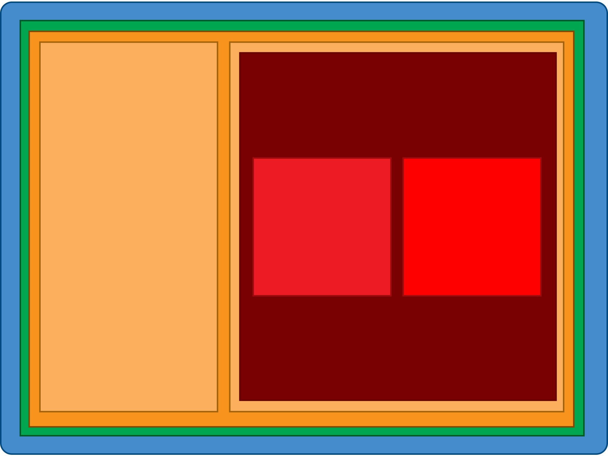
"Traits" control how elements of an interface change when things like device orientation change. "Trait environments" contain screens, windows, view controllers, views, and presentation controllers.
Sometimes, like on iPhone apps, these all look indistinguishable because they all fill the screen. Other times, like on iPad apps, it's easy to see a full screen filled with a split view overlaid by a popover. Developers need to be able to manipulate each individually, regardless.
"Trait collections" includes the horizontal and vertical size classes (compact or regular), the interface idiom (iPhone or iPad), and the display scale (1.0 or 2.0) for those environments.
Trait environments form a hierarchy from screen to window to view controller to view, and trait collections flow from parent to child. When a trait collection for a given trait environment changes, the interface can be changed accordingly. For example, when an iPhone is rotated from portrait to landscape, the vertical size class changes from regular to compact, and the interface can be changed to a split view.
Images are also getting support for trait collections. So, for example, you can not only create buttons @1x and @2x for standard and Retina, but a slightly smaller version for the vertically compact size class that only gets used when an iPhone is rotated to landscape and height becomes severely constrained. Rotate back, or switch to the iPad version, and the regular size class image is used.
To keep them more easily organized, different versions of images for different densities and size classes can be wrapped up into "image assets". To make things more flexible, Apple has also added image rendering support to the asset catalog. So, for example, black glyphs can be rendered in blue or red or another color as the interface requires.
A designer still has to make all the image variants, they're just better organized inside Xcode and transition automatically when changes to the trait collection occur, just like other interface elements.
Interface Builder
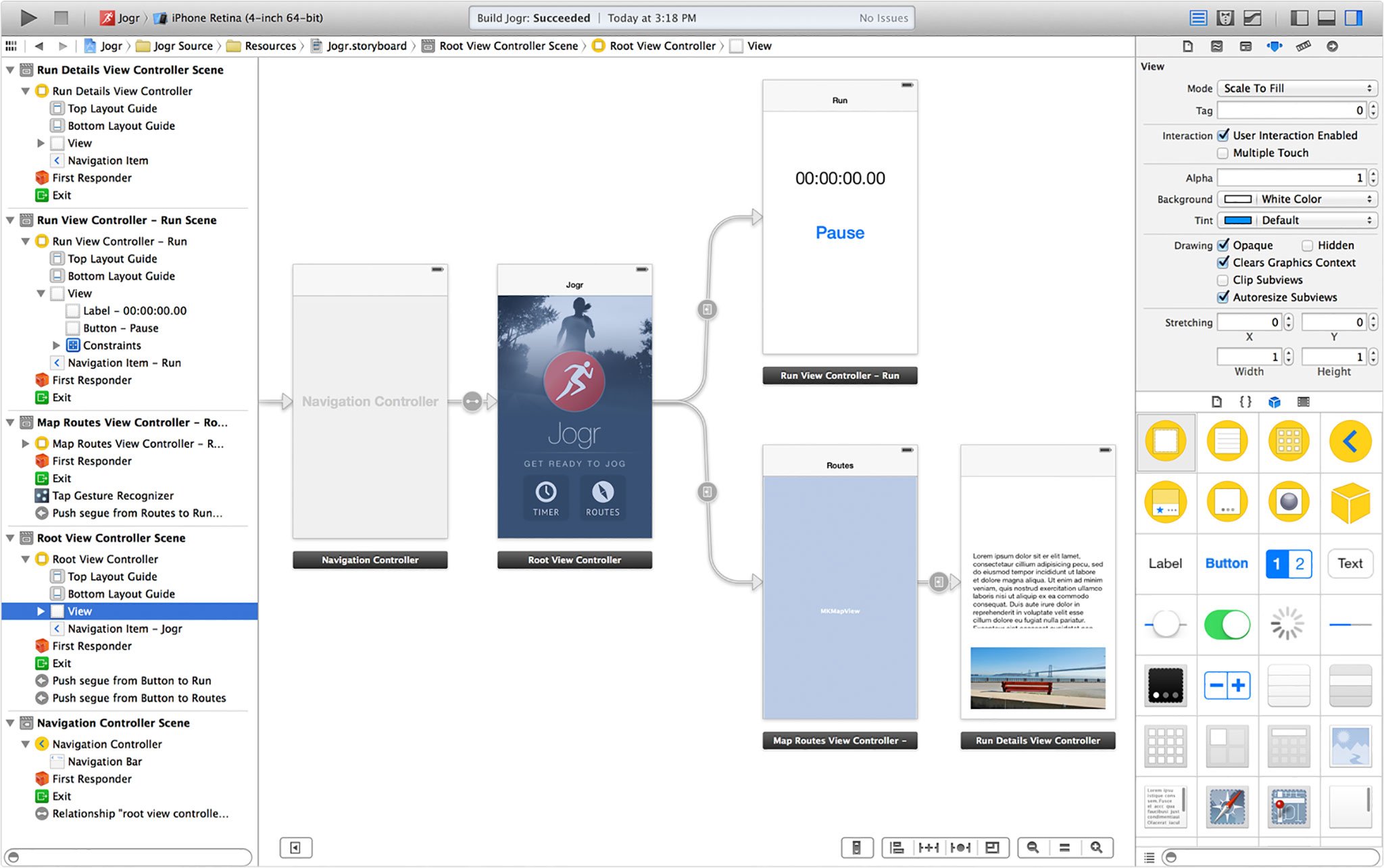
Adaptive UI in iOS 8 is surfaced for developers in Interface Builder through storyboards. When you use an iPhone or iPad app, you navigate between different views by tapping, swiping, etc. That navigation path — the relationship between those views — are visually displayed for developers as storyboards. Although storyboards have been around for a while, with iOS 8 developers can now use the same storyboard for both their iPhone and iPad interface. Since traits are hierarchical, developers can create universal attributes to keep their app's look and feel consistent, and then tweak individual elements on specific size classes, as needed to optimize for each device and orientation.
For example, a developer could start with a universal (any vertical, any horizontal, 480x480) layout, and build their basic interface, including colors, buttons, graphics, etc. Then, they could add a compact/regular layout for the iPhone in portrait where they move the buttons around to better suit the narrower screen.
Bottom line
Time was developers had a single screen size, orientation, and density to target. Now they have a few, and in the future they'll have many. Just like the web developed responsive design, Apple is providing adaptive UI as a way to make it easier for developers to manage and exploit multiple screen sizes, orientations, and densities, and perhaps one day, even smaller and bigger devices, multiple windows as well.
More of iOS 8: Explained
- Handoff in iOS 8 and OS X Yosemite: Explained
- Making and receiving phone calls on iOS 8 for iPad and OS X Yosemite: Explained
- Sending and receiving SMS/MMS on iOS 8 for iPad and OS X Yosemite: Explained
- AirDrop and Instant Hotspot in iOS 8 and OS X Yosemite: Explained
- QuickType keyboard in iOS 8: Explained
- Interactive notifications in iOS 8: Explained
- SceneKit in iOS 8: Explained
- Metal in iOS 8: Explained
- Widgets in iOS 8: Explained
- Share extensions in iOS 8: Explained
- Action extensions in iOS 8: Explained
- Inter-app photo and video editing in iOS 8: Explained
- Custom keyboards in iOS 8: Explained
- Family Sharing on iOS 8: Explained
- iCloud Drive and Document Picker for iOS 8: Explained
- Document provider extensions in iOS 8: Explained
- TestFlight in iOS 8: Explained
- Apple Maps in iOS 8: Explained
- iMessage in iOS 8: Explained
- Photos in iOS 8: Explained
- Spotlight in iOS 8: Explained
- Health in iOS 8: Explained
- Touch ID in iOS 8: Explained
- HomeKit in iOS 8: Explained
- Adaptive UI in iOS 8: Explained
- Manual camera controls in iOS 8: Explained

Rene Ritchie is one of the most respected Apple analysts in the business, reaching a combined audience of over 40 million readers a month. His YouTube channel, Vector, has over 90 thousand subscribers and 14 million views and his podcasts, including Debug, have been downloaded over 20 million times. He also regularly co-hosts MacBreak Weekly for the TWiT network and co-hosted CES Live! and Talk Mobile. Based in Montreal, Rene is a former director of product marketing, web developer, and graphic designer. He's authored several books and appeared on numerous television and radio segments to discuss Apple and the technology industry. When not working, he likes to cook, grapple, and spend time with his friends and family.
