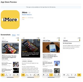
Today, Apple quietly rolled out a completely redesigned look for viewing apps on the web. It is now more in line with what we see when we view apps on iPhone and iPad in iOS 11.
The flat, clean design is a nice change from what we've been looking at on the web for years now. Rounded edges, a clean, simple look, plus a lot of new things that weren't there before.
Each app listing now includes the entire version history (I love this feature), customer reviews and editor notes listed the way they look on iPhone and iPad, plus suggested apps based on the developer and other apps similar to the one you're looking at.
Mac app listings have received the same redesign treatment as the mobile counterpart. Take a look at a Mac app and you'll see the new flat design and additional content.
This is a refreshing update for app listings on the web. I was hugely disappointed when Apple removed the App Store from iTunes on Mac. Ugly as it was, I used it daily for iOS app discovery. Hopefully, this new design will help us find things a little easier. Maybe Apple will someday actutally make an App Store available on Mac again.
What do you think? Do you like the new look of Apple's app listings on the web? Do you prefer the previous look?
Master your iPhone in minutes
iMore offers spot-on advice and guidance from our team of experts, with decades of Apple device experience to lean on. Learn more with iMore!
Lory is a renaissance woman, writing news, reviews, and how-to guides for iMore. She also fancies herself a bit of a rock star in her town and spends too much time reading comic books. If she's not typing away at her keyboard, you can probably find her at Disneyland or watching Star Wars (or both).
