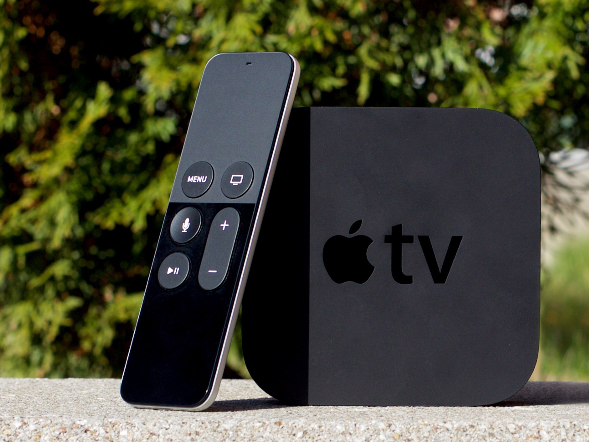
For the last few years, Apple TV has been the only way I've watched movies and TV shows at home. Since I live outside the U.S., that's primarily meant iTunes, Netflix, and AirPlay from the local network apps on my iPhone and iPad. It's been good enough, at least, that I've never felt the need to go running back to cable. But I've always wanted more.
As the months and years ticked by from the last Apple TV refresh in March of 2012, I've increasingly wanted a modern box set free of its limitations and allowed to truly deliver on its iOS foundations—the same foundations that power the tremendous platform behind the iPhone and iPad. And now, with the fourth generation Apple TV, Apple is delivering something that promises to be just that. It's been a long time coming. Too long, frankly. But is it really, finally here?
Note: The Apple TV content story, like every set top box content story, remains a U.S.-centric one. While I had a chance to use the new Apple TV in the U.S. for a few days during the launch, I don't get to live with or experience it every day. So, for a complete picture of how the new Apple TV works in the United States, and how well the content delivers there, please see my colleague, Serenity Caldwell's, forthcoming review.
For people who want:
- 1080p 60fps.
- Internet video.
- Apps on the TV.
- iOS-style gaming.
- Siri voice control.
Not for people who want:
- 4K.
- Video recording.
- Amazon on the TV.
- PS4- or Xbox One-style gaming.
- "Always listening" voice control.
Bottom Line
The fourth generation Apple TV was both too long in coming and too quick out the door. Frustratingly rough edges abound. Yet it manages to deliver something truly remarkable: A solid experience out of the box, and an amazing foundation for the future. If you want iTunes, Netflix, and more on your television, Siri voice control and full-on apps, you want the new Apple TV.
Apple TV Table of Contents
Apple TV Evolution
| Header Cell - Column 0 | Header Cell - Column 1 | Header Cell - Column 2 | Header Cell - Column 3 | Header Cell - Column 4 |
|---|---|---|---|---|
| Row 0 - Cell 0 | Apple TV 1 | Apple TV 2 | Apple TV 3 | Apple TV 4 |
| Code name | Row 1 - Cell 1 | K66 | J33 | J42 |
| OS | OS X Tiger-based | iOS-based | iOS-based | tvOS |
| Max video | 720p | 720p | 1080p | 1080p 60fps |
| Max audio | Dolby Digital 5.1 | Dolby Digital 5.1 | Dolby Digital 5.1 | Dolby Digital Plus 7.1 |
| Chipset | Intel Pentium M | 32-bit Apple A4 | Single core 32-bit Apple A5 | 64-bit dual-core Apple A8 |
| Memory | 256 MB | 512 MB | 512 MB | 2 GB |
| Storage | 40 GB/160 GB hard drive | 8 GB Flash | 8 GB Flash | 32 GB/64 GB Flash |
| Wi-Fi | 802.11n | 802.11n | 802.11n | 802.11ac |
| Bluetooth | N/A | Bluetooth | Bluetooth | Bluetooth 4.0 |
| Ethernet | 10/100Base-T | 10/100Base-T | 10/100Base-T | 10/100Base-T |
| Outputs | HDMIcomponent videooptical audioanalog audio | HDMIoptical audio | HDMIoptical audio | HDMI 1.4 |
| Diagnostics | USB | MicroUSB | MicroUSB | USB-C |
| Remote | Apple Remote | Apple Remote 2 | Apple Remote 2 | Siri Remote |
| Height | 1.1 inches (28 mm) | 0.9 inches (23 mm) | 0.9 inches (23 mm) | 1.4 inches (39 mm) |
| Width | 7.7 inches (197 mm) | 3.9 inches (98 mm) | 3.9 inches (98 mm) | 3.9 inches (98 mm) |
| Depth | 7.7 inches (197 mm) | 3.9 inches (98 mm) | 3.9 inches (98 mm) | 3.9 inches (98 mm) |
| Weight | 2.4 lbs (1089 g) | 0.6 lbs (272 g) | 0.6 lbs (272 g) | 0.9 lbs (425 g) |
| Development | None | Partner TVML | Partner TVML | Open TVML/tvOS |
| Release date | 1/9/2007 | 9/1/2010 | 3/7/2012 | 10/30/2015 |
Apple TV Box
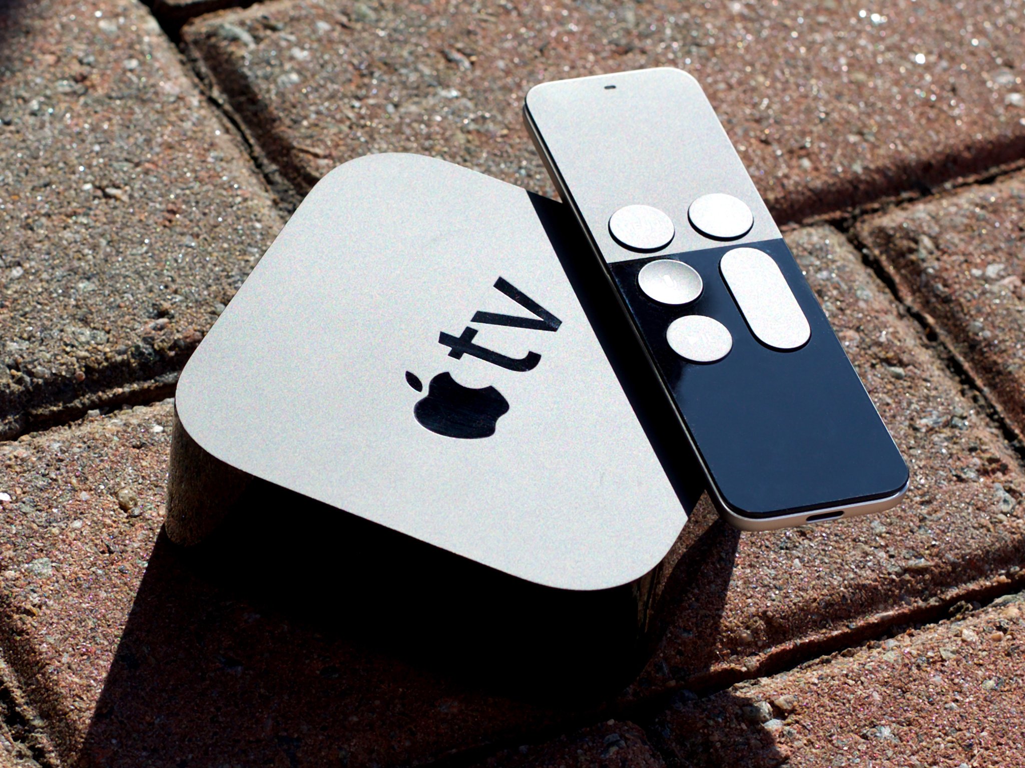
The 2015 Apple TV box looks identical to the 2012 and 2010 Apple TV boxes, at least from the top. Same black finish. Same rounded rectangular shape. Same shiny Apple TV logotype. It's only when you look at it in all three dimensions that the differences become apparent.
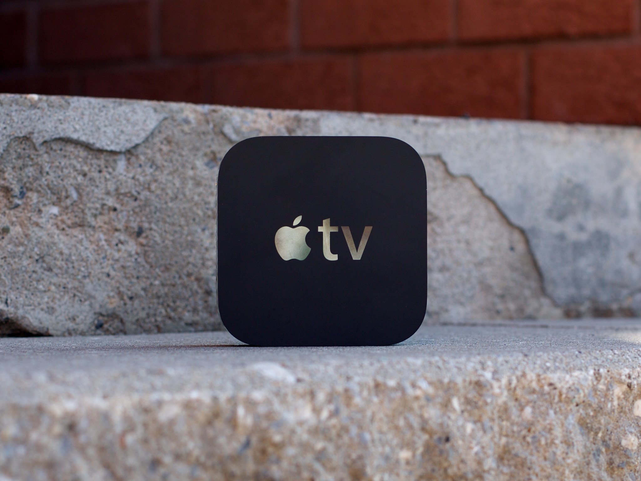
The biggest change, of course, was from the 2007 Apple TV to the 2010. Not only did the box shed it's "lobot" version of OS X Tiger for iOS under the hood, it shed its old, wide, hard drive-encasing silver enclosure for the little black number that it's kept ever since. Unlike 2012, however, when the size stayed exactly the same, this year's fourth generation Apple TV has grown up. Literally.
It's still 98 mm (3.9 inches) square, but it's 35 mm (1.4 inches) tall now. That's an increase of 16 mm (0.5 inches) from the last model, and it makes it heavier as well, at 425 g (0.9 lbs), an increase of 153 g (0.3 lbs). Since you don't have to carry it around, though, it really doesn't matter much.
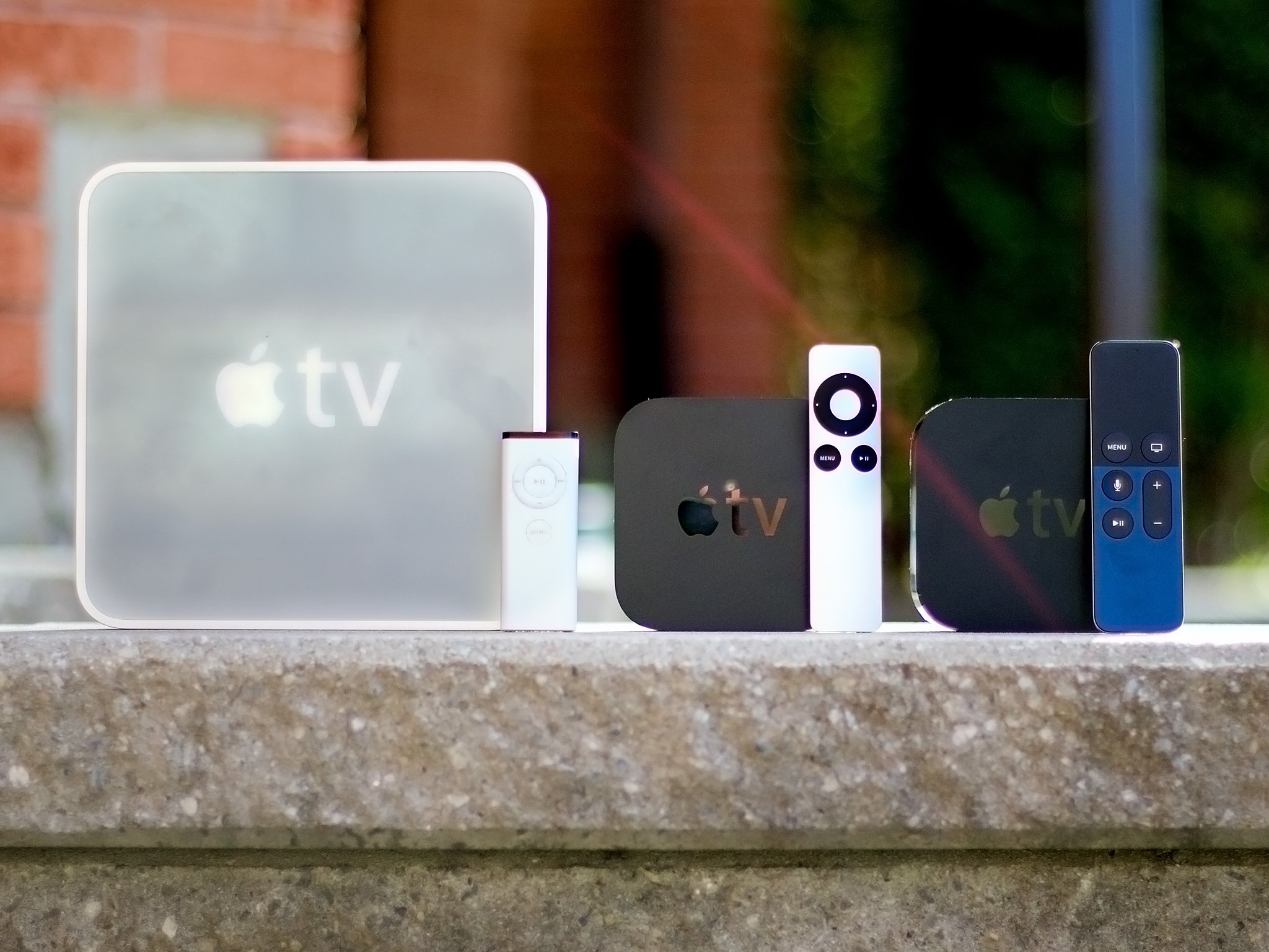
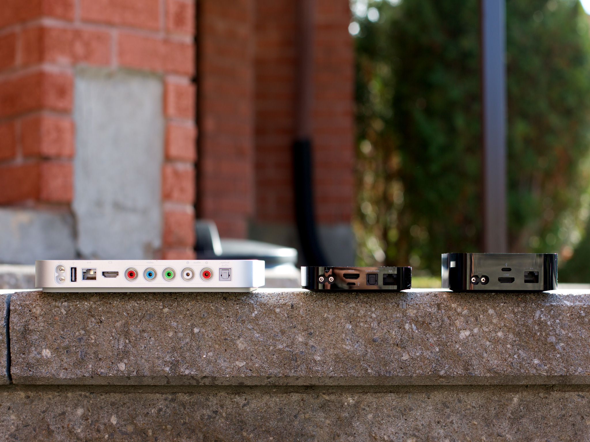
Since the footprint the Apple TV takes up in your living room—or meeting room or school room—hasn't changed, if you had a previous generation, unless you had the first generation, whatever cabinet or shelf or stand you had it on will still be as good a fit as always. And if you somehow still had the first generation, you'll now have room to spare.
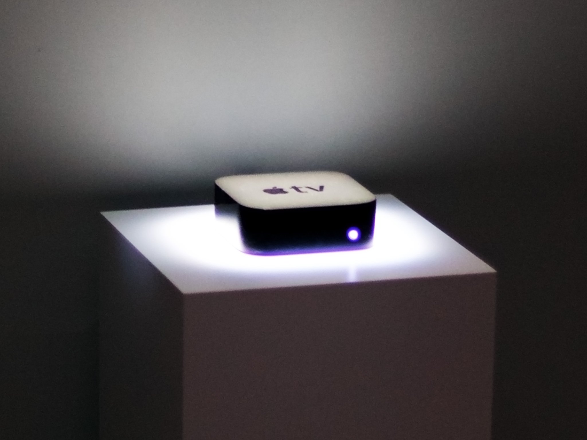
As an bonus, because the new Apple TV's Siri Remote is Bluetooth instead of infrared (IR), you no longer have to maintain line-of-sight with your Apple TV—you can now tuck it behind your TV, close it in a cabinet, or otherwise hide it away.
That's good because the LED light on the front is still there as well. While it's okay if you need to eliminate "Apple TV isn't on" from your troubleshooting list, if you're in a dark room and your Apple TV is in your eye-line, it can be distracting. (Especially since there's no way to disable it short of electrical tape.)
Taller and all, though, I'm still happy with the shape and size. You can fit it almost anywhere, you can stack it if you want to, and you can even travel with it easily should the need arise. In other words, the box itself is everything an Apple TV should be.
Performance
Inside the new Apple TV is a dual core Apple A8 system-on-a-chip (SoC). It pairs a second-generation 64-bit "Typhoon" central processor with a PowerVR GX6450 graphics processor. It's the same SoC found in the iPhones 6 and iPad mini 4. It's not as fast as the new Apple A9-series found on the iPhones 6s, but it's an exponential upgrade from the single core Apple A5 SoC in the previous Apple TV and it's more than enough to push around the pixels and bits of the new Apple TV.
There's 2 GB of memory as well, same as the latest iPhones and iPads, which is great to see. And you can get it with either 32 GB or 64 GB of NAND flash storage. That's interesting given most iOS devices have used the traditional three tier approach to pricing. The new iPad Pro also comes in only two tiers, 32 GB and 128 GB, so its likely something specific to how Apple sees these products selling. I don't know if a 128 GB Apple TV would eventually make sense, but time will tell.
No optional gold or rose gold finishes either. Dagnabit.
Apple TV Connectivity
Unlike every other iOS-based device, from the Apple Watch on your wrist to the iPhone and iPad in your hand, the Apple TV doesn't have a built-in display. That means you not only have to have a way to get content onto it, you have a way to get the content out as well. In other words, you need connectivity all the way through.
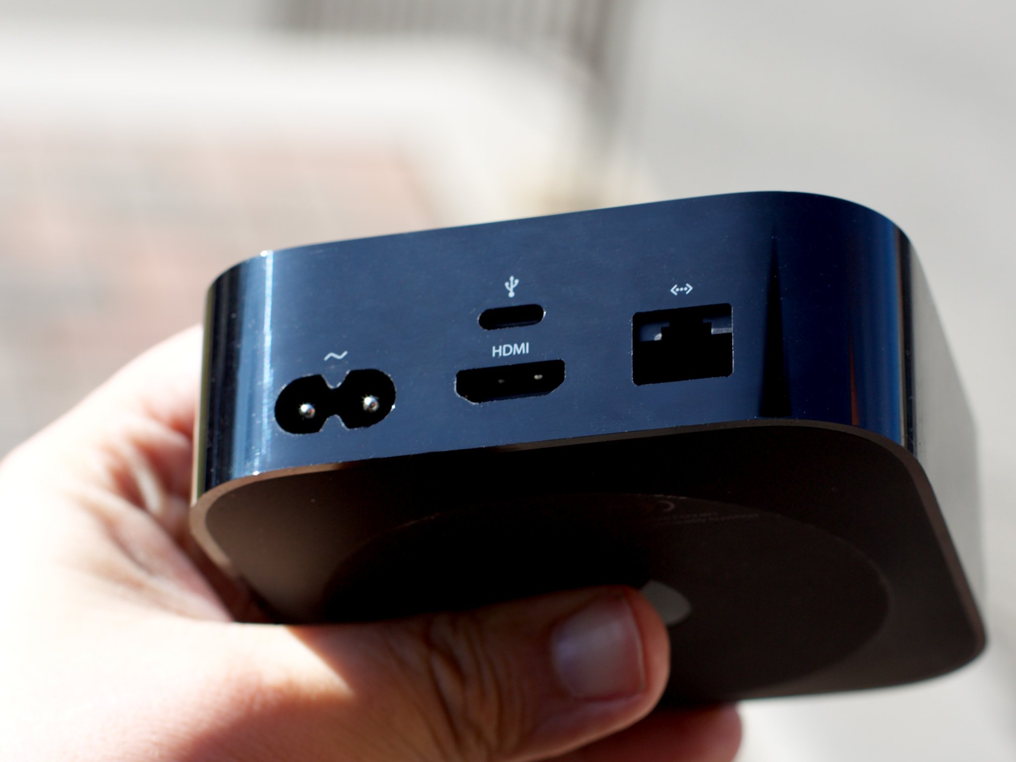
What Apple has done to address this is ditch some of the past while still not embracing much of the future.
Ethernet + Wi-Fi
Internet access for the Apple TV is provided by 10/100BASE-T ethernet or 802.11ac Wi-Fi. Yes, you read that right. Because there's no gigabit ethernet, the wireless connection on the new Apple TV is technically faster than the wired connection. Technically because, in the real world, wired connections are still more reliable than wireless
10/100BASE-T ethernet is fine for the amount of data being transferred by the Apple TV. Nothing you can throw at it should get anywhere near its saturation point. In fact, 10/100BASE-T is likely smarter than gigabit in this specific implementation because it consumes a more predictable amount of processing power, reducing the chance of dropped frames on higher bitrate streams.
I imagine most people prefer to go wireless these days anyway, so 802.11ac with multi-input and multi-output (MIMO) will give them a better, most reliable wireless experience as well.
HDMI 1.4 audio + video
Audio/video on the new Apple TV is handled exclusively by HDMI 1.4. Yes, you read that right as well. The optical audio output from the previous versions has gone the way of composite and component. That's bad news for people with sound systems that plug in via optical audio.
I use a SONOS home theater system at home that requires optical audio but, luckily, my television set has optical audio out so I can plug straight into that. Not everyone in the same situation is as lucky, though. There are workarounds, but they're either kludgy or costly.
HDMI 1.4 can support up to 4096×2160 pixels (4K) at 24 Hz -or 1920x1080 pixels (1080p) in 3D at 24 Hz. That's more than enough to handle the Apple TV's 1080p 60 fps video and Dolby Digital Plus 7.1.
Because, of course, the new Apple TV doesn't do 4K...

The 4K story?
I'd love 4K on the Apple TV now. Because, technologist. Yet 4K television still has minuscule marketshare and true 4K content—and the bandwidth to stream it—is still quasi-mythical for most people. So, more than now, I want it right. That means HDMI 2.0 for 60 Hz, hardware HEVC (H.265) decoding, and high dynamic range (HDR) support. And that's not now, sadly. That's next.
1080p 60 fps provides for rock-solid interface animation and great looking games. Cinema buffs would no doubt prefer Apple add a 24 fps mode so they can watch movies and shows the way nature and years of film conditioning intended. Most people won't notice or care about the difference, but it would be nice-to-have from a detail-oriented company like Apple.
Dolby Digital Plus 7.1 is supported by some iTunes content. You can see it in the Apple TV content description pages under audio, and it streams and sounds terrific. AirPlay, unfortunately, tops out at 5.1, as do most video serving apps. Hopefully that'll all improve over time.
HDMI 1.4 also supports Consumer Electronic Control (CEC). That means, if the other components in your setup support CEC as well, tapping the Siri Remote on your Apple TV will also turn on your TV, for example, and set it on the right input.
If not, there's still an infrared (IR) transmitter in the Siri Remote, so you can train your Apple TV to relay commands to your television or receiver.
Apple TV Siri Remote
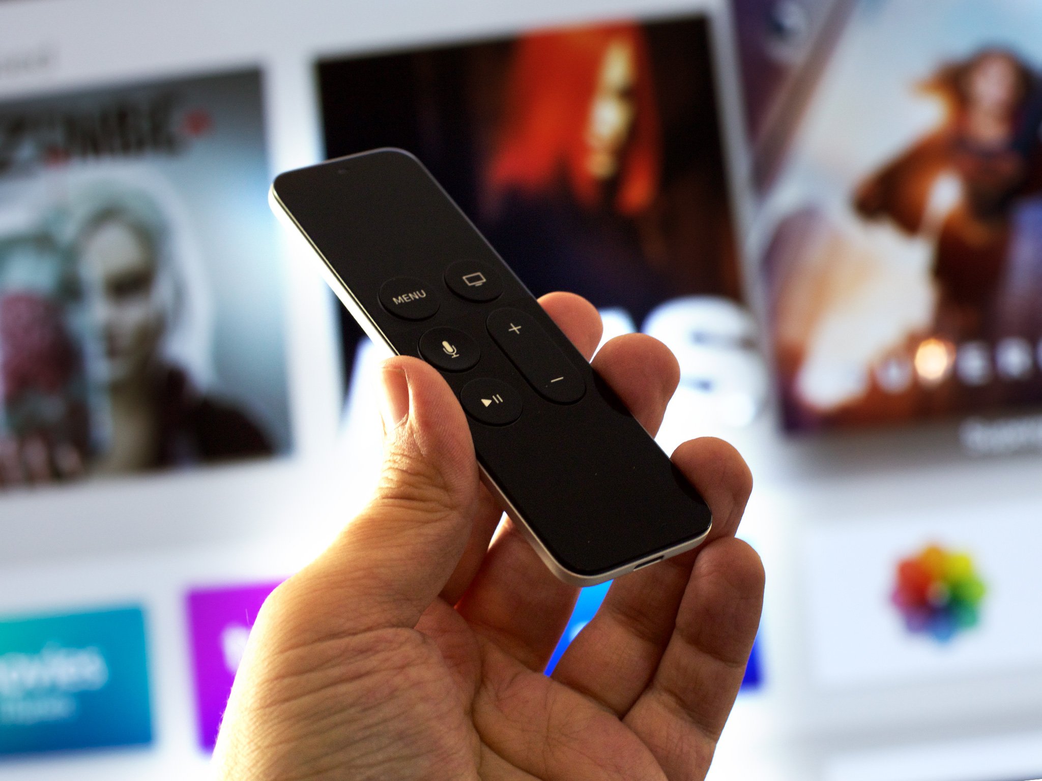
The Siri Remote—still called the Apple TV Remote in regions without Siri support—is a big part of what makes the new Apple TV so "new". It's got a glass touch surface, an accelerometer and gyroscope, Bluetooth connectivity, a rechargeable lithium-ion battery, and as the name betrays: Siri.
The last big Apple TV Remote update took it from stubby white plastic to elegant aluminum. It still had a directional pad at the top, but it put a Select button in the center and moved the Play/Pause button down to join the Menu button below. It was also longer and sleeker, but that's about it.
The Siri Remote is less redesign and more reimagining. Not only bigger again but with the addition of gesture and natural language voice control, it's more functional as well.
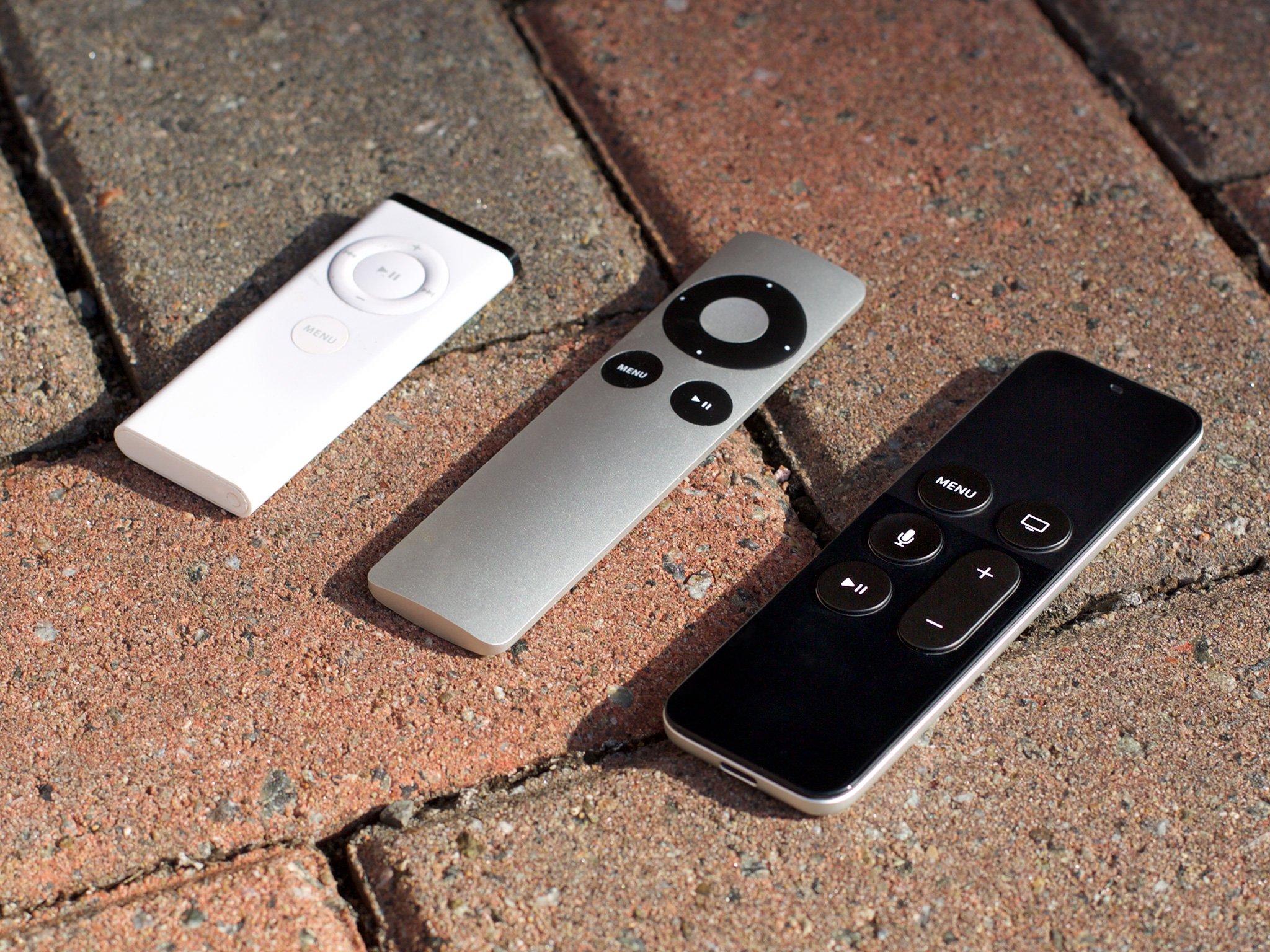
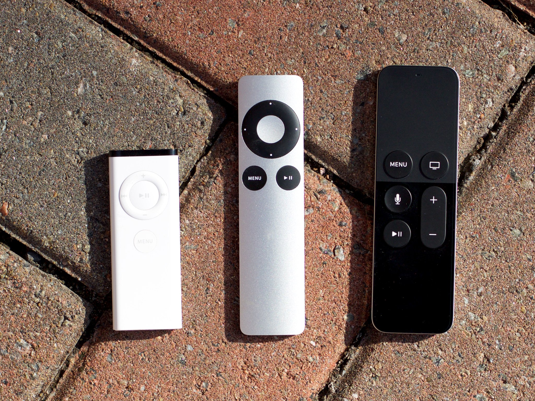
Physically the Siri Remote is easy to hold. The weighting and balance are good, and the buttons are easy to feel and satisfying to click. The top is matte and textured and the bottom shiny and smooth. The Siri button is also slightly more concave then the rest.
The symmetry—which provides room for the glass touch surface—has led some to complain they can't easily differentiate the front from back, and keep picking it up and holding it the wrong way around. Personally, the texture has been enough for me to tell, but I can see how it could cause confusion. (I have that problem with giant slab controllers festooned with dozens of buttons.)
The Siri Remote has a built-in lithium-ion battery. It charges via a Lightning port at the bottom, same as an iPhone, iPad, and all of Apple's new Magic accessories for Mac. You'll only need to recharge the Siri Remote every three months or so, according to Apple, but you can check the charge level at any time in Settings if you're unsure, and plug it in overnight any time you want to top-up.
There's no Touch ID, though people will obviously want it. Touch ID currently requires the secure enclave of a 64-bit A-series chipset, which on the Apple TV is in the box and not in the remote. Transiting security between the two in a way that can't be intercepted, spoofed, or otherwise attacked, would be terrific but would also likely be the definition of non-trivial.
You can still use the old white or aluminum remotes, if you have them handy, and other IR controllers if you train them.
Pairing
You pair the Siri remote over Bluetooth, which again means no line-of-sight is required. As long as you're within range, it just works. You can only pair one Siri Remote to one Apple TV, however. (The separate Siri Remotes sold by Apple are for replacement, not expansion.)
That the Siri Remote doubles as a motion controller something like the Nintendo Wii Remote, and many of us are used to pairing up to four Wii remotes at a time, the limitation feels strange. They're very different controllers, though. The Wii Remote has things like LEDs to show you which player slot it's paired to, and the Siri Remote has a gesture surface and, well, Siri.
All that to say: it's probably more complicated to manage multiple Siri Remotes than it is Wii Remotes, but I'd still love for that functionality to come at some point.
Glass touch surface
At the top of the Siri Remote is the glass touch surface. It feels like the Magic Trackpad but it's designed to sit in your hand and work with your thumb rather than sit on your desk and work with your fingers. It's also black, the color I wish the Magic Trackpad came in.
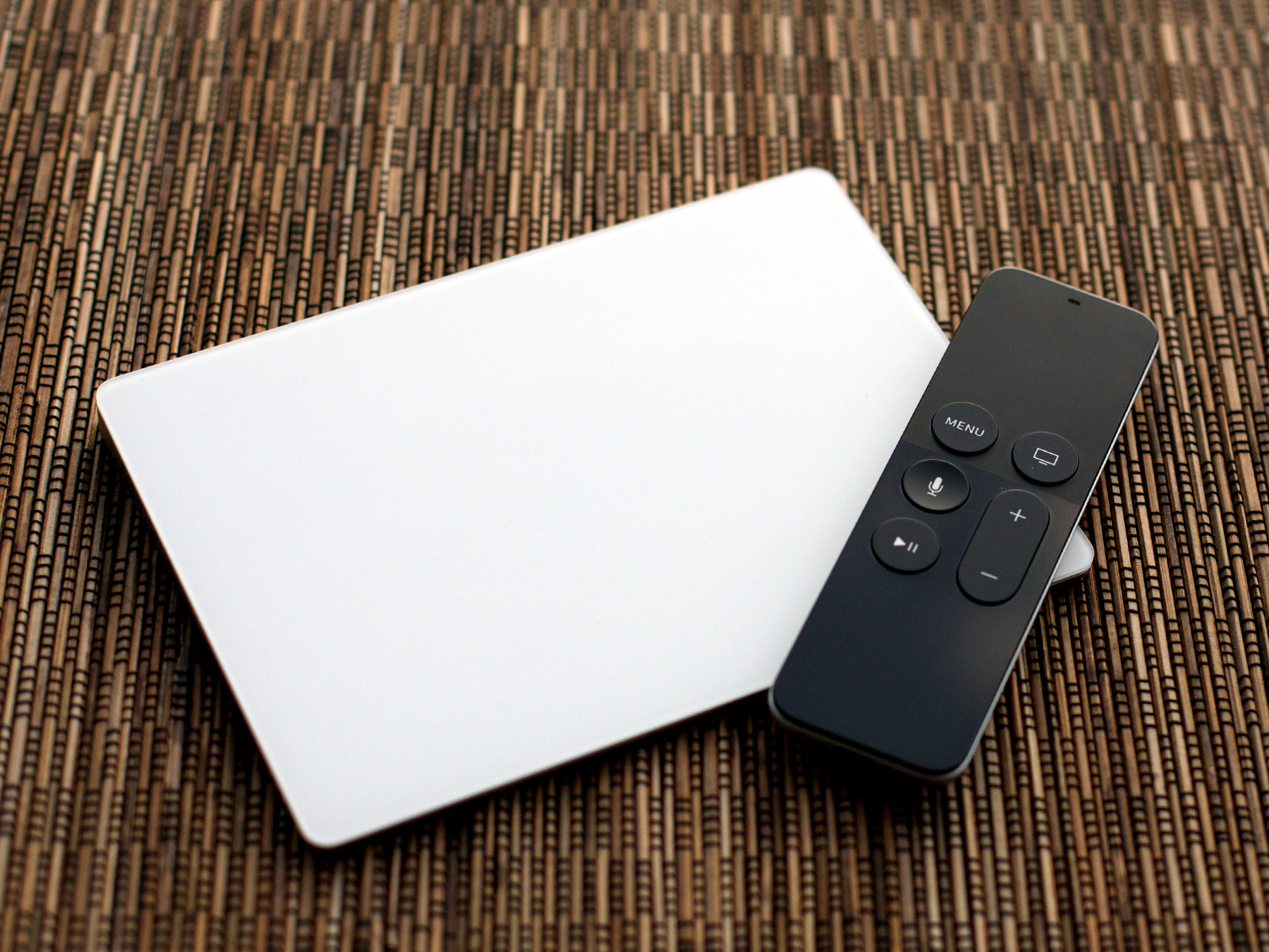
The Siri Remotes controls what's in "focus" on screen (see Focus Engine, below). Swipe up and the selector goes up. Swipe left, right, or down, and the selector goes left, right or down. The Siri Remote can also tell if you're swiping on the edge of the surface, and which edge, though it's up to individual apps or games to implement it if and as they wish.
That might sound like an iOS screen or a Mac trackpad, but interaction model is different than both. You hold the Siri Remote in your hand, like an iPhone, but the manipulation is indirect, like the Mac.
The scrolling is "inertial", so the faster you go, the faster the selector goes. And when you stop, it slows down before coming to a stop. What it doesn't do is use "natural" scrolling like on the iPhone or recent Macs. Instead of pushing the content around beneath the selector, you push the selector around. (The only exception is full-screen media, like photos, which you push around with "natural" scrolling.)
Still, it totally works. There's a "weight" to the selector that, as you start to swipe, gives a little wobbly resistance before letting go. As you go faster, it lets you go faster, ticking along until you stop. The sound design that goes along with it is spectacular as well.
I can't imagine how long it took to get the feeling just right, but Apple's interactivity team deserves immense credit for nailing it so hard.
You can also tap the surface and—because it's a button—you can click. Taps are meant for subtler actions, like revealing on-screen controls or information. Like with swipes, the glass touch surface can detect where you tap—top or bottom, left or right, but that type of positional differentiation won't be needed in the vast majority of apps.
Clicks are meant for purposeful actions, like confirming a selection, launching an app, or triggering something in a game. The click is mechanical, like previous generation trackpads, rather than Force Touch- or 3D Touch-based like recent Macs, the Apple Watch, and the iPhones 6s. It's hinged down from its bottom edge (the middle of the remote), so clicking at the top is the easiest and deepest point.
The Siri Remote can also tell where you clicked as well. For example, clicking on the left can jump you back 10 seconds, clicking on the right forward 10 seconds. Holding down can also rewind or fast forward.
I'd love it if you could hold an edge down and get continuous scrolling in that direction, but even as-is it's a huge improvement over the old Apple Remote's click-step mechanic. It's like going from a directional pad to an analog thumbstick in a game. Suddenly the world isn't binary any more, and the rhythm and force you put behind your actions manifest in the Apple TV's reactions.
Menu, Home, Play/Pause, and Volume buttons
The middle section of the Siri Remote contains a grid of buttons. Menu and Play/Pause remain from the previous generations of remotes and are joined now by Home and by a volume rocker.
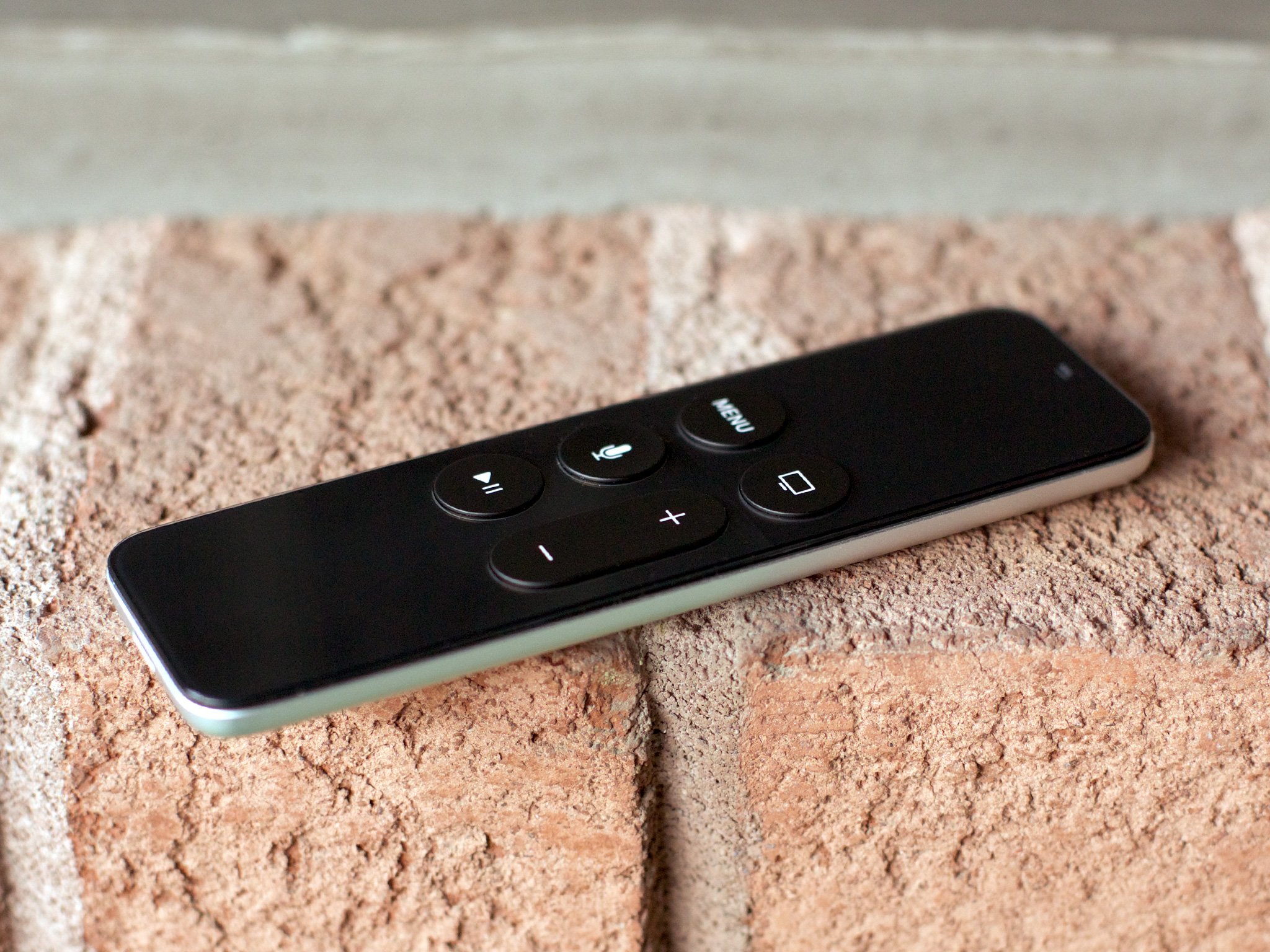
The Menu button and Home button are at the top, embedded in the glass touch surface. Menu is simply labeled "MENU" but Home shows an icon of a TV set. It's... odd. Typesetting both would have been more visually consistent. Making Home an unfilled roundrect would have been more stylistically consistent, given that's what the iPhone and iPad used for years.
Positioning the Home button at top right is also inconsistent with iOS devices, where it's always been bottom center. Apple no doubt had reasons for the positioning, but putting it bottom center would also have made the Siri Remote vertically asymmetrical, and perhaps less confusing for some.
Clicking Menu takes you back to the previous screen, just like it did on older versions of the Apple TV. If you're already on the top-most screen, clicking Menu takes you to the new screen savers. Which are gorgeous. Triple clicking Menu, if enabled, toggles the accessibility shortcut.
Clicking Home takes you immediately back to the Home screen, just like holding down Menu did on previous versions of the Apple TV. Double clicking it opens the fast app switcher, just like on iPhone and iPad. Originally, I found myself wishing Home worked like the Apple Watch, where it would switch back and forth between the Home screen and the now playing screen (instead of the clock face). Now I find myself simply using the fast app switcher.
On the old Apple TVs there was no sense of state, so if you did go "Home" and then wanted to go back, you'd have to click all the way down through the navigation stack again. Now, when you re-launch an app, state is preserved, so you go right back to where you left off. It's so much better.
The Play/Pause button is bottom left and still does exactly what its name and icon suggest, except in games where it's remapped to trigger secondary actions.
The volume rocker is elongated for both volume up and down. It let you control the audio level of most TVs and amplifiers. Volume has been a long-standing request for the remote, so it's great to see Apple deliver on it.
Siri button
Siri is Apple's virtual personal assistant previously found on iPhone, iPad, and Apple Watch. Activating Siri on Apple TV is different than any of those devices, though. Instead of saying "Hey Siri!" like you do on the latest generation iOS devices, or holding the Home button for a couple of seconds and then releasing like you do on older Siri-enabled iOS devices, you press the dedicated Siri button and hold it down until you've finished speaking.
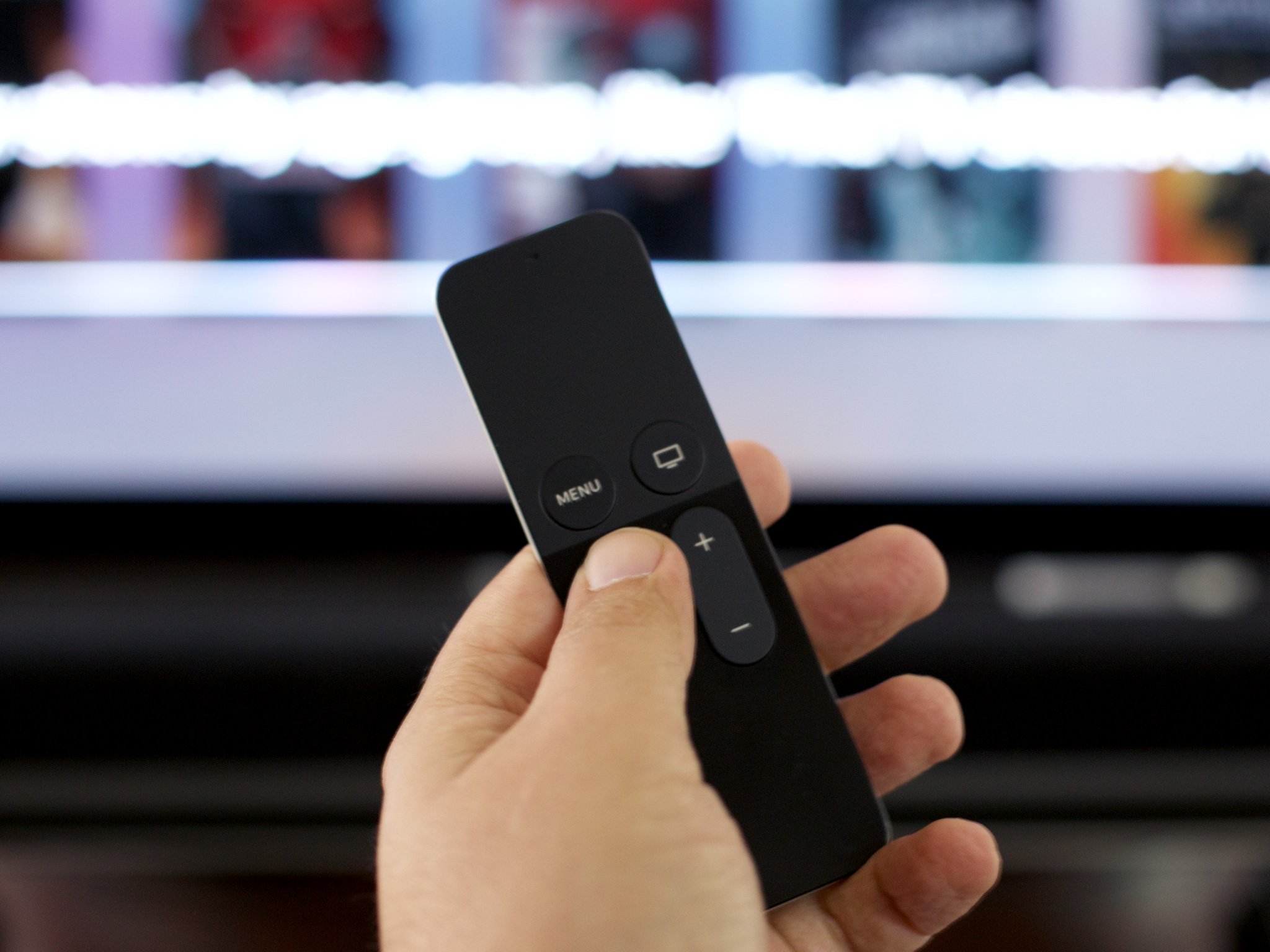
I'm typically of the "consistency is a user-facing feature" mindset, though the way Siri is implemented on Apple TV has some advantages. Having to push a button eliminates any concern over a live mic "always listening" in a living, meeting, or classroom, which is great for privacy. It also eliminates the chance of unwanted activation—accidental or malicious—and holding it down removes any delay or guesswork about the beginning and end point of activation.
Still, because it's inconsistent it creates some cognitive overhead. At first I kept pressing and releasing, then talking, like the iPhone had trained me to do. Then I started talking too early, because I assumed activation was instant on hold-down. Then I started holding the Home button down on my iPad, because the Apple TV had re-trained me. The human brain is remarkably elastic, though, and after a day or so I got over it.
That's in stark contrast to the lack of consistency within the Siri implementation itself. (See below.)
Accelerometer and gyroscope
The other new control system enabled by the Siri Remote is motion-based. It works off of a built-in accelerometer, which records changes in speed and direction, and a gyroscope, which measures movement in six axes and rotation around gravity.
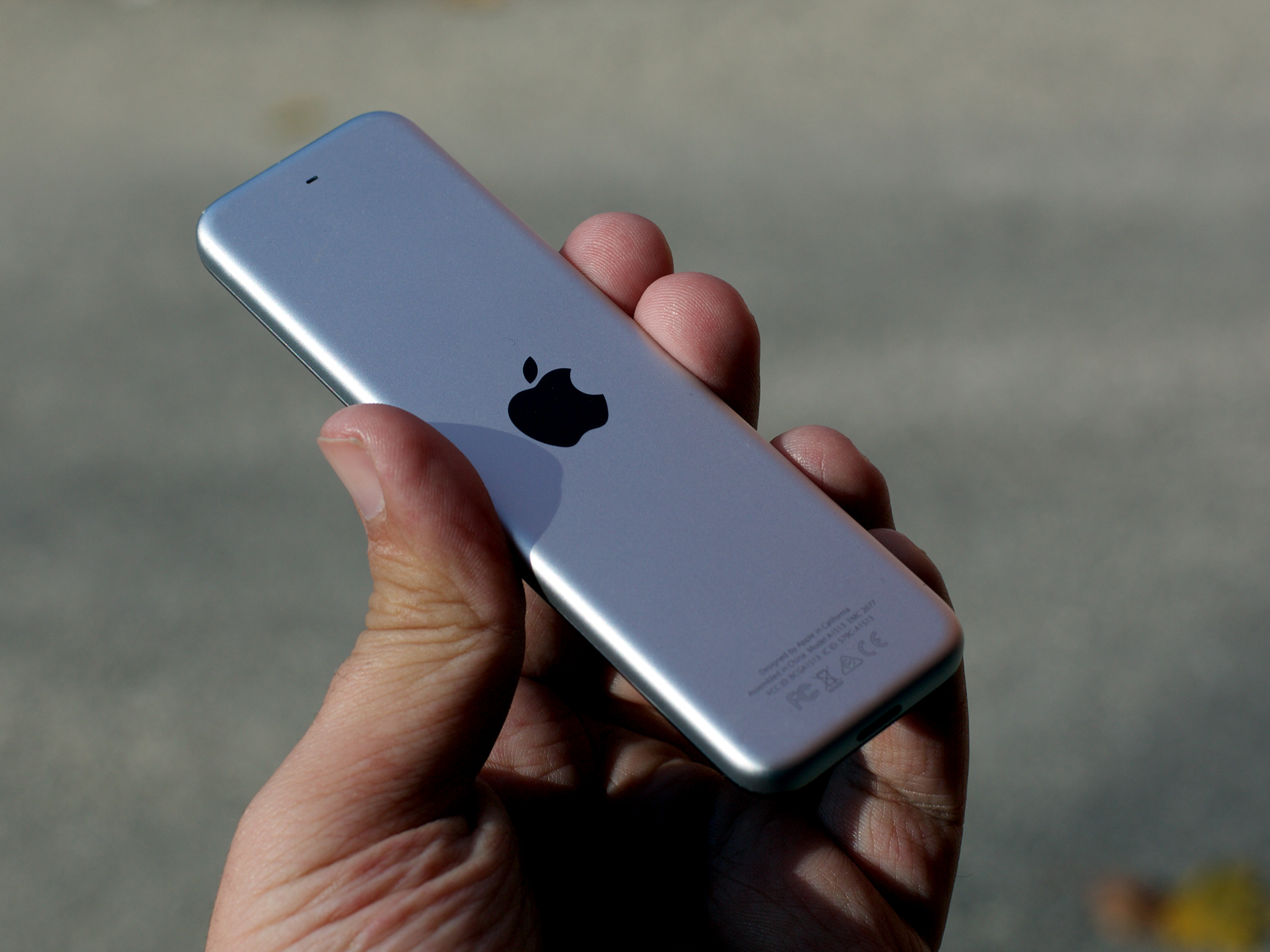
The accelerometer and gyroscope work in the Siri Remote just like they've been working in the iPhone for years now. Positional change information is reflected on the TV across the room, though, rather than the screen in your hand.
Motion control isn't currently used for the general purpose navigation—which would be interesting—but it is used for gaming. Turn the Siri Remote sideways, clasp it on either end, and you can steer a car or pilot a starship. It feels like something in between iPhone motion gaming and Nintendo Wii gaming.
It's up to individual apps and games to implement the controls, so it's another area where consistency can vary. Overall, though, the hardware is solid and the potential is beyond exciting.
Now, where's my lightsaber fighter?
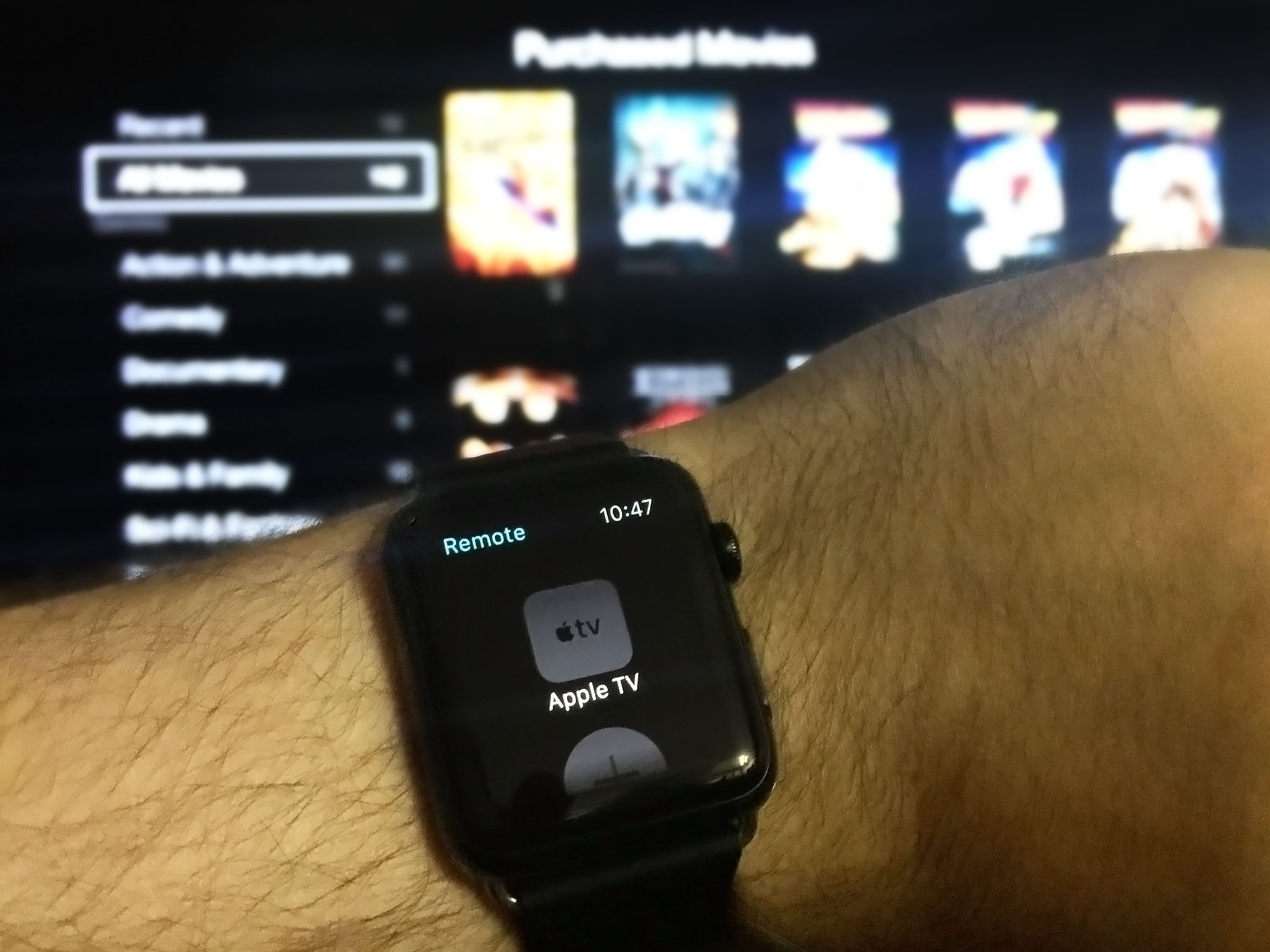
Remote app [Updated]
Update: tvOS 9.1 shipped with support for the existing Apple TV Remote app allowing basic navigation and text/password entry.
The new Apple TV shipped without a new version of the Remote app to support it. Available on the App Store for the previous generations of Apple TV, it made entering text for searches and passwords much, much easier. The built-in Apple Watch version also made reaching for a physical remote an option rather than a necessity. So, is Apple using the Siri Remote as an excuse to ditch the Remote app, or is it simply taking longer than expected to update the Remote app, nail the same gesture responsiveness, and handle Siri? Hopefully the latter.
Apple TV Accessories
Though the Apple TV has a USB-C port, it replaces the old microUSB port and remains for diagnostic and developer use only. So, anyone dreaming of external storage or peripherals that would transform the Apple TV into the iOS version of a Mac mini need to, sadly, keep dreaming.
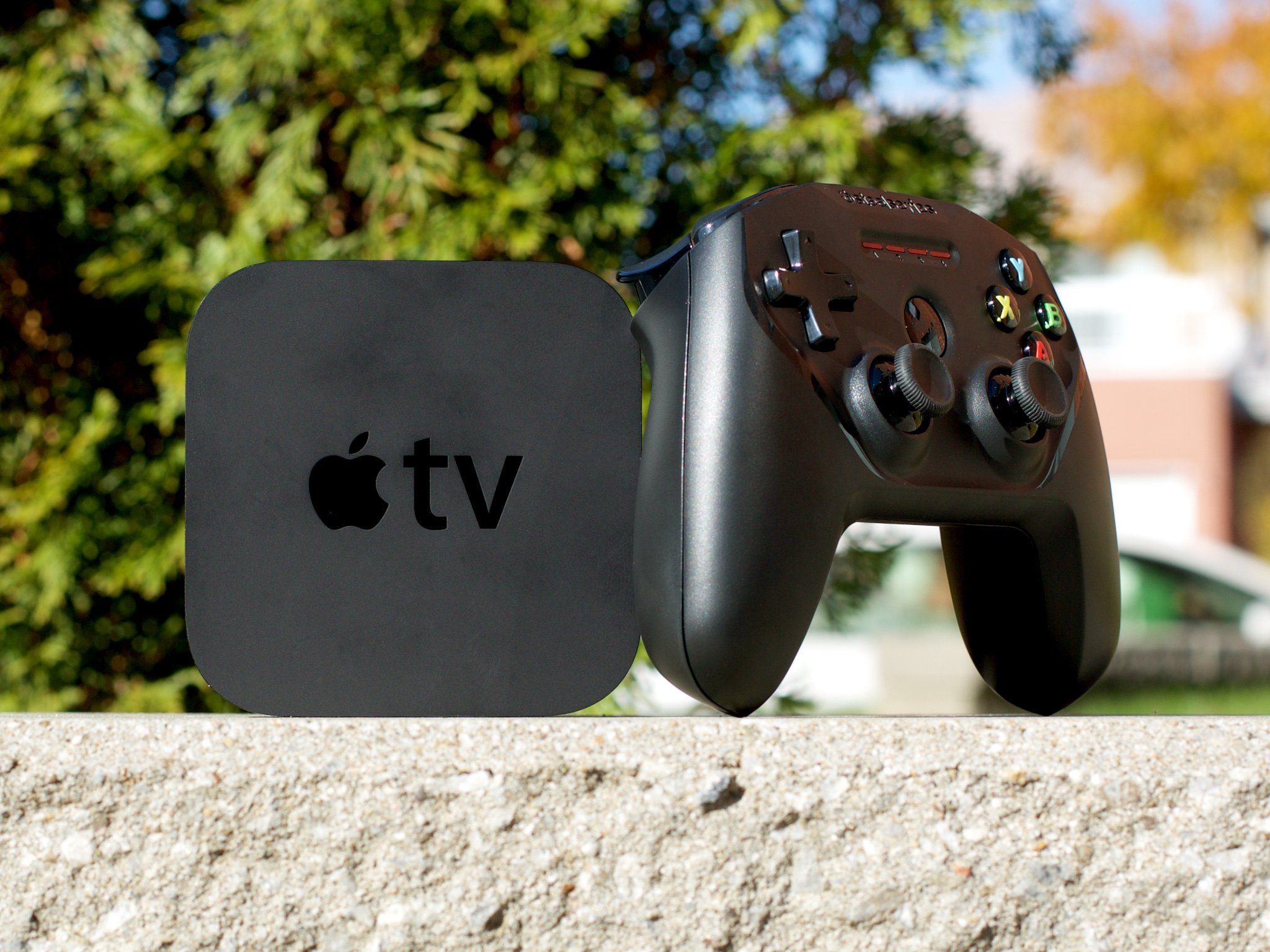
You can, however, use Bluetooth to pair with game controllers and headphones, and there's even a Remote Loop that plugs right into the Lightning port on the Siri Remote.
MFi game controllers
Made for iOS (MFi) game controllers debuted a couple of years ago for iPhone and iPad and were... uninspired. Since you can only pair one Siri Remote with an Apple TV, and the living room demands multiplayer gaming, Apple is extending that with MFi controllers. And ones that are actually good.

Sadly, while MFi game controllers let you go beyond the single Siri Remote limitation, they come with a limitation all their own—you can only pair two of them at a time. In a world where most gamers are used to four controllers on a TV box, it's frustrating.
You can work around it with a combination of the Siri Remote, MFi controllers, and iOS devices for controllers (if the game you want to play adds support for them), but it's just that—a workaround. When everyone is playing the same game, you really want everyone using the same type of controller.
To be clear, a lot of this has to do with Bluetooth being terrible, and Bluetooth connections being incredibly fragile. While people often complain when Apple deploys a proprietary protocol rather than a standard, bad standards don't help anyone either. So, Apple is being conservative here, limiting the amount of connected devices so that those devices have the highest chance possible of remaining connected and working.

Apple also initially made it seem like games could be developed exclusively for MFi controllers, which would allow for more console-style experiences. Later, however, Apple said that all games had to support the Siri Remote as well. That means developers now have to either constrain their games to a subset of controls that work on both, or create two sets of controls for the two very different controllers.
The upside is that no one has to worry about buying a game only to find out it won't work with the Siri Remote that, unlike an MFi controller, came bundled with their Apple TV. Apple could likely solve the same problem by requiring an MFi game controller be connected to the Apple TV before MFI-only games could be purchased. It would make for a more complex and potentially confusing experience, but it would also allow for more "gamey" games.
MFi controllers support a Menu button so you can still navigate the entire Apple TV interface. They also support a directional pad, left and right thumbsticks, A, B, X, and Y buttons—which map to select, menu, play/pause, and nothing, respectively—as well as left and right shoulder buttons and left and right trigger buttons.
Once you've paired them, which you can do quickly and easily in Settings, MFi Controllers like the Steel Series Nimbus work really, really well. They elevate some games, which were good on iOS, to great on the Apple TV. That's especially true for platform games and, I'm hoping, a while slew of fighting games to come.
Speaking of which, count me among those hoping in vain for Nintendo to start making MFi + bundled games. The hardware everyone cares about is the hardware we hold in our hands and everything from classic Nintendo to Sega to Atari controllers with games to match could end up being as cool as they are profitable.
There's already a Bluetooth "Live" controller for Guitar Hero, which is exempt from the requirement for Siri Remote support, and BT accessories for Skylanders and Disney, so it certainly seems there's room for companies to get creative here. Which, again, is exciting.
Bluetooth headphones
The new Apple TV can also be paired with Bluetooth headphones, the same type you use with iPhone, iPad, and Apple Watch.
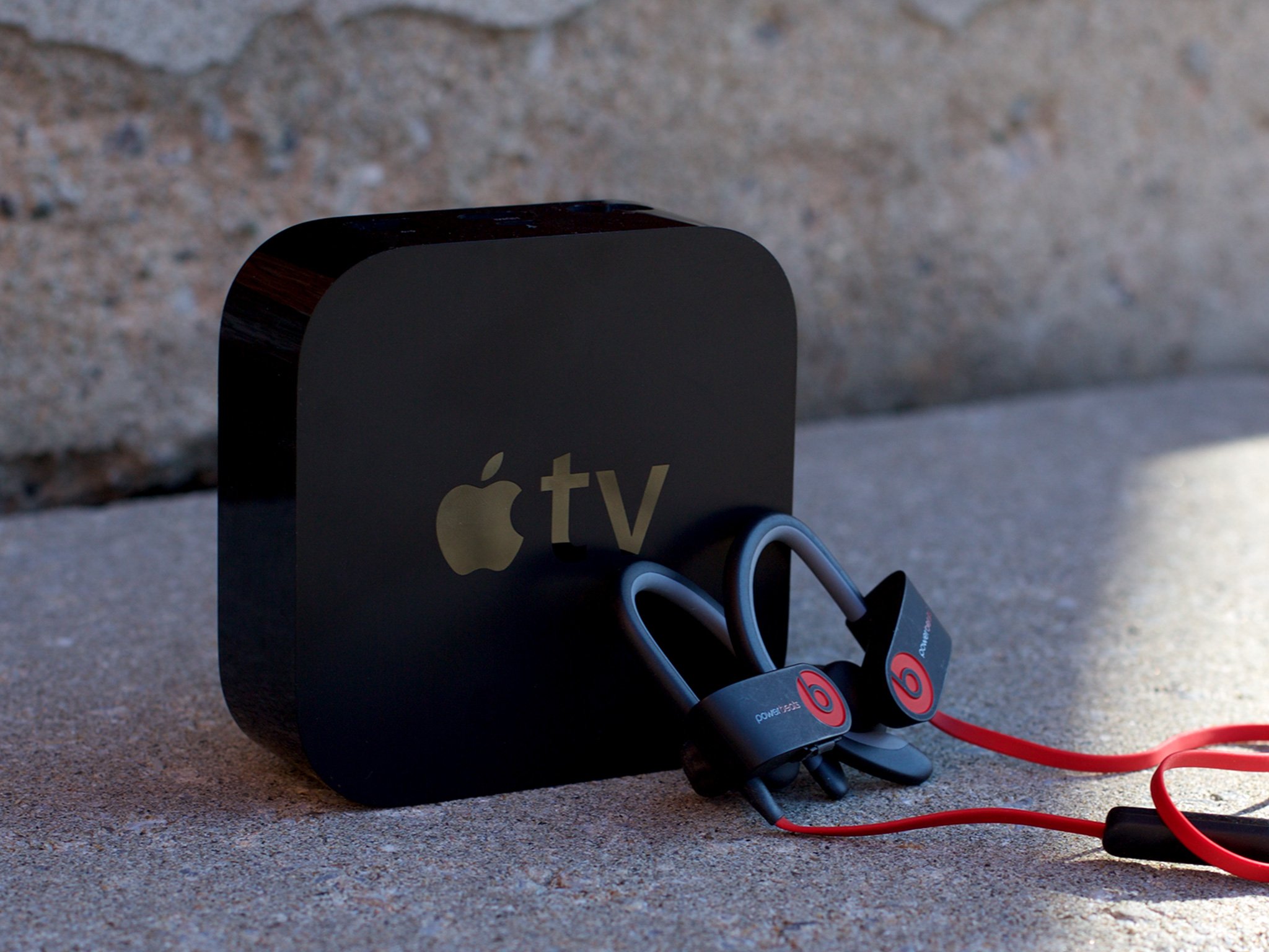
It's great if you want to watch TV without disturbing—or being disturbed by—anyone else in the room. What's not so great is—you guessed it—the pairing limitations. You can only pair one set of Bluetooth headphones, so if more than one person wants to listen that way—like multiple kids—you're out of luck. Also, if you pair a set of Bluetooth headphones, you can only pair one MFi game controller. Again, Bluetooth is terrible.
What you can do right now, though, is pair Bluetooth hearing aids, which is terrific for those with audio accessibility needs.
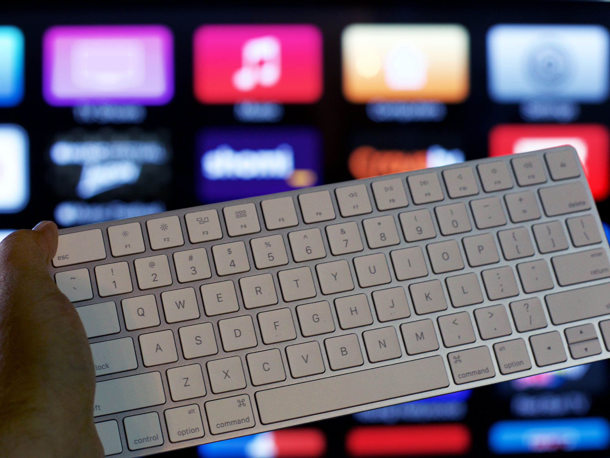
Bluetooth keyboard support?
While the new Apple TV gained Bluetooth controllers and headphones, it lost Bluetooth keyboards. Only a low single digit percentage of people ever used keyboards—rumor has it, mostly developers—so few will miss it. Like optical audio out, though, those who did use it will miss it a lot. It'll be interesting to see if Apple adds BT keyboard support back or if the company, politely, pushes people who want keyboards towards the Mac Mini.
Remote Loop
Because the Siri Remote can also be used for gaming, and that gaming can become frenetic, Apple has made an optional Remote Loop that goes around your wrist and then attaches to the Lightning port. And, once attached, two hooks make sure the it stays that way.
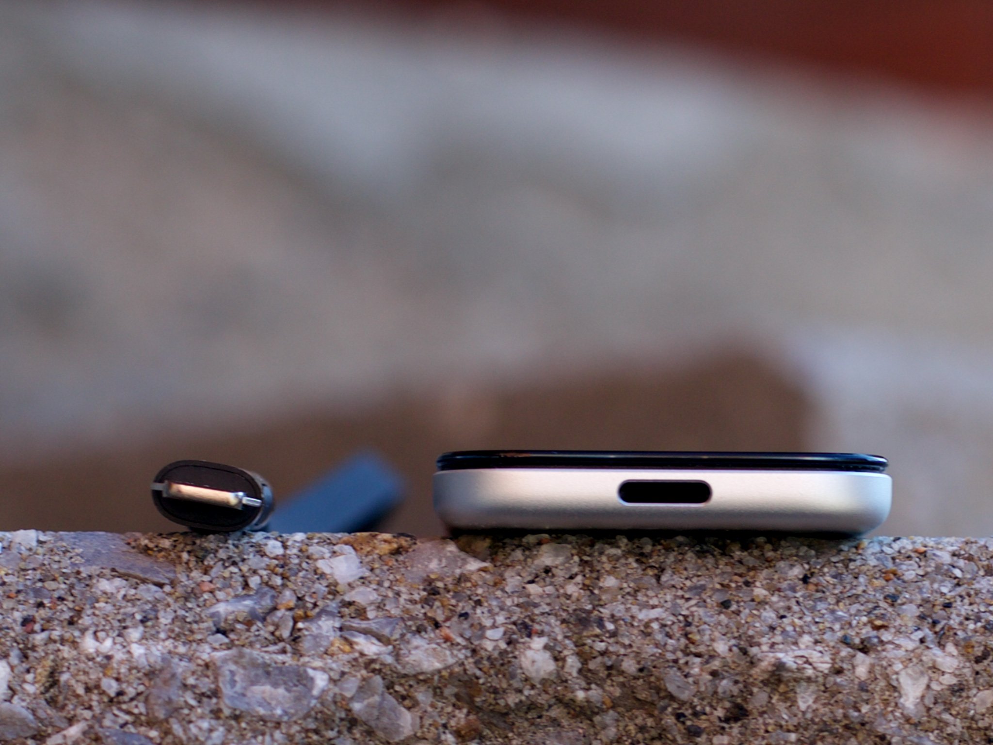

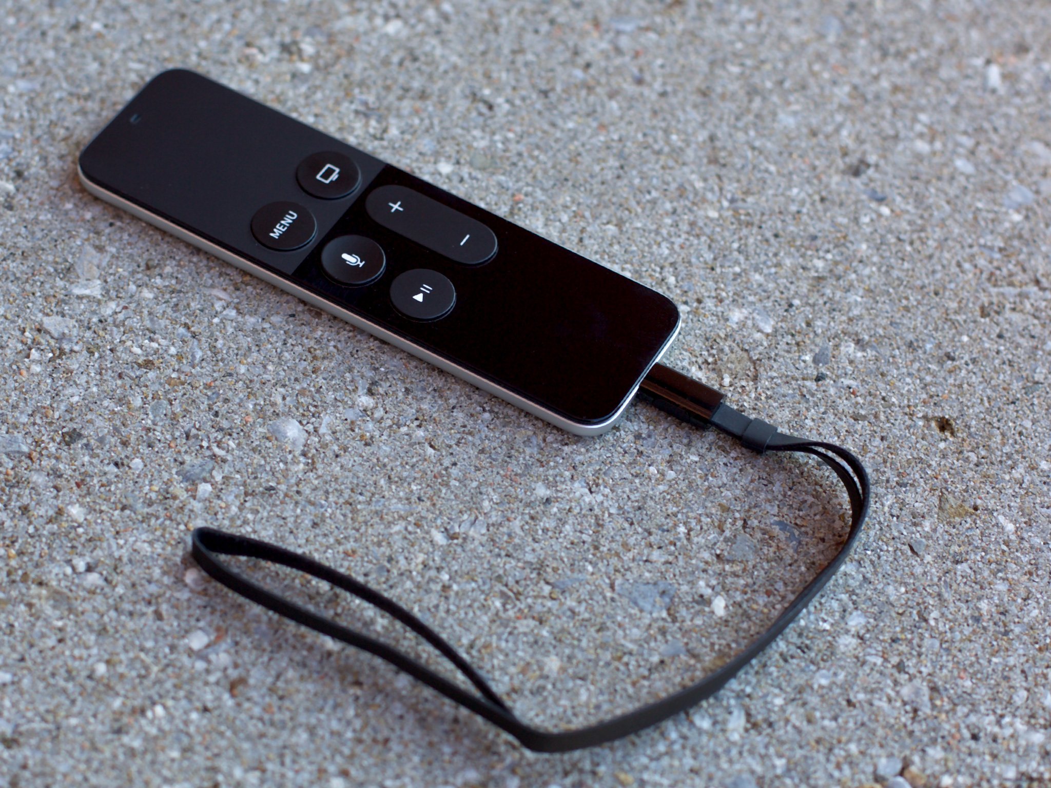
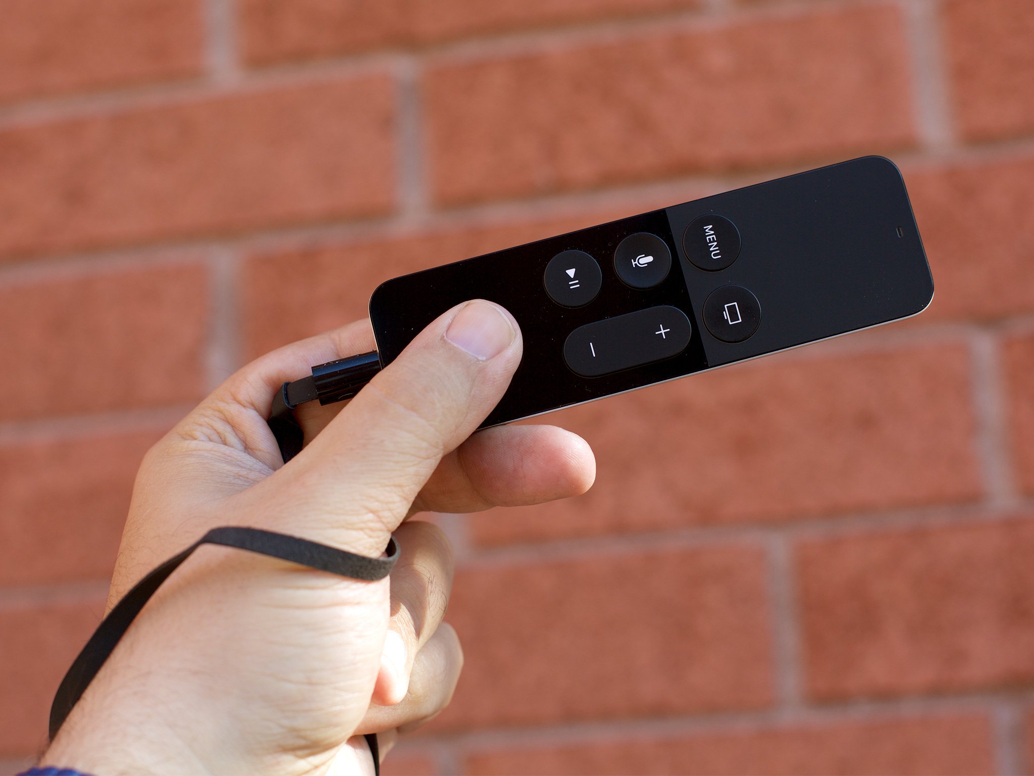
Obviously, you can't charge with the Remote Loop attached. To disconnect, you press the two buttons on the side of the loop's plug-in base and pull.
Apple TV and tvOS
The new Apple TV runs tvOS. Like watchOS, it has iOS as its foundation, but swaps the familiar iPhone and iPad interface layer for something that's better suited to the display size, distance, and interactivity requirements of a big screen TV across the room being controlled by remote.
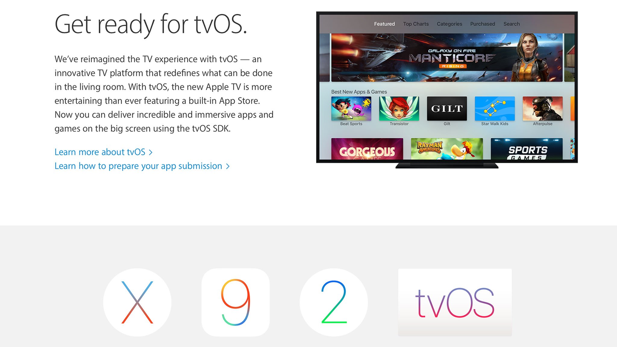
The original Apple TV from 2007 ran a "lobotomized" version of OS X 10.5 Tiger with a take on the Mac media center of the time, Front Row, as its primary interface. In 2010 the Apple TV switched to running a version of iOS, though the interface paradigm didn't change much. Neither did the app situation. Despite it's new underpinnings, no public software development kit (SDK) was made available, just television markup language (TVML) templates for a very few partners to make "channel" style apps.
Now all of that has changed. Still based on iOS, tvOS not only evolves the interface but, more importantly, brings that public SDK and finally makes Apple TV a full-on platform with full-on apps.
Where the iPhone and iPad have a single window and interface manager called "springboard", and the Apple Watch has "carousel", tvOS splits those duties between "pineboard" and "headboard". Beneath that, though, it's still iOS all the way down. That's why the first version of tvOS isn't 1.x but 9.x—it's based on iOS 9.x.
Set up
Setting up the Apple TV can either be okay or maddening. I've set it up almost a dozen times and it's been fine almost every time. The only exception was when I chose manual set up so I could experience and write about it. That was time consuming and tedious, but most people won't have to endure it.
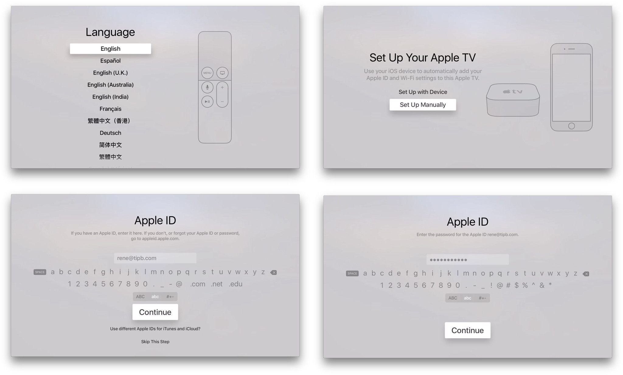
For those who have an iOS device and who subscribe to services like Netflix through iTunes, set up is simple and straight forward. You bring your iPhone or iPad close to your Apple TV, choose the automatic option, enter your Apple ID password on your iOS device—or your iCloud and iTunes passwords if they're different—and, later, restore purchases when you download apps.
You will have to use the Siri Remote to enter your iTunes password at least once, but you can choose to have your Apple TV remember it in perpetuity. If you can't or don't want to do that, or if you also want to enable Home Sharing or Game Center, or if something goes wrong and it keeps asking, or if you have multiple other accounts you want or need to log into... Well, that's when it starts to become maddening.
It's especially maddening because, as part of the automatic set up, password entry is handled on your iPhone or iPad instead of your Apple TV. Forget Bluetooth keyboard support, forget updating the Apple Remote app, that's all I really need for any and all Apple ID-owned password requests: Pop them up on the iPhone, iPod touch, or iPad and let me type them in there.
Perhaps the security model is more complicated post-setup but that's the kind of problem Apple excels at fixing. As it stands right now, entering passwords on the Apple TV is so onerous that it ruins the out-of-the-box experience. And that's a shame for Apple TV, because everything else about it is terrific.
Focus engine
The change from the old Apple TV interface to the new isn't as drastic as the change from iOS 6 to iOS 7. It's more like the change from OS X Mavericks to OS X Yosemite. It keeps the same structure while evolving to match the new design language. What's interesting is how the navigation model has evolved along with it—into something Apple calls the "focus engine".
Just like before, you use the remote to move up and down, left and right, from interface element to interface element. Whatever you're on at the time is in "focus". The difference with the new Apple TV is that whatever is in focus is much easier to see.
App icons, album artwork, movie posters, and other elements get bigger. What's more, if you move your move your thumb or finger idly on the Siri Remote's glass touch surface, the icon or artwork or poster will track your movement. The elements are meant to be composed of layers so they appear to have depth. They move in parallax and tvOS even renders a sheen on them to catch your eye.
If you stop using your Apple TV for a while, the rest of the screen will darken but what's in focus will stay spotlit, making it easier for you to visually re-acquire.
If developers use the standard interface frameworks (UIKit), they get all of this behavior "for free". If they build something custom, Apple stresses that they should still follow the core concepts of the focus engine anyway. Because, as Apple's Human Interface Guidelines for the Apple TV so eloquently state: "People tend to be unaware of an app's navigation until it doesn't meet their expectations."
Home screen
Like on the iPhone or iPad, the home screen on the Apple TV isn't meant as a destination but as a gateway to apps. Before, that meant Apple's apps and those of a select few partner services. Now, it means any and all of the apps available on the Apple TV App Store as well.
Structurally, the home screen layout is unchanged. The top shelf is still on the top. Below it is the top row. The top shelf exposes content from any app in the top row. Because App Store apps can now be in the top row, however, the way in which content can be exposed has evolved.
Now, at its simplest, the top shelf can contain a full-width static image. The static image can't be selected and doesn't offer any additional functionality, but it can help convey a sense of the app or game's brand and visual identity.
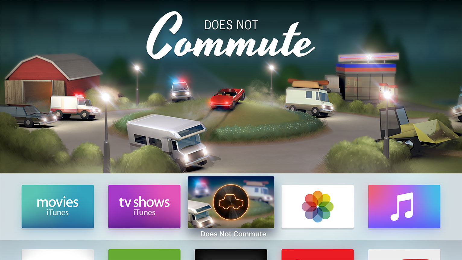
Dynamic content is where the top shelf shines. Dynamic content can be selected, and so it turns the top shelf into a shortcut that can be used to resume content, jump immediately to new or bookmarked content, or even offer personalized recommendations. It's similar to 3D Touch Home screen options on iPhone 6s, but instead of going straight to the selfie in Camera, for example, you go straight to Age of Ultron in iTunes Movies. Netflix, similarly, could highlight trending content, and the App Store, featured apps.
There are two types of dynamic content. First is sectioned row content, which is ideal for showing thumbnails for things like movie or TV show posters. The thumbnails can be for posters (2:3), albums/squares (1:1), or HDTV frames (16:9), or a mix of any or all three. There just have to be enough to fill the shelf. iTunes Movies and iTunes TV Shows use sectioned row content to great effect.
Second is a scrolling inset banner, which is almost full-width and can contain three or more images. The App Store app, for example, uses scrolling inset banners to highlight featured apps. An exercise app could use it to highlight new routines, a cooking app, new recipes, and so on.

Because dynamic content is functional, where static is not, it makes sense to load up your top row with apps that take full advantage of the top shelf.
Siri
With Siri, you can not only ask questions but issue voice commands and, thanks to contextual awareness and sequential inference, you can do so using natural, almost conversational language. Because Siri's been programmed with a personality—there can be the occasional wit and even snark—it typically makes for not just a powerful experience but an enjoyable and engaging one as well.
That said, it's best not to think of Siri on the Apple TV as equivalent to Siri on the iPhone and iPad. While it works in a similar way, it's not yet available in as many regions and it doesn't do anywhere nearly as many things.
Siri for Apple TV is currently available in far fewer than the 26 countries that currently enjoy support on iOS.
- Australia (English)
- Canada (English)
- France (French)
- Germany (German)
- Japan (Japanese)
- Spain (Spanish)
- United Kingdom (English)
- United States (English)
What Siri on Apple TV can do is far less than iOS as well.
- Search and control iTunes movies and TV
- Toggle closed captioning and subtitles
- Launch apps
- Check the weather
- Check sports scores and stats
- Check stocks and the markets
Siri can also find and play content from a few partner services, but the vast majority of those are U.S.-only.
- Netflix (Australia, Canada, France, Germany, U.K., U.S.)
- Hulu (U.S.)
- Showtime + Showtime Anytime (U.S.)
- HBO Go + HBO Now (U.S.)
Some of the limitations are understandable. Searching for content the way Siri does on the Apple TV—by title, genre, director, actor, rating, etc.—requires a lot of backend work to make sure the names of titles, cast, and crew are all accurate recognized. That's especially challenging where multiple languages are involved, for example someone in Germany searching for a U.S. movie title in English. Siri has to realize the switch is taking place and correctly parse the command from the content.
Handling Siri search for local libraries through home sharing, for example, would be similarly challenging given how widely the quality and quantity of metadata can vary in local collections. Sometimes on an item-by-item bases.
An application programming interface (API) for Siri could solve some of that, since each app could offer up its own index and register its own command set. Apple hasn't yet shipped anything like that for iOS, though. The chance for collision between apps and the scalability of the results pages would have to be taken into account at the very least.

Also and obviously, Siri can't be used to do anything that requires an app or service unavailable on the Apple TV. For example, placing calls, sending messages, finding locations, handling appointments, performing calculations, or searching the Web, Wikipedia, and Wolfram Alpha.
Update: tvOS 9.1 shipped with Siri support for Apple Music.
Other limitations are more disappointing. For example, Siri support for Apple Music is only rolling out in early 2016 and there's still no word on Siri support for HomeKit. No team has unlimited resources, of course, but these are Apple service and they've been up and running on iOS for months, so it would have been great to see them on Apple TV at launch.
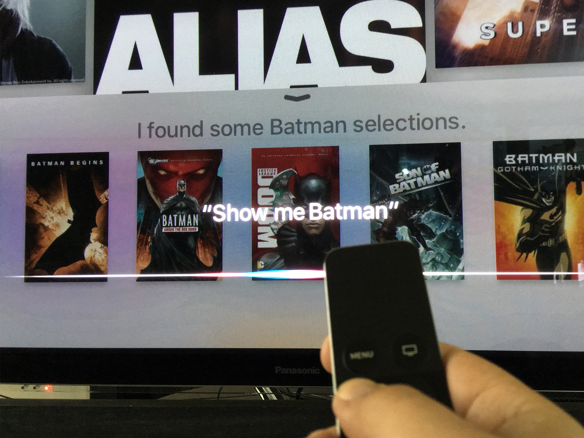
What does work, however, works really, really well. Content search and control is especially impressive. You can search by genre, title, actor or director name, for popular titles, and more. You can also filter and narrow down the criteria as you go. "Show me Batman" will give you a list of all the movies featuring the Dark Knight Detective. "Only the animated ones" will strip out the live action films. "Only the G-rated ones" will make sure they're kid friendly. (Only the Lego Movie remains. Ugh, Warners.)
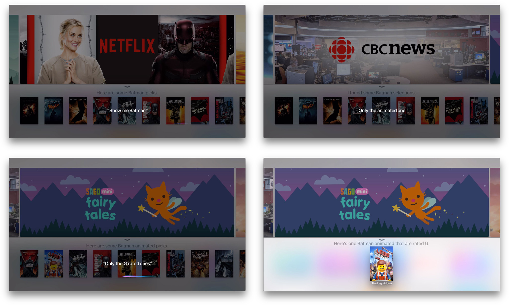
Start with action movies, then just the good ones, then just the ones rater R... For television shows you can even search for episodes with a popular guest star. All positively top notch.
Because Siri is parsed server-side, Apple can update and change things around at any time. That means results can vary as well. For example, a during the first few days searching for "Nashville" resulted in nothing but confusion. "Show Nashville", however, worked fine. A couple of days later, "Nashville", "show Nashville", and "find Nashville" all worked fine.
When you narrow it down to just one show or movie, the results page will show you any partner service that offers it as well. Priority is placed on what you already own or are subscribed to. So, for example, if you own Batman Begins on iTunes, that'll be first, then Netflix if you subscribe. If you don't own it in iTunes, Netflix will be first, because free. Even if you don't subscribe to Netflix, and what you want to watch is on Netflix, it'll still be shown to you in case you want to subscribe just to see it. It's really, really clever.

So is the control. You can tell Siri to skip around pretty much any way and any length you want. You can also ask Siri "what did s/he say?". That'll cause Siri to jump back and temporarily enable closed captions. So, you not only hear and see what you missed, you hear and see what you missed asking for what you missed. Genius.
Caching
Standard caching is used for content. So, as long as you have lots of space left on your Apple TV, videos will tend to stay around after you stream them. That way you can re-watch them without having to re-download them all over again. When you download new videos, though, the oldest ones get flushed from cache to make room.
That's how "nearline" works—it keeps recent and frequently accessed content immediately available on fast local storage, and offloads older and infrequently accessed content on cloud storage, a click and a download away. It's what makes the 64 GB Apple TV a good deal for people with slow or low internet access. The extra space means extra cache, so there's less pressure on your bandwidth cap.
Beyond standard cache, though, Apple's doing something even more intelligent for apps and games.
On-demand resources
See an app or game you want. Click to download. Get a popup saying you're out of storage and need to delete some stuff before you can try downloading again. That happens on other devices, including iPhones and iPad, but no one should ever have to deal with that on a TV. Nor should anyone have to wait while a multi-gigabyte game downloads or updates before they can play. Those are the guiding principles behind one of the most important new features in iOS and tvOS this year: on-demand resources (ODR).
ODR is part of app thinning, a technology that also includes asset slicing, which removes parts of a binary not necessary to the device for which it's being downloaded, and bitcode, which allows for compiler and chipset optimizations now and into the future.
Since Apple TV apps are distinct binaries—not "universal apps" like on iOS where one binary can run on both iPhone and iPad—no asset slicing is required. They're essentially "pre-sliced". On-demand resources, however, is foundational to way Apple TV works.
ODR requires that developers break up their app binaries into smaller bundles. Everything is then stored on Apple's iCloud servers, and only the specific parts you need are downloaded and only when you actually need them.
Bundles are composed of assets grouped together using tags. Main bundles, which are downloaded when someone gets or buys an app, are limited to 200 MB. That includes everything needed to launch and start using the app. Once you launch the app or game, it can immediately start downloading up to an additional 2 GB in bundles—anything the developer thinks you'll need imminently.
Developers can mark those bundles as initial or prefetch. Initial bundles are vital need to be fully downloaded before the app can launch. Prefetch are additional and will download in the background so the bundle doesn't prevent the app from launching.
From then on, even more bundles can be downloaded as and when needed, with older bundles that you no longer need getting purged to make space.
For security reasons, additional bundles can't contain any executable code. They can contain data files, images, shaders, particles, scenes, texture atlases, and image stacks. In total, including all bundles, an app can be 20 GB on iCloud, and if you have the space available, 20 GB on your local Apple TV as well.
If you don't have the space, though, you'll just keep the parts you're actually using. For example, if you download a new game, you'll get the 200 MB that include the game's code and everything else you need to launch it. If that 200 MB was enough to contain everything you need to start playing, great. If not, your Apple TV can start downloading up to 20 GB of additional data immediately, including assets for the first few levels, introductory videos, tutorials, and more.
Once you go through the introductory video, finish the tutorials, and start playing, your Apple TV will begin downloading the assets for additional levels, including graphics, cut scenes, additional tutorials, and more. If you have tons of space, it'll just keep downloading. If you start to run low on space, however, your Apple TV will delete the introductory video since you probably won't watch it again, and delete the assets for levels 1 and 2 to make room for levels 5 and 6, since you probably won't go back and play them again.
Likewise, if you haven't used an app for a month, go to download a new app, and start running out of space, your Apple TV will delete the contents of the old app to make room for the new one. If you do decide to launch the old app again, your Apple TV will simply re-download it.
There are some drawbacks. For example, the kind of massive games found on consoles and PCs are more difficult on Apple TV, at least for now. (That's why consoles and PCs have equally massive drives inside them.) If developers want to go beyond the 20 GB iCloud storage limit for their games, they'll have to store additional assets on their own servers. That's probably not a big hurdle for big studios, but it is a hurdle.
It's also a lot of additional work for developers. Hopefully the big gaming engines like Unity and Unreal can eventually handle some of the support on their end, making things easier for individual developers.
Overall, though, I love the idea of ODR. It's an intelligent system that does a lot of work behind the scenes so that we, the humans, don't have to do as much work in front of them. And that's what the future of computing, living room and mobile, needs to be.
Apple TV Built-in Apps
Built-in apps serve a dual purpose. For an device, they provide a base level of functionality so that, out of the box, customers can do everything you really need to do. For a platform, they also provide a base level of reference so that, in the early days, developers can expand on everything you really want do.
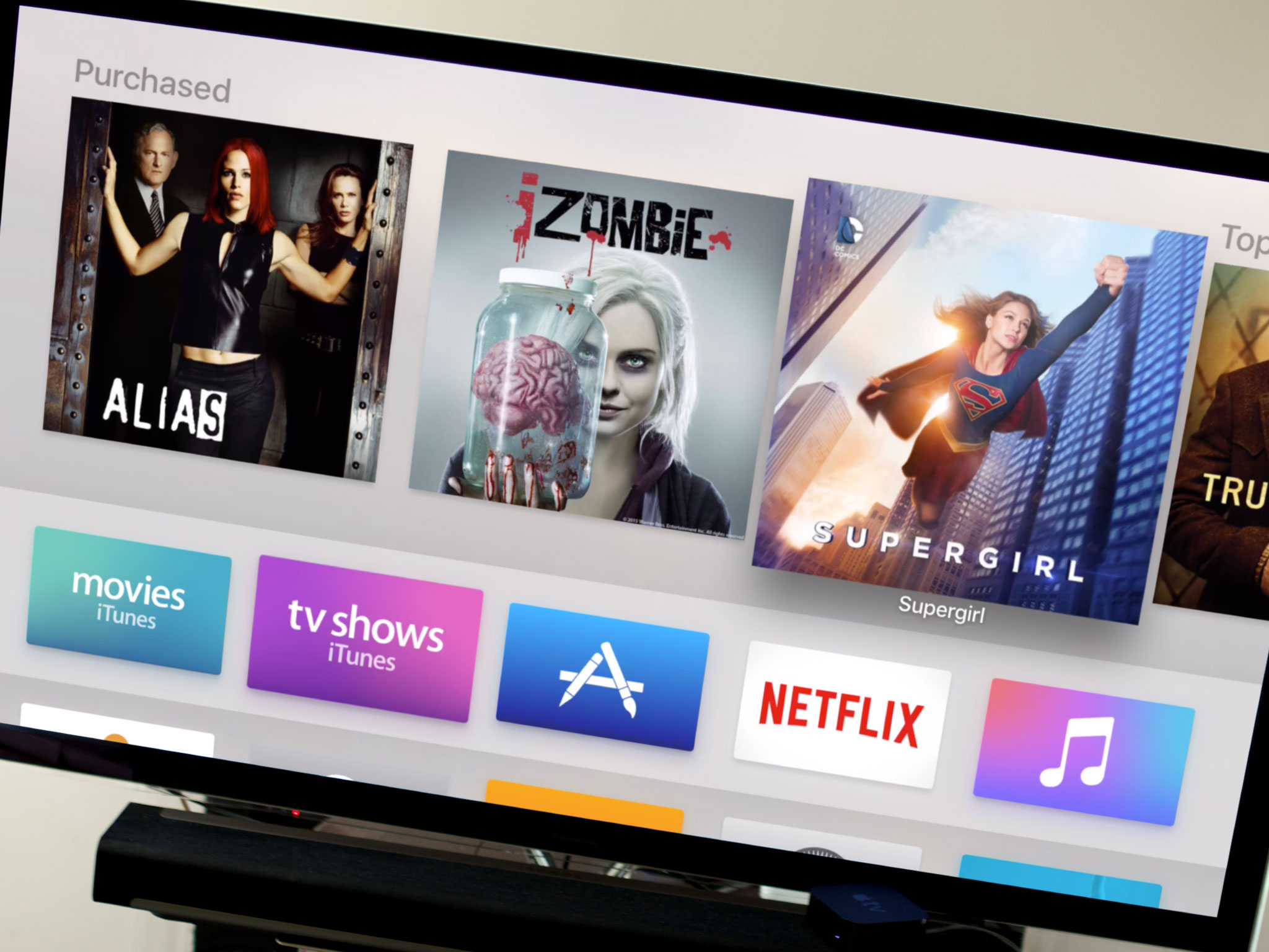
The new Apple TV includes several familiar built-in apps: iTunes Movies, iTunes TV Shows, Apple Music, Photos, Settings, and Computers (home sharing). It also includes two brand new and long-anticipated ones: Search and the App Store.
iTunes Movies + TV Shows
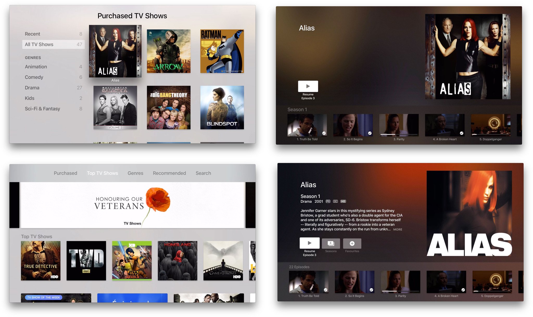
Instead of a single video app like on iPhone and iPad, the Apple TV retains separate iTunes Movies and iTunes TV Show apps. They also retain much of the layout and design of the previous versions. iTunes Movies has survived the transition well. Everything is right where you expect it to be and works just like you expect it to work. iTunes TV Shows, unfortunately, retains some old problems and inherits some new ones.
For example, in the Purchased sections, "recent" and "all" remain. Recent works fine for movies, showing you the last set of movies you bought. For TV shows, though, the implementation is less than ideal. That's because Apple TV defines "recent" based on the date of purchase. So, if you buy a season pass to a current show, then buy several old shows that are no longer in production, all you'll see are the old shows, even if new episodes appear for the new show. That's both in the TV Shows app and on the top shelf of the home screen.
I'd love "recent" to be defined in terms of last updated. If a new episode comes out for a show, it's much more useful to see that show on top of "recent". Especially since Apple TV has no notification system, it'd be a visual cue and reminder that the new episodes were available to watch.
The layout inside a TV season has changed on the new Apple TV. Instead of a long vertical list there's now a long horizontal list. It works okay for a single season but, like the vertical list before it, becomes cumbersome at scale. It's okay if you've watched everything in order—TV will present a button for the next unwatched episode that lets you continue right along. If you skipped a trailer or some other bonus feature in season 1, however, that'll be permanently stuck as the watch-next button and you'll have to scroll to the end, every time, like an animal. And since "mark all as watched" doesn't seem to have survived the transition, there's no fast way to jettison that stuff from the cue.
I'd prefer a hybrid approach to organization. I like the horizontal line for episodes but vertically stack the seasons. Sure, it would look like a grid, but one I could get around far quicker.
There are some frustrating bugs in the TV app as well. For example, the Siri and Search results pages for a show, and the iTunes Store pages they lead to, have buttons that let you access multiple or additional seasons of a series. The same show page, accessed from the TV app's purchased section, is missing that very helpful button. What's more, all the pages are missing the ability to preview a show before buying or watching it. (You can go look up the trailer in YouTube app for now, or on your iPhone or iPad.)
Most of the navigational issues can be easily worked around with Siri. Just ask for the show and episode you want to watch and you get it immediately. Not every region has Siri available, though, so the in-app navigation still needs to be rock-solid.
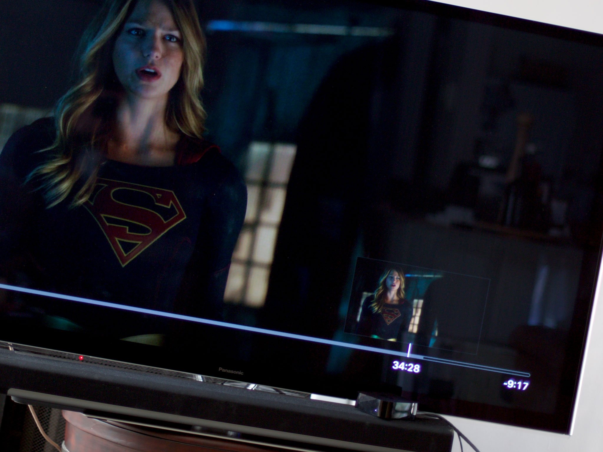
In-video navigation on the Apple TV is amazing.
Press the Siri Remote and the video pauses and a thumbnail pops up. Swipe one way or another and the thumbnail tracks your movement so you can see the timeline and go exactly where you want to go. It makes what used to be a tedious, hit-and-miss process interactive and immediate.
Also gone is the old "Authorizing" text that popped up whenever you hit play on iTunes content—the one that always made you feel like Hollywood was glaring at you, accusingly, from behind the counter. Now you get a simple, respectful spinner. It's a small change, but an important one.
Apple Music
The new Apple TV is the first Apple TV to have Apple Music built-in. It looks and works just as you'd expect—if you have an Apple Music subscription or are still in the midst of your 30-day trial.
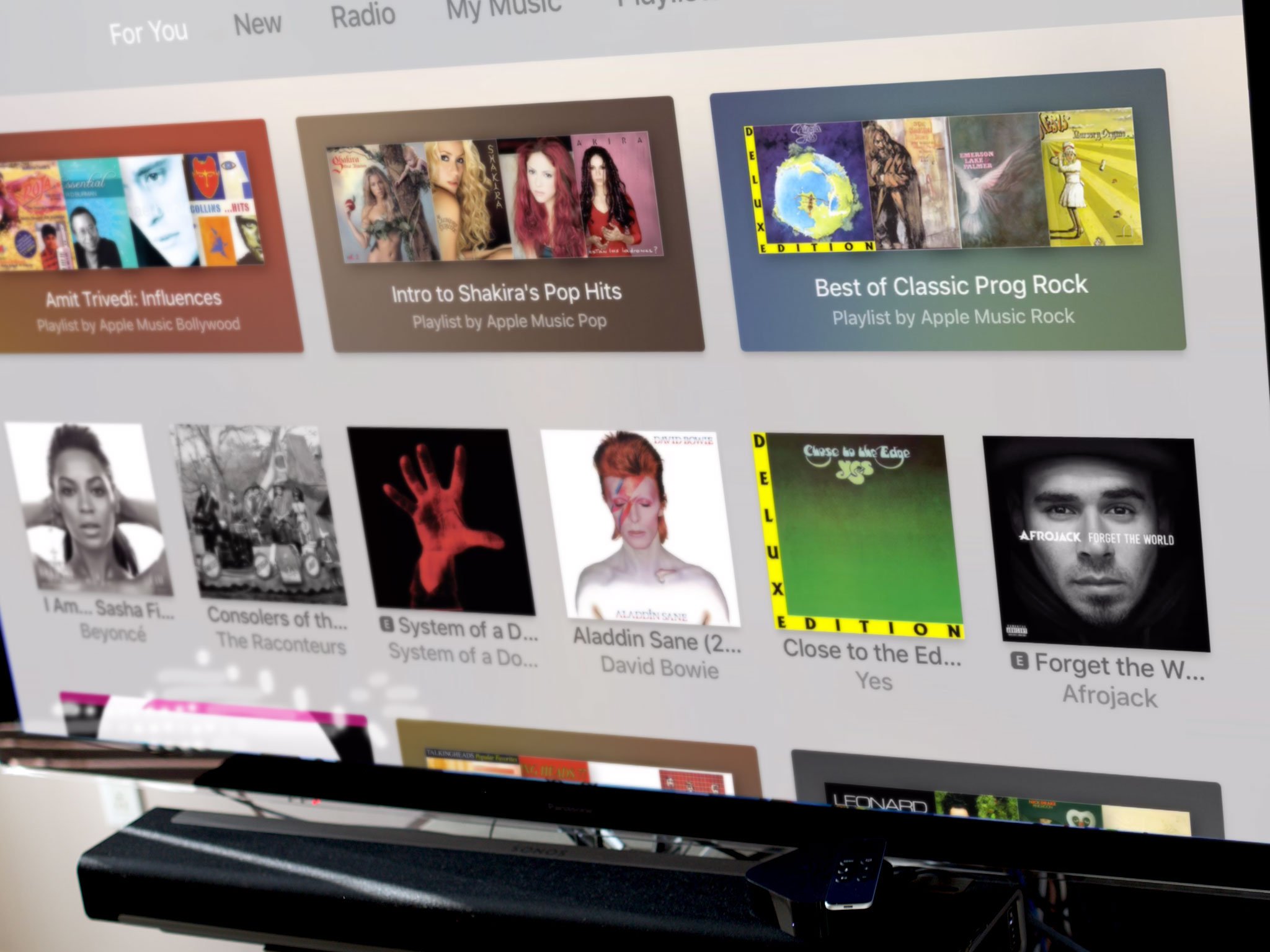
For You, New, Radio, My Music, Playlists, and Search, are all present and accounted for in the top tabs. Not Connect, though, which is Apple's social music network. Handling commenting would be tough but I'd have like to have seen even a read-only version for now—like how Photo Stream is currently implemented (see below). It's one of the most interesting parts of Apple Music.
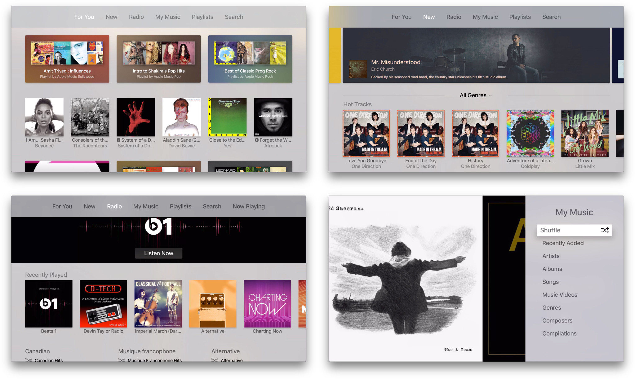
Apple did a great job bridging the rest of the feature set over—even if they had to bring the More button over to do it. Click on whatever is playing, and the ••• button pops right up. Click on that and you get options for everything from starting a station to adding/removing from My Music to managing a playlist to selecting speakers. All right from your Apple TV.
(Selecting external speakers—which lets you space-shift audio to anything capable of receiving it—is an incredible new feature in general.)
You can even click and hold on a song or album to add them to your Up Next queue.

Update: tvOS 9.1 shipped with Siri support for Apple Music.
Unfortunately, the way I use Apple Music most of the time is current impossible on the new Apple TV. That's "Hey, Siri, play..." followed by whatever song is in my head. It's the ultimate jukebox and, in my opinion, there's still no other service in the world that can match its magic. And, like I said in the Siri section, that's all missing from Apple TV for now.
There's still something great about playing music from the Apple TV. Instead of blaring at you from the device in your hand or on your lap, it surrounds you. It becomes less foreground and more background, and I've been loving Beats 1 just filling the room while I work.
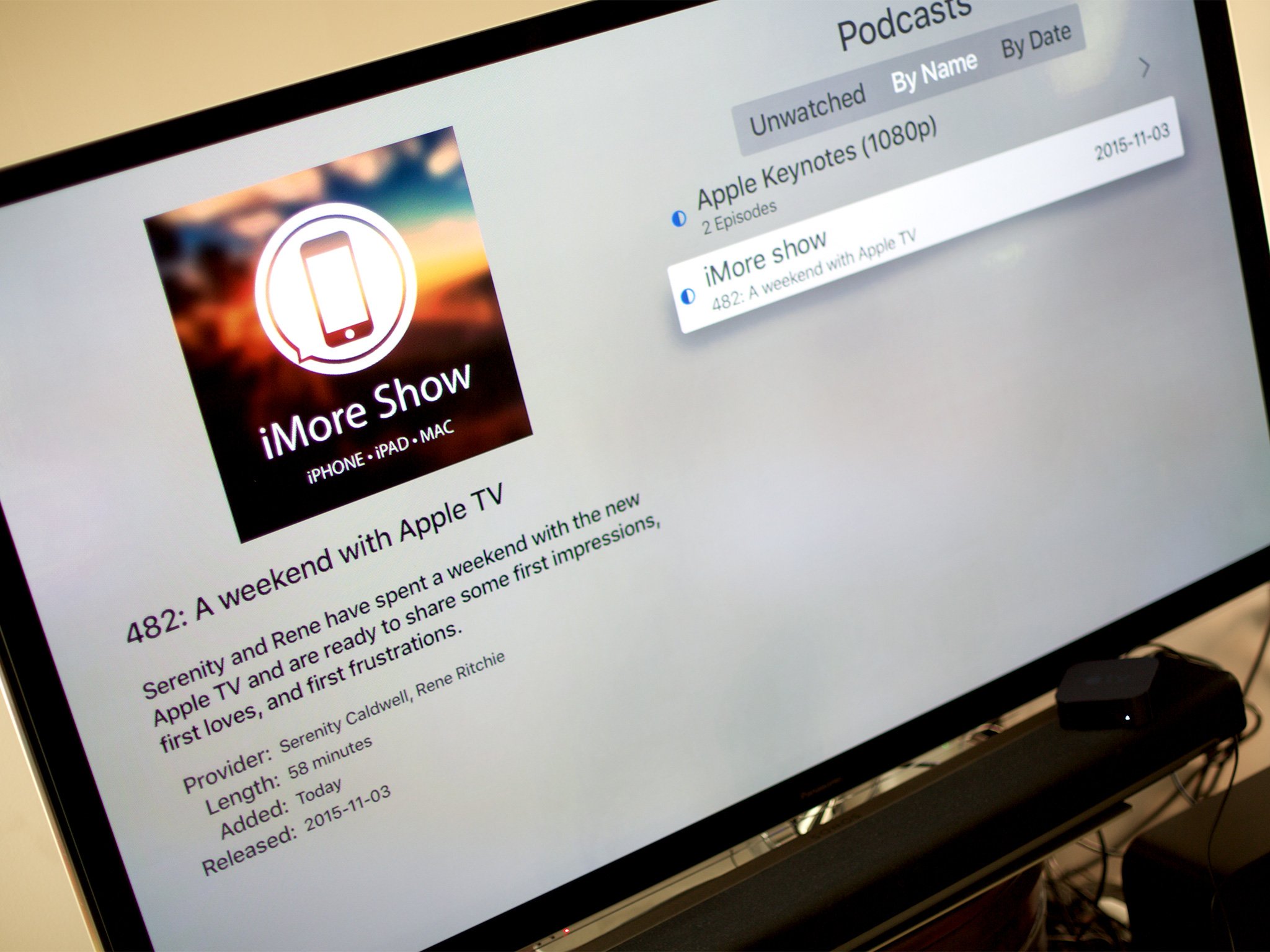
Podcasts?
The new Apple TV shipped without a Podcasts app despite its icon being partially visible during the introduction back in September—and being fully visible to this day in the tvOS developer documentation. That makes it seem like the updated Podcasts app just wasn't ready in time for launch. Hopefully it will be soon, and with Siri support baked in.
Photos
Photos for the new Apple TV is really Shared Photo Streams for the new Apple TV. If you choose to enable it, you'll have access to everything that lives in the Shared tab of the Photos app on your iPhone, iPad, or Mac.
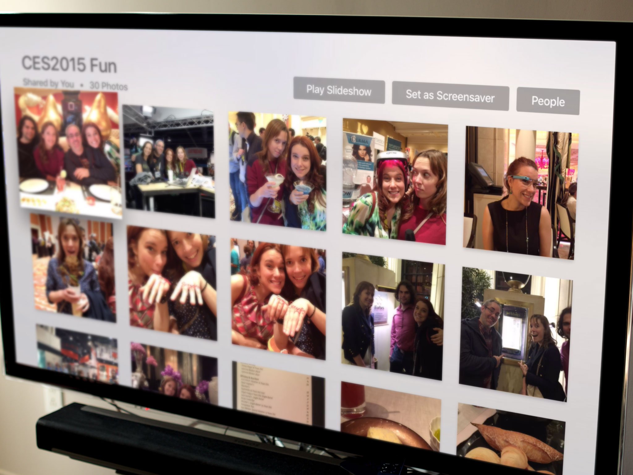
The limitation here could once again be based on Apple simply not finishing a more fully-featured Photos app for launch, but it could also be based on privacy. Not everyone might want, expect, or appreciate the complete contents of their camera roll/all photos album suddenly appearing in front of a room full of people.
If you made the conscious decision to share a photo, however, that does indicate that you're expecting that photo to be seen by other people. Even here, though, I'd prefer finer-grained controls. What significant others decide to share with each other on their personal phones, for example, might not be what they want to show up on their TV in front of a group of people in the living room. Either way, it's a tough balance to strike and Apple's done a reasonable job of striking it here.
Activity is in the top shelf position, so you can anything that's been recently added. My Albums are next, so you can see what you've shared. Shared by Family and Friends is on the bottom, so you can see what's been shared with you.
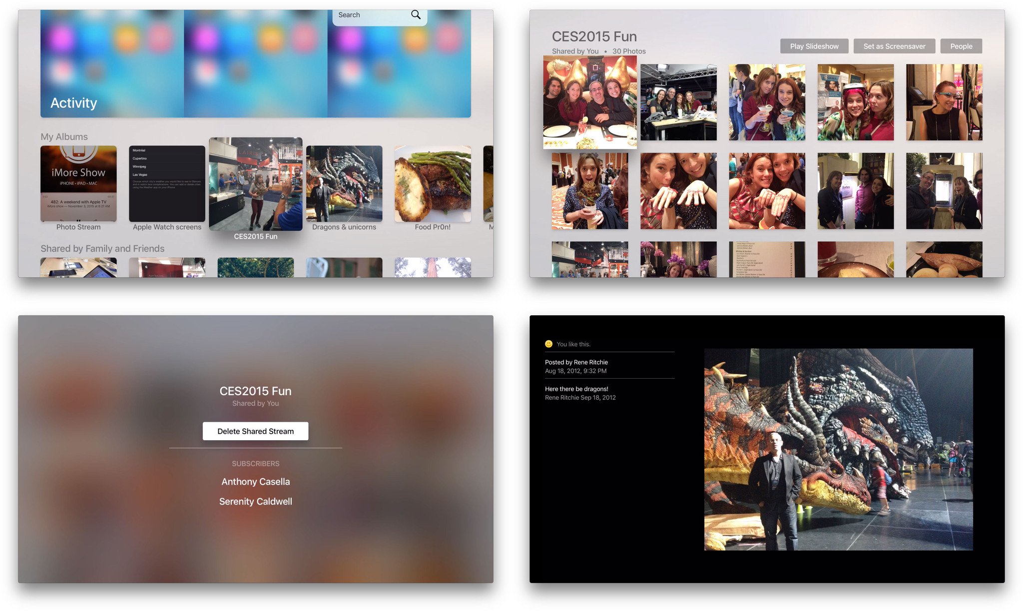
You can play any stream or album as a slide show or set one as the screensaver (just remember other people will likely see it), and you can check who shared a stream, who it's shared with, and leave a stream if you want. Click on a photo and you can see likes and comments, and even like or unlike a photo by clicking again. Really well done.
If you use Shared Photo Stream, Photos for the Apple TV continues to be the best way to take a picture somewhere and have it instantly enjoyable by everyone back at the TV.
Settings
There's always a wealth of great stuff in Settings and the new Apple TV is no exception. You've got top-level sections for general, accounts, audio and video, AirPlay, remotes and devices, apps, network, and system and the option to "sleep now". (For that last one, instead of navigating all the way to Settings, you're better off just holding down the Home button for a couple of seconds from wherever you are.)
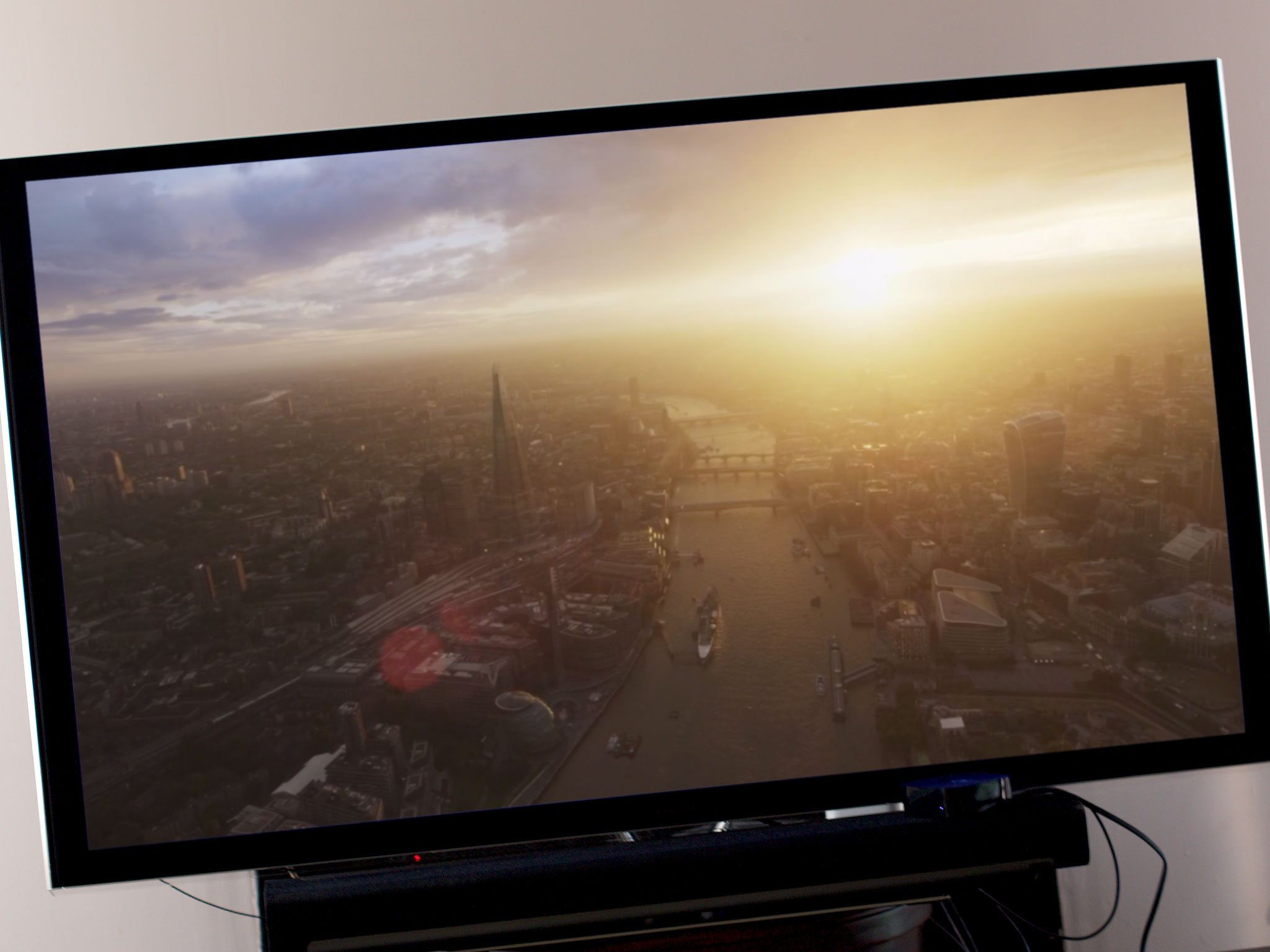
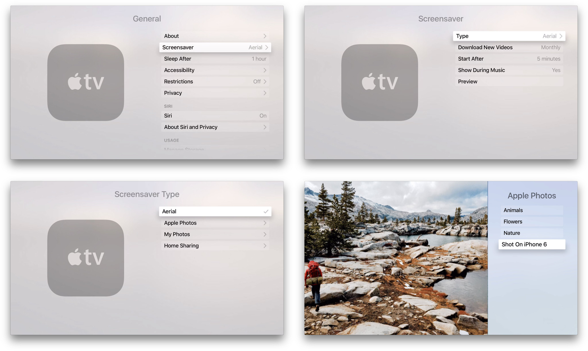
General Settings gives you access to the about information and lets you change the screensaver. The default, Aerial, features gorgeous helicopter and drone flyovers of cityscapes and landscapes that change from light to dark with sunrise and sunset. Apple will be updating them over time, and you can choose to check for those updates (which will weigh in at about 600 MB) daily, weekly, monthly, or never.

They're so great I can't imagine using anything else but, if you can, you can also switch Apple Photos, which include animals, flowers, nature, and images from the Shot on iPhone 6 campaign. You can also choose My Photos, which can be any of your shared Photo Streams, and Home Sharing, which are photos from your Mac or Windows PC.
You can also choose if and when you want the screen saver to start, up to 30 minutes, and whether or you want it to show during music playback. Similarly, you can set the automatic go-to-sleep period up to 10 hours.
Restrictions let you enable parental controls for iTunes and in-app purchases, as well as explicit content, content ratings, and explicit language for Siri. You can also lock down Game Center to prevent multiplayer games and adding friends, and settings themselves to prevent changing AirPlay or location services.
Privacy settings let you toggle location services, the transmission of diagnostic and usage data, and ad tracking (for App Store apps that may include ads). You can also switch Siri on or off, manage storage for App Store apps on an app-by-app basis, and handle date, time, and language preferences.

Accounts lets you sign into and out of iCloud, add and remove multiple iTunes accounts, manage password request frequency, and if enabled, whether you want the Apple TV to prompt for a password even on free downloads.
You can also log into Game Center, though frustratingly with only one account at a time. Like iTunes accounts, it'd be great if you could add multiple Game Center accounts and switch between them at any time. Same with Home Sharing.

Audio settings let you choose to output over external speakers, if available, and to set surround sound to auto, Dolby surround, or stereo. You can choose to reduce loud sounds (also always available in-app and via Siri), mute navigation clicks, toggle sound effects and music, toggle audio mode between auto and 16-bit, and set the audio and subtitle language.
Video settings let you switch HDMI between auto, YCbCR, RGB High, and RGB Low, depending on your TV, and resolution between a vast array of options from 1080p 60 Hz to 480p at 50 Hz. You can also calibrate for zoom and overscan, and call up color bars.

Apple continues to do a phenomenal job at proving deep support for accessibility on new devices from day one. For Apple TV, there's descriptive audio as well as closed captioning and SDH in several styles, but what's more—you can create your own closed captioning styles. I'm having a hard time adequately conveying how incredible that is.
Apple's screen reader, VoiceOver, is here, along with zoom, bold text, increased contrast, and reduced motion. Along with support for Bluetooth audio and voice control via Siri, it's a terrific offering right from launch. Thank you, Apple.

With AirPlay settings you can switch content beaming on or off and rename your Apple TV should you have multiple boxes and need to easily differentiate them. You can also toggle underscan, and set security options, including device verification for point-to-point AirPlay.
There's even a setting to handoff iCloud content to the Apple TV itself instead of beaming from your iPhone or iPad. That's a fantastic addition, especially for people who sometimes have trouble maintaining an AirPlay connection.
Although Apple introduced handoff as part of Continuity at WWDC 2014, we haven't seen it applied to media yet. Walking into a room while watching, listening, or playing something on my iPhone and being able to hand it off to my Apple TV would be terrific. Likewise getting up to leave the room and being able to hand off from Apple TV to iPad so I can take it with me. Hopefully it's on the roadmap.
Remotes and Devices lets you set touch surface tracking sensitivity, pair any and all supported Bluetooth devices, learn infrared remote controls, enable CEC-based multi-device control, and switch infrared volume control on or off.

Apps settings let you switch automatic app updates on or off. Music lets you toggle iCloud Music Library, repeat music, and sound check on or off. iTunes Movies and TV Shows lets you set video and preview resolutions. Computers lets you toggle playlists between music-only and all. And, as you install other apps, their settings can appear here as well.
Networking shows you your ethernet or Wi-Fi information. System contains help and legal information as well as Software Update, reset, and restart.
Good stuff, all of it.
Computers
Computers is where you set up and access Home Sharing, the service that lets you access the iTunes libraries of any Mac or Windows PC logged into the same account and available on the same network.
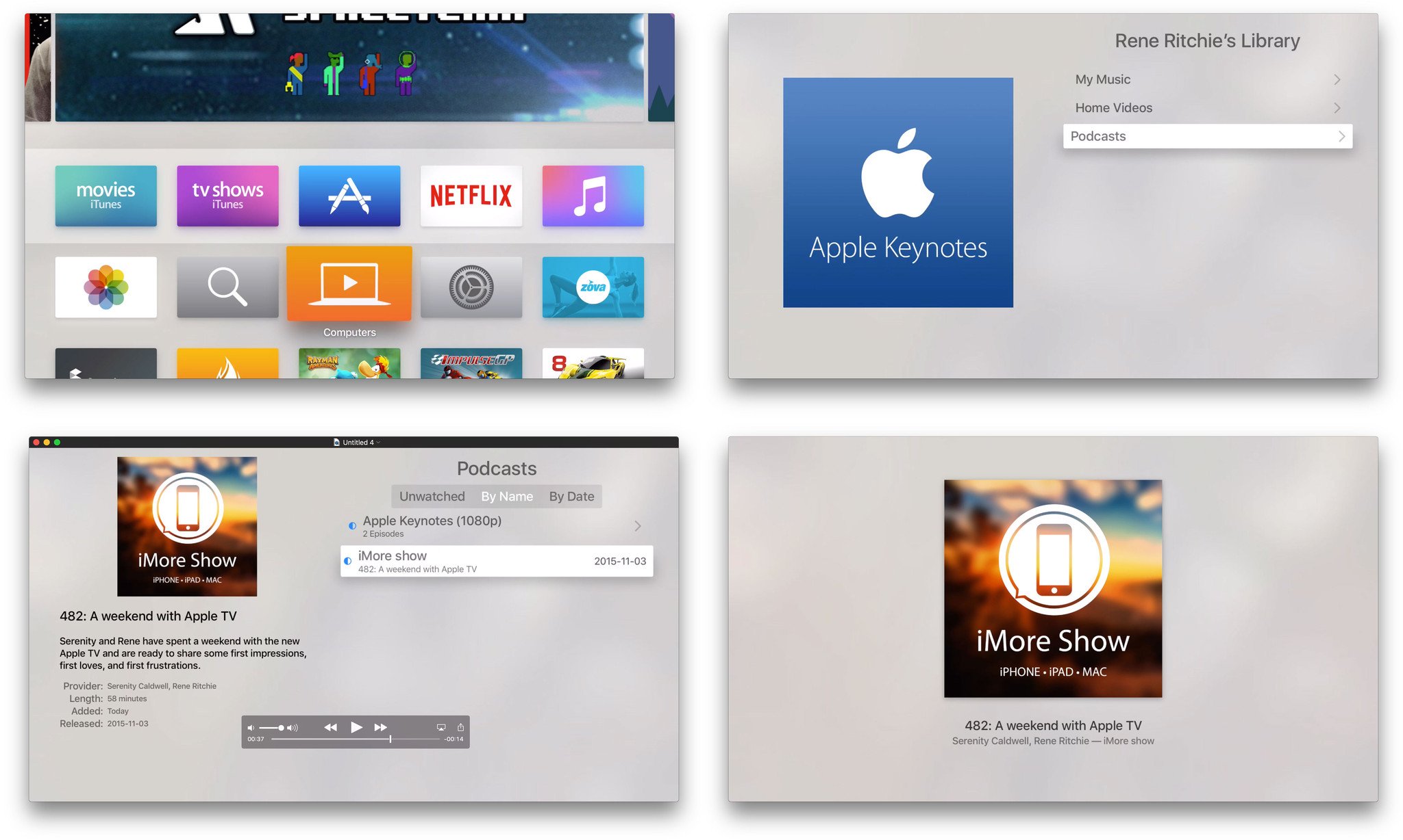
Once you've logged into Home Sharing, you get a series of sections. Which ones you get depends on the content you have in iTunes. They can include My Music, Movies, TV Shows, Home Videos, and Podcasts, for example. Each corresponds to the section of your iTunes Library of the same name.
In other words, as long as what you want to stream from your computer appears in your iTunes library in one of those sub-folders, it can appear on your big screen TV.
That said, the interface here still isn't as informative or usable as the main, on-device apps. With the new Apple TV, you also lose Siri, which works around a lot of the navigational problems that exist even in those apps.
If you're in a really low-bandwith, data-capped bind, Computers can let you stream locally rather than having to stream again (and again) from the internet. But it's still not a first-class experience.
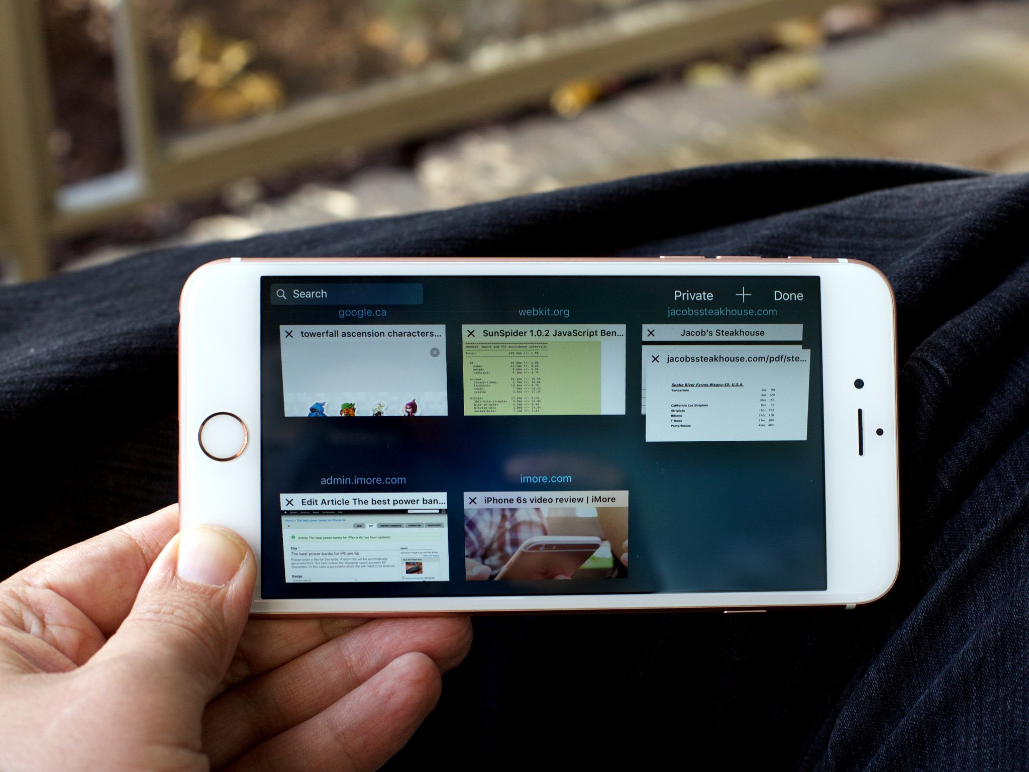
Safari + WebKit?
There's no Safari web browser on the new Apple TV, nor are there any WebKit frameworks publicly available for developers to make browsers or otherwise pull in content from the Web. Reactions to this have varied from the understanding to the outraged. Apple TV isn't meant to be a primary computing appliance the way a Mac or iPhone or iPad is, and the Apple TV App Store isn't meant for thinly wrapped web apps. Yet there's an enormous appeal to having all the world's information available on the big screen. Like with Keyboards, Apple seems to be saying if you want a computer on your TV, you want the Mac mini. At least for now.
More apps?
In addition to Safari, there's also no Maps on Apple TV, and no Apple News. Maps would be fun to have, both as a way to explore the world with the family and to look up directions before you leave. (Especially if the Apple TV could push them to iPhone, the way the Mac can.)
Because there's no WebKit, and Apple News is built on WebKit, it makes sense that it's not on the Apple TV for now. Still, I'd love to see a native version of News that pulls out video content and makes it into an amazing must-watch list for me. Same for video content in the Siri search page, in my Reading List, and in my Shared Links.
Actually, I'd prefer all that stuff just get unified and then have the unified video list appear in News for Apple TV. Because clicking on it and seeing everything I need to watch, sourced from recommendations, bookmarks, and social, would be phenomenal.
Apple TV App Store
The App Store on the Apple TV is both similar and familiar, and yet new and idiosyncratic in its own right. Like the iOS, Mac, and watchOS stores that came before it, the Apple TV App Store is the place you go to discover new and featured apps, to search for apps you may have heard of, to browse by category, and to check out the top charts. (Those last two sections are recent additions on Apple TV: they were revealed only after the amount of available apps was sufficient to fill them.)
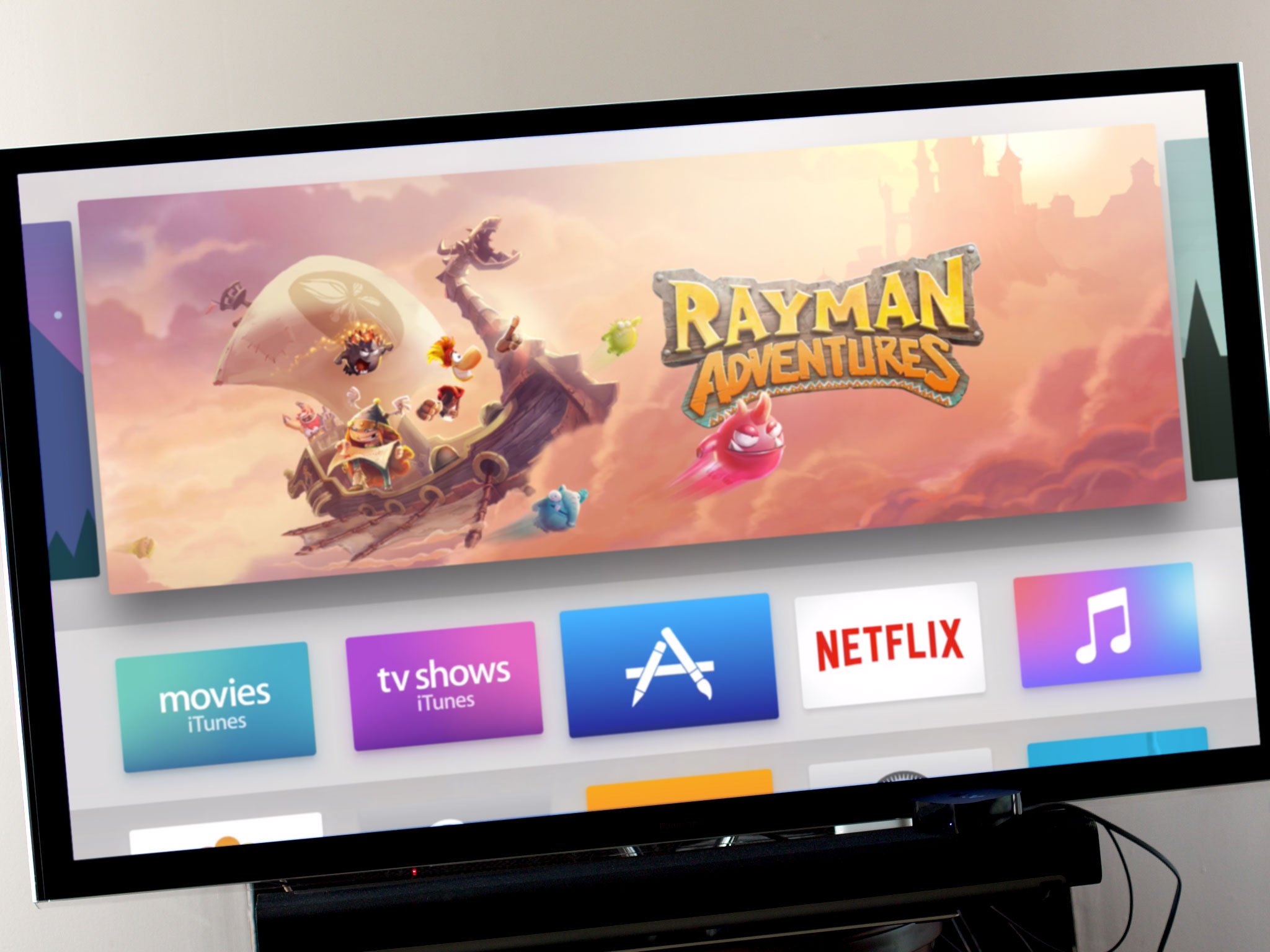
The iPhone and iPad App Stores launched before the age of iCloud. So, in order to sync, Apple built app management right into iTunes for Mac and PC, alongside everything else. That way you could find, acquire, and organize iOS apps on your computer as well as your mobile.
The Mac App Store was released as its own, separate Mac app. Because it didn't need to support other devices or be ported to Windows, it didn't need to be bundled into iTunes. No functionality to buy Mac apps when away from your Mac, like on iOS or the Web, has yet been made available.
The Apple Watch was and is the reverse. The Watch App Store—because even native Watch apps are still technically extensions of an iOS container app—isn't on the Watch itself but is integrated into the Watch app on the iPhone. That's where you go to find, acquire, organize, and even install Watch apps.
Out of all these implementations, the Apple TV App Store is most like the Mac. It exists as an app that runs on its own hardware and its own hardware alone. You can't find, acquire, or organize Apple TV apps using iTunes on the Mac or Windows, nor is there an iOS companion app with an integrated App Store for Apple TV (insert even louder Apple Remote app lamentations here).
None of that would really matter but for this—where iOS apps (and their Watch extensions, if available) and Mac apps are all surfaced, searchable, and linkable to and from iTunes Preview pages on the Web, Apple TV apps are not.
That means, while it's super easy to discover and acquire an Apple TV app from the Featured, Category, and Top Charts sections of the Apple TV App Store, every other form of acquisition is painful.
The reason the web and links don't work, of course, is because there's no Safari or WebKit surfaced on the Apple TV to resolve them and hand them off to the App Store app. And that would be fine, if you could buy Apple TV apps on other devices or even directly on the web through those aforementioned iTunes Preview pages. Then, if you had automatic downloads enabled, they'd just show up on the proper device. If not, a prompt could ask if you wanted to download them, or they could simply appear conveniently atop your purchased list.
As it is, if I find a great app I want to share with you, unless it's at the top of a featured, category, or top list slot, the only thing I can do is tell you to go to App Store search and start typing out its name. Not just like an animal, but like an animal from the 90s being told to search AOL keyword "apps!".
Media apps
There aren't many media apps available in Canada yet. None of the major Canadian TV networks—CTV, CBC, or Global—managed to get apps ready for launch. Since their iOS apps range from bad to terrible, that's less big surprise and more continued disappointment.
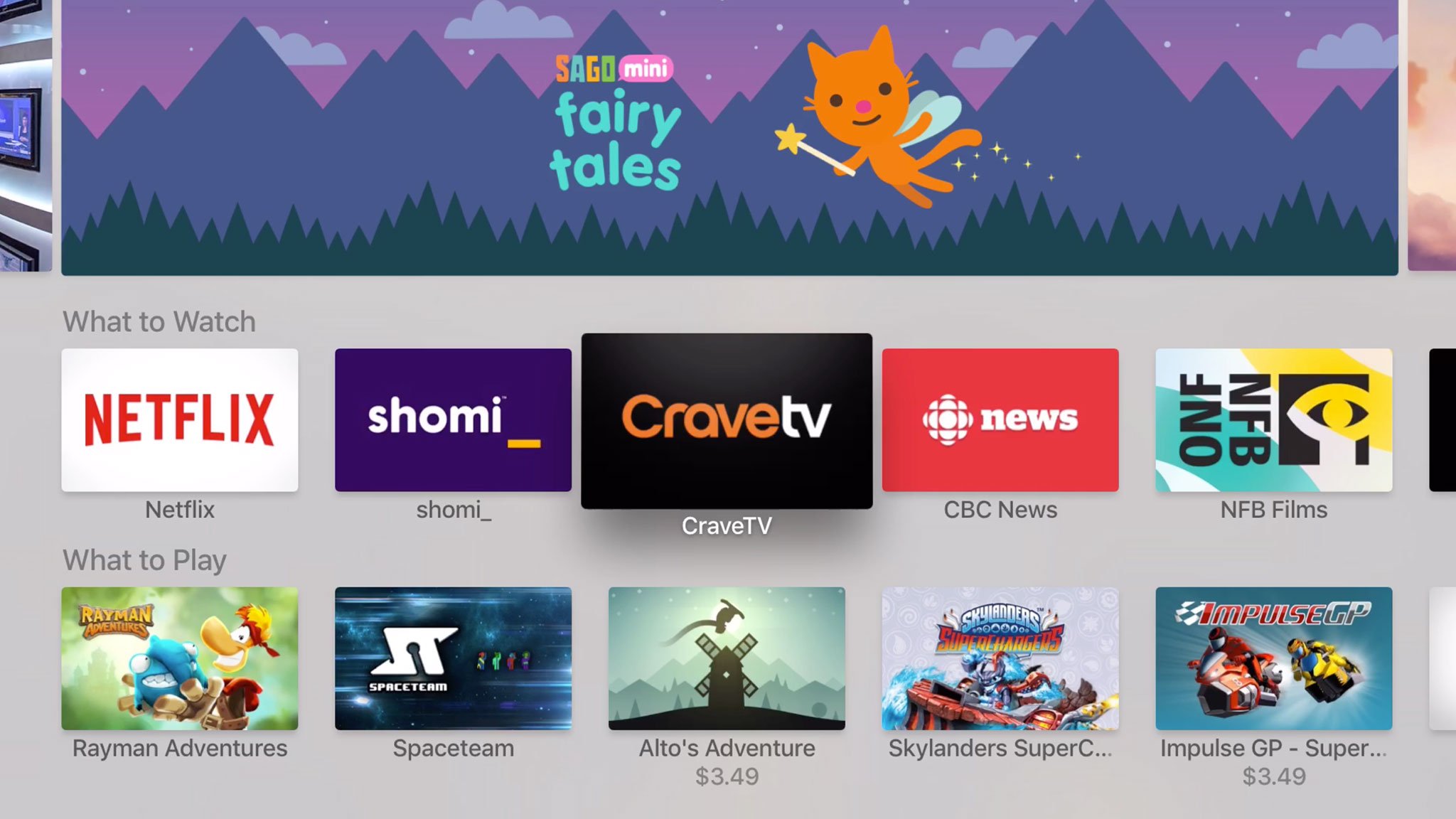
Shomi and CraveTV, which are something like a Canadian versions of Netflix and Hulu, are available, though Crave TV requires a cable subscription but doesn't seem to support cable subscriptions from the province in which I live. Unicode eye-roll emoji.
There's also Netflix proper, which is both amazing and terrible right now. Amazing in that, fast as Netflix was to play on the previous Apple TV, it's just as fast to skip around in while you're playing now. It used to be painful, but with the new Apple TV scrubber, it's a pleasure. Terrible in that a ton of functionality from the previous Apple TV version got lost in transition.
Gone are all the sections and the related content block. It means you're essentially trapped on the Netflix home screen, and it's almost claustrophobic. Luckily you can ask Siri to find Netflix content, but like with the iTunes TV app, that should be an accelerator, not a dependency.
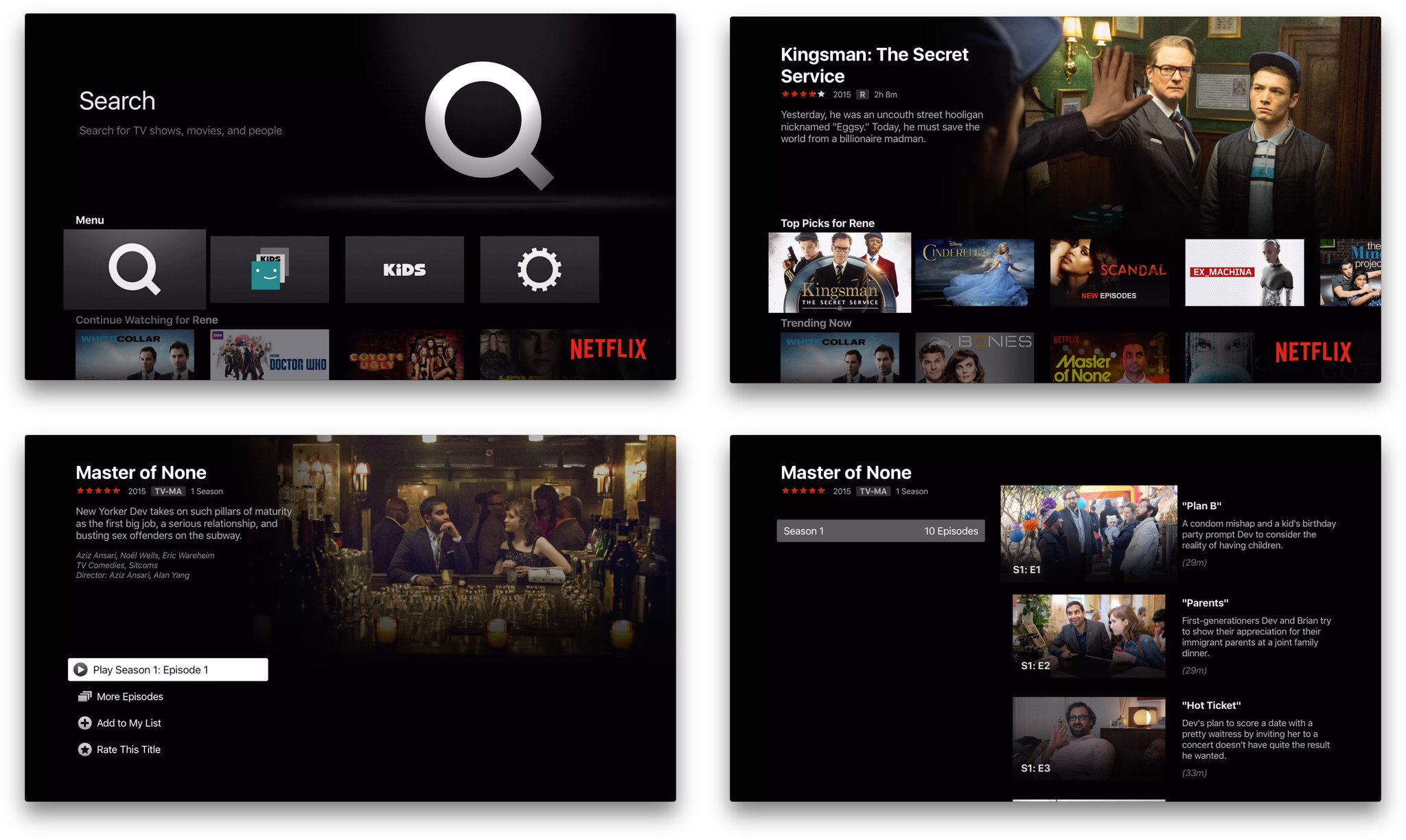
I do applaud Netflix for being on the platform, unlike Amazon which somehow enjoys a reality distortion well beyond the one typically ascribed to Apple. I'd also love to see HBO Now up here as well, above the Wall. I get that licensing is hard, and even Apple has only managed to get iTunes TV into a handful of countries, but fiefdoms are on the wrong side of history.
Make the deals. Break the existing ones if you have to. Disrupt or be disrupted.
Games
It's been said that games are enabled and constrained by the control methods available to them. Paddles, trackballs, joysticks, gamepads, keyboards, and multitouch have all led to remarkable, if very different, games.
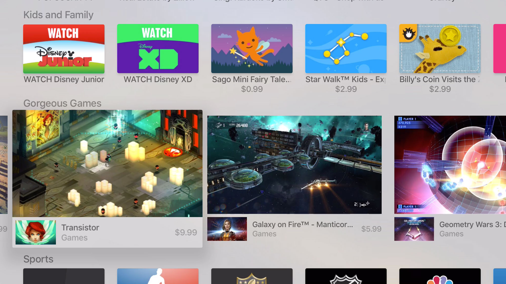
Now we have the Siri Remote, which almost all games are required to support, in addition to third-party gamepads and the on-demand resource system. What kinds of games will they enable and constrain?
We'll have to wait and see. Right now most of the launch games have been, as expected, ports of iOS games. I've tried a variety of button controlled platformers and motion controlled racers and most have been fine. Many have been a lot of fun, including Alto's Adventure and Canabalt.
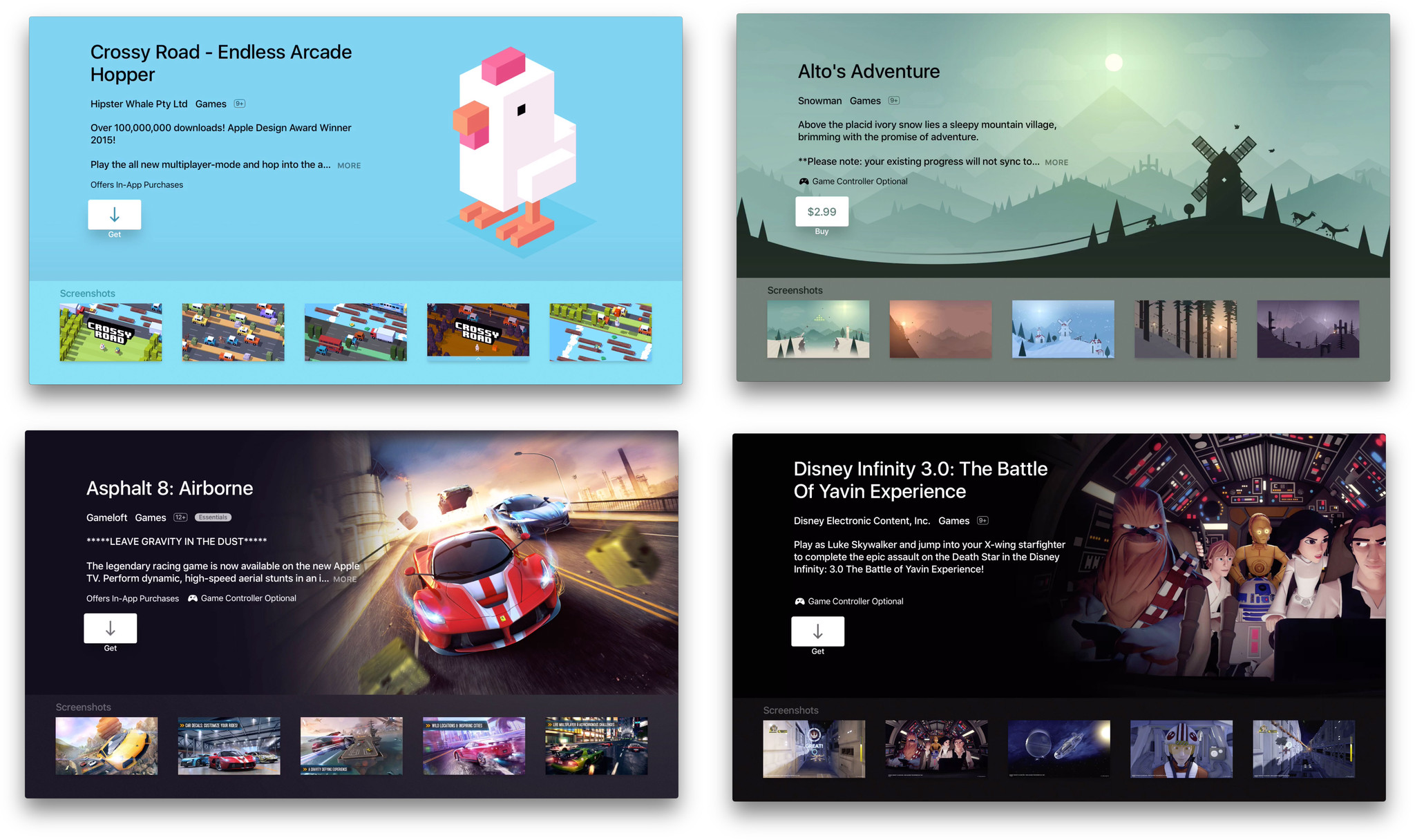
Moreover, the games that have added gamepad support have, when combined with the big screen, been solid and even spectacular at times. Rayman Adventures and Jetpack Joyride come immediately to mind. Others, like SketchParty TV feel even more at home on the big screen than they ever did the small.
Like a dedicated gaming console, however, it'll take some time before developers figure out the new platform and we start seeing games made for the Apple TV.
Other apps
I always knew there'd be great entertainment and games on the Apple TV, but apps was something I wasn't so sure about. What kind of apps would I want on my TV? It's something I thought about a lot.
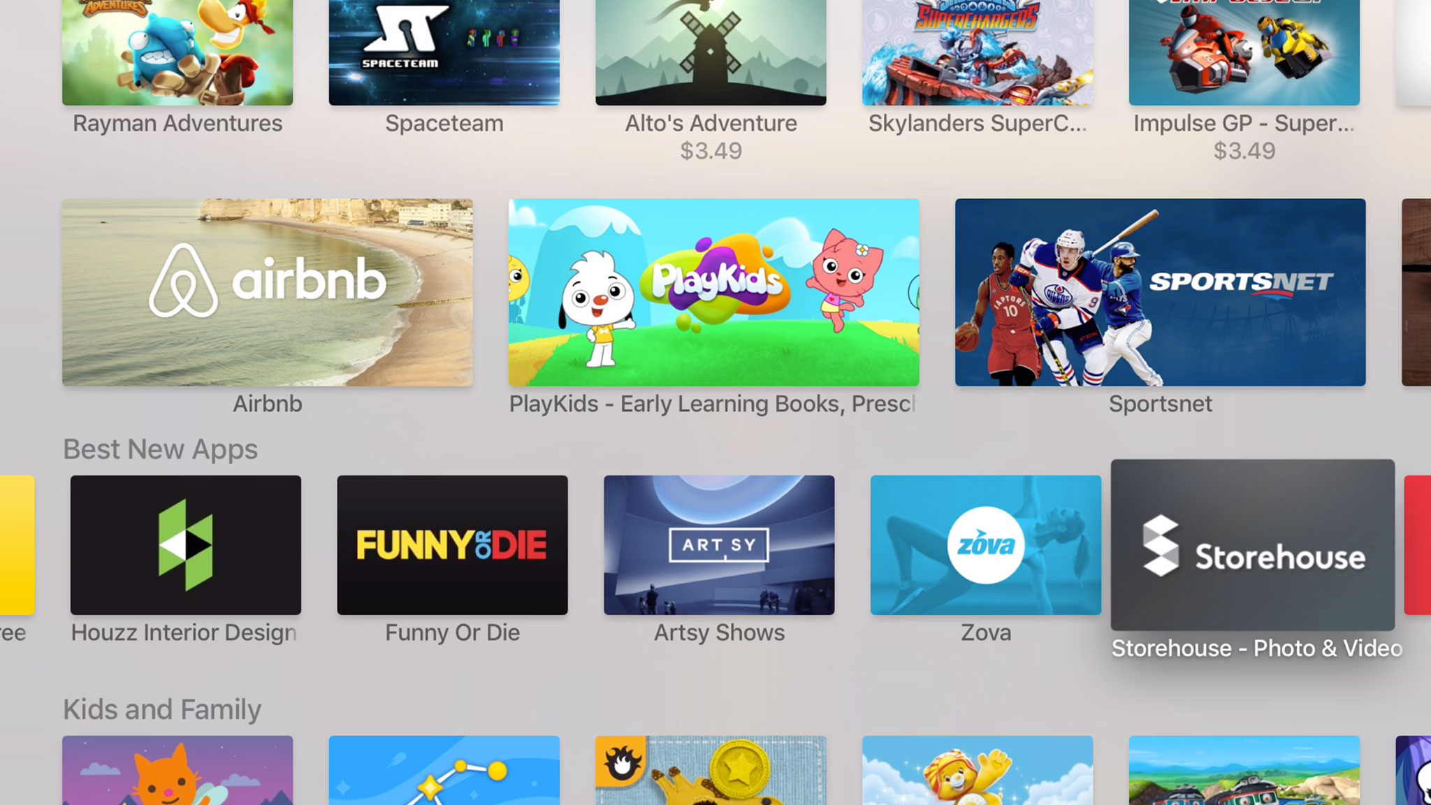
Where Apple Watch apps are best for brief but critical tasks, the Apple TV felt like the opposite. Beyond even the leaning back, feet up experience of the iPad, the Apple TV seemed like it needed apps that were either so enthralling you didn't want to do anything else, or so ambient you could easily do anything else at the same time.
I still don't have answer, and as with games, I think it'll take some time for everyone, including developers, to figure it out. For example, I have an enormous PCalc on my TV set now, because of course I do. But I also have Storehouse, which lets me see the visual stories I've made on iOS. I have shopping apps that let me browse from my couch and fitness apps that encourage me to get off it.
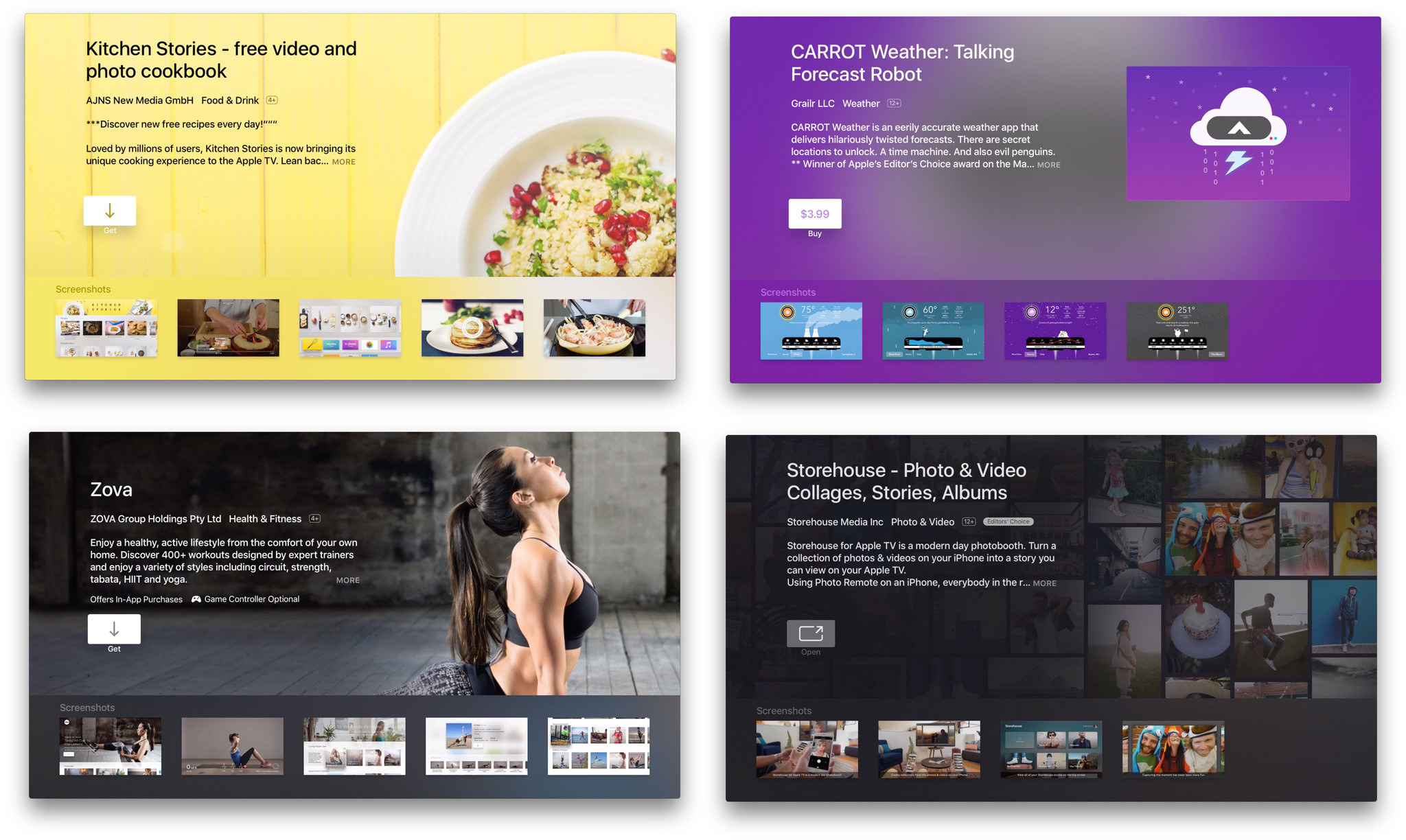
So far it's the apps that benefit from the biggest screen, the deepest immersion, the added interactivity, the collective experience, or the engulfing experience that I'm enjoying the most. That and the ones that integrate my other devices, like Zova which shows the heart rate from my Apple Watch on the Apple TV while I exercise. That's the future right there.
Like with games, I think it'll take a while before we all figure out the best kinds of apps for the Apple TV, but if the early crop is any indication, we're well on our way.
Bottom line
The new Apple TV took a long time to get here. Two and a half years long. Yet the version we got is still coming in "hot". There are a lot of incredible ideas here, not all of which are feature-complete. That duality—amazing Siri for video but none for music, a great movie app but no podcast app, a terrific Bluetooth remote control but no software remote and minimal support for multiple controls—is what makes the new Apple TV such a challenge to review.
The process that led to this Apple TV, the boxes and services that never shipped, are the stuff of rumor and hearsay. That it took so long to get to where we are now, though, is fact.
To be clear, I love that this is the direction Apple ultimately chose to go, and that this is the box Apple ultimately chose to ship. I just wish the company had made those choices two years ago so it the feature set would be better rounded out and the platform fuller by now. But it is what it is.
And that's an Apple TV true to its iOS roots, enabling and accessible, and—importantly for me and most of the people in this world—international. It's not tied to a content service for only one or a handful of countries. It's not some hope or dream for the future of over-the-top channels. It's here, now, and ready to rock until that future comes, if ever. It's the Apple TV now.
There's finishing and filling out to be done to be sure, but this is the Apple TV I've been waiting for. As someone who uses the Apple TV all day, every day, and my only source for television content, this is the Apple TV I've always wanted.
If you live outside the U.S., where rival services have failed to ship almost any atoms or bits, where iTunes and Netflix are among the few digital content services available, if any, and if the idea of Siri control and iOS-style apps on your television excites you as much as it does me, then this is the Apple TV you've been waiting for as well.
This is the Apple TV you're going to want.
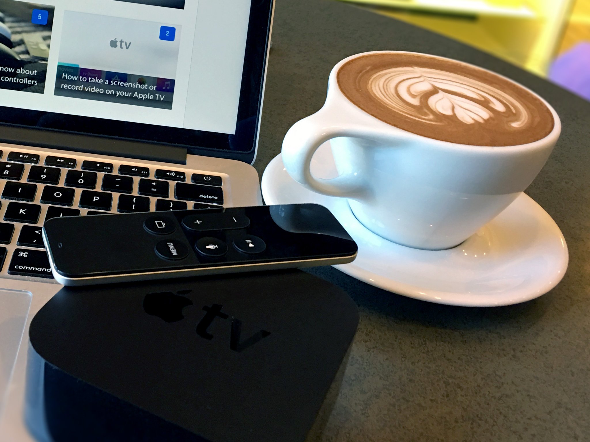
Apple TV (2015) guides
Not sure whether you should get a new Apple TV or upgrade your old one? Stuck on storage capacity? Or did you just get a new Apple TV and want some help getting set up or started? Check out our ultimate guides!

Rene Ritchie is one of the most respected Apple analysts in the business, reaching a combined audience of over 40 million readers a month. His YouTube channel, Vector, has over 90 thousand subscribers and 14 million views and his podcasts, including Debug, have been downloaded over 20 million times. He also regularly co-hosts MacBreak Weekly for the TWiT network and co-hosted CES Live! and Talk Mobile. Based in Montreal, Rene is a former director of product marketing, web developer, and graphic designer. He's authored several books and appeared on numerous television and radio segments to discuss Apple and the technology industry. When not working, he likes to cook, grapple, and spend time with his friends and family.
