Apple Watch and accessibility: First look

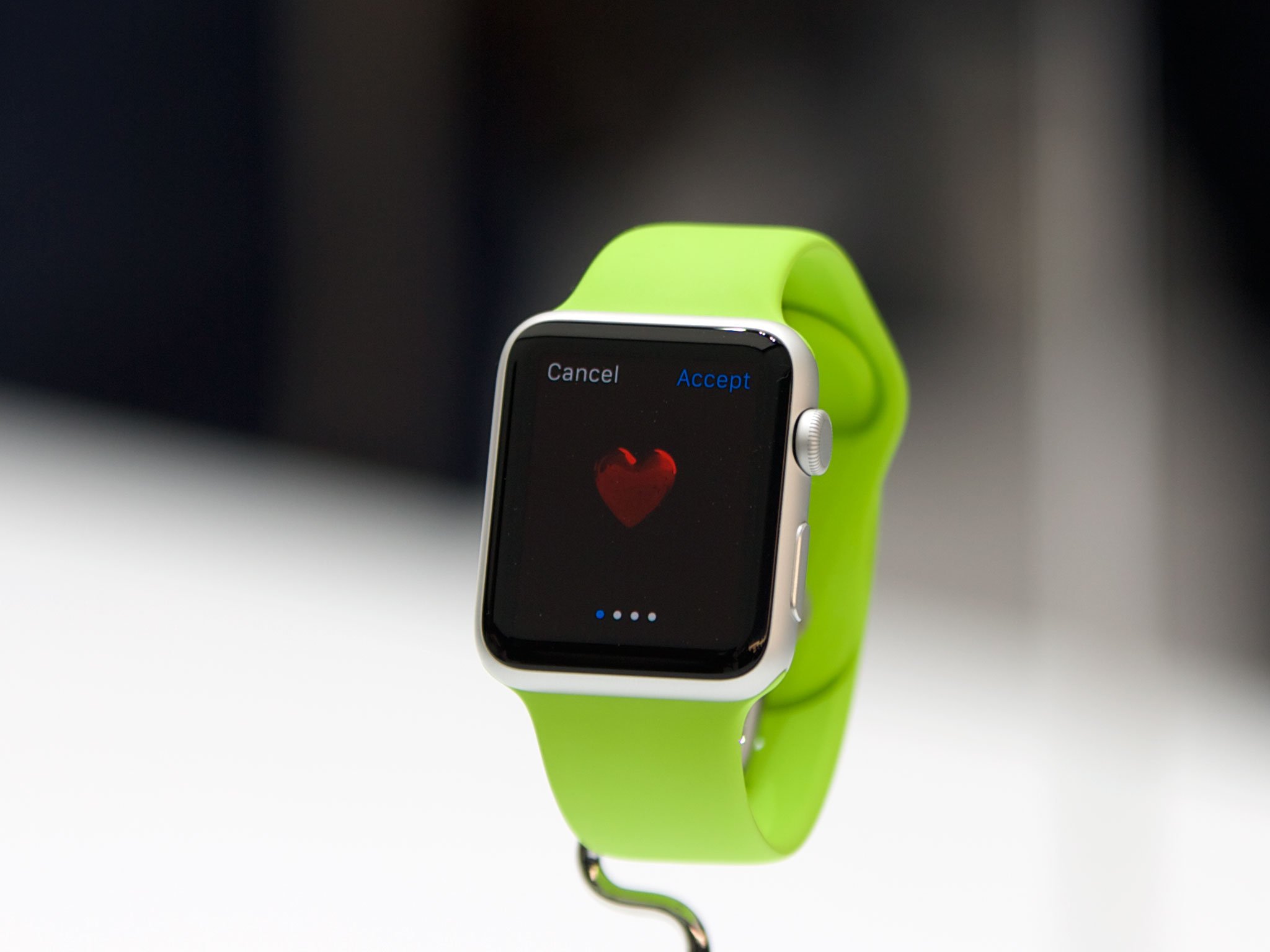
First, regarding the Apple Watch as an object, as a timepiece and fashion accessory: It's been years since I regularly wore a watch, but Apple Watch is pushing to change that. From everything I've seen and heard about the watch, I would be thrilled to wear it every day. As with Apple's other products, the watch seemingly strikes a good balance of form and function. Secondly, the Watch as a device — how it works and how one interacts with it — is bound to have far-reaching effects on users with disabilities. As a person with visual and motor delays, I've wondered myself how accessible the Watch will be, especially in context of the size of watch displays.
Ever since Apple unveiled the Watch last September, I've heard from many in the accessibility community who have expressed trepidation in their enthusiasm for the watch. The common refrain is that the usability story of it for, say, a blind person is unknown. As I said, we with special needs need reasonable assurance that Apple Watch will be usable, particularly in light of the introduction of the digital crown and Taptic Engine.
I met with Apple for a hands-on briefing of the watch and its accessibility features. My aim with this article is to run down what's available on Apple Watch, accessibility-wise, as well as share a few observations I have on their potential impact on watch wearers.
The accessibility of WatchOS
Apple Watch borrows numerous accessibility options from iOS. They include:
- VoiceOver
- Large Dynamic Type
- Extra Large Watch Face
- Reduce Motion
- Reduce Transparency
- Zoom
- Grayscale
- Mono Audio
- Bold Text
- On/Off Labels
- Accessibility Shortcut
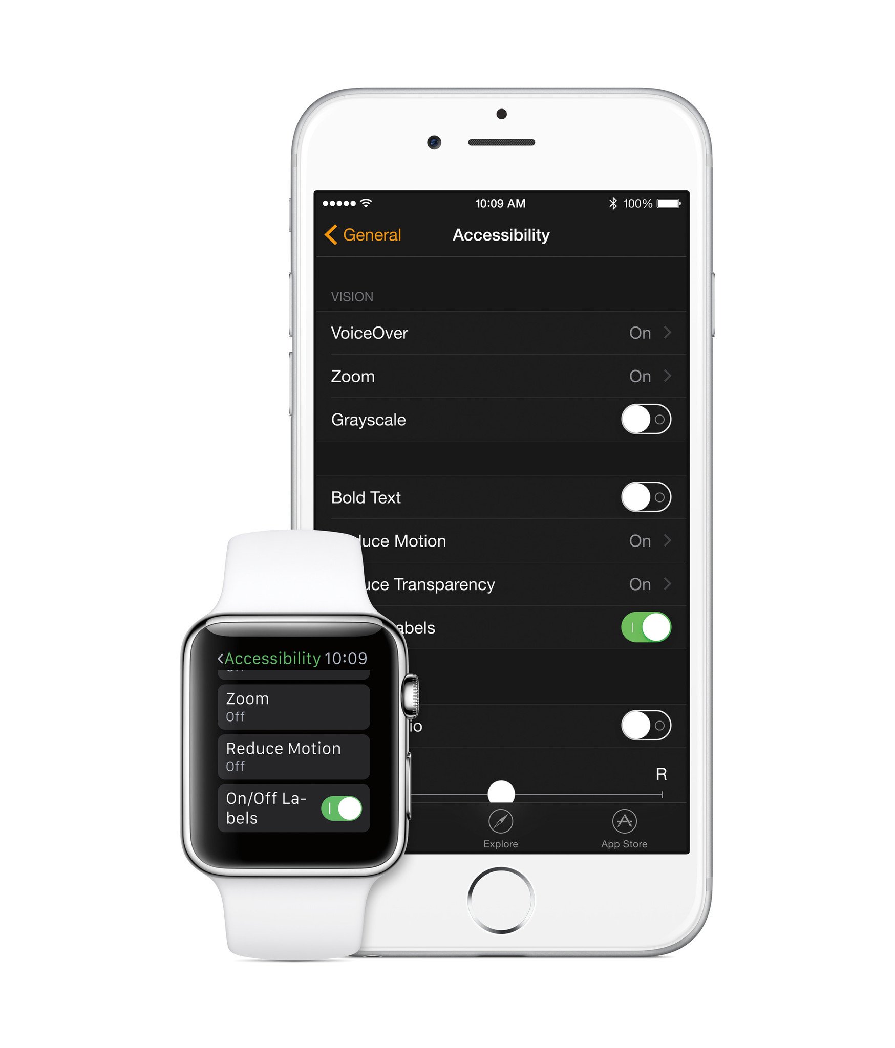
That's a lot of bullet points, but I'm glad to know the Watch supports so much out of the box. In general, the features that were demoed to me (VoiceOver and Reduce Motion were but two) work more or less the same way they do on iOS, albeit on a much smaller canvas. The watch's accessibility features are available on the device itself and on the companion Apple Watch app for iPhone.
It's worth noting that Apple feels the Taptic Engine — a new form of physical feedback that feels akin to a tap on the wrist — is a feature that will be very beneficial to those who are deaf or hard of hearing. I agree. As I wrote for MacStories about the accessibility ramifications of haptic feedback on users with disabilities, Apple's embrace of this technology is profound because it will help someone with a hearing loss, for example, become more aware of what's happening on his or her watch by supplementing the audio stimulus with a tactile one. (Just like an doorbell or telephone for the hearing impaired is equipped with a flashing light to indicate ringing. The phone still rings like normal, but it also simultaneously flashes.)
There are two accessibility features of the Apple Watch that stand out to me: Extra Large Watch Face and Zoom. Regarding the Large Watch Face, it does what it says: shows the time in a ginormous font. It's very well done, although for my needs, I'm confident that I can get by just as well with Large Dynamic Type. Overall, however, Large Watch Face will be great for those who need the clock to be extra big in order to read it. Likewise, the Zoom feature was helpful for me in identifying icons on the Home screen, as they're a tad small at normal size. I found that Zoom works best for me using the digital crown, as the two-finger pan was more difficult to do using my partially-paralyzed right hand (caused by my cerebral palsy).
Master your iPhone in minutes
iMore offers spot-on advice and guidance from our team of experts, with decades of Apple device experience to lean on. Learn more with iMore!
The Apple Watch app

The Apple Watch app is yet another one of those unintentional accessibility wins — it's a great accessibility tool.
As I mentioned above, the Apple Watch's accessibility features are available both on the device and in the Apple Watch app. Since the watch and the iPhone talk with each other, it's possible to, for instance, turn on Grayscale in the app and have it instantly enabled on the watch. This is important for a couple reasons.
The first, most obvious, reason is that the watch app is running on a big screen. Especially for a person with low vision, it's so much easier to fiddle with the Accessibility settings on the iPhone than it is on the watch. The same applies to organizing Home screen icons, setting friends for Digital Touch, and more. It saves on squinting, which ultimately saves on eye fatigue and strain.
The second reason is one of dexterity. My fine-motor mobility isn't the greatest, especially on my right side. I'd much rather complete the "housekeeping duties" for the watch in the app than on the device. My fingers have more room to move, and the margin for error (missed taps, etc) is lesser on the phone.
Of course, the Apple Watch app benefits the fully-abled too. Apple made a smart design decision to offload much of the grunt work to the phone. Not only does it relieve the watch of technical stress, but even those with 20/20 vision and impeccable fine-motor skills can appreciate not having to exclusively navigate such a small display.
The Apple Watch
- I got an opportunity to try on an Apple Watch. Despite being left-handed, I prefer wearing watches on my left wrist, for two reasons. (1) my left side is strongest, so I have more movement and muscle strength in my arm; and (2) as well, my left eye is strongest, and I felt more comfortable viewing the watch with my dominant eye. I realize the convention is to wear a watch on the opposite hand (from the hand with which one writes), but this feels most comfortable to me.
- The digital crown is a lot easier to move than I anticipated. There's a fluidity to it that makes it easy to turn even with the slightest touch of my finger. A definite lubriciousness to it. By contrast, I've always had trouble with traditional crowns on watches, since it takes more force to turn being that they're not nearly as lubricious as the watch's digital crown.
- One of the questions I've had surrounding the watch is how easily someone with motor delays would be able to unfasten and re-fasten the various bands. The watch I saw had a white Sport band, and I was pleasantly surprised at how easy the so-called "pin-and-tuck" method is to manipulate. I had no issues taking it on or off, nor with adjusting the fit. I'm very interested to find out how something like the Modern Buckle or Milanese Loop works in this context, especially since the loop bands (Leather, too) use magnets.
The beginning
As I said at the outset, what you see here is just an overview of Apple Watch's accessibility. The real test will come, of course, when I get a chance to live with the Watch for a while. I'm very much looking forward to assimilating the Watch into my daily life.
Steven is a freelance tech writer who specializes in iOS Accessibility. He also writes at Steven's Blog and co-hosts the @accessibleshow podcast. Lover of sports.


