Comparing iPhone Twitter app timeline views

It's often been said that we enjoy an embarrassment of riches when it comes to Twitter apps for iPhone. Some of the best developers and designers have spent months and years crafting, and in some cases continually re-crafting, app for Twitter, striving for their versions of perfection. And this in spite of Twitter's recent proclamations encouraging third party clients to walk out onto ice flows or sand dunes and die already. Over the weekend, Phil Nickinson compared 17 Twitter app timelines for Android, and he promptly challenged me to do the same for iPhone. I one-upped him with 18, though admittedly I cheated by including 3 discontinued Twitter apps in the comparison.
It's interesting to see them all gridded up, to see the juxtaposition of consistency vs. creativity, readability vs. information density. I used the exact same feed point for each client, with the exception of the legacy apps at the bottom. It includes an @mention so that we can see how, if at all, a client highlights or otherwise distinguishes that type of post. I also got rid of ads, wherever possible, to keep things clean, and made sure basic controls were in a visible state.
Here then, in order, from top left to bottom right, are:
- Twitter, Twitterrific, Tweetbot
- Flurry, Twittelator Neue, Twittelator Pro
- Watercooler, Tweetlist, Tweetcaster
- Tweetlogix, Echofon Pro, Tweetings
- Tweetdeck, UberSocial, Osfoora
- Birdfeed, Tweetie, Reportage (discontinued)

Of course, the timeline view is only one aspect of a Twitter app, and can't properly address features and flourishes like gestures, notifications and filters, parallax image embeds, sorting, and other ways some of the clients have innovative and provided extra enjoyment and value.
Consider this comparison, then, just a start.
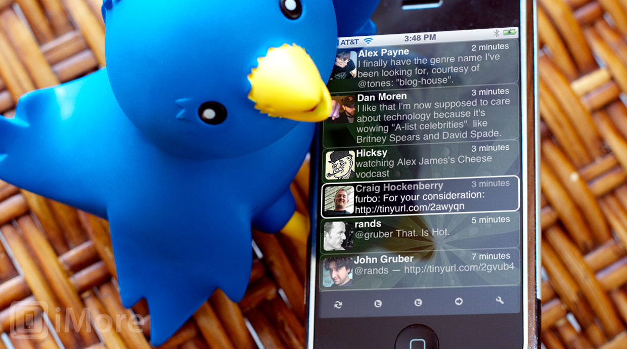
(Yes, the hero shot above is Ollie and Twitterrific 1.0, the original iPhone app that started it all, and one of the first inductees into our Hall of Fame.)
And if you want DVD-style extras, and a peak behind the scenes of your favorite Twitter apps, check out:
Master your iPhone in minutes
iMore offers spot-on advice and guidance from our team of experts, with decades of Apple device experience to lean on. Learn more with iMore!
- Debug 1: Loren Brichter and Tweetie
- Debug 2: Paul Haddad and Tweetbot
- Iterate 35: Gedeon Maheux, David Lanham and Twitterrific 5
- Debug 5: Craig Hockenberry, Sean Heber, and Twitterrific
Meanwhile, look over the designs above and let me know what you think. Which Twitter apps do you use, and are they the same ones that appeal to you most in the comparison above? Any of the timelines attractive enough they encourage you check out an alternative app? And how do you think they compare to the best and brightest of the Android Twitter app timelines Phil looked at?

Rene Ritchie is one of the most respected Apple analysts in the business, reaching a combined audience of over 40 million readers a month. His YouTube channel, Vector, has over 90 thousand subscribers and 14 million views and his podcasts, including Debug, have been downloaded over 20 million times. He also regularly co-hosts MacBreak Weekly for the TWiT network and co-hosted CES Live! and Talk Mobile. Based in Montreal, Rene is a former director of product marketing, web developer, and graphic designer. He's authored several books and appeared on numerous television and radio segments to discuss Apple and the technology industry. When not working, he likes to cook, grapple, and spend time with his friends and family.
