Custom complications on watchOS 2: Explained
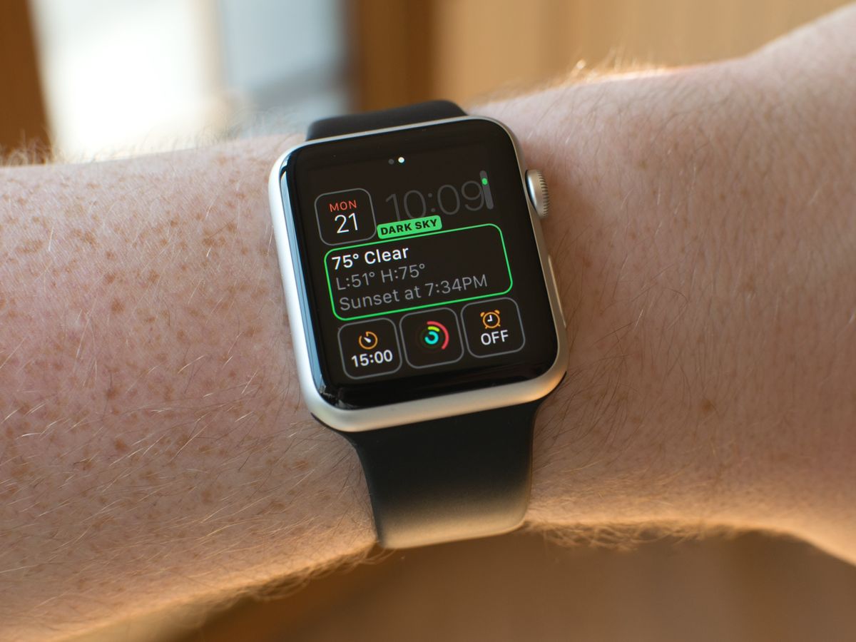
Calendar was the first Apple Watch complication that showed time keeping beyond what even a mechanical or digital watch could do. Now, with watchOS 2, Apple is letting third-party App Store apps in on the complications game with a framework called ClockKit. And in so doing, they're opening us up to something bigger and brighter—the future of the computational watch.
Sports scores, movie times, delivery schedules, arrival estimates, and more are now possible with custom complications. And that opens up not only new types of data but new styles of presentation. Carrot Weather, for example, will give you forecasts with attitude and that can brighten your day even when it's overcast.
How custom complications work
When you install an Apple Watch app with a complication, that complication becomes available for you to use on the clock face. You can then enable it the same way you enable built-in complications: Force press the clock face, choose the customize option, and then switch to it using the digital crown.
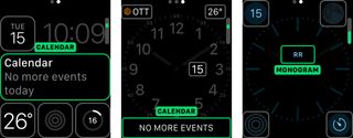
A placeholder for the complication is shown to give you a sample of what it looks like, and the label tells you the name of the app it comes from so you can make sure you're choosing the right one.
Data for the complication is provided by the app itself, but it's fitted and formatted by a template for the clock face. That makes sure everything stays both usable and consistent.
Complication templates
Since different clock faces can support different types of complications, the templates come in "families" that map to those clock faces.
- Modular small.
- Modular large.
- Utilitarian small.
- Utilitarian large.
- Circular small.
Modular complications are found on the Modular clock face and include the several small squares around the edges and a single big rectangle in the middle. Modular small can include a line of header text and a line of body text, an image stacked on a line of text, a single large line of text, a single image, a small bit of text or image surrounded by a progress ring, or a double column of text and numbers. Modular large can include a header text with optional header image and two rows of body text, header and option image and one large row of text, or two columns with optional header and two or three lines of data.
Master your iPhone in minutes
iMore offers spot-on advice and guidance from our team of experts, with decades of Apple device experience to lean on. Learn more with iMore!

Utilitarian complications are found on the Utility clock face and include the few small rectangles in the corners and the single big rectangle along the bottom. Utilitarian small can have a single bit of text with an optional header image, a small image, or a small bit of text or image surrounded by a progress ring. Utilitarian large can only be a line of text with an optional header image.
Circular small complications are found on the Color and similar clock faces and include the small round circles in the corners. They can include two stacked lines of text—a header and body, an image stacked on a line of text, a single large line of text, a single image, or a small bit of text or image surrounded by a progress ring.
Because images need to match the color scheme chosen for the clock face, they're provided as a set of assets that include an alpha-masked background and optional foreground image (image providers). Because text has to fit into a tiny amount of space, sometimes as small as 44 x 44 pixels, still needs to provide useful information, and can't be truncated, Apple handles the formatting and fitting as part of the template.
There's a date text provider, relative data text provider (for countdowns in natural, offset, or timer styles), simple text provider, time text provider, and time interval text provider. Using them, for example, "Wednesday, September 16" wouldn't render "Wednesd..." but would render "Wed, Sept 16", "Sept 16" or even "16" if that's all that fits. The complication simply pulls the data and, whenever possible, figures it out. It's also smart enough to dump redundant information.
It's technical wizardry, and it's what allows for other features like Time Travel, where you spin the Digital Crown and look at what happened in the past or what's expected to happen in the future. We'll dive into how that works in a future column.
Uncomplicated
Convenience is the killer Apple Watch feature and complications are its first, fastest layer. Brief bits of data you digest at a glance, they've previously fed us everything from time around the world to temperature where we are, our battery levels to our activity levels.
Now, with custom complications in watchOS 2, they can feed us anything developers can dream up. And, naming conventions aside. they can help make our lives decidedly less complicated.

Rene Ritchie is one of the most respected Apple analysts in the business, reaching a combined audience of over 40 million readers a month. His YouTube channel, Vector, has over 90 thousand subscribers and 14 million views and his podcasts, including Debug, have been downloaded over 20 million times. He also regularly co-hosts MacBreak Weekly for the TWiT network and co-hosted CES Live! and Talk Mobile. Based in Montreal, Rene is a former director of product marketing, web developer, and graphic designer. He's authored several books and appeared on numerous television and radio segments to discuss Apple and the technology industry. When not working, he likes to cook, grapple, and spend time with his friends and family.

