How to use iPhoto to darken and add drama to your iPhone photography
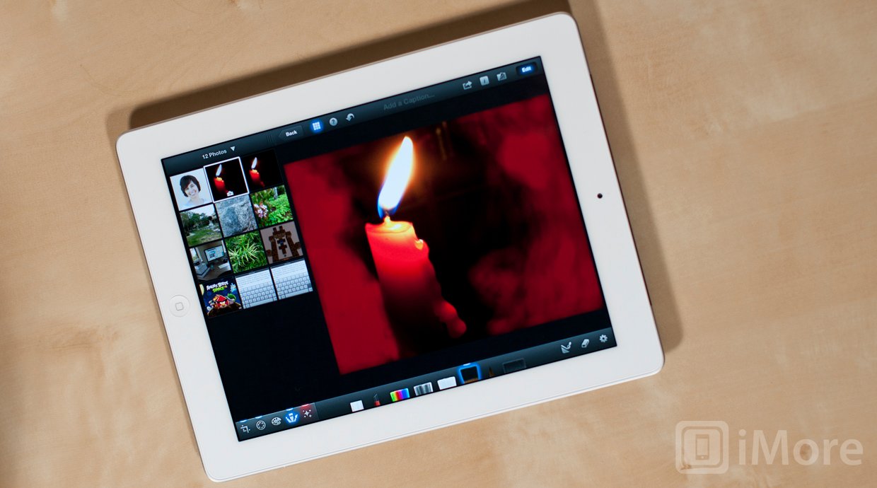
This week our iPhone Photography series is going to be a little different. Instead of exploring a new technique for taking better photos, we're going to dive into the digital darkroom of iPhoto to improve an image we've already taken. It's always worth capturing the best possible photo you can with your camera. Thanks to photo editing apps like iPhoto, however, when and if something goes wrong -- the framing is a little off, the white balance or exposure isn't perfect, the levels just don't look right -- there's a lot you can do to fix it.
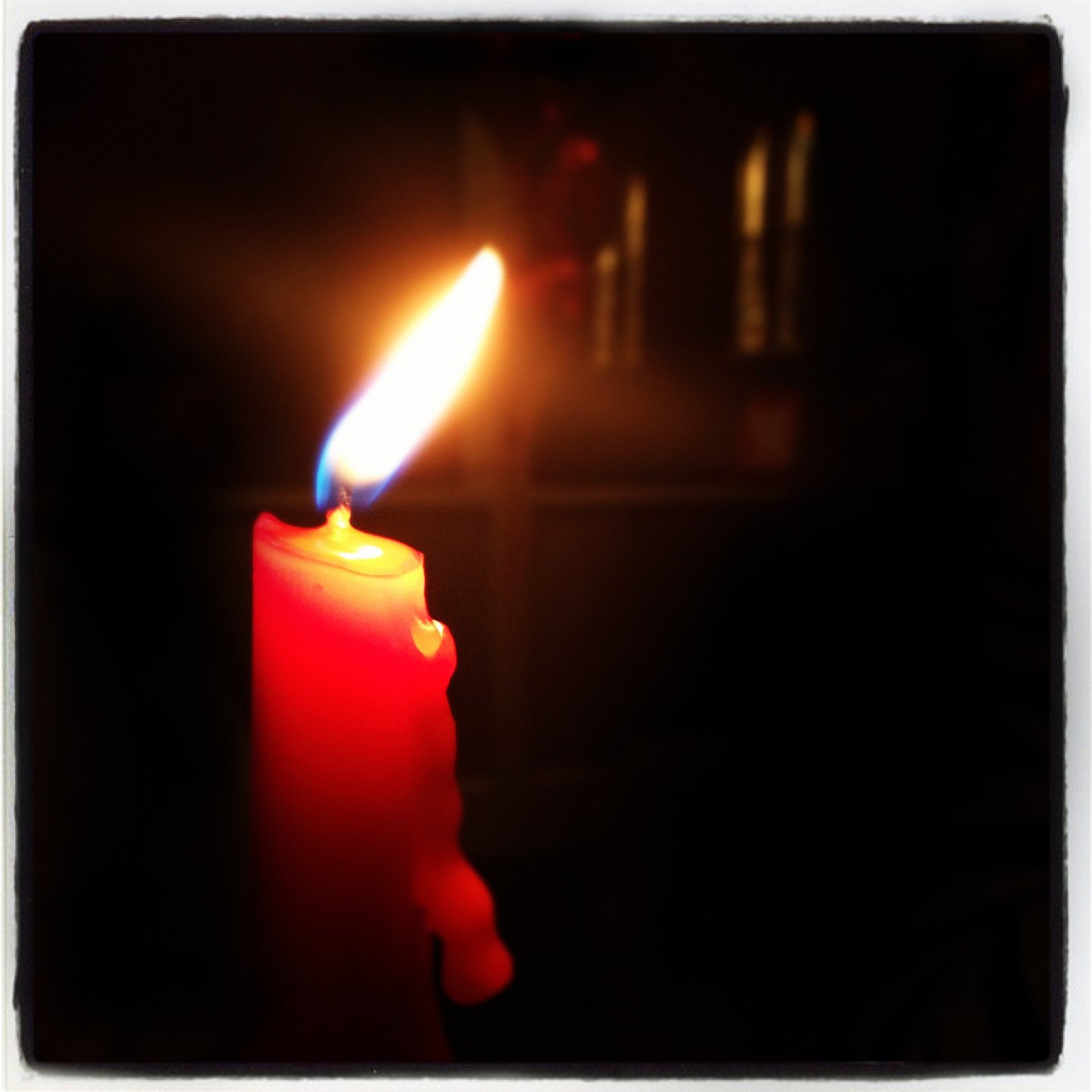
Perhaps you recall seeing this image in our lesson about negative space. I admitted to editing it a bit. What I didn't admit to was how much editing I did. Sure, I did crop to a square and apply an Instagram filter like I mentioned, but I also fired up Photoshop to darken parts of the image even more.
Well, this is an iPhoneography series, so instead of using Photoshop for our edits, we're going to use Apple's new iPhoto app for iPhone and iPad. I'm going to use the iPad because I enjoy using the larger screen, but the same process can also be done on the iPhone.
- iPhoto for iPhone and iPad, $4.99 - Download Now
Before we get started, download the full resolution version of the original image so that you can do the edits with me. (Hold down your finger on the image and tap Save Image. This will save it to your Camera Roll.) Here's what it should look like.
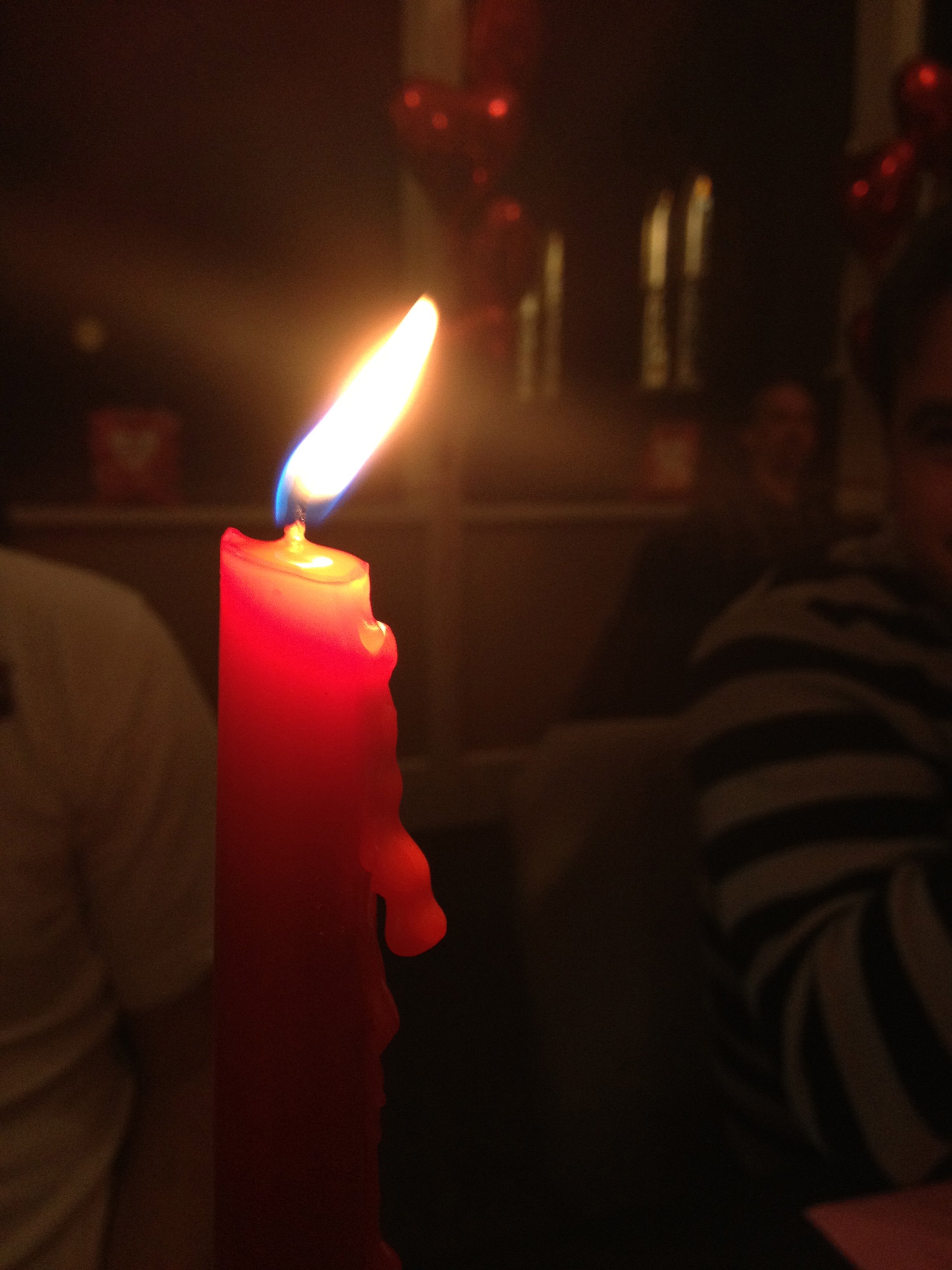
Huge difference from the final image I used, isn't it? This is why learning how to edit your photos is also an important part of photography, especially for iPhoneographers who don't have the luxuries and control that come with shooting with a DSLR.
Critique your image
When you decide you want to edit an image, the first thing you should do is sit back and critique it. What do you want it to look like? Why does it even need to be edited in the first place? You don't just want to start blindly editing photos with a "we'll see what happens" approach. This will result in images that look processed and overdone. This shouldn't be your goal. (Side note: that type of look does have its place, but it's not what we're going to focus on and, it too, should also be planned and deliberate).
When I look at my original image, I see a lot of flaws. First, the orientation is wrong. To bring the viewer's attention to the flame, my intended subject, it would be better cropped either horizontally, or as a square. Notice that I said my subject is the flame, not the candle. This is important. Know your subject.
Master your iPhone in minutes
iMore offers spot-on advice and guidance from our team of experts, with decades of Apple device experience to lean on. Learn more with iMore!
Second, there's a lot of distracting elements in the frame -- especially the people and balloons. Note, however, that I intentionally composed the shot so that the flame, itself, didn't have a person behind it.
Now that we've determined what's wrong with the photo, we know what we want to fix. We need to crop the image with a landscape orientation and get rid of the distracting elements. The most natural way to do that is by darkening those areas.
Crop
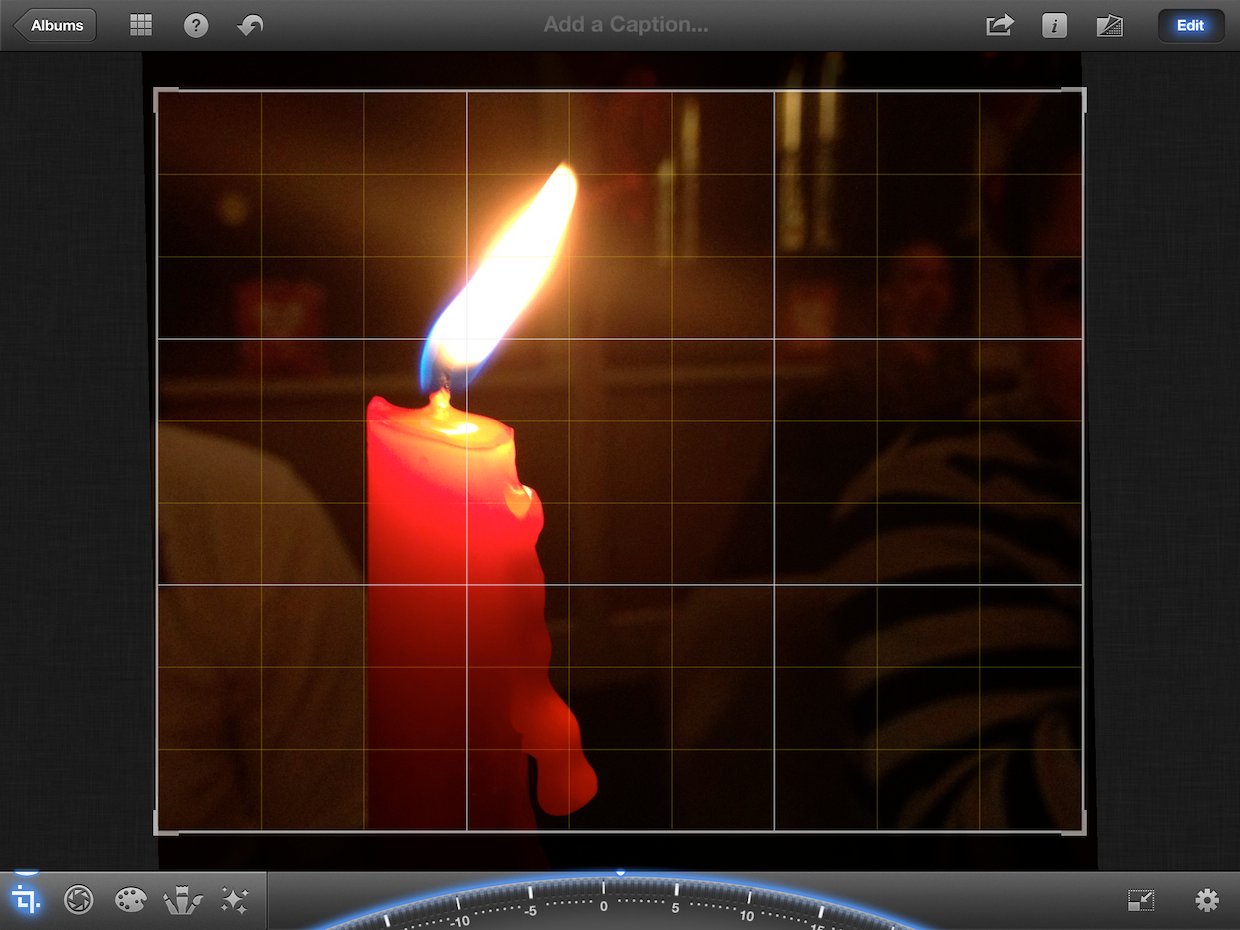
We're going to start by cropping the photo so that it has a horizontal orientation. There are many different ratios to choose from, and for this image, the important thing is to make sure that the ratio you choose doesn't cut off the dripping wax as this is an interesting element of the photograph. The best choice for this image was 10x8.
To crop the image, tap the crop icon in the lower left corner. Then tap the settings icon on the bottom right and swipe to the 2nd page to select 10x8. To make sure the image is straight, adjust the dial at the bottom until the grid lines are perfectly lined up with the candle. I went about two degrees in the positive direction.
Adjust contrast and shadows
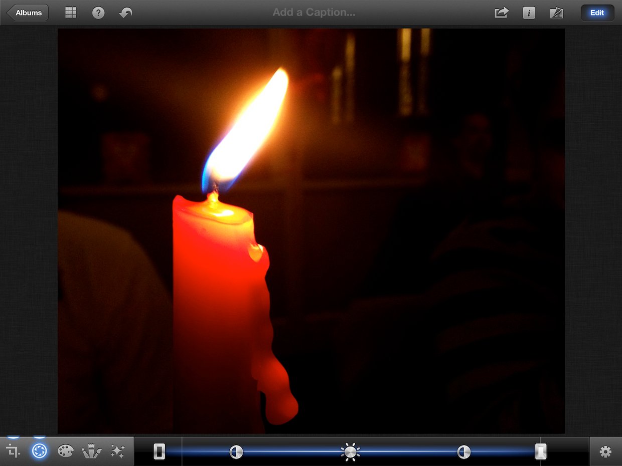
Next up, we're going to adjust the contrast and shadows. This will darken the background a bit before we jump into using the darken tool.
To adjust the contrast, tap the exposure icon. It's the one directly to the right of the crop icon. This will show you a line with some icons across the bottom of the screen. The first and last icons adjust the shadows and highlights, the middle icon adjusts the exposure, and the other two adjust the contrast.
Now let's make our adjustment. Tap either one of the contrast icons and slide it away from the center. This will increase the contrast. You'll notice that this will darken the background and make the flame and candle "pop" a bit more. Adjust this to taste. I went about a third of the way between the shadows icon and the exposure icon. I recommend moving it to where you think it looks good, then going a little bit less than that.
Finally, we'll adjust the shadows. Again, adjust to to where you think it looks good. I went about halfway between the zone on the left. This edit made my background even darker.
At this point, our image has already greatly improved. Trigger the button next to the Edit button in the upper right hand corner to compare with the original. Already a great improvement! But we can do even better. Specifically, I want to get rid of the remaining evidence of someone sitting on the right and darken that white shirt on the left as much as I can.
Darken
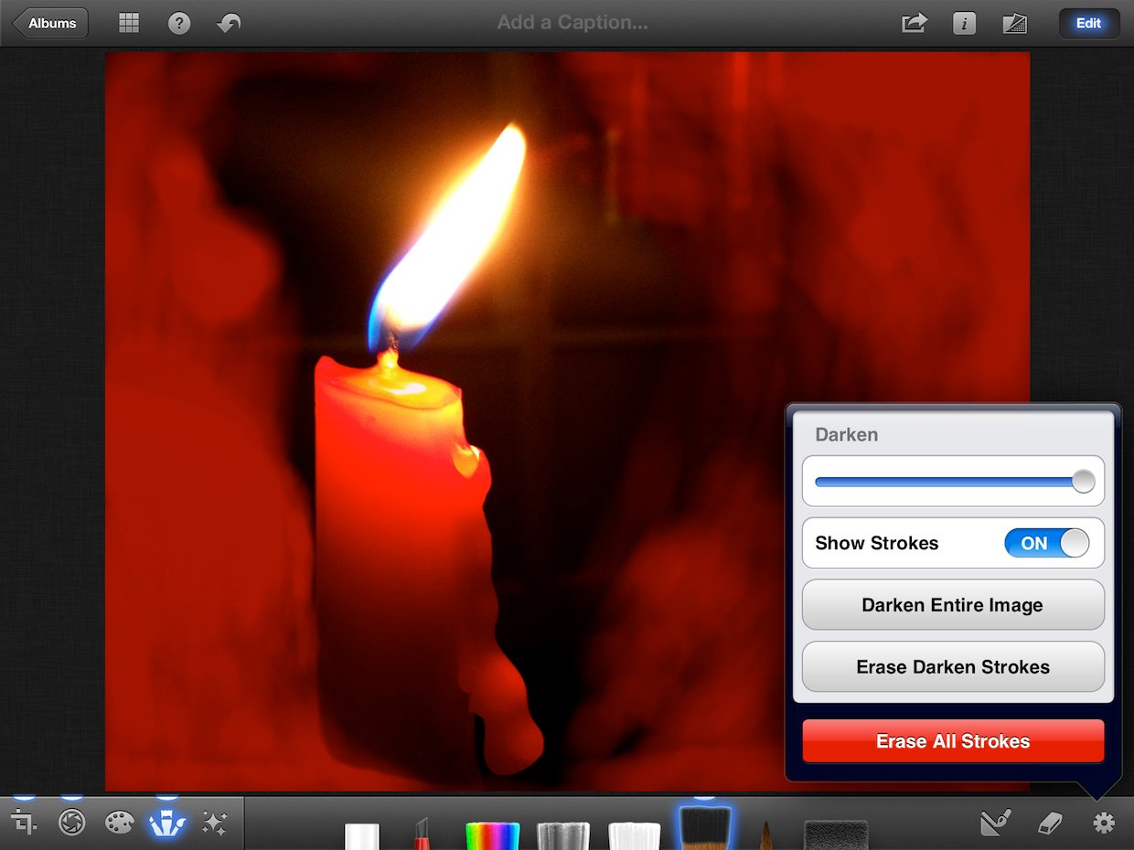
Now we're going to eliminate the remaining distracting elements by darkening those areas of the photo. To do this, select the Darken brush from the Brushes menu (4th icon in the bottom left corner). Next, tap the Settings icon in the lower right corner and toggle Show Strokes to ON. This will allow you to see exactly where you're applying the brush.
Start painting the areas around the flame with your finger. Your strokes will show up in red and you'll notice that the opacity increases the more times you go over an area. Make sure you go over the areas that are far away from the candle as much as possible. Also do your best to blend the opacity level of your strokes as you get closer to the candle. Otherwise, there will be an obvious line where you stopped applying the brush. Be patient. Take your time. Tap the undo button if you make a mistake. You can also use the eraser tool to erase your strokes.
Pay special attention to the area to the left of the candle and pinch to zoom into the photo to make sure you're precise. Also make sure you cover the area with the shirt good since it's so light.
When you're done, trigger Show Strokes to off and take a look at your results. Then adjust the slider all the way to the right to make the area you painted even darker. If you notice any areas that need to be fixed, turn Show Stokes back on and make your adjustments. Turn the stokes back off and compare with the original photo again.
Looking much better! But notice that you can still still the shirt on the left side of the candle and the windows are also a bit distracting. Unfortunately, the Darken tool couldn't completely take care of it. That's why we're going to see if there's a filter that'll help us out.
Filter
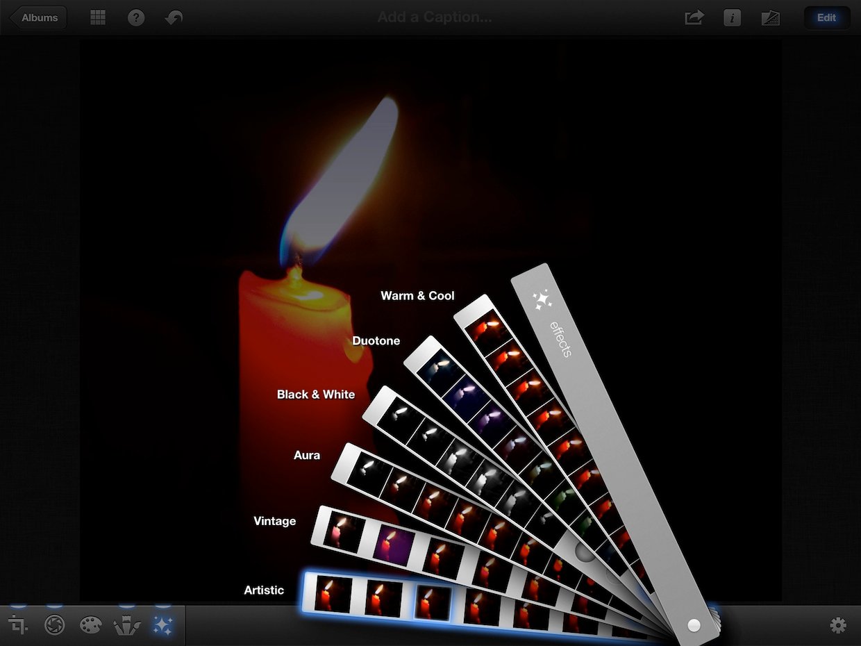
Feel free to experiment with the different filters, but I have narrowed it down to the two I think are best.
The third choice in the Artistic category does a great job of dimming the windows without drastically changing the look of the candle. However, the white shirt on the left is still fairly visible.
The third choice in the Vintage category almost eliminates the shirt entirely and also dims the windows a little bit. But it also reddens the already very red candle.
I think both of these filters make very fine choices. However, I wasn't completely satisfied with either, so I went with the one in the Artistic category, saved it to my Camera Roll, then edited the saved image by just darkening the area with the white shirt.
Final result
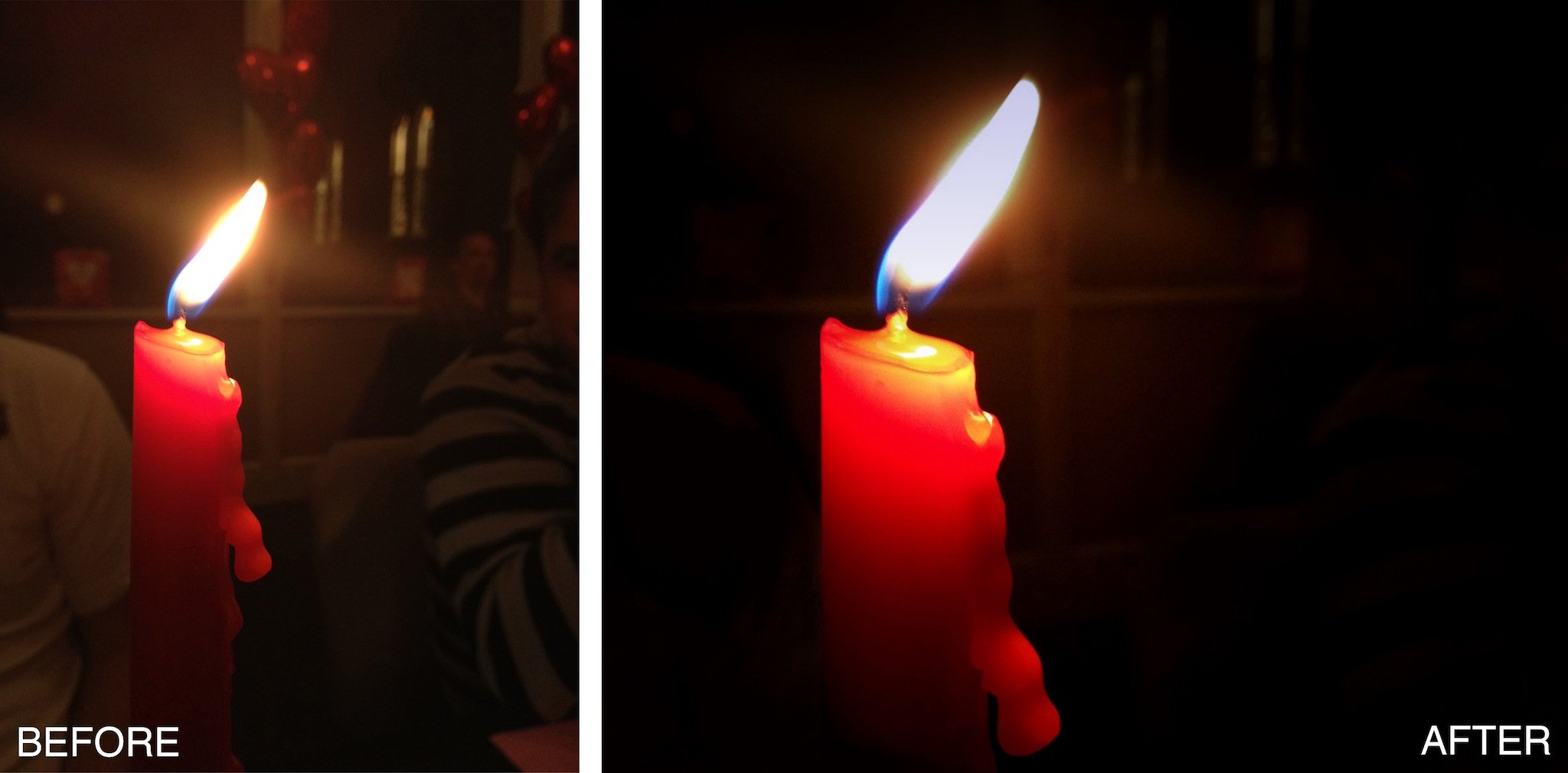
Look at the difference! To see a larger comparison, just tap/click the image.
Now, that wasn't too hard, was it? Usually, a few small edits can have a major impact on your images.
Assignment
Your assignment for this week is to edit your photos! Remember, the first thing you want to do is critique your image and decide on the changes that need to be made. If you need help, feel free to ask the iMore community for some suggestions. After you've made your edits, head to the iMore Photography forum and share your results! Make sure to include both the before and after shots!
How to get more help with iPhone photography
- How to get started with iPhone photography
- How to make your iPhone photography more striking with the “rule of thirds”
- How to make your iPhone photographs more powerful with negative space
- How to take amazing macros with your iPhone
- How to take stunning panoramas with your iPhone
- How to take awesome HDR photos with your iPhone
- How to take great looking portraits with your iPhone camera
- How to take fantastic photos of your kids with your iPhone
- How to take dreamy iPhone photos of your newborn baby
- How to take irresistible photos of your pets with your iPhone
- How to take spectacular photos of your car with your iPhone
- How to use iPhoto to darken and add drama to your iPhone photography
- How to use iPhoto to polish and perfect your iPhone portraits
- All iPhone Camera app how-tos
- All iPhone Photos app how-tos
- iPhone photography forum
Former app and photography editor at iMore, Leanna has since moved on to other endeavors. Mother, wife, mathamagician, even though she no longer writes for iMore you can still follow her on Twitter @llofte.
