Fixing the Apple TV Siri Remote

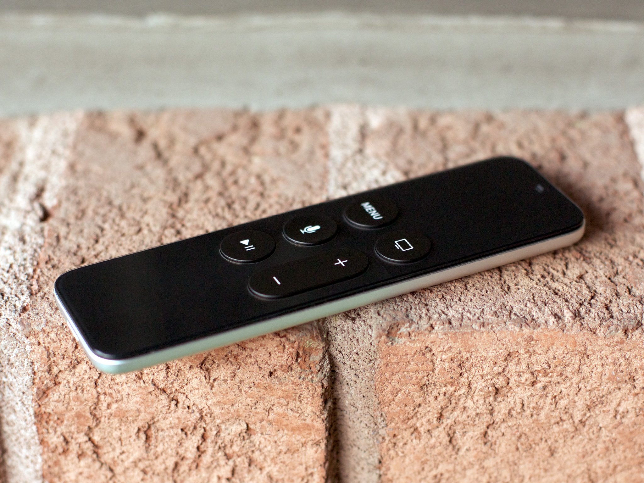
On The Talk Show, John Gruber and I spent some time discussing the new Siri Remote for Apple TV. The current design is useful but confusing. It's almost impossible to tell which side is up and the buttons aren't as intuitive as they could be.
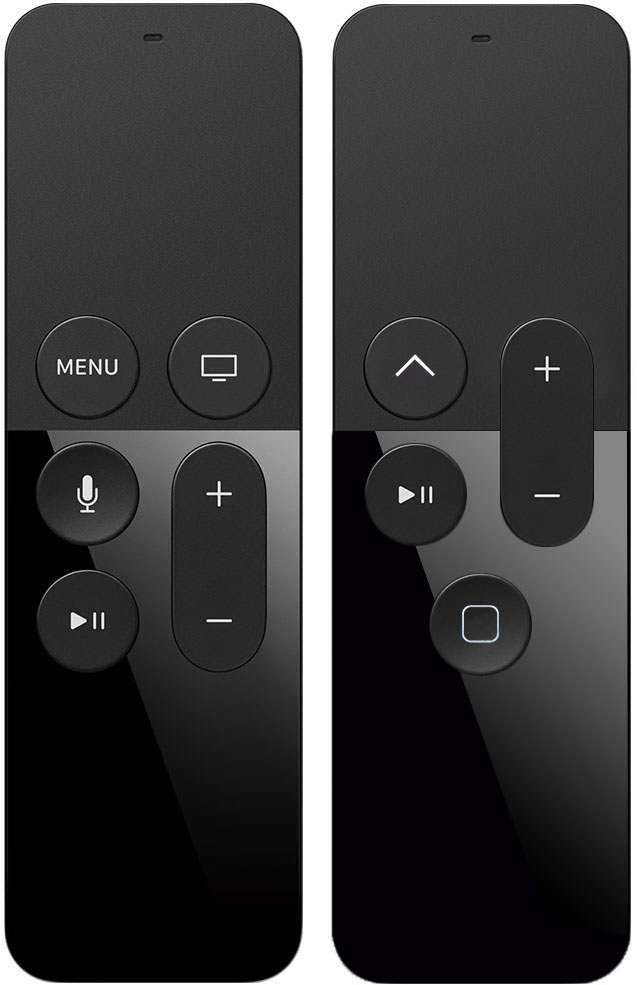
So, I took I put together mock up of some of the possible changes we felt could improve it.
1. Rebrand the MENU button

MENU is the only text used on the controller, which makes it stick out. It also improperly describes the button's function. Unlike the iPod, from which its derived, clicking MENU doesn't bring up a menu. It moves the system back through the navigation hierarchy. On iOS devices, this button is labels with a back chevron. On TV controller, that might be confused with content controls for "skip back" or "rewind", so I went with an upward chevron. It feels consistent, visually matches the experience, and also hints which end of the Siri Remote is up.
("Menu" isn't what the button does, and Apple has spent years dissuading designers from using the "hamburger" glyph (☰), so it wouldn't fit in here. The "More" gylph (•••) would likewise be out of context.)
2. Rebrand and reposition the Home button
The current Home button sports a TV set glyph. It's a departure from the rounded rectangle used on generations of iPhones, iPads, and iPods touch, and not only does it fail to describe the function, it's confusingly similar to the existing AirPlay icon. So, in this version, the Home button returns to the rounded rectangle and, more importantly, moves to the bottom—and to the center. Not only is that position immediately familiar to hundreds of millions of iOS device owners, it adds some much-needed asymmetry to the controller, clearly distinguishing top from bottom.
3. Remove the Siri button
By moving the Home button to bottom center we remove the slot currently assigned to the Siri button. Luckily, generations of iOS device owners have been trained to hold down on the Home button to trigger Siri, and we still have a Home button on this controller. Not only would that keep things consistent, it wouldn't flaunt Siri in the faces of the vast majority of the world in which the service is still not provided. For them, holding down Home could launch the Search app instead.
An argument could be made for moving the volume rocker to the side, like on the iPhone, as well. The goal of this exercise was stick as closely as possible to the existing controller, and while that's consistent positioning with the phone, this isn't a phone — it's a remote control.
iMore offers spot-on advice and guidance from our team of experts, with decades of Apple device experience to lean on. Learn more with iMore!
Your Siri Remote fixes?
I can't even imagine how hard it must have been to nail the feel and function of the touch-sensitive area on the Siri Remote, but Apple's interactivity team absolutely nailed it. I have no doubt they thought just as deeply and worked just as hard on the buttons.
Some design challenges have no clear or easy answers, though, and even the best balance is, by necessity, the best compromise. Great design is about finding what works and then iterating as time, technological advances, and wider feedback allows.
That's what this is—feedback. Let me know yours!

Rene Ritchie is one of the most respected Apple analysts in the business, reaching a combined audience of over 40 million readers a month. His YouTube channel, Vector, has over 90 thousand subscribers and 14 million views and his podcasts, including Debug, have been downloaded over 20 million times. He also regularly co-hosts MacBreak Weekly for the TWiT network and co-hosted CES Live! and Talk Mobile. Based in Montreal, Rene is a former director of product marketing, web developer, and graphic designer. He's authored several books and appeared on numerous television and radio segments to discuss Apple and the technology industry. When not working, he likes to cook, grapple, and spend time with his friends and family.

