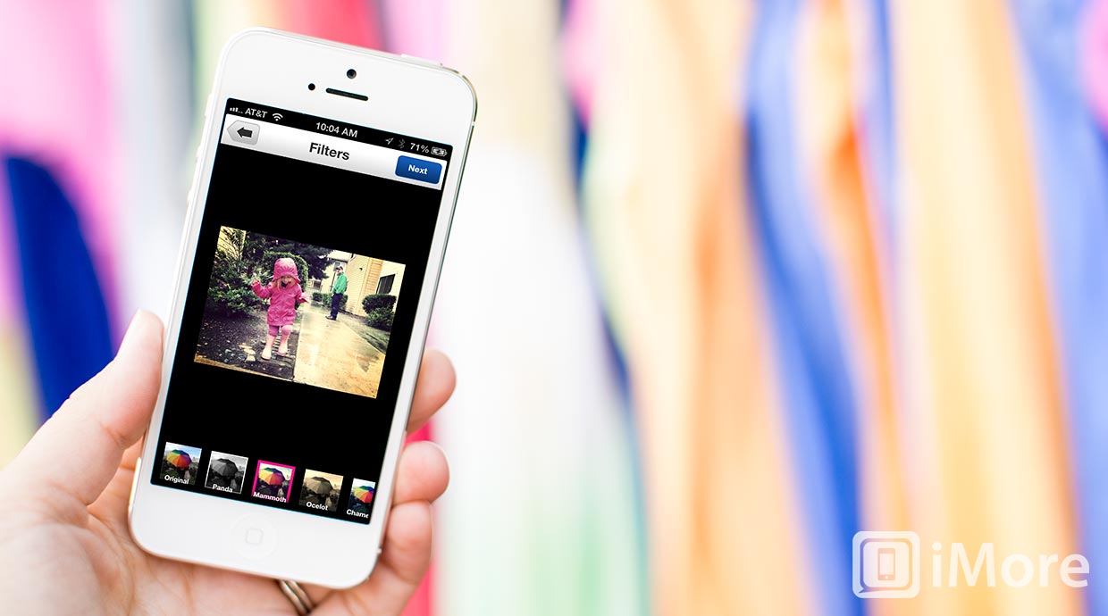
In case you didn't have enough photo-flitering apps to update this week between Instagram and Twitter, Flickr has also updated their iPhone app with a complete redesign and, you guessed it, filters! There are 16 different filters available as well a wide selection of editing tools.

The editing tool and filters included with Flickr for iPhone are actually not too bad. For editing, you can enhance, rotate, crop, and adjust brightness, contrast, saturation, and sharpness. You can also draw directly on your photo, add text, remove redeye, whiten teeth, and remove blemishes. The filters included cover a wide variety of choices and are well designed. I must say that Flickr's filters are way better than Twitter's. That's how it should be, though, since Flickr is actually a service dedicated to photography, whereas Twitter is not.
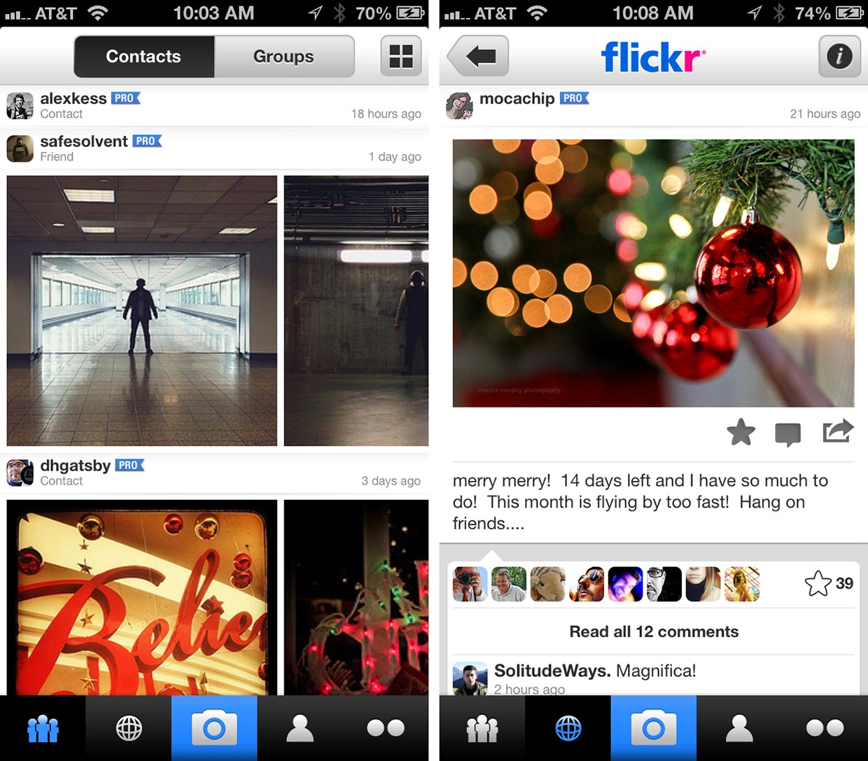
Making adjustments to your photos and adding filters is not all that Flickr has to offer. Flickr is a very social photo sharing service, so all of that goodness is also included in the app. The social tab will let you view feeds from your contacts and groups. The photos are organized vertically by user or group so that scrolling up and down will move through users and groups. Under each user or group, there are photos that can be scrolled through horizontally. I really like this approach as it's both visually appealing and effective. If, unlike me, you hate this look, you can switch to a vertical-only view that organizes photos by date.

What's great about both views is that Flickr respects the original crops of the photos and doesn't force them into square thumbnails. This is something that really bothers me about other popular photography apps. How the photographer crops and composes their photo is part of the art, so forcing users to either crop their photos as a square and/or to view non-square photos as square thumbnails is a major pet-peeve of mine.
When you tap on a photo, you will be taken to its page where you can tap on it again to see it even bigger, read comments and add your own, mark it as a favorite and share it to Facebook, Twitter, Tumblr, or Email. Swiping left or right while viewing a photo's page will advance through the other photos by that user or group.
The tab with the globe icon will let you browse through Flickr's Interesting stream and nearby photos.

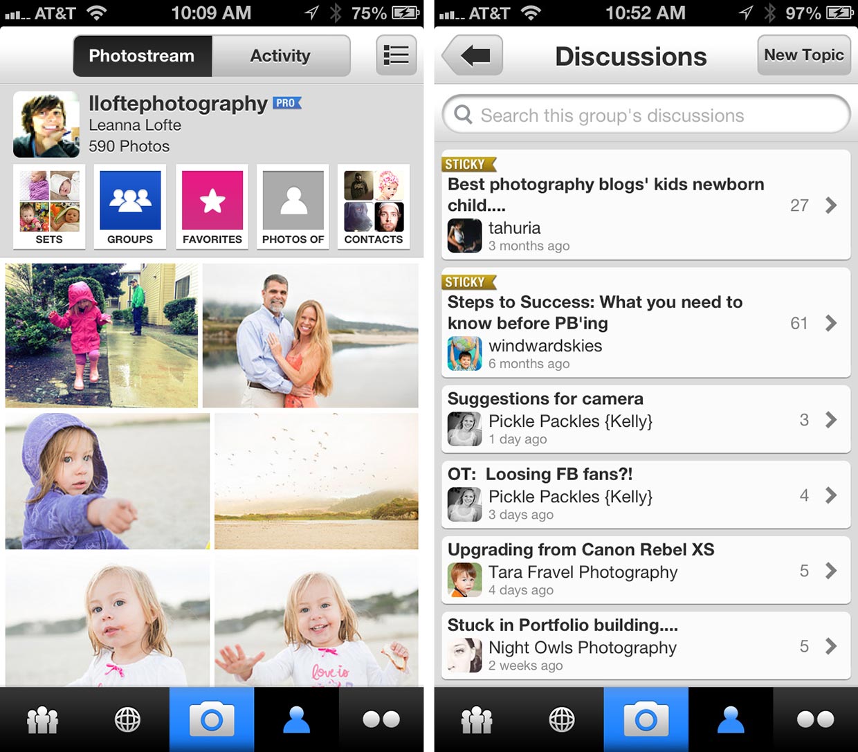
Your profile page will display your Photostream as well as give you quick access to your sets, groups (and discussions), favorites, photos of you, and contacts. You can choose to have you photos display in the typical collage style, or switch to a list view that shows a small (yes, square) thumbnail of each photo, it's title, and the number of views, favorites, and comments.
In addition to your photostream, your profile also has a tab that displays your activity stream.
I'll admit that when I first saw that Flickr was updated, I immediately focused on the fact that they jumped onboard the filters train and had a negative feeling towards Flickr because of that. But now that I've spent some time with the app, I'm very pleased with the update.
Any Flickr users want to give some input? What are your thoughts on Flickr's decision to add filters? Is this good for the community, or does it "cheapen" it?
- Free - Download now
Former app and photography editor at iMore, Leanna has since moved on to other endeavors. Mother, wife, mathamagician, even though she no longer writes for iMore you can still follow her on Twitter @llofte.


