The difference between Apple and Samsung industrial design
Galaxy S9
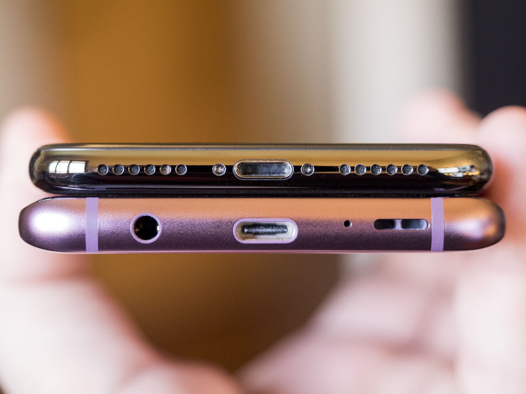
Three years later and Samsung either doesn't care about building aligned products from the ground (or board) up, or doesn't know how. The Galaxy S9:
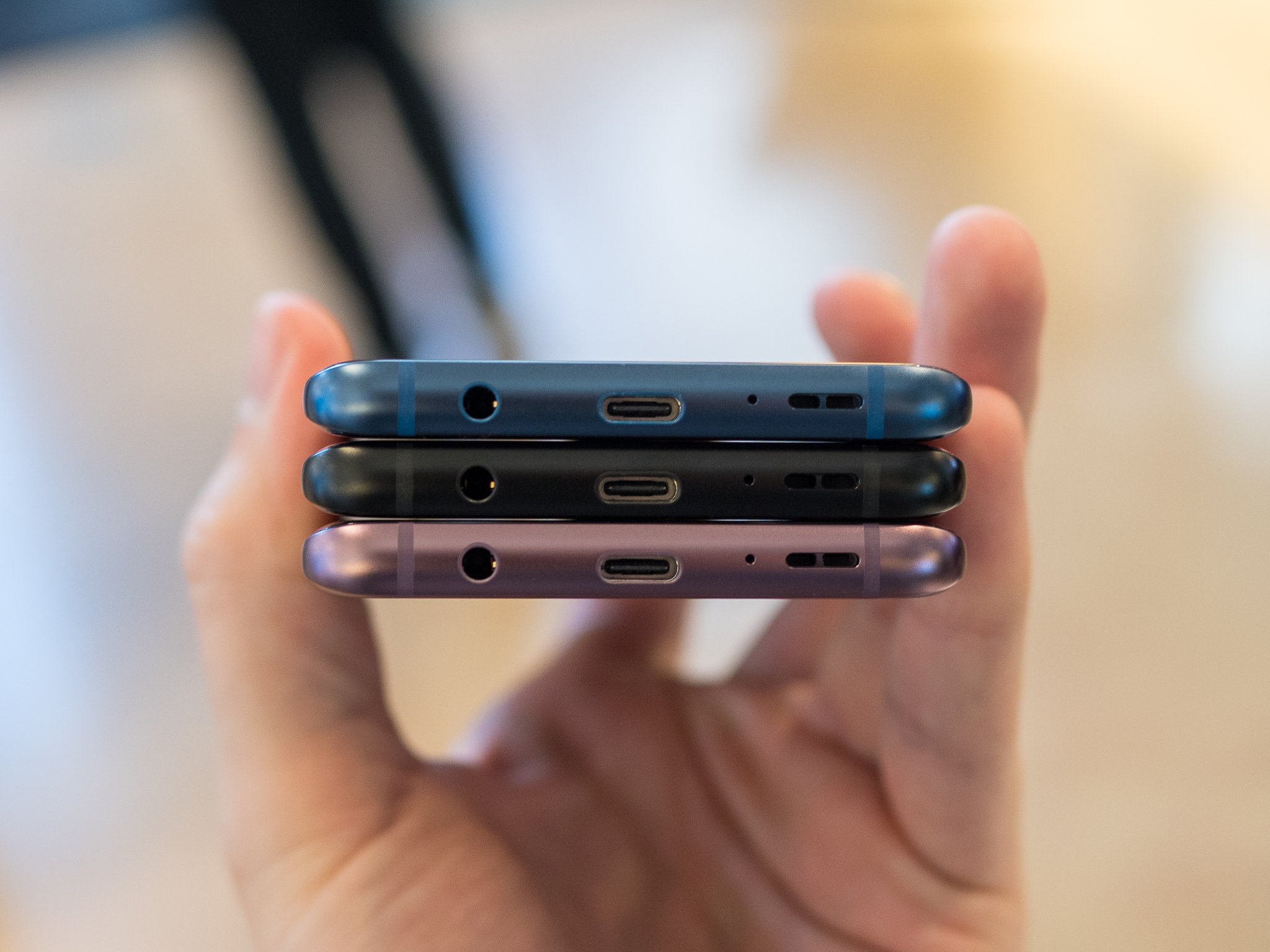
And here's how it compares to Apple's latest, the iPhone X.
Galaxy S8
Two years later and Samsung has to have finally gotten the ports and buttons aligned, right? Not so much. The just-announced Galaxy S8, sadly:
Galaxy S7
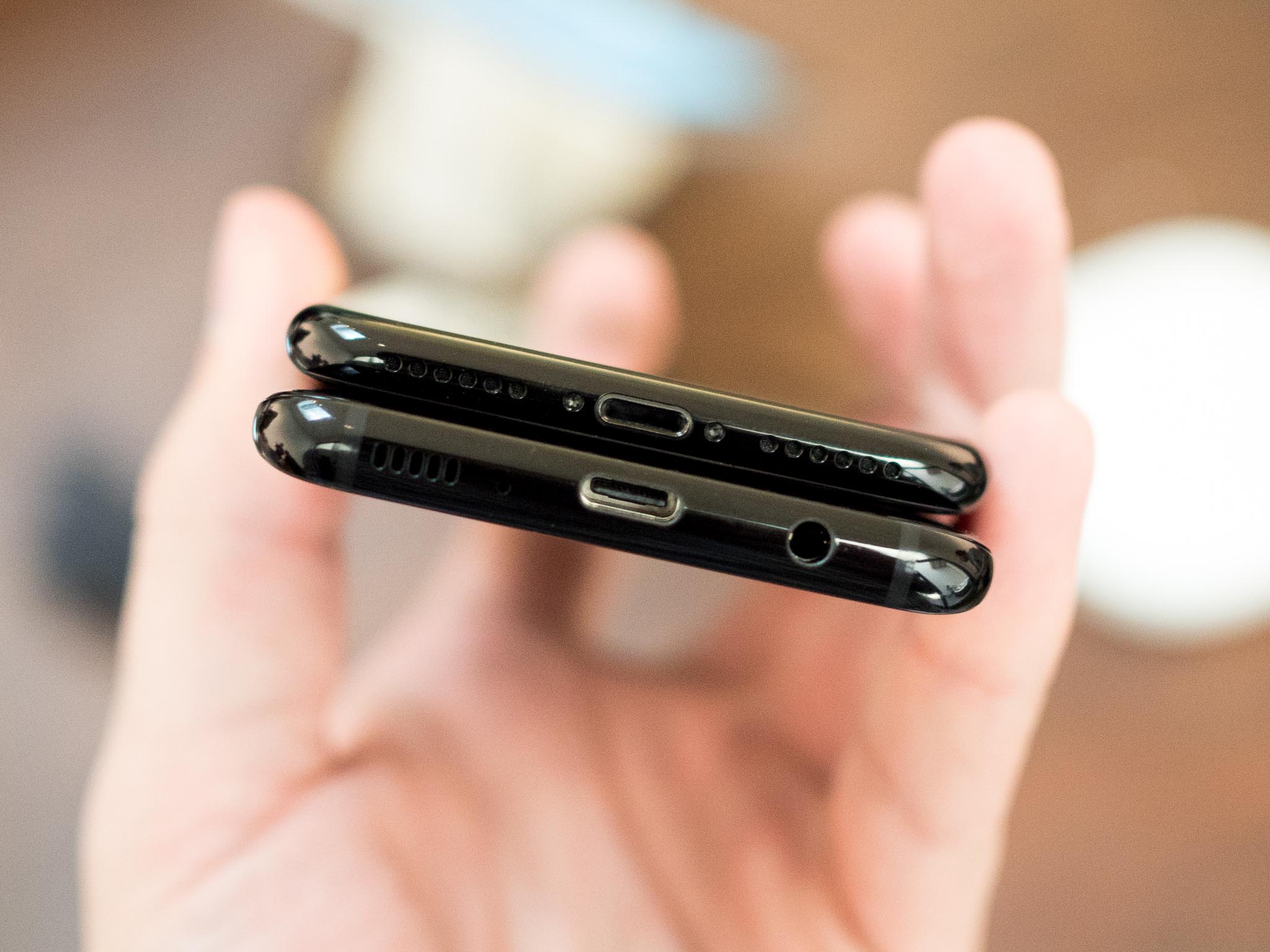
So, a year later, did Samsung get their ports and buttons in order? From the looks of the just-announced Galaxy S7, not so much.
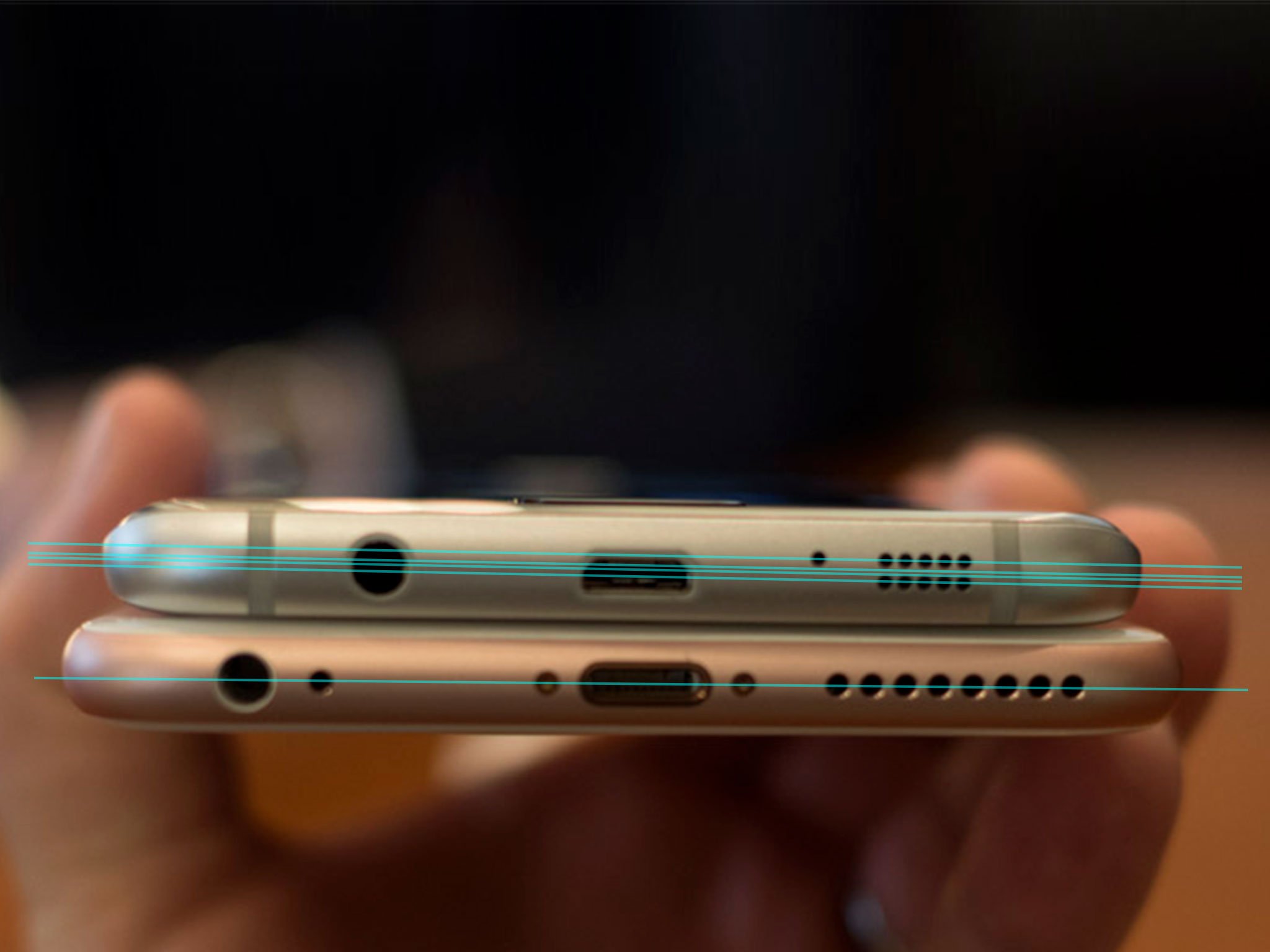
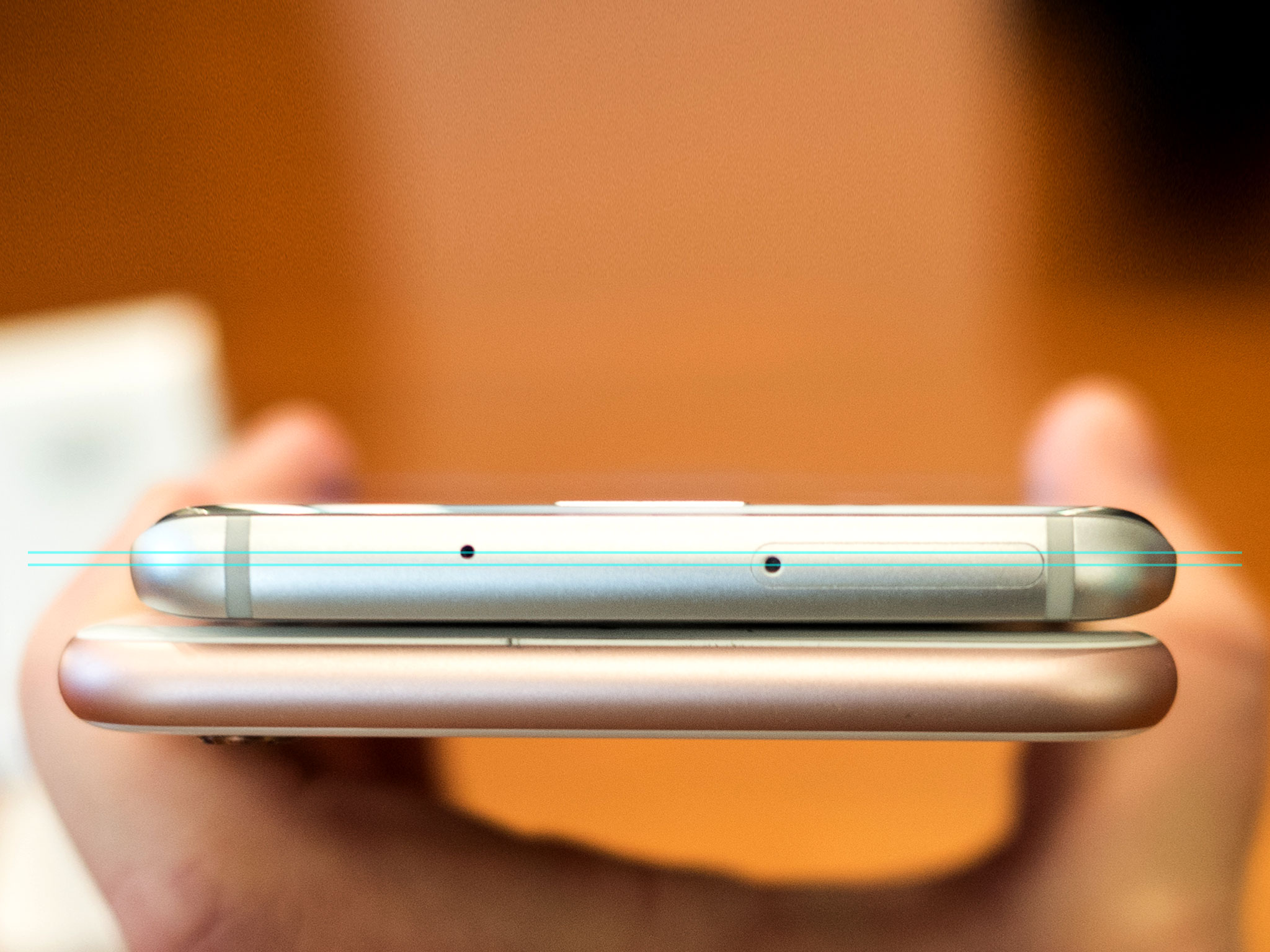
The ports, microphones, speakers, jacks, and other elements still don't line up. Not even close.
Galaxy S6
It's a quote from the late Steve Jobs' father intended to help instill pride in craft. Jony Ive, Apple's senior vice president of design, has spoken numerous times about the importance and inevitability of great design as well, about the care and consideration it takes, and how people notice it even when they don't notice themselves noticing it.
Recently there was a brouhaha about a Qualcomm sticker junking up the Samsung Galaxy S6 on Verizon. You don't see a sticker like that on the iPhone 6 or any other iPhone, of course, because Apple cares more about the look of their product than the licensing fees or other considerations refusing it entails. Same with Intel Inside stickers on the Mac.
iMore offers spot-on advice and guidance from our team of experts, with decades of Apple device experience to lean on. Learn more with iMore!
But when I looked at the picture of Samsung's product, it wasn't the sticker that bothered me so much. That, I assume, can be peeled off. It was something else I saw that bothered me, and something I can now never un-see.
It's the lack of basic alignment.
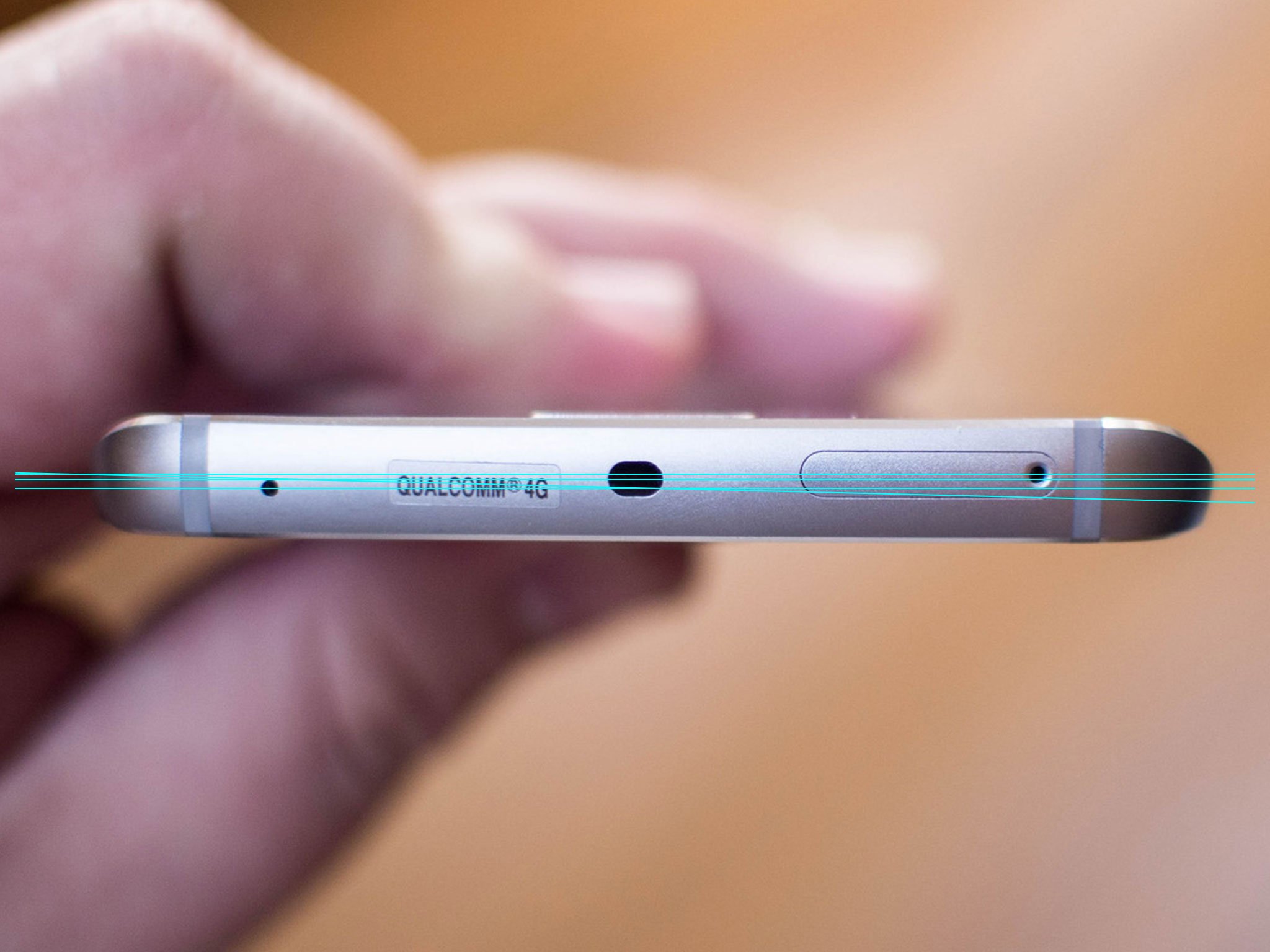
Here's the top image again, this time with lines drawn through the center points. The sticker isn't even put on straight, which seems unimaginable given modern production equipment.
I thought maybe it had something to do with the "edge" design, so I checked out the non-edge version as well.
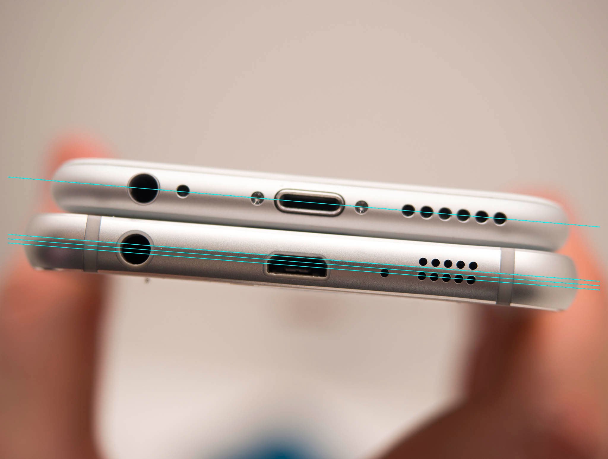
Same thing. Since the iPhone 6 is in the same photo, the lack of basic alignment is even more noticeable. In case it was just the bottom, I took a look at the top as well.
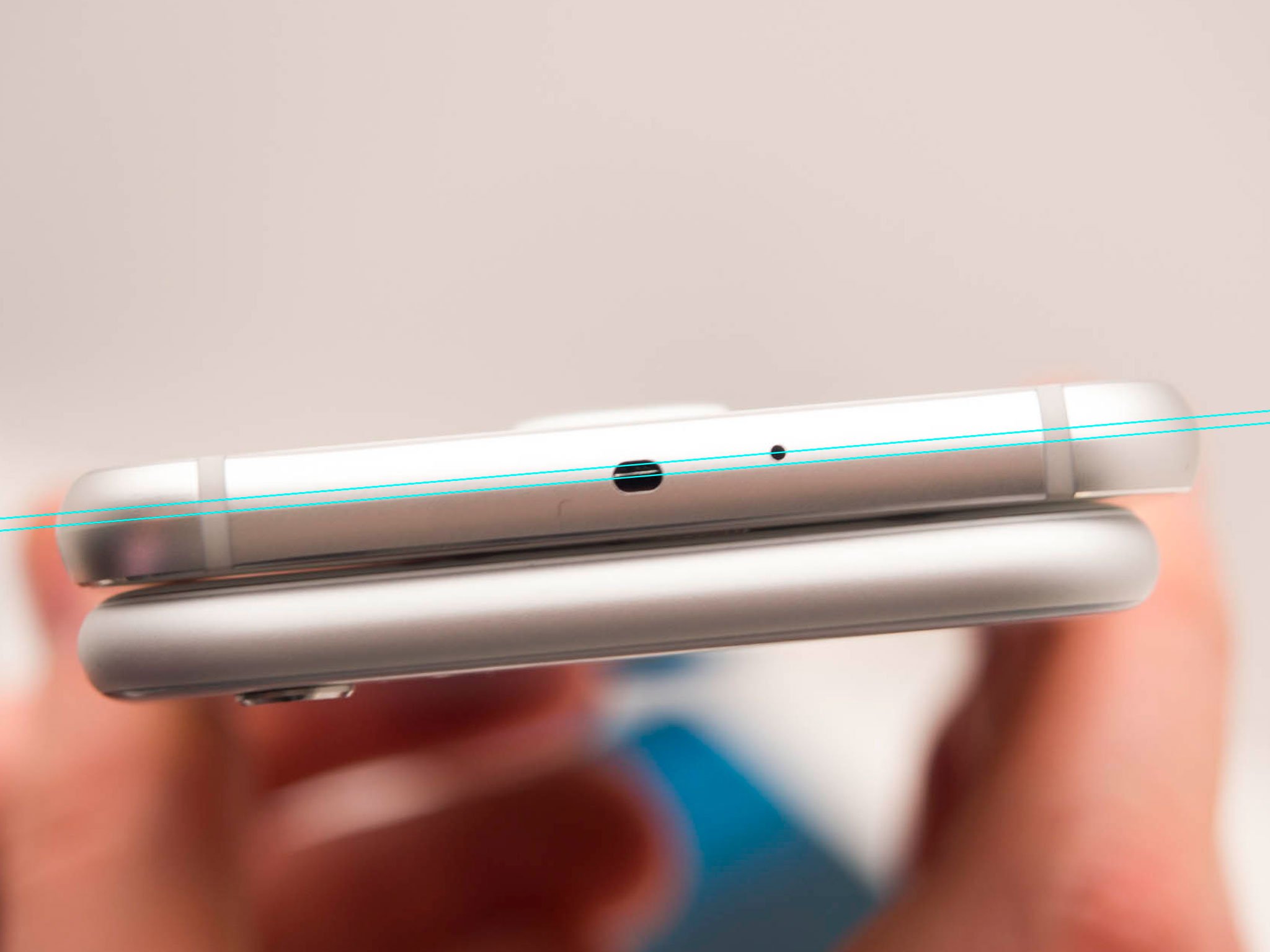
And the side.
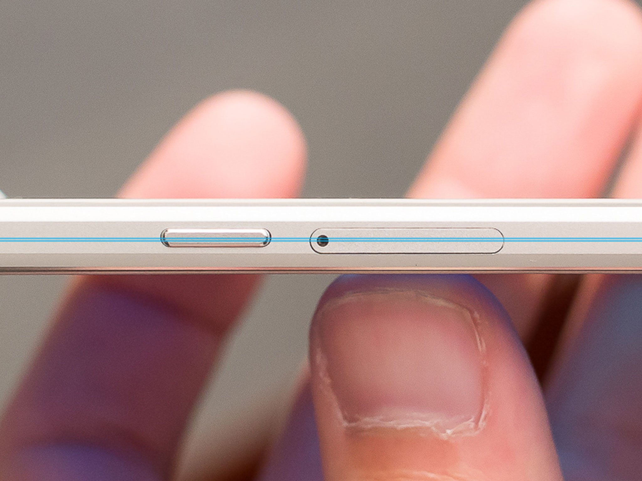
Almost nothing is aligned.
Some people might not care. Like painting the back of the fence or finishing the underside of the cabinet, it's a detail that only people who take tremendous pride in craft really care about. And, of course, people who look for just exactly that kind of quality.
That's because it takes an incredible amount of time and resources to achieve it. It takes an incredible amount of planning and coordination as well. It also takes the willingness to not do something if you feel doing it right is important enough.
To align everything along the edge of a device takes designing and mounting the boards in a certain way, and the ports and speakers, and the buttons and jacks, and the grills and every other detail so they all line up at exactly the right place at the end. Painstaking is likely an understatement.
Is it worth the effort? For me, as a customer, knowing that Apple had the consideration and took the time and effort to align their hardware speaks to the overall quality of their work. It reassures me that the same consideration and effort were likely spent making sure not a millimeter nor milliamp of battery space was wasted, not a nanometer of die, not a gap left around the screen, or a dead zone in the capacitive sensor.
Sure, problems crop up with every product, but like James Cameron says, when you aim unbelievably high, even your failures surpass other people's successes.
Again, I realize this won't matter to some people, and will serve as fodder for jokes for others. Software stability, some will no doubt cry. Yet bits can and are fixed. Software gets updated and services invisibly improved. Atoms, not so much. There's no magic patch that will ever bend those elements back into alignment. They, and owners, are stuck like that forever.
That's why it matters to me, and along with other things like privacy and security, better apps, Apple Stores and Apple Care, and a great Google experience and the best Microsoft experience, means it's absolutely something anyone who cares about design and quality should factor into their decision to switch to iPhone.
I had the chance to spend several evenings with the Galaxies S6 recently and while Samsung ditched a ton of differentiation to offer a more iPhone-like product. Android stalwarts will bemoan the lack of removable battery, the lack of SD card support, and the lack of waterproofing. My reaction was to bemoan the lack of deep, detail oriented design culture and pride in craft.
Because once you know the back of the fence wasn't painted, not only can you never un-know it, you can never stop wondering what else wasn't given that same care and consideration.

Rene Ritchie is one of the most respected Apple analysts in the business, reaching a combined audience of over 40 million readers a month. His YouTube channel, Vector, has over 90 thousand subscribers and 14 million views and his podcasts, including Debug, have been downloaded over 20 million times. He also regularly co-hosts MacBreak Weekly for the TWiT network and co-hosted CES Live! and Talk Mobile. Based in Montreal, Rene is a former director of product marketing, web developer, and graphic designer. He's authored several books and appeared on numerous television and radio segments to discuss Apple and the technology industry. When not working, he likes to cook, grapple, and spend time with his friends and family.
