Hello Again: Thoughts on Apple's October 2016 event
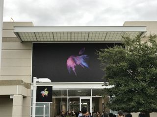
Apple wasn't supposed to have another event this year. Infinity Loop's Town Hall venue was given a send-off with iPhone SE back in March. But then the months rolled on, WWDC passed and so did the September event, and there was still one more thing waiting — new MacBooks Pro.
So, "Hello Again". One last event for 2016. One last hurrah for Town Hall. And one last product announcement before the holidays.
Accessibility
The October event kicked off with an accessibility video, shot and edited by someone who lives on and depends on accessible technology every day. It was magnificent, not just in terms of its technical look, pacing, and emotion, but as a reminder of how important inclusivity is to technology.
I wish every company, at every event, would highlight accessibility the way Apple does. It's important for all of us.
Apple TV
Before Apple went back to the Mac, they spent a few moments on Apple TV. Introduced in September of 2016, the current Apple TV is home to 8,000 apps, including 2,000 games — soon to also include Minecraft! — but finding what you wanted to watch in all those apps was still a challenge.
If you knew what you wanted to watch, Siri or Universal search were there, but what if you didn't want to know?
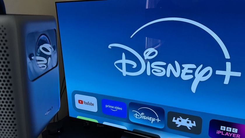
Enter the new TV app. Similar in design to the new bolder, brighter look or more coherent organization of the new Apple Music app in iOS 10, it brings together everything you're watching with curated suggestions and access to both your own library and the iTunes library.
Master your iPhone in minutes
iMore offers spot-on advice and guidance from our team of experts, with decades of Apple device experience to lean on. Learn more with iMore!
And it's also available for iPad.
For live TV, Apple's sticking to Siri, but improving it so you can ask to watch a live broadcast, a known program — including a sporting event — or a list of live programs.
Tim Cook said it made Apple TV the best way to watch TV, but we'll have to see how much it really has to offer when it ships. And how long it takes to go international.
Canadians want their hockey, Brits want their football, Indians their cricket, and the southern hemisphere wants its rugby, after all.
MacBooks Pro
Apple doesn't often look back. Steve Jobs was famously averse to it. This was the 25th anniversary of Apple's first notebook, though, so Tim Cook and Phil Schiller didn't just look back, they travelled back. Apple showed a video highlighting the company's achievements in portable computing, and of how they've driven the market.
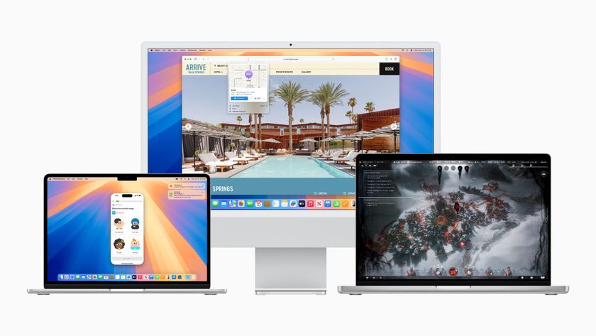
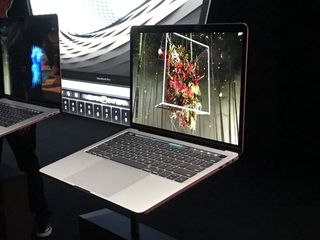
Then they showed the new MacBooks Pro.
Wide color
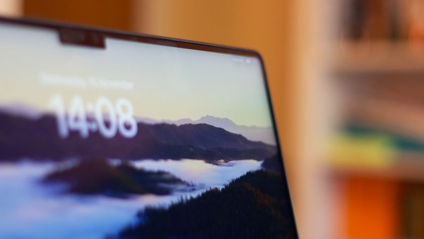
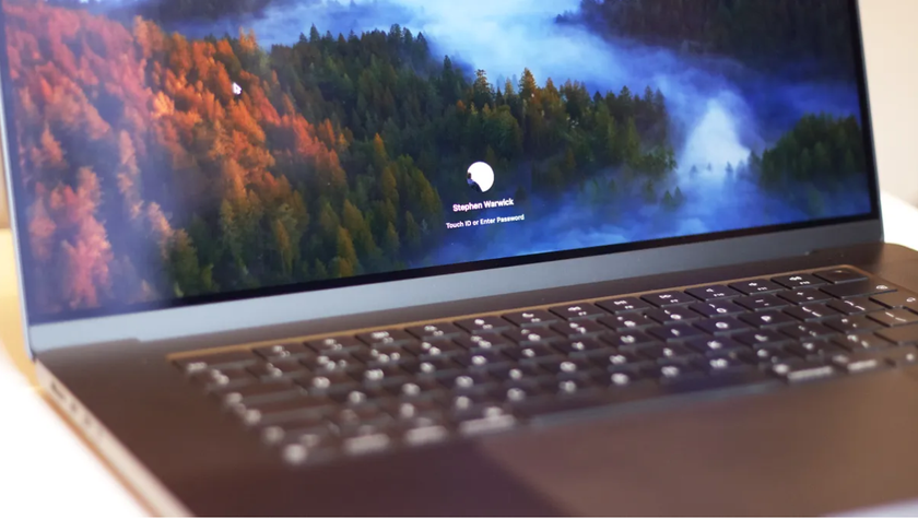
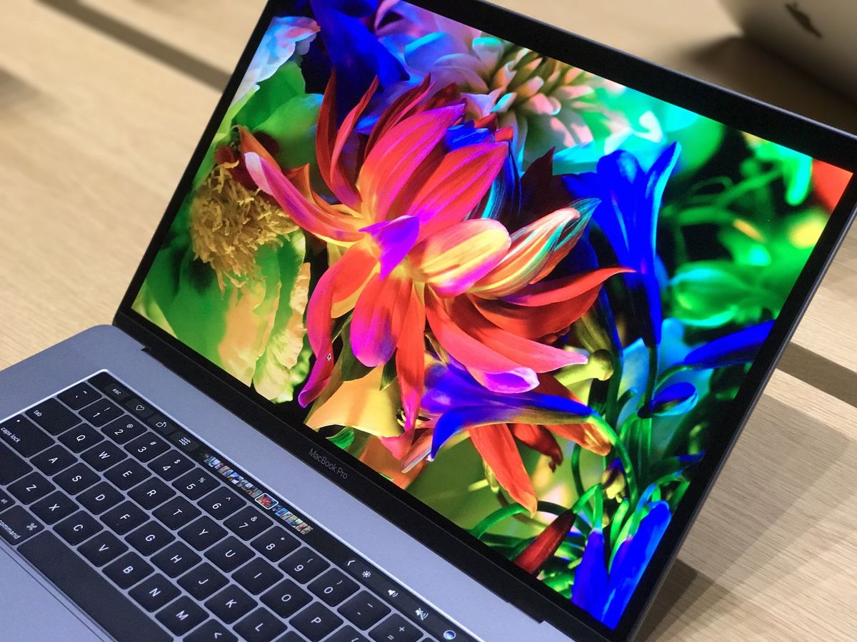
Once again re-engineered from the ground up, they're thinner, lighter, and smaller than ever before. They also have wide color DCI-P3 displays, like the iMac and iPhone 7. They show better reds and magentas and after having used them on an increasing range of devices, it's tough going back.
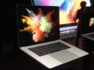
Looking at Photos on the new MacBooks Pro is amazing. The richness and detail pops off the screen. Because Apple manages the color profile from capture on iPhone 7 to display on iOS and Mac, you don't even have to worry about it yourself. Shoot what you shoot. See what you see. And it'll look as brilliant as possible. (That's real work, since P3 also means wider range to mess up.)
Otherwise it's about as thin as the 12-inch MacBook display but apparently even more advanced. Thankfully, Apple fixed my biggest beef with that display — they got a 720p camera in there.
RIP glowing Apple logo, though. When you get this thin, all you have room for the embedded stainless steel logo like the 12-inch MacBook.
Thunderbolt 3 and USB-C
Both MacBooks Pro have two Thunderbolt 3 ports on each side, four total. Since the connector is the same as USB-C, you essentially get four of both. There's also a 3.5 mm headphone jack.
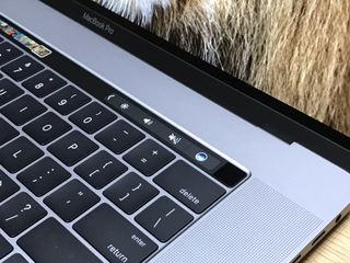
So, effectively it's like having a MacBook but with 4x the ports. That's both awesome and terrible. It's awesome in that they're super fast and that you can plug in multiple cables at the same time. It's terrible in that it means you'll need adapters for every other type of connector, including USB-A (standard USB), HDMI, VGA, etc.
And yes, like with the MacBook, you'll need an adapter or a Lightning to USB-C cable (introduced with the 12.9 inch iPad Pro) to charge your iPhone or iPad with the new MacBook Pro.
You also charge the same as MacBook — over USB-C. And you can use any of the four ports to do it.
It's incredibly future thinking. But it's also a bit of a troll. Those of us with MacBooks got over it eighteen months ago. Pro customers will feel some short-term pain.
Touch Bar
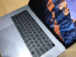
The Force Touch trackpad is much, much bigger now, which makes it feel much more expansive. The keyboard is a next generation version of what Apple debuted with the 12-inch MacBook in March of 2015. It has domes, it has butterflies, but it's optimized for a tad more travel.
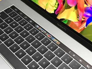
I only had a few minutes to type on it. I'm fine with the new MacBook keyboard, so I'm fine with this too. People who hate that will likely still hate that, even if there's a tiny bit of hope. Those who love it will find more to love.
The star of the show was the all-new Touch Bar, though. Think of it as a tiny 2170x60 iPad embedded right where the function keys used to be. Rumor has it it's OLED, like Apple Watch, but it has a matte finish that feels much like the keyboard keys.
It leverages the same kind of data detectors and data predictors Apple has been building into macOS for years, but uses them to show context-dependent, highly curated, dynamic controls.
Yes, your ESC key is still there. As are your other system functions like volume and brightness. But tuck those away and apps take over. In Photos you can scroll through your thumbnails, quickly access edit controls, even swipe to rotate. In Final Cut Pro you can scrub through your time line. In Safari you can scroll through your windows and open new tabs. In Xcode, even in Terminal — no Apple app went untouched, as far as I could see — there are context aware shortcuts.
And the emoji. You get emoji suggestions, just like iOS, and can access the emoji picker right on the Touch Bar. You can also access Tapback emoji. It makes the new, funner Messages app ridiculously faster.
Developers have an API, so all your favorite apps can update to add support. In Photoshop I you can work on the Track Pad and use the Touch Bar to change palette colors, for example, or access tools. In Excel you can hit a virtual button to generate different graph types.
There's also accessibility built in. Touch Bar supports VoiceOver, so it'll say the tools out loud for those with low or no vision. And it can also offer easy access to Switch Control.
You can customize the Touch Bar as well. For example, you can drag controls from the screen and down into the Touch Bar. It works so fluidly it's hard to believe. They really nailed it.
Touch ID
On the right hand side of the Touch Bar, protected by a sapphire crystal lens cover, is Touch ID. It's just like on iPhone or iPad, so you can use your fingerprint to log in and to make purchases with Apple Pay.
In practice, index finger feels more natural on MacBook Pro, as opposed to thumb which seems like the default on iPhone and iPad. Any finger will work, though.
For security, Apple has created an all-new T1 chip. It basically does what the secure enclave does on the Apple A-series chips on iPhone and iPad, making sure your fingerprint data is locked away and nothing can access it. All the system gets is the token.
It's pretty much like Apple created an ultra thin iOS or watchOS device and stuck it in the MacBook Pro, and that's such a smart solution for keeping it secure.
Speakers
Starting with the 12.9-inch iPad Pro, Apple really began upping their speaker game. iPhone 7 had much better speakers, and now the new MacBooks Pro do as well. They have broader dynamic range and better separation, and in the demo I heard they were LOUD and crystal c.l.e.a.r.
Chipsets
Apple's using Intel's Skylake processors here, which are the current generation. Intel's been struggling since their last die shrink but Skylake is now on solid footing. Kaby Lake will be next, then another tock with Coffee Lake, and… yeah.
As happy as I am we get these improvements, it's increasingly hard not to think Apple would be better off controlling their own destiny when it comes to Mac silicon, just like they do on iPhone, iPad, Apple TV, and Apple Watch.
The 13-inch MacBook Pro sticks to Intel Iris graphics, which are fine. The 15-inch, though, also get discreet graphics. (Last time it was only the highest end 15-inch that got discreet).
Apple's graphics chips of choice this year are AMD Polaris. That's going to make them much more attractive to anyone who wants to push significant pixels.
5K displays
There was no 5K Retina display from Apple. Sadness. But there was a 5K P3 display from LG that Apple worked with them on, and that provides a ton of high-density, wide gamut pixels over Thunderbolt 3.
The 13-inch MacBook Pro can drive one of them. The 15-inch, two of them. Yeah.
I had a chance to see them in action and while you'd never mistake them for Apple displays, they provide the same type of functionality, including port expansion, that you'd expect.
I miss the idea of an Apple display. We'll see if LG makes me miss it less.
Superlegera
One last surprise: A third MacBook Pro. No, Apple's still not making a Retina Air, but this is the next, better thing. It's a version of the 13-inch MacBook Pro without the Touch Bar that's meant for people who love the 13-inch MacBook Air but want a Retina display and modern architecture.
It's an interesting choice, but I think a good one. The MacBook Air chassis is at the end of the line. This provides a new beginning. You pay for the new screen and processors, though — this new 13-inch MacBook Pro starts at $500 more than the old 13-inch MacBook Air.
Final thoughts (for now)
The lines have been drawn. Apple once again showed they absolutely don't believe in Macs with multitouch displays, going so far as to embed an entirely distinct display in the keyboard. Are they right?
They may be. The human brain hates context changing. It interrupts work flows. Even on iPad Pro, when you have to stop typing to tap the screen, it's an interruption. Likewise, gesturing at 90º isn't optimal ergonomics, not for the amount of hours you spend behind a Mac.
But is the Touch Bar any better? Will it prove any more intuitive and let you keep controls at your fingers while your eyes are on the screen? Or will you be forced to hunt and peck the Touch Bar, achieving exactly the opposite effect?
In my brief hands-on time with the new MacBooks Pro, I liked what I saw and felt. The choices feel deeply considered and smartly implemented. I'll have to spend more time with one before I make up my mind, though.
For now, it feels like Apple's next step towards more functional, more dynamic Macs, but in a way that's still distinctly Mac.
The new MacBooks Pro are available for order now. Super legere 13-inch ships now, Touch Bar 13- and 15-inch ship in a couple of weeks.

Rene Ritchie is one of the most respected Apple analysts in the business, reaching a combined audience of over 40 million readers a month. His YouTube channel, Vector, has over 90 thousand subscribers and 14 million views and his podcasts, including Debug, have been downloaded over 20 million times. He also regularly co-hosts MacBreak Weekly for the TWiT network and co-hosted CES Live! and Talk Mobile. Based in Montreal, Rene is a former director of product marketing, web developer, and graphic designer. He's authored several books and appeared on numerous television and radio segments to discuss Apple and the technology industry. When not working, he likes to cook, grapple, and spend time with his friends and family.

