Instapaper vs Pocket vs Readability: iPhone read later app shootout
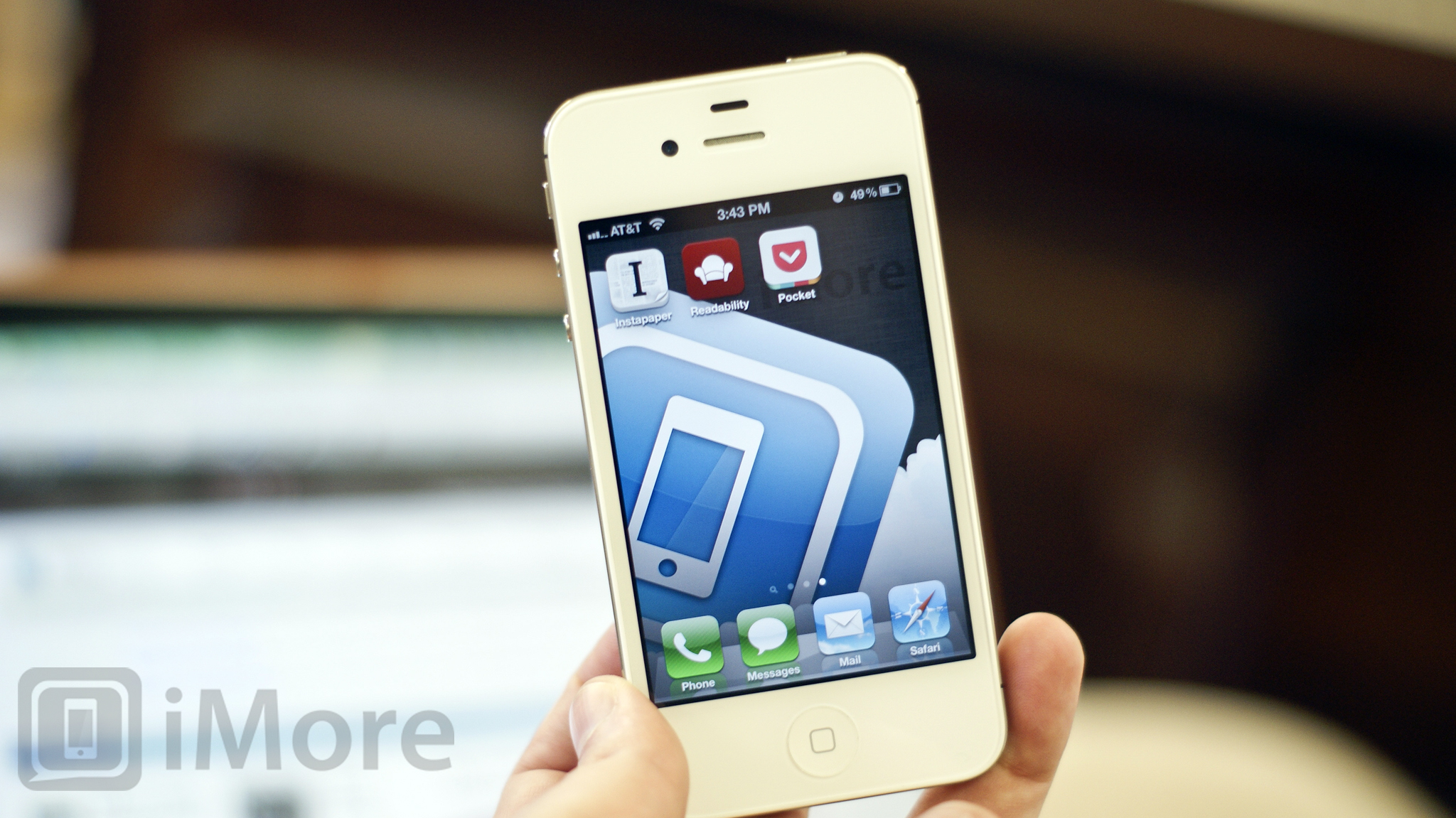
Instapaper, Pocket (formerly known as Read It Later), and Readability are all great ways to "read later", or time-shift the Web articles and other content you don't have time to read now. (Think of them as TiVo for the web.) Some are highly focused on text, others also prioritize photos and videos. Some are highly focused on iPhone, iPod touch, and iPad only, others offer more cross-platform and Android support. Each one tries to solve the same problem -- letting you enjoy the content you want to enjoy, when you want to enjoy it -- but goes about it in a different way. So which one does it best, and for whom?
Note: Instapaper, Pocket, and Readability all have support for both iPhone and iPad but we're focusing exclusively on the iPhone versions for this shootout.
Instapaper vs Pocket vs Readability: Design & Interface

Reading is a personal experience for most of us, and one that should always be be enjoyable. More than likely, you'll want to kick back and relax while catching up on the day's stories. While content is king, the experience you get while interacting with that content can be just as important for most.
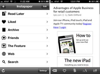
Instapaper approaches saving articles in a fairly straight-forward way -- the table view and the file system. You can create folders on your iPhone to categorize and archive articles. Tap into the section you'd like to view and tap on an article you'd like to read. Your top tab, labeled Read Later, is where you'll find all the articles you've saved to the service. Articles are displayed in an a stripped down format, devoid of ads and other cruft, and that makes them really easy to read.
Instapaper also integrates a feature called tilt scrolling that, as the name implies, will scroll the page up and down as you tilt your iPhone. Tab into font settings to switch from light and dark mode, change the font type (with some beautiful new typefaces to choose from), increase or decrease font size, change line spacing, and to widen or narrow margins. Overall, Instapaper does a good job of formatting articles nicely. I have run into a few issues with how it formats images or headers on websites which can be bothersome at times.
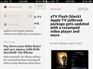
Readability approaches things a bit differently when it comes to menus and organization. The main home screen will aggregate a list of your saved content. Tapping on the reading list button will allow you to navigate to items you've marked as favorites or view archived articles.
Readability also allows you to switch between light and dark modes and change the font to customize the experience. Their font choices are beautiful but not always optimal for long form reading. Where Readability really shines, however, is how it makes sure the focus is on having a seamless reading experience. When you tap into an article all the menus and navigation options disappear, leaving you with nothing but the content you want in front of you. Tap anywhere on the screen to bring up the menus. Swipe to the right to bring up your main reading list again.
Master your iPhone in minutes
iMore offers spot-on advice and guidance from our team of experts, with decades of Apple device experience to lean on. Learn more with iMore!
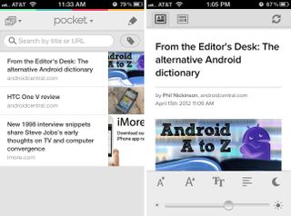
Pocket has newly designed interface to go with its new name. Just like Readability and Instapaper, you can change the margins, fonts, switch from dark to light mode, and customize the experience. But that's pretty much where the similarities end.
Pocket treats photos and videos as first-class citizens alongside articles. You can sort by articles that contain images, video, or just plain text articles. You can also bulk edit from the main screen. Simply tap the edit button and either trash articles, mark them as read, or tag them with categories.
When inside an article, Pocket allows you to quickly switch from a scaled down version and the full blown web version of a saved clip. And toggling between them is super fast. It's also great at rendering inline images, and is really smart about what content should and shouldn't be presented.
While all three have easy to use interfaces, their designs are very different. Instapaper is almost old-school in its presentation, but incredibly focused in its choices. Readability looks very good but the edge goes to Pocket which has the best mix of presentation of functionality. The ability to easily edit and sort articles is great and the interface is both powerful and accessible.
Instapaper vs Pocket vs Readability: Cross-platform support

If you have multiple devices, whether it's an iPhone and iPad, or iPhone and Kindle Fire, or some other combination, being able to access the content you saved on the platforms you use is important. Here's what Instapaper, Pocket, and Readability support:
Instapaper
- iPhone
- iPad
- Kindle Fire
Readability
- iPhone
- iPad
- Android
- Kindle Fire
- iPhone
- iPad
- Android
- Kindle Fire
Instapaper doesn't provide official support for Android and none of them seem to officially support BlackBerry or Windows Phone. So for now, it's a tie between Pocket and Readability as far as native mobile app support goes.
Instapaper vs Pocket vs Readability: 3rd party app support

In order for a "read later" service to be of service, it has to be readily available from the apps you use all day. Because Instapaper, Pocket, and Readability have all been around for a while, in one form or another, you can find support for all three services in many of the most popular Twitter, RSS, and similar apps.
Tie.
Instapaper vs Pocket vs Readability: Desktop Support

Instapaper, Readability, and Pocket all provide web browser plug-ins to easily save content to read later, and all offer a web-based way to access this content when and where you want to access it. Just like the mobile apps, however, the experience will be different across each client.
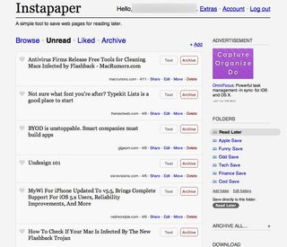
Instapaper's website sticks to the standard table view of articles. Clicking one takes you to the full article. You can also choose to view a text version or to archive it. It gets the job done and does it well but just like the app, it isn't very exciting to look at.
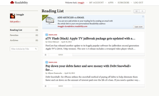
Readability's website also provides an experience that's a closely tied to their iPhone app, and that makes it really usable. It doesn't hide navigation the way the website does, but due to the bigger canvas they have to work with, that's not a problem. You can find your main navigation off the to left and each article will have sharing options and edit options directly underneath it. Easy to use and easy to maintain.
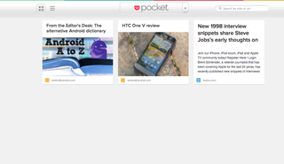
Pocket's website also tries to be as close to the mobile experience as possible. At least when it comes to layout and format. You can, of course, view full blown articles but the layout feels very simliar. You actually don't even feel like you're on a website for the most part. It feels like you're browsing right from your phone but with the bigger screen real-estate of your computer monitor. Same functionality, same basic layout, just full blown articles.
Since the websites all mirror the apps to a greater or lesser degree, just like with the app, Pocket has the edge here.
Instapaper vs Pocket vs Readability: Cost
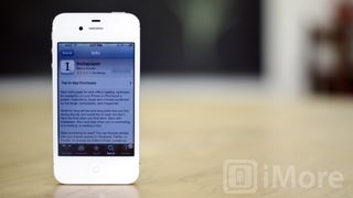
If cost is a factor to you, you'll be happy to know that both Pocket and Readability are available for free. (At least up front, at least for now.)
Instapaper costs $4.99 but it's a universal app so you'll only need to purchase once. There's also an optional subscription service that offers additional functionality.
Readability also has a -- now optional, still controversial -- subscription service.
Some users will no doubt prefer the presumed security that comes from paying for an app or service, most just want free stuff, no questions asked.
Tie between Readability and Pocket.
Instapaper vs Pocket vs Readability: Conclusion

While Instapaper vs Pocket vs Readability all have great native apps, fantastic web sites, and excellent services, they all come to the table with very different focuses and approaches.
Power iOS-only users might love Instapaper's thoughtful functionality and no-frills design, while cross-platform users might find it too austere and limited.
New users might take a liking to Readbility's good looks and high level of integration, while power users might find it a bit limited. (Their business model, which we won't get into here, is also a turn-off to some.)
Cross-platform and multimedia users might enjoy Pockets wider device support, slick interface, and first-class handling of photos and videos. Dedicated iOS-centric, article-centric users might not like the broader focus.
So which is the best?
Pocket.
The re-design brought with it much greater attention to detail and it really shows. Pocket provides the best design and user experience for the broadest base of users, both on the app and on the website.
If you're already all-in on Instapaper and video isn't a priority for you, there's no reason to switch to anything else. If you want more than articles, or you're new to the whole idea of "read later" and time-shifting content, give Pocket a go. It's free, so there's no risk to try it out, and you may be surprised how quickly you start saving things you happen upon on the web.
If you've been "reading later" for a while and have a personal preference, let us know why in our iPhone apps forum.
Pocket - Free - Download Now
Readability - Free - Download Now
Instapaper - $4.99 - Download Now
iMore senior editor from 2011 to 2015.


