Interested in a flatter OS X interface? Look to iCloud for clues

It's time for Apple to update OS X with a flatter interface like iOS 7. iCloud gives us an idea of how that may look
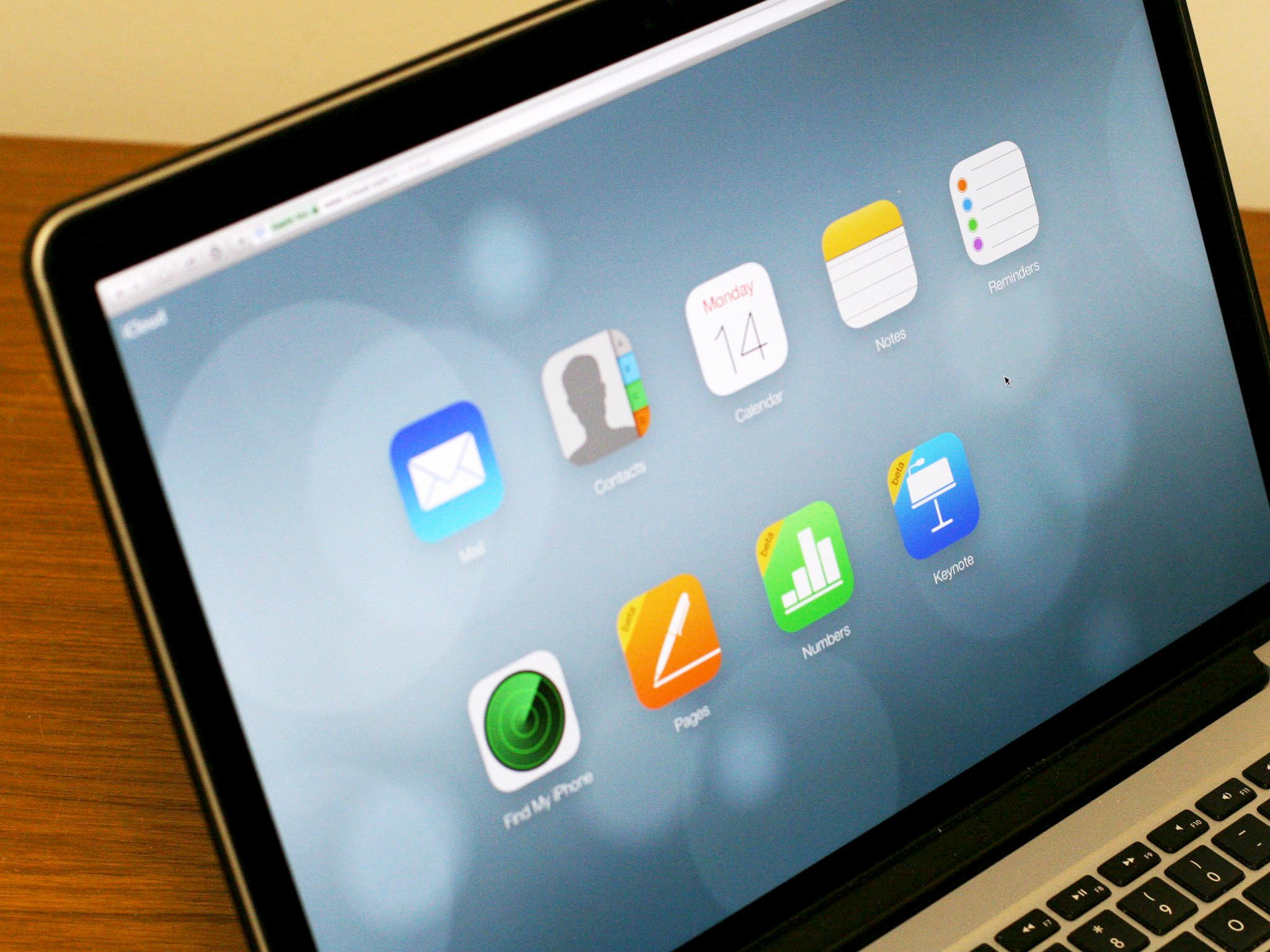
Based on what I posted last week, it's clear that many of you — like me — want Apple to adopt a more uniform user experience between iOS 7 and OS X — a flatter interface for OS X 10.10. Rumors have abounded since January that Apple is working on just that by creating a "flatter" interface for OS X 10.10 (code-named Syrah) that makes icons and other interface elements more consistent with their iOS 7 counterparts. We don't have to work too hard to imagine what it'll look like: Just open iCloud in a web browser.
Admittedly, iCloud.com uses an extraordinarily simplified interface compared to OS X. But from the Home screen icons to the apps themselves, iCloud certainly has more in common with iOS 7 than it does with OS X. Even the dynamic background on the home screen echoes iOS 7's. As does the concept of a home screen.
But the design principles as they could be applied to OS X shine through. Clear typography. An emphasis on clean, open space and crisply-edged icons. Two dimensional illustrations with bright colors.
Mavericks has already begun the transition to a flatter interface. While more rounded three-dimensional icons still abound, apps like Calendar have gotten a rework to more closely resemble their iOS counterparts. I expect to see that process continue with OS X 10.10, of course.
But if you look at iCloud.com in full screen on a Mac, as simplified as it is, it does look striking. Imagining that same design sensibility employed across the entire OS X user interface isn't too much of a stretch.
This isn't to imply that Apple plans to simplify the actual Mac user experience with any sort of user interface rework. The Mac remains fundamentally different terrain than iOS, with an emphasis on file management that is almost completely absence from iOS. The way applications work on the Mac, with multiple windows, is completely different.
iOS 7's visual rework was a jarring change. Not all users liked it. But most of us who didn't love it at first blush have grown accustomed to it and many of us are willing to admit that it did move the goalposts forward for future innovations in iOS.
Master your iPhone in minutes
iMore offers spot-on advice and guidance from our team of experts, with decades of Apple device experience to lean on. Learn more with iMore!
What's more, those changes didn't fundamentally change our usage of iOS. Things worked the same way they did before, they just looked different.
If this truly is the year OS X gets a makeover, I expect the same to apply. Things may look different — and it'll take developers time to adjust — but it'll still work the same.
In the interim, check out iCloud.com and see for yourself. Is that the future of OS X? Tell me what you think.
