iOS 7 wants: Better App Store search usability
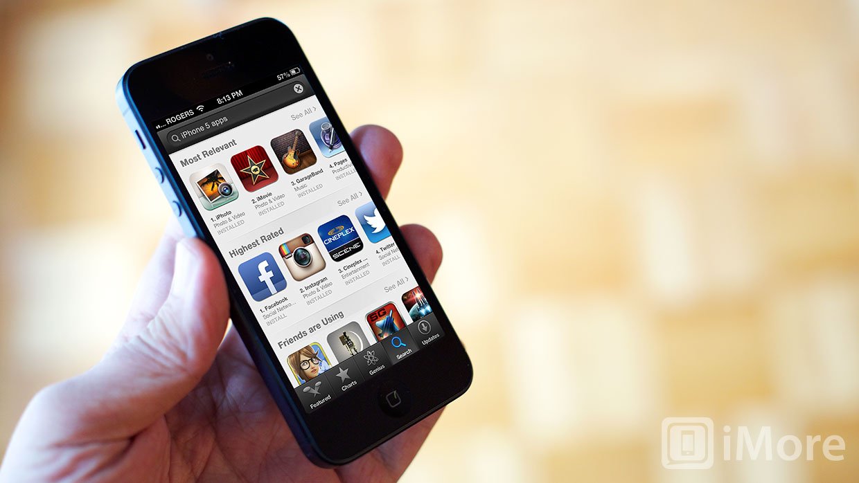
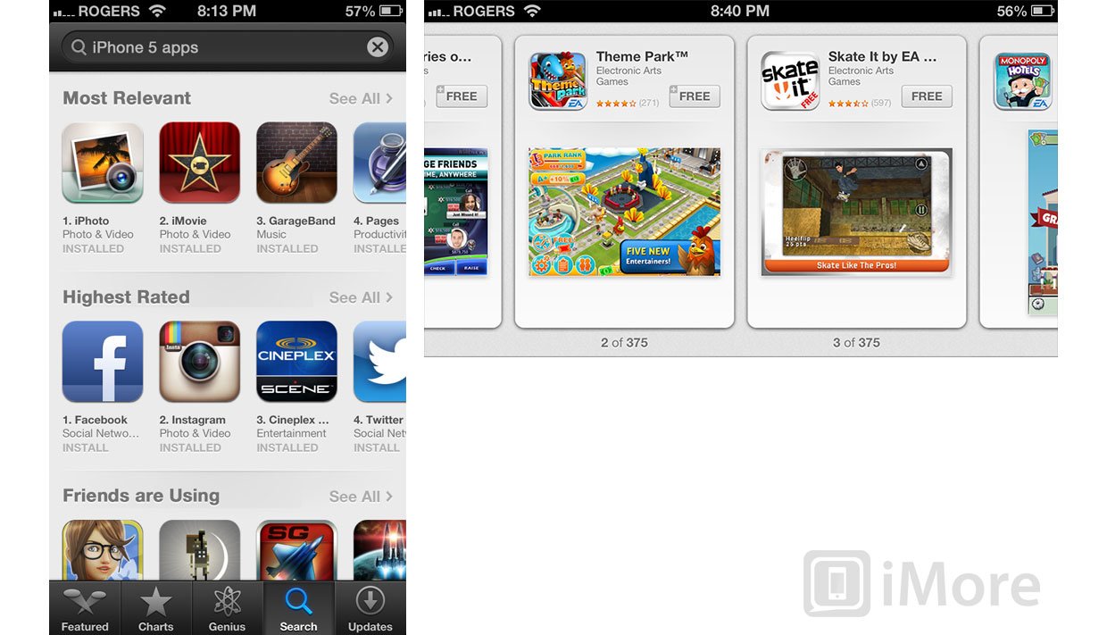
With iOS 6, Apple has totally changed the way search results appear in the on-device App Store app. With the old App Store search, five results were immediately visible in a list view, and you could vertically scroll or flick quickly through large amounts more. With the new iOS 6 App Store search, only one result is visible at a time, and you whether you scroll or flick, you only ever get one result more at a time. And that's not good.
If you're searching for something specific, like "Tweetbot", it won't mean much because the first result will likely be the right one, so you only need that first result. If you're searching for something more general, like a game made by Electronic Arts, but you can't remember the name, the degradation is severe. You're presented with 1 possibility instead of 5. That's an 80% loss in information density. Ironically, the new 16:9 aspect ration of the iPhone 5 would have allowed for even more search results in the list view, 6 in total. Instead, with the new iOS 6 App Store search, we still get 1. Only longer. That's an 83.33% loss in information density.
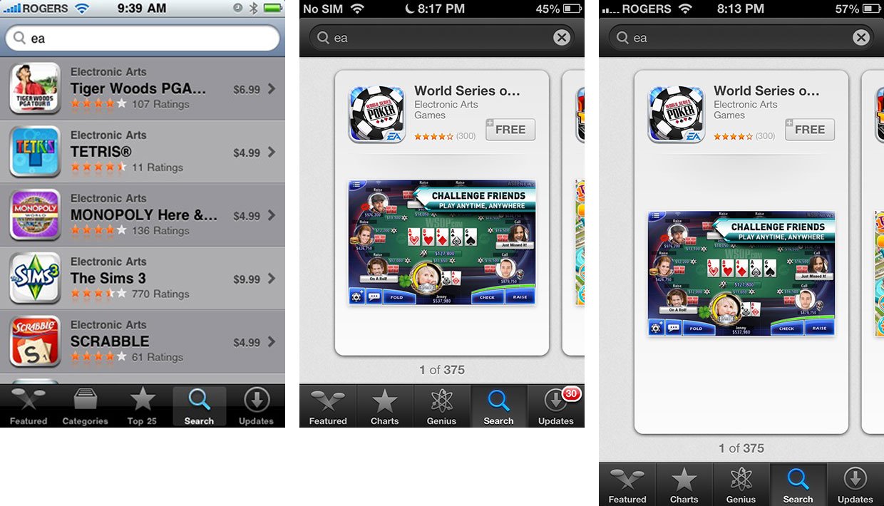
Worse, both cards and the way they're implemented deliberately make the search interface slower. With the old App Store list view interface, you could touch and slowly scroll through results, or flick and rapidly scroll through them. So, if you didn't remember an app's name but did vaguely remember its icon, you could quickly skim for it. Or you could quickly skim until the icon, title, or anything caught your eye. With the iOS 6 App Store's card-based search, Apple has made the physics such that no matter how slowly or quickly you scroll or flick, you can only ever get to the next result. No more fast skimming. So now, even if you know the icon or some element of the title or data you're looking for, you're forced to go through one app at a time, every time, to get there. The interface has essentially gone from walk/run to forced walk.
The new card view interface does show an app screenshot in the results, but it's arguable whether or not that additional information increases identification and discoverability or just creates extra noise to visually parse. (That likely depends on the content and context of the screenshots, but until Apple allows them to be video, they'll always be of limited value.)
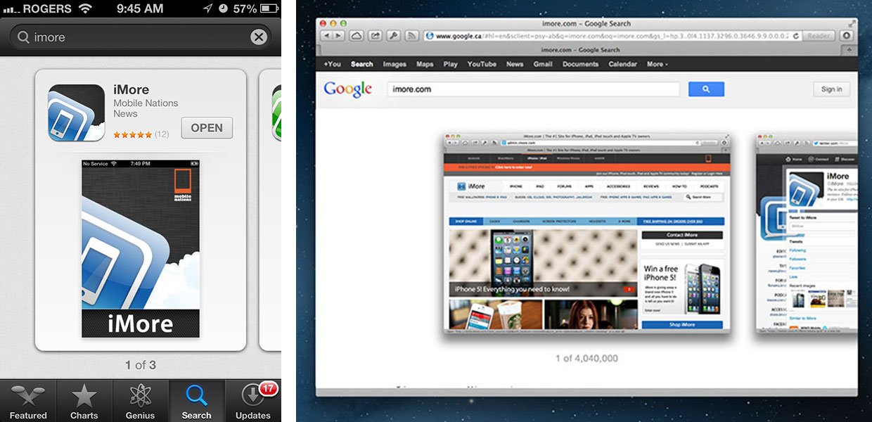
To get an idea of how badly the metaphor works for search in the App Store, all we have to do is extrapolate it to Google search. Imagine typing a search term into Google and instead of a page full of web results, you got a card showing one page. Currently, if the result you needed was #17, it's on the second page. With the card interface, it would be on the 17th page.
Apple could explore metaphors like this for the fast app switcher, where webOS has shown that the visualization of content makes sense. In App Store search, it just borders on the absurd.
So how could Apple fix it? An option to toggle between new-style card view and old-style list view could be a good compromise. To avoid an extra setting or button, Apple could also simply present the list view in portrait mode and the card view in landscape mode, where at least more than one app could be seen at a time. That would also match the behavior seen in the Music app with CoverFlow.
Master your iPhone in minutes
iMore offers spot-on advice and guidance from our team of experts, with decades of Apple device experience to lean on. Learn more with iMore!
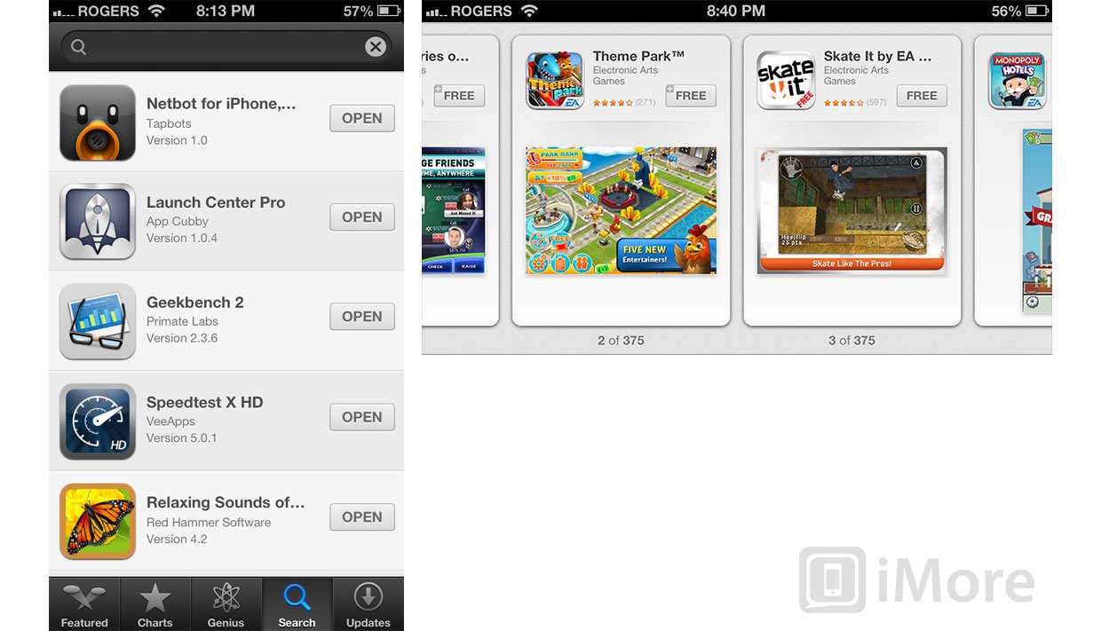
Taking it one step further, Apple could implement the portrait interface they use for app categories and present a few horizontal list views. The first could present search results filtered by keyword relevance, the second by rating, the third by how many "friends" have the app, the fourth by recency of release, etc. So, for example, a search for "Twitter" could result in the official Twitter for iPhone app showing up first for relevancy, Tweetbot first for friends who have the app, and Flurry for most recent.
While that could add complexity, it would at least be balanced by the options presented -- "I just want a Twitter app" vs. "What Twitter app are my friends using?" vs. "I want to try a different Twitter app, which are the newest?"
If Apple's going to use the mixed vertical and horizontally scrolling pages anyway, they might as well use it to enhance sorting.
The iOS 6 App Store did not come gently into this world. The betas were fraught with strange behavior, some of which did not get fixed prior to release. The combination of vertical and horizontal scrolling elements in the app can be quirky and off-putting to navigate. Purchased lists sometimes don't display and when they do, the scrolling and touch events are janky. Search algorithms, reportedly now using technology from Apple's Chomp acquisition, have changed repeatedly.
For an app so important to Apple, developers, and users, it's a pain, and it's something that needs some considered, usability-focused attention from Apple. And soon.

Rene Ritchie is one of the most respected Apple analysts in the business, reaching a combined audience of over 40 million readers a month. His YouTube channel, Vector, has over 90 thousand subscribers and 14 million views and his podcasts, including Debug, have been downloaded over 20 million times. He also regularly co-hosts MacBreak Weekly for the TWiT network and co-hosted CES Live! and Talk Mobile. Based in Montreal, Rene is a former director of product marketing, web developer, and graphic designer. He's authored several books and appeared on numerous television and radio segments to discuss Apple and the technology industry. When not working, he likes to cook, grapple, and spend time with his friends and family.
