iOS 7 preview: Camera gains real-time filters, and... a square

iOS 7 Camera brings an all-new interface, along with a new Square photo mode, and a bevy of new, real-time Filters.
The Camera app has gotten the same objectified and gamified makeover as the rest of iOS 7, but Apple also managed to sneak in a few new features as well. First is, um,Square mode. The second is Filters. The bigger news, however, is what was taken away, including the signature shutter animation and button treatments are gone.
Here's how Apple describes it:
Camera in iOS 7 puts all your shooting formats — still, video, panorama, and now square — front and center. With a swipe, you can capture what you want the way you want.1 Fast. And new filters let you do even more with each image. Give it a retro feel. Dial up the contrast. Or go black and white. Artistic license is all yours.
And for developers{.nofollow}:
Let your users capture and compose photos and videos just the way they want. Capture video at 60fps, so you can replay dramatic scenes in slow motion. Get a closer look by directly controlling the zoom level of the camera. Create video effects and transitions by combining multiple video tracks using the custom video compositing APIs. Scan and recognize barcodes with the camera.

Based on what we've seen so far, here's how the new Camera looks, and the new features appear to work:
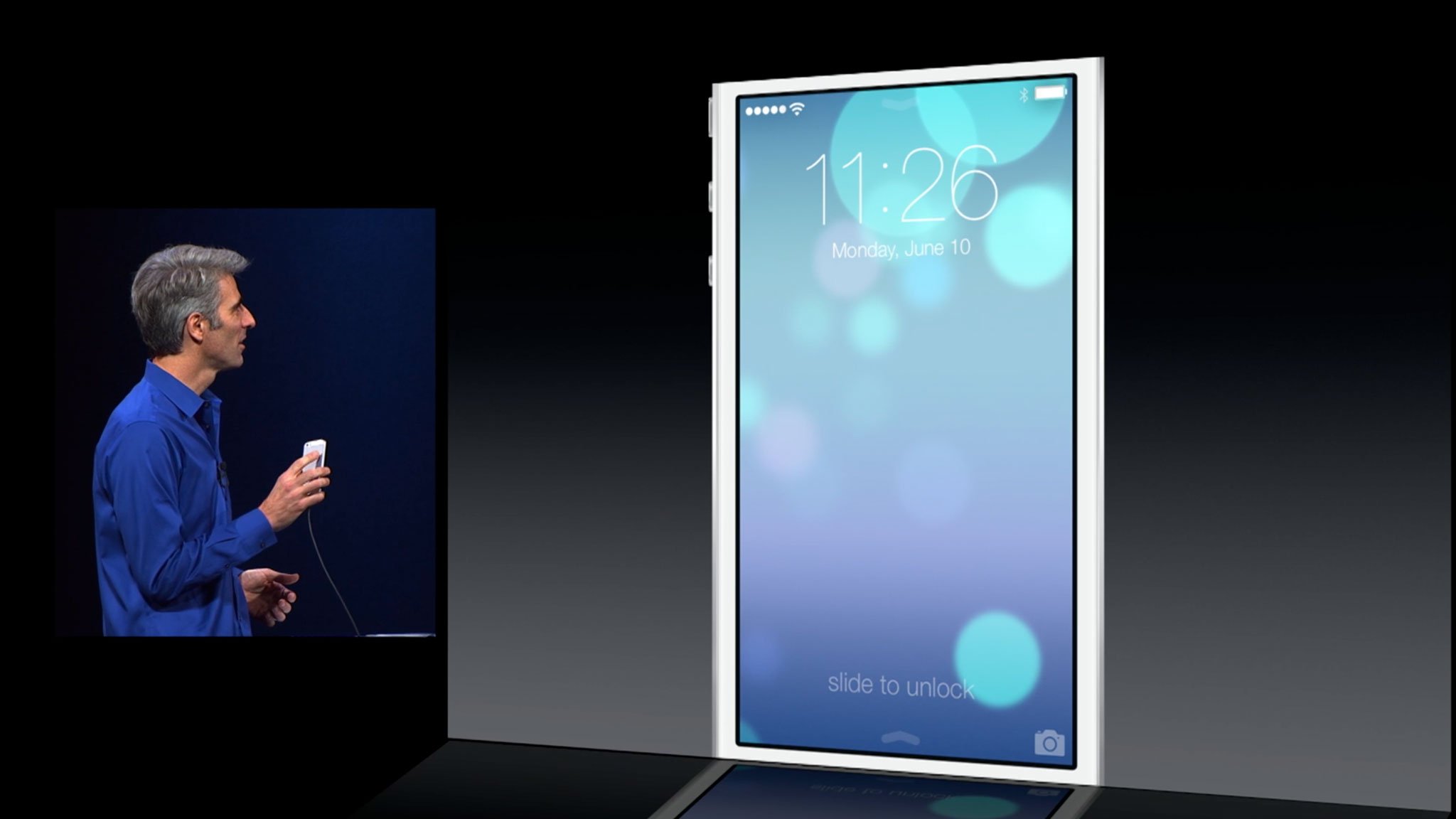
- There's still a quick-access slider on the Lock screen, though now it competes for that gesture with Control Center and unless Apple changes it, that could cause some confusion or collision.
- Like the rest of the iOS 7 makeover, Apple seems to have kept controls spatially consistent, so the flash button, front/rear-facing selector, and shutter button, for example, look to be in the same places as they were on iOS 6. The Options button, however, seems to be gone, with HDR moving down to sit atop the shutter button, and the grid button... currently MIA?
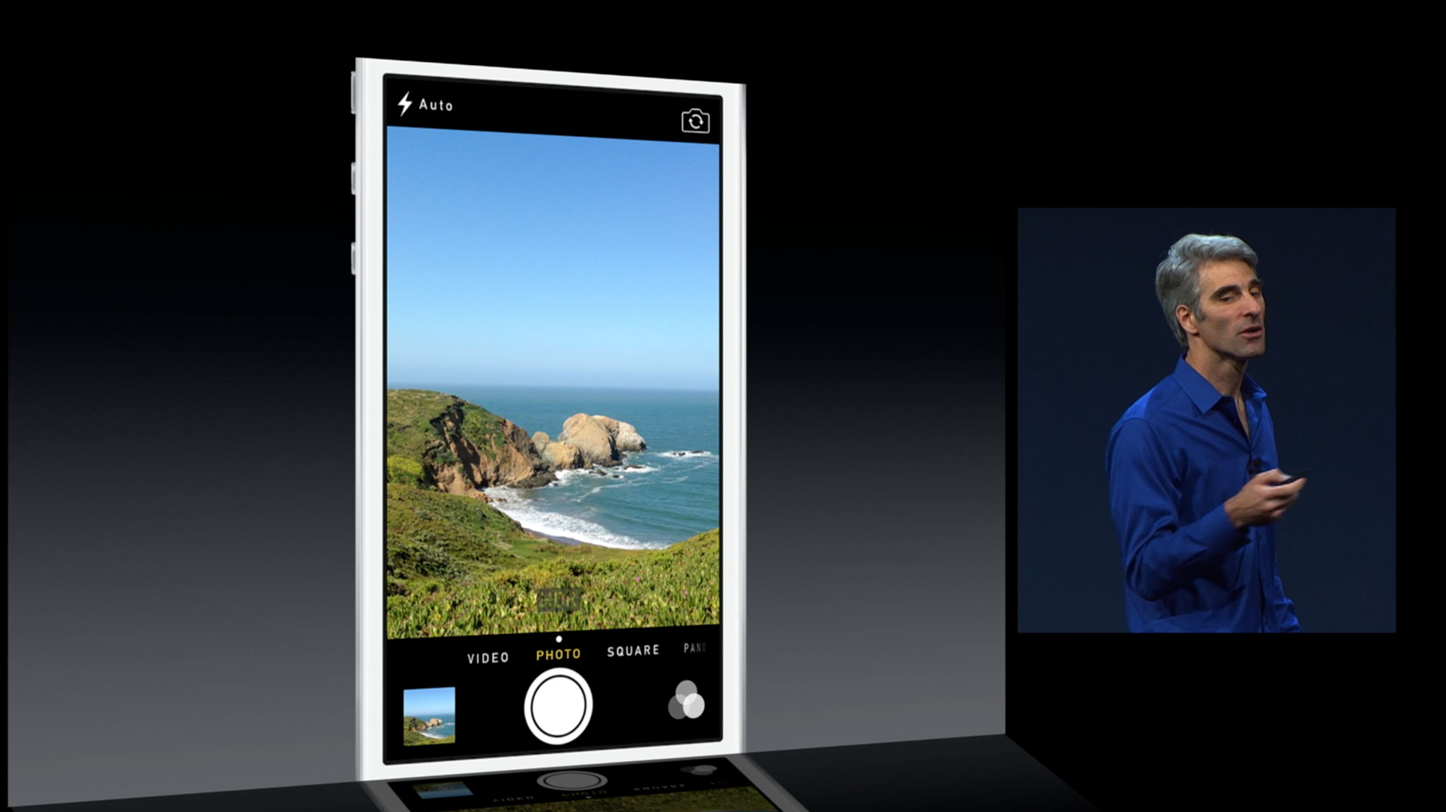
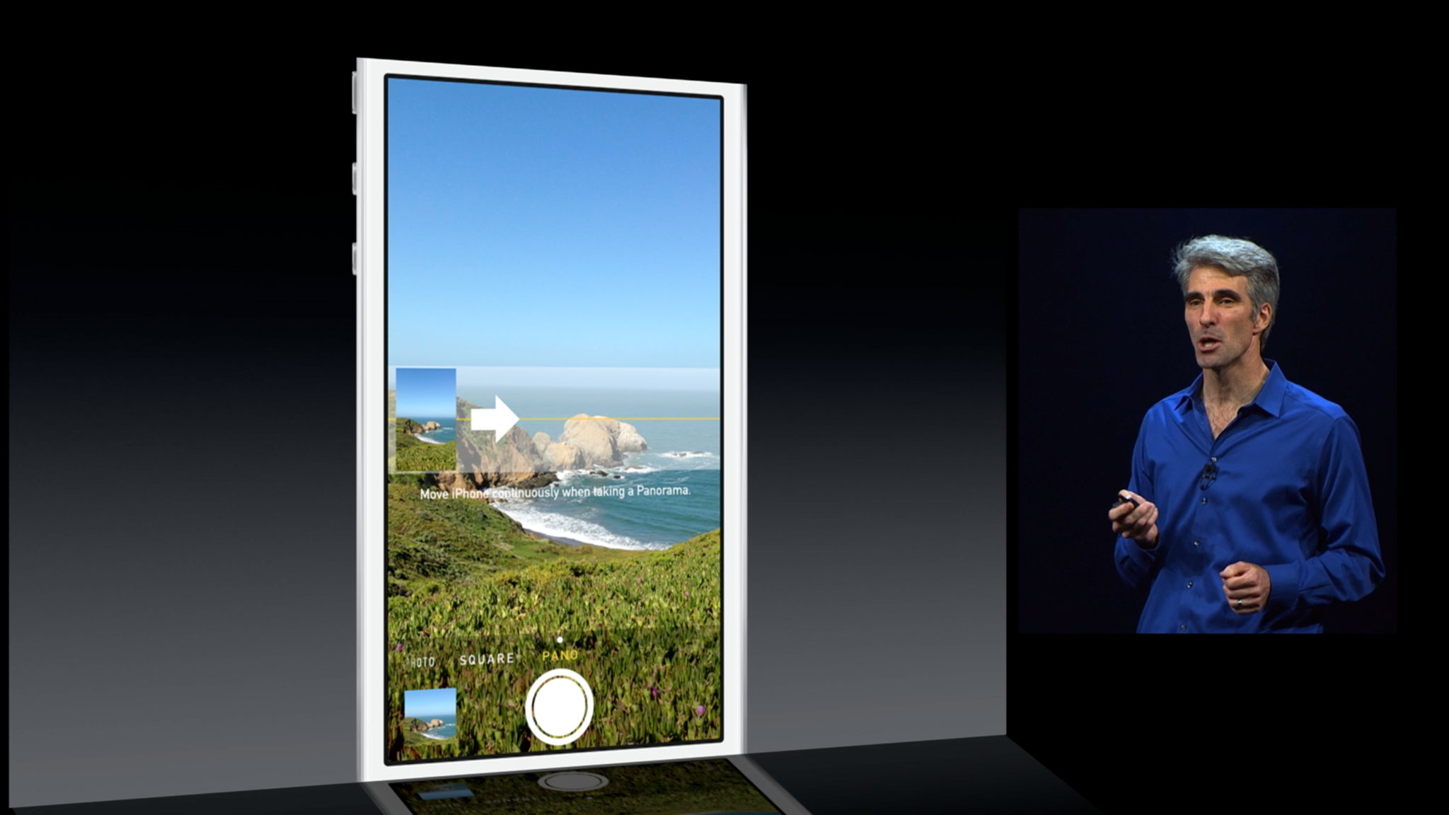
- The video toggle and panorama button have likewise moved, to an all new slider control that starts you off on Photo, lets you slide to the left for Video, and slide to the right for Square (think Instagram), and Panorama. The interface for Panorama looks largely unchanged from iOS 6.
- Taking a photo in iOS 7 looks to be lightning fast. Absent the shutter animation, which may once have covered lag in the original iPhone camera, it appears to be almost instant now. You take your shot and it gets took.
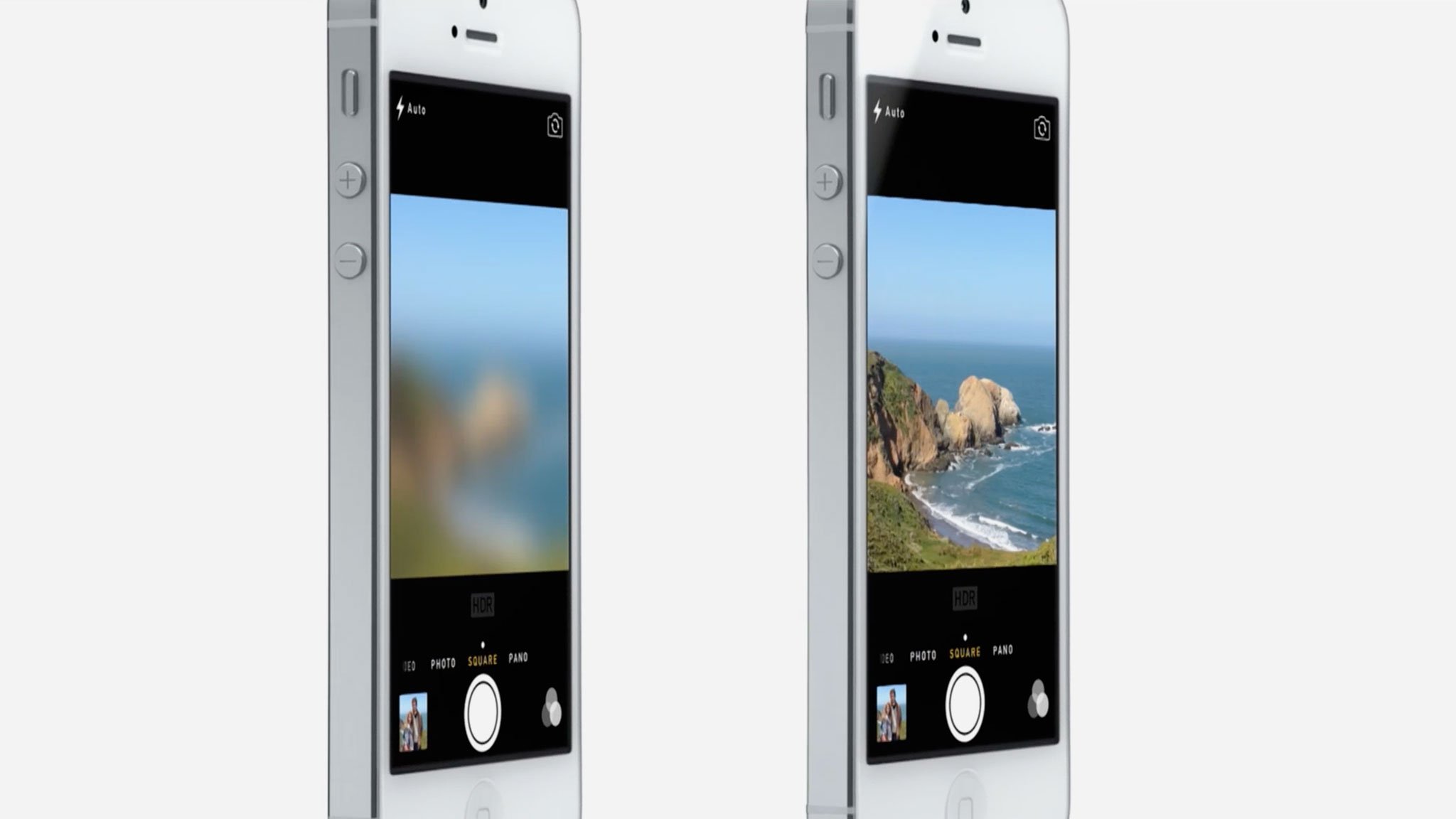
- Switching between modes looks to invoke a real-time blur effect, not dissimilar to those seen elsewhere in iOS 7. It makes for a dynamic, though likely computationally expensive transition.
- The new filters feature sits to the right of the camera shutter button, on the opposite side of the Camera Roll preview tile. Filter effects appear to be live, though they seem limited to Photos and Square, and not available to Video or Panorama. Mono, Tonal, Noir, Fade, Chrome, Process, Transfer, and Instant are the filters shown off the date.
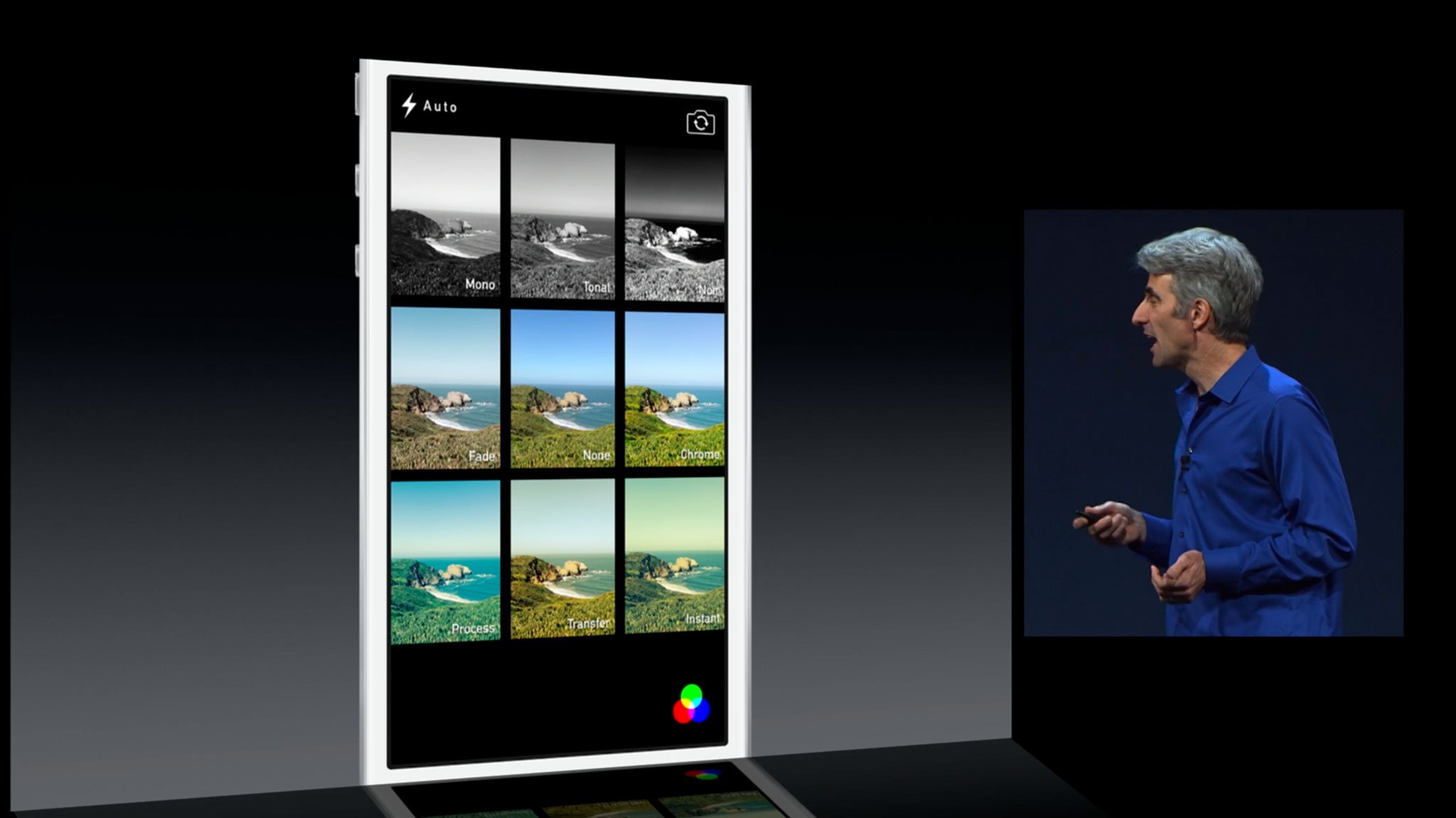
The Camera interface, originally designed by no less than Mike Matas and shown off by Steve Jobs on the very first iPhone in 2007, was delightful, but 6 years later it's earned its visual refresh.
The addition of the new square mode and the new filters highlight the immense influence of Instagram on mobile photography. I don't mind it. When not using Instagram I've still had the urge to square-cut photos, and having to do it in post with the crop tool was slow.
The filters, however, are far more subtle than Instagram's. There appear to be three types of black and white, one desaturated, one over saturated, and three that tint towards blue, red, and green respectively. Nothing blown out, nothing vignetted, and nothing overly dramatic. Depending on your tastes, that's either a huge negative, or a huge plus. I've wanted Apple to co-opt filtering for a while now, given how many other apps were piling on the feature. Whether this helps calm that down, or only spur it on further remains to be seen.
Master your iPhone in minutes
iMore offers spot-on advice and guidance from our team of experts, with decades of Apple device experience to lean on. Learn more with iMore!
Worth noting, there's no tilt-shift, no frame or border effects, and no sliders for controlling the amount of filter added, at least not that Apple's shown off so far.
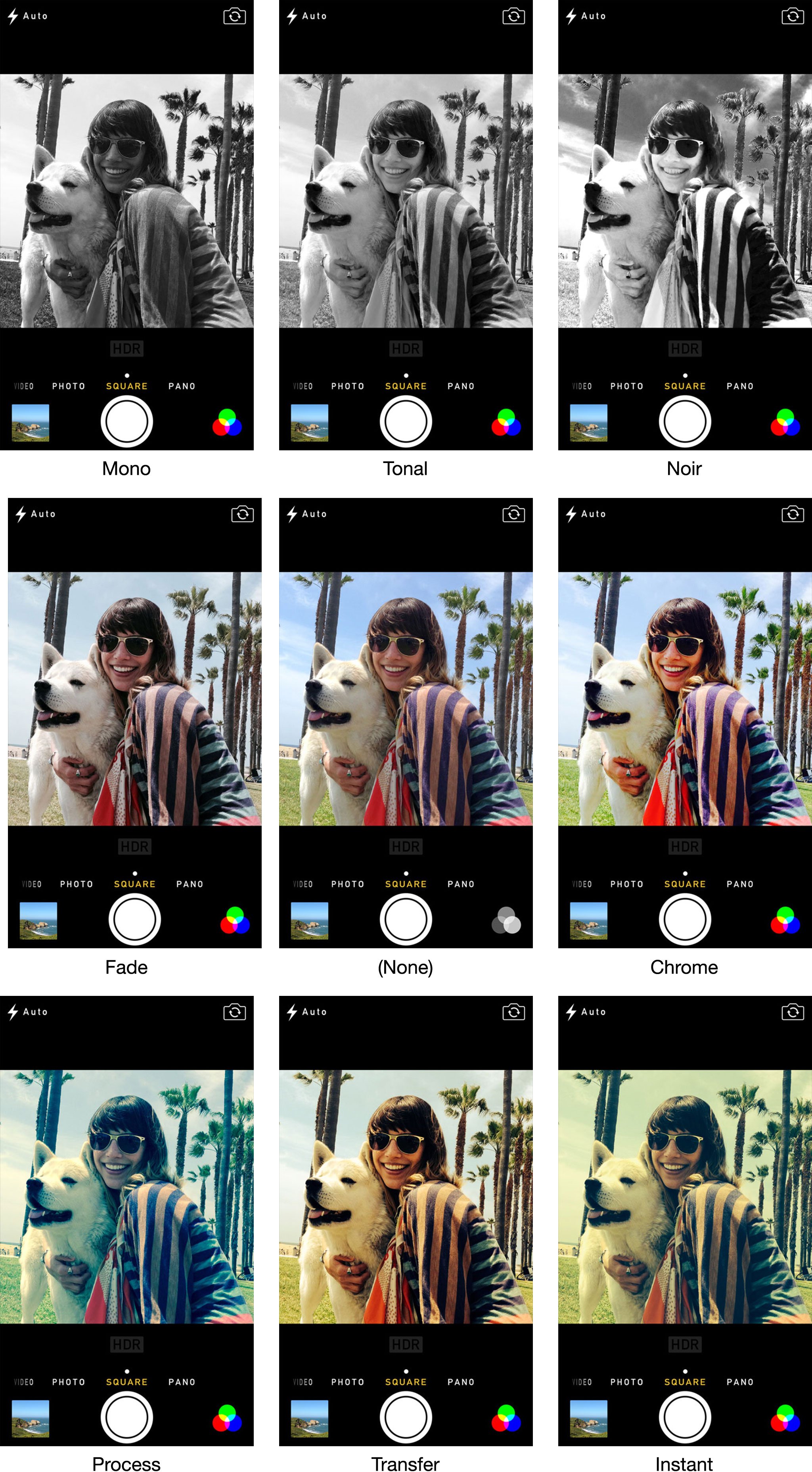
The speed of picture taking, if it holds up in real-world use, is amazing. Other platforms have been pushing the speed limits for a while now, and it's fantastic Apple's bringing the same attention and optimization to their software as they've been doing with their hardware for a while now. It'll be interesting to see what the next generation iPhone can do with it.
I do miss the grid dearly, however. Hopefully it's still there and we just haven't seen it yet. But as someone who still wants to be able to visually refer to the rule of thirds at times, if it's gone, it'll be a step backwards for me. There also doesn't seem to be any provision for more advanced photographers; no expert mode. That's not Apple's style, however, so it'll remain the providence of third-party camera apps, and with the new APIs in iOS7, hey could also get a welcome boost.
The updated Camera app will ship as part of iOS 7 this fall. Check out the resources below for more, and let me know - are the square mode and filters filters, along with its new look, enough for Apple's next generation?
- Camera: Everything you need to know
- iOS 7: Everything you need to know
- iOS 7: Discussion forum

Rene Ritchie is one of the most respected Apple analysts in the business, reaching a combined audience of over 40 million readers a month. His YouTube channel, Vector, has over 90 thousand subscribers and 14 million views and his podcasts, including Debug, have been downloaded over 20 million times. He also regularly co-hosts MacBreak Weekly for the TWiT network and co-hosted CES Live! and Talk Mobile. Based in Montreal, Rene is a former director of product marketing, web developer, and graphic designer. He's authored several books and appeared on numerous television and radio segments to discuss Apple and the technology industry. When not working, he likes to cook, grapple, and spend time with his friends and family.
