iOS 7 preview: Notification Center gets new Today screen, predictive traffic info, and more!
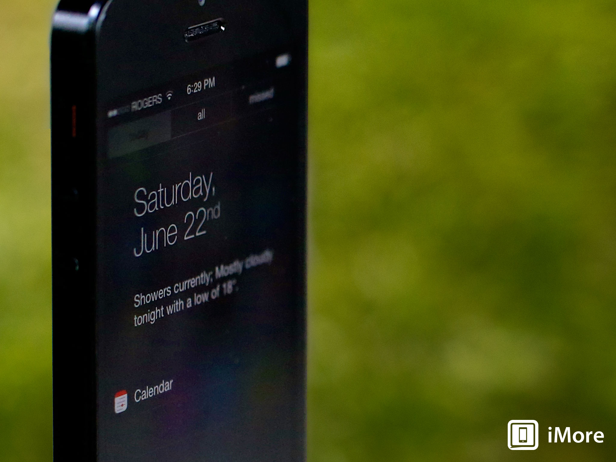
Notification Center now provides drop-down access not only to all your alerts, but your most recently missed alerts, and includes an all-new, contextual Today screen as well as Lock screen access!
Notification Center debuted in iOS 5 as way to quickly, easily see all your system and push alerts in one, unified place. Far less obtrusive than the original, modal iOS alert system, better looking if not as feature-rich as the Android or webOS notification centers that preceded it, Notification Center was a first step towards Apple better handling all the alerts all of us now get all day. With iOS 7, Apple has taken another... half step forward.
Here's how Apple describes the improvements to Notification Center in iOS 7:
Notification Center lets you know about new mail, missed calls, to-dos that need doing, and more. And a new feature called Today gives you a convenient summary of, well, today. One glance at your iPhone and you’ll know if it’s a certain someone’s birthday, if you’ll need an umbrella, or if traffic will slow down your commute. You’ll even get a heads-up on tomorrow. You can access Notification Center from any screen, including the Lock screen. Just swipe down. And get up to speed.
And, based on what Apple's shown off at WWDC 2013 and Apple.com to date, here's how it works:
- Notification Center, like all of iOS 7, is built on a new physics engine so it behaves more like a real-world (if not this world) object. It has velocity and collision detection, so if you slam it down, it'll bounce!
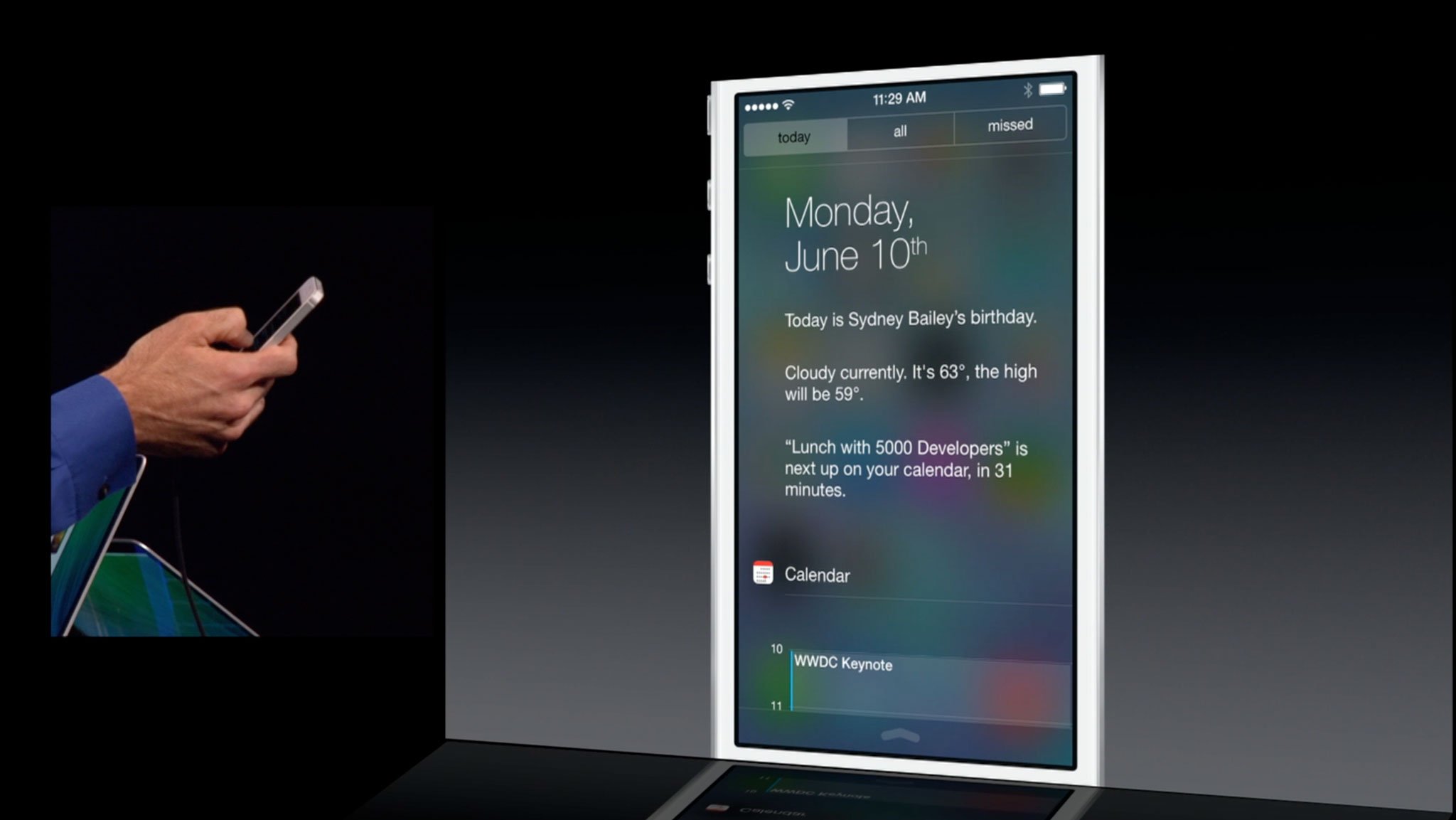
- The new, tabbed interface lets you choose between Today, All, and Missed.
- The Missed view only shows you alerts from the last 24 hours.
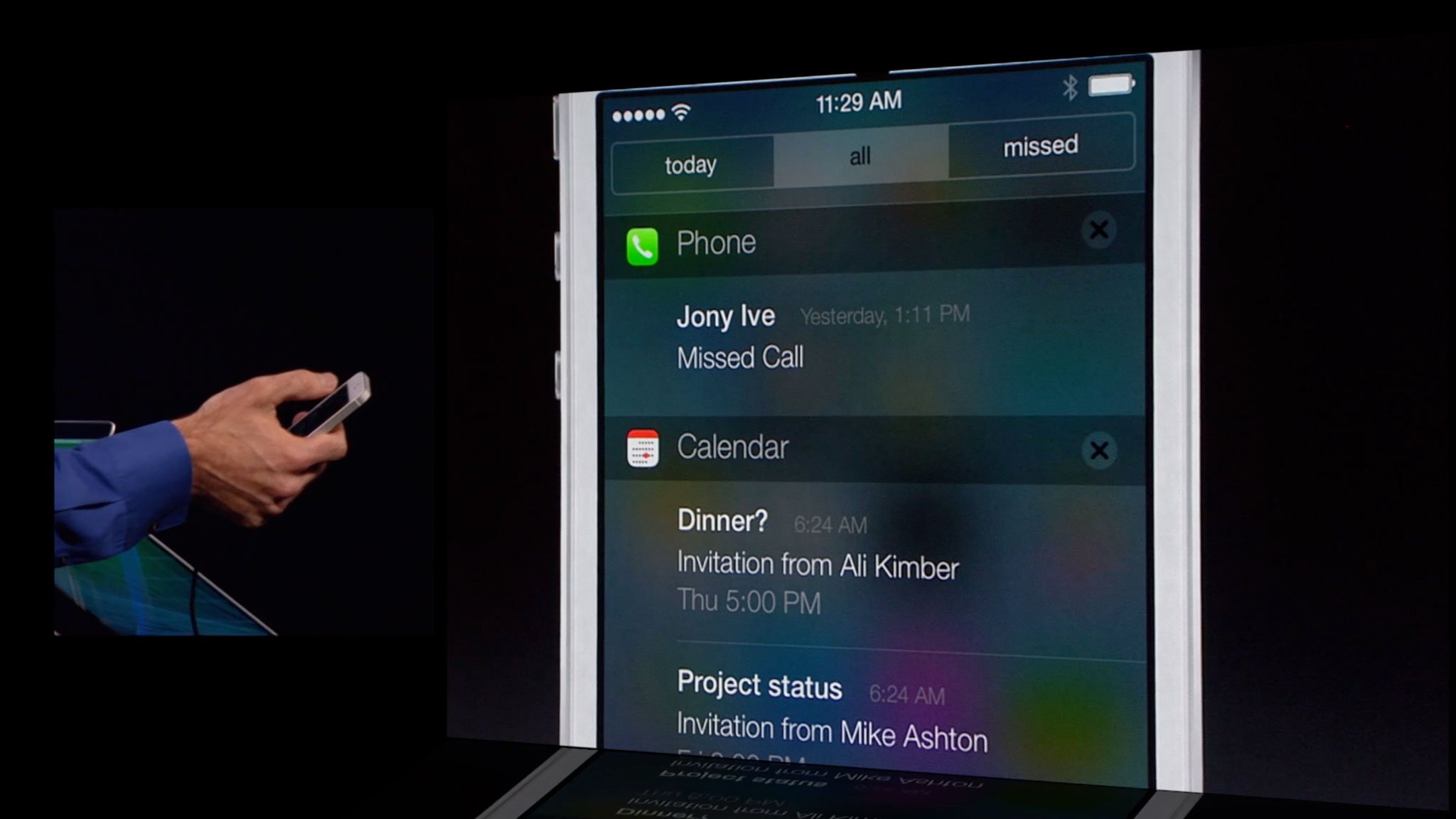
- The All view, as the name implies, shows you all alerts.
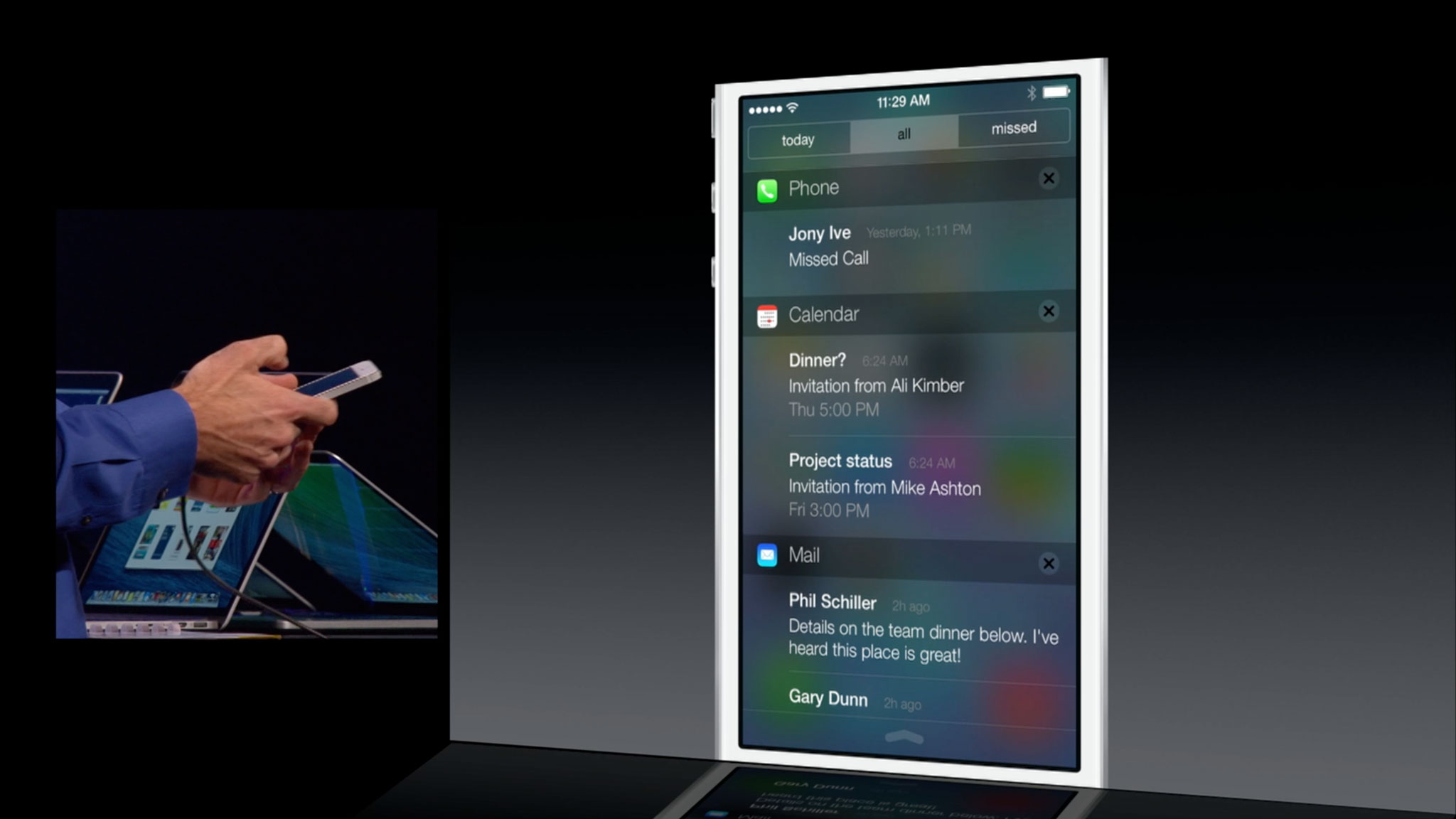
- The All view is similar to the iOS 5 and iOS 6 version of Notification Center, with an app-by-app breakdown of your alerts. The Tap to Tweet (Twitter) and Tap to Post (Facebook) buttons appear to be missing, or to have been removed, but I mourn them not for while convenient, they were not notifications and thus existed out-of-context.
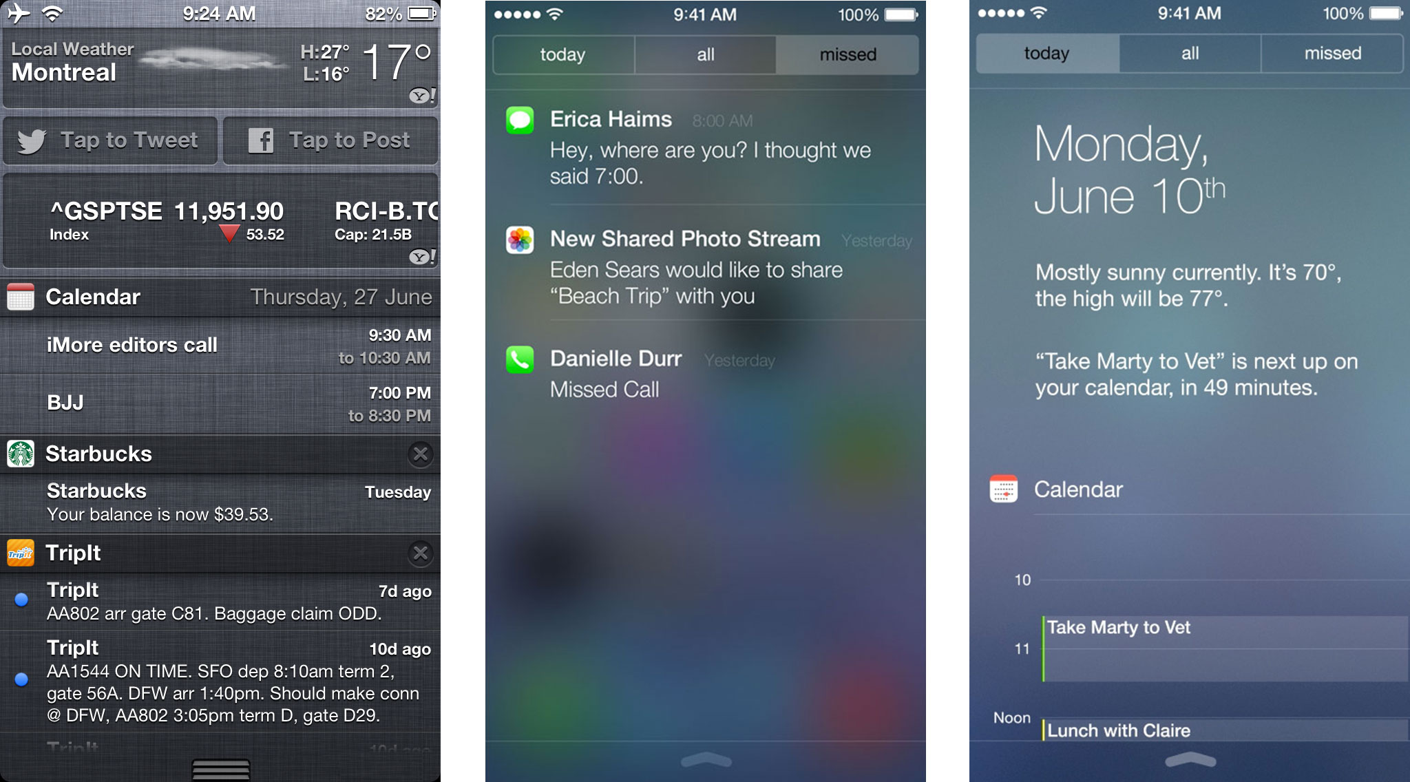
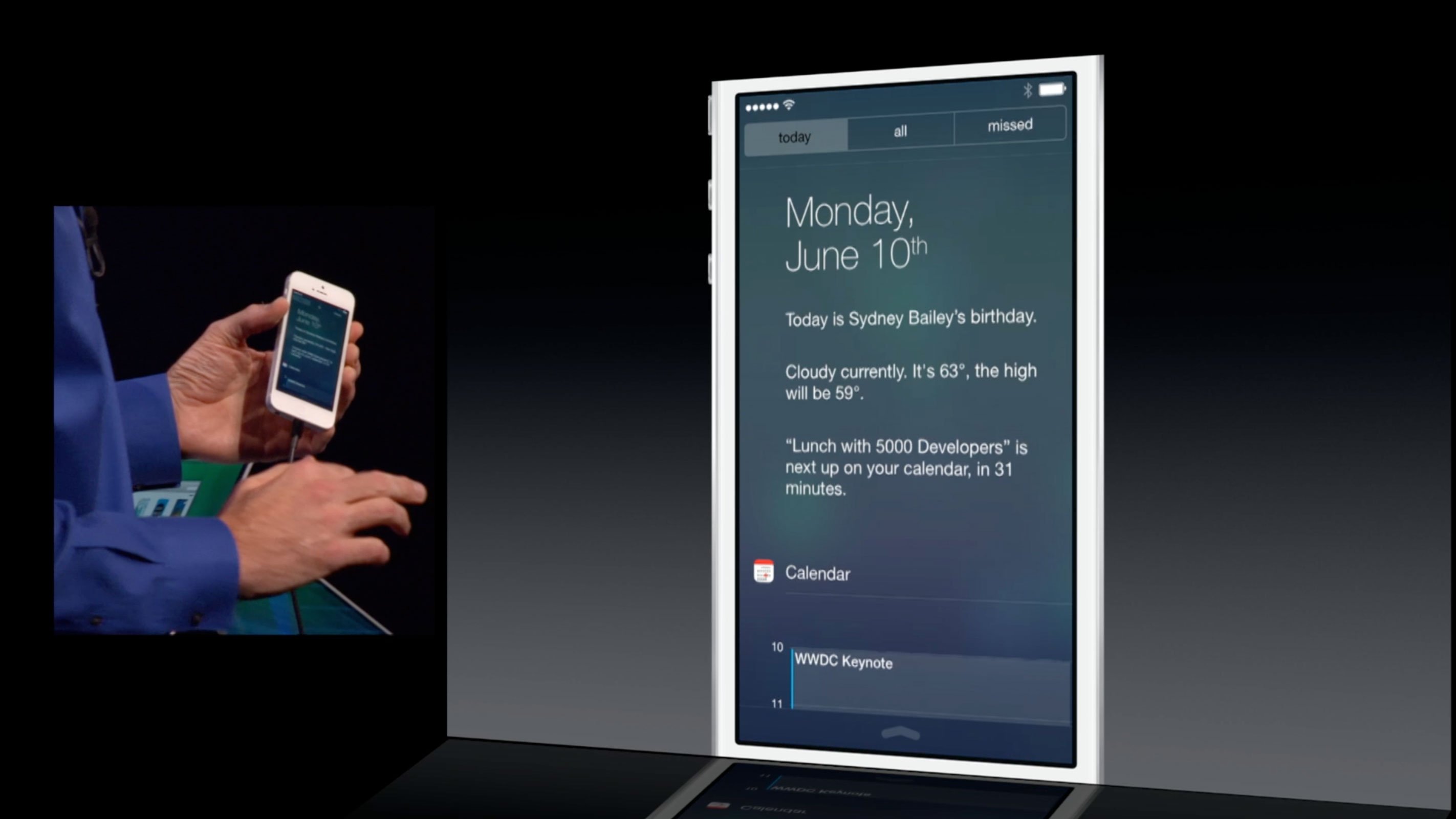
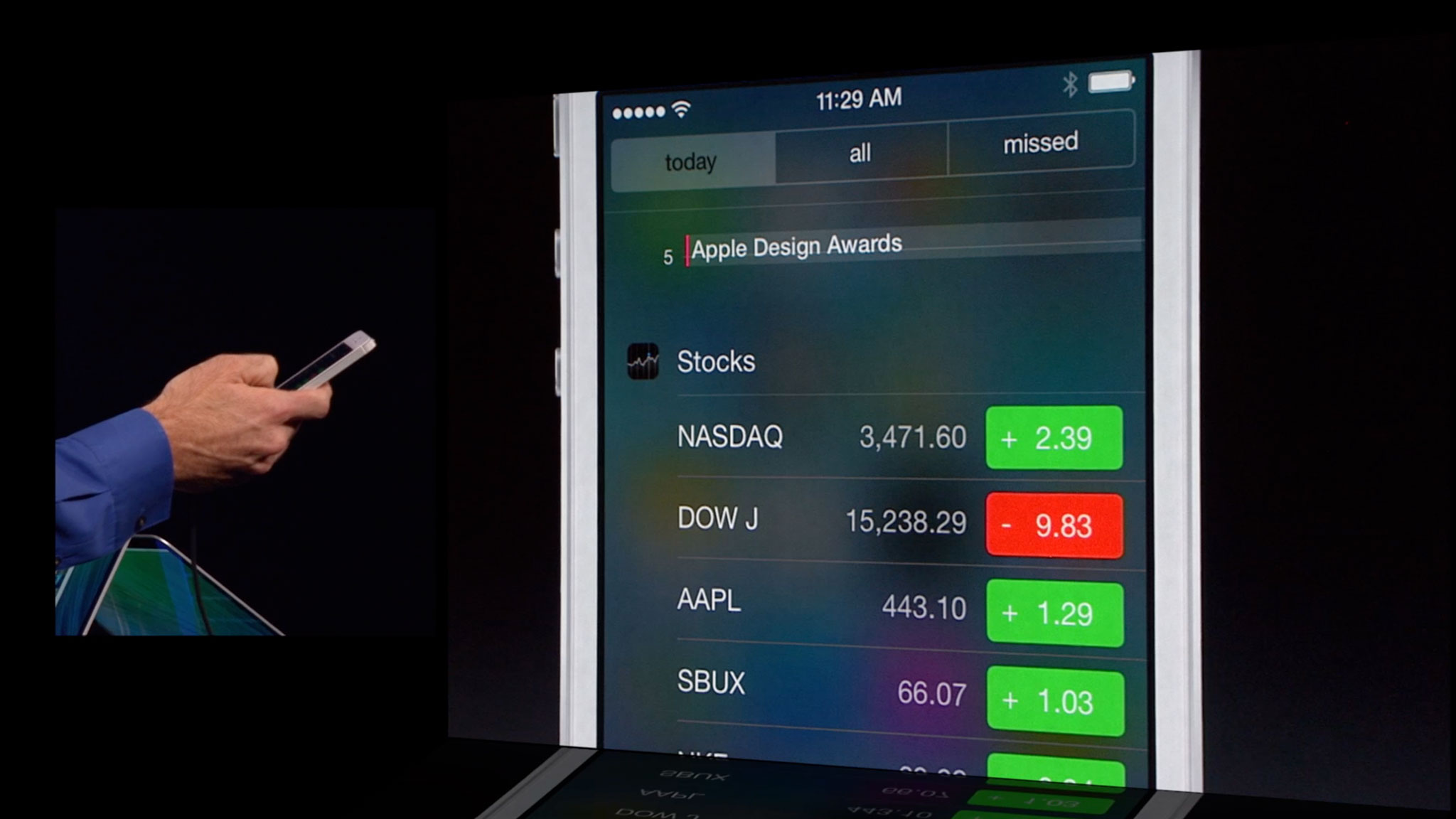
- The Today view shows you the current day and date in large type (ultrathin, of course!) along with a brief, written description of the current weather in your current location, and a written description of your next appointment. It can also tell you if current traffic conditions will impact your next trip. Beneath that you get a more elaborate, more graphical look at Calendar, Reminders, and Stocks, as well as another written out description, this time recapping what's coming up tomorrow.
- Notification Center, like it's new companion, Control Center, is now accessible from the Lock screen. (Though, presumably, based on previous feature patterns, that'll be an option for those more privacy-minded.)
- Notification sync means when you dismiss a notification on one device, it should dismiss it on all devices, so you don't have to deal with the same alerts, again and again.
The core concept of Notification Center remains largely unchanged in iOS 7, which is a boon to people already familiar with how to use it. The ability to pull Notification Center down even while on the Lock screen is interesting. The Lock screen already enjoys notification support all its own, but nothing as powerful or persistent as Notification Center proper. (Unlike Lock screen notifications, a quick swipe in iOS 7 can now get you back to an earlier alert you want to catch up on, or refresh you memory about.) The doubling up is slightly awkward, more function over form, but it will likely appeal to people who prefer convenience over privacy.
The difference between All alerts and Missed enjoys similar overlap but similar appeal to power users. "Missed" might be misnamed, as based on the demos to date it looks more like a "Recent" or "Latest" view, but that might be made clearer once the behavior is better understood (do recent but already seen alerts get excluded, for example?)
Today is the biggest change, both in form and functionality. It harkens back to the old Windows Mobile Today Screen of years and versions passed, but with a decidedly Apple focus, iOS 7 aesthetic, and new-fangled technological bent.
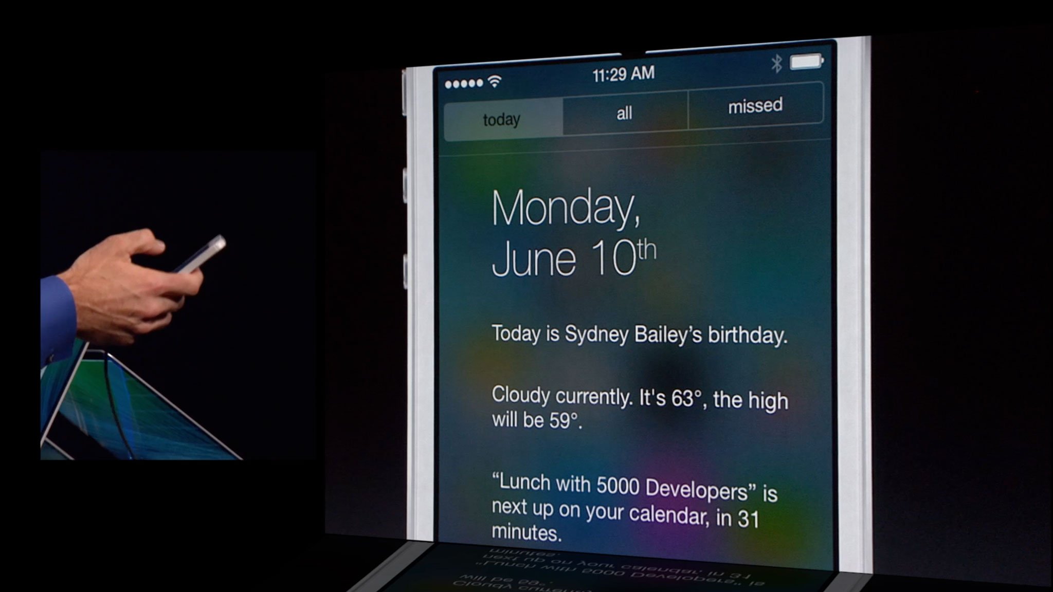
The written out weather and next appointment seems to be a step backwards when it comes to glance-ability and a step forwards in terms of informational density. iOS 5 and iOS 6 had a graphical weather widget that was easier to get the gist of at a glance, but provided little more than "sunny" or "rainy". In a perfect world, Apple would find a way to balance both. Re-introduce a graphical element and keep the deeper text. Likewise with stocks, which used to scroll in one tidy widget, and now sprawls out row after row after row...
Master your iPhone in minutes
iMore offers spot-on advice and guidance from our team of experts, with decades of Apple device experience to lean on. Learn more with iMore!
Integrating traffic information, on the other hand, is outstanding and hopefully only the first indication that Apple is heading towards a more Google Now-style implementation where they parse location, time, calendar, and every other metric they have at their disposal and present contextually appropriate, predictive alerts in Notification Center.
Unfortunately, for all iOS 7's objectification and direct manipulation the demos to date haven't shown any gesture-based way to dismiss notifications. Other platforms have allowed you to swipe away notifications for a long time already. Even Apple's own Mail has a swipe-to-delete feature, and the immediacy of "tossing things away" is tough to beat. Hopefully Apple addresses this, because the tiny little X button is discoverable, but not very usable by itself.
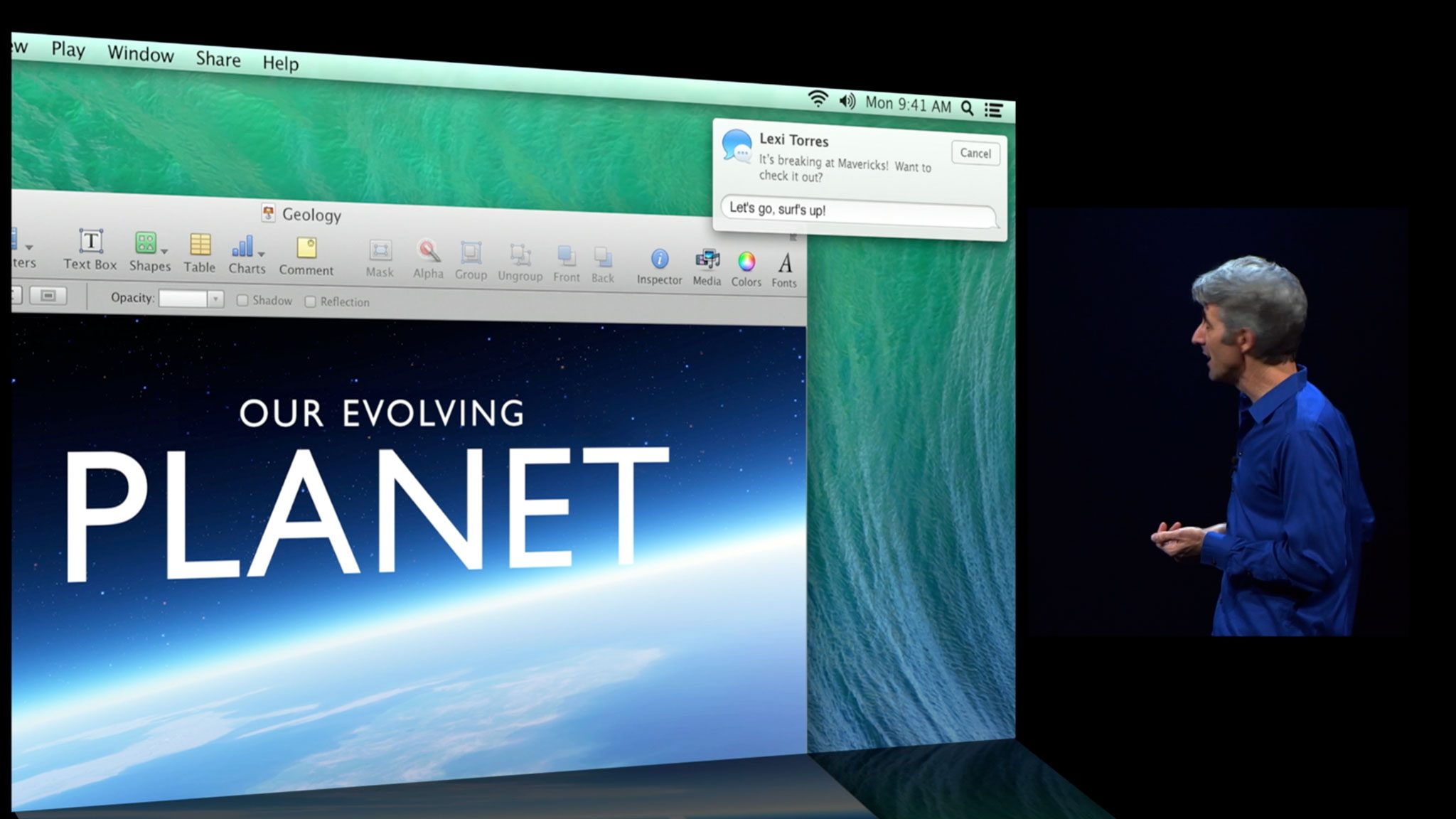
Perhaps the biggest omission in the whole system remains active notifications, which Apple just introduced for the Mac in OS X Mavericks but hasn't thus far announced for iOS. The ability to quickly respond to a message, reset a timer, or otherwise handle simple items without having to switch apps is even more necessary on mobile than on the desktop. Hopefully actionable notifications on OS X are just a precursor to the same or similar system on iOS, and sooner rather than later.
The new Notification Center will become available to everyone when iOS 7 ships to the general public this fall. Check out the resources below for more, and let me know -- how do you like what you've seen of the newly updated Notification Center so far?
- Notification Center: Everything you need to know
- iOS 7: Everything you need to know
- iOS 7: Discussion forum

Rene Ritchie is one of the most respected Apple analysts in the business, reaching a combined audience of over 40 million readers a month. His YouTube channel, Vector, has over 90 thousand subscribers and 14 million views and his podcasts, including Debug, have been downloaded over 20 million times. He also regularly co-hosts MacBreak Weekly for the TWiT network and co-hosted CES Live! and Talk Mobile. Based in Montreal, Rene is a former director of product marketing, web developer, and graphic designer. He's authored several books and appeared on numerous television and radio segments to discuss Apple and the technology industry. When not working, he likes to cook, grapple, and spend time with his friends and family.
