iOS 7 preview: Safari amps up search, tabs, sharing, reading, and more!
Safari is one of the most important apps on iOS, and so it's not surprising it gets one of the biggest redesigns in iOS 7. The gateway to the web on iPhone, iPod touch, and iPad, Apple finally gives it a unified search bar, along with some slick new social features, a better reading list, and an all-new, all awesome new tab interface that really shows off the objectification, gamification, and general dynamism of iOS 7.
Here's what Apple has to say about the new Safari features in iOS 7:
Browsing is bigger, better, and more beautiful with Safari in iOS 7. Buttons and bars — like the unified smart search field — stay hidden until you scroll to reveal them. So you see more content than ever on your screen. And with a swipe, you can go back or forward a page. It’s all designed so nothing gets in your way or slows you down.
And here's what Apple's shown off of it so far:
- Safari now sports a new, full-screen design where interface elements minimize or disappear during normal browsing.

- For example, when you're at the top of a webpage, or tap the website name at the top, the new unified smart search field presents itself. When you scroll down, it disappears. Same with the basic control buttons.

- Tapping into the unified smart search field presents you with a page full of icons, giving you easy access to all your favorite websites.

- When you start typing in the unified smart search field, you get shown the top hit (hits?), then results from Google (or whatever your default search engine is set to?), as well as results from Bookmarks and History. (Presumably local results to the page text as well?)

- The Bookmark button now opens up a tabbed interface that, first, includes the traditional list of your bookmarks.

- Next is the Shared Links, which shows you pages your friends have shared with your on Twitter.

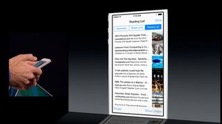
- Last is the Reading List, which as the name suggests, shows you pages you've saved to the reading list. You can choose to show only unread stories, and also scroll continuously through stories without going back to the list view.
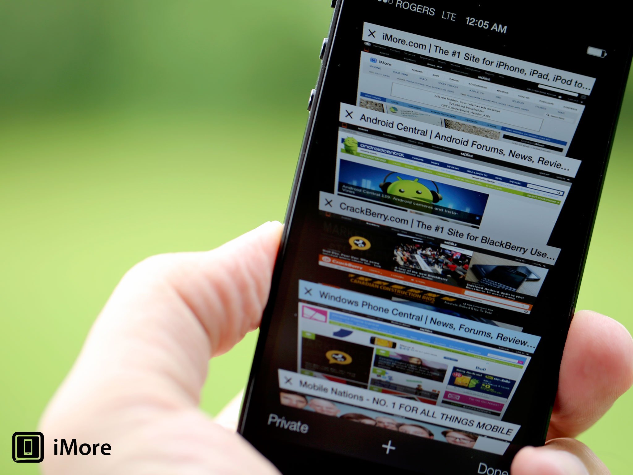
- Tabs has an all-new interface. Pages are now presented in a virtual 3D "rolodex" that you can scroll through. And the old tab limit is gone. You can have as many tabs as you want now.

- You can reorder a tab by touching and holding it and then moving it to the place you want it. You can get rid of a tab by tapping the X icon at the top left, or by touching and holding it and then tossing it off to the left.

- At the bottom of the tab interface are iCloud tabs. Unlike the regular tabs, they're not presented as cards but as a list overlaid on top of the cards, sorted by device.
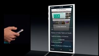
- Private browsing, which used to require a separate trip to the Settings app to toggle, now appears at the bottom of the bookmarks and tabs interfaces.
- Gestures have been incorporated that let you swipe from left to right to navigate back through the browser history, and from right to left to navigate forward through it.

- Safari on iOS also gets the iCloud Keychain feature.

The new interface for Safari looks great. I'm still not a huge fan of the unified address and search fields - I never saw the need for the URLs I type in to be parsed by the company who made the browser. Even if they separate fully formed URLs from search terms at the interface level, there are all sorts of opportunities for user errors that spawn searches, and they don't need any more data from me - and on me - than they get already. However, for people who don't care about that, it's a really convenient feature and in iOS 7 Safari, it's done well.
What remains to be seen how well Safari auto-hides and reveals the unified smart search field and the controls in actual use. Barring a direct connection to my brain, it'll be hard for Safari to know exactly when I want an uncluttered, full-screen experience, and when I want that damn control button now, now, now. The new navigational gestures, while they have issues, will no doubt mitigate that slightly. Would that it were possible to figure out more of them. Quick bookmark access would be grand.
The favorites are a good idea, and look useful. Likewise the new, tabbed Bookmarks, Reading List, and Shared Links. Apple hasn't said how they're pulling the Shared Links yet, but I presume it has something to do with the existing Twitter integration. No word yet on what, if anything, happens if you have multiple Twitter accounts set up in Settings.
Privacy being available right from Bookmarks or tabs is excellent. No more having to switch apps to toggle. Hopefully we'll eventually be able to have private tabs co-existing with non-private tabs at the same time.
Master your iPhone in minutes
iMore offers spot-on advice and guidance from our team of experts, with decades of Apple device experience to lean on. Learn more with iMore!
The new Tab browser is epic. It shows off everything that's great about iOS 7, including the new physics engine that allows for the rolodex metaphor, the parallax effect that allows for "peaking" at what's behind things, the direct manipulation that allows for intuitive re-ordering and removal, and the absolute delight of the experience in general. It's just so well done, and should make all of us eager to see what this kind of potential can lead to in the years ahead.
Layering iCloud tabs at the bottom looks great as well, though the lack of a tab limit means they could potentially take a while to scroll down to.
As to iCloud Keychain, we covered that previously:
Overall, iOS 7 Safari looks like a terrific update, as befits one of the most important, most used apps on the platform. It ships, along with the rest of iOS 7 this fall. In the meantime, let me know what you think of it - a lot of improvements, a lot of eye candy, or a bit of both?
- Safari: Everything you need to know
- iOS 7: Everything you need to know
- iOS 7: Discussion forum

Rene Ritchie is one of the most respected Apple analysts in the business, reaching a combined audience of over 40 million readers a month. His YouTube channel, Vector, has over 90 thousand subscribers and 14 million views and his podcasts, including Debug, have been downloaded over 20 million times. He also regularly co-hosts MacBreak Weekly for the TWiT network and co-hosted CES Live! and Talk Mobile. Based in Montreal, Rene is a former director of product marketing, web developer, and graphic designer. He's authored several books and appeared on numerous television and radio segments to discuss Apple and the technology industry. When not working, he likes to cook, grapple, and spend time with his friends and family.


