iOS 8 wants: Customizable Control Center
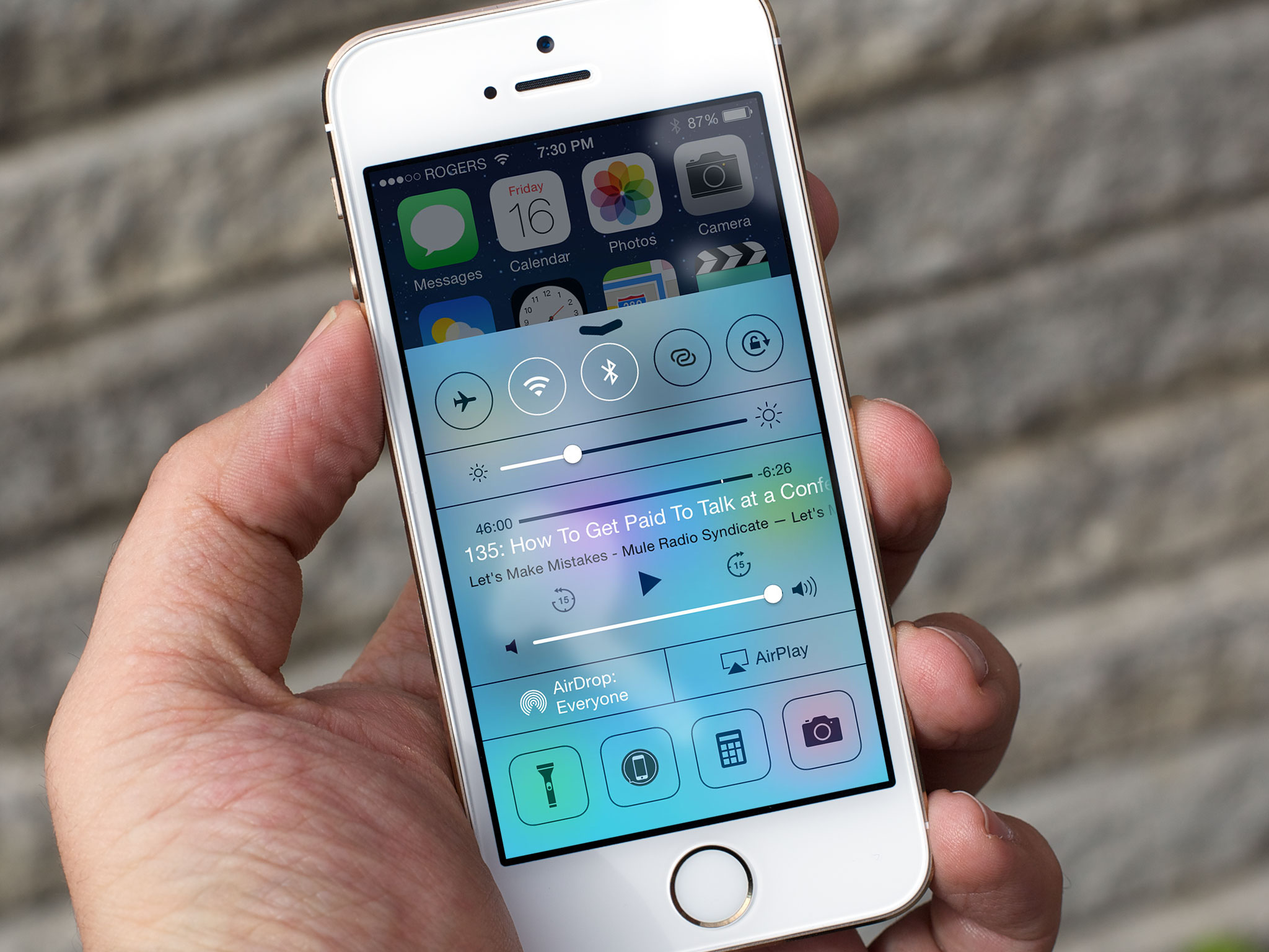
Apple introduced Control Center in iOS 7 as a way to quickly get to the settings, controls, and basic functions most iPhone and iPad users need most of the time. That includes Airplane Mode, Wi-Fi, Bluetooth, Do Not Disturb, and Orientation Lock, Brightness, media scrubber, player controls, and volume, AirDrop and AirPlay, and FlashLight, Timer, Calculator, and Camera. Yet not all of those options, especially the app ones, will be useful for all people, all of the time. So, with iOS 8, it would be great if Apple made them at least partially customizable.
Of course, the idea of a customizable Control Center isn't new. Everyone's wanted it since almost immediately after they first saw it back in June of 2013. It's the implementation and scope that's tricky to work out.
For example, I almost never use Do Not Disturb but I use Personal Hotspot all the time. I'd love to be able to swap the former out for the latter. What kind of mechanic could that use?
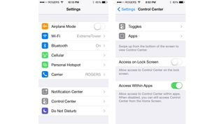
A page or two in Settings is an obvious answer. Go to Settings > Control Center > Toggles and get a list of on/off options to choose from. Go to Settings > Control Center > Apps and likewise get a list of special functions and items.
How would you select which of the listed toggles would be in Control Center? How would the app list scale to handle hundreds or thousands of options? How would third party app icons look in Control Center?
If developers had to include a special, black and white version for Control Center — just one more in a long list of versions already required — they could look great. If not, forced black and white could look... not great. Perhaps Apple could only offer up apps that have the Control Center icon included. That would certainly incentivize their creation.
Settings don't have the be the only option, however. iOS 7 excels at direct manipulation and gestures can be great shortcuts for experienced users. Maybe something like Tweetbot 3's long press. Touch and hold a toggle and a few other, sensible and popular options pop up. Tap one of those and it takes it takes the spot.
Master your iPhone in minutes
iMore offers spot-on advice and guidance from our team of experts, with decades of Apple device experience to lean on. Learn more with iMore!
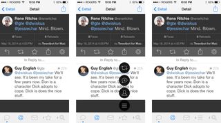
The quick launches at the bottom are again harder to figure out simply by virtue of its potential scale. People typically have dozens if not hundreds of apps on their iPhones and iPads. There's no way to contain that many apps in a Tweetbot 3-style long press pop-up.
Perhaps doing a long press on an app in Control Center could dump you into a black-and-white version of the Home screen where you could pick any other app to take its place.
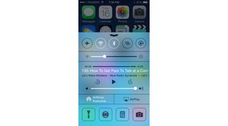
But there's another problem. The first two icons, Flashlight and Timer, aren't really apps. Flashlight turns the LED flash on, which has no app counterpart. Timer is a deep link that goes to a specific tab in the Clock app. If you ever swapped them out, how would you get them back?
Apple could create a special "Home page" for them and other, similar, first party special functions. Yet that could also be confusing and unwieldy.
Update: I neglected to mention security. Unless it's disabled in Settings, Control Center can be accessed via the Lock screen. That means, a Control Center that can be customized with third-party apps could make those apps accessible via the Lock screen, thwarting Touch ID/Passcode/Password protection. I disable Control Center on Lock screen anyway, but it's another implementation factor to consider.
Again, these are the kinds of problems Apple is really good at figuring out. It's also the kind of problem Apple will patiently work on until they have a solution, even if it means waiting a few versions to implement. It would be great, of course, if that version was iOS 8.
Would you like a customizable Control Center and if so, how would you like to see it implemented?

Rene Ritchie is one of the most respected Apple analysts in the business, reaching a combined audience of over 40 million readers a month. His YouTube channel, Vector, has over 90 thousand subscribers and 14 million views and his podcasts, including Debug, have been downloaded over 20 million times. He also regularly co-hosts MacBreak Weekly for the TWiT network and co-hosted CES Live! and Talk Mobile. Based in Montreal, Rene is a former director of product marketing, web developer, and graphic designer. He's authored several books and appeared on numerous television and radio segments to discuss Apple and the technology industry. When not working, he likes to cook, grapple, and spend time with his friends and family.

