My favorite Apple Watch accessibility features

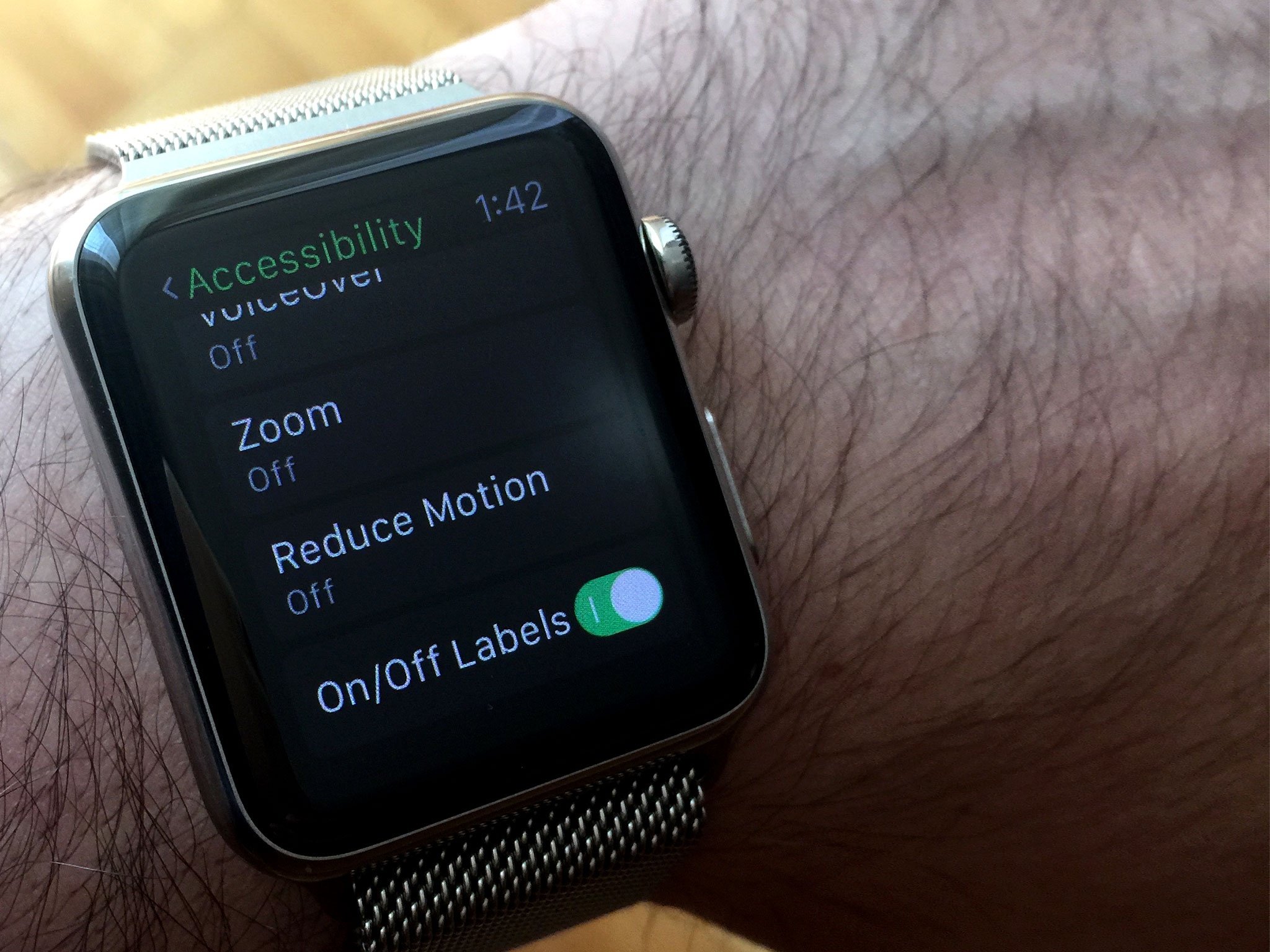
As part of my ongoing efforts to better use and understand Apple Watch, I've recently taken to looking at a few of Watch OS's Accessibility features in more detail. While my vision is good enough that I don't have to use every option, there are a handful that I often like to use because they're well done and are handy.
Large dynamic type
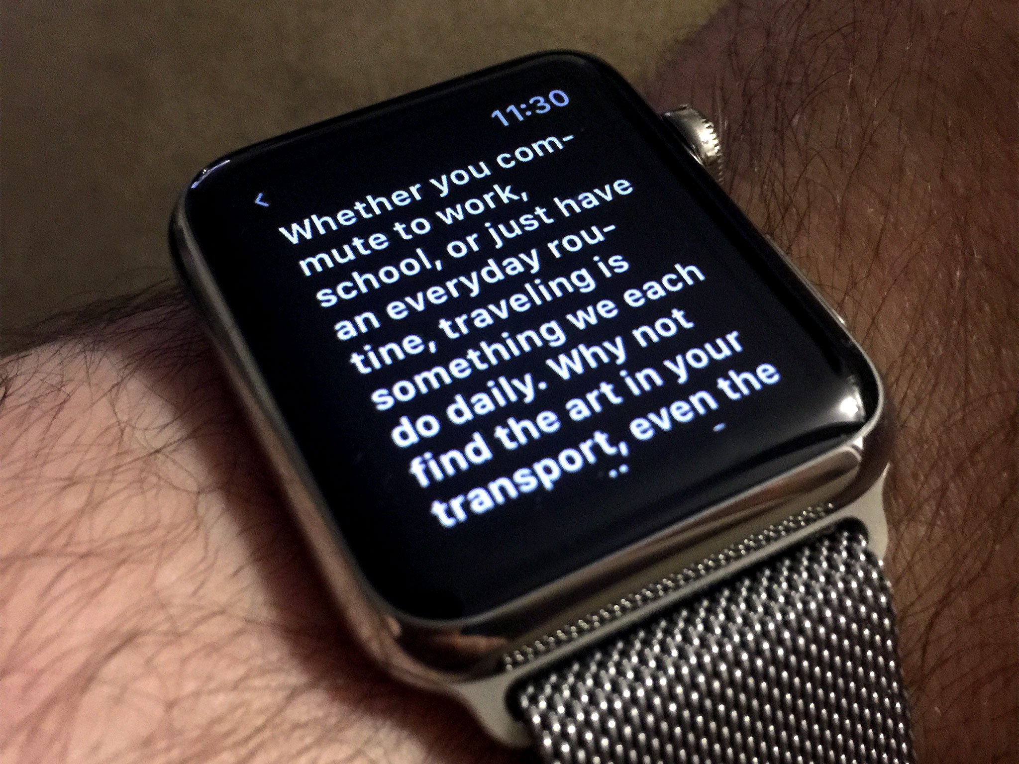
On a screen as small as Apple Watch's, using Large Dynamic Type is a necessity for someone who's visually impaired. In fact, the first thing I did upon turning on my Apple Watch for the first time was crank up the text size to one notch below the highest setting. (I also set the screen brightness to the maximum level.) Taken together, these steps do much to compensate for the Watch's small display, particularly that of the 38mm model.
I love Larger Dynamic Type because it works all over the place.
As with all of Watch OS's Accessibility features, Large Dynamic Type is borrowed from iOS. Introduced in iOS 7, what this setting does is set the text size everywhere text is shown system-wide. In addition, third-party developers are able to support Large Dynamic Type in their apps via an API. Aside from its practical gains, the big advantage of Large Dynamic Type is convenience. It saves users from hunting for a text slider in every app that may need larger font.
I love Larger Dynamic Type on the Apple Watch for the same reason I love it on iOS: it works all over the place. From Glances to Apple's bundled apps to Notification Center, text is 100% readable with minimal eye strain.
Bold text

Bold Text does what it says: makes all text bold. When I first got my Apple Watch, I didn't enable Bold Text because I didn't think I needed it --- and, frankly, I was afraid it wouldn't look very good.
Then I heard John Gruber sing Bold Text's praises on a recent episode of his podcast, The Talk Show. He said Bold Text makes text stand out more and it looks good, so I decided to try it. Much to my delight, my experience with Bold Text matches John's exactly: it does improve contrast and it does look good. So, I'm sticking with it. Anything I can do to improve legibility on the Watch's tiny display, so much the better.
Alas, there is one bugaboo with using Bold Text. In order to enable it, you must restart your device. (This is true on iOS as well.) I have no idea why devices need to be rebooted for Bold Text to take effect, but it does put a little crimp on Apple's "everything works seamlessly" mantra. Especially on the Watch, where it takes a minute or so to boot, the delay is noticeable. A minor annoyance in the grand scheme of things, but it's definitely something for users to keep in mind.
Master your iPhone in minutes
iMore offers spot-on advice and guidance from our team of experts, with decades of Apple device experience to lean on. Learn more with iMore!
Zoom
Zoom's greatest utility is when navigating the Watch's Home screen. To me, nothing is more frustrating than using the Home screen. Icons are tiny, naturally, but a consequence of their diminutive nature is that touch targets are also tiny. In terms of accessibility, this is problematic because not only are Home screen icons hard to see, but the small touch targets require a level of precision that a person (like me) with fine-motor delays may not be able to maintain. It makes for a not-so-fun user experience.
The Home screen is where Zoom shines.
This is where Zoom shines. After turning it on in Settings, I can double-tap on the screen to zoom in, then use the digital crown to pan around and adjust the level of zoom. Obviously, the benefit here is that Home screen icons (and their touch targets) are now much bigger, making it so much easier to find and tap the app I want.
Of course, the downside to Zoom is that you see less of the screen, which means more panning to find what you need. Even so, it seems like an acceptable trade-off considering that the Home screen is so inaccessible at normal size. In my usage, given how infrequently I use the Home screen (for more reasons than just accessibility), I don't mind letting Zoom help me get around.
Extra large watch face

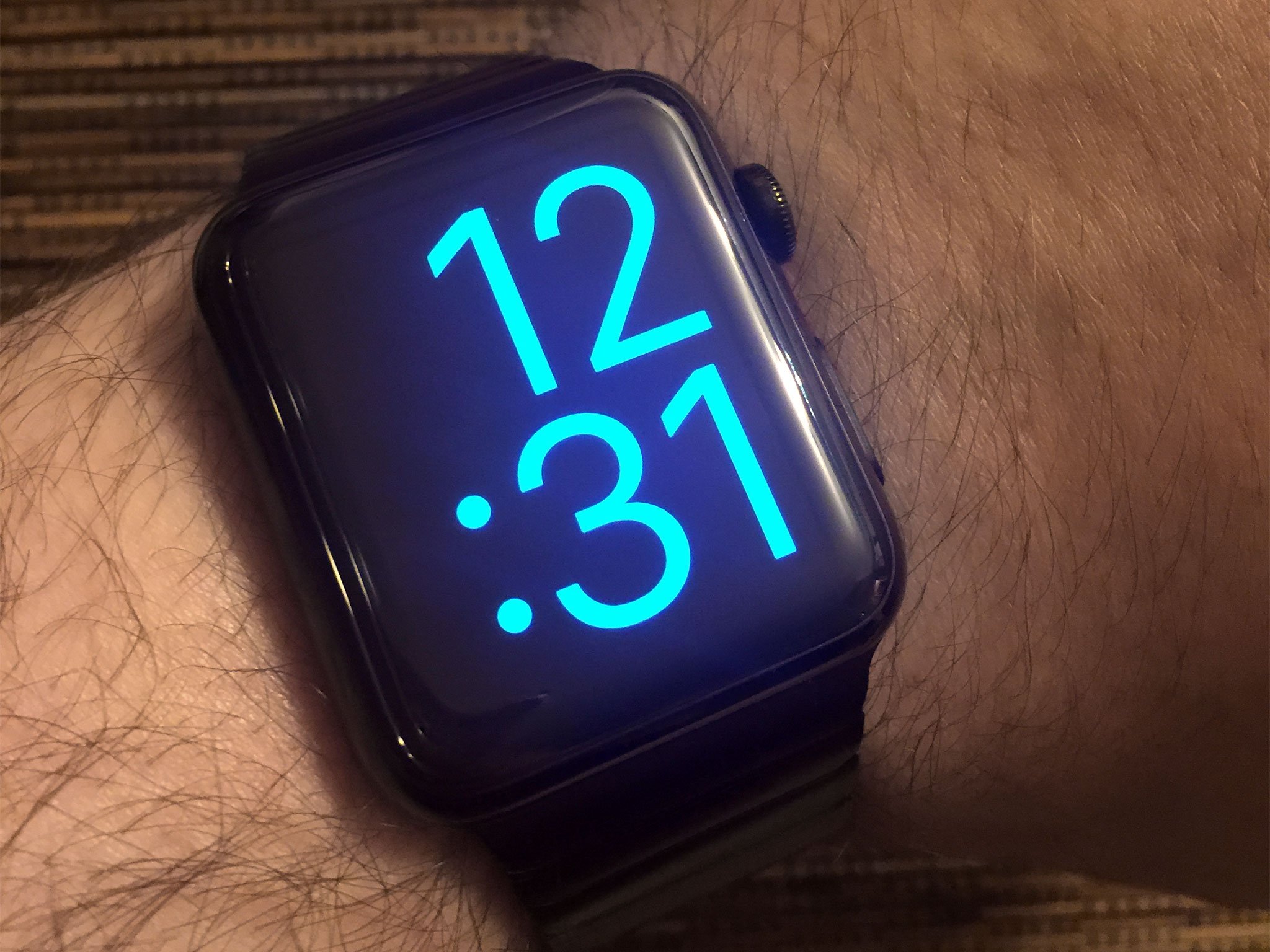
While technically not a discrete Accessibility feature, the Extra Large watch face is, for all intents and purposes, a accessibility feature. I like it for no other reason than the time is shown with ginormous numbers. When I use it, there are no questions about what time it is. It's right there in my favorite color (blue).
The problem, though, with using the Extra Large watch face is the font size is so big that it leaves no room for other information. For wearers who like Complications on their watch face, the Extra Large variety isn't a good choice. All it shows you is the time; no date, no calendar events, nothing. It's as basic as you can get.
That said, if you need the time that big and don't care about knowing when sunset is, then the Extra Large watch face is great.
I should note, too, that the features I list here are valuable to the fully-abled just as aptly. Like I always say, accessibility, conceptually, is not a domain bound strictly to the disabled. These options may be intended for people with disabilities, but there's no reason their utility can't be extended to those without challenges.
Steven is a freelance tech writer who specializes in iOS Accessibility. He also writes at Steven's Blog and co-hosts the @accessibleshow podcast. Lover of sports.

