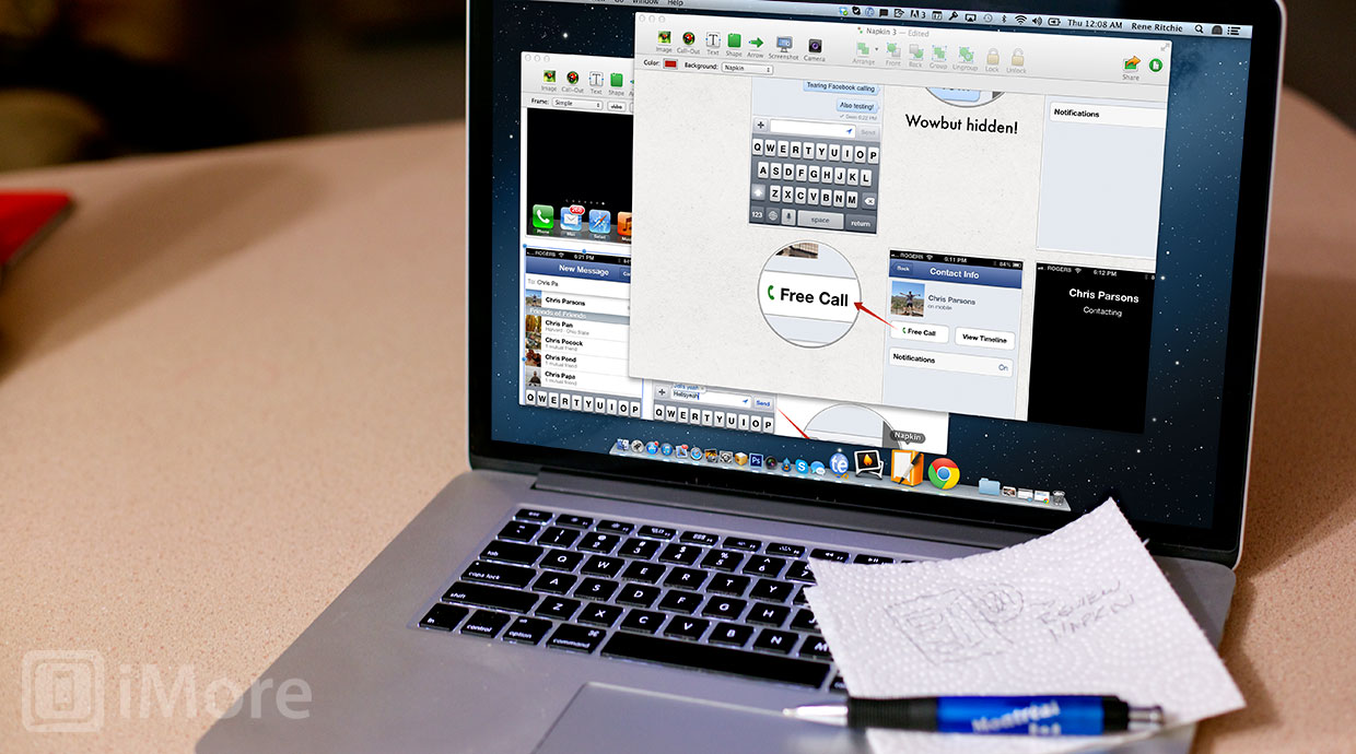
Napkin is a brand new take on image annotation crafted for the Mac by Aged & Distilled. Combining intuitive gestures, fluid shape creation, just-type text entry, and a lot of really disciplined, really smart interface choices, it manages to bring the immediacy of iOS to OS X, producing results that are as fast as they are beautiful.
It began with Guy English -- maybe you've heard of him -- who'd worked in gaming, renowned Mac apps, and one of the most successful franchises in iOS history. That was the industry's Gom Jabbar. This was his -- he was going to make an iPhone app on the Mac. It was before the iPad launched, and the challenge of iOS-style speed with OS X-afforded scope was compelling. So was his desire for an app that would let him easily, elegantly share images, and collaborate with clients and co-workers regardless of the distances involved. It was an idea he wanted to put on screen. It was code he wanted to write.
Chris Parrish had built software for Adobe and won Apple design awards, and he was looking to do something different as well. They created Aged & Distilled -- don't ask them which is which -- and brought in designer Thomas Unterberger to paint it up. Together they re-imagined and re-focused English's original idea, transforming it into something that looks like it could have been part of an iWork suite, and works like it's only one step removed from the iPad. Transforming it into a product. Napkin.
- For more on the creation of Napkin, the challenges they faced and choices they made, check out Iterate 38: Aged & Distilled and Napkin with Guy English, Chris Parish, and Thomas Unterberger.
Napkin doesn't do everything a full on PDF suite does. It takes a deliberately less-is-more approach. It's reductionist by design. The only possible exception is the menu bar. While Apple has increasingly taken color out of their Mac interfaces, Napkin still uses it, and uses it well. It never competes with the content on the canvas, but is always there to better snap the eye to the controls. That was purposeful, according to Unterberger, as was the bright orange, diner-inspired icon. It makes Napkin instantly recognizable on docks increasingly swathed in shades of blue.
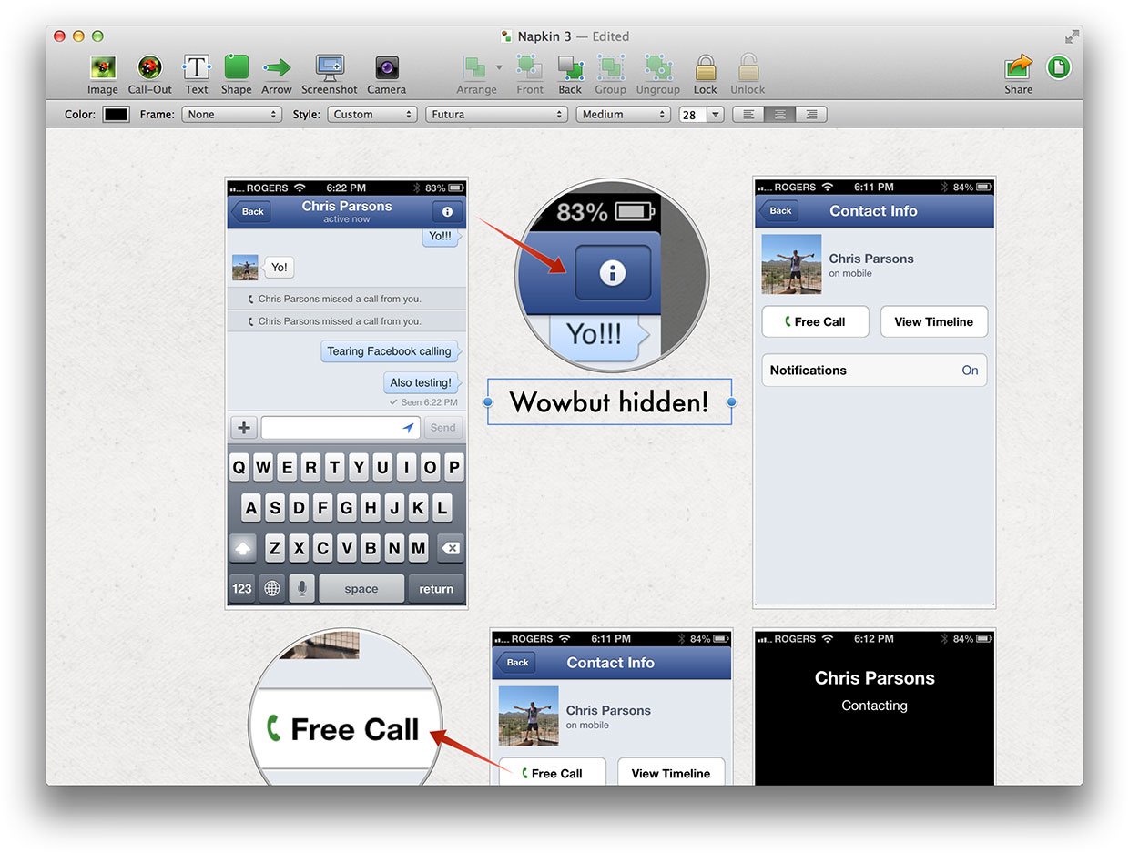
You start off with a clean canvas. It defaults to a subtle napkin texture, but you can also choose white or transparent. To begin working, add or drag in one or more images. To redact an image, double click on it and blackout all your secrets.
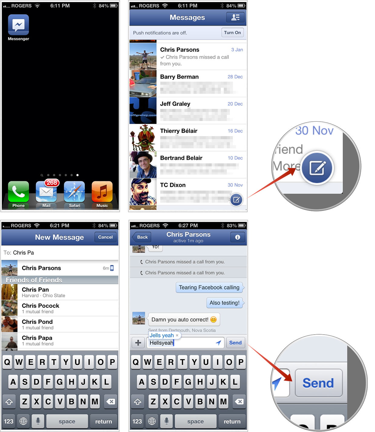
To create a call-out, draw anything even remotely approximating a circle or oval. To pick the focus of the callout, drag the cross-hairs to their intended target on the image. To change the scale, double tap in the center and adjust the slider. Once set, drag the callout anywhere you want, and never worry about it changing until you change it.
To create a shape, hold down command and draw a rectangle/square or oval/circle. If you draw the wrong kind of shape, there's no need to undo, delete, or start over. Just drag the handles and a round becomes a round-rect becomes a rectangle. (Don't ask me how, English said something about them all being the same form in code -- it sounded both truthy and Zen.) The handles even intelligently place themselves along the longest edge, to aid in usability.
iMore offers spot-on advice and guidance from our team of experts, with decades of Apple device experience to lean on. Learn more with iMore!
To create an arrow, draw a line and then adjust the base and point icon to just exactly where you want it. It'll even "lock" on objects it touches and move with them going forward.
To create text, just start typing. Once the text you want is there, put it where you want it and style it just the way you like.
To select items, hold down shift and drag across them.
To "save" a Napkin, just grab the document icon and drag it to the Desktop, to the Finder, or straight into imaging apps like Photoshop if you like.
To share a Napkin, click on the OS X 10.8 share button and chose iCloud, Export, Email, Message, AirDrop, Twitter, Facebook or Flickr. (Through some form of Elektra-level ninjary, Napkin will even suss out the direct iCloud link and provide it to you to share however you like.)

Once you get get used to it -- something helped enormously by an introduction video and initial text tips -- you can mark up everything from interface concepts to internet memes with almost no overhead. Napkin just figures out what you're most likely trying to do and just does it for you, letting you fine tune or change the results afterwards, if you need or want to. It stays entirely out of your way unless or until you decide otherwise. That's what makes Napkin so speed-force fast.
I'd love to see a few more features in the future, but only a carefully selected few. Things that add to the speed and ease of use, but never get in its way. iWork-style object snapping and dynamic alignment guides, for example.
And yeah, it's begging for an iPad version.
For now, though, English, Parrish, and Unterberger are locked on getting 1.0 shipped for the Mac. They're already using it for their own work, both on Napkin and for their contract jobs, so that they can quickly show, rather than laboriously tell, their thoughts, critiques, iterations, and ideas on the products they're making.
I've been using Napkin for a while in a similar fashion, and I've gotten fast enough with it, and impressed enough with its results, that you'll be seeing it on iMore in our help and how-to pieces going forward. I can't give any better recommendation than that.

Napkin lets you direct attention just exactly where you want it, express an opinion quickly and clearly, share it easily, and do it all in style.
Check it out.
- $39.95 - Download now
Note: Guy English is a friend and my co-host on the Debug podcast. For that reason, I was planning to have someone else write this piece. However, the timing on that didn't work out, and it got kicked back to me. To mitigate any conflicts, however, I'll add links below to other reviews, so you can get more opinions and context.

Rene Ritchie is one of the most respected Apple analysts in the business, reaching a combined audience of over 40 million readers a month. His YouTube channel, Vector, has over 90 thousand subscribers and 14 million views and his podcasts, including Debug, have been downloaded over 20 million times. He also regularly co-hosts MacBreak Weekly for the TWiT network and co-hosted CES Live! and Talk Mobile. Based in Montreal, Rene is a former director of product marketing, web developer, and graphic designer. He's authored several books and appeared on numerous television and radio segments to discuss Apple and the technology industry. When not working, he likes to cook, grapple, and spend time with his friends and family.

