How to use negative space to take more powerful photos with your iPhone
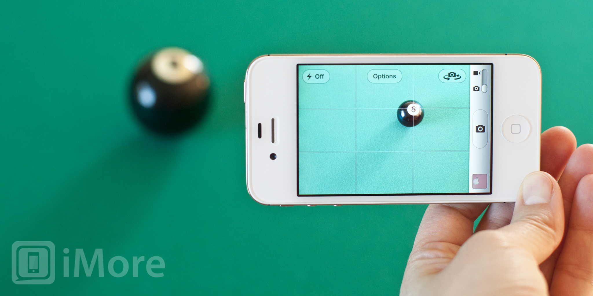
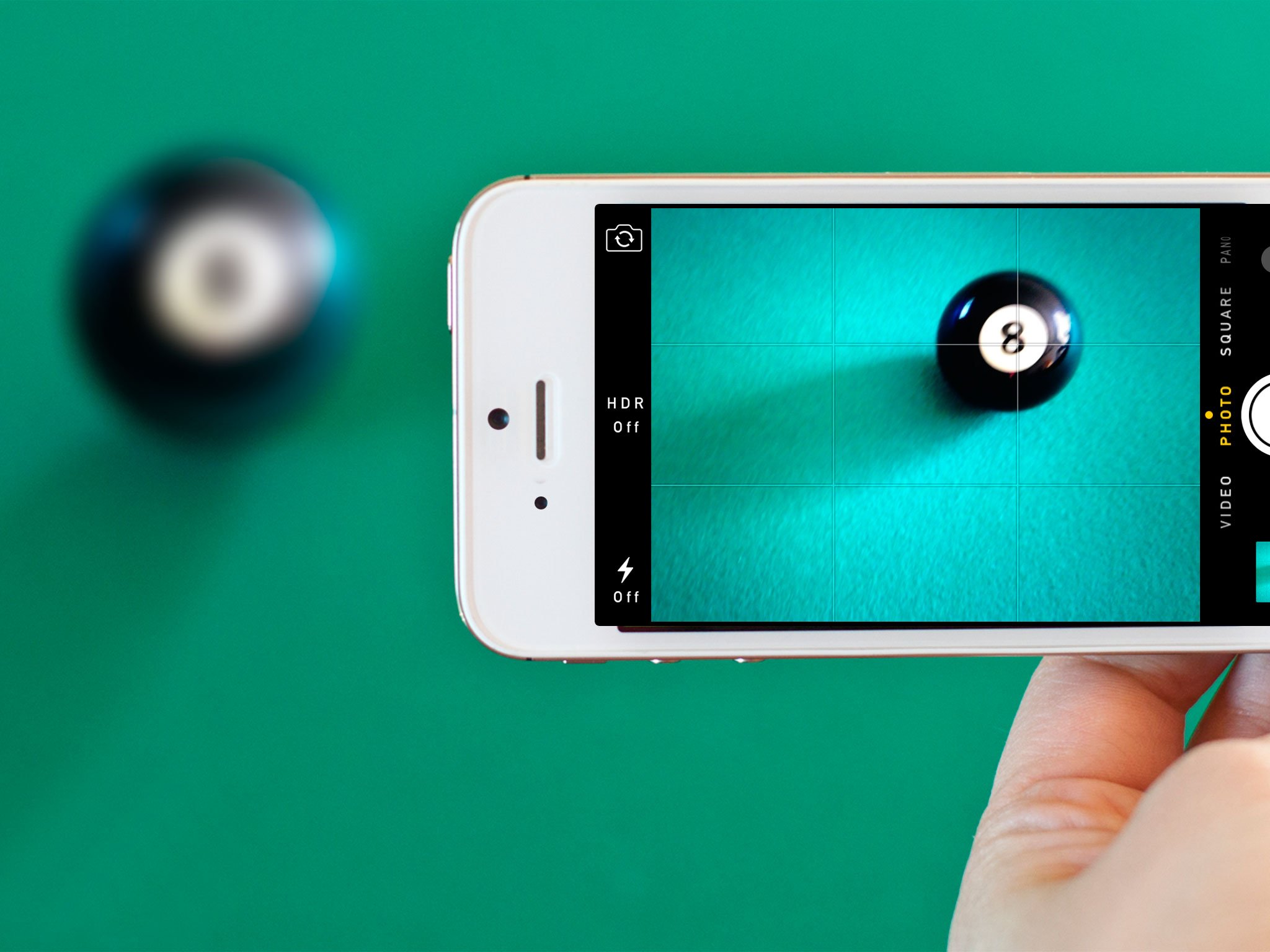
The placement of your subject or subjects is incredibly important when it comes to creating powerful iPhone photo compositions, but just as important is everything around and between them — the negative space. We started out our iPhoneography series by introducing the rule of thirds. Now we're going to explore that other two thirds, how it defines the forms, leads the eye, and helps create more balanced, more visually interesting work.
The positives of negative space
If every pixel in your photograph was filled with important information it would be impossible to know what to focus on. In other words, if everything is special or important, nothing is. Just like the silence in between the notes defines the music, the negative space around the subjects of your photograph defines the composition.
Don't think of negative space as "empty" space, because that's not always the case. Negative space can be filled with clouds or forests, it could be out of focus or in stark contrast, it could be lost in motion or frozen in stillness. Think of negative space as something that balances out your photos, the supporting player that really lets your subjects shine.
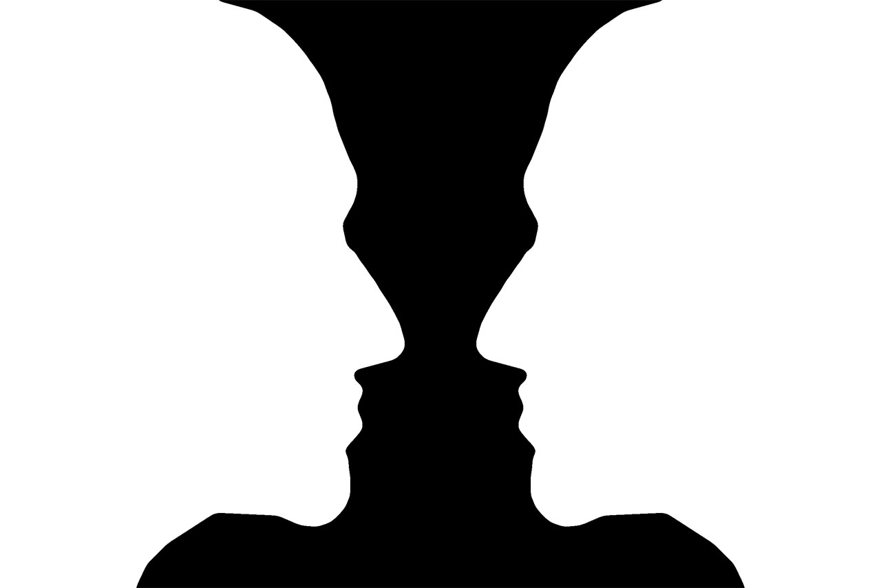
It's a difficult concept to grasp, and sometimes not an obvious one, especially now that we have 8 megapixel, million color cameras on our iPhones. Rubin's Vase (above) is a classic example of the power of negative space, and breaking things down into extremely high contrast (i.e. black and white) can help you get the hang of it.
Lead the eyes into negative space

Until now, many of you probably didn't even think about the negative space and how it can impact your photography. Most people are focused on the subject and ignore everything else when composing their photos. Simply being aware of the negative space will immediately improve your photographs.
The best way to relate your subject and negative space is to compose your shots so that an element of your subject leads your eyes into the negative space. We talked about this briefly with portraits when we mentioned that you want to keep the negative space in front of your subject.
Dramatic lighting with harsh shadows is a prime opportunity for using negative space. Compose your shots so that the shadows are moving into the negative space because your eyes will naturally follow it.
Master your iPhone in minutes
iMore offers spot-on advice and guidance from our team of experts, with decades of Apple device experience to lean on. Learn more with iMore!
This next photo is another great example and I want to walk you through my thought process with producing the final image.
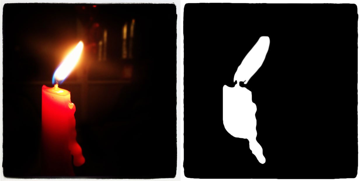
I took about 5 shots of this photo because of the moving flame. I settled on the above photo because the flame leads your eyes into the negative space. If the flame was pointing toward the left, it would still be a nice picture, but not have the same impact as this one.
Now, this candle was actually sitting on a table that had a lot of people sitting around it. I positioned myself so that no one was behind it, shot in portrait mode, and used the rule of thirds with the candle to the left. I used portrait orientation because I wanted to keep the people out of the shot, but in the end, the composition wasn't working for me --it should've been taken in landscape. That's why I decided to use Instagram to crop the photo to a square and applied a filter that darkened my background and eliminated the distractions. The square crop dramatized the negative space and brought the focus on the flame.

This photo is a great example of using a uniform color for your negative space and how it can positively impact your photo. I considered tilting the lens so that the leaf of the Apple symbol would lead the eyes into the negative space, but in the end I decided to leave it straight because the bite out of the Apple plays that role nicely. I also cropped it to a 16:9 ratio to dramatize the negative space by making it appear longer.
I've also seen uniform negative space done nicely with the sky as the background, by looking up at a tree or flower, and on portraits with a solid colored wall or backdrop behind the subject.
Examples
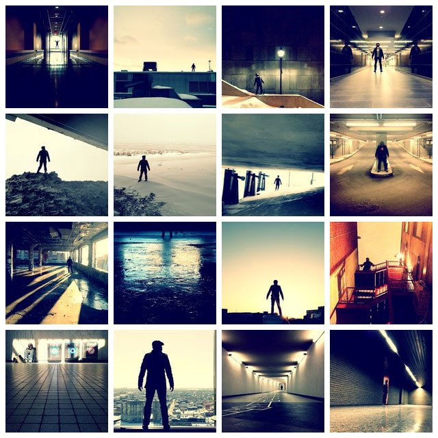
One of iMore's friends specializes in the use of negative space in his photography and iPhoneography. Check out some of Martin Reisch's (aka *safe solvent™) work on Instagram or on his website http://www.safesolvent.com/
Critique yourself
Composition is hard to master and is a skill that takes a lot of practice and patience to develop. In addition to the assignment this week, I challenge you to seriously critique every image you take that you're proud of. There are many elements to a photo that need to be critiqued, but for this week, pay special attention to that negative space and ask yourself how you could have made better use of it.
For example, take a look at this version of the 8-ball photo:
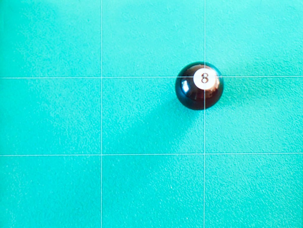
There are two different light sources hitting the 8-ball, casting two different shadows. The choice of negative space is good -- the 8-ball is in its element on the pool felt. However, even though I have the longer shadow leading the eyes into the negative space, The composition could still use a little tweeking. What make this image a little different is that there are two shadows, and together, they lead your eyes in a different direction than if the long shadow was by itself. When I look at that photo, my eyes keep falling into the bottom right corner, which then I fight back by jumping up and looking at the bigger space in opposite corner. This is bad.
How should I fix it? My first thought was to position the iPhone so that the shadows work together to lead my eyes into the bottom left or bottom right corner. But when I actually attempted it, the angle of the shadows wasn't really working. So I decided the move the 8-ball entirely, so that only one light source was casting a shadow on it. Then I cropped to 16:9 ratio to make the shadow seem longer. Here's the result.
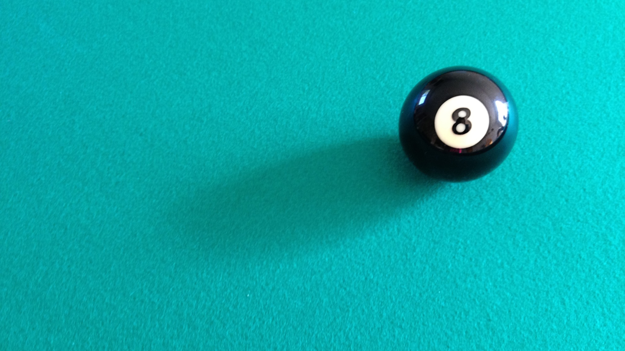
Much better!
Now go out and shoot! And critique!
So your assignment this week is to not only make good use of negative space, but to give your photos a good honest critique. Then head to the iMore Photography Forum and share both your photos and a critique of each photo you share. Then ask your fellow iMore iPhoneographers for their critique and offer up your own constructive criticism to their photos as well. Let's grow as iPhoneographers, together!
How to get more help with iPhone photography
Former app and photography editor at iMore, Leanna has since moved on to other endeavors. Mother, wife, mathamagician, even though she no longer writes for iMore you can still follow her on Twitter @llofte.
