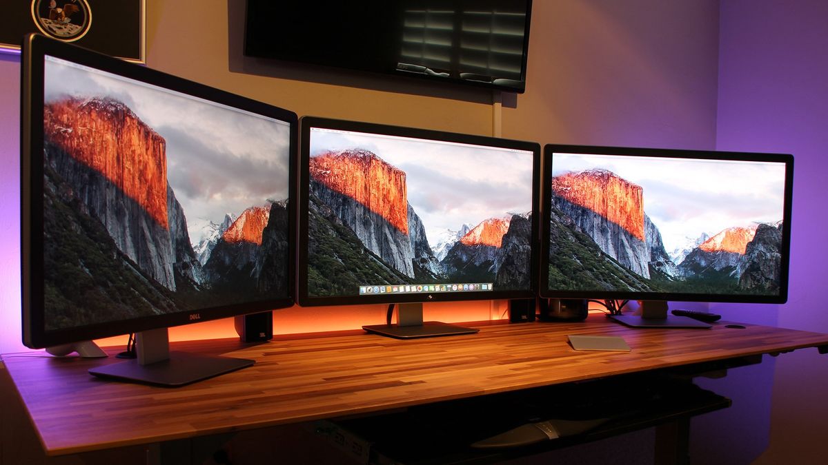
OS X Leopard begat OS X Snow Leopard. OS X Lion begat OS X Mountain Lion. And now OS X Yosemite has begotten OS X El Capitan. Just as the granite monolith is part of the national park yet every bit a landmark in its own right, so is Apple's latest operating system for the Mac. It has the same general design and architecture as what came before, but brings an entirely new level of intelligence, convenience, and polish.
That includes an improved Mission Control and new Split View; a smarter Spotlight and improved apps like Notes, Safari, Mail, Maps, and Photos; enhanced security and performance, including bringing the Metal graphics framework to the Mac; and new system fonts like San Francisco for alphabetic languages and Ping Fang for Chinese. There's also content blocking extensions, audio unit extensions, and much more going on under the hood as well.
Apple's climbing El Capitan, they say, to refine the OS X experience and improve the performance. So, did they make it to the top?
- Free - Download now
OS X El Capitan Table of Contents
- Window Management
- Spotlight
- Notes
- Safari
- Maps
- Photos
- Performance
- Security
- Typography
- Trackpad
- Miscellaneous
- Bottom line
OS X El Capitan Evolution
| Header Cell - Column 0 | Header Cell - Column 1 | Header Cell - Column 2 | Header Cell - Column 3 | Header Cell - Column 4 | Header Cell - Column 5 | Header Cell - Column 6 | Header Cell - Column 7 | Header Cell - Column 8 | Header Cell - Column 9 | Header Cell - Column 10 | Header Cell - Column 11 | Header Cell - Column 12 |
|---|---|---|---|---|---|---|---|---|---|---|---|---|
| Version | OS X 10.0 | OS X 10.1 | OS X 10.2 | OS X 10.3 | OS X 10.4 | OS X 10.5 | OS X 10.6 | OS X 10.7 | OS X 10.8 | OS X 10.9 | OS X 10.10 | OS X 10.11 |
| Release name | Cheetah | Puma | Jaguar | Panther | Tiger | Leopard | Snow Leopard | Lion | Mountain Lion | Mavericks | Yosemite | El Capitan |
| Code name | Cheetah | Puma | Jaguar | Pinot | Merlot (PPC)Chardonnay (Intel) | Chablis | Snow Leopard | Barolo | Zinfandel | Cabernet | Syrah | Gala |
| Architecture | PowerPC | PowerPC | PowerPC | PowerPC | PowerPC/Intel | PowerPC/Intel | Intel | Intel | Intel | Intel | Intel | Intel |
| Features | Pre-emptive multitaskingMemory protectionAqua interface | PerformanceEnhanced CD/DVD supportEnhanced 3DImproved AppleScriptColorSync 4.0Image Capture | Address BookRendezvous/BonjourCUPS printingRevamped FinderSpam filteringWindows networkingQuartz ExtremeSherlock 3Universal AccessQuickTime 6PerformanceJournaling | Fast user switchingExposéFileVaultiChat AVX11 | SpotlightSafari RSSMail 2DashboardAutomatorVoiceOverQuickTime 7DashboardQuartz ComposerRosettaCore ImageCore DataCore Video | Back to My MacBoot CampStacks in DockCover Flow in FinderiCalSafari 3SpacesTime MachineCore AnimationRuby on Rails | QuickTime XSafari 4Cocoaized FinderImproved performanceExchange ActiveSyncGrand Central DispatchOpenCLBetter power management | AirDropPush NotificationAuto SaveAuto CorrectionFaceTimeLaunchpadMac App StoreMultitouch gesturesResume mode64-bit exclusive | NotesMessagesGame CenterAirPlay Mirroring | Multiple display supportTabbed FinderiBooksMapsiCloud KeychainTimer coalescingApp NapCompressed MemoryLinkedIn supportOpenGL 4.1OpenCL 1.2 | ContinuityExtensibilityPhotosiCloud DriveMail DropFamily Sharing | Split ViewEnhanced Mission ControlSpotlight intelligenceNotesTransitEnhanced MailEnhanced PhotosEnhanced SafariNew typographyMetal |
| Release date | 3/24/2001 | 9/25/2001 | 8/23/2002 | 10/24/2003 | 4/29/2005 | 10/26/2007 | 8/28/2009 | 7/20/2011 | 7/25/2012 | 10/22/2013 | 10/16/2014 | 9/30/2015 |
| Price | $129.00 | $0.00 | $129.00 | $129.00 | $129.00 | $129.00 | $29.00 | $29.00 | $19.00 | $0.00 | $0.00 | $0.00 |
Previously...
Compatibility and updating
You can download and install OS X El Capitan, for free, on any device capable of running OS X Yosemite.
- MacBook (Late 2008 Aluminum, or Early 2009 or newer)
- MacBook (Early 2015 or newer)
- MacBook Air (Late 2008 or newer)
- MacBook Pro (Mid/Late 2007 or newer)
- Mac mini (Early 2009 or newer)
- iMac (Mid 2007 or newer)
- Mac Pro (Early 2008 or newer)
- Xserve (Early 2009)
OS X El Capitan Window Management
The primary way apps manifest themselves on a graphical user interface is through windows. Windows hold the content and the controls. They can vary in size and position and often there can be multiple tabs per window, multiple windows per app, and multiple apps per workspace. That can make finding the window you need amid all those layers and layouts a challenge. And it's one Apple's been trying to solve on OS X for years.
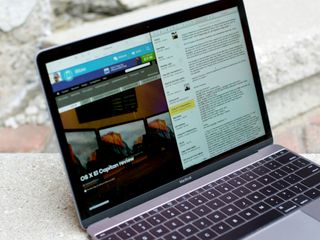
Exposé, Apple's first attempt to make our windows more manageable, has long since been subsumed by the better organized Mission Control. Dashboard, which provided a separate space for widgets, is all but deprecated now that Notification Center has widgets of its own. Spaces, which provided for multiple desktops, also enabled full-screen apps. Hot corners, which can trigger actions based on mouse movement, have been augmented by multitouch gestures. All of them have their purpose, but not all of them always contributed towards a single, coherent purpose. El Cap hopes to change that.
Find my Cursor

Find my Cursor isn't strictly windows management but it is new to OS X El Capitan and is something you'll encounter immediately when trying to manage your windows. It's also every bit as strange and genius as it sounds.
We've all stared at our screens at one time or another and rapidly shaken our mouse or swiped across our trackpads in hopes the movement would draw our eyes to the cursor. El Cap makes sure you won't miss it by just as rapidly enlarging the cursor until it's impossible to miss.
Like all great interactive flourishes, it's a natural extension of instinctive behavior, and that's why it works so wonderfully well. Even when you're thinking and fiddling and doing it just for fun.
Split View apps
Full-screen apps came with OS X Lion. It was part of the movement to bring the iOS and iPad experience to back to the Mac—to make things more familiar but to also more focused. It worked for some apps, especially photo and video editors where the content really needs as much space as possible, or text editors where distraction needs to be avoided. It removed the traditional power of the multi-window operating system. It traded one type of productivity for another.

Split View attempts to create a balance. It fills the screen, but with two apps instead of one. In so doing it hopes to retain both focus and flexibility. And not coincidentally, the iPad is doing the same thing in iOS 9.
That Split View, like full screen, is handled at the system level means that it works in a consistent way and consistency, as I'm endlessly fond of repeating, is a customer-facing feature.
You enter the Split View from regular window mode by clicking and holding down on the green button in an app's toolbar. The app then docks to the left or right side of the display. You can choose which one by dragging the pointer to whichever side you please.
Once docked the other half of the screen shows you thumbnails of the other available apps. Click on one and it'll dock on that side. Split View engaged. Don't click on one, and you go full screen.
It would be convenient, and save a lot of back-and-forths, if you could also click and hold on the green button from full screen to go to Split View, but that hasn't been enabled (at least not yet).
By default, Split View takes half the width of the screen but you can drag the border to make it wider or narrower. An app can't be narrower than it's pre-set minimum width nor wider than the minimum width of the app tiled beside it will allow.
You can also easily switch sides by dragging an app's toolbar from left to right or vice versa. You can exit it by hitting the green button again or escape on the keyboard. That makes the app you escaped return to normal window mode, but the other app go full screen. (That's counter-intuitive to me; I'd expect them both to return to normal window mode.)
If you try to put two apps in Split View, and the total of their minimum widths would be greater than the width of the screen, OS X will decline to tile the second app. That shouldn't happen too often, though.
Any standard window that can be resized can be put into Split View. Developers can explicitly make apps available for tiling even if they're not otherwise resizable, or can opt-out of entirely if they don't ever want their app to run that way. So, for example, a calculator can temporarily add extra vertical padding so it can fit in Split View next to another app, or a video editing app can pop up a message saying "not available for split screen" if it can't work that way.
The implementation is thoughtful, bit there are still a lot of rough edges. For example, I can't figure out how to hide the Notes list and just focus on one note, and I can't figure out how to show the Messages list and not be trapped in one conversation. You can sometimes drag to expand and collapse views, but not always, and when in Split View with a wide app you have very little leeway.
There's also no way to quickly change the apps contained in an existing Split View on OS X like there is on iOS. That means you can't just live in it. For example, taking notes persistently on one side while you switch between Safari, Maps, Photos, and more on the other, dragging in everything you want for your vacation planning.
Unless I'm missing something obvious, a standard way to show/hide the list views and switch tasks, would go a long way towards making apps more useful in Split View.

On the iPad Split View doubles your productive potential. On the Mac, it's much more of a middle ground. For those who love the full screen, it's twice the screen to love. For those for whom multi-window drag-and-drop is muscle memory, even twice still isn't enough.
But that's what makes the Mac the Mac. You can have it all and easily switch between full screen, Split View, and good old-fashioned multi-window desktops with ease. Or not, if you prefer only working in one mode. Split View is additive. It's there if you ever want or need it but stays completely out of your way if you don't.
I've been making a point to use Split View for the last four months, especially for this review. I've got Notes on one side and, typically, Safari on the other. I'm not sure how much I'll stick with it. I just love multi-window so much. But as Apple continues to iterate on it, I think a lot of people, especially those who get lost in layers, will come to appreciate it. Split View really does manage to balance more and less, and full screen with fuller productivity.
Mission Control
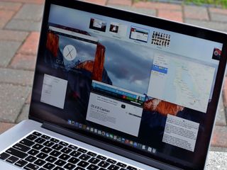
Mission Control in OS X El Capitan takes everything that's come before, from Exposé to Spaces, and makes it all clearer and easier to both see and understand. It furthers Yosemite's design principles with a flatter look but also creates a flatter experience. Windows appear in a single, quickly scannable layer that respects the position of the workspaces. Apps on the left are on the left, right on the right. That helps keep everything oriented as well as accessible.

A three finger swipe upwards on your trackpad, a tap of the Mission Control key (F3) from your keyboard, or a click of the Mission Control icon with your mouse will still take you right to the main view, just as before. But once you're in Mission Control, you have a new way of interacting with your windows.
The new Spaces Bar labels your current desktops alongside any full screen and Split View apps you may have running. Mouse over the bar, and it expands to thumbnails so you can immediately, visually identify your workspaces, switch between them, and even rearrange and remove them.
There's also a new draggable Mission Control shortcut in El Cap: Just pull any window to the top of the screen, then drag a little more to reveal the Spaces Bar. From there, you can drop the window where you want it, either full screen, onto an existing full-screen app to create a Split View, or onto a new or existing desktop Space. Alas, you can't drop an app onto an existing Split View to replace one of the apps in that Split View, at least not yet.
Dragging straight into Mission Control can be tricky to nail at first. You really need to grab the window, push up on the mouse or trackpad until it hits the menu bar and stops, and then push up again. Once you get it, though, you get it.
It's an incredibly fluid experience, and the new Mission Control succeeds in making the sometimes mixed workspace metaphors—which were already improved in Yosemite—more usable, more coherent system.
OS X El Capitan Spotlight
OS X Yosemite saw an all-new Spotlight design that put Apple's universal search and action bar front-and-center on the Mac. Now, El Cap strives to put it front-and-center in our workflows as well.
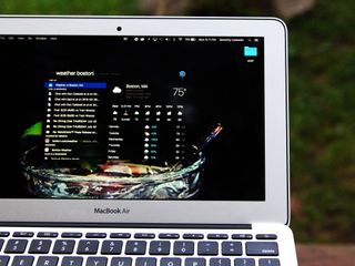
As part of that, you can move and resize the Spotlight window now. So if you want to check it while you work, you don't have to worry about it overlaying what you're trying to refer from. It's always exactly where you want it. And it's got more there than ever before.
New sources
The suggested results engine, which debuted last year, has been enhanced with several new data sources, including weather, stocks, web video, and sports across MLB, NHL, NFL, NBA, WNBA, college football, college basketball, and many European soccer leagues.
It's much closer to what iOS is offering now as well, which creates a better and more consistent experience for those who use both Apple's desktop and mobile platforms. It also works well, and better than I expected given the potential for collision—similar words used in different ways—on a system as complex as OS X.
Pretty much any time I type, as long as I keep typing enough, I find what I'm looking for.
Natural language
Critically, you can now access Spotlight using natural language.

That's the same type of interface Siri has been using for years on iOS and it's a far more human way of interacting. Instead of writing SQL or boolean or even type: date: contains: you just type the way you talk. For example: "Documents I worked on this week containing El Cap" tells Spotlight I'm only looking for documents, so don't show me mail or web hits or anything else. "This week" constrains the time period, so I don't see anything older than the last few days, and "El Cap" means I want something with those words in it.
It's the way Siri has always worked for voice input, and I've longed for it to work in text for years. I'd still love Apple's personal assistant to come fully to the Mac—as would accessibility advocates everywhere—but this is a tremendous start.
In-app search
Thanks to a new CoreSpotlight API, developers can make the content in their apps, including documents, messages, and more, available to Spotlight as well. That means it'll be even easier to find what we're looking for, no matter where it's located. No more opening an app, looking, closing, opening, looking, closing, or hoping to scrap whatever plain text may exist in the file format. Just type and it will appear. At least once developers update to support it.
I've tried LaunchBar, Alfred, and Quicksilver, but none of them ever stuck: Spotlight has always been my go-to. Yosemite made it significantly more functional, but natural language and the new results engine make Spotlight more integral.
OS X El Capitan Notes
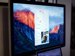
Notes has been completely rebuilt for both OS X El Capitan and iOS 9. That means it's no longer the simple, plain Marker Felt text app it was in OS X Lion, but a far more robust, far more capable note-taking system.
Formatting
As you start typing, your first line can automatically be formatted as a title—if appropriate—and the rest, as the body. (You can tweak this behavior in the preferences pane.) There are other formatting options as well: heading, checklist, bulleted list, dashed list, and numbered list.
Choose a checklist, and you can make and track to-dos right from Notes. It's different than Reminders, which are meant to alert you about activities at specific times or places. These are meant for shopping, packing, or other lists that don't need alerts but do benefit from being grouped together in the context of a note.
Collecting
You can also quickly bring together important bits of information in Notes, including photos, videos, PDF documents, web sites, audio clips, map locations, Pages documents, Numbers spreadsheets, and Keynote presentations, and more.

Because OS X is a full-on multi-windowing environment, you can drag any support data from any supported app and just droop it right into the note. You can also share them from Safari, Maps, Photos, Pages, Numbers, Keynote, and other apps using the standard Share Sheet, when and if that's more convenient.
The ability to do both makes Notes for OS X powerful—you never have to stop what you're doing, find Notes, and add something. You can work from wherever you are.
You can't do sketches directly on the Mac like you can on iPhone or iPad, however. It's a pity, especially with the potential of the Force Touch trackpad's pressure sensitive drawing. Hopefully, that'll come in an update. You can, for now, add sketches from iOS and they'll sync across to OS X.
Finding
To keep track of everything, Notes includes an attachment browser. So, if you remember adding something, but not where you added it, you still have a good shot at finding it easily and visually based on photos and video, sketches, websites, audio, and documents.
El Cap's new Notes isn't Evernote or Yojimbo, nor is it meant to be. It's just what the name implies—an efficient way to collect, keep, and find the information that matters to you.
Like I said in the iOS 9 review, I typically use Notes as a live, iCloud-synced clipboard to move text-based content between my Mac, iPhone, and iPad. Now I can keep doing just that but with even more and multiple content types. It's simple, but it's glorious.
OS X El Capitan Safari
Safari began as Konqueror, WebKit as KHTML and, from its roots as the Alexander project, it's become an enormously popular and influential browser even though it's only available on Apple's platforms. Part of that is due to mobile, where other browsers have adopted and even forked Safari's engine. But the rest is due to its focus. Apple has a native platform, so it's not obsessed with cramming native-like functionality into the browser. Instead, it's obsessed with making the browsing experience more private, more secure, and much, much faster.

Pinned tabs
Anyone who has to open the same handful of websites day in, day out, relishes the idea of keeping those sites easily and always available. And that's just what Safari in El Cap does with tab pinning.

Pin a web page either by grabbing its tab and dragging left until it gets compacted down or by right-clicking and choosing the option. The page gets its own, small, icon-identifiable, re-arrangeable tab on the left. Then it stays there, launch after launch, restart after restart, ready any time you need it or until you decide to remove it.
The pinned site will also always display the exact page you pinned. If you click on a link, that link will open in a new, regular tab. It's a great way to explore without losing your starting point.
I have iMore open all the time, obviously, but I also have several other sites I go to near-constantly—like Apple's developer pages right now. Not having to open new tabs and open those bookmarks every time I re-open Safari might sound like a small thing, but it's a huge time and effort saver.
Mute
Mute tabs, on the other hand, is a huge annoyance-saver.
If you've ever been blasted by audio coming out of one of a dozen or more tabs across just as many windows, with no indication which tab it is, you'll love this. Click the audio icon on the right end of the Smart Search field and you can mute whatever single tab is actively playing audio or, if multiple apps are playing, you can mute the current one. Option-click and you can mute all other tabs. Click and hold and you can do both those things as well as get a list of, and selectively choose to mute, any and all tabs playing audio. It's bliss.

Apple originally demonstrated a click-and-hold option to mute all audio. I thought I'd prefer that to the current and other options that ended up shipping. But I don't. Sometimes I do want to mute all audio, and now that does take two clicks instead of one. More often I want to mute all other audio, and not that takes one click instead of two. Having both options might be nice for when I really do want to drop an EMP on all sound but as-is the new functionality is a huge win.
Search, Shared Links extensions, and Safari Reader
A lot of the same new intelligence that powers Spotlight can now be found in Safari's new Smart Search Bar, including weather, stocks, and sports.
Safari Reader gets a selection of fonts, including Athelas, Charter, Georgia, Iowan, Palatino, San Francisco (more on that later), Seravek, and Times New Roman, and themes in white, sepia, gray, or black. It's great for both accessibility and nighttime reading.

Shared Links now get an extension that mean they no longer simply surface content that appears in your Twitter, LinkedIn, and Weibo timelines. Now developers can push stuff in as well.
Shared Links app extensions work on both OS X and iOS. When the extension is called, the app returns a list of items, including a unique identifier (so items don't get repeated or mixed up), the URL, the publication date (for reverse-chronological sequencing), an optional display name, the title, and the body.
The app's icon gets displayed on the right, and an optional custom graphic can also be specified for the item itself. That way, it's both easy to identify where the link came from and visually differentiate it from other items from the same source.
That's what makes Shared Links app extensions different from something like Reading Lists. It isn't a passive, generalized service that lets you arbitrarily save cleaned up content to read later. It's a proactive service that lets apps suggest specific links to add to your feed in their original form.
Like I said in the iOS 9 review, though, I'm not sure if we really need pushed Shared Links in addition to Reading List and in addition to bookmarks. It feels like something simpler and more unified could take their place. Dynamic bookmarks, perhaps?
Content blocking extensions
Just like iOS 9, OS X El Capitan is getting content blocking extensions as well. I've written a ton about them already, but this bears repeating: content blockers aren't ad blockers. They're designed to block any CSS container or JavaScript code to prevent content from being seen or resources from being loaded. Ads are absolutely the most common and popular type of content that'll be blocked, but the goal here is principally privacy and performance.
Blocking content, especially ads, has been possible on desktop browsers for a while, including OS X and Safari. Traditional blockers, however, were services that the browser consulted at load time. That meant the act of blocking content itself could reduce performance, and information about the page being visited could be collected by the service doing the blocking. In some cases, the blockers themselves could theoretically be worse than the content. Even malicious.
Apple doesn't want that. They don't want to replace heavy CSS and JavaScript with just-as-heavy plug-ins, even on systems where power is plentiful like laptops and the desktops. They simply don't want to replace ad trackers with blockers that track.
Just like on iOS, where content blocking extensions have been getting a ton of attention, they work through a set of rules defined in a JSON file. The rules contain triggers and actions. Triggers determine when the rules get to run and actions determine what happens when they run. For page elements like divisions (div), the trigger can be as simple as encountering CSS class. The action, setting its display property to "none". For scripts, it can be as simple as blocking them from loading. Filtering is handled by regular expression (regex). Rules can even be created that, if the proper conditions are met, negate other rules.
Once the content blocking extension is downloaded and enabled, Safari or compiles the extension's rules into bytecode and applies them whenever it loads a web page. Since developers can provide ways to change rules in the app that contains the extension, in action extensions, and in Settings, developers can notify Safari about updates and have the rules recompiled.
Desktops are so powerful that content blocking on OS X is less about raw performance than it is privacy and taking back control of the browser experience. How it all shakes out, we'll have to wait and see. On a platform that already had content blockers, however, OS X El Capitan's version is better and more secure.
AirPlay, PiP, Inspector, and more
Previously you could AirPlay your entire screen from OS X to AirpLay. Now you can Airplay a single YouTube or other HTML5 video. It's fantastic because you're no longer trapped on the screen you want to watch Just like iOS has done for years, you can now watch one thing while doing something else. Same goes for the new picture-in-picture (PiP) mode as well.
Safari can even stream "premium" content wrapped in FairPlay DRM now. How and where that'll be used will be interesting to see.

Web Inspector has also been given a responsive redesign, with a tab-based interface, type profiler, code coverage mode, paint indicator, and frame rendering track.
There's CSS scroll snapping to keep in-focus content in view during and following scrolling, and there are backdrop filers to get that OS X blur effect on web pages.
I vastly prefer Safari to Chrome. The interface is lighter and cleaner, the power efficiency is far greater, and the experience is simply better for me. I still keep Chrome around as a jail for Flash and Google Docs but for everything else I use and enjoy Safari, and these additions just make it better.
Let Google and Firefox and Opera worry about making the web more native for now. I'm delighted the Safari and WebKit teams and putting just as much energy into making it infinitely more usable on my Mac.
OS X El Capitan Mail
Mail is one of those OS X apps you don't appreciate until you have a bunch of email accounts from different services, and you want to not only see them all in a unified place, but work on them all in a consistent, coherent way. Not in a new-fangled getting-things-done metaphor either, but in a traditional email way, just with all the modern conveniences.
Gesture shortcuts
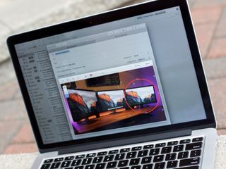
Mail gets the same gestures on the Mac that the app has enjoyed on the iPhone and iPad for a while now: swipe right to mark as read, swipe left to delete.
That same delete behavior is also now available in Messages, Notes, Reading List, and Reminders.
Full screen, multi-draft
Full screen Mail also draws inspiration from iOS with a multitasking drafts mode that lets you start composing, then tuck the message away, go check, reference, or copy something from another email, drag in photos, documents, and other content, and then keep on going with the message.

It also has a tabbed interface, so you can work on multiple drafts at once without having to Command-~ Rolodex through them.
Detect and search
Data detectors, which have always been powerful, are now even more discoverable—and that includes the new flight information detectors. Instead of hiding inline, waiting for you to mouse over them, they suggest themselves right below the address field—like iOS—and are immediately recognizable and actionable. It's really useful for contacts and events.

Search has also been improved, adding the natural language engine from Spotlight. So, for example, you can enter "this week from Serenity" or "sent to Kevin" and don't have to worry about assembling from:/to: or data ranges.
IMAP and more
The IMAP engine now intelligently downloads the most important messages first. Apple claims the engine is up to 2x faster on account setup, allowing you to start reading before the entire message stack gets pulled down.
Setting up a machine as new, I did notice email came down quickly, but I don't keep enough mail unarchived or undeleted for it to make a real difference for me.
I've always been a Mail.app user; having all my mail, all in one place, with a unified inbox is just too compelling to move away from. I have to use Gmail for work, however, and Google has always had an… eccentric IMAP implementation. Mavericks was rough at times; Yosemite pretty good. El Cap is shaping up very, very well.
OS X El Capitan Maps
Apple started doing its own maps in iOS 6 and brought them to the Mac in OS X Mavericks. The company has built on them steadily ever since, and in OS X El Capitan they're adding Transit directions. That means, in addition to walking and driving, you can get step-by-step navigation for buses, trains, and subways/metros.

Transit gets its own, optimized Maps view, which shows the stations and routes you'll need to get where you're going. The app also mixes in walking directions so that you can seamlessly get from one station or stop to another.
Schedules are also fully supported, so you can plan activities not only at both ends but along the way. There are even place cards for stations that show not only schedules, but any known issues with the routes.

Of course, since it's not practical to do step-by-step navigation with a Mac, once you plan your route you can easily send the directions to your iPhone, which also makes them available on your Apple Watch, if you have one.
Because transit is a nightmare of petty municipal fiefdoms that are sometimes reluctant to share what they believe is their proprietary data, coverage right now is limited to a handful of cities. That is, outside China where everything is centralized and unified.)
- Baltimore
- Chicago
- New York
- Philadelphia
- San Francisco Bay Area
- Washington, DC
- Toronto
- Mexico City
- London
- Berlin
- Beijing
- Shanghai
- Guangzhou
- Shenzen
- Around 300 additional Chinese cities
Apple's competitors started earlier and are much further ahead. That means Apple will need to work hard—and smart—to catch up.
My city, Montreal, didn't make the shortlist, but I like I said in my iOS 9 review, I tried out transit in San Francisco while I was there. Maps for OS X did a fine job finding routes and sending them to my iPhone and Apple Watch for navigation on the go.
OS X El Capitan Photos
Photos for OS X was quickly previewed during WWDC 2014, shown off again alongside the iMac with Retina 5K display last October, and launched back in March of this year. That should give a good indication of just how big an undertaking it was. Tied into iCloud Photo Library, it offers ubiquitous access to all your pictures and videos, on all your Apple devices, and through iCloud.com.
The Photos for Mac app itself, while closer to being feature-complete than most of Apple's previous reboots, was still missing a few key features. The OS X El Capitan version aims to fix at least some of that.
Editing extensions
There will be editing extensions now—akin to the photo extensions that launched with iOS 8 last year—that let developers add their own filters and editing tools right into Apple's app. They'll be available via the Mac App Store starting this week.
Like on the iPhone and iPad, Apple's PhotoKit frameworks allow the editing extensions to be non-destructive. That means you can use as many as you want, and go back and tweak or remove them at any time.
Because the Mac is the Mac, extensions can be bundled into existing apps or shipped on their own, and they'll be easy to enable and customize in System Preferences.
Editing... extended
There's still no "Open in external editor…" for quickly round-tripping to Photoshop or other pixel polishers, at least not that I could find, but there will be the ability to add and edit location information. You can do it for a single photo, a selection of photos, or an entire Moment. Just open the info panel and "Add a Location". Bliss.

It's not just location data that you can batch change either. Titles, dates, times, and Faces are all editable as well. For the latter, just select the photos and drag them into a name in your library. Photos and albums can now be sorted by date and title as well.
While I moved my main iPhoto library over to Photos for OS X back when it went into beta, I kept using Aperture on occasion as well. Though there are still features I'd like to see come to Photos, these updates go a long way to relieving my lingering Aperture needs. There are still holes, still quirks, and still some rough edges, but Photos is getting there.
I don't know if I can give up Photoshop just yet—I've been using it for decades, and it's muscle memory now—but I'm eager to see how close Photos can come to removing everything but pixel editing from that needs list.
OS X El Capitan Performance
Apple has worked to make OS X El Capitan even faster and better-performing. The company claims it launches apps up to 40 percent faster, switches between apps up to 2x as fast, and does things like opening PDF files up to 4x faster. It's tough to test claims like that with a stopwatch because conditions can vary so much between machines, other activity, and app state, but anecdotally large apps do feel like they're launching faster.
And hey, for times when they're not launching or processing fast enough, there's also an all new, all flatter and more modern spinning beach ball to help entertain you while you pass the time. What?
Stability
Last year the popular sentiment was that Apple was moving ahead too fast and with too many things, and that software quality was suffering. Everyone has gripes every year, of course, but after a couple years of significant change, pressure clearly built up. There might not have been as many crashers as years past but frustrators in sufficient quantity create feelings indistinguishable from crashers.
Much of that sentiment was piled on the back of discoveryd, the daemon introduced in OS X Yosemite (and iOS 8) to handle unicast DNS resolution, multicast DNS resolution, and Service Discovery. After months of connection eccentricity, Apple recently returned to a version of the venerable mDNSResponder updated to support Continuity and other modern features. And that's what remains in El Capitan.
Ultimately that's a terrific sign. discoveryd certainly wasn't solely responsible for every pain point in OS X, but that Apple's core operating system team was willing to walk it back is good. Good for the platform. Good for customers. And good for Apple.
Metal
Metal refers to "writing to the metal", a programming term for accessing hardware in as direct and performance-based a way as possible. Apple debuted it with iOS 8 last year as a way to circumvent some of the more cumbersome aspects of OpenGL—the standardized graphics language framework for games, design, and science applications—used to communicate with the GPU (graphics processing unit).
With OS X El Capitan, Apple has brought Metal to OS X, but they've also made Metal much more powerful. Now it provides a single, unified API (application programming interface) and runtime for both OpenGL and OpenCL—the standard computing language that both leverages the GPU and lets it be used for more general tasks.
Apple has also moved two of the company's essential rendering systems, Core Graphics and Core Animation, to Metal; any developer already using one or both gets all the new performance benefits essentially "for free".
Because Metal optimizes both the CPU and the GPU (integrated and discreet), it reduces overhead and, according to Apple, delivers more than 10x the draw calls per frame, and up to 40 percent higher efficiency.
That translates into more detailed games with better effects; more powerful pro apps for everything from illustration to post-production; and full-on multithreading and multi-core performance for everyone and every thing.
Games using Metal should start shipping this week, but it will likely take months before we see games really optimized for it.
OS X El Capitan Security + Privacy
The Mac doesn't enjoy the same market share as Windows, but for years now it's been growing while PC sales have been shrinking. Apple has also become the biggest and best-known tech company in the world. All of that combines to put a larger target on OS X than ever before.

That's probably why we're seeing more attempts to exploit Apple's computer operating system, and why the company has spent a tremendous amount of time and effort on security enhancements.
System Integrity Protection
With OS X El Capitan, those enhancements take the form of System Integrity Protection (SIP). In essence, it prevents anyone or anything from writing to /System, /bin, /usr (except /usr/local), and /sbin. In other words, it provides a type of root-level protection to the Mac similar to what the iPhone and iPad have benefited from for years.
Code injection and runtime attachments are no longer permitted, though expert users who really want to will still be able to access the system as deeply, if nowhere nearly as conveniently: It involves having to reboot into the recovery partition.
Those who simply buy a new Mac and run as administrator without even thinking about it, however, will be better protected. And that's terrific.
App Transport Security
Apple has also added Application Transport Security, which enforces best practices when our data is sent from our Macs to web services. Currently, that's TLS 1.2, but as stronger transports become available, ATS will push everyone towards them as well. It's another terrific security improvement from the folks in Cupertino.
Privacy
Along with security, Apple has made privacy a top-level feature. In OS X El Capitan, that manifests in the way in which your user data is handled. Since Apple isn't a cloud company, they don't default to saving your information in server space: That means they don't bring our data up to their network; they bring their network down to our data.
Certain things like movies, sports, and Internet search results have to be accessed online because they don't exist on our devices. Other information, like our contacts, calendars, web history, and more, does live on our devices—and never has to leave them.
Likewise, Apple claims that if you opt-in to one of its online services, that data isn't even shared with the company's companion online services.
It remains to be seen whether or not this privacy-first model ultimately affects the features Apple can deliver, but for most, the lower risk of data misuse and abuse—even accidental—will make it worthwhile.
And for those who don't mind having their data stored on the cloud and used to feed web services, OS X El Cap works great with Google as well.
Choice is a good thing.
OS X El Capitan Typography
Lucida Grande had been the OS X system font since 1999, but Yosemite shook that up in 2014 by bringing iOS 7-style Helvetica Neue to the Mac. Now, just a year later, Apple is replacing it with an in-house designed font of the company's own making: San Francisco.
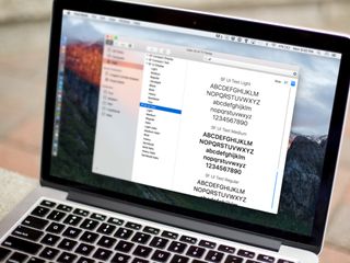
San Francisco is a neo-grotesque sans-serif, like Helvetica and FF Din. SF has two optical sizes: Text and Display. Text is for anything under 20 pt, Display for anything over 20 pt.
Most times you won't have to worry about the difference—the system handles it automatically. If you're doing work in an image editor, however, and want to match the way SF looks on the screen, you'll need to manually change from Text to Display when you go above 20 pt.
There are six weights for Text, both regular and italic:
- Light
- Regular
- Medium
- Semibold
- Bold
- Heavy
Display has nine weights total, adding:
- Ultralight
- Thin
- Black
San Francisco scales beautifully from the tiny 38mm Apple Watch to the enormous 27-inch Retina 5K iMac, managing to be both familiar and distinct, interesting but not distracting, legible and enjoyable.

SF ends up being fresher than Lucida Grande and more distinctive than Helvetica Neue, and it gives something that the Mac should have had for a long while—a look all the Apple's own.
Chinese and Japanese language support
In addition to San Francisco, OS X El Capitan also has a new Chinese system font named Ping Fang. (I think that means "Apple Square," but my two years of college Mandarin might be failing me.)
Ping Fang is available for both traditional and simplified Chinese characters, and carries over Apple's same focus on legibility. It brings a modern look to roughly 50,000 characters—a huge amount—and comes in six weights from ultralight to semibold. There are also matching roman letters and numerals to ensure easy mixed-language use.
Keyboard input for Chinese has also been improved with the addition of an advanced prediction engine, more frequently updated dictionaries, and an expandable candidate window. El Cap also learns the words and phrases—and emoji!—you use most often and stacks them front and center on the candidate window for faster selection.
Even better, writing Chinese characters on the Mac Trackpad has significantly improved. The software window is now proportional to the hardware size, and you can even write multiple characters in a row.
As someone who found Twin Bridge near-magical a decade ago, I can't wait to work more with all of this.
The Japanese system font, originally designed by JIYUKOBO and formerly called Hiragino Kaku Gothic, is now Hiragino Sans. For El Cap, it goes from three to ten weights. There are also four new Japanese fonts included, both classic and modern, and in two weights each.
Japanese input gets an enhanced vocabulary and improved engine, but it also gets live conversion, which replaces text strings automagically with Kanji, Hiragana, Katakana, and even Roman words—all in real time. If you've ever seen Siri refine speech-to-text as you continue talking, then imagine that for text conversion. It reduces what used to be a cumbersome, multi-step process into something fast and streamlined.
OS X El Capitan Trackpad
Apple continues to blur the lines between capacitive iOS screen and capacitive OS X trackpad. They remain very different experiences—direct manipulation vs. proxied manipulation—but the gesture language is being unified where it makes sense.
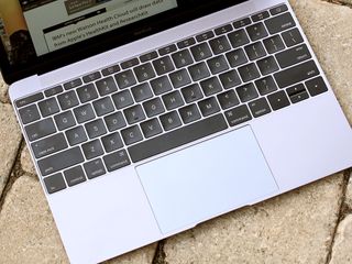
Developers are getting access to new frameworks for table rows, which will let them offer gesture actions akin to Apple Mail's swipe to mark or swipe to delete. The destructive actions get a red color treatment and a longer activation path, to prevent misfires, but both should enable new levels of convenience for the gesture-savvy.
Spring loaded controls, which used to be restricted to popping over folders when you hovered over them long enough, now work with a variety of interface elements. And if you have Force Touch trackpad and dislike waiting, you to force click to trigger the springs immediately. Since time-based interactions never feel as satisfying as directly triggered interactions, it provides the opportunity for a perceptively faster and more satisfying experience.
It's opt-in for developers, but since it can be enabled by checking a Spring Loaded button in Interface Builder, hopefully the simplicity of adoption will aid in the velocity of adoption.
Accelerator controls, and multi-level accelerator controls, let all kinds of buttons react to the amount of pressure you use when you click. The standard accelerator controls are linear. So, for example, the harder you press the bigger your brush becomes, nicely and smoother. The multi-level accelerator controls are incremental. So, for example, the harder you press the further along the 2x, 5x, 10x, 30x, and 60x fast forward speeds you move. Multi-level defaults to two stages but developers can set it higher.
There are also momentary accelerator controls, like zoom in Maps, and continuous accelerator controls, like in Photos. More pressure equals more speed through the photo sequence. The former controls the amount of change, the second the frequency. Again, developers can opt-in with a check box.
Pressure was added to the event stream options to support the new Force Touch trackpad in the MacBook and MacBooks Pro. For developers who prefer to use the responder approach, Apple has a new responder method that provides pressure changes as well.
Apple is doing a lot to measure which finger or thumb is being used and how much pressure is being applied to provide a consistent, normalized experience. So, instead of just providing raw data to developers, they're providing post-processed indicators of change. We'll have to see how well it works when apps start to ship with the new features enabled. Like with any new technology, though, it might take some time for everyone to figure out the best approaches.
There's alignment feedback to provide haptic feedback for snapping objects into place along the horizontal axis, vertical axis, or both. So if you want to align two screenshots in an annotation app, for example, you can get a tap to confirm they're perfectly straight. And because it's consistent across apps that implement it, it means it's something you can learn to feel and rely on.
Apple is also providing a way to configure the primacy of interactions for the trackpad inside apps. That way clicks, deep clicks, deep drags, and other interactions can only occur when appropriate. For example, if you're drawing and press to get a thicker line, you don't want a force click to register.
None of this is meant to be all up in your finger tips. It's meant to be subtle. A hint, not a hammer.
If you have one of Apple's new Force Touch Trackpads—currently available on the new MacBook and 2015 versions of the MacBook Pro—then you're in for a treat with OS X El Capitan.
Both AppKit—the framework developers use to build Mac apps—and WebKit—the engine underlying Safari—get new APIs for interacting with Force Touch. That means both apps and web pages will be able to provide precise pressure sensitivity for input as well as haptic feedback from the Taptic Engine.
We'll have to wait and see how it all gets implemented, but the potential is beyond exciting.
Miscellaneous
There's a lot more going on with OS X El Capitan under the hood. While many of these may seem to be developer-specific features and technologies, all of them will result in better apps for everyone. What's more, they once again show how Apple not only continues to build on the foundation of Continuity and Extensibility, introduced last year, but continues to bring both OS X and iOS into alignment.
OS X and iOS remain two distinct operating systems with common foundations, but increasingly they're moving in a common direction as well.
Audio unit extensions
Audio unit extensions create a modern architecture for audio plugins. On iOS, it's a first. On OS X, it's a latest and greatest. It means audio plugins can now be packaged into apps and made available on the Mac App Store just like the new Photo extensions.
Network extensions
Network extensions include Wi-Fi hotspot helpers, personal VPN managers, and custom Enterprise VPN servers. With them, instead of having to manually launch an app to manage networking, extensions can be called by the system when and as needed.
Game kits
While OS X doesn't seem to be getting ReplayKit to record and share games, it is getting GameplayKit and Model I/O to make building games for the Mac easier than ever.
Back to the Mac
In addition to bringing Metal to the Mac, Apple is also bringing TextKit, the company's dynamic type system. UICollectionView—a way of laying out apps—is coming to OS X as NSCollectionView, and NSStackView is debuting alongside its iOS counterpart. There are also improvements to AutoLayout, Apple's constraint-based design system, including guides and anchors. And there's a new contact framework shared between OS X and iOS.
All of these not only make modern apps easier to build but provide for a consistent methodology between OS X and iOS. Apple may not believe the Mac and iPad should merge, but they do believe developers should be able to do similar things on both platforms in similar ways.
It's not only efficient; it's effective.
See also
The Bottom Line
El Capitan translates to "The Captain" or "The Chief" and represents the heights of Yosemite. OS X El Capitan aspires to the same. It takes everything that was great about 10.10 and tries to make it better for 10.11.
If you've got software that's not yet updated to support OS X El Capitan, especially production software on production equipment, wait as long as you have to before upgrading. If you want to avoid the crowds and any last minute surprises, wait a couple days or a week.
I've been running it since the first beta on my MacBook Pro and with the gold master, I put it on my iMac as well. It's been working great on both and, given the improvements to security alone; it would be in everyone's best interests to upgrade as quickly as possible.
Based on both popular sentiment and the narrative from the last year, it's clear that following a series of redesigns and re-architectures, everyone needed a moment to settle and breathe again. A "Snow Leopard moment". El Cap gives us that, but like Snow Leopard it also gives us much more.
It moves the Mac forward, not by the leaps and bounds of some previous years, but steadily and surely.

See also

Rene Ritchie is one of the most respected Apple analysts in the business, reaching a combined audience of over 40 million readers a month. His YouTube channel, Vector, has over 90 thousand subscribers and 14 million views and his podcasts, including Debug, have been downloaded over 20 million times. He also regularly co-hosts MacBreak Weekly for the TWiT network and co-hosted CES Live! and Talk Mobile. Based in Montreal, Rene is a former director of product marketing, web developer, and graphic designer. He's authored several books and appeared on numerous television and radio segments to discuss Apple and the technology industry. When not working, he likes to cook, grapple, and spend time with his friends and family.
