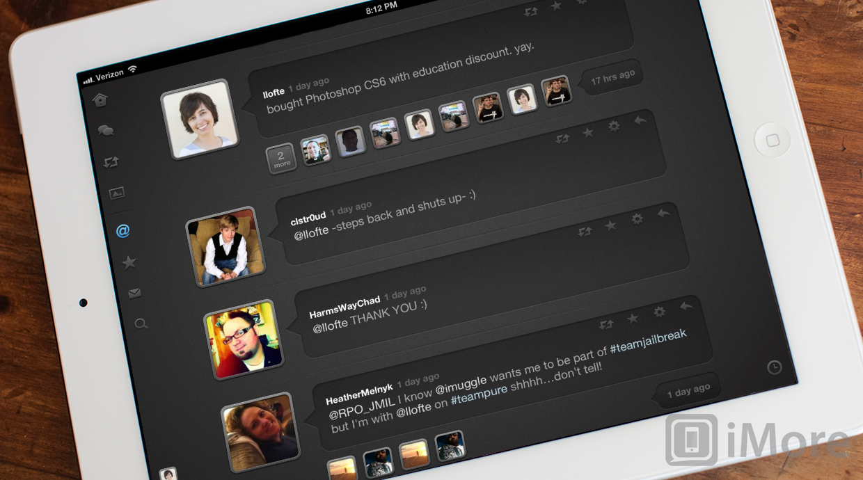
With Quip, you'll never feel lost in a Twitter conversation again
Quip is a new Twitter app for the iPad designed by the incredible development team Glasshouse Apps. I know what you're thinking: "another Twitter app?" Yes, but Quip is no ordinary Twitter app. Quip takes a refreshing approach that focuses on making it easy to follow conversations.
Imagine trying to follow a conversation in real life if the group of people involved all spoke backwards while others nearby kept interrupting with random comments. It sounds crazy but that’s what it can often be like when scanning a normal Twitter timeline.
Ain't that the truth!

Quip features a very nice dark-themed UI that has a greater emphasis on looks than it does information density. Avatars are displayed very big with speech bubbles containing the tweets. It looks really great, but it does come at the cost of only displaying 4 tweets at a time in landscape orientation, six in portrait.
But the extra space between tweets isn't just for looks, it actually serves a very important purpose. For tweets that are part of a conversation, the avatars of the users that have participated in the conversation appear in the space below the tweet. It's an awesome visual cue. When you tap on a tweet that's part of a conversation, the small avatars below the tweet will move below the tweet and display their replies, in order, nested underneath the main tweet.

I absolutely love this approach to Twitter conversations. Many Twitter apps will display the conversations in order, but Quip is the first do it so elegantly without changing screens. I would love to see Glasshouse apps take this idea a little further and display the replies at various nesting levels. This would make following conversations even easier.

In addition to the traditional tabs that you'll find in any Twitter client, Quip also includes a tab for conversations, one for retweets, and another for photos. The conversation and retweet tabs only show tweets that are part of a conversation or that have been retweeted.

Similarly, the photos tab only shows tweets that contain photos, but instead of displaying the tweets, it displays a grid of the photos. Tapping on the photo will enlarge it and display its associated tweet below it.

The direct messages tab takes a similar visual approach and instead of displaying a list of all the users you have direct messages with, it displays their avatars with little icons that indicate how many messages you have with that user.
The good
- Beautiful design
- Revolutionary approach to twitter conversations
- Conversations, retweet, and photos tabs
- Photos tab displays grid of photos that have been tweeted
- Direct messages tab shows grid of user avatars
The bad
- Scrolling and animations have the tendency to lag
- No light theme
The bottom line
I've only been using Quip for a few hours, but I'm already a huge fan. It's a fresh approach to a popular genre of apps and I applaud Glasshouse Apps for creating such a beauty. However, some work can definitely be made in the performance area as scrolling and animations do tend to lag. It's not enough to destroy the experience, but it's noticeable. With that said, I'm confident that Glasshouse Apps will release a fix shortly.
$0.99 - Download Now
Former app and photography editor at iMore, Leanna has since moved on to other endeavors. Mother, wife, mathamagician, even though she no longer writes for iMore you can still follow her on Twitter @llofte.

