Ryan Jones on directing Weather Line for iPhone

iMore offers spot-on advice and guidance from our team of experts, with decades of Apple device experience to lean on. Learn more with iMore!
You are now subscribed
Your newsletter sign-up was successful
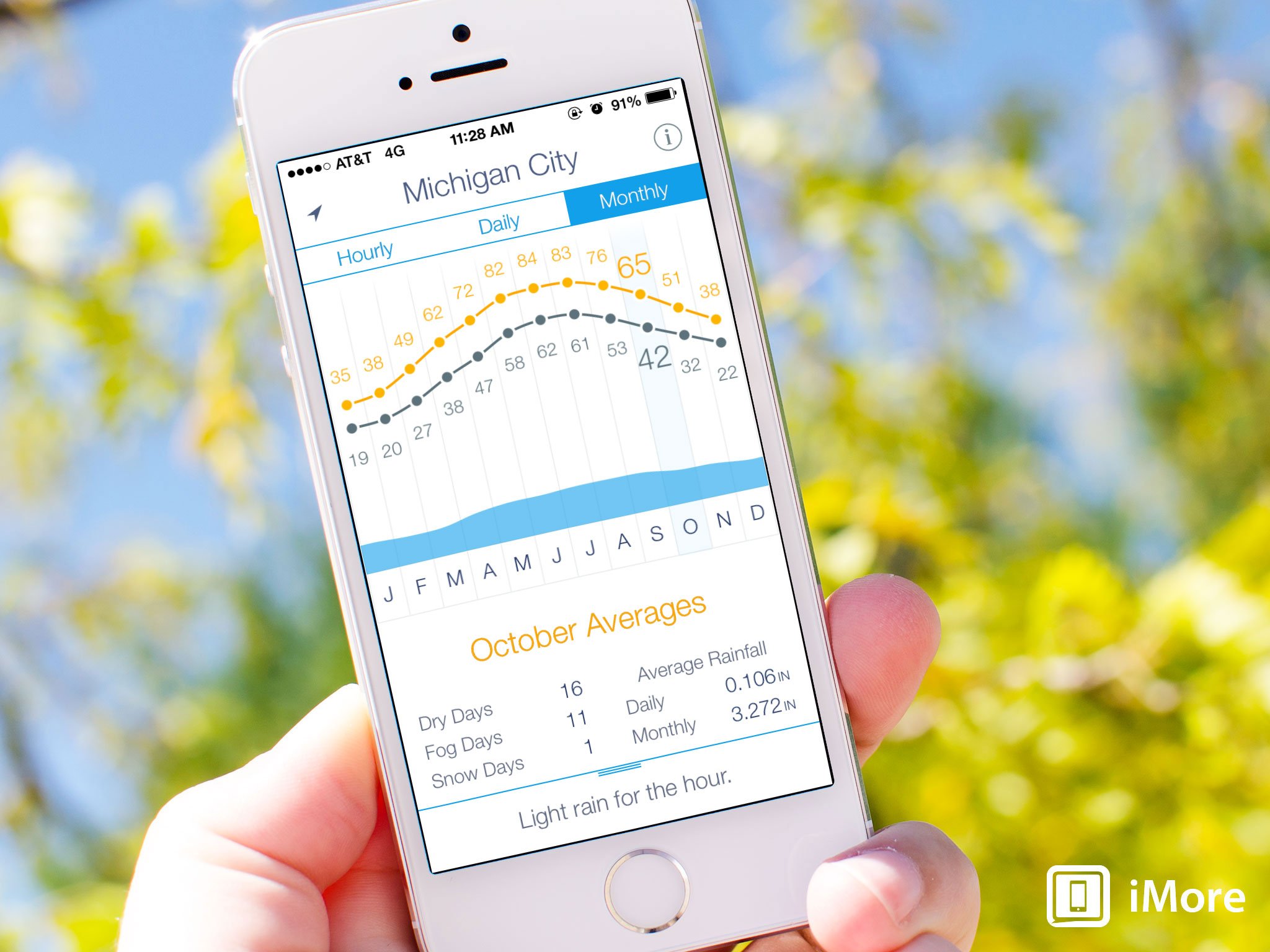
Weather Line is an impeccably designed, delightfully crafted weather app that comes from another one of those director, developers, designer trios that seems to be working so wonderfully well lately. The director for Weather Line, Ryan Jones, was gracious enough to expound on why the world needed another weather app, what iOS 7 allowed them to do with it, and what his role entailed.
First up, what made you want to make Weather Line? What did Weather Line bring the table that no other weather app captured for you before?
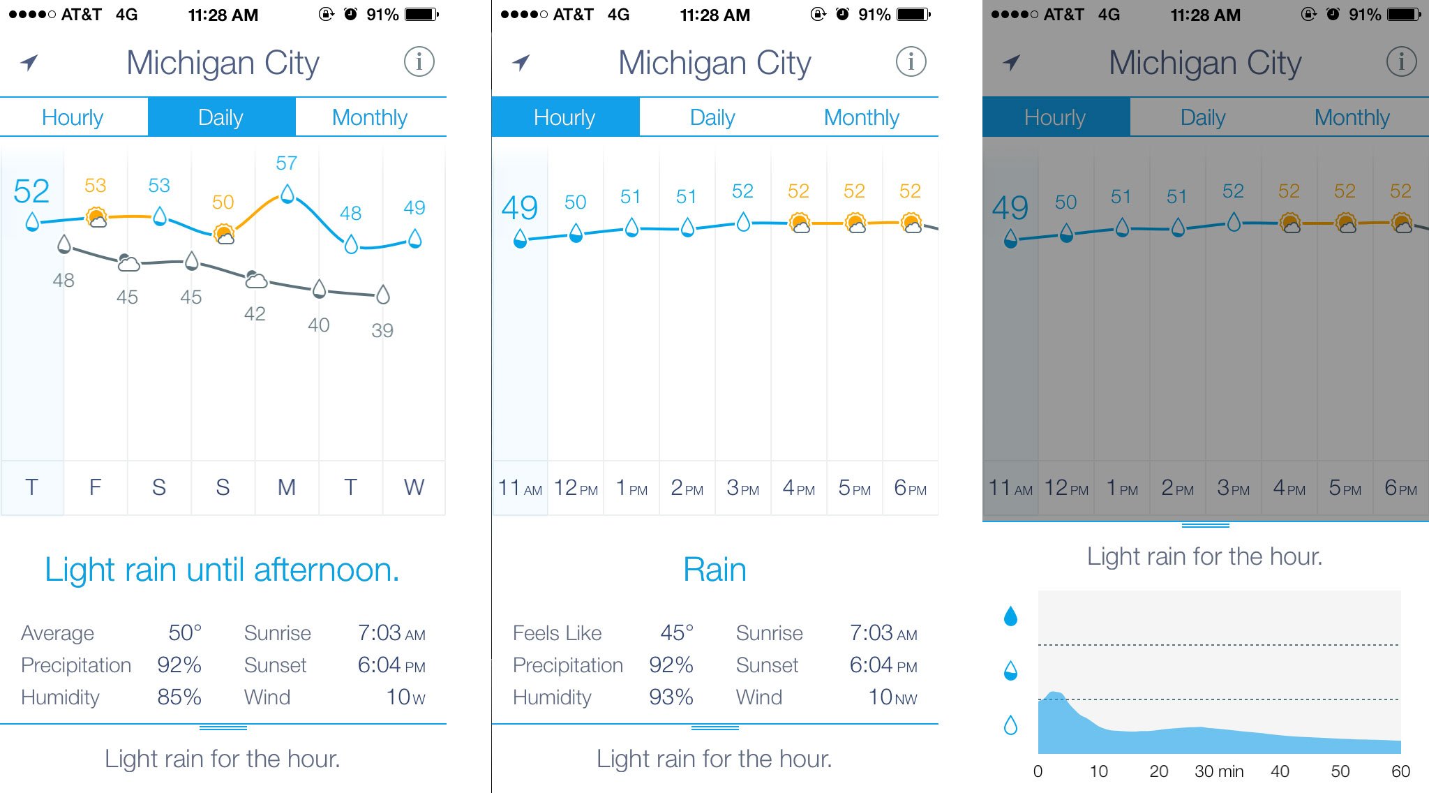
Ryan Jones:Ryan Jones: I've literally had [the idea for Weather Line] in my head since the first time I saw the Stocks.app in iPhone OS 1. I thought [the interface] was obvious and someone would do it. Maybe even Apple. Then I thought I was an idiot and there was an obvious reason no one was doing it. That I was missing something. Then I thought it wasn't "different enough". That there were too many good weather apps, and a better presentation may not be enough to sell apps. Then I finally said "I just have to know the answer, I'll make it myself."A couple of apps have tried a graphical [weather] view, but either only on the iPad where there is more space or by going from the Hi to the Lo every single day. I won't call them out, but you can find them easily. That just plain doesn't work.More so, no one had my idea of putting the condition as the data point. Which I thought was really elegant and a great way to get more data in less space. We can show the temperature, the condition, the trend, and the rain chance/intensity all with very very little information and screen space. If you think about a table or list, which is what most apps use, it would be 36 rows and 4-5 columns. Not including the trend, which is arguably the best part.

What, if anything, did iOS 7 allow you to do that previous versions of iOS wouldn't?
Article continues belowRyan Jones: The app's job-to-be-done is "quickly present data", so Apple's movement to defer to content was huge for us. We removed chromes and tiles and shadows and labels.For example, iOS 7 gave us permission to remove the Pagination Dots. In iOS 7 Apple signaled that users can be trusted with common interactions now. We are no longer hand holding users, and the base layer of interaction is considered common sense. Some really great beta testers (with famous apps) pushed back on this, but of the 100+ feedback emails I've received, not a single one mentioned this. That could be self selection, but it's meaningful. I think Apple is right, users "get" the basics.We implemented the new Backgrounding API, but took it out. I’ve explained why on the site: We tested and considered it deeply. However, weather data actually changes too rapidly. If we updated in the background, we would still have to update again when you launched the app. So then we'd just be wasting your battery with a background update that we never used. The best experience comes by refreshing data as fast as possible when you launch the app. And we did, it's very fast.
How did you like being an app director?
Ryan Jones: I was worried, big time. I tried to learn to code about 3 times and totally stalled right away. So I just had to hire. I looked to guys like David Barnard who basically paved the way.It felt strange explaining my point of view to really famous and awesome designers like Pacific Helm. I would explain my ideas, but I felt like - who am I? I can barely use Photoshop, what do I know? But they were great, and tried the ideas that had potential, and explained why some ideas were naive and just wouldn't work.I got incredibly lucky to find Mircea Grelus (my developer). I had a detailed Work Spec that I sent out, but his response stood out - he immediately "got it" and shared my vision. During development, he would often surprise me with new features he created on his own or take the time to explain why something did or didn't work. Sometimes he would send me a beta, I'd play with it and ask him to try a few things, then we could end up exactly where he started. For example, we did that with the text spacing in the Details area. That was an entire day of iterations on the vertical spacing, text size, horizontal spacing, white space, edge padding, center column padding, etc. But we ended up almost exactly where he started. Once we had that trust things moved much faster. I knew he was the one in the code and had the same eye for details that I did, so he had tried already tried many iterations and picked the best.
Thanks Ryan! The thoughtfulness is obvious in the app!
You can find Weather Line in the App Store.
- $2.99 - Download Now
iMore offers spot-on advice and guidance from our team of experts, with decades of Apple device experience to lean on. Learn more with iMore!

Rene Ritchie is one of the most respected Apple analysts in the business, reaching a combined audience of over 40 million readers a month. His YouTube channel, Vector, has over 90 thousand subscribers and 14 million views and his podcasts, including Debug, have been downloaded over 20 million times. He also regularly co-hosts MacBreak Weekly for the TWiT network and co-hosted CES Live! and Talk Mobile. Based in Montreal, Rene is a former director of product marketing, web developer, and graphic designer. He's authored several books and appeared on numerous television and radio segments to discuss Apple and the technology industry. When not working, he likes to cook, grapple, and spend time with his friends and family.
