Smart Battery Case for iPhone review
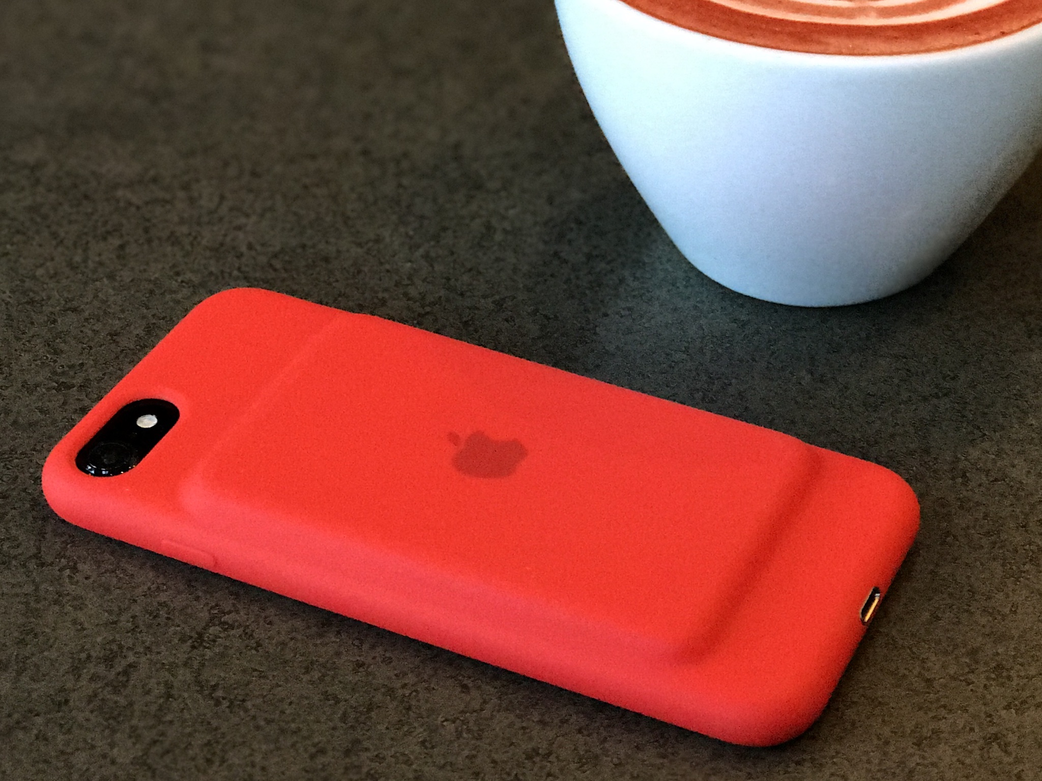
Update: Apple has just released a new Product (RED) version of the Smart Battery Case to benefit World AIDS Day. Check out the new pictures below!
The Smart Battery Case, originally introduced last year for the 4.7-inch iPhone 6s and iPhone 6, now supports the new iPhone 7. At launch it generated an incredible amount of internet noise. Much of it was reactionary and superficial. The "hump" on the back overshadowed the very clever engineering going on, outside and in.
Since then, though, it's become the go-to for people who need extra battery life for trips, conferences, and even everyday life. Even those who mocked the design seem to have been won over by its utility.
There's no version for the 5.5-inch iPhone Plus size, presumably because that line already benefits from a bigger power reserve. This battery case is intended to even the playing field — to allow you to have your smaller phone but use it longer too. So, does it?
Smart Battery Case hump
Because the Smart Battery Case is essentially Apple's silicone case for iPhone with a power pack embedded in the back, it looks like it has a "hump" or "bump". An iPod on top of the iPhone. Yoda on Luke's back. Whatever you want to call it, it's there and it's impossible to ignore.
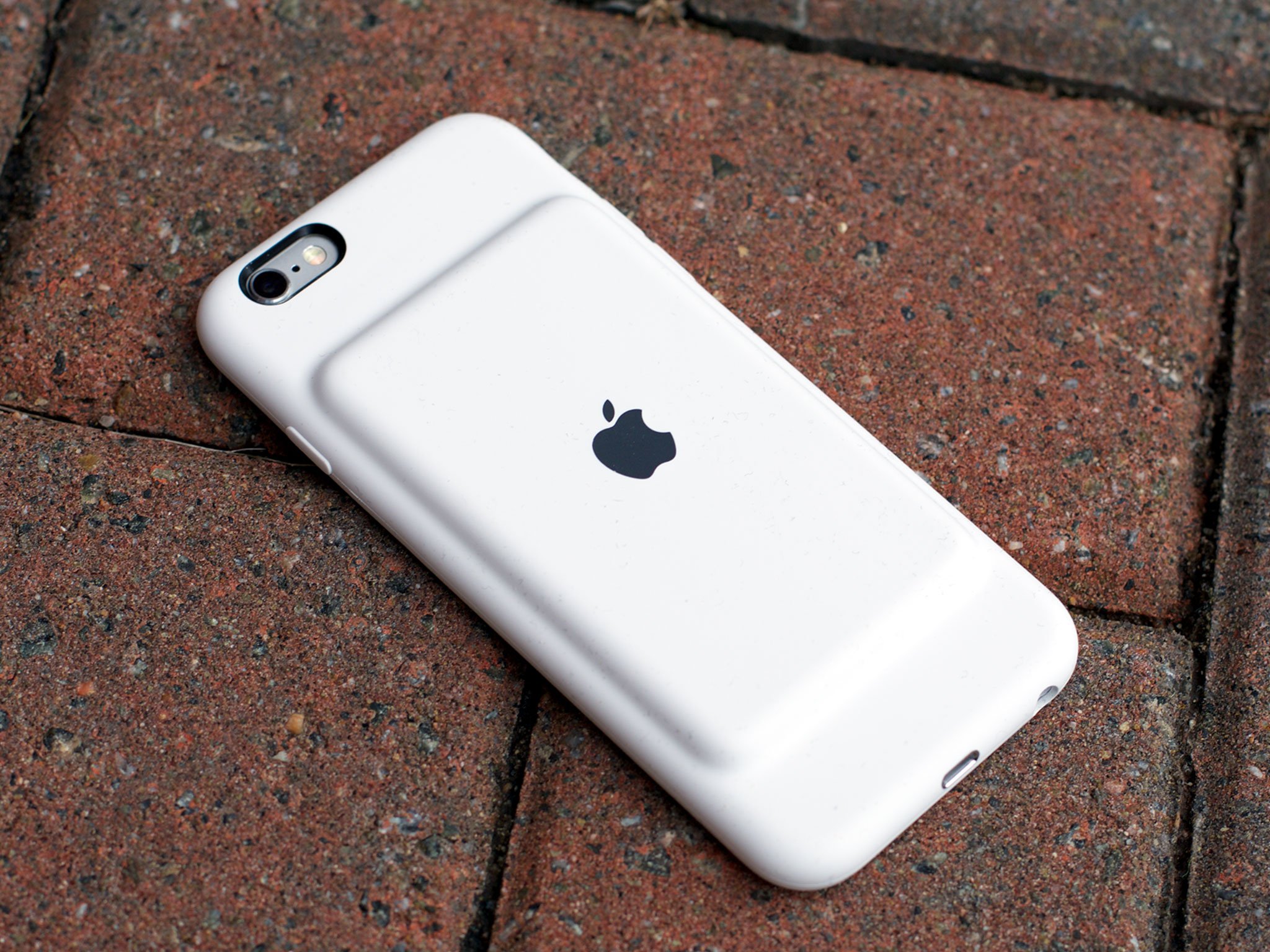
Objectively the design is fine. It's symmetrical, impeccably moulded, and enables significant functionality. Subjectively, it's awkward-looking. There's an unabashed minimalism to it that's not ugly per se, because it's not lopsided or ostentatious, but that's severely lacking in the elegant curves and lines we've come to expect from Apple.
Master your iPhone in minutes
iMore offers spot-on advice and guidance from our team of experts, with decades of Apple device experience to lean on. Learn more with iMore!
And that's made for some fascinating reactions.
Apple is routinely criticized for putting form ahead of function. In this case, though, putting function ahead of form has resulted in some of the loudest bouts of criticism in recent history.
The "hump" is the result of hard choices made during the design process. By not running the battery all the way along the back, and by not using rigid material to cover it, Apple can hide a hinge beneath the silicone. That hinge lets the top part of the case bend backwards so you can slide your iPhone in and then slip the case back over it.
It provides an alternative to the two-piece cases that require you to remove the top or back in order to put them on. They're typically fussier and more difficult to put on, and the extra parts are susceptible to damage or loss. So, even though the Smart Battery Case is less pleasing to the eye, the resulting one-piece design is a huge win.
Likewise the reception. With other cases, the material can sometimes cause cellular signal to drop. Manufacturers have done a lot to mitigate that over the years, but in areas that already have bad reception, it can still be a problem.
Because of the Smart Battery Case's design, the antenna bands are essentially covered only by thin silicone portion of the case. Moreover, Apple has added coupled passive antennas to further maintain signal. As a result, even in areas where I typically have poor coverage, I haven't noticed any bars dropping. So, the Smart Battery Case may look awkward but the signal retention is another huge win.
That's critically important because when a phone loses signal it boosts the radio which drains power — the exact opposite of what you want with a battery case. It's something most battery cases suffer from, though, which makes them far less efficient.
Here, Apple has solved for efficiency.
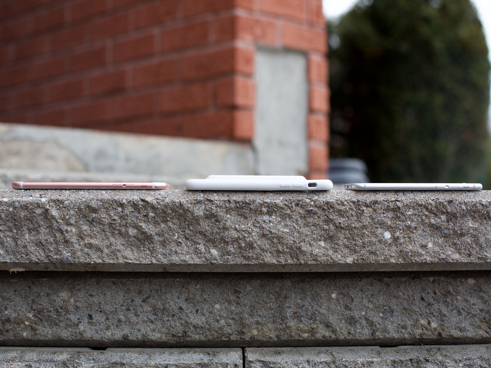
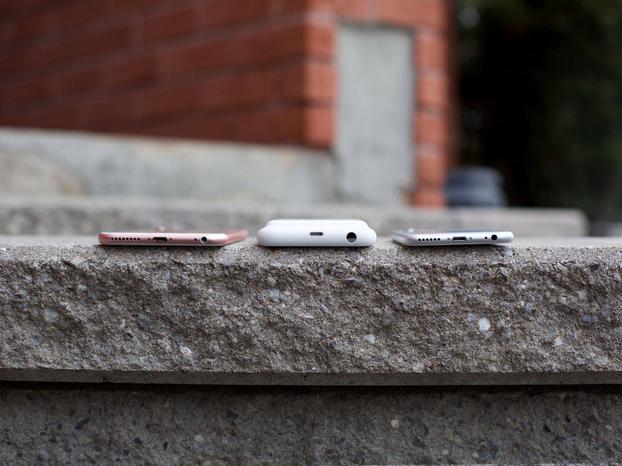
The lack of bulk around the sides is also great when you hold it. Because there's no padding to "round it out", it feels especially slim. For me, my index finger naturally falls right above the hump and the rest of it evaporates into my palm. That's considerably better than the slight stretching I feel when I hold other, more voluminous cases. Likewise, it's svelte enough that it slips into pockets without feeling bulky. So, not easy on the eyes but easy pretty much everywhere else.
The hinge, the antennas, the lack of bulk—none of these would be possible if Apple had gone with a more traditional design. None of that functionality would be there absent this form.
For some it won't matter. The hump will be a deal-breaker. They'll never be able to un-see it so they'll never buy it. For others, it'll be a non-issue. They'll frown at the hump once, then pick it up and seldom if ever think about it again.
Smart Battery Case Finish
The Smart Battery Case has a soft-touch finish that, for iPhone 7, comes in white and black — and, as of December 2016, Product (RED). The previous generation version for iPhone 6s and iPhone 6 comes in white and charcoal.
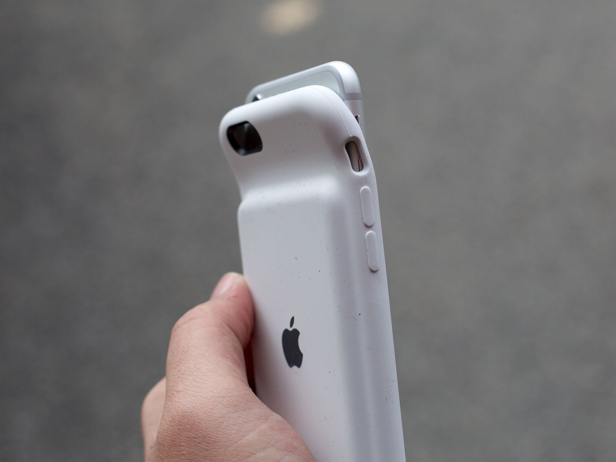
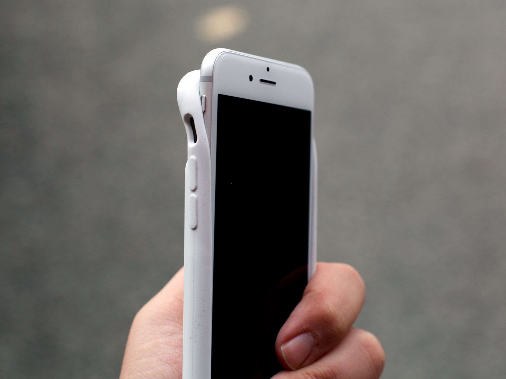
To my eyes, the white matches the Magnetic Charging Dock for the Apple Watch and the charcoal is similar to the Smart Keyboard Case for iPad Pro. The black is deeper and a better match for the (matte) and jet black of iPhone 7. The red, as with the rest of the Product (RED) line, is fire
I like the new colors best. White looks crisp and clean on both models, but the black appeals to me far more than the charcoal did. And did I already say the Product (RED) is fire?
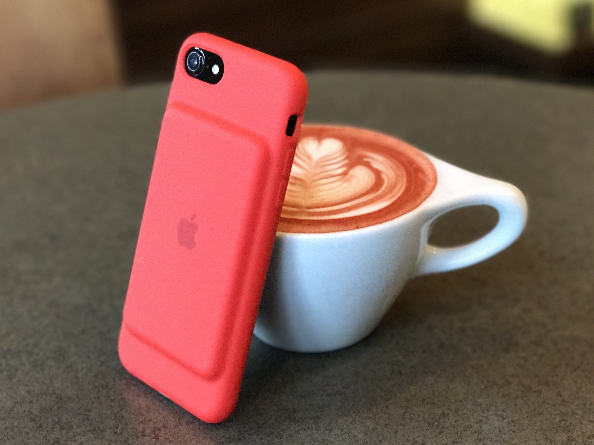
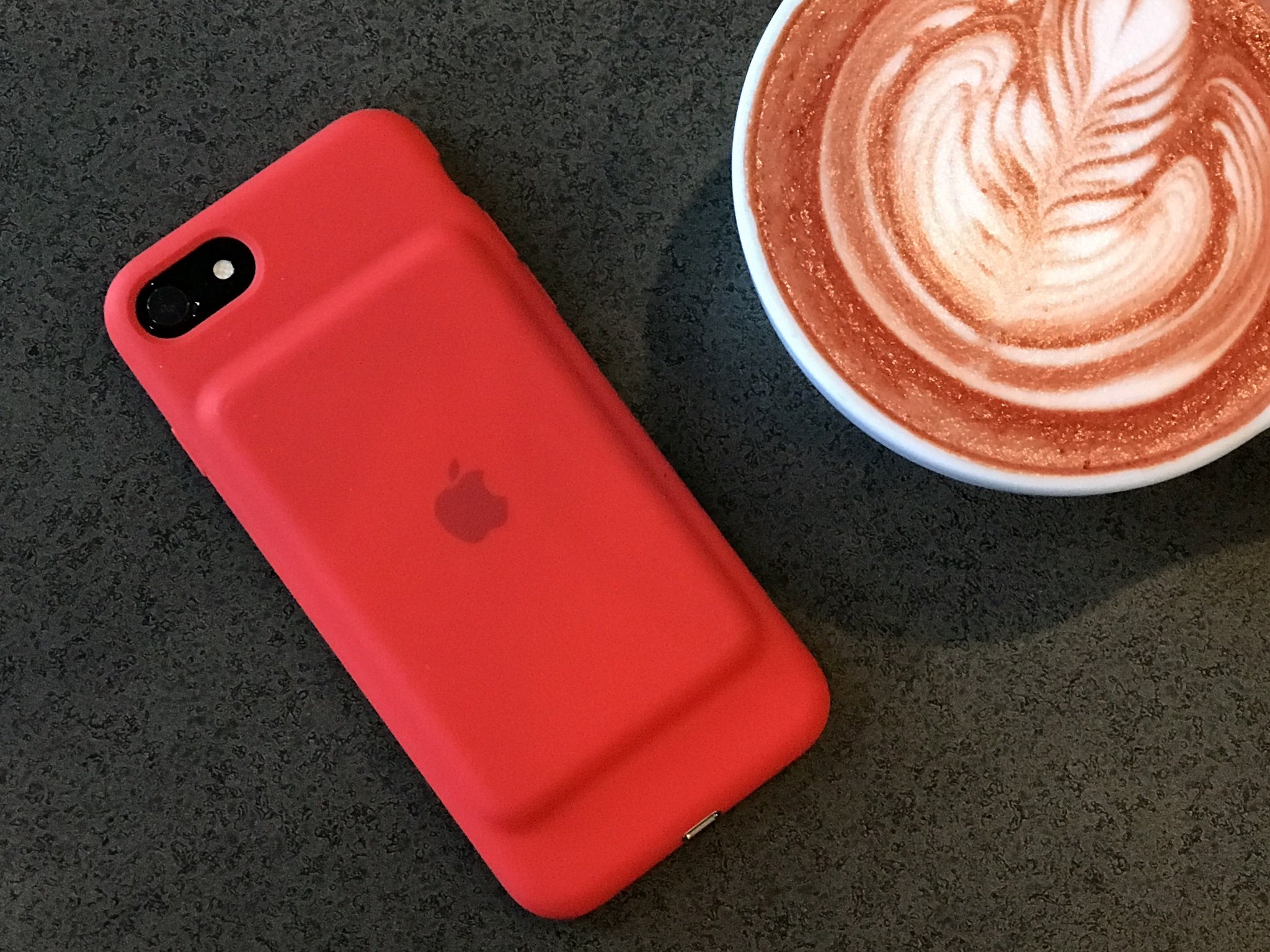
I'm generally not a fan of soft-touch, though. Never have been. I dislike how much lint it holds onto. Whenever I have a soft-touch phone or case I constantly find myself trying—and failing—to keep it clean. I'm likely not in the majority on that, though.
Since the soft-touch finish, especially combined with the shape, absolutely make the iPhone easier to hold, I think most people will appreciate it.
Smart Battery Case Ports and Buttons
The cutouts on the Smart Battery Case are great. There's ample room around the rear-facing iSight camera and flash, and around the mute switch. The acoustical port for the speaker channels sound to the front of the case. Not only does it prevent audio and calls from being muffled, it projects them loud and clear.
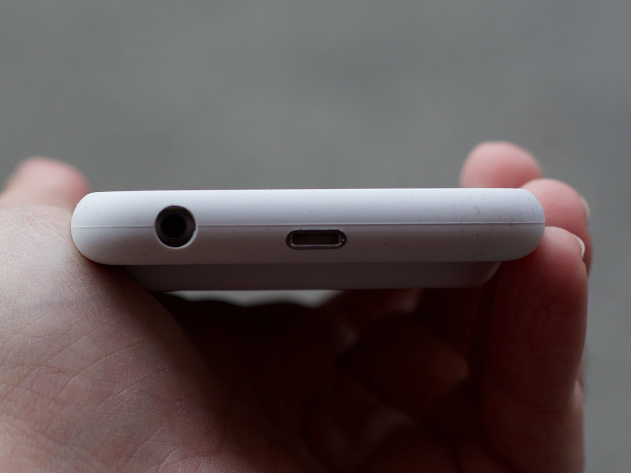
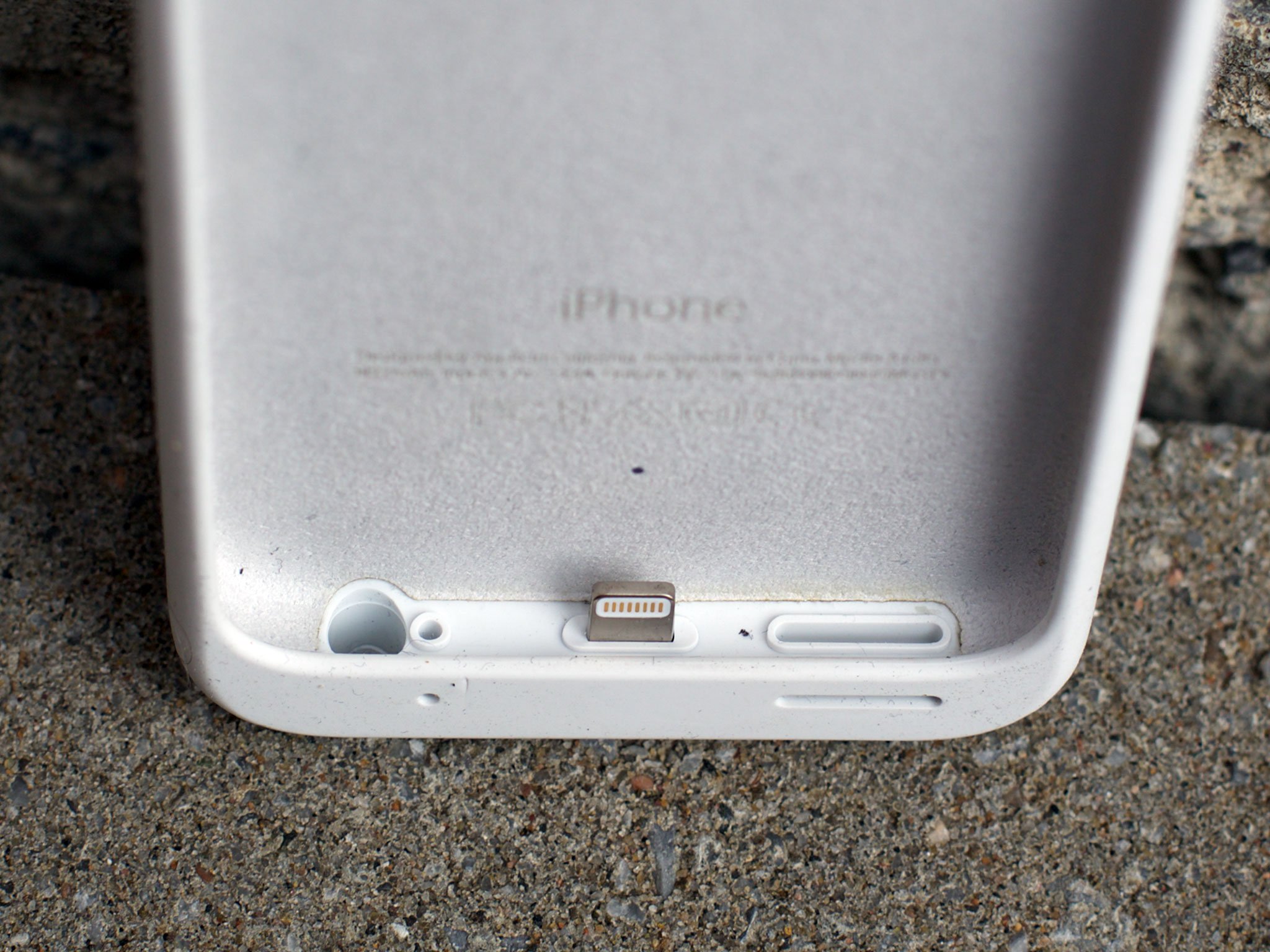
The edges of the case rise up above the screen so you can put it face down without scratching the glass. I was worried it might interfere with bezel gestures, like swiping to go backwards or forwards in Safari, but I haven't had any trouble.
The passthroughs for the other buttons, including the volume rocker and sleep/wake button, are similarly well done. You have to press a little harder but unlike some other cases they're move cleanly and feel precise.
My one grip is with how the 3.5mm headphone jack is handled. On the iPhone 6s and iPhone 6 version, the slim plug at the end of Apple's EarBuds fits into the hole at the bottom of the Smart Battery Case, no problem. Anything wider—and lots of headphone plugs are wider—and it won't fit at all. That's a problem.
The iPhone 7 version, of course, has no 3.5mm headphone jack and so has no need of a cutout. But it would benefit from providing one.
Just like the iPhone Dock connects via lightning but provides 3.5mm out, it'd be great if the Smart Battery Case plugged into Lightning to charge the phone but provided its own 3.5mm out. That feels like it would fix the problem of the cutout on the version for iPhones 6 and provide additional functionality — and accessibility! — for the version for iPhone 7.
Smart Battery Case Charging
Apple has two huge home-court advantages with the Smart Battery Case. First, they get to use a fully functional Lightning passthrough—a Lightning port on the outside and plug on the inside. Second, they get full integration with iOS.

Since the Smart Battery Case has a Lightning instead of a microUSB, you can charge it with the same cable you use to charge your iPhone. Moreover, since it's fully functional, you can charge both the case and the iPhone at the same time. That's one less cable you have to keep around or carry with you, and one less thing you have to remember to charge separately.
The charging is literally "smart" too. With the iPhone adapter, it'll charge the iPhone first then the case. With the iPad adapter, it seems to charge the iPhone and, because there's so much juice, charge the case at the same time. Either way, your iPhone gets priority, which means it'll always have the most charge possible.
Also, your iPhone knows when it's connected to the case rather than a plug so it's smart enough not to begin any backups or background tasks, or other processes that cause excessive drain. If you plug the case in, though, it's also smart enough to open up all those power-hungry processes.
Some people might want a case to enable all that activity, of course, and plenty of cases do. Apple is doing something different: solving for maximum power efficiency in the lightest possible package.
That's why looking at milliamp hours is ridiculous. More gas doesn't help if you consume it faster. It's why Apple branded this the smart battery case rather than the big battery case. They're literally getting more bang from less battery.
Thanks to the iOS integration, charge status for both the iPhone and the Smart Battery Care is prominently displayed immediately on the Lock screen when you plug it in. Charge status for both is also available at any time from Notification Center. Simply swipe down from the top.
Lightning bolt icons show you exactly what is being charged and when. If the case is on, you see it charging the iPhone. If the case is plugged in, you see both the case and iPhone charging. And because you can see the exact percentage for each, which is far more precise then a sequence of four LED lights, you can make a more informed decisions about exactly how much power is left and exactly how you want to spend it.
Other cases sometimes have independent on/off switches. That way, if you want them on your iPhone but not actively charging it, you can do that. Not so with the Smart Battery Case. If it's on, it's charging. That's a benefit. It's handling the power management so you don't have to, and in so doing, keeping the battery as healthy as possible.
Likewise, there's no physical button and light system to show you charge level on the case. That means you can't just pick it up by itself and see how much charge is left. You have to put it on the iPhone.
There is a small LED light inside the case that, when you plug it in, will glow amber when charging and green when fully charged. It can't, however, tell you the level of charge. So, you're back to having to put it on your iPhone.
Again, unabashed minimalism. The case simply keeps your iPhone at the best possible power level at all times, and makes sure you're unnecessarily racing through your battery's charging cycles. You put it on and use it as needed—set it and forget it. For most people, letting the case do the work just works.
Smart Battery Case Bottom Line
At $99 to roughly double the charge capacity of the iPhone 7, iPhone 6s, or iPhone 6, the Smart Battery Case seems much more expensive than budget battery cases. Coming from Apple, that should surprise absolutely no one.
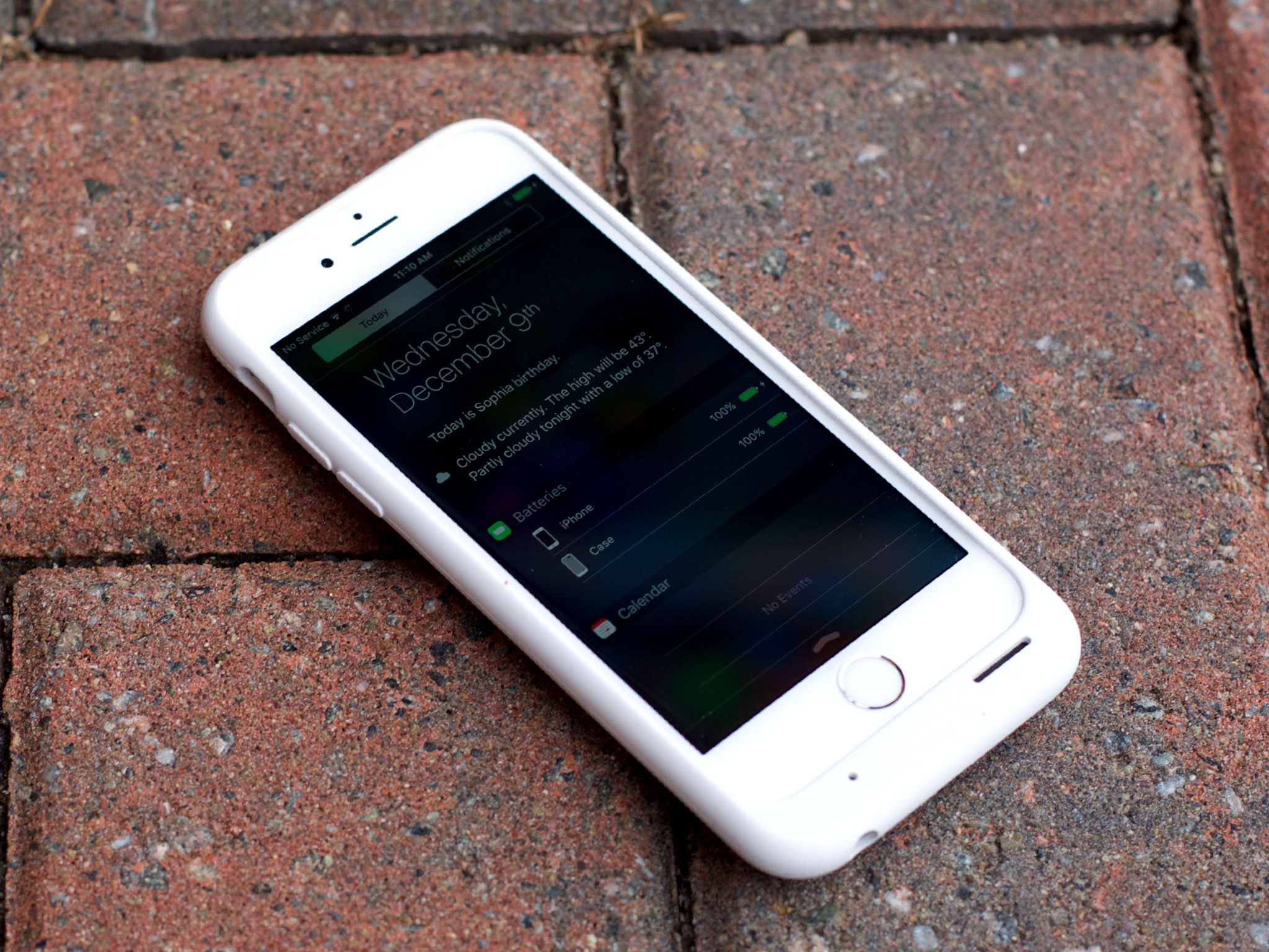
Just like you can find cheaper phones than the iPhone, cheaper smart watches than the Apple Watch, and cheaper computers than the Mac, you can find cheaper battery cases than the Smart Battery Case. You just typically can't find them with the same level of materials, manufacturing, and integration. Those come with the Apple logo on the back.
Beyond that, though, Apple is doing something novel here: They're trying to get the most power from the least battery. Bigger is heavier and that comes with a cost in the hand and the pocket or bag. Apple's case is for those who need a little extra juice some of the time, but want to be weighed down and bulked up as little as possible. That's what they're solving for.
If you don't care about any of that, then you should absolutely buy something else. If the hump isn't a deal-breaker, though, you should get the Smart Battery Case.
Originally written December 2015. Last updated December 2016 for Product (RED).

Rene Ritchie is one of the most respected Apple analysts in the business, reaching a combined audience of over 40 million readers a month. His YouTube channel, Vector, has over 90 thousand subscribers and 14 million views and his podcasts, including Debug, have been downloaded over 20 million times. He also regularly co-hosts MacBreak Weekly for the TWiT network and co-hosted CES Live! and Talk Mobile. Based in Montreal, Rene is a former director of product marketing, web developer, and graphic designer. He's authored several books and appeared on numerous television and radio segments to discuss Apple and the technology industry. When not working, he likes to cook, grapple, and spend time with his friends and family.
