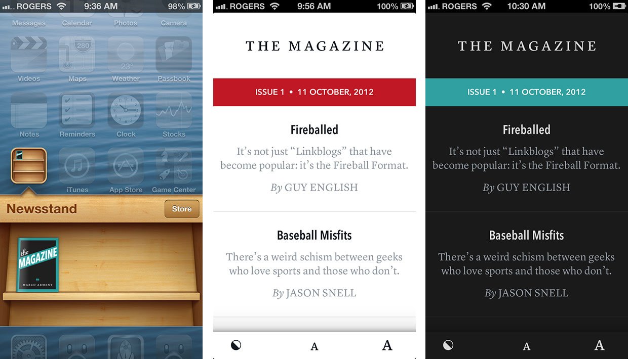
The Magazine is a new endeavor by Marco Arment, the creator of Instapaper and host of Build & Analyze, with no greater or lesser goal than to do an iOS Newsstand periodical the way it was meant to be done. In a market all too littered by massive, unwieldy Adobe InDesign exports, shackled to old-world sales and marketing models, The Magazine's premise comes off as audacious -- 4 articles every two weeks, written by passionate technologists for passionate technologists. Here's how Arment describes it in his forward/declaration of intent:
I’ve always loved technology, and I especially love the recent focus on mobile phones, tablets, and truly great personal computers. These interests also increasingly include other fields, such as photography, publishing, and music, affected heavily by technology.This is what The Magazine is about.
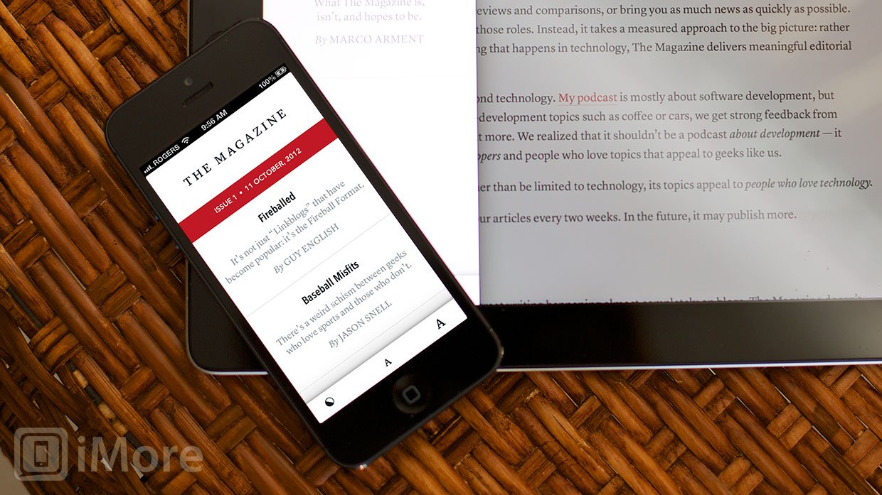
Arment is also taking a page, almost literally, from Instapaper's playbook. Eschewing the static PNG files and anachronistic layouts of traditional magazines, he's simply, beautifully, cleanly, presenting The Magazine's content in as enjoyably readable a format a possible. Controls are likewise minimal. From the table of contents you can switch between dark and light mode, increase or decrease the type size, or swipe to delete content (a small trashcan will appear in the colored issue number/data bar to confirm).

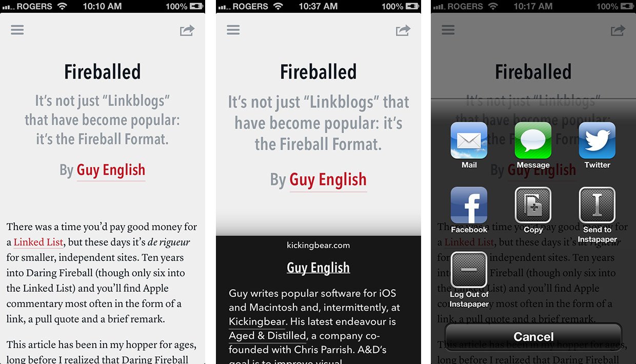
From an individual article's page, you can share content via Mail, Message, Twitter, or Facebook, or send a copy to the clipboard or to Instapaper. Links are easy to see and if you tap on one, the article lifts up to show you a preview of the linked content. If you tap a link in the preview, you're carousel'ed out of The Magazine and the web page is served up in Safari.
The reading controls, however, are only available on the table of contents screen, so you can't change type size or toggle dark/light modes while inside an article, which also means you can't preview type-size changes without flipping back and forth. The share sheet is available on the article pages, but it's anchored to the top, so if you only decide you want to share an article by the time you finish reading it, you have to scroll all the way back to the top. Some sort of persistent controls (the way the issue number and date persist on the table of content), or even a set reveal-on-touch controls, would feel better.
Scrolling in articles is fast and fluid, and both button and gesture-based navigation options are available. From the table of contents screen, tap a article to go to that article, and tap the contents button to go back to the table of contents. You can also swipe to push the table of contents aside and reveal an article beneath it (the first article if you haven't begun reading yet, otherwise the last article you were reading). You can also swipe to pull the table of contents back into place so you can choose another article. Unfortunately, you can't swipe the other way to navigate to the next article. That's something I keep instinctively wanting to do, so hopefully it gets added in a future release.

In addition to Arment's forward, the first issue of The Magazine includes essays by Guy English, Jason Snell, Alex Payne, and Michael Lopp. English takes a look at the [Daring] Fireball Format of link blogs and their rise in popularity, Snell tackles the schism between geeks who do and don't love sports, Alex Payne laments on the people behind technology and how sometimes we get it wrong, and Lopp explores leadership and the dynamics between stability and volatility.
Most magazines aren't really in the content business. They're in the advertising and marketing business, selling our attention and our mailing addresses, with the content serving as a kiss and a cookie to keep us happily flipping page and subscribed. That's not always bad, and some really terrific magazines have been funded using that model. But The Magazine looks to be in the actual content business -- you read what you pay for.
iMore offers spot-on advice and guidance from our team of experts, with decades of Apple device experience to lean on. Learn more with iMore!
With The Magazine, Arment has stripped the traditional format, model, and expectations of the magazine down to its essence, to the barest possible elements it needs to exist as a magazine -- a determined publisher, talented writers, and solid content -- and is hoping that in doing so, it flourishes.
I hope so as well. I hope it gives voice and exposure to a wide array of technologists who take the opportunity to raise the bar and the stakes of technology writing. And I hope it provides an oasis to readers hungry for just that. That may sound like a lot of pressure to put on a new type of publication on the day of its very first issue, but it seems like not an ounce less than Arment himself is placing upon it. And that's a stupendous thing.
The first issue of The Magazine, with free 7-day trial, is available now. Subscriptions cost $1.99 a month (which should include 2 issues given the current publishing schedule). Give it a read.
Free to try - Download now
Note: There's currently a bug that prevents you from subscribing on multiple iOS devices. According to Arment, a fix is on its way.

Rene Ritchie is one of the most respected Apple analysts in the business, reaching a combined audience of over 40 million readers a month. His YouTube channel, Vector, has over 90 thousand subscribers and 14 million views and his podcasts, including Debug, have been downloaded over 20 million times. He also regularly co-hosts MacBreak Weekly for the TWiT network and co-hosted CES Live! and Talk Mobile. Based in Montreal, Rene is a former director of product marketing, web developer, and graphic designer. He's authored several books and appeared on numerous television and radio segments to discuss Apple and the technology industry. When not working, he likes to cook, grapple, and spend time with his friends and family.

