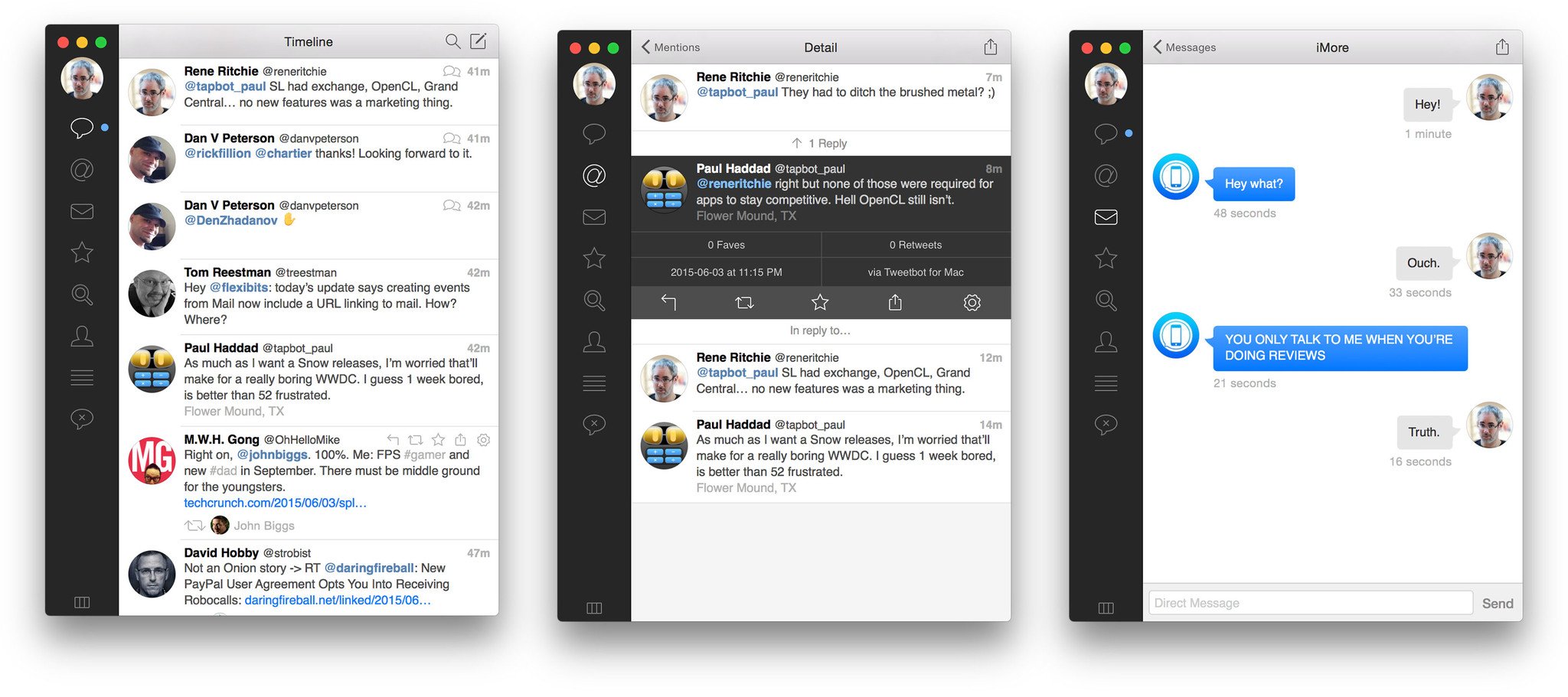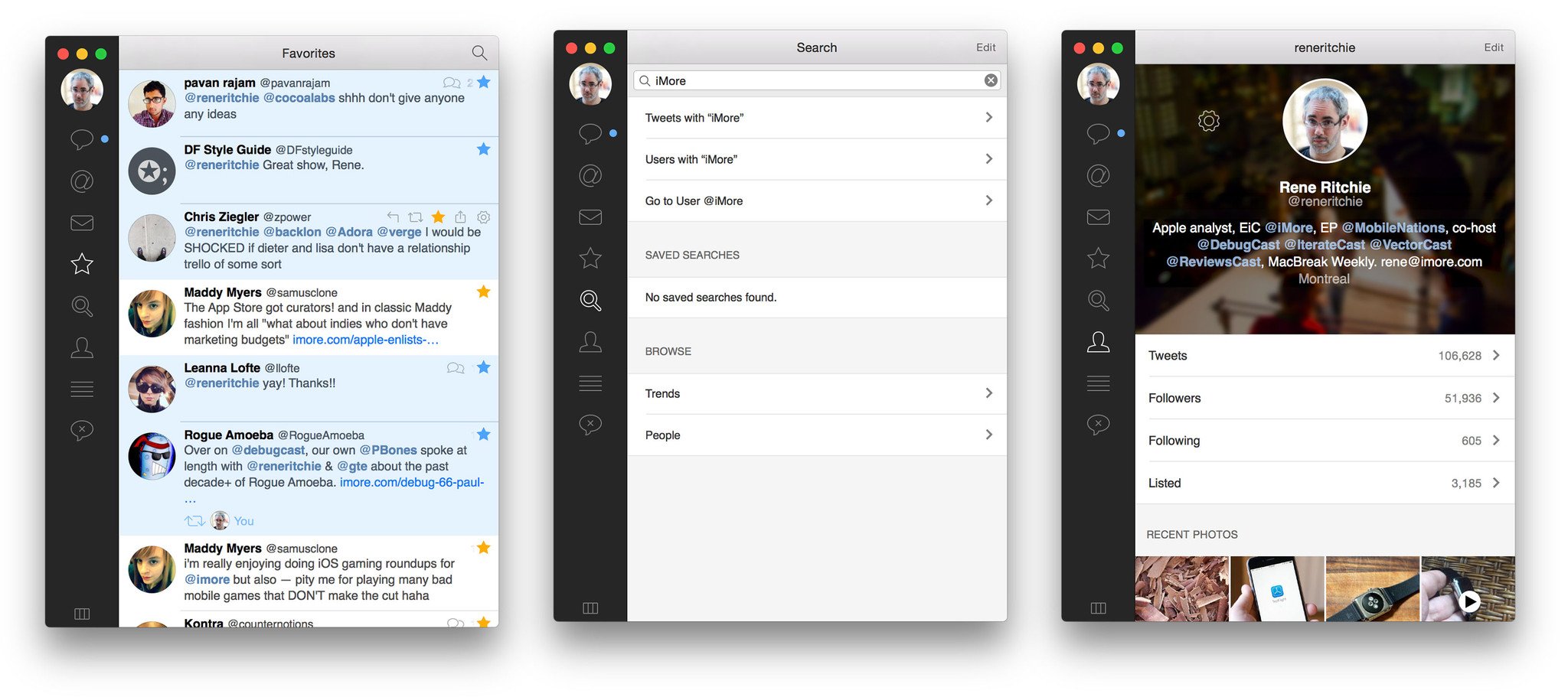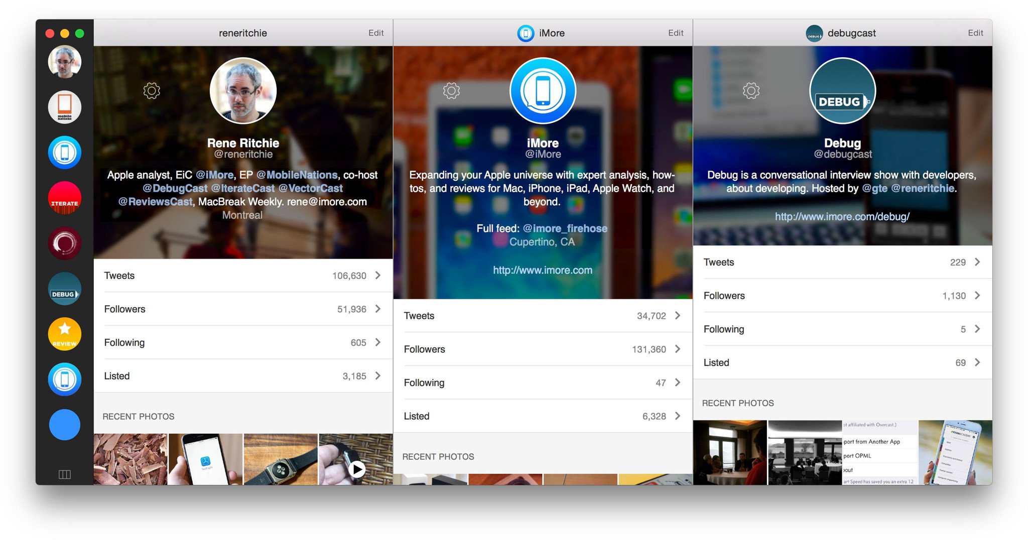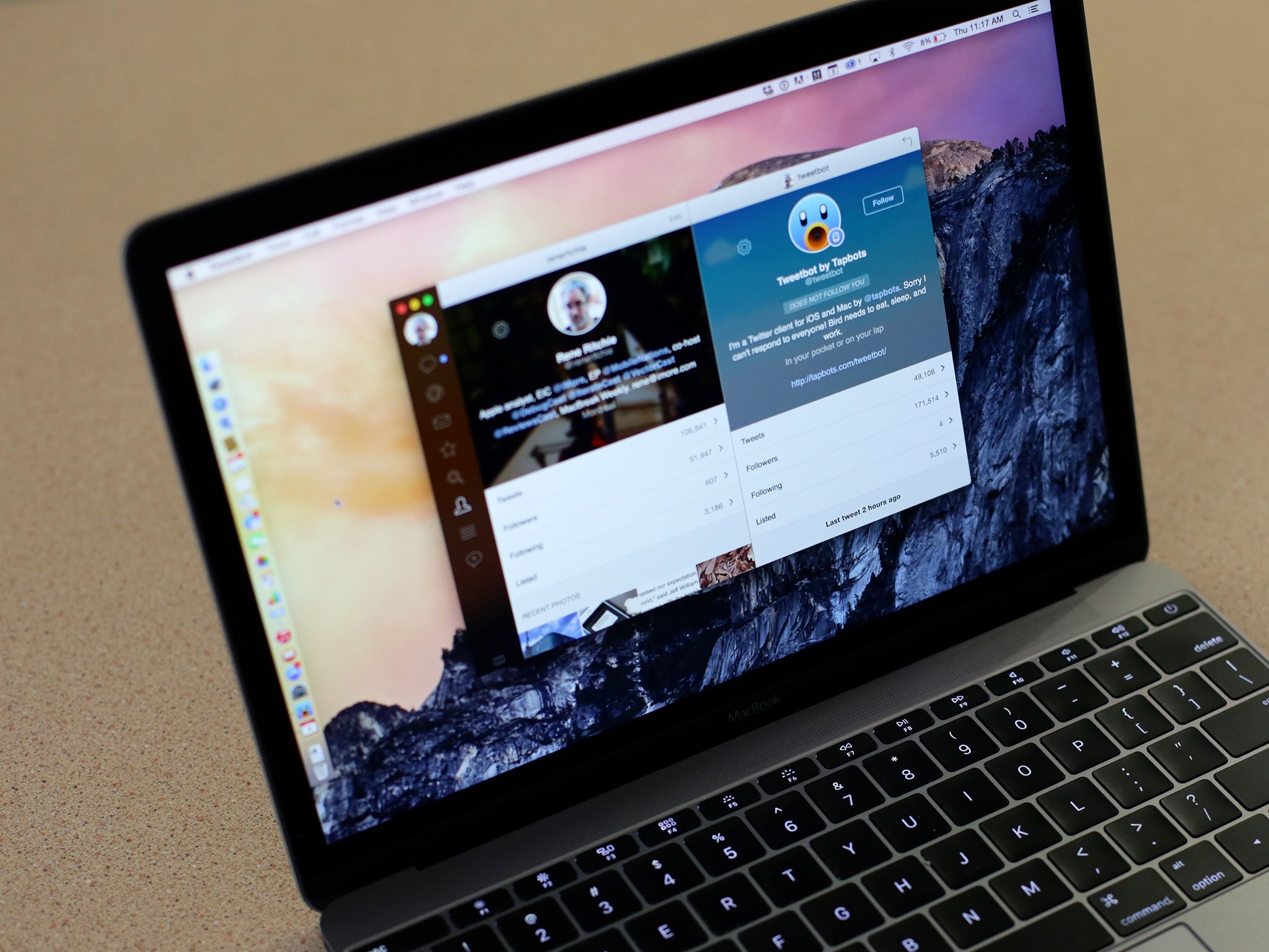
The transition from the old, richly textured look of Apple software to the current, more physical age meant a lot of designers and apps had to figure out how to translate their personality from rendered pixels to physics and animation. Tapbots and designer Mark Jardine had among the most distinctive styles of the previous era. Tweetbot 3 for iPhone showed that his skills were every bit as fierce in the post iOS-era. So how do they hold up post-Yosemite?
- $12.99 - Download now

I've been testing Tweetbot 2.0 for Mac since it went into beta, and I've gotten so used to it I had to go back and try the original version again to remind myself what it looked like. Though the spirit is very much the same, the look is all new.
It's not exactly like the iPhone version any more than Yosemite was like iOS 7. The themes and goals are similar, but the nature and needs of the Mac take priority.

Beyond design, Tweetbot 2.0 for Mac is functionally very close to Tweetbot 3.5 for iPhone.
I'm not a fan of the direction Twitter's taken their apps, and Tweetdeck feels more mechanical than human, so alternatives like Tweetbot are essential for me. The previous version was functionally okay but had fallen well out of date with the look and feel of the modern Mac. Tweetbot 2.0 fixes that.

That the redesign took so long is possibly equal parts Mark figuring out what he wanted to do, the realities of a tiny indie company with several apps to maintain and improve, and the lack of viable upgrade options on the Mac App Store forcing redesign down on the priority list.
The first two I understand completely. I want boutique, artisanal apps that are crafted and considered rather than stamped out. The last one I get but regret. There's arguably no feature as valuable as usability, and that's what design is all about. It's not something most people are willing to pay for, which makes it hard to justify the time and investment.
I'm glad Tapbots did it anyway, even if it took a while. I wish I could throw some money at them in appreciation, but they're giving this one away for free. If you own it already, simply cue the update. If not, it's well worth the current asking price. And then some.
- $12.99 - Download now

Rene Ritchie is one of the most respected Apple analysts in the business, reaching a combined audience of over 40 million readers a month. His YouTube channel, Vector, has over 90 thousand subscribers and 14 million views and his podcasts, including Debug, have been downloaded over 20 million times. He also regularly co-hosts MacBreak Weekly for the TWiT network and co-hosted CES Live! and Talk Mobile. Based in Montreal, Rene is a former director of product marketing, web developer, and graphic designer. He's authored several books and appeared on numerous television and radio segments to discuss Apple and the technology industry. When not working, he likes to cook, grapple, and spend time with his friends and family.

