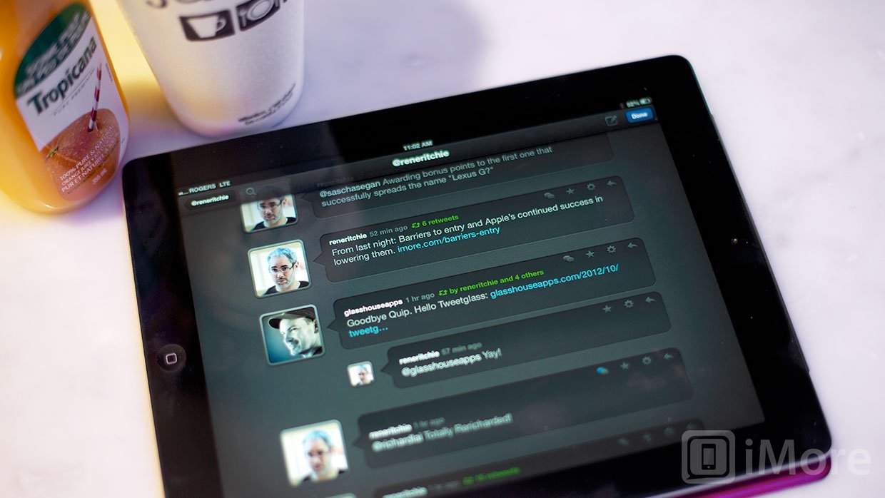
Tweetglass, the Twitter client formally known as Quip, is a an iPad Twitter app that focuses on automatically streamlining and condensing your timeline, especially when it comes to conversations. It was recently updated with streaming over Wi-Fi, list support, read-later support, performance improvements, and more.

Tweetglass features a very nice dark-themed UI that has a greater emphasis on looks than it does information density. Avatars are displayed very big with speech bubbles containing the tweets. It looks really great, but it does come at the cost of only displaying 4-5 tweets at a time in landscape orientation, six in portrait.
But the extra space between tweets isn't just for looks, it actually serves a very important purpose. For tweets that are part of a conversation, the avatars of the users that have participated in the conversation appear in the space below the tweet. It's an awesome visual cue. When you tap on a tweet that's part of a conversation, the small avatars below the tweet will move below the tweet and display their replies, in order, nested underneath the main tweet.
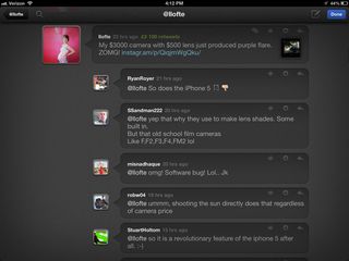
I absolutely love this approach to Twitter conversations. Many Twitter apps will display the conversations in order, but Tweetglass does it much more elegantly without changing screens. I would love to see Glasshouse apps take this idea a little further and display the replies at various nesting levels. This would make following conversations even easier.
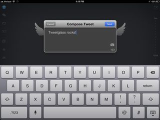
In addition to the traditional tabs that you'll find in any Twitter client, Tweetglass also includes a tab for conversations, one for retweets, and another for photos. The conversation and retweet tabs only show tweets that are part of a conversation or that have been retweeted.
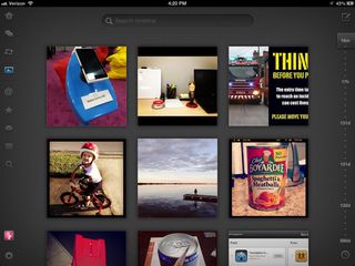
Similarly, the photos tab in Tweetglass only shows tweets that contain photos, but instead of displaying the tweets, it displays a grid of the photos. Tapping on a photo will enlarge it and display its associated tweet below it with options to view the conversation, mark as a favorite, reply, share, or reply. The design of this tab is visually nice, but the scrolling does tend to suffer since the large thumbnails sometimes have difficulty loading fast enough.
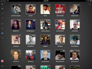
The direct messages tab takes a similar visual approach and instead of displaying a list of all the users you have direct messages with, it displays their avatars with little icons that indicate how many messages you have with that user. Because the avatars here are much smaller than the photo thumbnails in the photos tab, scrolling is a lot smoother.
The good
- Beautiful design
- Revolutionary approach to twitter conversations
- Conversations, retweet, and photos tabs
- Photos tab displays grid of photos that have been tweeted
- Direct messages tab shows grid of user avatars
- List support
- Streaming over Wi-Fi
- Auto-refresh intervals of 1, 5 or 10min (or manual refresh)
- Support for Instapaper, Pocket, and Readability
- Double-tap Message tap to mark all as read
The bad
- No light theme
- Performance has noticeably improved, but the photos tab is still a bit laggy
The bottom line
I'm a huge fan of Tweetglass and it's unique spin on a Twitter application. It's a fresh approach to a popular genre of apps and I applaud Glasshouse Apps for creating such a beauty. Tweetglass is not meant to be a primary Twitter client, but one that you browse through when you want to sit back and enjoy catching up on conversations, photos, and links from people who interest you.
$0.99 - Download now
Former app and photography editor at iMore, Leanna has since moved on to other endeavors. Mother, wife, mathamagician, even though she no longer writes for iMore you can still follow her on Twitter @llofte.
