Understanding the first generation of Apple Watch apps

Messages used to be an app I launched constantly. Now it's often something I access through Siri or, more often than not, interactive notifications from anywhere on my iPhone. Likewise, PCalc used to be an app I hunted to find amid pages of icons and folders. Now it's a widget I can swipe down at any time. Apps have been unbundled and, in large part, their functionality has been set free. No longer hidden or lost, specific interactions can now manifest everywhere — our iPhone, iPad, AirPlay-enabled TV, CarPlay-enabled dashboard, and soon, the Apple Watch.
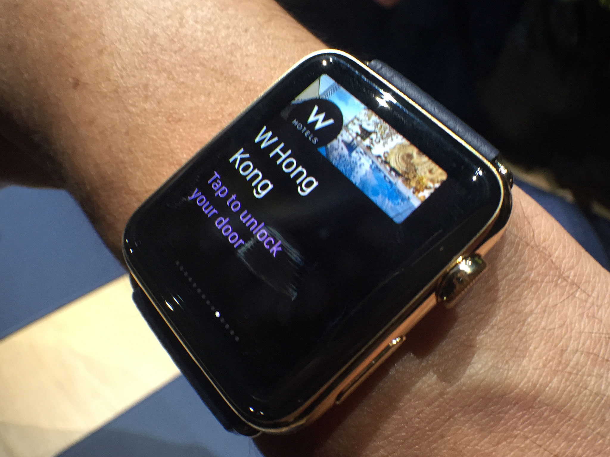
When Apple originally announced the Apple Watch back in September of 2014 all they promised in terms of third party app support was interactive notifications and widgets. When Apple delivered WatchKit, they not only had short and long looks and glances, but remote views — app-like extensions that lived on the iPhone but presented their interface on the watch as well.
Much of this was made possible by Apple's new Extensibility and Continuity features that decouple apps and interface, and sync activity across devices.
Native apps were promised as well, but for later in 2015. Apple was very careful to set expectations for the first generation of Apple Watch software. That's because there are obvious constraints, power conservation above all. But people — and writers — get excited and often forget what they have and focus instead on what they wish they had.
Understanding the constraints is going to be important, but understanding the fundamental change in what it means to interact with mobile devices is going to be even more important.
In "Keep calm and Apple Watch on" I went over the differences in the context of a user.
The Apple Watch isn't an iPhone any more than the iPhone is a Mac. Computing has moved from the server room to the desktop to the laptop to the pocket and now onto the wrist. Every time that's happened, every time it's moved to a new, more personal place, those of us who were used to it in its old place have become slightly anxious, we've become subject to our own expectational debt.
It's the same thing for developers.
Master your iPhone in minutes
iMore offers spot-on advice and guidance from our team of experts, with decades of Apple device experience to lean on. Learn more with iMore!
Making an Apple Watch app, either now or in the native-enabled future, shouldn't be the same as making an iPhone app any more than making an iPhone app was the same as making a Mac app. It shouldn't be an icon dumped on the carousel that a customer has to hunt and peck for and then struggle to use as they watch their battery life drain away before their eyes.
An Apple Watch app should be a set of functionality that manifests when, where, and as the customer needs it. Rapidly disappearing are the days where we had to go to the software. Now, the software has to start coming to us.
Sure, Apple Watch apps won't update when they're not connected to an iPhone, just like a web app won't update when it's offline. Yes, there aren't native app-style transitions or interactions, because there aren't yet native apps. All of that is known. All of that has been known since the Apple Watch was first announced. There's no surprises here. There's just opportunity.
Think it "sucks" Apple doesn't yet provide unfettered access to perfect temporal sync or animated transitions or swipes or anything else? What "sucks" worse is shredded battery life. Apple is obviously prioritizing that, so shouldn't developers as well?
It goes back to this — What is an app in the post-Apple Watch world? What functionality does it need and how can that functionality best manifest on the wrist? Maybe all that's needed is really tight notifications, maybe a really essential glance, or maybe some incredibly important interactivity. Going through that thought process — distilling what's critical on a small screen for a brief period of time — is the opportunity here.
As one developer told us:
Some see limits as a limitation rather than a chance to be creative. I love limitations as they are an easy way to stand out from the crowd. You can quote me on that.
When it comes to developing for the Apple Watch, if there's something that can't be done, think about whether it really needs doing in an Apple Watch environment. If it does, think about how you can make the constraints work for you, not against you. You might need to reconsider some long-held assumptions and evolve some habit-formed opinions, but that's a vital process for everyone to go through, especially when working on something so new.
There will be growing pains, of course. Looking back, the early iPhone web apps didn't do anywhere nearly as much as current iPhone apps, but what really talented developers managed to do even with those incredible constraints was brilliant. So to, watch apps.
I've had the opportunity to try quite a few Apple Watch apps on the Apple Watch and several of them not only impressed me — they delighted me.
I'm not deluding myself. There will be times when they're slow or fail to update, when they don't work the way I expect them to, or when I'm forced to work around them instead of with them. That still happens with phone, tablet, and computer software sometimes, of course, but I'm expecting it to happen more with the Apple Watch because it's so new. Because we're all — Apple, developers, and customers — going to need to learn what it really is and what it means.
Native apps will come, maybe extended or third-party watch faces, maybe with other things we've only begun to discuss. And one day the Apple Watch will go iPhone-free the way the iPhone went PC-free with iOS 5. (Yes, it took five years.)
For now, though, I'm not the least bit concerned that Apple Watch apps won't be iPhone apps. I already have an iPhone for that, and the definition of what it means to be an app is in the middle of a big enough transition that I'm happy the Apple Watch won't be saddled with that legacy out of the gate.
What I am concerned about is how well all the new unbundled functionality, all the short and long looks, all the glances, all the really necessary interactivity, is brought to me on my wrist. And which developers are going to be genius enough to do it first and best.

Rene Ritchie is one of the most respected Apple analysts in the business, reaching a combined audience of over 40 million readers a month. His YouTube channel, Vector, has over 90 thousand subscribers and 14 million views and his podcasts, including Debug, have been downloaded over 20 million times. He also regularly co-hosts MacBreak Weekly for the TWiT network and co-hosted CES Live! and Talk Mobile. Based in Montreal, Rene is a former director of product marketing, web developer, and graphic designer. He's authored several books and appeared on numerous television and radio segments to discuss Apple and the technology industry. When not working, he likes to cook, grapple, and spend time with his friends and family.


