What's new for CarPlay in iOS 10.3

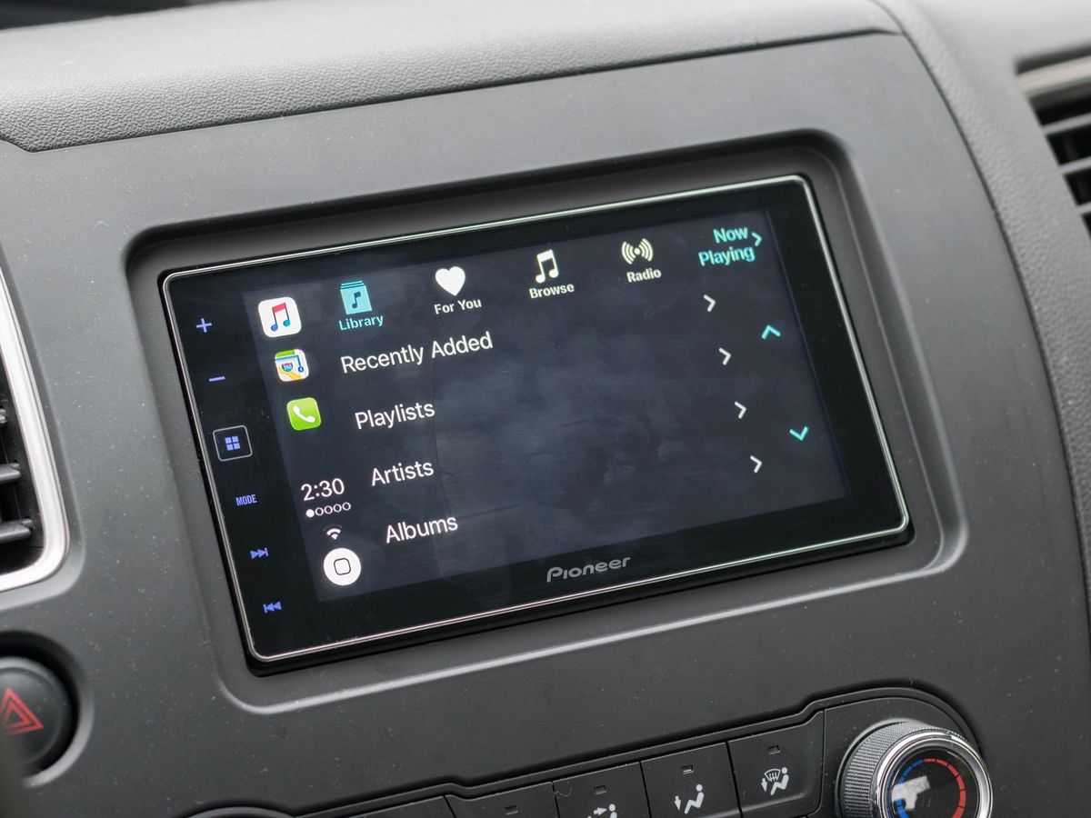
While there aren't a lot in the way of shiny new features in iOS 10.3, the update does bring a nice addition for CarPlay users: Apple has added a quick app switcher to the in-dash system in iOS 10.3.

In CarPlay on iOS 10.3, Apple has moved the clock and wireless status indicators from the center of their side of the display to the bottom corner of that side. This leaves room for three car app icons to appear on that side as well, but in the top corner. The top icon will be your current app, while below that will reside your two most recent apps. Just tap the icons to jump between the apps.
This is a welcome change for CarPlay users. In iOS 10.2 and before, if you wanted to switch between apps, you needed to tap the virtual Home button and choose an app. You might even have needed to swipe to the next Home screen to find the app you're looking for. All of this wastes time and is, more importantly, distracting. Many drivers only need to switch between apps like Maps and Music in any case, so this new system will make that easier, and will hopefully lead to safer driving overall.
Master your iPhone in minutes
iMore offers spot-on advice and guidance from our team of experts, with decades of Apple device experience to lean on. Learn more with iMore!
Joseph Keller is the former Editor in Chief of iMore. An Apple user for almost 20 years, he spends his time learning the ins and outs of iOS and macOS, always finding ways of getting the most out of his iPhone, iPad, Apple Watch, and Mac.

