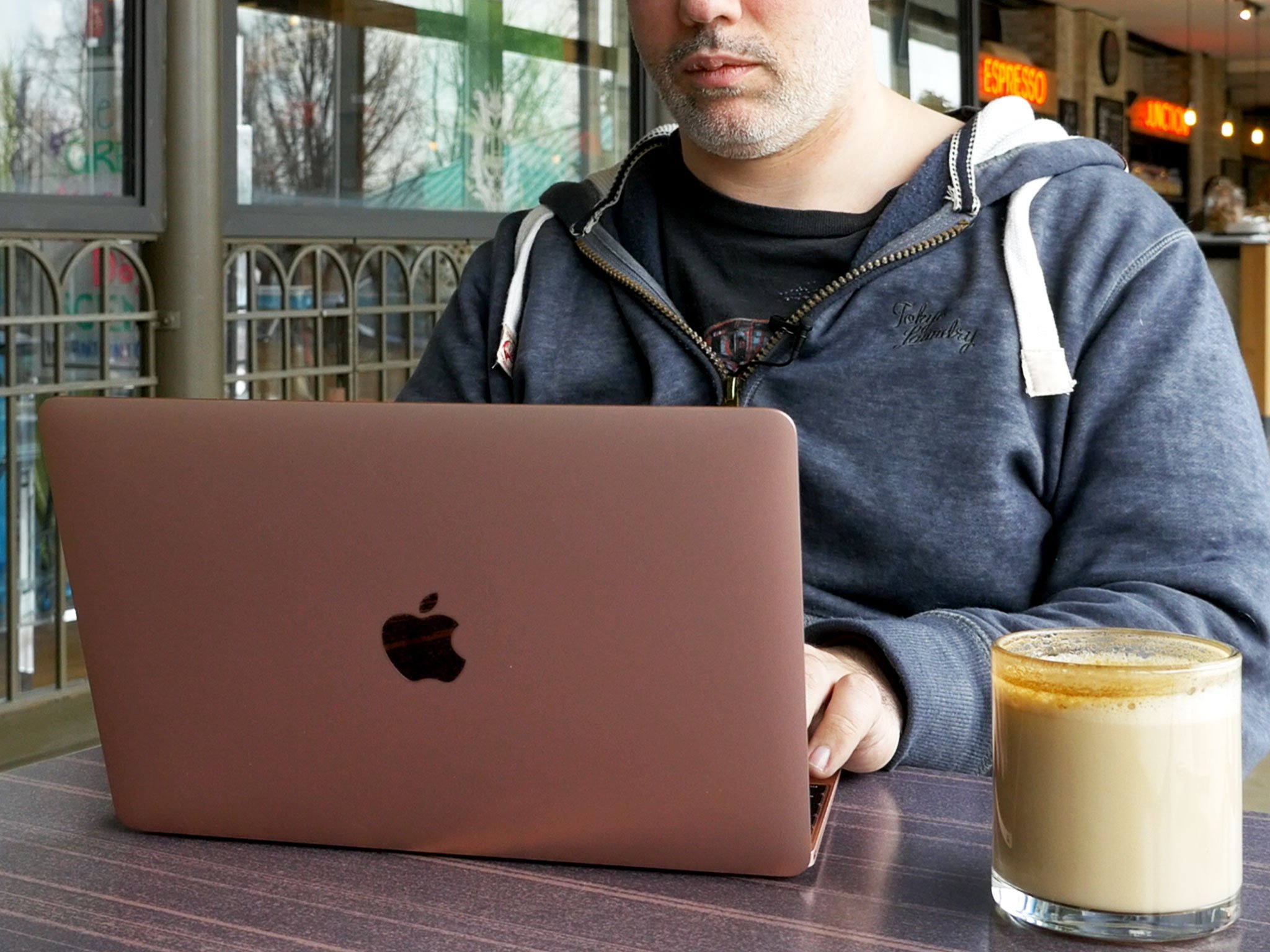
2016 update
The 2016 MacBook has a new rose gold finish, Intel's new Core M "Skylake" processor, and faster flash storage. Rather than simply list out the changes, I'm updating the original review to include them. That way, if you're thinking about buying a 12-inch MacBook today, you still get the full picture. If all you want is the updates, though, you can jump right to them:

When The Terminator first arrives in our time, it's naked. The lesson learned is this — you can have the future right here, right now, You just can't have anything extraneous along with it. So too, the new — and now newly updated — 12-inch MacBook.
Every few years Apple likes to redefine what it means to be a laptop. The company has done it with plastics and metals, by passing around unibodies and pulling them out of envelopes. Drives have come and gone and so have ports. With this latest 12-inch MacBook, even the constants of screen, keyboard, and trackpad have changed. They've gone Retina, butterfly, and Force Touch respectively. Each of the changes represent a relentless desire to drive technology forward. The only question is whether or not those changes, and the MacBook itself, are suited for you today?
12-inch MacBook Video Review
Rather watch than read? Give us just under three minutes and we'll give you the newly updated 12-inch MacBook.
For people who want:
- Simplicity and ultra-portability.
- Fanless, noiseless operations.
- Tomorrow's technology today.
- Premium experience over price.
Not for people who want:
- High-performance processors or graphics.
- A large number and variety of ports.
- Deep, clackity keyboards.
- Low, low pricing.
In brief
For years people have been asking for a Mac that was more like an iPad. Well, here it is. Still not a touchscreen, still running OS X, and with a price as cutting edge as its technology. But as mobile as an iPad in all the ways that matter.
12-inch MacBook Design
Picking up the new 12-inch MacBook makes one thing instantly clear — you're holding something new. It's not the first time Apple's pulled this trick, and we really should have come to expect it by now, but when you see how clean the lines are, how gorgeous the finishes look, how strong and yet light the unibody feels, it resets the bar and makes everything else instantly feel chunky, wobbly, and old.
It does take some getting used to, though. The first few times I picked up the new MacBook I found myself accidentally depressing keys — there's almost no bezel on the sides. After a few stray deletions, tabs, quotes, and slashes, I switched to grabbing it lower down, at trackpad level, or from underneath.
When you do hold it, you get a palpable sense of just how small the new MacBook really is. It weighs 2 pounds. That's about the weight of the original iPad with a case on it. It's also only 13.1 mm thick. That makes the MacBook the lightest, thinnest laptop Apple has ever sold, and for everyone who remembers Steve Jobs sliding the original MacBook Air out of an envelope, that's saying something.
More remarkably, the thinness and lightness doesn't come at the price of solidity. The new MacBook is still a unibody, like the last major MacBook redesign, and still comes with all the structural benefits of being formed from a single piece of aluminum. It is, however, a new and improved unibody.
Here's how it looks compared to Apple's 13-inch MacBook Air and Pro.
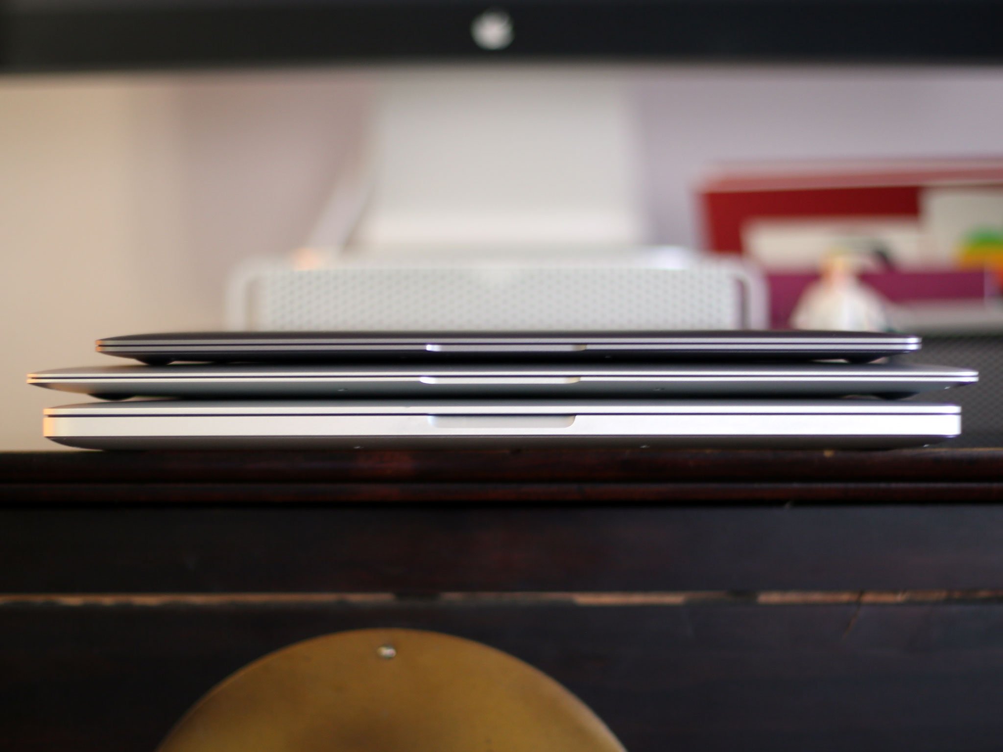
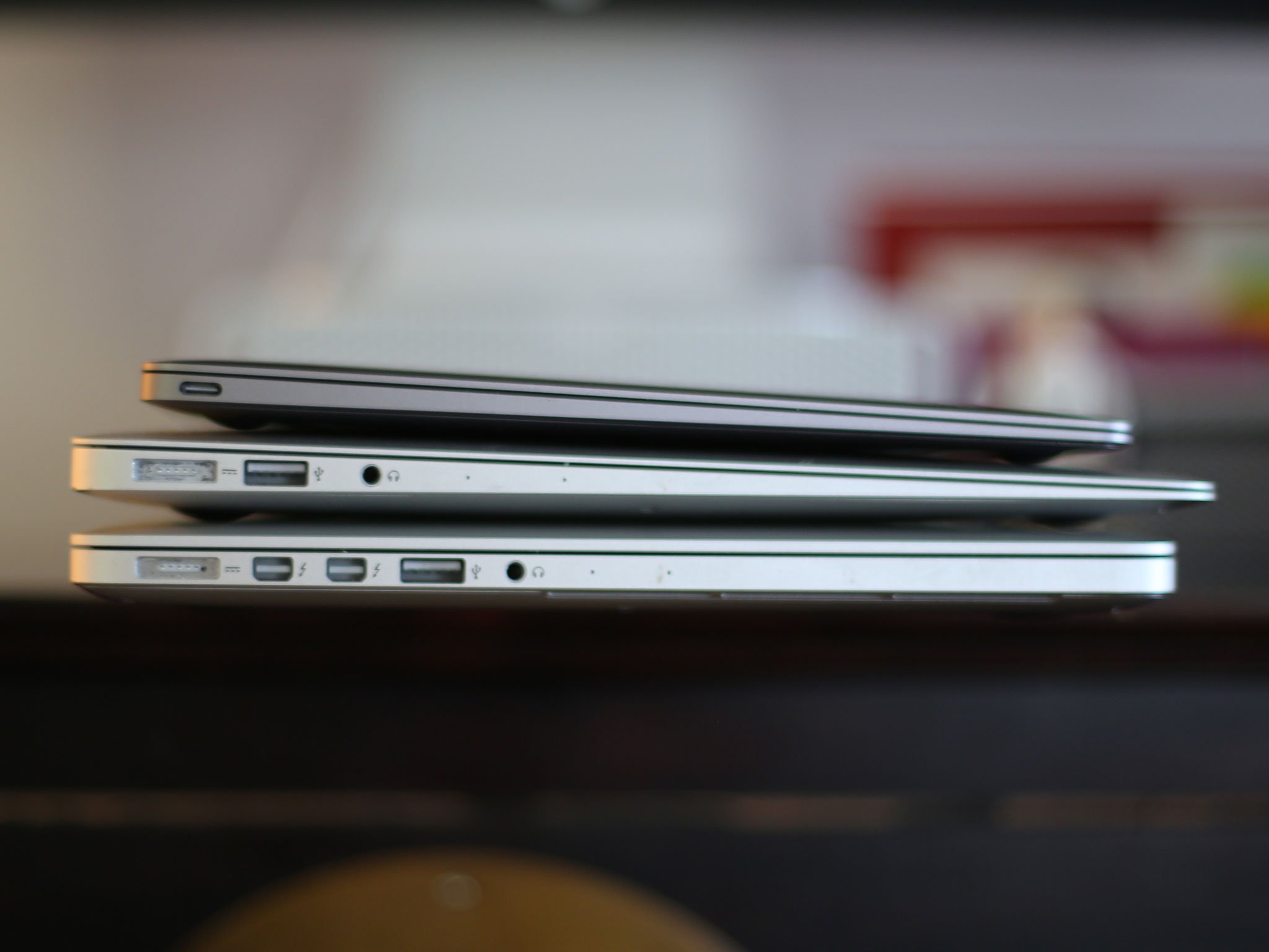
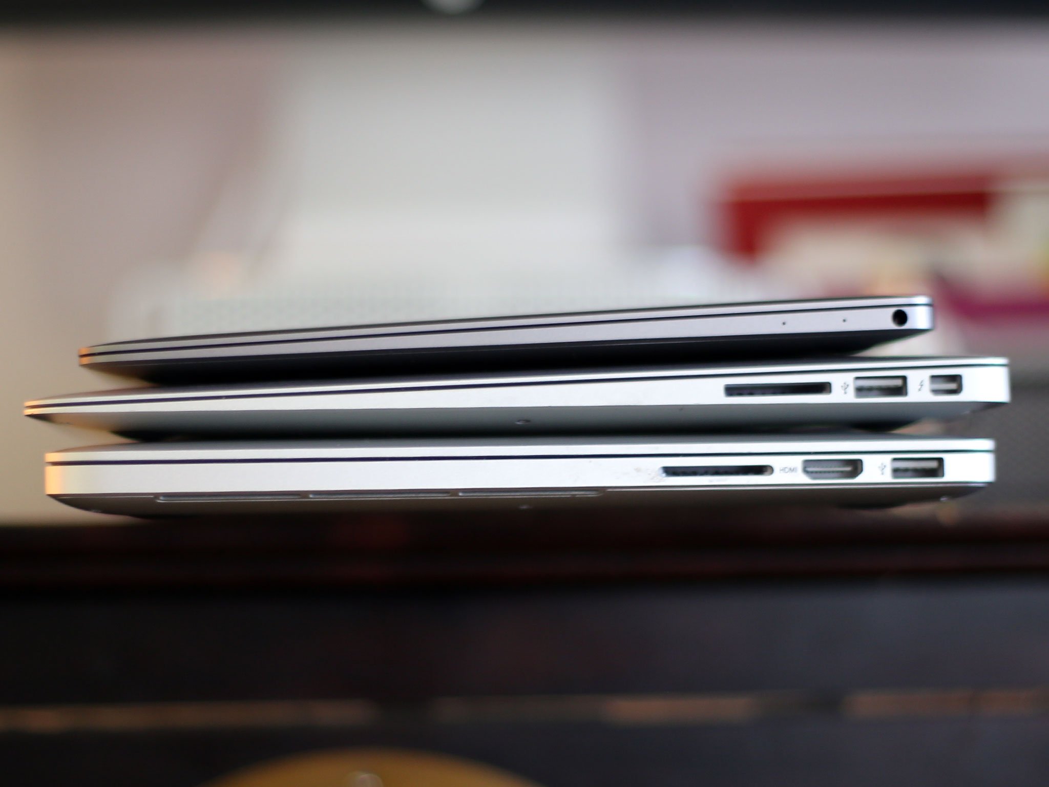
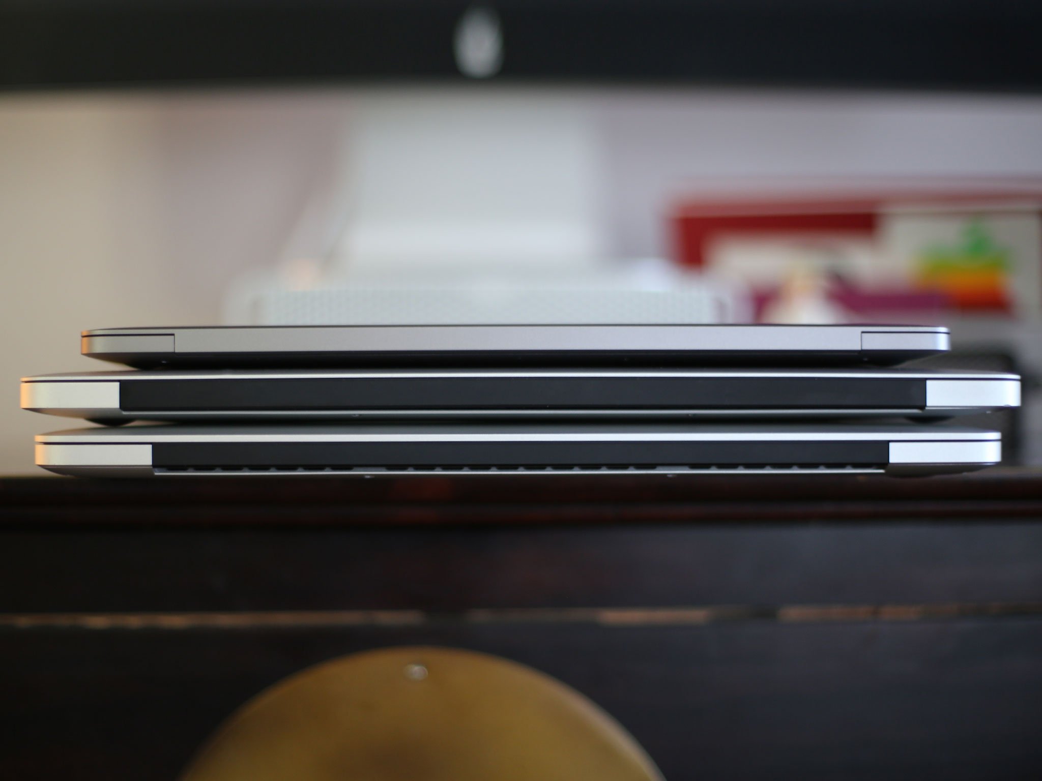
It's smaller than both those machines, obviously, but the 12-inch MacBook also manages to look smaller than the 11-inch MacBook Air as well.
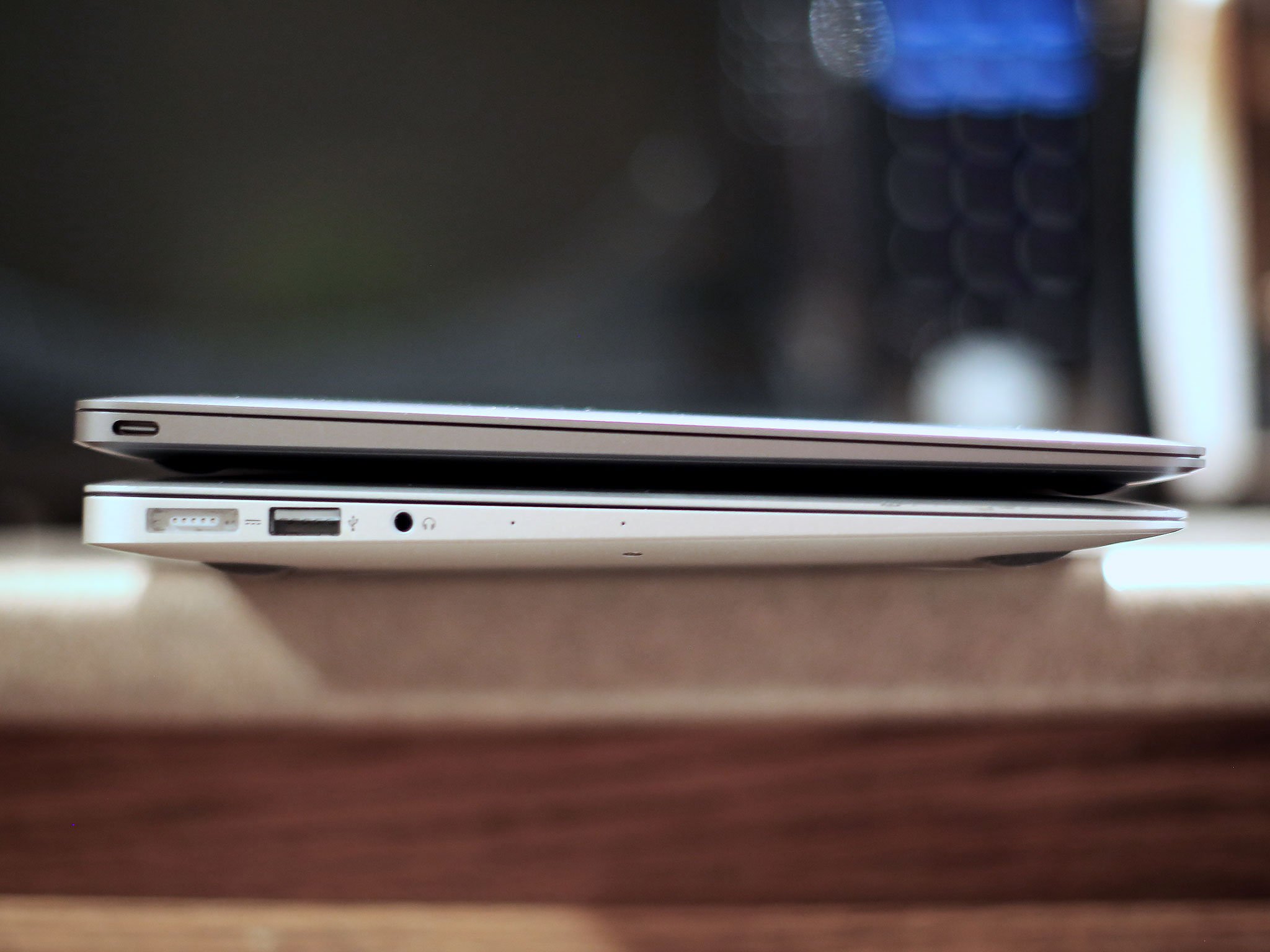
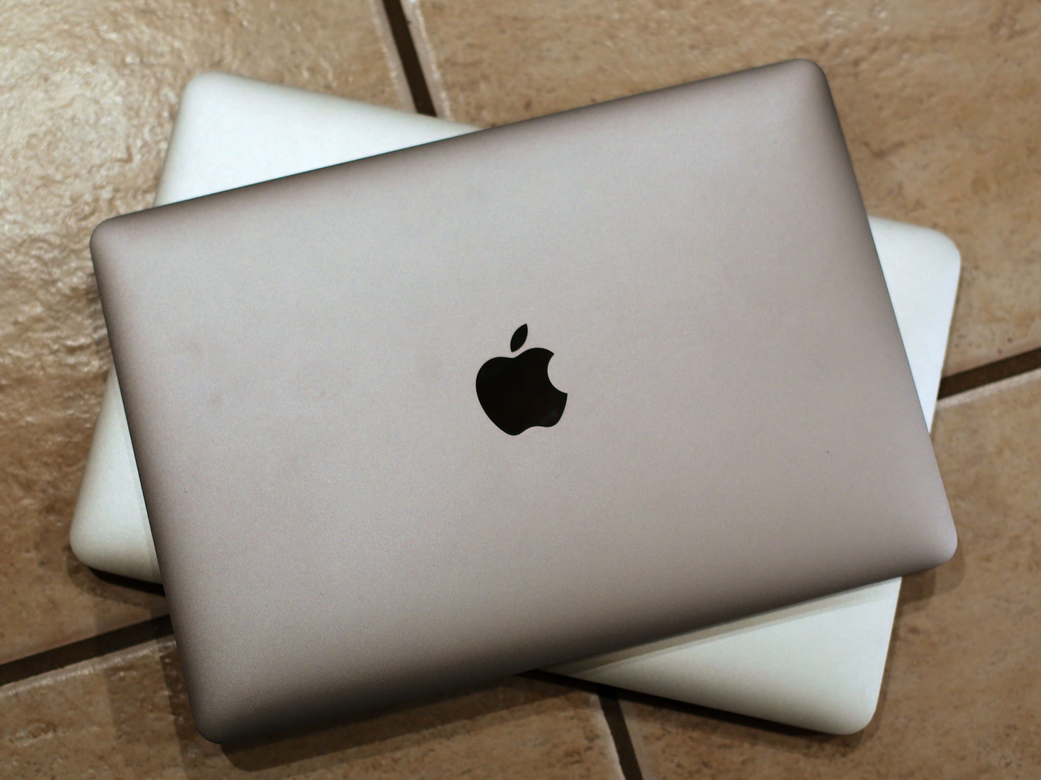
The differences are easy to see. Gone is the plastic that used to cover the hinge on the back, for example; it's metal now all the way up. That makes the MacBook feel even more like a singular object.
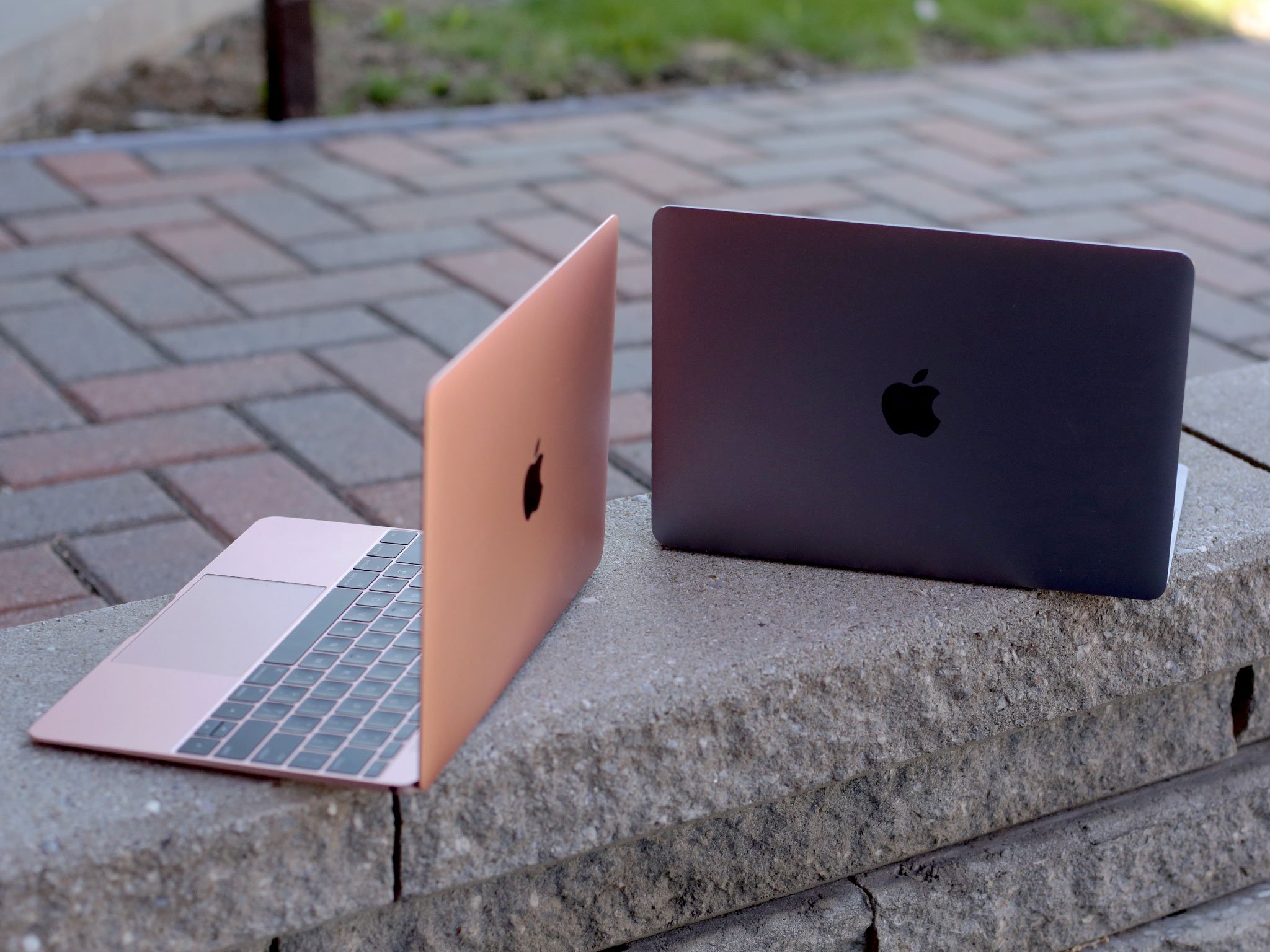
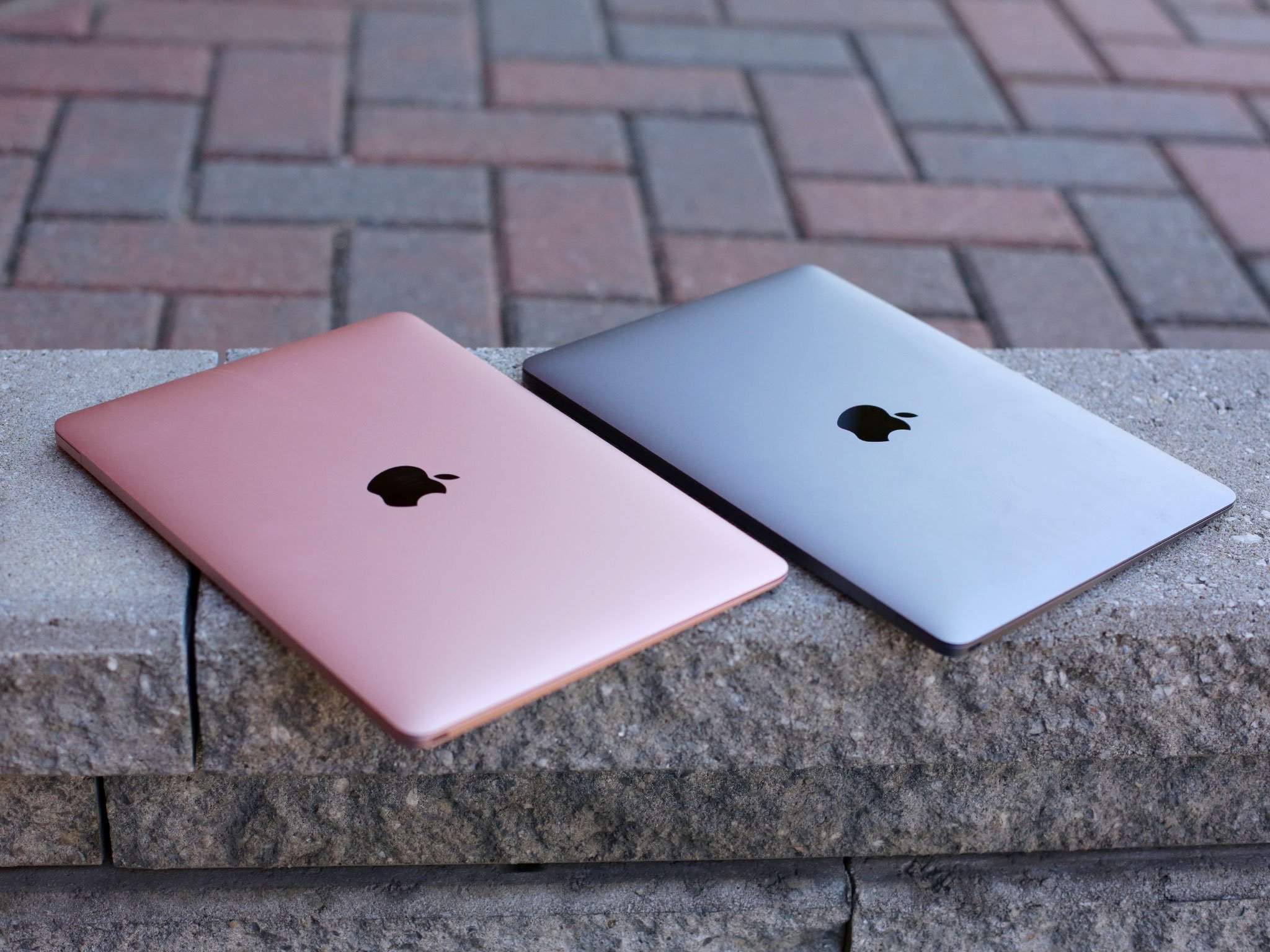
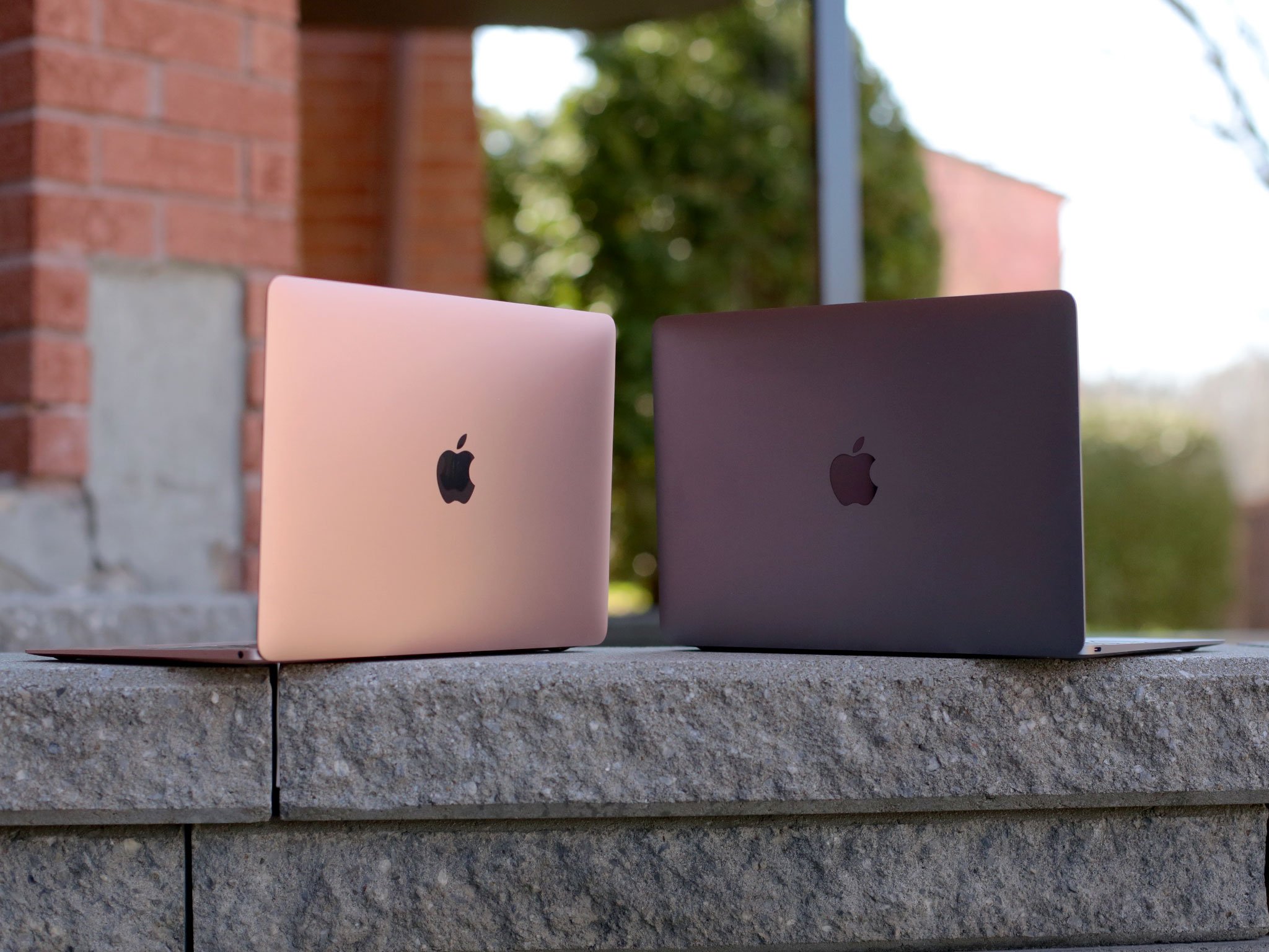
The all-new anodized aluminum finishes make it look that way as well. They're available in all the same colors as iPhone and iPad, including space gray, silver, gold, and — new for 2016 — rose gold.
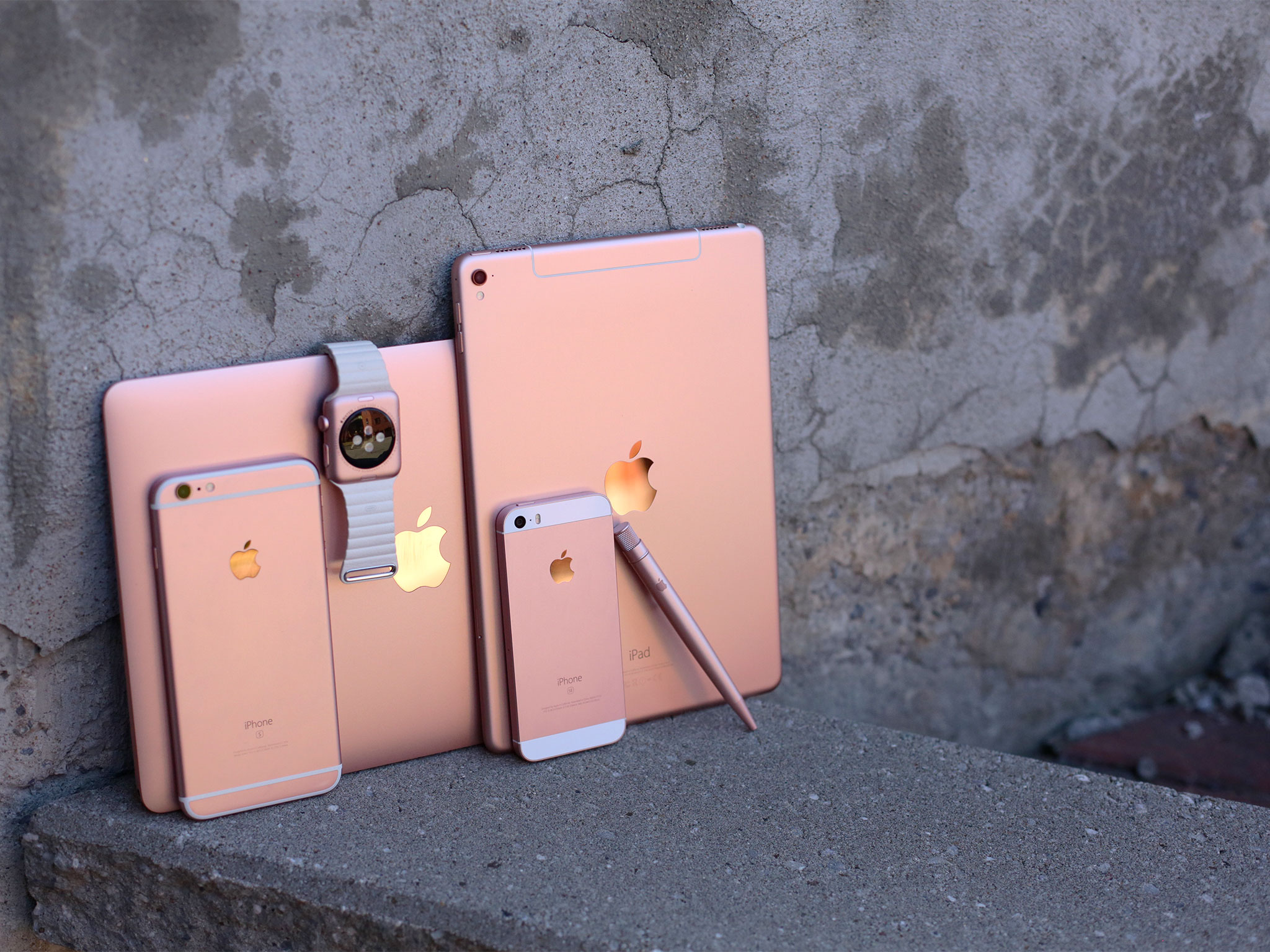
All the rose gold
Rose gold debuted with iPhone 6s and Apple Watch sport and this spring came to the 9.7-inch iPad Pro and MacBook as well. Depending on the light, it can look more rose — read: pink — more gold, or even more copper or silver. And it stands out, considerably against the drab plastics that continue to plague laptop cases everywhere, but even against other Apple finishes.
Maybe we'll see metallic blue or purple one day as well. For now, though, if you want everyone to know you have the latest and greatest MacBook, you want rose gold.
The overall effect, at the risk of further abusing the metaphor, is something that looks even more like it was poured from liquid metal. It's practically seamless. It's like an iPad.
The screen bezel is black glass like the MacBook Pro, not aluminum like the MacBook Air. It's minimal but not as minimal as television sets and some competing laptops.
There's also a speaker grid now between the screen and the keyboard. It looks fine, as arrays of what I imagine must be laser hewn dots go, and it sounds fine too. More than fine, actually. Compared to the Air, it's loud.
The word "MacBook" appears at the bottom, something Apple has stopped doing with the more recent MacBook Pro iterations. I'm still not sure if I consider it a regression or not. It's classic but also clutter. If Apple ditched it here too, I wouldn't miss it.
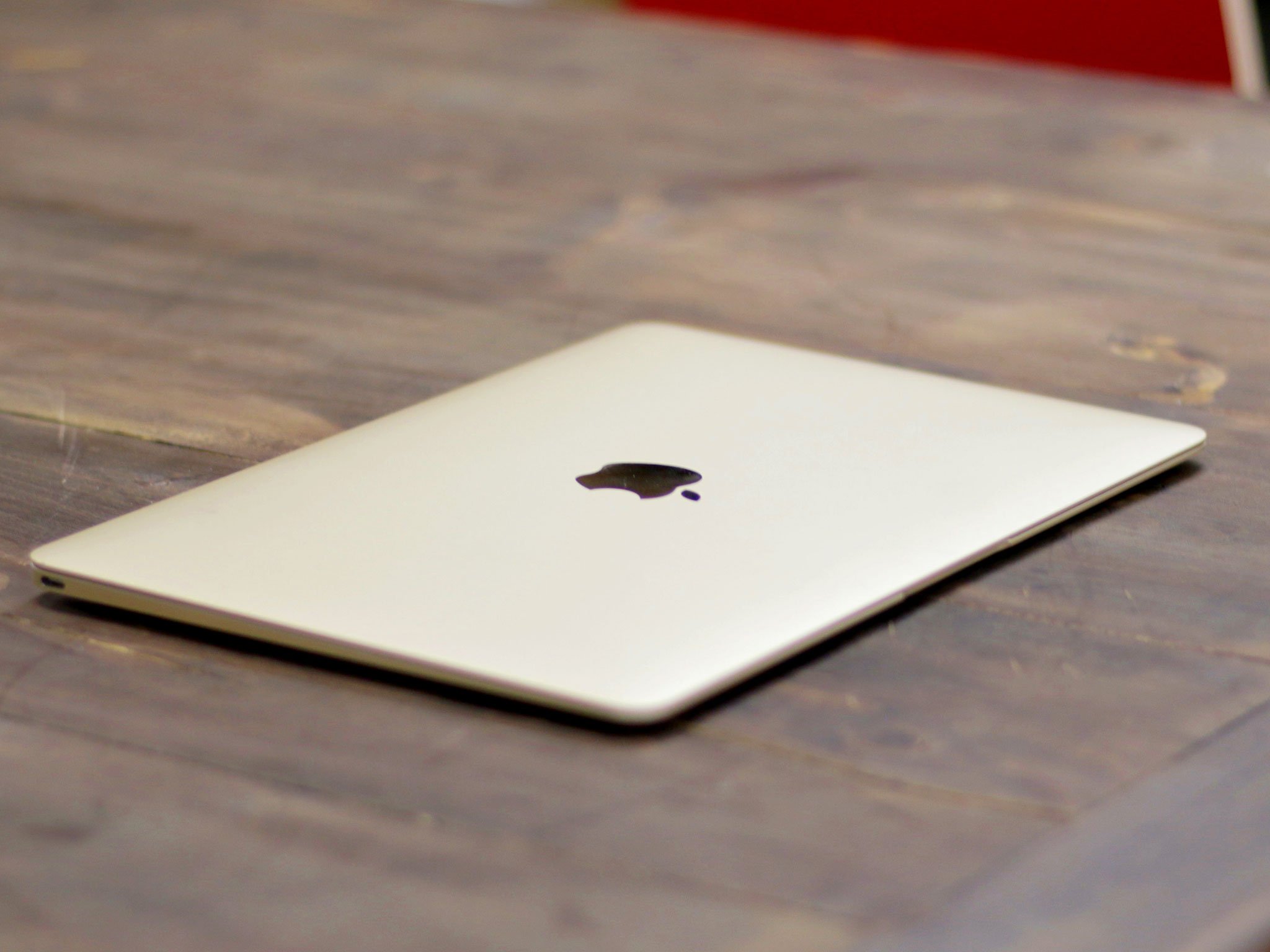
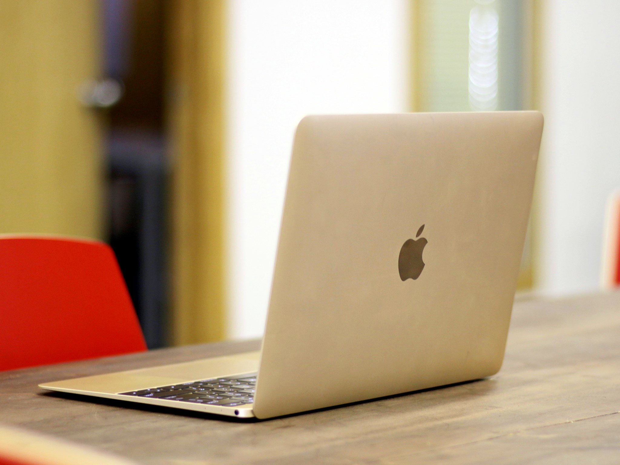
Gone also is the glowing Apple logo on the back. The sight of it everywhere from coffee shops to the State of the Union to Microsoft's media events was impossible to miss, like a Bat-signal. Instead, it has an inset logo, polished like the iPhone 6s and iPad Air Pro. It looks great, and I find myself oddly unsure now if I'll really miss the glow.
Everything else about the new MacBook looks and feels great. I called it a redesign before but it's really something closer akin to a refinement. It's absolutely a MacBook in every way, but where the Air always seemed flattened out, the new MacBook seems truly distilled down. Apple isn't bumping up against the constraints of technology any more as much as they are the physical size of the human interfaces — the keyboard and display.
And for an ultra-portable, that's the ideal.
12-inch MacBook Retina display
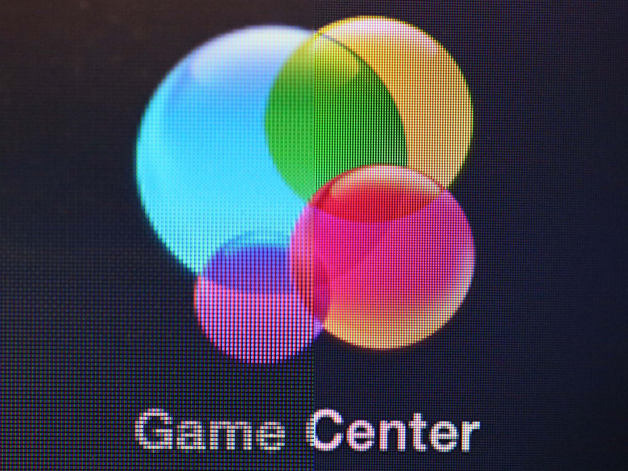
The new MacBook sports a 12-inch, 2304x1440 pixel, 226 ppi, 16:10 aspect ratio Retina display. Apple uses the marketing term "Retina" to classify a pixel density that, when looked at from a typical viewing distance, renders the pixels practically invisible. That means the grid of dots that make up the screen disappear and only the content remains — crisp text, clear pictures, and sharp interface elements.
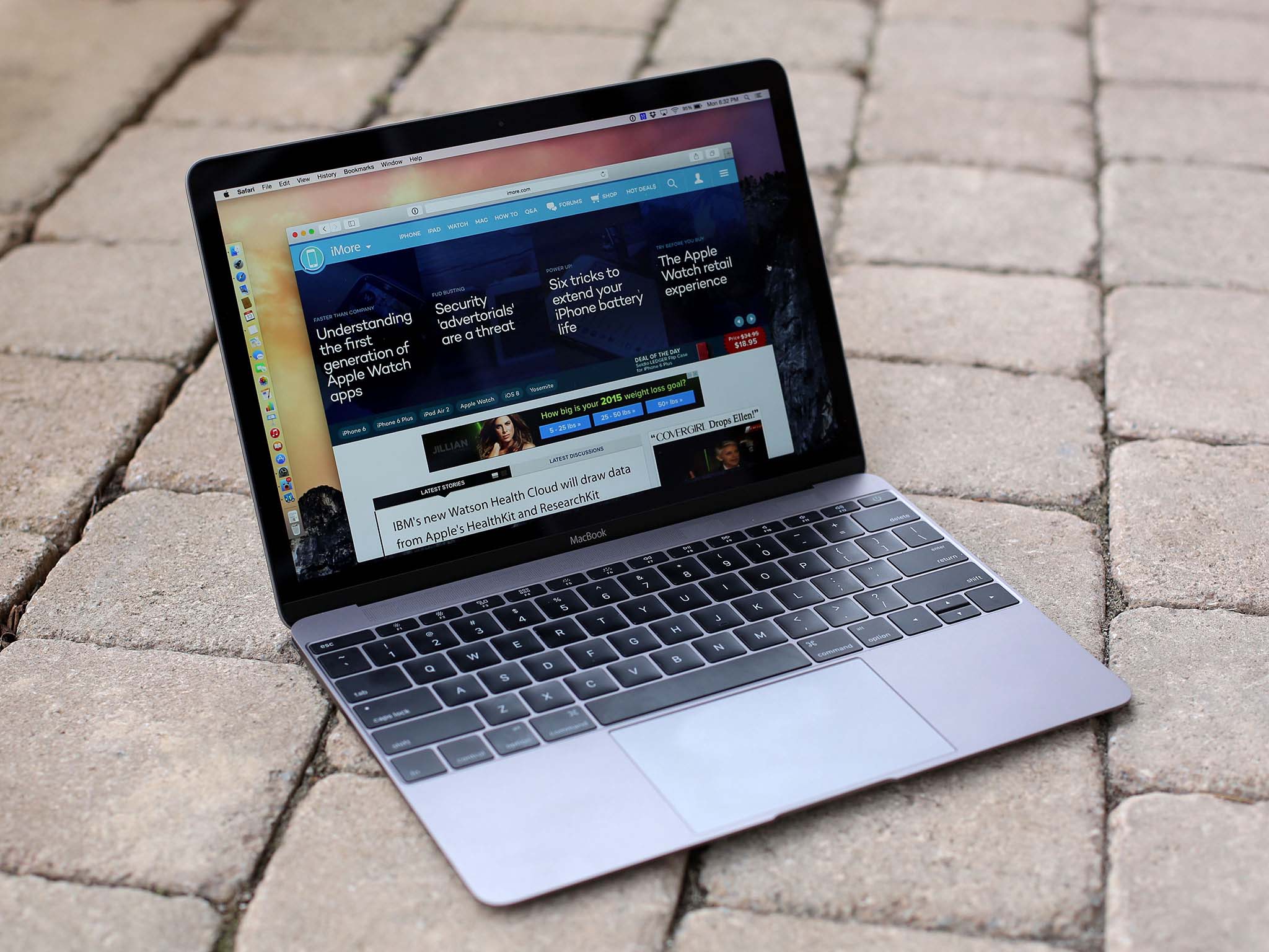
Apple introduced Retina with the iPhone 4 in 2010 and first brought it to the Mac in 2012 with the 15-inch MacBook Pro. The 13-inch Pro followed shortly thereafter and, in October of 2014, to the 27-inch Retina 5K iMac.
The Retina display on the MacBook looks stunning. It's of the new generation where it almost looks better than real life. The colors are deep and true and the blacks as inky as LCD (liquid crystal display) can deliver.
The display on the MacBook looks stunning. It's of the new generation where it almost looks better than real life.
To achieve that quality at this thinness, Apple redesigned the pixels to create a wider aperture. That allowed the company to use low power LED (light emitting diodes) backlighting for 30% better energy efficiency at the same brightness level as previous displays.
When Apple first announced the new 12-inch display, I was nervous. I've never been able to use an 11-inch MacBook Air because it's 1366x768 display simply didn't provide enough screen real estate for me, especially vertically.
With a typical Retina display, 2304x1440 pixels would work out to 1152x720 points — four Retina pixels for every point. That would be even less screen real estate, especially vertically.
But Apple's not doing a typical Retina display here. They're doing what they did with the iPhone 6 Plus — rendering it larger and then scaling it to fit the screen.
By default you get 1280x800. That's the same default as a 13-inch MacBook Pro.
Like all Retina Macs, however, you can go into System Preferences and switch to a scaled mode. Options for bigger text include 1024x640 and the truly native 1152x720. The option for more space is 1440x900.
Here's what the pixel count differences look like for the scaled modes, from left (larger text) to right (more space):

And here's what the different densities look like on screen, again from left (larger text) to right (more space):

If you have incredibly sharp vision, you might notice the scaling in either standard or more space mode. I don't and I don't. What I do notice is the real estate it gives me.
You can't scale to 1680x1050 like you can a Retina MacBook Pro, but 1440x900 is still as much as you get with a 13-inch MacBook Air. And you get them in Retina.
Here's how the 13-inch MacBook Air's standard pixels compare to the MacBook's Retina pixels:
Here's how the default pixel count of the new MacBook compares to the rest of Apple's current laptop lineup. From left: MacBook Air 11-inch, MacBook Air 13-inch, MacBook, MacBook Pro 13-inch, MacBook Pro 15-inch.

And just for fun, here's how it compares to the rest of Apple's Retina display lineup. From left, Apple Watch (48mm, 38mm), iPhone (iPhone 6 Plus, iPhone 6, iPhone 5s), iPad (12.9-inch iPad Pro and all other iPads), MacBook, MacBook Pro (15-inch, 13-inch), Retina 5K iMac.

The end result, for me, is that where the 11-inch MacBook Air felt cramped, the new MacBook has as many pixels as a Pro but in a package almost as small as the smallest Air.
It's the best of both worlds.
12-inch MacBook FaceTime camera
There's another compromise that comes with the thinness of the new display casing: The FaceTime camera. Cameras need depth and, at 0.88 mm, the MacBook has precious little to offer. That's led the FaceTime camera to regressed back down to 480p. That's the non-interlaced resolution equivalent of an old, pre-HD television.
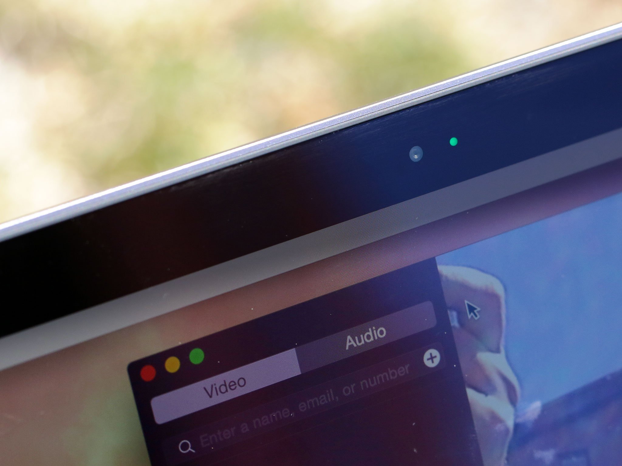
It's the one area where the new MacBook feels like something from the past rather than the future. I rarely use the FaceTime camera — I'm not a Photo Booth kind of person — and when I do I care more about communication than quality. But I'm not everyone, and I know some care about FaceTime camera quality a great deal.
That's why I hope Apple engineers figure out a way to keep the thinness and bring the camera back to 720p or, frankly, 1080p by now. An iPhone 6s or 9.7-inch iPad Pro bump is on option. And personally, I'd be fine with that.
12-inch MacBook Keyboard
Some people like deep, clickety clackety keyboards. An entire cottage industry has cropped up to support those who still miss the Apple Extended II. I'm not one of them. For me, the less travel and the more gravity can power my typing process, the better. That's the reason I've always liked Apple laptop keyboards, and why I like the new MacBook keyboard.
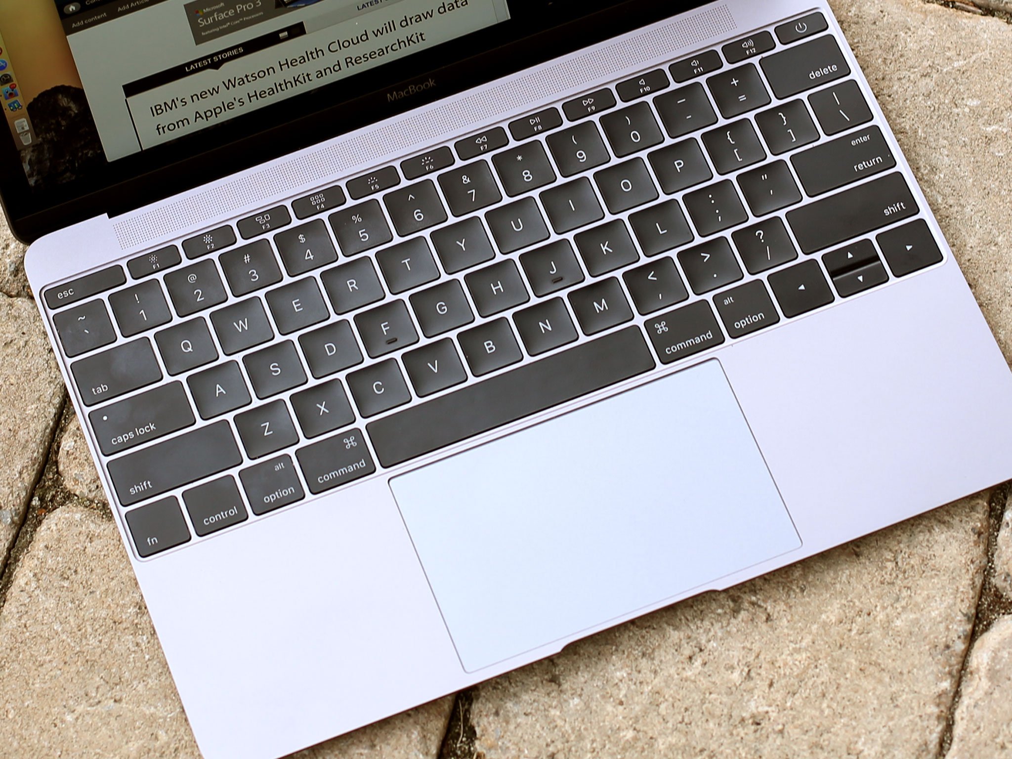
Because the new MacBook is so thin, Apple has had to engineer its shallowest keyboard ever. The company did this, in part, by creating a new kind of keyboard mechanism — the butterfly.
Previous MacBook keyboards used a scissor mechanism. It was great but it was also like a teeter-totter — if you pressed closer to the edge of a key than the center, the key wouldn't just depress, it would tilt. The new butterfly mechanism, which incorporates a stainless steel dome switch, moves as a single unit. If you hit an edge it feels like you hit dead center.
Apple says the new butterfly mechanism is 40 percent thinner than the old scissor one, yet four times more stable. At the same time, the company has increased the surface area of each key by 17% and deepened the "scoop" by 50 percent.
All together, it takes some getting used to. I spent about an hour typing away before it started feeling normal. But then I could type as quickly and easily on the MacBook as I could on my 13-inch MacBook Pro. In fact, when I switched back briefly to make sure, it was the MacBook Pro keyboard, keys titling every few strokes, that felt a bit weird.
It's freakish how the mind adapts.
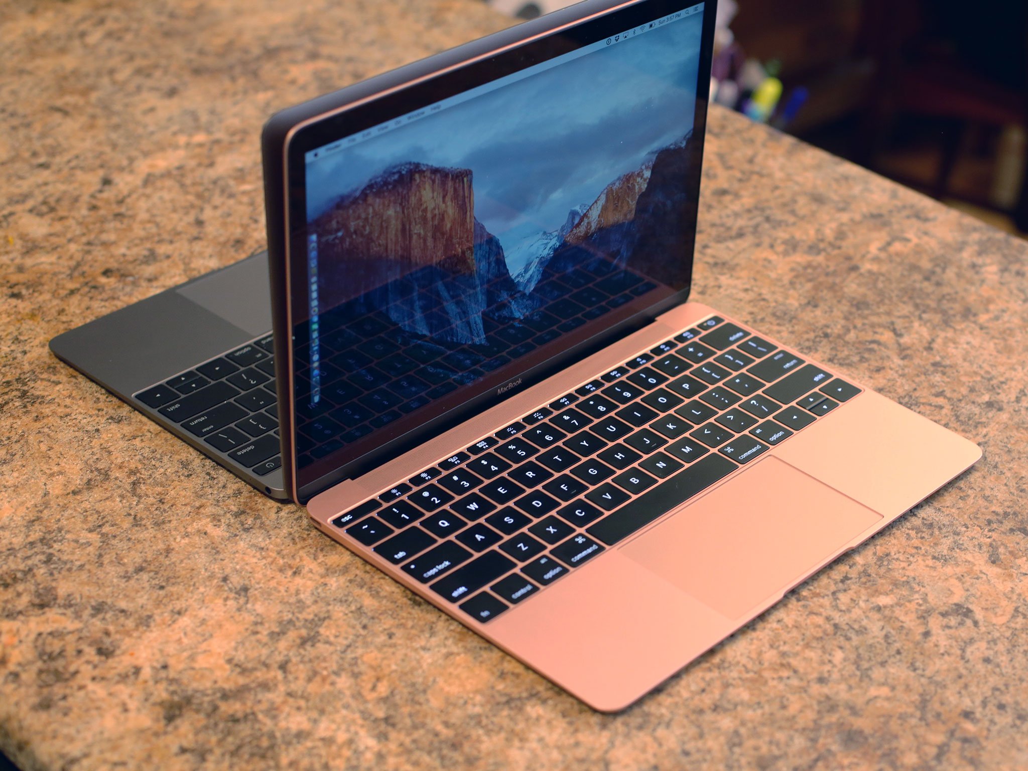
There are a few oddities. The escape key looks strangely elongated and the left and right arrow keys are now full height even as the up and down arrow keys remain half-height. The former I've barely noticed, the latter I'm still getting used to.
Also, the backlight now consists of individual LED for each key. That creates better uniformity and prevents light leakage from around the sides. It makes for a very crisp, very clean look.
Again, those who love big, unabashed keyboards with tons of travel might not like this new, ultra-thin MacBook keyboard one bit. But I love it and hope to see it in many more Macs to come.
Until, of course, it's replaced by a Force Touch...
12-inch MacBook Force Touch trackpad
Apple showed Force Touch first on the Watch, but shipped it first on the 12-inch MacBook. Since then, it's spread to the 13-inch MacBook Pro, the Magic Trackpad 2, and even the iPhones 6s as 3D Touch — which, of course, has a trackpad mode. In all its various forms, it's bewilderingly brilliant.
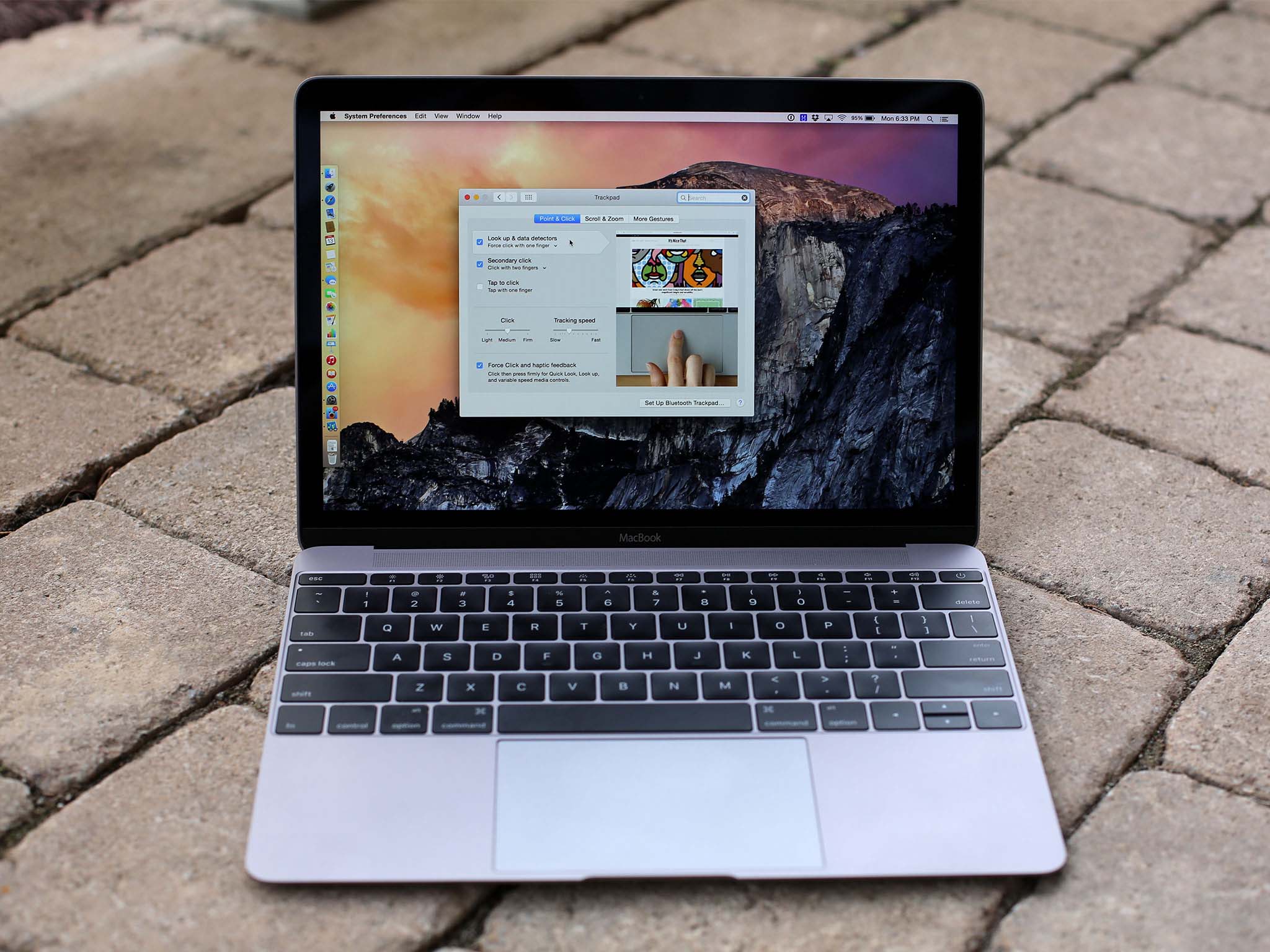
When you first start using the Force Touch trackpad, it makes you think physics is a lie, or that maybe your fingers are simply liars. Turn the new MacBook off and the trackpad feels like a solid, dead part of the unibody with no clicking mechanism or movement to it at all. Turn it on, however, and the trackpad comes alive. You can click on it the way you've clicked on any previous trackpad, but across the entire range of its surface, not just the bottom. What's more, you can click, then click deeper, then click deeper still.
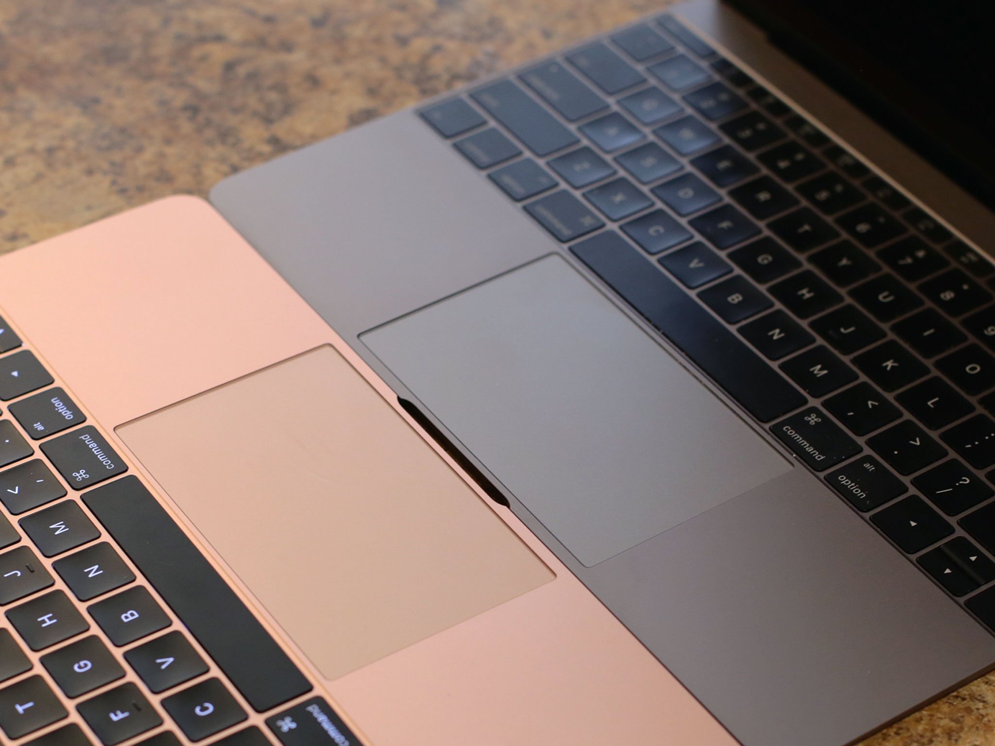
In other words, when on, the Force Touch trackpad on the MacBook (right) not only feels almost indistinguishable from the mechanical trackpad on something like the MacBook Air (left), because you can click just as easily top or bottom it feels better.
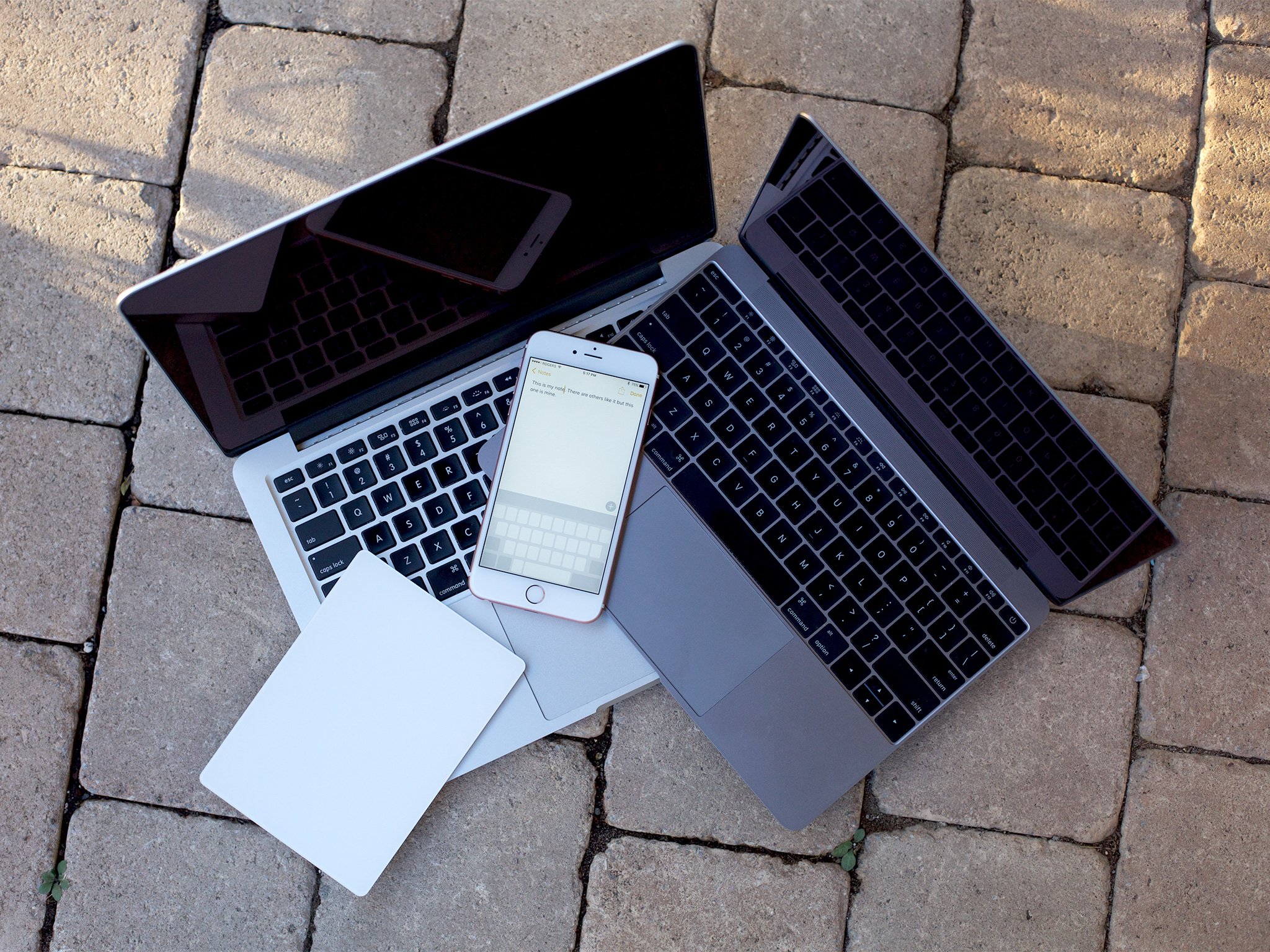
Thanks to four touch sensors, the new MacBook trackpad can sense how much pressure you're using when you press down on it. Thanks to the electromagnetic "Taptic Engine", the trackpad can then return a feeling to match that level of pressure.
Moving the mechanics out from under the trackpad means Apple can make thinner devices — no more vertical headroom needed for a physical button. Moving to Force Touch, though, means Apple can also do a whole lot more.
How to use Force Touch
Force Touch makes the Mac even more convenient. Once you set it up to your liking, you can press to click — and press harder to Force Click — in a wide range of apps and for a wide range of effects.
The crude explanation is that the trackpad is returning horizontal force that your fingers are interpreting as vertical. As proprioceptive illusions go, it's a doozy. How it's being done, however, fascinating as the science truly is, won't be what matters to most people. That it's being done and successfully will be what matters — because most of us won't even notice the difference.
For example, press down on a neutral location and you'll feel a click. Press harder and you'll feel a second "force click". Apple has hooked the Force Click into Quick Look, Look Up, Data Detectors, media scrubbers, pressure sensitive drawing and writing, zooming, and more.
I've joked with our tech team that I'd love force touch to work with our content management system so that if I press really hard, all the text turns to ALL CAPS as it publishes. That way I can not only write, but WRITE ANGRY.
12-inch MacBook USB-C and ports
The MacBook includes a USB-C cable and a 29-watt power adapter, so you can plug it into a wall to charge the same way you would an iPad. Also like an iPad, you could also plug it into an external battery pack and charge that way. In addition, you can transfer data at up to 5 Gpbs over USB (or ethernet with a USB adapter) and power an external display using a DisplayPort 1.2 (with an HDMI or VGA adapter). All in an ambi-copular package 33 percent the size of standard USB.
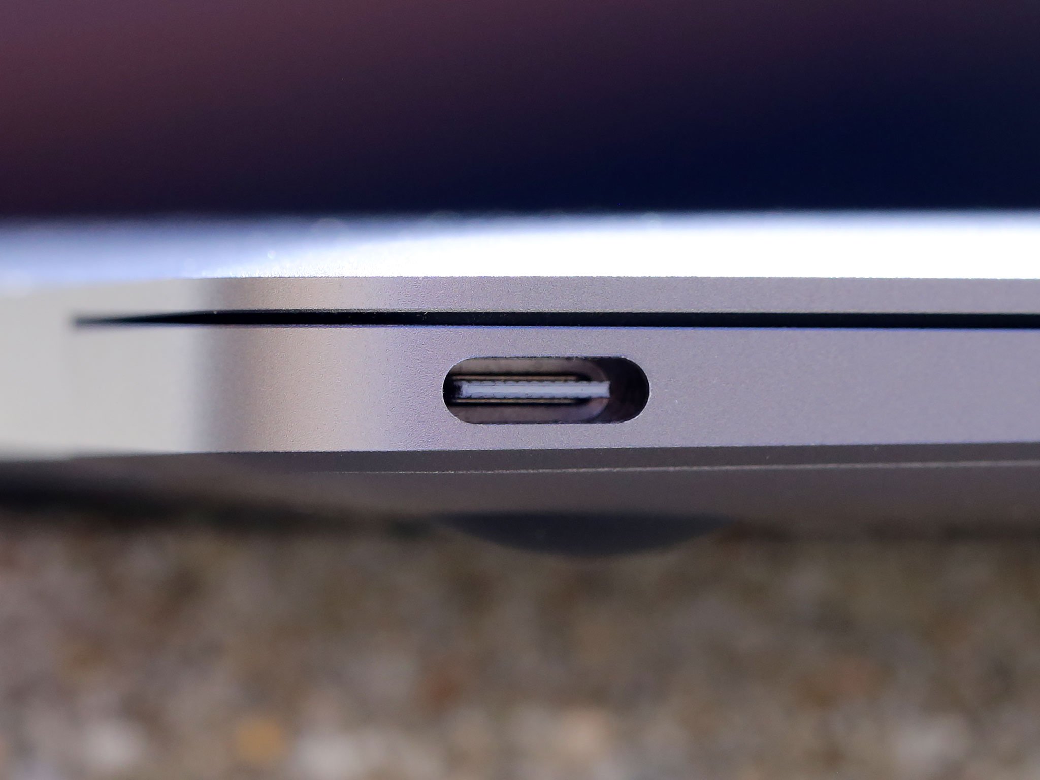
When I first heard about the new MacBook and its single USB-C port, I didn't believe it. Even when I saw it on stage at the introduction event, I wasn't sure why Apple did it or how it would work. Then I got an iMessage. It was about my mom's interest in getting the new MacBook, the first MacBook she'd ever been interested in getting. I found out later one of the main reasons was that it had just one port, just like her iPad. To her that wasn't a compromise. It was a feature.
As someone who has stuck USB into MagSafe on older Macs only to see the computer shut off, I could sympathize. For some of us more is more. For others, less is more.
I owned an original MacBook Air, the one with the single USB port that opened down like the boarding ramp on the Millennium Falcon. I was doing more trade shows at the time and the value of something so light, something that wouldn't break my back if I walked a convention center with it all day, was more important than the power and ports I had to sacrifice to use it.
Since then I've switched to a 15-inch Retina MacBook Pro to regain performance, a 13-inch Haswell MacBook Air to regain portability and power-efficiency, and most recently, a 13-inch Retina MacBook Pro to try and get some balance of both.
There have been occasions where lack of ports have hindered me, like when I wanted to video podcast live from a show floor and had to attach a USB camera, USB ethernet adapter, and USB mic all to the same machine, all at the same time, and came up short. Or when I forget the miniUSB cable for my DLSR and had to repeatedly swap SDHC cards to get photos off during a keynote.
That I can remember both those occasions so vividly shows just how rare they were. Almost as rare as when I had to race for an adapter to my MacBook so that, even with all its ports, it could connect to ethernet or some lame VGA projector. For the most part, though, my MacBooks have simply sat on my lap or on a table, only occasionally connected to AC power.
So, for me, USB-C is simply like Lightning on an iPad. (Let's just chalk the reasons why up to a remarkable coincidence...)
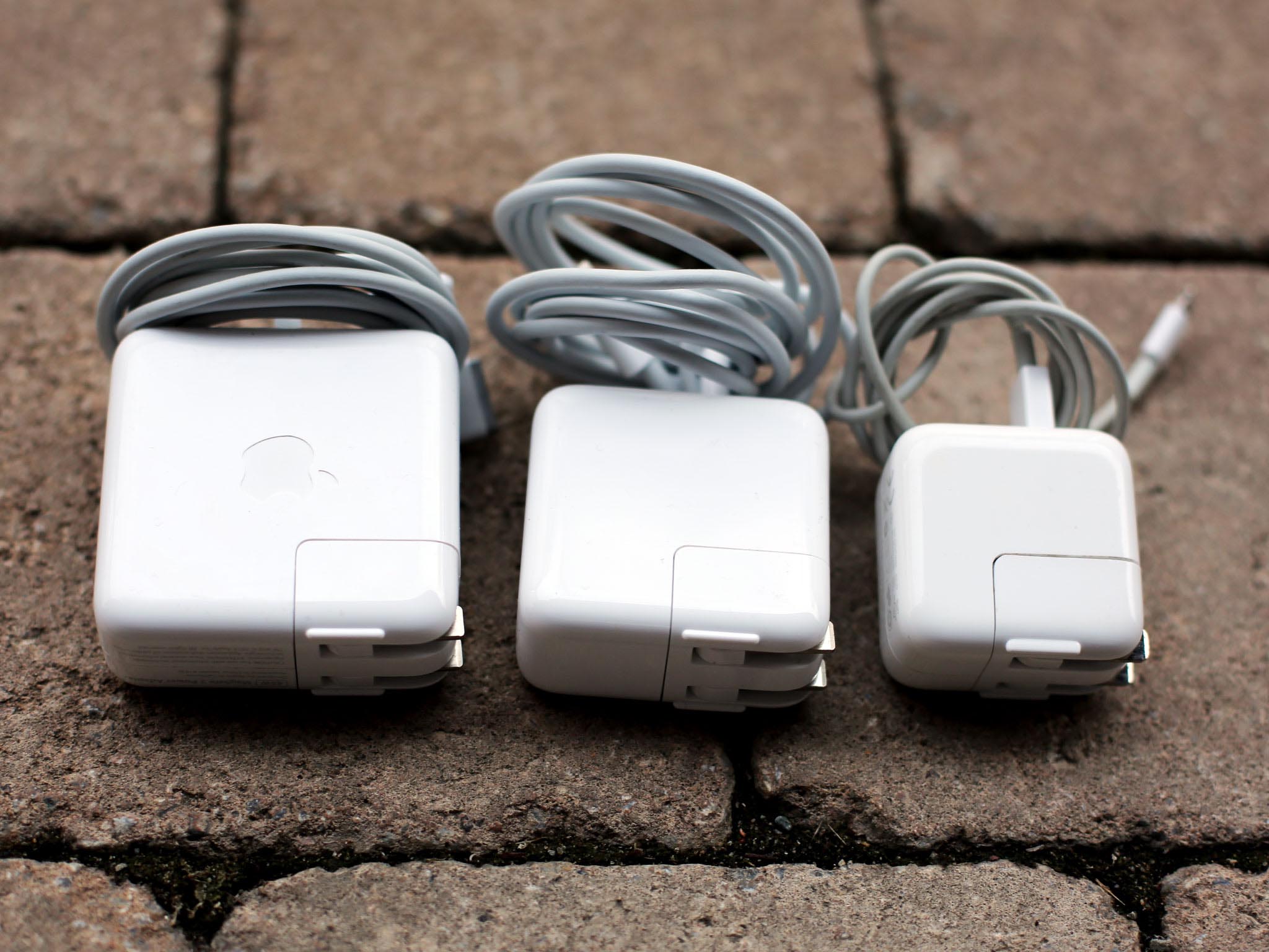
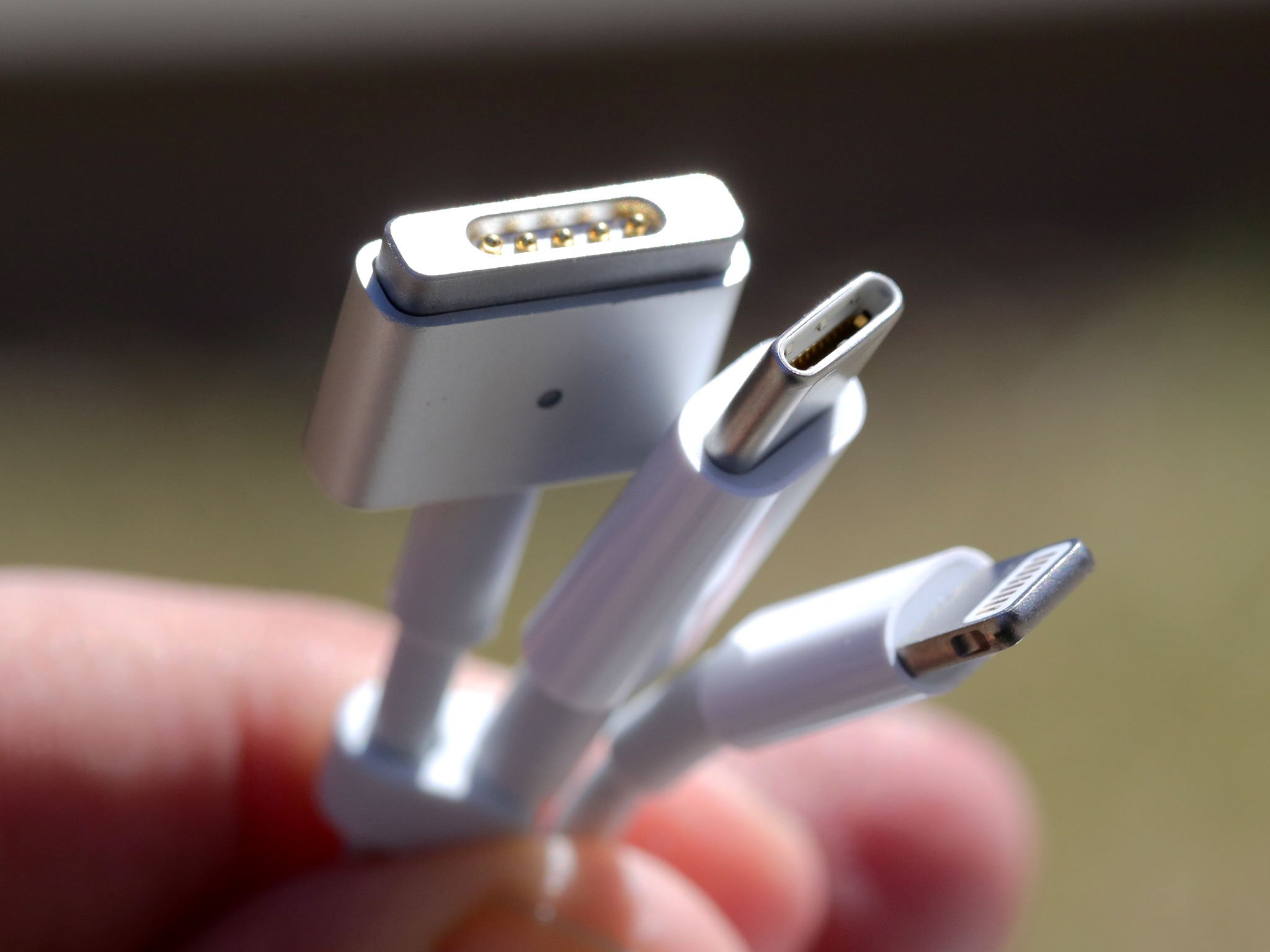
If Apple had gone with Lightning on the MacBook it wouldn't have been an industry standard and so it wouldn't have been compatible with all the forthcoming USB-C peripherals. It Apple had stuck with Thunderbolt, we'd be where we are with the rest of the Mac line — stuck between the few and the expensive. USB-C will be mainstream and it will be cost-effective and that means it will be better for anyone short of video and other high-end professionals.
Those are the people for whom USB-C, especially a single USB-C, is going to be a deal-break. Those are also the people for whom there's the MacBook Air and the MacBook Pro.
For the vast majority of people, the kind of people that use iPads in particular, and who don't use external displays or ethernet or attach multiple peripherals at once, the sheer simplicity is going to be very appealing.
If you fall somewhere in the middle, like I do, where most of the time you need nothing but your laptop but a few critical times you need more, Apple has adapters — sold separately, of course — to go along with the new MacBook and its USB-C port.
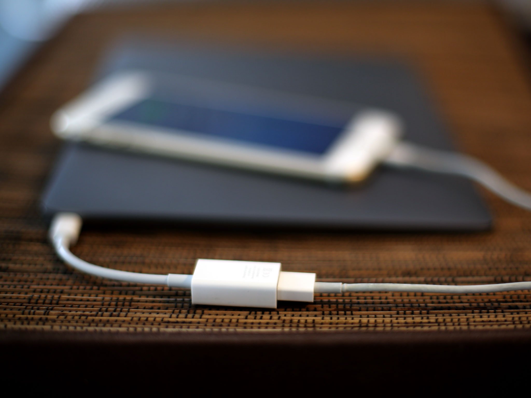
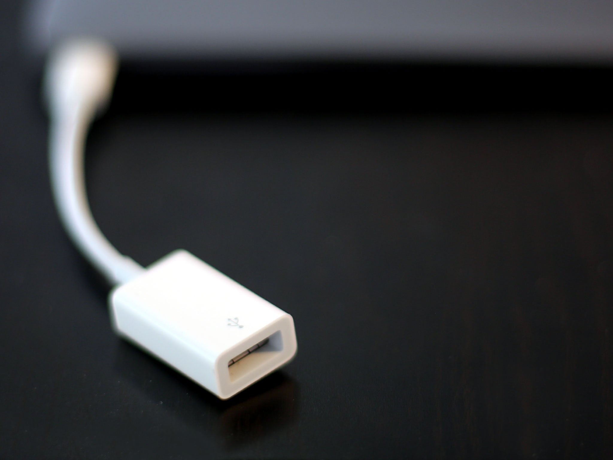
First and foremost there's a USB-C to USB-A adapter. With that you can plug in anything that uses USB 3.1, USB 3, or USB 2, including the Lightning cable for your iPhone or iPad, or a standard USB to USB, USB to mini USB, or USB to micro USB for your camera, external drive, and more.
For displays, there are currently adapters for both VGA and HDMI. Using HDMI, the MacBook can support up to a 2160p 4K external display. Perplexingly, there's no DisplayPort 1.2 adapter, at least not yet, so it can't support Apple's own ThunderBolt Display.
The HDMI and VGA adapters both have USB-C and USB-A ports as well as their respective video ports, so you can plug into power and another peripheral at the same time.
The HDMI adapter supports HDMI 1.4b, which covers 720p, 1080p, 1920x1200, 3840x2160 at 30 Hz, and 4096x2016 at 24 Hz. The VGA adapter supports 1920x1200.
There's no PCI pipe, however, which means no Thunderbolt, no daisy chaining, and no support for anything that requires the massive throughput of Apple's pro-level port. That's especially vexing now that USB-C and Thunderbolt 3 share the same interconnect. Even for occasional use, when speed is critical, when you only have one port, it has the be the best port. And this isn't.
Otherwise, having used it now for over a year, I'm fine with it. The 12-inch MacBook wasn't designed to be tied down by cables. It was born to be wireless. It's not about adapters but about AirPlay, AirDrop, Continuity, Bluetooth, and similar technologies. Too early, too optimistic, even too aggressive, for the customer for whom the MacBook is intended, none of this will be a deal-breaker.
12-inch MacBook Performance
The 12-inch MacBook has been referred to as ManagerBook because, while light and power-efficient, it isn't code-compiling, video-editing, hardcore gaming, throw-cores-at-it powerhouse. It's not meant to be, of course, but it's so new, so great looking, that many people might try to convince themselves they can get it anyway. But there's a reason the MacBook Pro is still on the shelves.
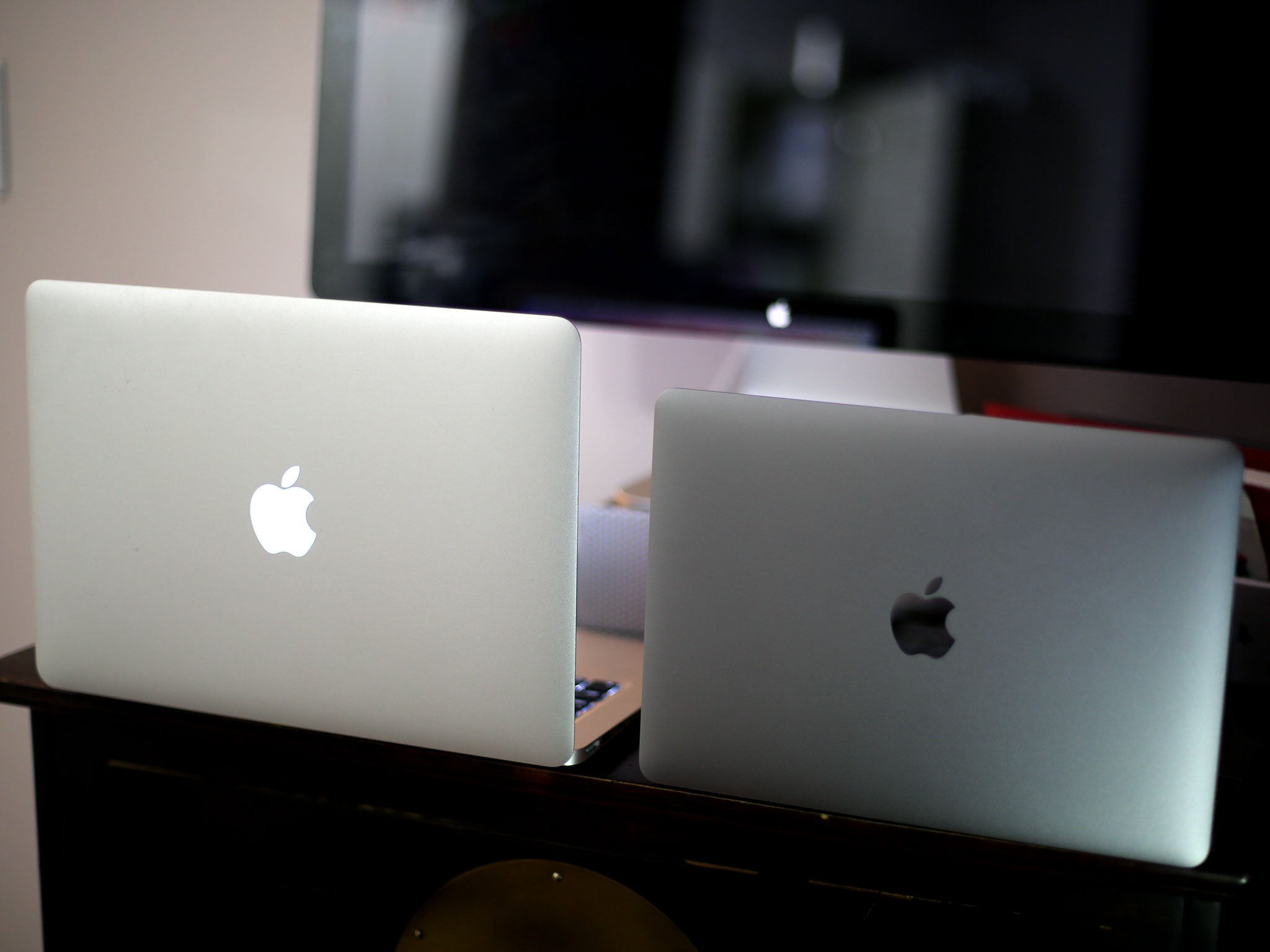
My switching from MacBooks Pro to Air and back is an example of just that. Some of us crave fast video rendering and transcoding, silky-smooth gameplay, and builds that finish by the time we come back with more coffee. Others want nothing more than ultra-long battery life so we can browse, type, watch, listen, and learn the day away. Throw the additional tension between Retina and fanless into the mix, and we're consistently asking less battery to do more and better. And compromises need to be made.
For the 12-inch MacBook that means using Intel's Core M processor. Originally a fifth-generation Broadwell, Apple has just updated the line to a sixth-generation Skylake. You can now choose between dual-core m3, m5, or m7.
The m3 is 1.1GHz with Turbo Boost up to 2.2GHz, the m5 is 1.2GHz with Turbo Boost up to 2.7GHz, and the m5 is 1.3GHz with Turbo Boost up to 3.1GHz. They all have Intel HD Graphics 515, which Apple says is 25 percent faster than last year's models.
Apple sent me an m3 to review but I ordered myself an m7. It'll be here soon and I'll follow up with a comparison of both. In terms of raw power, though, Geekbench 3 offers the following:
| Header Cell - Column 0 | Chipset | Single-core | Multi-core |
|---|---|---|---|
| iPad Pro 2015 | Apple A9X | 3200 | 5500 |
| MacBook 2015 | Intel Core M5 | 2438 | 5051 |
| MacBook 2016 | Intel Core M5 | 2623 | 5347 |
| MacBook Air 2015 | Intel Core I7 | 3250 | 6855 |
| MacBook Pro 2015 | Intel Core I7 | 3636 | 13759 |
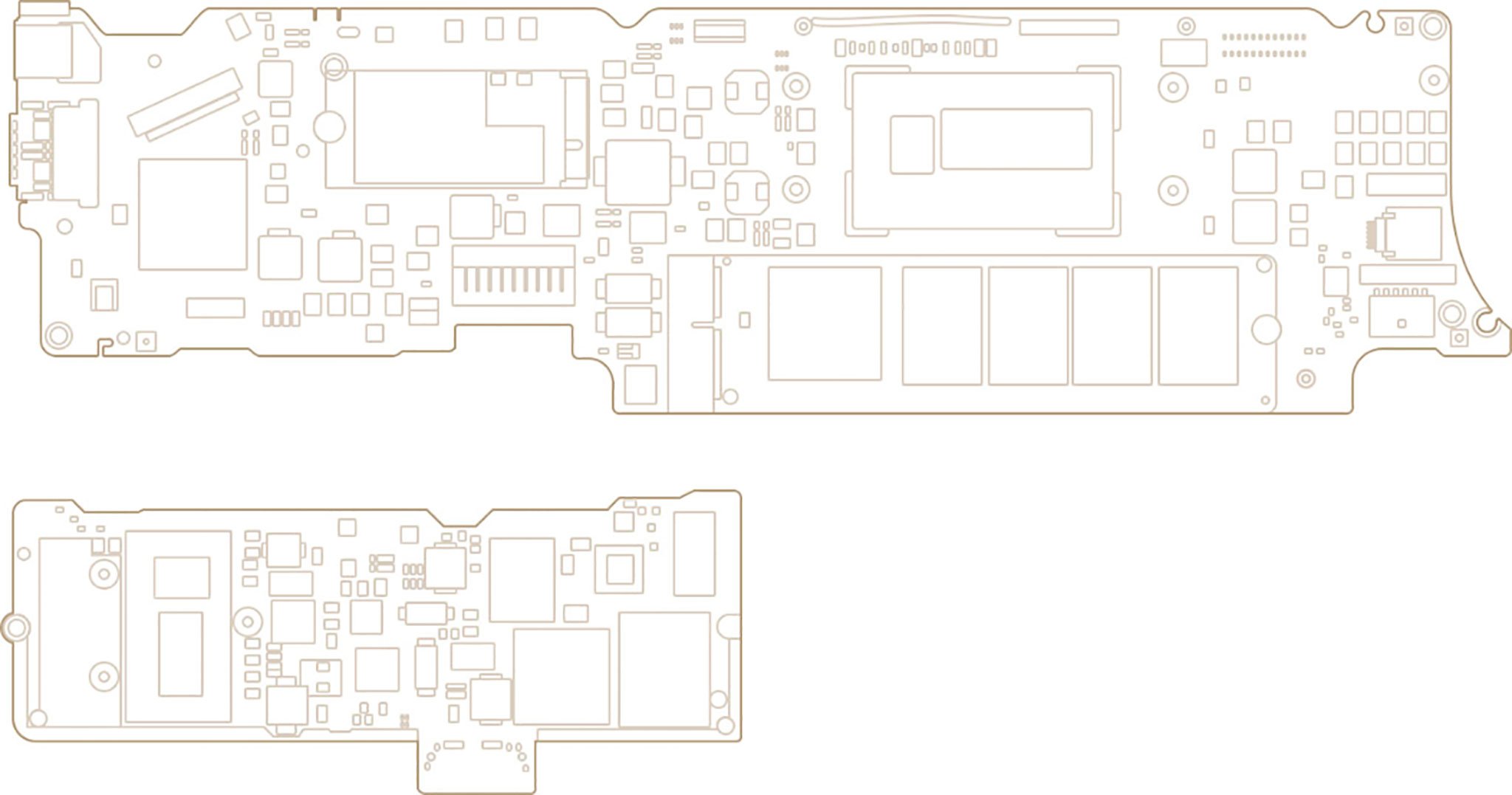
Core M also lets Apple reduce the size of the actual computer board inside the MacBook, which lets them make it substantially smaller and lighter. All told, the MacBook's board is an astonishing 67 percent smaller than even the 11-inch MacBook Air. It looks more like an iPad board than a Mac board. Here's the diagram the company uses to illustrate the difference:
Skylake runs at 5 watts, and that means, even as it lights up a Retina display it can eek out up to ten hours of web browsing and up to ten hours of iTunes playback. That's an hour longer than the previous generation, at least according to Apple's estimates. I've tried to run it down working at coffee shops for the last few days, and I haven't been able too. I'll follow up with longer term battery results, but that's a good sign.
To get the most battery into the smallest space, Apple's sticking to the terracing system it unveiled with the MacBook back in 2015. The layers result in as little wasted area as possible. Tiny boards combined with big batteries has been key to Apple's mobile devices, and it's key to taking the MacBook from portable to truly mobile.
Core M is also what's letting Apple run fanless with the new MacBook. Yes, fanless-as-in-no-fan. None. Zero. And no fan noise to go along with it. Put the new MacBook under load and do you know what you hear? Nothing. Because, fanless.
I never expected Skylake to do much to improve on Broadwell. For those familiar with Intel's tick-tock cycle, Broadwell was the die-shrink down to 14 nanometers and Skylake the architecture update to really get the most out of it. But going to Skylake proved difficult and now, for the first time in history, there'll be a second tock — Kaby Lake.
When compared to the A9X Apple fielded in the iPads Pro, Core M seems to be chugging along rather than racing ahead. It remains to be seen what Apple will do in the future, but it's tough not to see the A series taking the lead when it comes to ultra-mobility. On all of Apple's platforms.
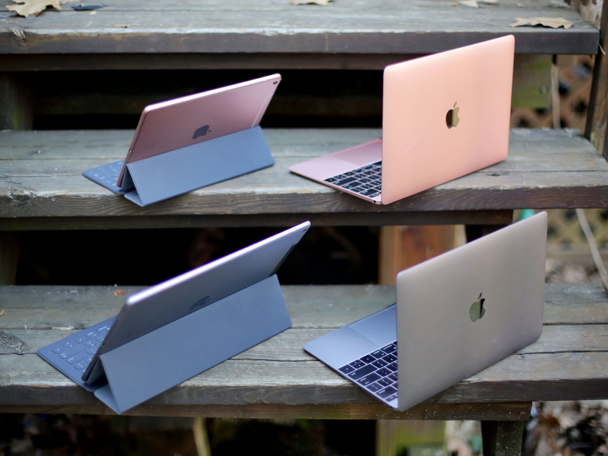
There is one area, however, where the updated MacBook's performance is impressive. Most impressive, as they say. Thats input/output speeds (I/O).
The new flash storage can do sequential reads at up to 1 GBps. That's 20 percent faster than last year. It can also write 90% faster. Numbers are numbers, but watching it peg BlackMagic's benchmarks is amazing.
For real-world usage it means this— click, launch, click open, click close. You spend less time waiting and more time getting things done.
So, If all you're doing is browsing, typing, watching, listening, and learning Skylake and the 12-inch MacBook will suit you just fine. If you set your stop-watch on transcoding and compiling times, however, you'll likely be happier with the MacBook Pro. And that's why Apple still has multiple laptops in its lineup.
OS X El Capitan and apps
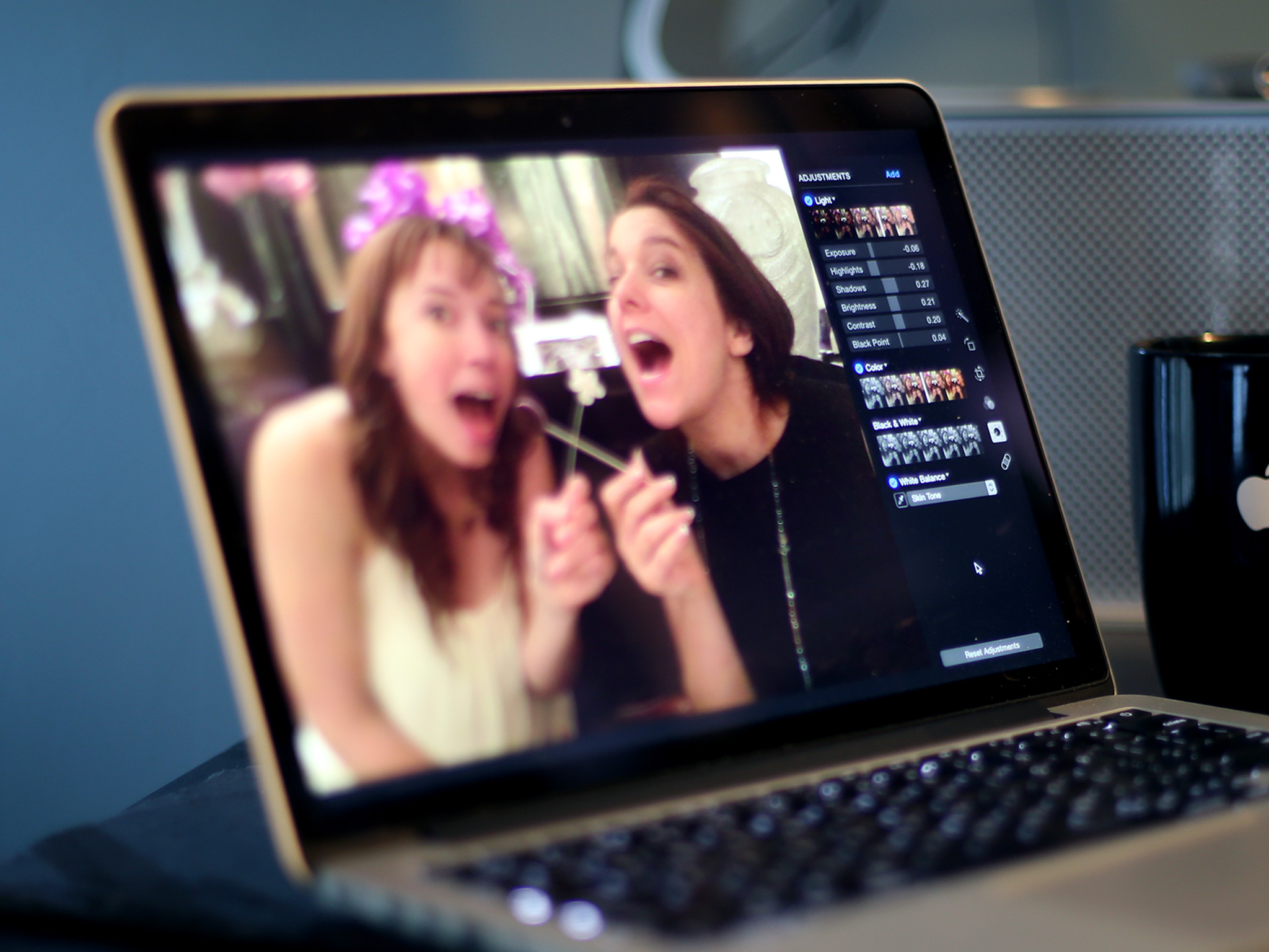
OS X 10.11 El Capitan runs well on the MacBook. Scrolling and animations are smooth, H.264 video and MP3 and AAC audio playback is solid. Web pages render quickly enough, even ones with more than their fair share of JavaScript, and Photos performs just fine. Editing video, though, isn't great. Where the A9X in the iPad Pro is optimized for up to three streams of 4K, the Core M in the MacBook... is not.
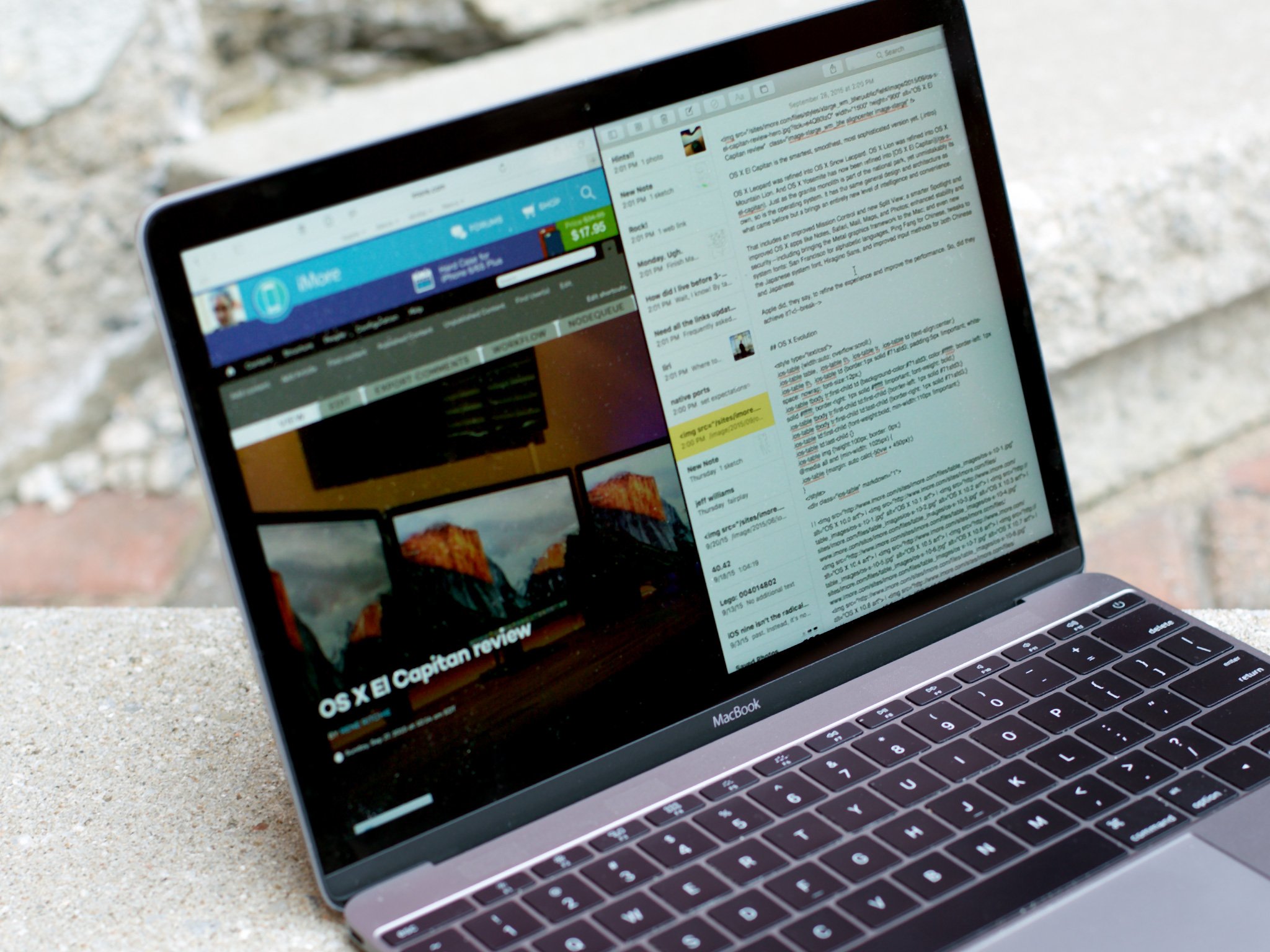
General productivity work in iWork and Google Docs is fine. (I haven't had Office installed on a Mac in years.) iTunes can beachball my maxed-out Retina 5K iMac but it's no worse on the MacBook, which is both surprising and appalling. Napkin, which likes the GPU, also works without a hitch on the MacBook.
If you're used to an Air, especially one from a couple years ago, you'll know what to expect. The truth is, for most people, most of the time, we achieved acceptable levels of performance years ago. That's why maintaining those levels and shifting to size, battery life, and other vectors has become not only possible, but preferable.
OS X Yosemite review + best Mac apps
If you're new to OS X El Capitan, the latest version of Apple's Mac operating system released in September of 2015, we have a complete review for you. If you're wondering what kinds of apps are available for the Mac, we've collected together the very best ones.
- Read our OS X El Capitan review
- Browse the best Mac apps
The Apple ecosystem
The updated MacBook, like all of Apple's devices, works fine by itself but works even better when connected to and combined with other Apple products and services. iCloud provides sync for everything from accounts to files to the newly launched Photos for OS X app. Continuity lets you send and receive SMS, MMS, and even phone calls right from your Mac as long as your iPhone is on the same network. It also lets you tether instantly, AirDrop files between devices, AirPlay to Apple TV, and best of all — handoff activities from one to the other.
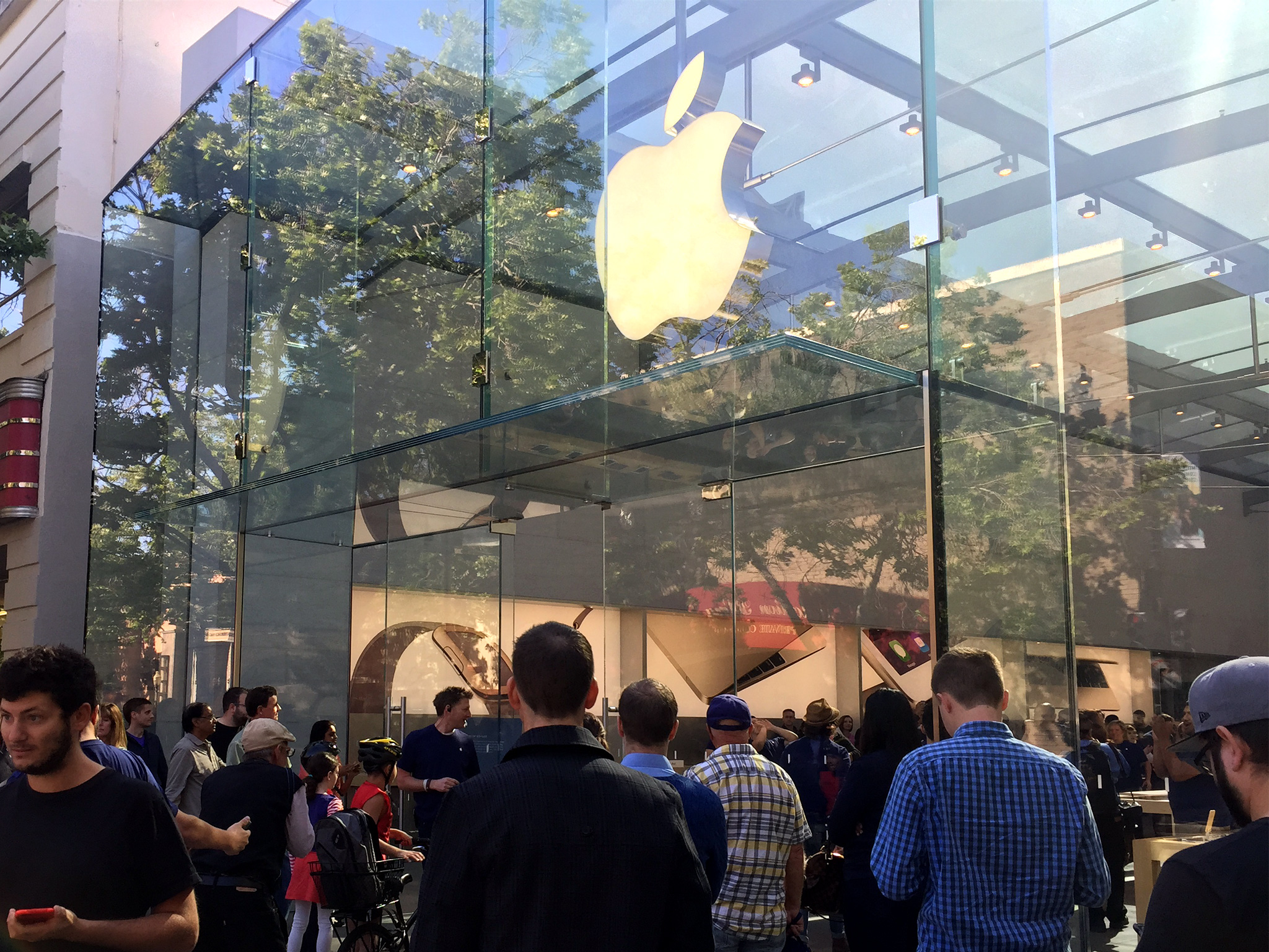
Apple Retail Stores can also provide everything from shopping assistance to data migration to one-on-one training to Genius Bar tech support. It's a considerable advantage to Apple's approach, and one that needs to be factored in to any buying decision about any product the company make.
12-inch MacBook: The bottom line
Small, light, Retina display, single port — make no mistake, this is an iPad in MacBook clothing. Apple wants the iPad to be the iPad and the Mac to be the Mac, but the company clearly continues to want everything great about the iPad to make the Mac even better.
For many people, the iPad remains simpler, more convenient, and more accessible than the Mac, and despite the acceleration tapering off iPad sales, the speed is holding up just fine. The Mac is still accelerating, albeit it relative to a declining market, but if Apple can capture the best of both products — if Apple can deliver a Mac as accessible and appealing to the mainstream as an iPad — then the future could be very, very interesting.
But that's the future. And just like in the Terminator — and just like with the 2008 MacBook Air — the future can only leap back to the present if it's stripped bare.
For those who want all the pixels, all the ports, and all the performance, it's not a good tradeoff. If Final Cut Pro X and maybe even Xcode are your things, the MacBook probably shouldn't be. Apple knows that, which is why they make the MacBook Pro.
For most other people, however, performance won't be the issue. The issue will be the $1299 starting price. It's that, not the keyboard, not the Force Touch trackpad, and not even the single USB-C port, but the price that will likely prevent the new MacBook from being truly accessible and appealing to the mainstream.
Apple no doubt knows that as well. The original MacBook Air debuted at $1799 and the 11-inch version now starts at $899. The same will hold true for the MacBook. The technology will become less expensive and the price will drop. Bringing it to market now helps assure that.
In the meantime, if you've always wanted the equivalent to an iPad that opens up with a full keyboard and runs OS X, if a next-generation ultralight holds ultra-appeal, if you want to hold tomorrow's laptop in your hands today, and if price is one of the least important features on your list, then the new MacBook is absolutely for you. It's an amazing machine. Get it and enjoy.

Rene Ritchie is one of the most respected Apple analysts in the business, reaching a combined audience of over 40 million readers a month. His YouTube channel, Vector, has over 90 thousand subscribers and 14 million views and his podcasts, including Debug, have been downloaded over 20 million times. He also regularly co-hosts MacBreak Weekly for the TWiT network and co-hosted CES Live! and Talk Mobile. Based in Montreal, Rene is a former director of product marketing, web developer, and graphic designer. He's authored several books and appeared on numerous television and radio segments to discuss Apple and the technology industry. When not working, he likes to cook, grapple, and spend time with his friends and family.
