"That's no MacBook..."
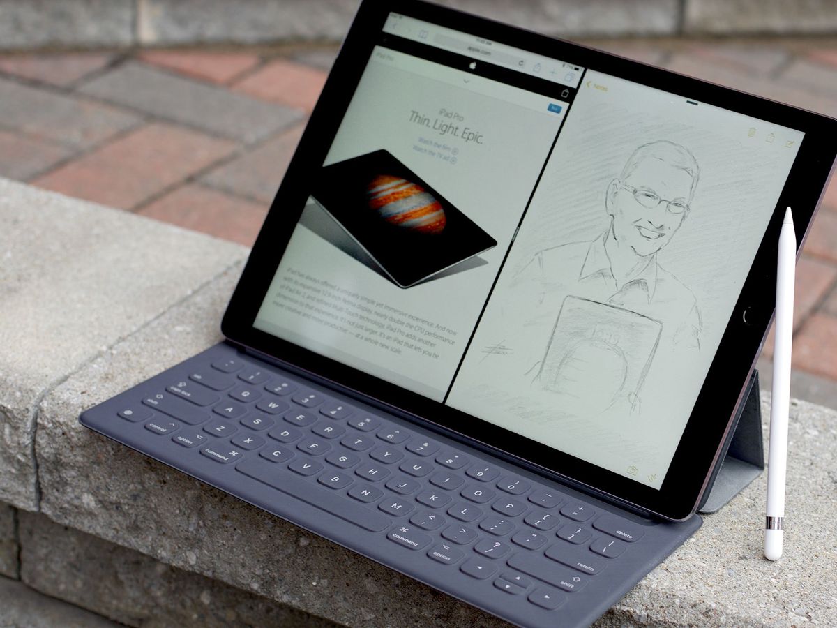
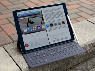
We weren't coming out of hyperspace. We were coming out of Apple's September event. And it rose up in front of us, a 12.9-inch display atop a full-sized keyboard. Two apps ran on it, side-by-side. But not OS X. They were iOS. Close by a pencil drew, but in pixels.
All of these elements had been seen before, of course, but never from Apple and never quite this. So, instead of turning around, we tractor-beamed our way in—to the iPad Pro.
If the original iPad was meant to fit in the space between the phone and the laptop, and the iPad mini between the phone and the iPad, the iPad Pro fits somewhere between the iPad and the laptop. Just as phones have become larger and more capable, though, laptops have become lighter and more portable. And the space between them has become narrower.
Still, Tim Cook called the iPad Pro "the clearest expression of our vision of the future of personal computing", and a piece of multitouch glass he thinks can prove even more approachable, accessible, and empowering than anything that's come before.
So, how close does the iPad Pro come to achieving that vision?
For people who want:
- A giant display
- Improved keyboard integration
- Optional pencil input
Not for people who want:
- A pocketable tablet
- A traditional laptop
- OS X or Windows software
In brief
The iPad Pro is the next step in Apple's tablet evolution. It's a bigger, more powerful, more productive display, with an optional, amazingly creative Pencil. But it's also a first step and one that needs the software to catch up to the hardware. So, if you need a laptop, you'll want to stick with a laptop. If want a tablet that can do some laptop-y things, but with all the flexibility and accessibility that's become the hallmark of the iPad, you'll want the iPad Pro.
iPad Pro Table of Contents
- Review video
- Evolution
- Design
- Display
- Performance
- Speakers
- Cameras
- Connectivity
- Smart Keyboard
- Apple Pencil
- iOS 9
- Apps
- Accessories
- Bottom Line
iPad Pro Video Review
Give us 4 minutes and we'll give you the iPad Pro!
iPad Evolution
| Header Cell - Column 0 | Header Cell - Column 1 | Header Cell - Column 2 | Header Cell - Column 3 | Header Cell - Column 4 | Header Cell - Column 5 | Header Cell - Column 6 | Header Cell - Column 7 | Header Cell - Column 8 | Header Cell - Column 9 | Header Cell - Column 10 | Header Cell - Column 11 |
|---|---|---|---|---|---|---|---|---|---|---|---|
| Row 0 - Cell 0 | iPad | iPad 2 | iPad 3 | iPad mini | iPad 4 | iPad Air | iPad mini 2 | iPad mini 3 | iPad Air 2 | iPad mini 4 | iPad Pro |
| Code Name | K48 | K94 | J1 | J65 | P101 | J72 | J85 | J85 | J81 | J96 | J98 |
| Model Name | iPad 1,1 | iPad 2,1 | iPad 3,1 | iPad 2,5 | iPad 3,4 | iPad 4,1 | iPad 4,4 | iPad 4,7 | iPad 5,3 | iPad 5,1 | iPad 6,7 |
| Launch OS | iPhone OS 3.2 | iOS 4.3 | iOS 5.1 | iOS 6 | iOS 6 | iOS 7 | iOS 7 | iOS 8.1 | iOS 8.1 | iOS 9 | iOS 9.1 |
| Screen Size | 9.7 inches | 9.7 inches | 9.7 inches | 7.9 inches | 9.7 inches | 9.7 inches | 7.9 inches | 7.9 inches | 9.7 inches | 7.9 inches | 12.9 inches |
| Screen Resolution | 1024x768 (132ppi) | 1024x768 (132ppi) | 2048x1536 (264ppi) | 1024x768 (163ppi) | 2048x1536 (264ppi) | 2048x1536 (264ppi) | 2048x1536 (326ppi) | 2048x1536 (326ppi) | 2048x1536 (264ppi) | 2048x1536 (326ppi) | 2732x2048 (264ppi) |
| Screen Type | IPS LED | IPS LED | IPS LED | IPS LED | IPS LED | IPS LED | IPS LED | IPS LED | Laminated IPS LED | Laminated IPS LED | Laminated IPS LED |
| System-on-a-chip | Apple A4 | Apple A5 | Apple A5X | Apple A5 | Apple A6X | Apple A7 | Apple A7 | Apple A7 | Apple A8X | Apple A8 | Apple A9X |
| CPU | 800MHz ARM Cortex-A8 | 1GHz dual-core ARM Cortex-A9 | 1GHz dual-core ARM Cortex-A9 | 1GHz dual-core ARM Cortex-A9 | 1.4GHz dual-core Swift | 64-bit dual core Apple A7 Cyclone | 64-bit dual core Apple A7 Cyclone | 64-bit dual core Apple A7 Cyclone | 64-bit triple core Apple A8 Typhoon | 64-bit dual core Apple A8 Typhoon | 64-bit Apple A9 Twister |
| GPU | PowerVR SGX535 | PowerVR dual-core SGX543MP2 | PowerVR dual-core SGX543MP4 | PowerVR dual-core SGX543MP2 | PowerVR quad-core SGX554MP4 | PowerVR G6430 | PowerVR G6430 | PowerVR G6430 | PowerVR GXA6850 | GX6450 | Row 9 - Cell 11 |
| Co-processor | none | none | none | none | none | M7 Motion | M7 Motion | M7 Motion | M8 Motion | M8 Motion | M9 Motion (integrated) |
| RAM | 256MB | 512MB | 1GB | 512MB | 1GB | 1GB | 1GB | 1GB | 2GB | 2GB | 4GB |
| Storage | 16GB/32GB/64GB | 16GB/32GB/64GB | 16GB/32GB/64GB | 16GB/32GB/64GB | 16GB/32GB/64GB/128GB | 16GB/32GB/64GB/128GB | 16GB/32GB/64GB/128GB | 16GB/64GB/128GB | 16GB/64GB/128GB | 16GB/64GB/128GB | 32GB/128GB |
| Cellular Data | HSPA | LTE | LTE | LTE | LTE | LTE | LTE | LTE | LTE Advanced | LTE Advanced | LTE Advanced |
| SIM | Micro | Micro | Micro | Nano | Micro | Nano | Nano | Nano | Apple | Apple | Apple |
| Rear Camera | none | 1.3MP/720p | 5MP/1080p | 5MP/1080p | 5MP/1080p | 5MP/1080p | 5MP/1080p | 5MP/1080P | 8MP/1080P | 8MP/1080P | | 8MP/1080P |
| Front Camera | none | 0.3MP/VGA | 0.3MP/VGA | 1.2MP/720p | 1.2MP/720p | 1.2MP/720p | 1.2MP/720p | 1.2MP/720p | 1.2MP/720p | 1.2MP/720p | 1.2MP/720p |
| Bluetooth | Bluetooth 2.1+EDR | Bluetooth 2.1+EDR | Bluetooth 4.0 | Bluetooth 4.0 | Bluetooth 4.0 | Bluetooth 4.0 | Bluetooth 4.0 | Bluetooth 4.0 | Bluetooth 4.0 | Bluetooth 4.2 | Bluetooth 4.2 |
| Wi-Fi | 802.11a/b/g/n | 802.11a/b/g/n | 802.11a/b/g/n | 802.11a/b/g/n | 802.11a/b/g/n | 802.11a/b/g/n MIMO | 802.11a/b/g/n MIMO | 802.11a/b/g/n MIMO | 802.11a/b/g/n/ac MIMO | 802.11a/b/g/n/ac MIMO | 802.11a/b/g/n/ac MIMO |
| GPS | aGPS | aGPS | aGPS, GLONASS | aGPS, GLONASS | aGPS, GLONASS | aGPS, GLONASS | aGPS, GLONASS | aGPS, GLONASS | aGPS, GLONASS | aGPS, GLONASS | aGPS, GLONASS |
| Sensors | Ambient light, accelerometer,compass | Ambient light, accelerometer,compass, gyroscope | Ambient light, accelerometer,compass, gyroscope | Ambient light, accelerometer,compass, gyroscope | Ambient light, accelerometer,compass, gyroscope | Ambient light, accelerometer,compass, gyroscope | Ambient light, accelerometer,compass, gyroscope | Ambient light, accelerometer,compass, gyroscope | Ambient light, accelerometer,compass, gyroscope, barometer | Ambient light, accelerometer,compass, gyroscope, barometer | Ambient light, accelerometer,compass, gyroscope, barometer |
| Speakers | Mono | Mono | Mono | Stereo | Mono | Stereo | Stereo | Stereo | Stereo | Stereo | Stereo | Stereo |
| Connector | 30-pin Dock | 30-pin Dock | 30-pin Dock | Lightning | Lightning | Lightning | Lightning | Lightning | Lightning | Lightning | Lightning |
| Height | 9.56 inches (242.8 mm) | 9.5 inches (241.3 mm) | 9.5 inches (241.3 mm) | 7.87 inches (199.9 mm) | 9.5 inches (241.3 mm) | 9.4 inches (238.8 mm) | 7.87 inches (199.9 mm) | 7.87 inches (199.9 mm) | 9.4 inches (238.8 mm) | 8 inches (203.2 mm) | 12 inches (305.7 mm) |
| Width | 7.47 inches (189.7 mm) | 7.31 inches (185.7 mm) | 7.31 inches (185.7 mm) | 5.3 inches (134.6 mm) | 7.31 inches (185.7 mm) | 6.6 inches (167.6 mm) | 5.3 inches (134.6 mm) | 5.3 inches (134.6 mm) | 6.6 inches (167.6 mm) | 5.3 inches (134.8 mm) | 8.68 inches (220.6 mm) |
| Depth | 0.53 inches (13.5 mm) | 0.34 inches (8.6 mm) | 0.37 inches (9.4 mm) | 0.28 inches (7.1 mm) | 0.37 inches (9.4 mm) | 0.29 inches (7.4 mm) | 0.29 inches (7.4 mm) | 0.29 inches (7.4 mm) | 0.24 inches (6.1 mm) | 0.24 inches (6.1mm) | 0.27 inch (6.9 mm) |
| Weight | 1.5 lbs (680 g) | 1.33 lbs (603 g) | 1.44 lbs (653 g) | 0.68 lbs (308 g) | 1.44 lbs (653 g) | 1.0 lbs (454 g) | 0.73 lbs (331 g) | 0.73 lbs (331 g) | 0.96 lbs (437 g) | 0.65 lbs (298.8 grams) | 1.57 pounds (713 grams) |
| Battery | 6600mAh | 6930mAh | 11560mAh | 4440mAh | 11560mAh | 8820mAh | 6471mAh | 6471mAh | 6471mAh | 7,340mAh | 5124mAh | |
| Colors | Black | Black/White | Black/White | Black/White | Black/White | Space gray/Silver | Space gray/Silver | Space gray/Silver | Space gray/Silver/Gold | Space gray/Silver/Gold | Space gray/Silver/Gold |
| Launch Price | Wi-Fi: $499, $599, $699Cellular: $629, $729, $829 | Wi-Fi: $499, $599, $699Cellular: $629, $729, $829 | Wi-Fi: $499, $599, $699Cellular: $629, $729, $829 | Wi-Fi: $329, $429, $529Cellular: $459, $559, $659 | Wi-Fi: $499, $599, $699, $799Cellular: $629, $729, $829, $929 | Wi-Fi: $499, $599, $699, $799Cellular: $629, $729, $829, $929 | Wi-Fi: $399, $499, $599, $699Cellular: $529, $629, $729, $829 | Wi-Fi: $399, $499, $599, $699Cellular: $529, $629, $729, $829 | Wi-Fi: $499, $599, $699, $799Cellular: $629, $729, $829, $929 | Wi-Fi: $399, $499, $599Cellular: $529, $629, $729 | Wi-Fi: $749Cellular: $949, $1079 |
| Release Date | 4/3/2010 | 3/11/2011 | 3/16/2012 | 11/2/2012 | 11/2/2012 | 11/1/2013 | 11/12/2013 | 10/24/2014 | 10/24/2014 | 09/09/2015 | 11/2015 |
Previously...
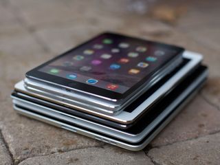
Each generation of iPad was built on the ones before. Instead of repeating existing features here, please check out all the details in our previous reviews.
- iPad mini 4 review
- iPad Air 2 review
- iPad mini 3 review
- iPad Air review
- iPad mini 2 review
- iPad 4 review
- iPad mini review
- iPad 3 review
- iPad 2 review
- iPad review
iPad Pro Design
The iPad Pro continues the design language introduced with the iPod touch and iPad mini in 2012, carried over to the iPad Air in 2013, and now scaled up to fit the new 12.9-inch display in 2015. It brings the rounded, rectangular aluminum chassis to 12 inches (305.7 mm) high, 8.68 inches (220.6 mm) wide, and 0.27 inch (6.9 mm) deep, and to 1.57 pounds (713 grams) for the Wi-Fi version and 1.59 pounds (723 grams) for the Wi-Fi + Cellular version.
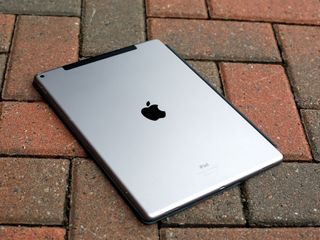
And that's a lot of iPad.
It's roughly the same weight as the original iPad, though spread out so it doesn't feel as dense. It's taken Apple half-a-decade and all the many advances in the iPad mini and iPad Air to be able to make a tablet this big that's still, relatively speaking, this light. Still, this is the first iPad that, for me, is a real two-hander.
Depending on your grip and arm strength, you can hold the iPad Pro in one hand and tap away on it with the other, just like the iPad Air. You can also thumb type in portrait mode if you simply must—though Apple doesn't provide the split keyboard, likely in recognition of how uncomfortable and unsustainable that is for any real length of time. But this iPad really demands a lap or table.


The iPad Pro comes in the same front plate colors and metallic casing finishes as the iPad Air 2, iPad mini 4, and new MacBook. That's black and space gray, and white with either silver or gold. No rose gold option like the iPhones 6s, alas.
There are some new elements, though. Two speaker grills on the top now match the two on bottom and enable the terrific new speaker system. And a new Smart Connector now sits on the left side, providing power and data for hardware keyboard attachments.


That Apple didn't use the iPad Pro to introduce a more significant design evolution is interesting. The iPhone 6 and iPhone 6 Plus, which got larger display sizes last year, not only got the rounder backs, but took a step forward with rounder fronts as well, better suiting the growing number of edge gestures.
Having already reduced iOS devices to the barest of essentials, though, where else could the iPad go? Even further, perhaps, with rounded front edges like the iPhone, thinner bezels, and perhaps even a virtualized Home button? Then they could truly become multitouch panes of glass. We'll just have to wait and see.
For now, the big changes are mostly on the inside. Mostly...
iPad Pro Display
The iPad Pro delivers Apple's biggest ever multitouch display—12.9 inches (327.66) with 2732x2048 pixels at 264 pixels per inch (ppi) big.
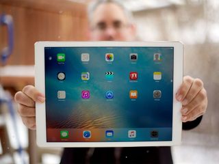
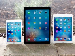
That compares to 9.7-inches on the iPad Air 2 and 7.9-inches on the iPad mini 4, both with 2048x1536 pixels, the former at the same 264 ppi, and the latter at an iPhone 6s-equalling 326 ppi.
While the iPad Pro display may not be as dense as the iPad mini 4 and iPhone 6s, much less the 401 ppi of the iPhone 6s Plus, neither can touch it when it comes to pixel quantity. 2732x2048 equals 5,595,136 pixels. That beats the iPad Air 2 and iPad mini 4's 3,145,728 pixels and the iPhone 6s Plus' 2,073,600 (physical) pixels. It also beats the 15-inch Retina MacBook Pro's 5,184,000 pixels. It's only when you get to the 21.5-inch Retina 4K's 9,437,184 pixels that you find more.
Here's how Apple's current line of Retina displays compare in terms of pixel resolution. 42mm and 38mm Apple Watch on the left; then iPhone 6S Plus, iPhone 6s, and iPhone 5s; iPad Pro and iPad Air/mini (same resolution), MacBook; MacBook Pro 15-inch and 13-inch; and iMac 27-inch and 21.5-inch on the right.

Held right in front of you, the iPad Pro's many pixels feel expansive. It's like someone replaced your living room windows with floor-to-ceiling glass.
Variable refresh rate
In order to handle all those pixels, Apple is using a custom-designed timing controller (TCON), just like with the Retina iMac. It allows for greater bandwidth, which lets all those pixels respond as fast as technologically possible. So fast it looks like any other iPad, which is quite an accomplishment.
Apple's also using the same photo alignment process the company employs with the iPhones. It involves projecting ultraviolet light to create a more consistent, uniform surface across the coating on the film transistor and color filter. The result is higher contrast, blacker blacks, and richer colors when you're looking directly at the display.
To my eyes, the reds and magentas aren't as saturated as on my iPad Air 2, and technologically the iPad Pro doesn't have a DCI-P3 color space that the latest iMacs enjoy. Still, it looks great for photos, videos, games, and everything else I've thrown at it.
Also like the Retina iMac, the iPad Pro has an oxide thin film transistor (TFT). It allows for faster and more uniform pixel changing, even across the very large display.
The oxide TFT also enables something remarkable—variable refresh rate. The refresh rate measures how many times per second the screen draws the pixel data it's being fed. (It's technically not the same as frame rate, because refresh rate can contain the same frame rendered multiple times.)
So, when nothing much is happening on the screen, the iPad Pro can cycle down from 60 Hz to 30 Hz. That's how Apple manages to retain the iPad's traditionally great battery life even when lighting up all those pro pixels.
Pressure sensitivity
There's no 3D Touch on the iPad Pro. That's the name Apple gives to the system that measures the microscopic change in distance between the glass and LED lights on the iPhones 6s to enable the pressure-sensitive Home screen options and "peek and pop" features.
It's a different technology than what's used to enable force touch on the Apple Watch or the Mac trackpad because the iPhone has a different screen size and interactivity requirement.
So too, the iPad Pro.
Whether or not Apple could implement 3D Touch in the same way on the iPad Pro, and whether or not it would be compatible with what else they're doing, and with their weight goals for the device, I don't know. But what Apple has implemented instead is fascinating.
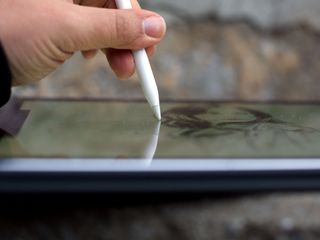
Along with the refresh rate, the iPad Pro display scans for the optional Apple Pencil 240 times per second as well, effectively doubling "sensitivity".
The iPad Pro's multitouch display system can also measure the relative position of the sensors in the Apple Pencil, so it can tell when the Pencil is tilted.
It's extremely clever. And, best of all, unlike competing technologies, it doesn't force a digitizer beneath the display. That means no air gap to increase glare or introduce parallax. Which you can never un-notice.
Combined with the same fully-laminated, anti-glare technology found in the iPad Air 2 and iPad mini 4, it means the iPad Pro gets the benefit of Pencil-based input without the visual sacrifices made by displays that incorporate Wacom or Wacom-like technology.
That's a huge advantage whether you use a Pencil or not.
iPad Pro Performance
There's an old story about Steve Jobs wanting the best of everything, including the best people in the world to design chipsets for iOS devices. Flash-forward less than a decade and Apple has become the most exciting chip design company in the world, leapfrogging the traditional, dedicated silicon companies.

Sure, Intel is still a terrific fab, Nvidia remains super interesting, and Qualcomm and Samsung could certainly surprise us again. But Johny Srouji's team at Apple is shipping A-series processors year after year, and in a way that continuously challenges our preconceptions and expectations about ARM and mobile.
Apple A9X chipset
The central processor in the A9X is Apple's third-generation, dual-core 64-bit Twister running at 2.20 GHz. That's the same processor as the iPhones 6s, though clocked faster than their 1.85 GHz.
The graphics processor is a still-to-be-determined multi-core Imagination PowerVR 7XT series.
Apple claims the A9X provides roughly double the performance, central and graphical, of last year's Apple A8X inside the iPad Air 2. That iPad always felt ridiculously over-powered, so I can only describe the iPad Pro as... ludicrously so?
The Apple A9X also contains the same integrated M9 coprocessor as the A9, yet the iPad Pro doesn't offer the same unplugged "Hey, Siri!" voice activation as the iPhones 6s.
That means if your iPad Pro is across the kitchen counter while you're cooking or across the room while you're working out, like previous iPads you'll have to plug it in to control it from afar. Whether there are other technical limitations at work, or Apple simply feels there's something different about the nature of tablets and voice activation, I don't know. I do know it's tremendously convenient at times and I'd love to have it as an option.
In terms of raw power, Geekbench 3 paints an interesting picture:
| Header Cell - Column 0 | Chipset | Single-core | Multi-core |
|---|---|---|---|
| iPad Pro | Apple A9X | 3200 | 5500 |
| iPhone 6s | Apple A9 | 2500 | 4340 |
| iPad Air 2 | Apple A8X | 1810 | 4530 |
| MacBook 2015 | Intel Core M | 2629 | 5263 |
| MacBook Air 2015 | Intel Core I7 | 3250 | 6855 |
| MacBook Pro 2015 | Intel Core I7 | 3636 | 13759 |
What that picture doesn't paint, though, is the advantage Apple gets by designing chips to precisely match the hardware and software features they ship. It's not just optimizations either—it's freedom from the burden of supporting cross-platform technologies they don't ship.
As a result, the iPad Pro can do things like handle up to three separate streams of 4K video at the same time, something that would tax many recent Intel-based laptops., MacBooks included.
Storage + controller
Incredibly fast engines will only get you so far if you don't also have the pipes to feed them. That's why Apple has given the iPad Pro a new storage controller as well.
We'll have to wait and see whether or not it's the same as the new controller in the iPhones 6s, which reportedly uses PCI-E and NVMe, making them, essentially, like MacBook controllers. Either way, it's fast.
4K videos, high-resolution photos, audio files, and other large objects don't splatter in a bit at a time. They flood in all at once. Almost immediately in many cases.
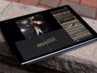
Likewise when you render out. If you expect your 4K video will take long enough for you to grab a cup of coffee, better make it a press rather than a pour-over or it'll likely be sitting there waiting for you when you come back.
The improvement is significant enough that I hope Apple considers bringing some USB 3.x speed to Lightning for those who still want to backup and transfer over a wire.
The storage behind that controller is still NAND flash, and you can get either 32 GB or 128 GB. There's no 16 GB option like other iPads, and no 64 GB option either.
It's unusual for Apple to offer only 2-tiers on an iOS device. Typically the low-end version gets people in the door, the mid-point version is the up-sell, and the high-end is for premium buyers.
Like the new Apple TV, though, there's only low or high here. It's almost as if Apple thinks the customers for these products will naturally gravitate to one end or the other.
32 GB might work for people who want the lowest possible price and don't intend to store a lot of content locally. That includes enterprise, education, entertainment industry, medical, government, and similar buyers.
128 GB will, of course, better suit people who do want to keep a lot of content locally.
I went for 128 GB because I wanted LTE and that's the only version that offers it, sadly. But even after two weeks I'm only using 24 GB of it. I'll be curious to see where that sits after a year.
Touch ID
Like the iPad Air 2 and iPads mini 3 and 4, the iPad Pro has a Touch ID fingerprint sensor. It lets you authenticate your identity to unlock your iPad and apps, including banking and password management, and it lets you authorize iTunes and Apple Pay purchases.
But it won't let you do it as fast as it does on the new iPhones 6s. Those have second-generation Touch ID sensors, and they're so fast it feels like they activate before you touch them. Almost.
Whether Apple didn't have enough second-generation Touch ID sensors to supply both the iPhones 6s and iPad Pro, or simply didn't think the benefits aren't as great on a tablet as they are on a phone, is impossible to say from the outside.
Once you get used to the speed of Touch ID on the new iPhones, though, you want it everywhere.
Battery life
Looking at the iPad Pro, it's easy to wonder why Apple didn't fill up the entire casing with power cells to enable multi-day battery life.
Sadly, even if lithium-ion battery geometry worked that way, which it doesn't, and batteries weren't thermal insulators, radio opaque, and governed by international shipping regulations, which they are, the bottom line is this—they're heavy. And heaviness remains incredibly bad for usability.
To keep weight down and battery life up, Apple is using both the variable refresh rate of the display and the power efficiency of the A9-series chipset. That's letting them compromise on the same 10 hours of power for the iPad Pro that the company has compromised on for every iPad going back to the original.
I've been using my iPad Pro consistently for over two weeks now. That includes a day trip where the iPad Pro was all I brought with me, aside from my iPhone. It lasted the whole trip, including several multi-hour sessions at hotels, coffee shops, and airports between meetings, and with juice to spare.
Normally, when I'm alternating between the iPad Pro and the 2015 Retina 5K iMac I'm also in the process of reviewing, I've only had to charge it every two or three days. (Except for a few nights where I just couldn't stop drawing with the Pencil...)
The biggest difference I've found between the iPad Pro and the iPad Air 2 or iPad mini 4 is brightness. When I've cranked the iPad Pro to maximum for use outside, it's drained much faster. But that's the price we pay for so many pixels being lit up so brightly.
Laptop replacement?
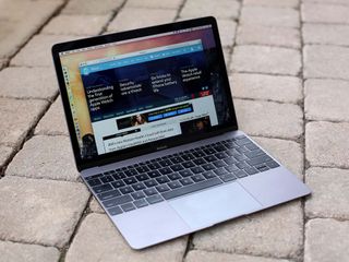
Can the iPad Pro replace your laptop? That's the wrong question, like asking if the iPad Pro can replace your TV or your sketchbook or, yes, if your car can replace your truck. We're in the midst of a major transition in computing but only in the midst. That means, for now, the only answers are personal ones. If the tasks you routinely perform rely on hardware or software only available on laptops, you'll still need a laptop. If not, an iPad Pro offers new hardware and software that might very well suit you better than any laptop. Figure out what you really need to do, and you'll figure out which device you really need to get.
iPad Pro Speakers
You're Apple, and you have extra space in the iPad Pro casing, space that makes no sense for power cells or anything else heavy. You also have a strong desire to improve the audio quality of the iPad. So what do you do? Easy. You fill all that space with four incredibly light, incredibly booming speakers.
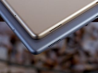
The iPad speakers went stereo with the iPad mini and iPad Air, and while they haven't quite gone quadriphonic (4.0 surround) with the iPad Pro, they have gone... smart.
The four speakers, one per corner, are machined right into the aluminum casing and sealed with carbon fiber caps. Apple claims they're not only three times louder then the previous speakers, but that they have a wider frequency range and response as well, for deeper bass and richer mid and high tones.
Just like with screen rotation, the speakers can tell the orientation of the iPad Pro. That way they can send bass to all four speakers, but mids and highs just to the top. And, impressively, as you rotate the iPad Pro screen, the speakers rotate too—in perfect sync with the screen.
That's why, not only does it sound great, it always sounds great no matter how you're holding it or using it.


I listened to quite a bit of Apple Music and Beats 1 on the iPad Pro, watched several episodes of Jessica Jones on Netflix and the entirety of Ant-Man on iTunes, and played some Monument Valley and Alto's Adventure, and it was all deep, rich, and immersive.
I can't imagine how hard achieving that coordination and cross-fade, that sound depth and quality, was but Apple's audio teams absolutely killed it.
Finally, an iPad with sound to match the display.
iPad Pro Cameras
The iPad Pro has the same front-mounted FaceTime camera and rear-mounted iSight camera found in the iPad Air 2 and iPad mini 4. Since the software is also identical, it leaves only one major difference between The Pro and the Air and mini—the next generation image signal processor (ISP) inside the Apple A9X chipset.
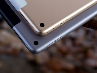
I'm sure the Apple A9X is processing those pixels even faster and smarter than the A8-series, but after taking some test shots, I'm hard-pressed to tell the difference. They all look good, given the cameras.
I did, of course, get some funny looks going out and shooting with the iPad Pro. But if you're going to shoot with an iPad, you gotta own it anyway.


Given how great a viewfinder it has, I wish Apple had added the same optically stabilized 12 megapixel, 4K video sensor to the iPad Pro that they did the iPhone 6s Plus. It still wouldn't be convenient for point-and-shoot, of course, but it would be great for mounted remote work.
It's still more than good enough to scan in documents or artwork and to handle video calls, but it could be so much more.
iPad Pro Connectivity
Like the iPad Air 2 and the iPad mini 4, the iPad Pro has 802.11ac Wi-Fi with multiple-input, multiple-output (MIMO) that allows for up to 866 Mbps of data transfer. Also the same, optional LTE Advanced cellular networking—though only for the 128 GB model)—with support for up to 20 bands at up to 150 Mbps.
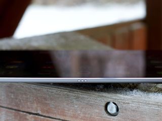
There's even the same Lightning port at the bottom for charging, data transfer, and wired accessories. The difference is, on the iPad Pro, Lightning isn't the only port. There's also the the new Smart Connector.
Smart Connector
The Smart Connector is vertically centered on left of the iPad Pro. It's magnetic but doesn't use inductive power. Rather, it consists of three small, circular ports that provide power, data, and ground. The magnet are what keep the connection. And like with Smart Covers in the past, they do the job well. Really well.
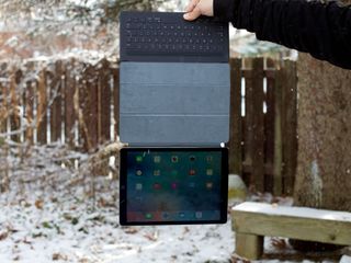
Right now the Smart Connector is only used for external keyboards, and Apple has an MFi (Made for iOS) program so third parties can get in on the action. Whether or not it ever goes beyond keyboards, we'll have to wait and see.
It's interesting that Apple has prioritized Bluetooth with the Mac—including the new Magic Keyboard and related peripherals—and yet the company is going back to physical connections with the iPad Pro. The reason, I suspect, is wires.
A Mac mini, iMac, or Mac Pro can't move and so the keyboard needs to move for them. For a physical connection, that means wires. If you don't want wires, that means Bluetooth. For a MacBook, any MacBook, the keyboard is attached, so no wires, no Bluetooth. For the iPad Pro to really provide laptop-like functionality, it needs to provide a laptop-like keyboard connection.
If you don't want to attach a keyboard, the Magic Keyboard or something similar will work fine, avoid wires, and let you position the keyboard separately from the iPad Pro—for example on a standing desk. If you do want to attach a keyboard, though, you now get all the advantages of an attached keyboard.
That's what the smart connector enables.
iPad Pro Smart Keyboard
The Smart Keyboard is Apple's first iPad-specific keyboard since the original in 2010, which was little more than a Mac keyboard with a 30-pin Dock connector fused on top. It worked, if you didn't mind having your iPad stuck in portrait mode, but it wasn't flexible or portable. The Smart Keyboard is both.
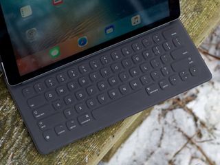
It's made from a single piece of custom woven fabric—taffeta isn't just for weddings any more!—and then laser ablated to form each key. While it uses the same domes inside the keys as the new MacBook, instead of butterfly switches, the structure of the fabric itself acts as part of the mechanism.
The fabric is treated with a durable water-resistant (DWR) coating to protect against spills and stains. Because there's no space between the keys, there's also nowhere for food or dirt particles to collect, and nowhere for liquids to get in.
I've been using the Smart Keyboard at airports, coffee shops, hotels, and on airplanes, and that feature is terrific. I'm super careful with my keyboards anyway, because I travel so much, but not having to be paranoid about the Smart Keyboard is a huge stress-reducer.


Folding the Smart Keyboard into place can be awkward, though, even after you've become familiar with the process, and there's no way to control the angle. It's got one position and one position only. I'd love to have two or three options, so I could adjust for lighting, for example.
The Smart Keyboard does hold its position well, whether on a table or on your lap. The connector's magnet is stronger than the keyboard's magnet as well. So, when you want to fold it back up, the connector comes off the keyboard easily, but the iPad stays stuck to the connector.
Whether it always recognizes it's connected is another story. I often find the software keyboard fails to go away when I attach the Smart Keyboard. You can't just swipe it away either, because the minute you go to enter text, it comes back. Reseating the Smart Keyboard a few times usually gets it to go away, but it's one of those things that just needs to work.
As with the MacBook keyboard, it took me about an hour to get used to typing on the Smart Keyboard. Since then I've been using it without even thinking about it, for hours at a time. Because it doesn't feel like a traditional keyboard, though, it won't appeal tor everyone—It'll likely be even more divisive than the new MacBook keyboard.
For something with this much portability, and with this low a profile, however, it's about as good as it can be. Personally, I'm fine with the compromise. If you're not, though, there's already a Logitech keyboard for the Smart Connector that has far more MacBook-like, backlit keys, and more on the way.
iPad Pro Apple Pencil
I grew up drawing every afternoon, all afternoon, often at the expense of my homework. I took art every year as my elective. I went to college, as much as I went to college, for art. After that I worked in design and illustration for years and, in that capacity, used Wacom tablets professionally for over a decade. So I can say this without hint of hyperbole: Apple Pencil is the best digital drawing tool I've ever used.

The design of the Pencil itself is decidedly different than previous "stylus" and "pens" as well. It is, as you might expect, nakedly Apple. A white object, pencil-like in shape, and almost nothing more. And only white. No space gray, silver, gold, or rose gold Pencils. At least not yet.
There's no eraser on the end, either, which I didn't notice at first. I haven't had erasers on the ends of my pencils since grade school, and none of the professional pencils I use have anything on the other end but end. I did have a virtual eraser on the end of some of my other styluses over the years, but I never thought to use them. I did use the undo button some of them had on the side, though. It was conveniently placed and computer-y in context.

In the real world I have gum and cheese and white erasers that I use in my other hand, and I've found myself doing similar with the iPad Pro—switching to my left to tap to undo or switch to the eraser tool. Whether or not flipping the Pencil around to erase would be physically or cognitively faster, I don't know. I do know I'd rather Apple not limit their thinking to what was and experiment with what could be.
The Pencil has a built-in lithium-ion battery. To charge it, you remove the magnetic cap on the end to expose the Lightning connector. Connector, not port, because unlike every other rechargeable Apple makes, the Pencil comes with an outy not an inny.
Charging with Lightning out rather than in lets the Apple Pencil avoid having to house the port, and technically it's fine. You plug it into the Lightning port in your iPad or any other Lightning-equipped device, or use the adapter included with the Pencil to connect it to a Lightning cable, and you charge away.
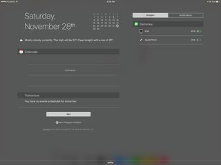
But because it's different than everything else, it took my a while to make it part of my routine. The first week I'd plug my iPad Pro in to charge, then think about the Pencil, then realize the Lightning port was already being used to charge. Since I typically plug in at night, so was my iPhone. So, I've taken to checking the charge level in Notification Center, then plugging the Pencil in between drawing sessions.


Since the Apple Pencil is close to perfectly round rather than hexagonal like some pencils, and because it doesn't have a pocket clip like a pen, Apple has weighted it to prevent it from rolling. It works well enough, weeble-wobble-style, on a slight inclines but on steeper inclines, it works like an accelerator.
There's no Pencil holder built into the iPad Pro or any of Apple's Smart covers, cases, or keyboards. It's an optional accessory, so a permanent fixture for it wouldn't be ideal. Not having any easy way to store it, though, is also not ideal. Because it's not sharp like a real pencil or pen, though, I've been putting my Pencil in my front pocket with my iPhone 6s Plus and it's been fine.
When the iPad Pro display senses the Apple Pencil, it boosts the scanning rate to 240 Hz. That makes for excellent responsiveness. The multitouch technology in the panel also detects things like the tilt in the Pencil so it can do things like switching from line rendering to shading. What's more, the iPad Pro receives data from the Pencil over Bluetooth, including pressure levels, which lets it dynamically adjust things like opacity and/or size.
Apple has also provided frameworks for coalescing and predicting touch events, allowing apps to fine-tune everything from palm rejection to Pencil tracking. The result is digital input that tracks what you're doing with remarkably little latency and remarkably high accuracy.
If you pay really close attention, you can see things like unintentional palm or finger marks that snuck past the rejection system getting quickly erased, or lines that might have been close getting redrawn so they're pixel perfect. Mostly, though, all you notice is how well it works.
Wacom and similar digitizer-based technologies have been okay at this in the past, but once you saw the air gap, the parallax, and the goofy little cursor that tracked your movements on screen, you could never un-see them. They were uncanny.
Apple Pencil, by contrast, feels like its drawing directly on the screen, with as close to one-to-one responsiveness as anything I've used, and with nothing dancing between the tip and the line its creating.
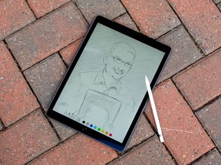
Even in a simple yet well-tuned app like Apple's Notes, using the Scribble tool to draw or write is amazing. The level of detail you can achieve, whether it be tiny letters or textured cross-hatching or small line work is incredible. When you're using apps like Procreate or Adobe Sketch or Paper by FiftyThree, it's a level beyond. So is using it with Astropad, which lets you connect your iPad Pro to your Mac as though it was a digitizing tablet.
Note taking with Notes or Notability works just as well. So well, I'd love to see a really great OCR note-taking app so I could search through my writing at some point.
My colleague, Serenity Caldwell, has done a terrific job showing how the Apple Pencil works on its own and in comparison to other popular platforms.


It's really hard to capture the experience of using a pencil or pen, especially when you're using it on glass instead of paper, but that's what Apple's done. It feels right. It looks right. So right that you almost forget you're using a digital tool. That's an incredible achievement, even after years of working on it. First time out the gate, it's beyond incredible.

iPad Pro accessories
In addition to the Smart Keyboard and Pencil, Apple has released a keyboard-less Smart Cover, as well as a silicone Smart Case. Third party keyboards and cases are also available, as are a variety of other accessories. We'll be reviewing more of them over the next few months. In the meantime, here are some of our favorites.
iPad Pro + iOS 9
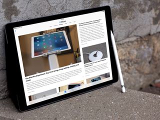
iOS 9, the latest version of Apple's mobile operating system, brings a plethora of new features to iPhone, iPod touch, and iPad, including Apple News, a new Notes app, transit directions in Maps, an updated Apple Wallet, an iCloud Drive app, and a more intelligent voice and text assistant with Siri and Search.
There are also several features unique for the iPad this time as well, and several of them are especially well suited to the iPad Pro.
Trackpad mode
The iPhones 6s come with a great feature where you can 3D Touch (press firmly) on the keyboard and it will transform into a trackpad and let you easily move the cursor around in text fields. You can even press harder to switch between cursor movement and text selection.

The iPad Pro doesn't have 3D Touch, but it does have trackpad mode. It's just activated differently—by a two-finger touch. There's no pressure sensitivity so you can't switch between movement and selection as quickly and easily as you can on the iPhones 6s, though. Instead you get one or the other. If you start fresh, you move the cursor. If you start with a selection, you move the selection boundaries.
The iPad Pro does have the Pencil, though, so it'd be great to see Apple adding a way to use it for quick text edits—circle to select, strike out to delete, underline to emphasize, tilt strikeout to bold, etc. I have no idea how practical any of that would be in actual use, but the potential is super interesting.
QuickType Keyboard
QuickType is the name of Apple's predictive keyboard for iOS. With iOS 9, Apple has taken advantage of the extra space on either side of the predictive results row to add shortcut keys. They're meant to provide quick access to common editing commands.
In the case of Mail, that includes undo, redo, and paste to the left side, and bold, italic, underline, and attach to the right. They can change depending on context and between apps. For example, if there's text selected, Mail swaps undo and redo for cut and copy. Because Notes has different needs, it includes different shortcuts like styles, checklists, images, and sketches instead.
The idea is, no matter the app, you shouldn't have to dig around to find the functions you need. And that's consistent across all iPads.
For iPad Pro specifically, though, Apple is using the laptop-like screen size to provide a full, laptop-like keyboard.

That includes a full number row, tab key, and all the bells and whistles... er, symbol and punctuation keys. It almost works, too. You can type pretty much as you would on a laptop keyboard but sometimes iOS conventions get the way. For example, iOS automatically engages the shift key for the first character in a sentence, but that makes it impossible to manually engage it for punctuation. So, starting a sentence with { or : is difficult. You can touch and hold numbers and symbols to get a popup with the shift-equivalent, but then you're not using it like a laptop keyboard any more.
That'll all get smoothed out eventually, of course, but it shows the transition we're in, and the collisions that can occur as the old and new try to meet somewhere in the middle.
While Apple has added the full-sized keyboard, they've taken away the split keyboard from previous iPads. The assumption is that people wouldn't want to thumb-type on the iPad Pro, given its size. For portrait at least, I'd still like the option.
You can touch and hold down on the Hide Keyboard button to pop up the Undock button. I've used it a few times in portrait mode to get close to thumb typing, but with better balance, and it's worked. Your thumb reach might vary.
Mostly with the iPad Pro, though, I've been using the external keyboard.
External Keyboards
As mentioned previously, Apple has offered external keyboard support for iPad since the original. Over the years that support has been okay. You can type in your passcode and hit enter to unlock. You can use familiar keyboard commands for editing, like CMD + C, X, and V for copy, cut, and paste. CMD + Space will bring up Spotlight and CMD + Shift + H will take you back to the Home screen.
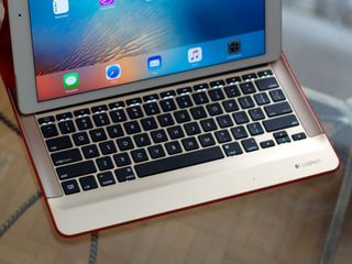
New with iOS 9 is CMD + Tab, which brings up a fast app switcher. It's not the same fast app switcher that comes up if you double-click the Home button, but one that looks and acts like switcher on the Mac. That there are two different fast app switchers now is admittedly odd, but each feels familiar and natural in its respective context.
Holding down a modifier key will now also show you all the available shortcuts for that key. So, hold down CMD and you see all the shortcuts for the CMD key, for example. It's up to developers to implement the feature in App Store apps, but it's extremely useful when they do.

What you can't do with an external keyboard is navigate the basic iPad interface. You can't use the arrow keys to move between apps, buttons, or list items, or the enter key to select them. For that, you still have to reach over and tap or swipe the iPad's display.
That's led to complaints about keyboard and trackpad support on the iPad. Yes, after years of complaining about lack of touch on OS X, now we're complaining about having to touch iOS.
If I had to guess, I'd say better keyboard navigation is already being worked on, at least for the Home screen and Spotlight results. Since iOS has no concept of a universal "pointer", though, I don't expect full trackpad or any mouse support. Something like the Apple TV's focus engine makes more sense. Move focus to the element you want, hit enter to select it.
Mapping the text-entry cursor and new trackpad mode to the hardware keyboard would require something like a capacitive strip on or below the space bar, or something similar.
All this to say that it's a good start. Apple is giving hardware keyboard support some much-needed attention, and hopefully there's more to come.
Multitasking
The most important features iOS 9 brings to iPad are slide over, split view, and picture-in-picture. With it, the iPad goes from full-screen unitasker to multi-app multitasker. All recent iPads get slide over and picture-in-picture, and the iPad Air 2 and iPad mini 4 also get split view. But the scale of the iPad Pro makes these features especially valuable.
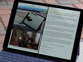
There are three types of multi-app multitasking in iOS 9 and the iPad mini 4, thanks to its 2 GB of memory, can provide for all of them.
- Slide Over lets you quickly access a secondary app as a sidebar-style overlay so you can respond to messages or mail, add to notes or check the web, or do another brief task without having to switch completely away from the primary app.
- Split View lets you pin a secondary app so it shares the screen, side by side, with the primary app so you can reference, copy and paste, or otherwise use them both at the same time.
- Picture-in-Picture (PiP), which has been available on TVs for decades, lets you float a video on top of whatever other app you're using at the time, or even two apps if you're in Slide Over or Split View modes.
With the iPad mini 4, you can get almost two iPhone 6s Plus-sized apps side-by-side. With the iPad Air 2, you can get almost two iPad mini-sized apps side-by-side. With the iPad Pro, though, you can get almost two iPad Air-sized apps side-by-side.
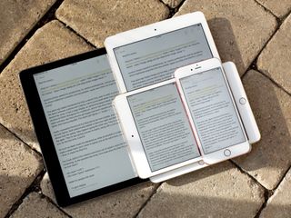
That's about as big as using OS X El Capitan split view on a MacBook or 13-inch MacBook Pro, especially when you have an external keyboard attached. It's so big that, unlike the iPad mini 4, where I found myself using slide over as a convenience more than split view for productivity, I mostly just stay in split view.
Thanks to the size and the memory, every interface element remains easy to use and every app remains immediately responsive.
That there are completely different methods for swapping the primary app and secondary app aren't ideal. It's lightyears ahead of the Mac, where you can't swap them at all, but it seems like we're getting to the point where new interactions need to be considered for all this new capability.
The PiP window is likewise big and easy to see, especially at its maximum size. I do find myself tucking it off to the side more often though, because of how much relative space it takes up. Enough that it makes me wonder what vertical instead of horizontal split view would be like in portrait mode...
Also, drag and drop. From the moment Apple showed off split view the idea of being able to touch, hold, drag, and drop photos, videos, text selections, detected data, and more between apps has be tantalizing. With the iPad Pro, only more so.
Even as it exists now, though, multi-app multitasking is tremendously useful. Whether it's pulling out a slide over to quickly respond to a message, or working in split view to reference and write and the same time, it lets you focus on doing instead of switching. And on the iPad Pro, that's a step forward as epic as the display.
iOS vs. iPadOS
iOS was originally iPhone OS, even when it debuted on the original iPad. The Home screen app launcher (Springboard) was and remains the same grid of icons. Instead of simply scaling up and spacing out the iPhone app interface, though, Apple split it into a two column layout (master detail view) to better take advantage of the screen size.
Since then, the iPad stayed pretty much in lock-step with the iPhone, with the exception of some multitouch navigation gestures and the above-mentioned capabilities in iOS 9.

This is in contrast with how Apple TV and Apple Watch have been handled. Though both have the same foundations, frameworks, and background and foreground managers (Backboard and Frontboard) as iOS, they also have distinct interface layers in Headboard and the top shelf, in Carousel and clock faces. They even have distinct names—tvOS and watchOS.
While they're secondary devices at extreme ends of the spectrum—tiny vs. massive screen, highly power constrained vs. plugged in—there's an argument to be made that the iPad could likewise benefit from a distinct interface layer, from an iPadOS.
I don't know what that layer would look or work like. Higher icon density on the Home screen, PiP windows for apps, split view for remote views, drag and drop, and other items have all adorned wish-lists, my own included.
Yet the biggest advantage of the iPad, bigger than its screen size, remains it's approachability. It's simple up front, and if additional functionality and complexity isn't wanted, it stays completely out of the way. That, in part, is what helped the iPad succeed where competitors who went with more desktop-like tablets failed. For the vast majority of people, a traditional interface on a tablet isn't an advantage, it's a detriment.
That's exactly the type of problem Apple is uniquely positioned to solve. And with the iPad Pro, there's more incentive than ever to solve it.
More on iOS 9
For more on the other new features in iOS 9, including Siri and Search intelligence, Apple News, the new Notes app, and more, see our in-depth review.
iPad Pro Apps
When Apple launched the original iPad, they didn't just launch it with the built-in apps, they reimagined their iWork productivity suite—Keynote, Pages, and Numbers—and soon thereafter, their iLife creative suite—GarageBand and iMovie—in part to show what real multitouch tablet software could achieve.
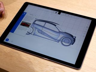
While Apple didn't use the launch of the iPad Pro to launch Xcode for iOS, they did update the iWork and iLife apps for iOS 9 multitasking, and to take advantage of the power of the A9X processor, for three streams of 4K video editing, for example. The increased size makes iMovie even easier to use and makes the piano in GarageBand a legitimate two-handed keyboard. And, as you'd expect, Pages now shows full-sized pages. All terrific.
App Store apps have likewise updated, not just to support the size and power but the Pencil. That includes Procreate and Paper, a series of Adobe apps like Photoshop Mix, Photoshop Sketch, Photoshop Fix, and Adobe Comp, and Astropad that lets you use your iPad Pro like a drawing tablet for your Mac. There are also new apps like Umake, which is 3D modeling born to multitouch.
On the productivity side, Microsoft Office—Word, Excel, PowerPoint, and OneNote—on the iPad Pro is arguably better than Office on the Mac. That's in stark contrast to Google's productivity apps, which are currently a hot mess. Panic's Coda, on the other hand, provides an integrated web development environment with live preview in Safari via split view multitasking. Omni Group, likewise, continues to be all-in on the iPad with updated versions of all their apps—OmniOutliner, OmniFocus, OmniGraffle, and OmniPlan.
The business of selling iPad apps remains tough, though. Apple gives theirs away for free with new hardware. Microsoft and Adobe have huge existing costumer bases and subscription services. Umake and the podcast editor, Ferrite, are free for basic features but have in-app purchases for advanced features. Panic and Omni, like PCalc, have held the line on up-front pricing.
Some blame Apple for not doing more to help enhance the value of apps by providing for trials and upgrading pricing, creating a "boutique-within-a-store" to highlight premium apps, enabling web-based purchasing, allowing per-platform purchases, or more. Others blame developers for racing to the bottom, having unreasonable expectations for universal success, or for taking venture capital rather than charging for their work. And still others blame customers who simply seem not to want to pay for almost anything anymore.
I still see it as the sum of all compromises, and something else that'll take concerted, creative effort from Apple and developers to solve.
Using the iPad Pro, though, as a customer, it's something I want solved more than ever. Because the software to date is terrific, and I not only want it to survive—I want it to thrive.
iPad Pro Bottom Line
The iPad Pro is the biggest, most powerful hand-held window into the internet and apps that Apple has ever released. It's also something new and doesn't yet take full advantage of all that size or power. It is, as Tim Cook says, "the clearest expression of [Apple's] vision of the future of personal computing, a simple multitouch piece of glass that instantly transforms into anything you want it to be." And we're still looking towards that future.
Yet what we have with the iPad Pro, now, today, is remarkable. It's an iPad powerful in a way we previously only thought Macs could be. With that power and the productivity enabled by split view multitasking and hardware keyboard support, the iPad Pro becomes a legitimate laptop replacement for those who value portability and flexibility even over traditional desktop apps. Even though I've been using Photoshop and Final Cut Pro for years, I can travel and work with the iPad Pro with no real compromises. (What you've heard is true, Office is better on iPad Pro.)
When combined with the Apple Pencil the iPad Pro becomes, in its first generation, and writing and drawing tool that rival the best the industry previously had to offer. From taking notes to producing technical work to creating art, the Apple Pencil responds with precision and, corny as it sounds, ignites passion. I haven't drawn this much, or had this much fun doing it, in years.
Even without the keyboard and Pencil, the iPad Pro remains an iPad. And that means it remains an incredibly approachable, accessible computer for those for whom traditional computers have always been anything but. At the larger size it might not be as portable, but it's even more accessible, and without all the legacy baggage.
It may not replace a laptop for anyone or even most people yet, but the iPad Pro and what follows will increasingly be what many people get instead of laptops.
For now, though, if you have a laptop and want to keep it, you might be happier with an iPad mini 4. If you want something light and easy to use around the home or office, you might be happier with an iPad Air 2.
If you're someone who works a lot on the go, if you want the ease of use of iOS but the power of a traditional computer, if you want tools that help you create, then what you want isn't any other tablet or laptop...
"...It's an iPad Pro."
iPad Pro buyers guide
There's a lot to consider when buying an iPad Pro, including screen size, storage capacity, color, carrier, and more. To help you choose the perfect iPad for you, check out our buyers guide.

Rene Ritchie is one of the most respected Apple analysts in the business, reaching a combined audience of over 40 million readers a month. His YouTube channel, Vector, has over 90 thousand subscribers and 14 million views and his podcasts, including Debug, have been downloaded over 20 million times. He also regularly co-hosts MacBreak Weekly for the TWiT network and co-hosted CES Live! and Talk Mobile. Based in Montreal, Rene is a former director of product marketing, web developer, and graphic designer. He's authored several books and appeared on numerous television and radio segments to discuss Apple and the technology industry. When not working, he likes to cook, grapple, and spend time with his friends and family.
