3D Touch on your iPhone: Explained
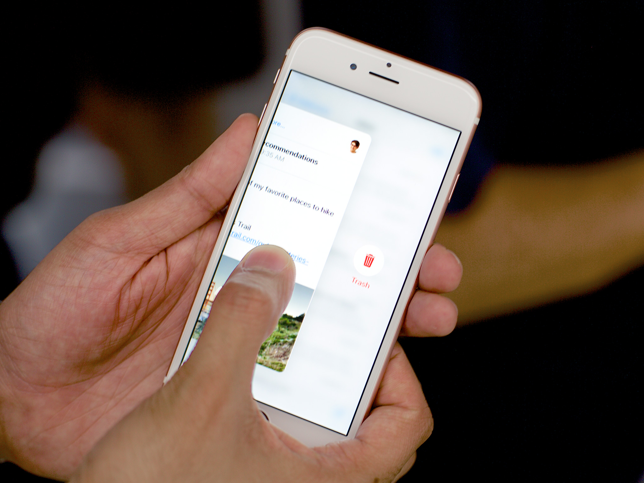
Apple first showed off pressure sensitivity combined with tactile haptic feedback—taptics—a year ago on the Apple Watch Because of the small display size it was limited in scope: press and you get a context-sensitive set of options. Next was the new MacBooks, which began to hint at the potential of multiple levels of force touching multiple points of a surface. Now, on the iPhone 6s and iPhone 6s Plus we get to see what's possible when you combine the direct interaction of the former with the spatiality of the latter.
It's important because the iPhone remains primarily an icon launcher and single column view of computing, especially in its typical portrait orientation. It doesn't have the split view controller of the iPad, which lets you quickly tap lists and glance at the details beside it. Instead, you have to tap, check, and if you went to the wrong place, tap back.
3D Touch works around that. It folds space almost like a wormhole so you can jump directly to actions or look or leap through to views and entirely different apps on the other side.
That might sound silly but functionally, it's genius.
Home screen quick actions
Home screen quick actions let you press an app icon and get a list of options you can choose from, right from the Home screen. Think of them like shortcuts or wormholes straight into the functionality of an app. Instead of tapping Camera, then switching to the front-facing camera or slow-mo video more, you can press the Camera app icon, swipe down to the Selfie or Slo-Mo options, deep-press, and launch right into that mode. It's like a launch accelerator.
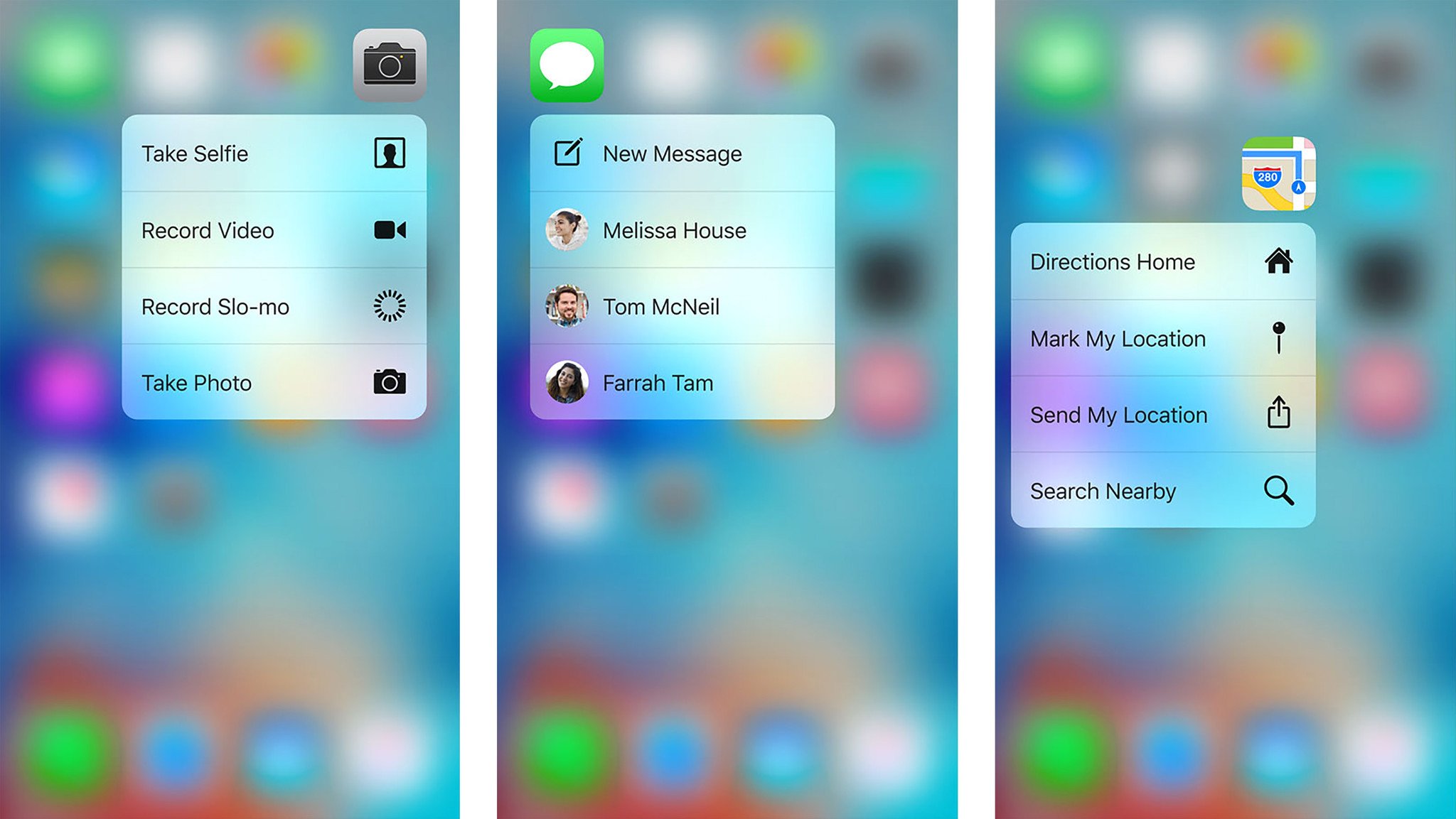
There are two kinds of quick actions:
- Static quick actions ((UIApplicationShortcutItem)), which are available immediately when you install an app.
- Dynamic quick actions (shortcutItems), which are available after you've launched the app.
As the names imply, static quick actions are always there and always the same, while dynamic quick actions are optional and can change according to conditions.
Master your iPhone in minutes
iMore offers spot-on advice and guidance from our team of experts, with decades of Apple device experience to lean on. Learn more with iMore!
Up to four quick actions can be displayed for any app. Static quick actions get displayed first and then, if there's any space left, dynamic quick actions. So, for example, Messages can show you a static "New Message" action, and dynamic actions based on the last three people you texted.
Each quick action can include up to two lines of text and an icon to help make them faster to visually parse and acquire. They also support VoiceOver for visual accessibility, which is great.
Delightfully, if no quick actions are present, you get the 3D Touch and haptic equivalent of the head-shake interaction, which tells you there's nothing there but encourages you to keep exploring.
Reducing the amount of taps not only shaves seconds off each interaction, which all add up, but makes one-handed use easier as well. Instead of having to balance while moving around to tap several different areas in succession, you can press an icon and then tap an option that's proximal to it. Much less getting there, much more being there.
Overall, Home screen quick actions don't reduce the Home screen's (Springboard's) roll as the gateway to apps, but it does transform it from an app launcher to a feature launcher, which is perceptively a much, much faster paradigm for when you're starting from Home.
Peek and Pop
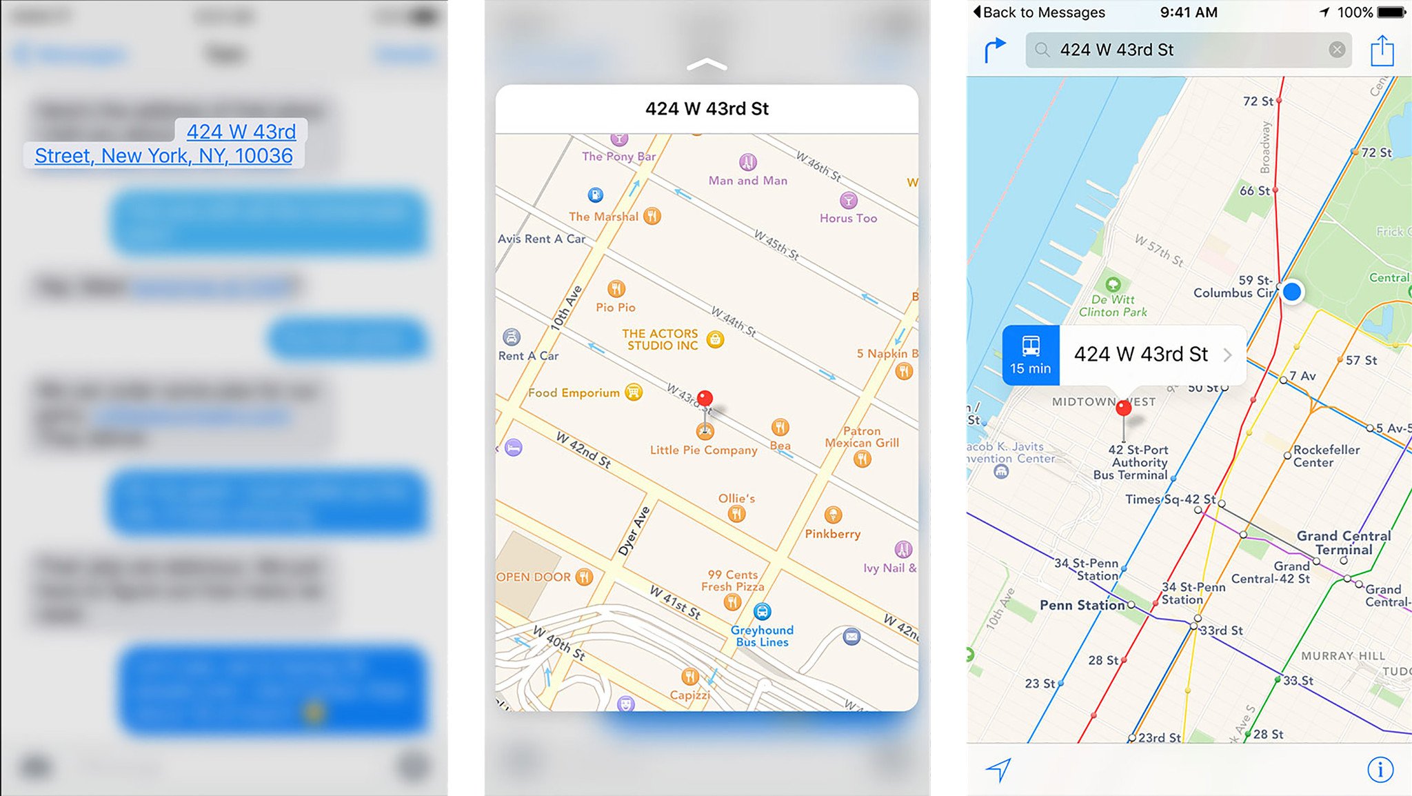
Peek and Poke—technically hint, peek, and pop, because there's a hover-like state for discoverability—let you glance at items or go to them. Think of it as a preview. You can press the title of an email in your inbox to peek inside and then press harder to pop right into it. Then, in that email, you can press a linked location to peek at it on a map and then press harder to pop right into it in the Maps app.
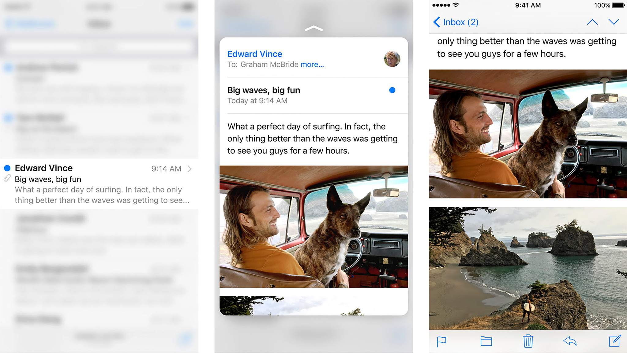
- Hint lets you know something is there. It blurs out the rest of the screen so that only the list item or link (including links created by data detectors) is visible.
- Peek lets you preview (using new methods in UIViewController) the contents of the item or link. It keeps the rest of the screen blurred and overlays it with a remote view of the item's or link's content, whether from the same app or a different app.
- Pop lets you commit to going to the contents of the item or link. It works similarly to how tapping a list item, or link has always worked but since the view is already open, it simply animates it expanding as you move into it in the same or different app.
The great thing about this interaction is that you can abort at any time. If you decide you don't want to peek at a hint or pop into a peek, you simply let go. There's no need to navigate back because you stopped before you actually went anywhere.
Developers can also add quick actions to a preview. Swipe up and the peek will not only stay on screen even if you let go, but will show you a list of common tasks for that view. For example, flag a message, add a webpage to Reading List, or FaceTime a contact.
Think of it as a combination of peek and pop and Home screen actions, because functionally it provides the convenience of both.
Mail gets a couple of custom actions as well, thanks to its existing gestures and use as a way to triage emails on the go, you can also swipe sideways to get to mark and trash buttons. Those behaviors aren't available to developers, at least not yet, but show how more complex options could eventually be mapped.
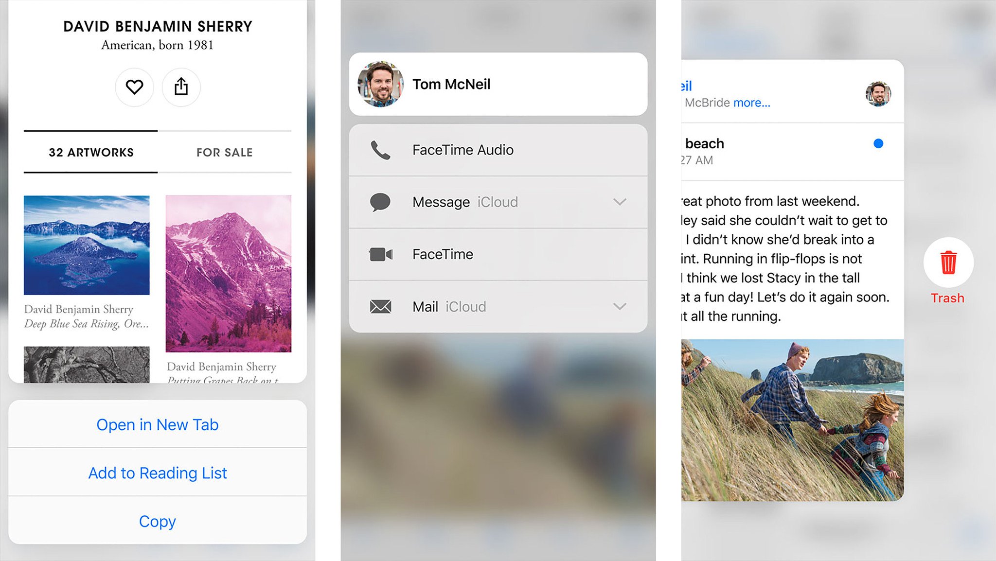
Peek and pop are also available for the web (using AllowsLinkPreview) for standard and data detector generated links in the new Safari View Controller as well as the older WKWebView and UIWebview controllers. That means modern Twitter and chat clients can implement them, as well as custom browsers like Chrome.
Pressure sensitivity
In addition to Home screen actions and peek and pop, Apple has also provided a way for developers to get direct pressure data as well (force and maximumPossibleForce. The pressure of a touch has a high dynamic range that's provided to developers as a floating point.
Apple shows it off in the iPhone 6s and iPhone 6s Plus version of the new Notes apps. When you use the Sketch tool, you can increase or decrease the line thickness by increasing or decreasing the pressure you put on the screen. It doesn't work as well as the iPad Pro, and it's dedicated Pencil, but it works.
Personally I'm hoping messaging clients adopt a universal "deep press" action for the Send button that lets it know you're angry or excited and then POSTS IN ALL CAPS. Come on, you know you want it.
3D touch miscellany
Apple is also using 3D Touch in a variety of other ways on the iPhone 6s and iPhone 6s Plus.
- Activate Live Photo.
- Pull up the fast app switcher.
- Switch from keyboard to trackpad and back.
And perhaps other ways that we'll discover as everyone starts using it.
Multidimensional Touch
Prior to iOS 8, most interfaces were "pull". You had to leave where you were and go hunting for the app that contained what you wanted to do. Post-iOS 8, thanks to Extensibility, interfaces started to become "push". Actions, widgets, and more would come to you where you already were.
Peek and pop take it even further. Instead of "pull" or "push" they're closer to "teleport". They let you pull in what you want to see, right where you are, and then push into it, and simply by increasing the pressure on the screen.
If we consider pre-iOS 8 Extensibility interfaces as being pull and post-iOS 8 Extensibility interfaces as being push, then peek and pop make those distinctions seamless. Now interface can both come to you and you can go to it simply by varying the degree of pressure you put on the screen.
It really does make multitouch multidimensional. The hardware is finely tuned, and the interface is consistent and incredibly well considered. It might take time for the really important options to become perfectly chosen and placed for each and every app, but even at launch it's obvious it's going to be transformative.
It's one of those things that makes an interface, especially a single-column interface like the iPhone perceptively much, much faster. And I've long felt that when it comes to mobile, convenience is always the killer app.

Rene Ritchie is one of the most respected Apple analysts in the business, reaching a combined audience of over 40 million readers a month. His YouTube channel, Vector, has over 90 thousand subscribers and 14 million views and his podcasts, including Debug, have been downloaded over 20 million times. He also regularly co-hosts MacBreak Weekly for the TWiT network and co-hosted CES Live! and Talk Mobile. Based in Montreal, Rene is a former director of product marketing, web developer, and graphic designer. He's authored several books and appeared on numerous television and radio segments to discuss Apple and the technology industry. When not working, he likes to cook, grapple, and spend time with his friends and family.
