8 Apple Watch fixes I want in the next software update
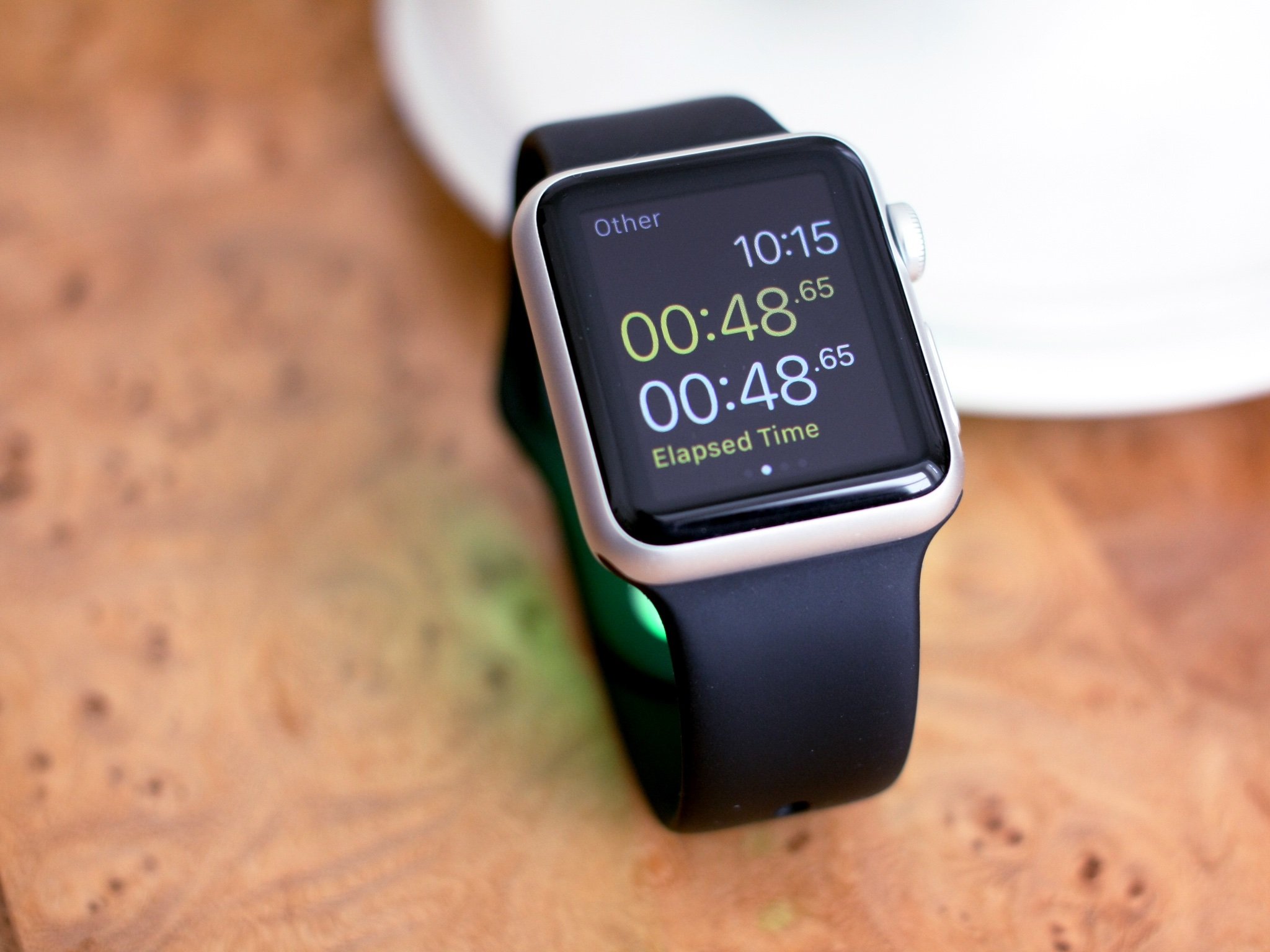
The central problem with the Apple Watch is its software. When I hand someone an iPhone, its user interface is intuitive. Yet to me, the Apple Watch isn't something that's easy to understand. On top of that, for a company that's known for sweating the details, Apple has seemingly missed a few with its software.
I like my Apple Watch. It's great. But here are eight simple software changes — four fitness-based quirks, four general tweaks — that would make it even better.
1. Workouts need to end automatically
I love to work out, and the Apple Watch is the best fitness gadget I've ever owned. It records heart rate, caloric expenditure, and my progress throughout the day.
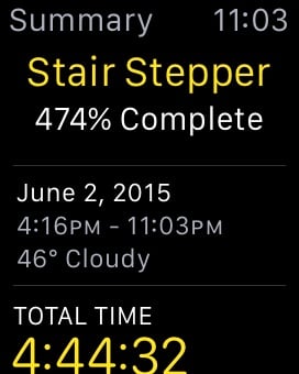
But what I don't love is what happens if I forget to end my workout: The app continues to monitor your pulse, quickly draining the battery and throwing off your fitness stats. I've had my Watch battery die at least 10 times this month from forgetting to end a workout. Often, when you've really worked out, fiddling with your watch is the last thing on your mind.
As a software problem, this is an easy fix: The Apple Watch is in high energy mode, monitoring your pulse. When it senses that your heart rate has returned to normal, it can vibrate to ask if you want to end the workout. No, I didn't spend 5 hours on a Stairmaster, I forgot to end my workout. And now my watch is dead.
2. Add other options for double-pressing the Side Button

Apple Pay is flat-out awesome: I love it for Uber, and I love it at the Apple Store. But, let's be honest: It's far from ubiquitous in 2015. I can't wait for the day that I don't have to carry my credit cards with me — but for now, let's admit it's not widespread enough to dedicate one of two shortcut buttons to.
For me, the app I use most is the Workout app. For others, it might be a third-party app like Marco Arment's Overcast. The point is, this is something I should have control over. The entire point of the Apple Watch is giving us quicker access to information, so let's not waste it on a feature most of us can't use frequently yet.
Master your iPhone in minutes
iMore offers spot-on advice and guidance from our team of experts, with decades of Apple device experience to lean on. Learn more with iMore!
3. The Workout app needs a Unified View
Let me paint you a word picture: I was biking the other day on the Minuteman Trail. It's gorgeous out, and my Apple Watch is tracking my workout. But because of Apple's UI choices, I was unable to see my statistics as I went: It would have required taking both hands off the handlebars — not a safety compromise I was willing to make.
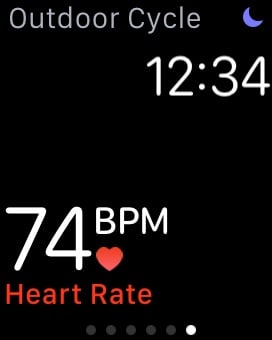
This is a major problem with all of Apple's workout options — they only show you one stat at a time. I can see time, calories burned, speed and heart rate, but I have to page through them by swiping right and left. This is a bad design, and entirely against the Apple Watch's purpose, which to give you information more conveniently than your iPhone.
Garmin has been making fitness wearables for years, and understands that giving you glanceable information is vital. Apple should too. The Workout app needs to either give you a single pane of information, or automatically switch views every few seconds.
4. The Apple Watch should adjust your calorie targets day by day
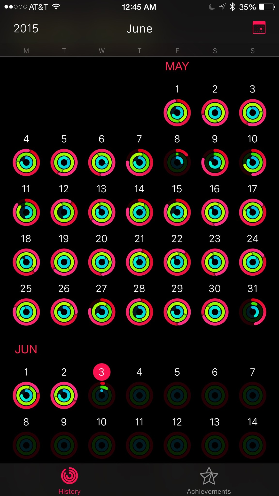
When I got my Apple Watch, it gave me three activity levels to pick from. While these general goals are fine, they aren't very helpful for those of us trying to push ourselves to get into better shape. Right now, I work out for 600 calories on elliptical days, and 800 calories on running days.
You can manually change your weekly goal by pressing firmly on the screen while in the Activity app, but I'd love a way to set each day with more granularity, to prod myself to a better level of fitness.
Right now, my Apple Watch just tells me which days I worked out — usually all of them when I'm not sick. But I'd like it to hold me more accountable: I want it to push me to set the elliptical higher. Right now, it gives you no real motivation to do a hard workout at 160 BPM instead of a leisurely 130 BPM. The reward is the same — a filled in green circle.
5. More options for activate on wrist raise
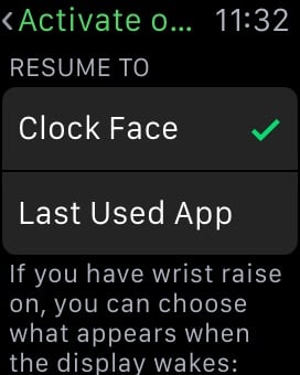
I realize Apple is erring on the conservative side when it automatically shuts off my display to conserve battery life, but this is something the user should have more control over. It's simply not active for long enough for me to read my calendar information. Users should be able to specify how long this default should be — even at the expense of their battery life.
Instead, the only option we get on this screen is choosing what the screen wakes to: clock face or last-used app. I've tried both settings, and each has severe drawbacks: When I'm working out, I cannot quickly get information about my stats from the clock screen without hitting a button. But if you activate "Last used app," you find yourself staring at a workout start screen throughout the day.
This is where Apple should tailor this function for its built-in apps. It already does this haphazardly for the stopwatch and (some of the time) for workouts, but I'd like to see it applied to other active apps, too.
6. Make the time an option for the center for the Modular Face
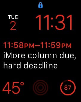
Not that I don't love having my calendar displayed so prominently, but the most important function of a watch is telling time. Aesthetically, it makes little sense to have it shoved in the upper right corner.
I realize that there are typography issues with trying to put different functions in different locations; as such, Apple could also give users size variations of the modular design. Adding the option to replace the two tinier squares with a long column at the very bottom would let Apple move the time to the center where it belongs.
7. Timer, Stopwatch and Alarms should be a single app
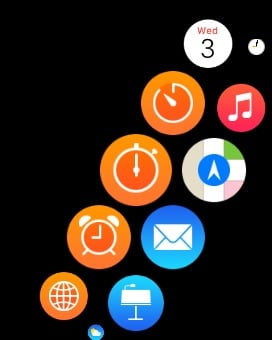
This one really leaves me scratching my head. The Apple Watch home screen is already a mass of cluttered icons — it's like trying to find your clothes in a pile of unfolded laundry. So why did Apple add to this by making the same basic idea three separate apps?
I understand that Apple Watch apps can only be so complicated, but it especially makes no sense when you consider that these three features are a single app in iOS, and Apple Watch users must have an iPhone. Let's err on the side of simplicity and merge them.
8. Bring some organization to the Apple Watch Home screen
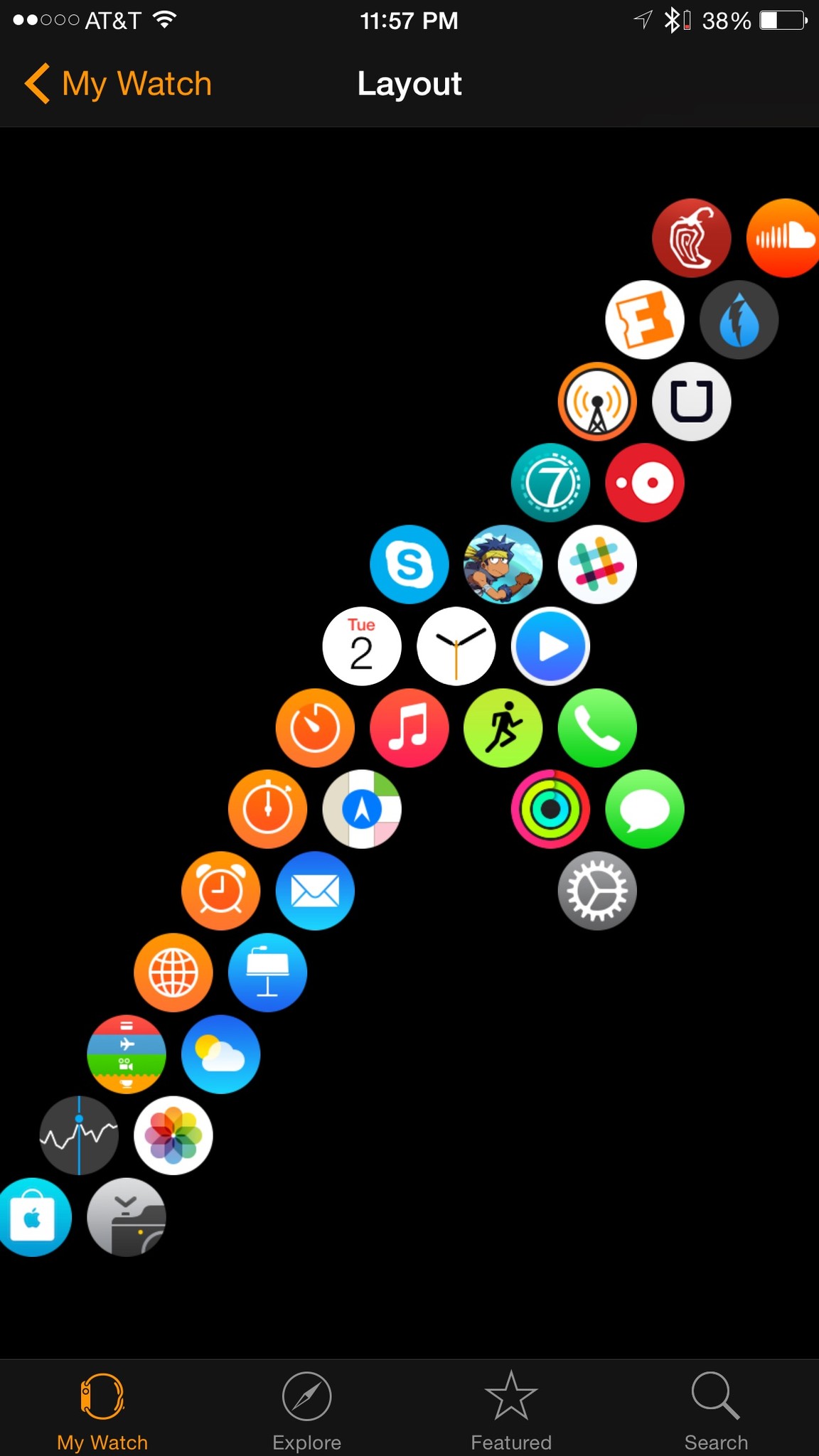
There's no nice way to say this: The Apple Watch's Home screen is a mess. I get that the idea is to give you a large list of functions to choose from with a single tap, but in practice, the touch targets are so small that you end up wasting time panning and zooming.
It's worth taking a step back in time to the fifth-generation iPod Nano, which many people wore as a watch. This interface was dead simple. I understand that it would become unwieldy with a lot of icons, but you could fit four to a page, and let people swipe up, right, left, or down.
Adding folders would be another option. Apple could keep the honeycomb pattern they've established for Apple Watch, and let users go into submenus. It would require several taps to get to some apps, but it would be neater than panning and zooming over a giant pile of icons.
My current best bad option I've found to organizing Apple Watch apps involves branches off the honeycomb. Lower left, system. Lower right, frequently used. Upper right, third-party apps.
Faith in a better future
All in all, the Apple Watch sets an amazingly high bar for wearables. But there are a lot of features that simply weren't thought all the way through. For a device that's supposed to be a convenience, I feel like I waste a lot of time with little things that could be easily fixed.
There are certain parts of the Apple Watch that can't be adjusted immediately: Battery life and speed, for example, are simple hardware limits. You can only cram a certain size battery into a small space; the same goes for the amount of power a tiny processor can draw upon.
But that's all the more reason for Apple to get to work and do what they do best — sweat these software details, and polish the experience until it shines.
Head of Development at Giant Spacekat. Host of Isometric and Rocket on Relay.FM. Godzilla of tech feminists.

