We took a look at Agenda Calendar for iPhone and iPad back when they were first released and this time, the guys over at Savvy Apps are back with Agenda Calendar 4. This time around they've managed to make a great app even better by cutting unnecessary UI items and adding easy to use gestures.
I've had some time over the past few weeks to use the iPhone version of Agenda Calendar 4 and I have to say that I've come away more delighted than I was with the original version, which was also quite good.

When I first opened the newly updated version of Agenda Calendar on my iPhone, I instantly noticed that a lot of menus and other items that I'd become accustomed to seeing were not along the bottom. So I did what seemed natural, I started swiping and flicking my way through the different screens.
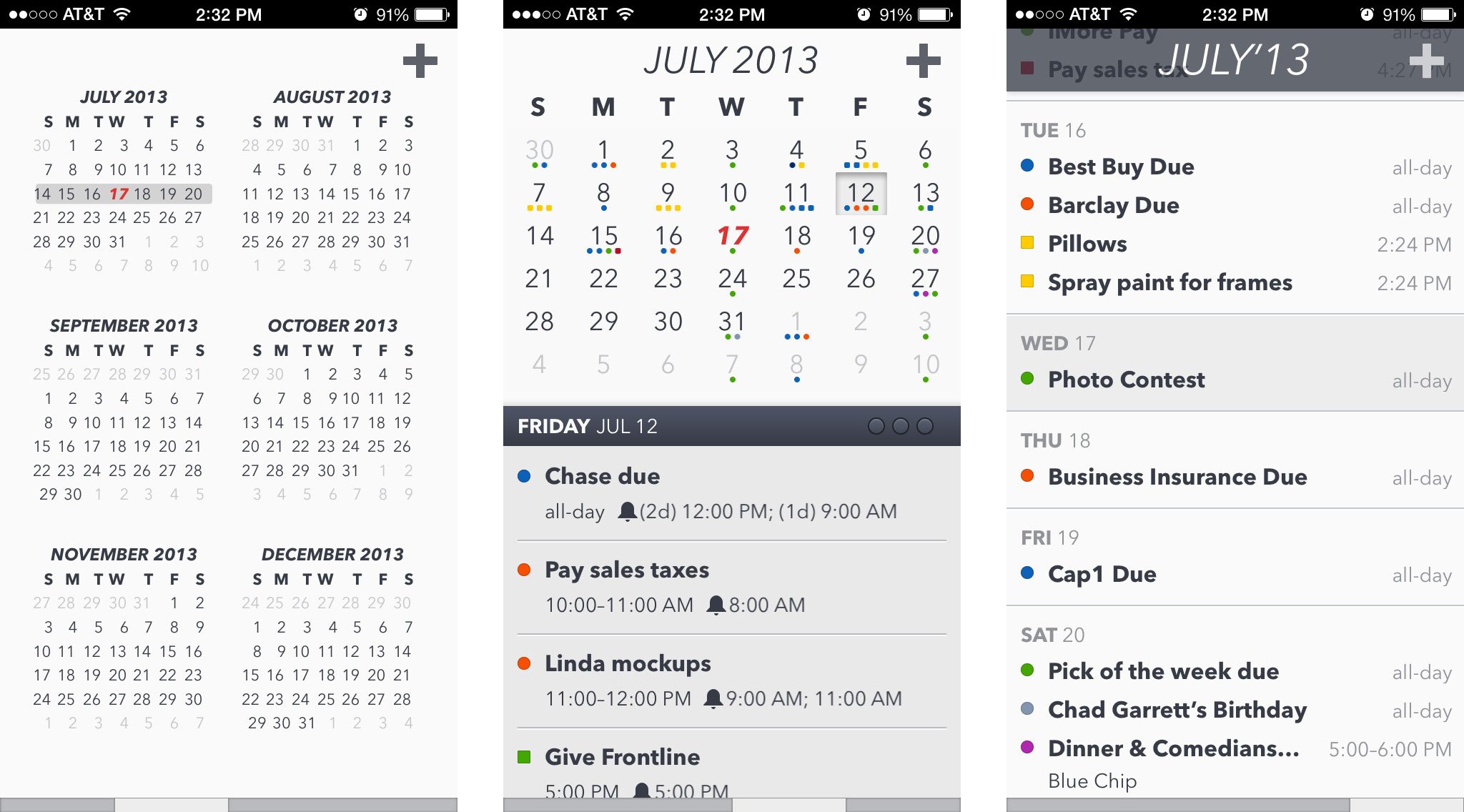
The removal of some of these unnecessary menus made way for you to be able to see more events and details on one screen. That means more of my events filter at the bottom and I have to scroll less in order to view what I'd like. If I want to see a larger list view of my events, I can simply swipe to the left to view an entire list of not only events, but reminders as well.

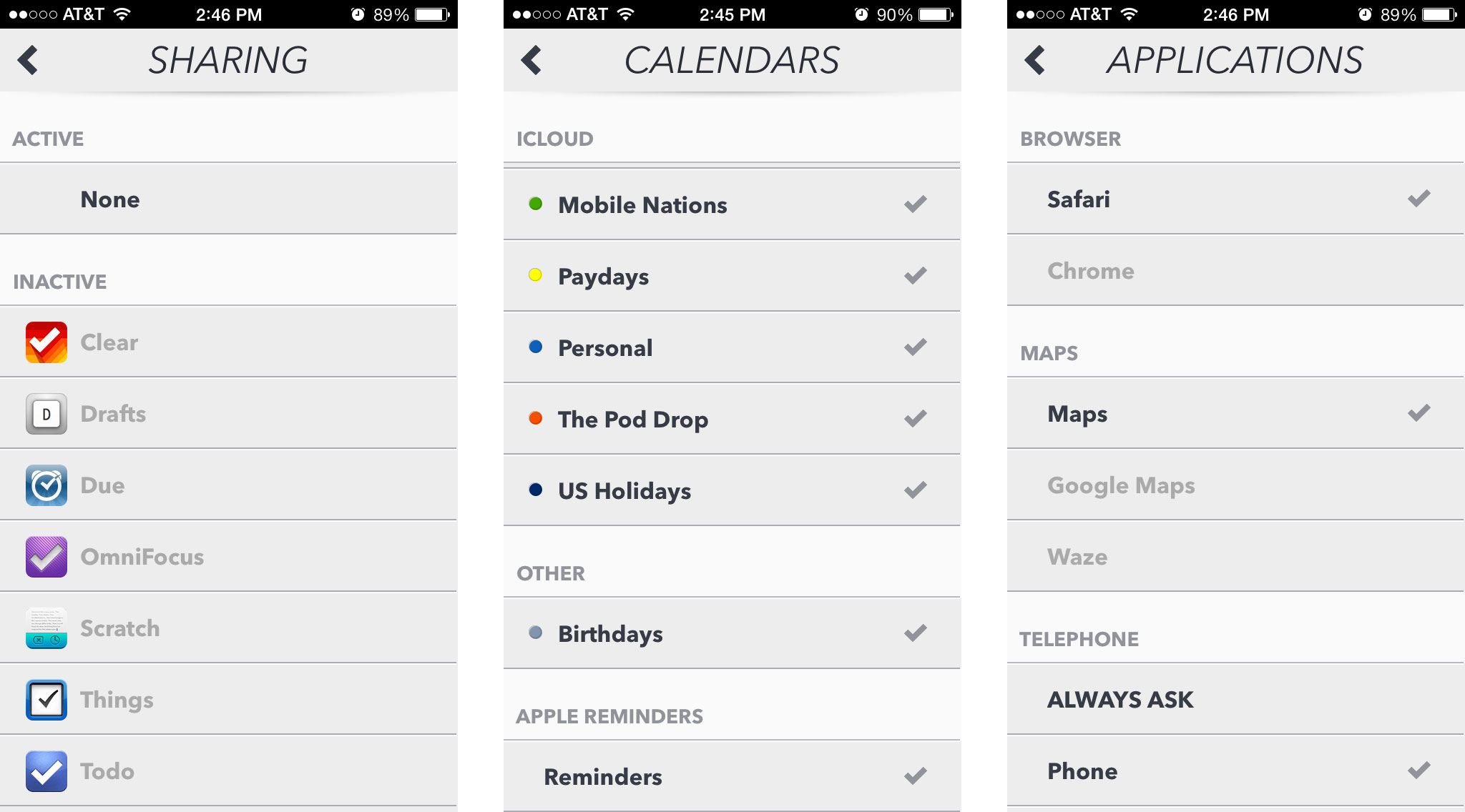
For those not familiar with Agenda Calendar already, it will pull in from your native Calendar app as well as the Reminders app. If you already use these, there will be virtually no setup required. All of your items will be imported instantly for you. Agenda Calendar can also interact with and share information across many apps such as Omnifocus, Clear, Things, Todo, Due, Drafts, and more.
As far as the different calendar views go, you can swipe left and right between a six month view, single month view, and list view. On the single month view you'll also see your events and reminders aggregate below the calendar.
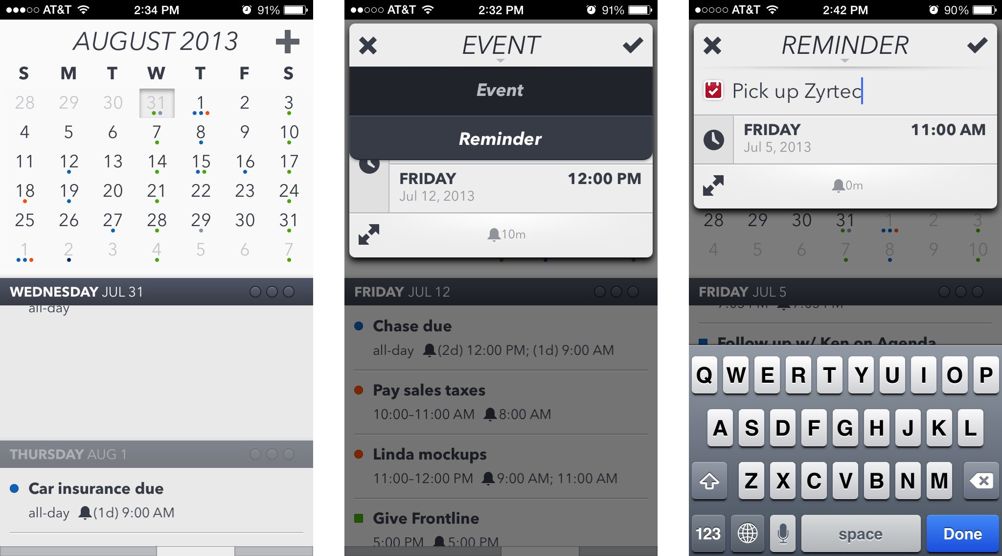
When it comes to handling reminders, Agenda Calendar isn't yet a full fledged solution. It will simply filter all the reminders in from the native Reminders app. If you need to mark something as complete, you'll still need to use the native Reminders app. If you don't mind just deleting the reminder, that works too but it's more of a workaround than an actual solution. It won't be a viable one for anyone looking to keep a record of reminders they're completed in the past.

The good
- Already great interface got even better
- The ability to share across many productivity apps makes it a better solution than the native Calendar if you're already using other todo apps
- Gesture based interface seems more natural than the old menu style layout, it won't be hard to get used to for existing Agenda users
- Allows you to view reminders and calendar events all in one place
The bad
- Reminders management still isn't an all-in-one solution, but it's getting there
- All reminders are clumped into one group instead of staying in their respective lists
The bottom line
If you use other task apps such as Omnifocus, Todo, or Clear, you may find that Agenda Calendar's ability to share information to other apps and keep everything in sync will make your life just that much easier. It's definitely a better option for these users than the stock Calendar app.
For existing users of Agenda Calendar for iPhone, Agenda Calendar 4 will be a great update and solve some of the tiny frustrations with the interface. It may be a separate purchase but if you really love Agenda Calendar, it's well worth it.
- $1.99 - Download Now
iMore senior editor from 2011 to 2015.


