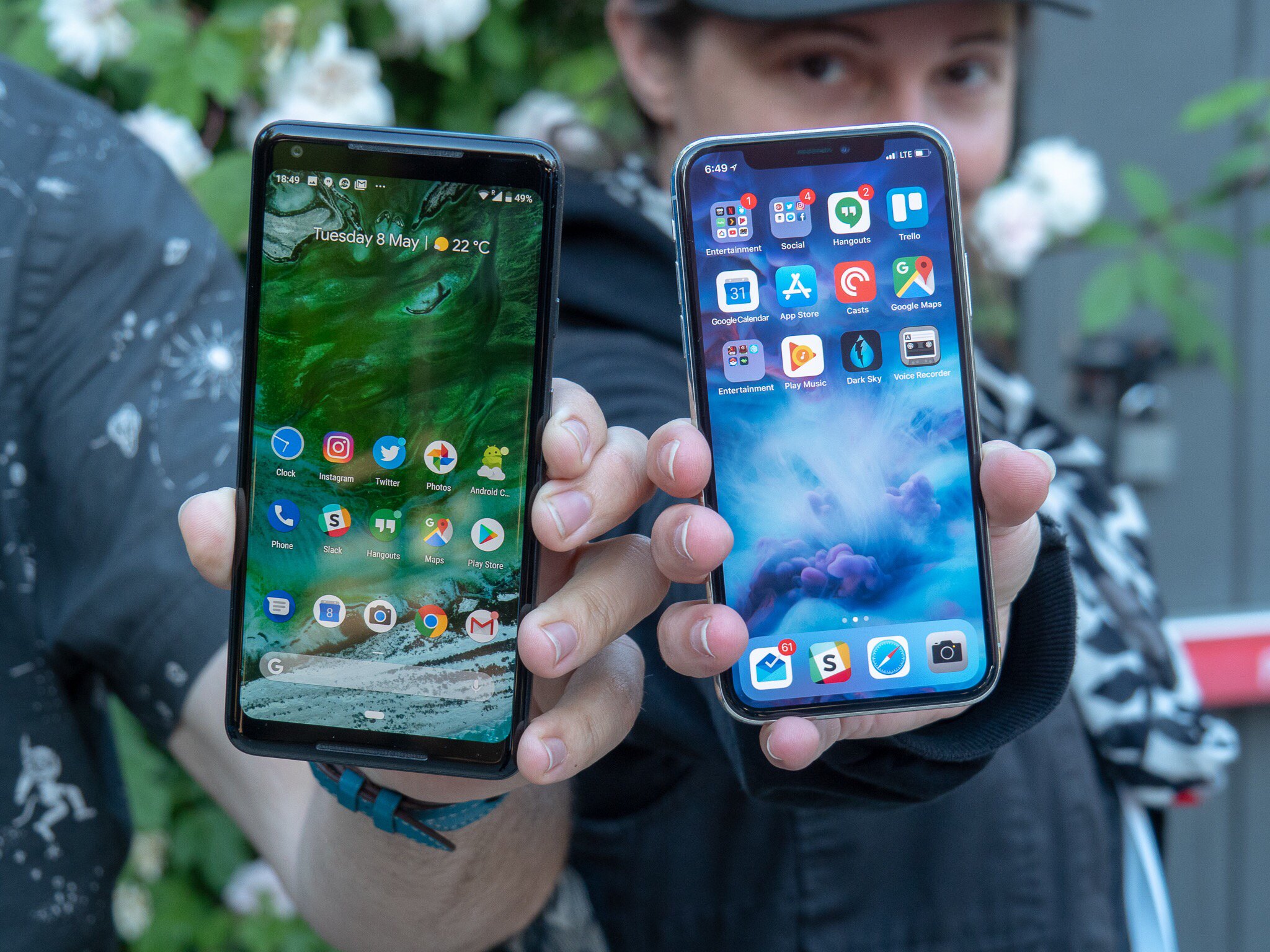
In the tech world, you're either an iPhone user or an Android user and one camp thinks the other's has a terrible user interface design. The reality is they're a lot more similar than the tech world would make you think. Android P's first public beta brings with it some fantastic gesture-based home screen navigation that reminds me a lot of how Apple designed the anti-physical button iPhone X's Home screen gestures. It feels natural and intuitive. In some ways, I like it more.
Swiping straight up like a boss
To access the app switcher from the Home screen on the iPhone X, you swipe up — but not just up — you swipe up and to the right. Or you can swipe up and hold until the app switcher appears. It takes just a fraction of a second pause before triggering the feature. It's ... fine, especially when it's the only thing you've ever known.
Android P's Home screen app switcher works by swiping straight up ... just up ... nothing else. I know, Apple reserved the straight up gesture for jumping back to the first page of your Home Screen, but I use the app switcher way more often than I jump to the first page of the Home screen, so I much prefer mapping it to the latter.
Suggested apps where you swipe
On iPhone X, you gain access to Siri suggested apps by swiping down from the middle of the Home screen. When you "pull down," you get the search bar and four suggested apps (plus some additional suggestions from Siri).
In Android P, whenever you swipe up to access the app switcher, five suggested apps appear at the bottom of the screen, along with a search bar.
I like this little addition to the user interface. It's like always having some additional options at your fingertips, wherever you're headed. If you trigger the app switcher because you want to get to a specific app and a suggestion appears, showing you the five apps you open the most often, you're going to have a very pleasant search experience.
I love being able to pull down from the middle of the Home screen to access Siri's suggestions on my iPhone, but having the additional app suggestions right at the bottom of the app switcher would be an equally loved bonus feature.
Master your iPhone in minutes
iMore offers spot-on advice and guidance from our team of experts, with decades of Apple device experience to lean on. Learn more with iMore!
Gestures for all
This is the thing I actually love the most about Android P. If the final build is the same as this developer build, everyone that updates to Android P will gain the gesture-based home screen features — not just phones that don't have a home button.
The main reason I think the iPhone X is the best phone Apple has ever made has a lot to do with the built-in gestures, which were designed to mitigate the lack of a Home button, but are so intuitive they should be available on every iPhone. Imagine being able to choose whether to use a physical Home button or swipe gestures to navigate the iPhone 8 Plus, or even iPhone SE!
It's all about the P
I love Apple's implementation of gesture-based Home screen navigation and I love Google's implementation of the same. If I could ask Apple to do one extra thing, it would be to add gesture-based navigation to all of iOS, not just the iPhone X.
Lory is a renaissance woman, writing news, reviews, and how-to guides for iMore. She also fancies herself a bit of a rock star in her town and spends too much time reading comic books. If she's not typing away at her keyboard, you can probably find her at Disneyland or watching Star Wars (or both).


